 Back To Projects
Client
Energise Sales
Deliverables
- Brand Identity
- Logo Design
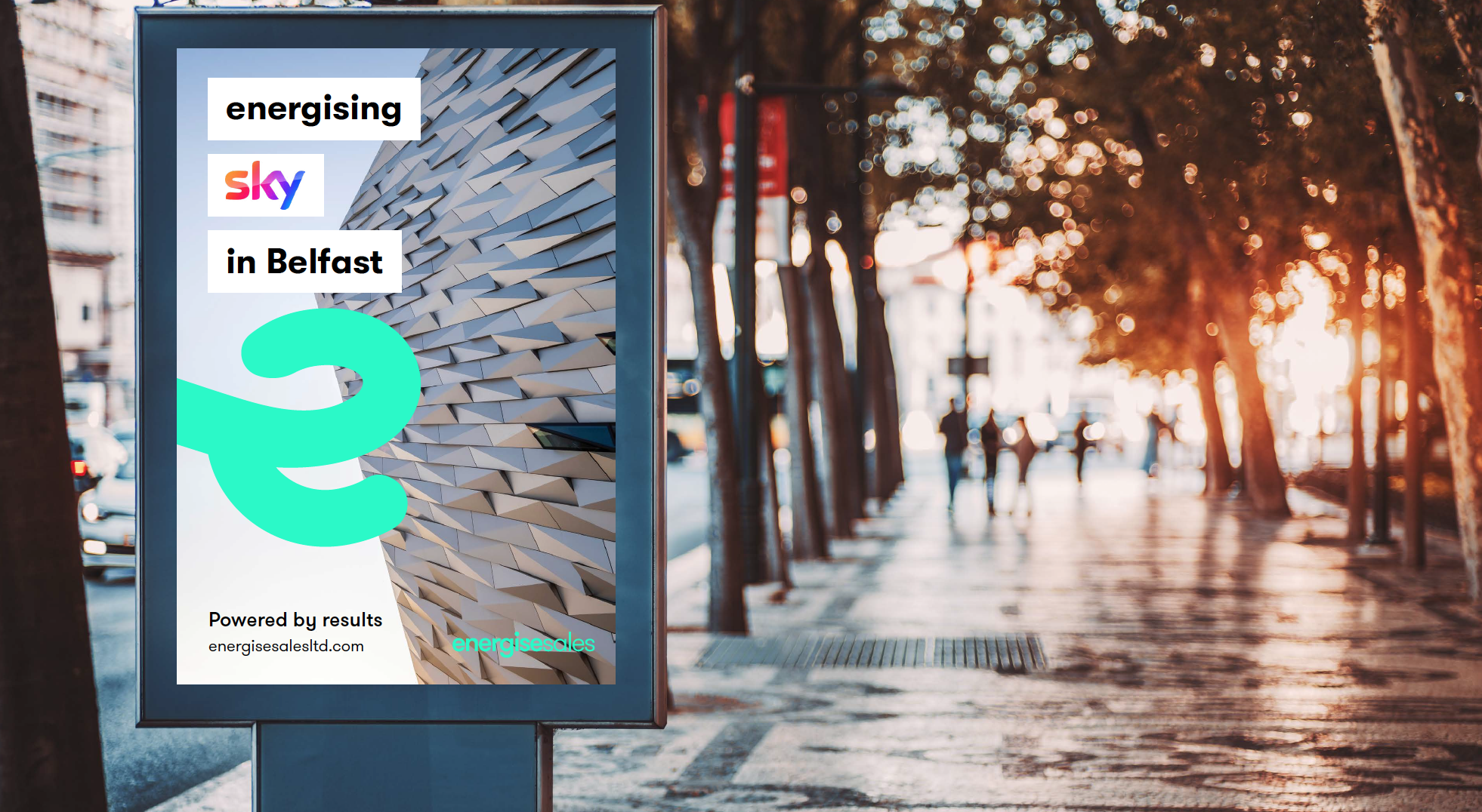
Powered By Results
As a relatively new company, Energise Sales approached the Kaizen Brand Evolution team to create and develop the brand into an engaging, innovative force that makes and impact. Our aim was to create a brand that would build brand confidence across existing and new customers and to establish a sound foundation for growth nationally.
Process
Bespoke Design
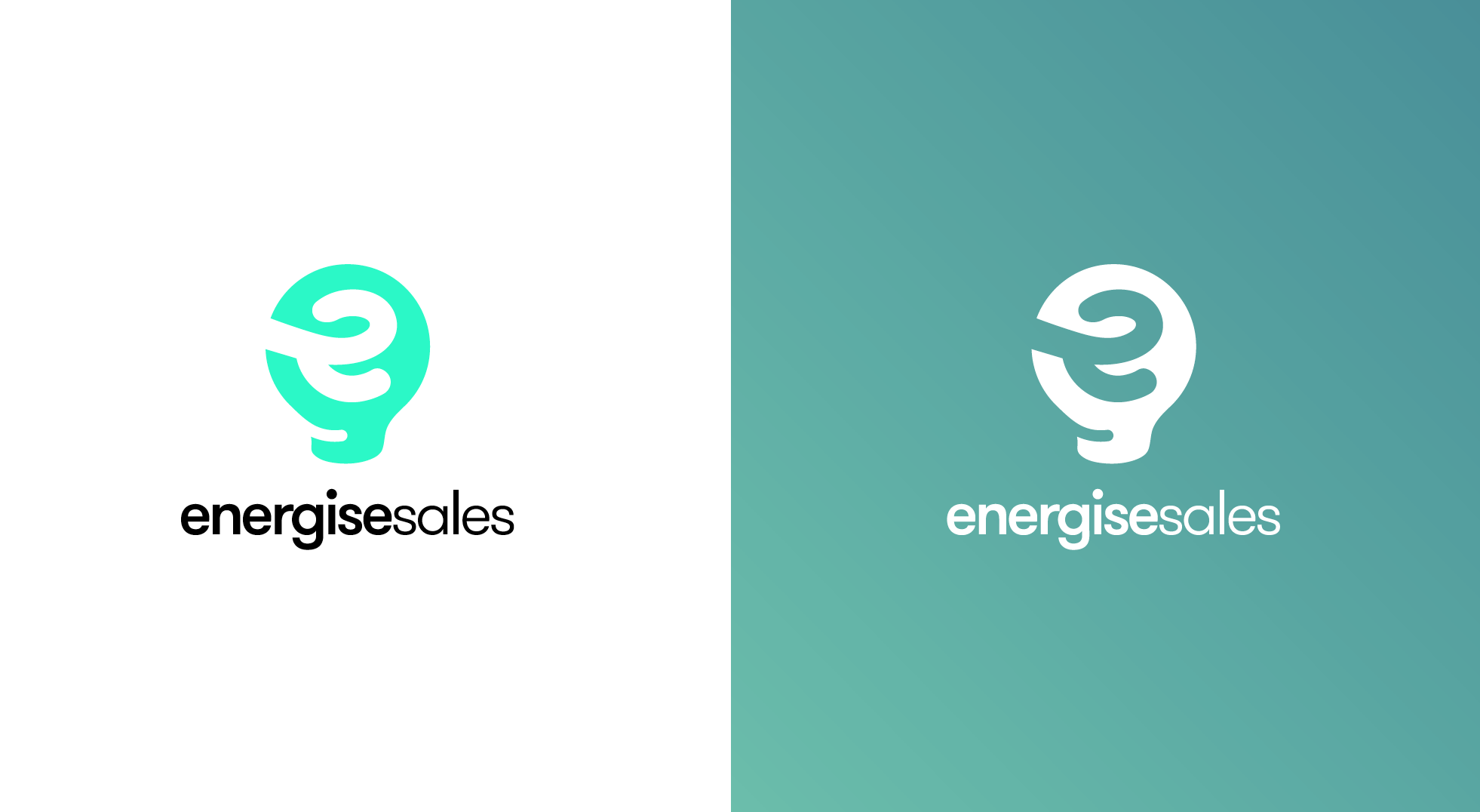
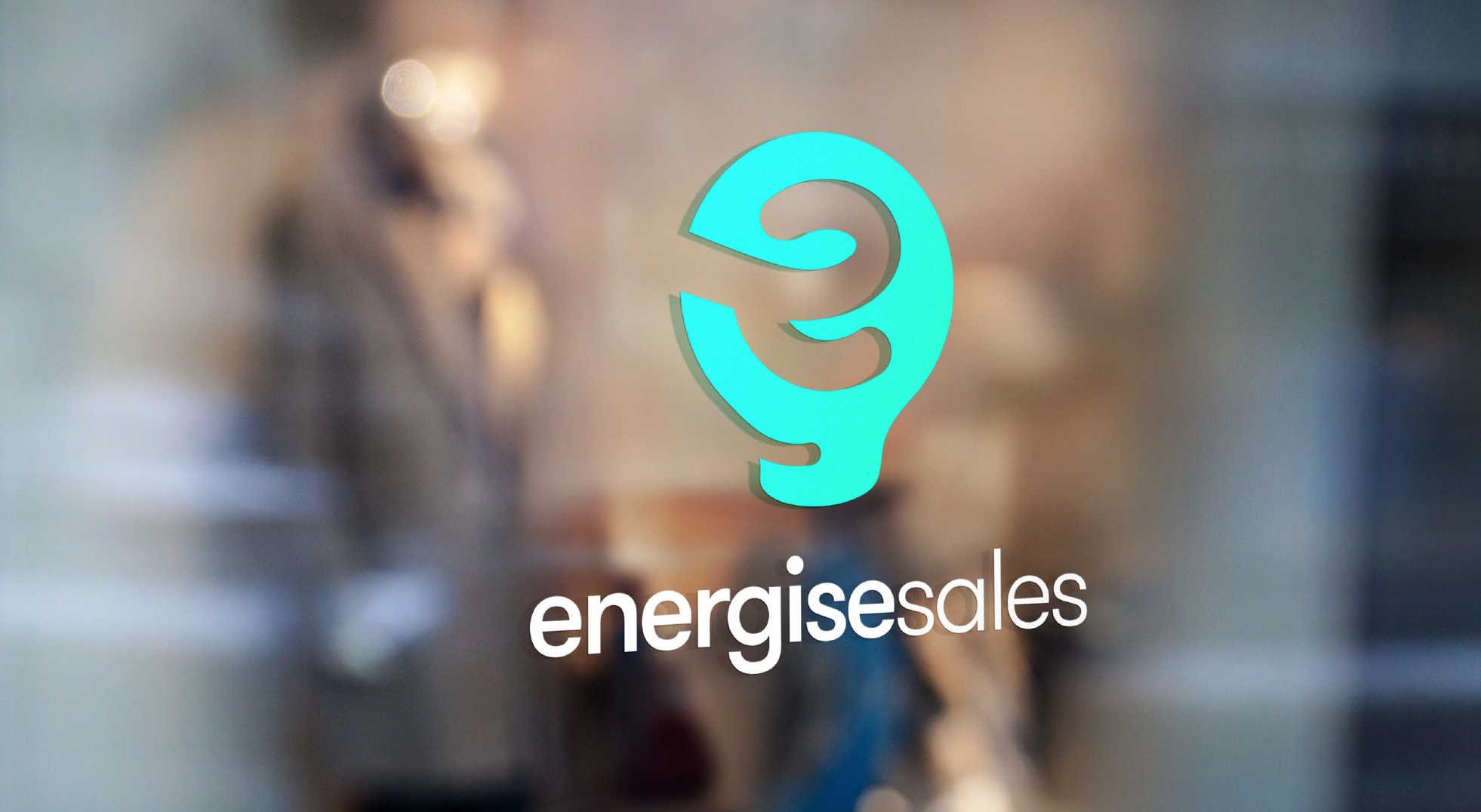
The brand mark icon is made up of a light bulb and the e from energise sales creating the filament of the bulb. This E can be brought throughout the brand with flowing movement and is welcoming. Energise Sales typography uses GT Walsheim Pro, a friendly approachable san serif typeface. It has welcoming features with circle dots and rounded letter forms which is extremely important for a sales brand to be approachable.
Process
The Use of Colour
The use of colour seen throughout their new brand identity is a bright and engaging.The bright greens show the energy of the brand for the name Energise and the idea of the light bulb to always show the vivid brand.
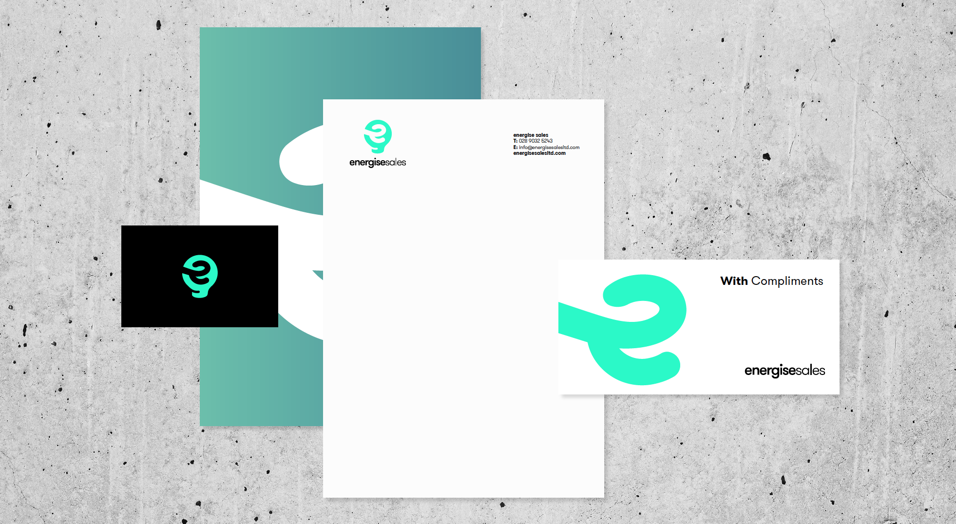
Branding Assets
When our business first started, we created our own logo and brand, however as a company we had huge plans for growth and development and realised that we wanted to take our business to the next level, and to do so, we needed a new brand that was professional looking. After a few initial discussions with Kaizen about our business and how we wanted to be seen, Ryan and the wider design team at Kaizen presented our new brand to us. We went into this meeting knowing we would be pleased with the outcome, but we were blown away by what we actually got. Our new brand now represents our company well and is more desirable to our clients and customers. Having our brand on point will be very beneficial to us in the longer run as we aim to grow and build on what we have already achieved as a company.
Chris - Managing Director - Energise Sales
