Say it with Social Media!

We are living in the new, digital era. Social media is single handily the most powerful tool for business and it is important to capitalise on this.

From Instagram to Twitter, to TikTok and Facebook. Each platform has a different art and getting it right is key. Promote what you do to the endless stream of scrollers.

Failing to maintain a consistent presence on online may result in your organisation going unnoticed and your competitors stealing your target audience and potential customers.

Invest in the best social

Social media has become an incredible resource for staying updated on current events, connecting with friends or family, and engaging with businesses online.

For brands hoping to leverage the popularity of different online platforms and reach the ever-growing user database of those platforms, investment is key.

Developing a well-thought-out social media campaign can be an incredible investment, helping to build brand recognition and boost the success of your business.

Keep up with Competitors

Social media is a brilliant tool, allowing an open access platform to monitor the progress of competitors. Yet, it is crucial that organisations do not get sucked in and begin mirroring the behaviour of their competitors.

Innovative and original behaviour will breed success and ensuring your organisation maintains a competitive edge is key. A massive asset in this process is to hold a consistent presence online.

Communicate with your target audience

Social media is a great platform for organisations to maintain real time communication with customers, clients and target audiences. Hence, continuously updating your platform is key.

Whether you conduct online surveys via your Instagram stories, engage with your audience through question and answer sessions or operate an open direct message policy, all is beneficial.

Additionally, social media can be used to promote your company as a customer focused business and encourage engagement and feedback. Doing this will not only benefit customers, providing them with the best possible service but will also benefit your company, highlighting what your audience wants and incidentally generating ideas for future projects.

Get your timing right

Posting on social media requires considered, calculated planning. Many people still have suspicious holdups about online platforms and do not see the immense power that it holds.

When it comes to posting, timing is key. There are certain times of the day that is best for posting and capitalising on this is key. You could have a perfect social media campaign but the benefits are often disregarded if posted at an incorrect time.

#Hashtags #Are #Key

The power of the hashtag is not to be undermined. They are a valuable tool, used strategically across almost all social media platforms.

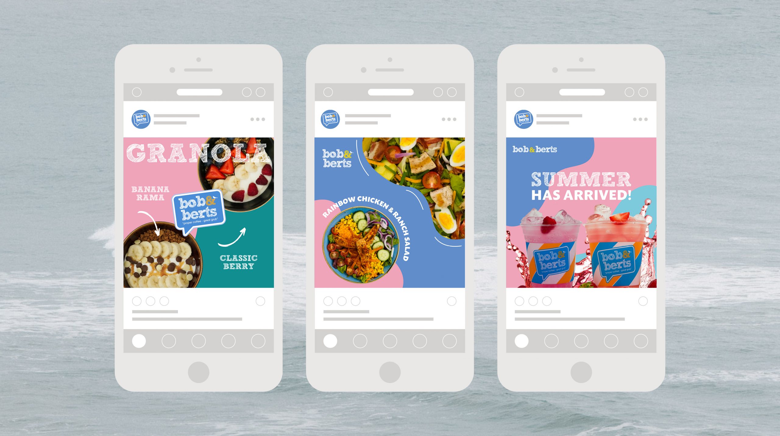
Using relatable, relevant and engaging hashtags are key, boosting your exposure and targeting your audience of choice. If correctly implemented, the use of hashtags holds the power to boost your campaign engagement, increase your audience, generate sales and enhance your organic social reach.

Furthermore, using hashtags allows your organisation to get involved in conversations and other important issues on social media. Hence, when running a campaign, it is worthwhile to research topics that are trending in relation to your focus and placing the campaign amongst that conversation through hashtags.

Track your social stats

Getting to know your audience has never been as simple as it is at the moment. Through tracking your audience’s activity, you can gain an accurate understanding into their social habits, with active time being one of them.

Posting content at optimal time, when most of your audience are active on social media is key. This will encourage their engagement and boost your exposure.

How Kaizen can help YOU with social

At Kaizen Brand Evolution, we understand how to navigate platforms and how to perform well on each relevant site.

We understand how each site can be used to benefit your business differently. We use this knowledge to create a social media strategy so you can begin to master your own social media accounts.

For organisations seeking to leverage celebrated insights, social media campaigns can be very worthwhile, targeting the ever-growing users of online communities. Kaizen Brand Evolution differentiate between social platforms and categorise which platforms will work best for you. Incidentally, we can evolve your platform by creating stand-out designs that are sure to surge your insights.

Blog Writing: Tips & Tricks

In the modern era of online social sharing, writing a blog holds a massive opportunity for your company. The power of blogging will give your company a competitive edge, boosting your products and services into the online community in an enlightening and engaging way.

Blogging brings a massive boost to an organisations place in the market, increasing custom and growing sales through educating consumers about what you do.

Intriguing titles

When deciding on a blog topic, it is important to consider your audience and the impression this blog will make. Capture their attention instantly, making them want to click straight away!

We have seen it time and time again, where brilliant blogs go unnoticed due to a lazy, boring title. They say “don’t judge a book by its cover” but believe it or not, we all do it. Often, a title alone is enough to draw your attention in. Incidentally, the title of your blog has the power to make or break a readers decision to entertain your blog.

First impressions are key. We find ourselves gravitating towards reading material that hold exciting titles. On the other hand, we often find ourselves overlooking content that have poorly thought-out titles.

Understand your blog readers

In every aspect of business, it is crucial that you recognise, value and understand your audience. This is no different when it comes to writing a blog.

There is no better way to showcase all the brilliant things your organisation does than through blogging. A blog provides an unfiltered, unlimited and underrated platform to shout about what you do, sharing your achievements, your improvements and your advancements.

Blogging provides an opportunity to educate your audience on matters that are important for your business. Using your platform to blog about your products and services will ensure there is a more well-rounded understanding of your organisation. When readers have a clear vision of what your company has to offer, they are more likely to follow through and become a valued customer.

Featured images and social posts

We are now living in the digital era, where visuals are preferred to text. Unfortunately, this is not good news for blog writers but there are some loop holes that can lure people in and encourage them to take 5 minutes out of their day to read your blog.

Using your own images is even more valuable. Whether you offer products or services, you will find that first-hand images will resonate with readers and intrigue them.

Equally, creating consistent blog posts ensures you will always have content to share on social media. It is so important to share images when posting on social media.

Spending lengthy periods of time carefully creating blog content must be followed up by an impressive promotion plan in order to reach your target customers and potential new audience members. Remaining active on social media is paramount for organisations and ensuring content is continuously fresh and innovative will give you that competitive edge.

Let your blog tell a story

When writing a blog, it is important to consider a brand-new customer, one who has never heard of your products or services. Taking this approach will ensure your content tells a story about your brand, guaranteeing that readers will understand what you are aiming to achieve.

Blogs must be educational and informative in order to work. Although it is desired that customers recognise your brand identity, this is not always the case and you must be prepared for this eventuality.

The 5 W’s in your blog

Who, When, What, Where and Why?

When creating a blog based on your products or services, it is advisory to incorporate the trusty 5 W’s. Who are your target audience? When are your target audience going to realise what the blog is about? What is the product or service you are aiming to showcase and does the blog represent this? Where are your target audience going to avail of your product or service? Why have you chosen to write about this?

Recognise potential questions and answer them

A tip for blogging would be to integrate answers to possible questions into your content. We are all too familiar with google when it comes to questions; just ping in your query and you are likely to have the answer in seconds.

If your blog holds a solution to a query of a potential customer, it will likely appear on their search results and lead them directly to you. Providing engaging and informative blogs is imperative for your organisation as it will be a key deciding factor for potential customers.

Get in Touch

At Kaizen Brand Evolution, we work internationally with brands large and small, delivering a suite of brand assets through which to promote their business.

Having one of the largest graphic design teams in the country, we are equipped to meet the demands of both large and small organisations. We work to the tightest of deadlines, while always retaining the highest level of design possible.

To discuss a creative project for your business, get in touch with our team via the contact form or on 028 95072007.

Brand design to make you stand out

A brand design is the visual illustration that the public hold of your organisation. Your brand is the associative feeling that people get when considering your product or service. From first impressions, to long-lasting associations, it is important that your organisation holds an applicable brand design that will capture attention and boast positive reactions.

Branding is an innovative way to create your own narrative and educate your audience. From your service offerings to your company values, it is important that your branding relates to your identity and engages your audience.

Brand design is important for all businesses, whether you are a brand-new business, or an established, long-standing firm. The design that your organisation holds will promote your organisation as a whole, as well as the more complex details. These details include representing your brand strategy, vision, goals, personality and much more. 

Consistency is key

Running a brand requires detailed consideration across all areas, including brand representation. It is crucial to develop a recognisable brand in the early stages of establishment and maintain this over time.

Brand design is a massive asset in this process, helpful in establishing a familiar identity and building trust within your industry. Unfortunately, society has become unsettled and gaining trust is not an easy task due to technical scams. Hence, the importance of an established and consistent brand identity is second to none.  

Like everything, consistency is key. Whether it is online; through websites, social media, or advertisements or physically; in events, posters, billboards or retail, it is paramount to maintain a consistent design. Consistency will create a sense of unity in your brand and promote a recognisable and dependable identity.

Involve the experts in your brand design

One of the most valuable understandings a brand can hold is the benefits of involving the experts in your brand design. Investing in your design is crucial. Availing of top-quality service will stand the test of time for your company, particularly when it comes to design.

Brand design holds an equal power status to that of your products, services and indeed your workforce. Consumers will resonate with a design that is captivating and this will in turn boost your reputation and establishment.

Gaining and maintaining this established identity is massively beneficial for your organisation, especially in the early stages. Nonetheless, it is also beneficial for long-established organisations to conduct a brand redesign, in order to boost existing opinions and better position your brand for future consideration.

Brand Design at Kaizen Brand Evolution

At Kaizen Brand Evolution, we have a team of experienced graphic designers. We have worked alongside organisations across the UK, Ireland and beyond, creating premium, consistent and recognisable brand designs.

Our branding team have created bespoke brands for some of the most widely known businesses organisations across the country. Some of our branding clients include: Fusion Antibodies, Slims Healthy Kitchen, Down Royal Racecourse, Punchestown Racecourse, McQuillan Companies and United Wines.

Our established experience positions us as industry experts. With widespread knowledge in delivering successful brand design packages for all types of organisations, including B2B, B2C and third sector, we have a vast experience in creating brands that engage your audiences.

Whether you are starting out and need a new innovative design for your business or you are an established organisation who requires a revamp, we can boost your brand massively. Through creating brand designs that can add significant value to your products or services, Kaizen create meaningful change and evolve every brand through innovative design.

At Kaizen Brand Evolution, we strive to create successful and commercially driven brand designs. Each brand design that we conduct is unique and bespoke to your business, promoting the key areas of performance and ensuring a stand-out reputation.

Brand Designs that deliver

We understand and value the importance of individuality when it comes to brand identity. Incidentally, we approach every task with a clean slate and open mind. Through detailed research and collaboration with the team behind your organisation, we will create an exciting, innovative brand design that will showcase the drive and ambition that lives in your brand identity.

Start a project with us

Our team are enthusiastic to create an innovative, recognisable and premium brand design for your organisation. We also understand that the process can be daunting and unknown to your team. Therefore, we promise to provide a detailed introduction to the service and walk you through every stage. We aspire to showcase the endless opportunities that brand design can provide for your organisation.

Better your Brand with Brochure Design

In the modern, digital world, we often fail to consider the continuous benefits of traditional marketing concepts, for example brochure design.

It is undeniable that the benefits of digital platforms in some situations, massively outweigh the perks of traditional platforms. Yet, this is not the case in all situations.

When we think traditional marketing, we think newspapers, posters, brochures, and flyers. It would be unreasonable to suggested their popularity remains the same. Yet, if implemented correctly, their power remains prevalent in the modern day.

Brochure Design

In a digital world, we often overlook some of the most tried and tested traditional opportunities to engage our customers. Brochure and booklet design is still one of the most effective opportunities for your business to develop sales and marketing opportunities, and it is therefore imperative that your brochure design is delivered to the highest of standards.

Printed Brochures

The printed brochure is the concept we are all most familiar with. From annual reports, to sales brochures and seasonal product catalogues. They are often placed in our company through many methods of communication, including postal marketing, public hand-outs, and workplace distribution.

The perks of a printed brochure are second to none. The longevity of their value remains prevalent for days as the brochure will be available to read at all times. Additionally, a brochure can boast a wonderful design that will boost brand identity and reputation.

Digital Brochures

Like all innovative organisations, Kaizen Brand Evolution take pride in evolving with the times and adapting to change. This applies more than ever in the marketing industry comes to marketing techniques.

In addition to creating eye-catching print brochures, we ensure that our designs can be adapted to function in a modern environment. Incorporating innovative ideas, they can be evolved into a contemporary and digital tool.

Understanding that digital delivery is often paramount to a project’s success we output your brochure in any number of required digital formats.

Within interactive, digital brochure designs, we can add advanced functionality such as hyperlinks, UTM tracking codes and animations intended to engage and fascinate your target audiences.

Do your Bit for the Environment

We are now living in a world where it is more important than ever before to look out for the environment in everything we do. Many organisations are taking a stand against waste and as a result are reducing their paper usage.

At Kaizen Brand Evolution, we felt it important to provide clients the choice of digital design as opposed to print, reducing unnecessary distribution. This option is massively beneficial for both the environment and for organisations in promoting your efforts to protect the environment through corporate social responsibility.

Types of Brochure Designs Available

The variety of brochure designs to choose from are endless. The team at Kaizen Brand Evolution have widespread experience across the range and are happy to consider your suggestions throughout the process.

Our most common brochure design projects include:

  • Annual Report
  • Booklet
  • Company Brochure
  • Bulletin
  • Catalogue
  • Directory
  • Guide
  • Handbook
  • Magazine
  • Manual
  • Newsletter
  • Programme
  • Prospectus

Brochure Design at Kaizen Brand Evolution

At Kaizen Brand Evolution, we design brochures for numerous industries across the UK and Ireland. From annual reports to training manuals, sales brochures, and gallery collections, we have experience in designing 1000s of brochure designs for all types of businesses.

Here at Kaizen, we are extremely lucky to have an esteemed partner in print; Kaizen Print. Hence, we have the unrivalled knowledge of understanding what is needed to create a premium, eye-catching brochure design that will be sure to stand ahead of the competition.

Get in touch with our team to discuss a brochure design project. Upon interest, we will explain the professional process in which we undertake to create your product. Once we have agreed on this, we will request content, imagery, and assets that we need to create the design.

Once we have quoted the project and received approval from the client, we will begin the exciting brochure design process. We involve our clients in every step of the process, requesting sign off at every stage. Doing this ensures that we deliver the best possible results, staying on brand and meeting the commercial needs of the project.

When the final product is approved, we will output this promptly and professionally in the agreed formats for print or digital use.

To start a brochure design project with Kaizen Brand Evolution, please get in touch with our team via the contact form or call us on 028 9507 2007.

Perk up your Packaging Design

When it comes to packaging design, consideration of the printed output and knowledge on how to achieve this is critical to the project success. Carefully considered packaging will ensure your brand is developed at every touch point of the purchase process.

Creating a relatable and attractive packaging design is very important for businesses, big and small. The packaging design for a product is often a primary element of association for consumers, particularly in a physical setting, such as in retail stores.

For example; when we enter a grocery store and see a can with chromatic red and black packaging design, we instantly associate it with Coca-Cola. This is the overall goal for organisations, to be instantly recognised by their brand identity. Packaging can play an influential role in this process.

Don’t Leave Packaging Design Behind

Unfortunately, packaging design can get the back seat when it comes to product design. As the last step in the product process, it can be forgotten about and as a result of this, rushed in the last minute.

It is important to carefully consider this stage. Yes, it is essentially the final step but is a massively important asset to your brand identity.

Packaging design can be used across many platforms, not just in a retail setting. Other uses of packaging design include online product promotion, delivery services and many more.

Stand out from the Crowd

The massive variety across all markets has resulted in a difficulty to stand out in the crowd. Appearing pride of place in a retail setting is the overall goal. Hence to achieve this you must carefully consider your design, remain consistent and boost your brand identity.

We have all done it, bought a product based on their packaging design alone. A beautifully designed packaging concept has enough power to draw attention to a product and encourage purchasing. Yet it is important to realise that the design of your packaging has the power to make or break a customer’s purchasing decision.

Premium Packaging is Key

Packaging is in essence the most important step of the product creation, as it is essentially what makes people purchase your brand. Often though, this is overlooked and the packaging can become an afterthought.

Yet, organisations who involve professional graphic designers in this process have no need to worry about this. Graphic designers recognise and highlight the importance of every step in the product creation process. From the product itself, right through to the packaging, each stage is equally important.

Poorly designed packaging can be detrimental to the success of your product. Consumers will recognise this immediately and incidentally ‘judge a book by its cover’ and avoid purchasing the product.

Packaging Design at Kaizen Brand Evolution

At Kaizen Brand Evolution, we are experienced in the design and development of packaging design for numerous industries. We can produce packaging design for an extensive variety of products. These include food packaging sleeves, gift bags, gift boxes, labelling and many other types of outer packaging.

With great experience in B2C moment of choice decision influencing, our creatives will ensure your brand has the best opportunity for purchase and engagement.

We have an excellent team of dedicated and world class designers, who have helped many organisations evolve their packaging, ensuring that their products are the best looking on the shelves.

Drinks Industry Labels & Packaging

We work with independent and multinational drinks brands to develop their brand strategy, brand activation and their range of packaging including labels and gift boxes.

Kaizen design with overall consideration for your brand strategy, but with a direct commercial focus that ensures our designs can be output in a cost-effective manner. Some of our drinks industry clients include: Bushmills Whiskey, Kraken Rum, Glencree Whiskey, Thompsons Rum and Shortcross Gin.

Start a Packaging Design Project with Kaizen

To begin your project, please get in touch with our client services team 02895 072007.

We will explain the steps, find out about your project and send a quote to bring the project to life.

Logo Design: Stand the Test of Time

Logo design is extremely important to any brand or organisation. A logo is the primary identifier for your brand that will immediately engage with the public. Acting as a symbol to represent the brand, your logo plays a key role in boosting brand identity and recognition.

Commonly customers and clients will associate your logo with their experience with your business. Hence, logo design is a key element in the buying process, encouraging customers to invest in your company.

Consider your all-time favourite brand… was the first thing you pictured their logo? It is common that consumers are often able to picture the logo design instantly when they think of a brand, more so than the typeface or name.

Creating a Logo Design for your brand

Logo design is often the first step in any brand development and should be considered at the earliest stages of business planning. As the first step in brand development, there should be a detailed and considerable amount of time spent on logo design. This will ensure that the design begins to take shape how you would like it to, from the outset and throughout the branding stages.

When beginning the logo design process, it is crucial that organisations conduct a thorough mind mapping exercise, to be sure all elements of your brand are considered in the logo development. A brilliant logo design will clearly represent your brand, its goals, and its purpose.

It is equally important that in everything you do, you consider your audience. At the end of the day, your clients, potential customers, and target audience are your most important critics.

In order to target your audience successfully, you must hold a clear understanding of who they are and what they are looking for. By conducting this thorough research, you will be on track to creating a logo that clearly resonates with your audience. This will prove advantageous to your reputation, positioning your organisation as a customer focused brand.

Keep up with your Competitors

We are now living in a world that is constantly changing. Organisations are quickly evolving, shifting and altering their service offerings. In order to keep up with other organisations in your industry and curb the competition, it is important to remain attentive to the altering trends in logo design.

If your organisation has evolved in service offerings, it is important to showcase this through an update to your brand assets. This includes logo design, an extremely important tool for representing your identity. It is crucial that your logos align with company values to permit a stand-out position in the market, remaining competitive and evolutionary.

A logo is the visual representation for your business, hence the importance it resounds with the audience. From the font, to the symbol, it is vital to choose wisely, representing your business in the finest manner.

Involve the Experts in your Logo Design

One of the most valuable understandings a brand can hold is the benefits of involving the experts in your brand design. Investing in your design is crucial. Availing of top-quality service will stand the test of time for your company, particularly when it comes to design.

A logo design holds an equal power status to that of your products, services and indeed your workforce. Consumers will resonate with a logo design that is captivating and this will in turn boost your reputation and establishment.

How Kaizen can help YOU

At Kaizen Brand Evolution, we have designed hundreds of logos for businesses nationwide, as well as on a universal scale. We have one of the largest design studio teams in Belfast and Dublin and our focus is always on developing the best logo to suit your business needs.

Our industry experience and understanding of many market sectors and the ability to draw on our skill, ensures we are experts in logo creation. With one of the largest design studio teams, our focus is always on creating a stand-out logo to represent your business to the highest standard possible.

To discuss a creative project for your business, get in touch with our team via the contact form or on 028 95072007.

Get ahead of the game: Festive Design

Yes, it is approaching that time of year again. No, we can’t believe it either! Some are excited and others filled with that all too familiar seasonal dread. If the latter is you, don’t panic! Kaizen Brand Evolution are here to help you combat those stressful hospitality design preparations and get you on track for the most wonderful time of the year.

Menu Design

Let’s face it, when we think Christmas, we think food. The festive period is a time to indulge, eat out and celebrate with delicious seasonal dishes. Aside from the festive food, your restaurant menu is your most important component.

Many hospitality businesses will introduce a festive menu, offering an altered choice of dishes, especially chosen for the Christmas period. Capture attention with a beautifully designed festive menu that will impress customers, before they have even got their food. The quality of the menu itself leaves a lasting impression with your customers. 

Brochure Design

A method of traditional promotion that remains popular to this day is brochure design. Printed or digital brochures? We say both, be sure to target all arenas. Brochures provide opportunities for your business to achieve sales in both a digital and physical setting.

Many organisations have lots of seasonal products and services to promote in the lead up to Christmas. Why not avail of our incredible design service, and go above and beyond customer expectations.  

Christmas Cards

Personalised Christmas Card design is the perfect opportunity to keep in meaningful contact with friends, colleagues or customers this festive season. We provide a variety of choice with pre-designed options or you can design your own with our graphic design team.

Whether it is an employee, a stakeholder or a customer, this personal approach will be effective in showing your sincere appreciation. We recommend that you make a list of recipients that have supported your business during 2022 and use a personalised Christmas card to thank them and wish them an enjoyable break. Make it memorable and you are guaranteed a happy new year with repeated business and a happy workforce.

Gift Vouchers

People love receiving gift vouchers for their favourite local businesses, particularly at Christmas time. Promoting gift vouchers for your business is a genius gateway to target new audiences and boost revenue. The success of gift vouchers stretches far beyond the Christmas period with new customers entering your doors for months to spend their valued revenue.

Invitations and Tickets

They don’t call it sparkle season for nothing! Christmas is the only time of year where it is socially acceptable to go to events every night!

Are you throwing the ultimate Christmas party? Start the event off right with some custom designed invites. Your guests will love them and it provides an opportunity to send all the event details in one fell swoop.

Christmas design at Kaizen Brand Evolution

At Kaizen Brand Evolution, we are experts in designing hospitality stationary for both printed output and digital delivery.

Our design studio have created thousands of festive designs for businesses, charities and other organisations spanning every conceivable market sector.

At Kaizen Brand Evolution, we have the unique benefit of being part of the Belfasts’ leading printing companies. With this said we have designed thousands of graphics for organisations all across the country steeped in print design. Our designs can be seen proudly placed in the following hospitality sectors: Retail Stores, Fast Foods, Nightclubs, Bars, Restaurants and Hotels.

Our experience and knowledge of type, layout and photography ensures we position your brand perfectly, while providing opportunity to meet the strategic goals of the project, whatever they may be. We understand that the delivery of your stationary may take many forms and so our team of graphic designers can expertly output your design for both print and digital delivery.

If you want to explore a design project further, please get in touch with our client service team via the contact form or by calling us on 028 9507 2007.

Wow this Winter with your Event Design

We know, we know! Summer has just begun, but winter is coming… faster than you think. Although winter is an unfavourable season for many reasons; the cold, the dark and the dreary, it does have its exceptions. Winter is the ultimate event season, boasting Halloween, Christmas and New Year parties, to name just a few! Whether you are hosting an event or attending a trade show, it is important to make a memorable impression on your audience with event design.

Event branding offers companies, organisations and collectives a chance to massively amplify awareness, using experiential design best practices to offer an impactful and unforgettable experience. Through the power of distinctive, dynamic design, businesses can harness the immense potential of event branding – but it’s only through an intelligent and cohesive approach that you’ll experience the full effect.

Let the experts deliver memorable results

Event planning can be extremely stressful, particularly around the festive season. Why not take the pressure off and involve a professional graphic design team in your planning and implementation? Not only will this take a huge chunk off your workload, it will also ensure the highest quality content is produced and promoted.

There are many complex layers to the task of event design. Many of which go unrecognised until the late stages in planning and preparation. Elements include website design and monitoring, campaign design, branding and promotion, to name a few!

Involving a professional design team in this process offers the prospect of massively amplifying brand awareness for your organisation, using experiential design best practices to produce an attractive and unforgettable experience.

Consistency is key with event design

When hosting an event, the overall goal is to impress your audience and ensure they have a wonderful time. Equally, you hope to receive the deserved recognition and reputation boost.

To achieve the optimum brand recognition and create a memorable impression with attendees, it is crucial that your event design is consistent. Whether your event is a one-off occurrence or a frequent experience, holding consistent design is advisable to ensure both a high standard of delivery and a familiar brand identity.

Maintaining this consistency can be difficult without the involvement of a professional in event design. Graphic designers are experienced in developing projects that hold a unform template through meeting careful considered brand guidelines; using brand fonts, design, imagery and colours. Without the correct software or design knowledge, implementing event design in-house can be both time consuming and unobtainable for your business.

Consider your attendee

Creating a sense of togetherness throughout your event branding is especially important where the attendee journey is concerned. The journey an attendee takes from entrance to exit needs to be subtly and strategically designed.

With all elements of the event working together, the journey from A to B should be seamless, that way, your audience will have the most immersive and engaging experience possible. Maintaining a sense of perspective throughout the event branding process guarantees results.

It’s by keeping one eye on the big picture, exploring how different elements interact and how they work to communicate your core message, that you’ll deliver a meaningful and memorable event.

The benefits of event design

Event design is a massively beneficial tool, promoting a top-class reputation and providing an inclusive feel for attendees. Whatever the definitive aim of your event is, whether it’s to boost brand exposure, advance awareness on a topic or promote sales and subscriptions, the journey an attendee takes from start to finish needs to be subtly and strategically designed.

Within Kaizen Brand Evolution, we have worked with a number of different businesses, right across Belfast and Northern Ireland, as well as event organisers themselves, to provide them with the right display products and design for their events.

Our designers will make sure that the design used for your event material are the best you can get, being both eye catching as well as durable, so that no matter where you are, potential customers and clients will notice you and want to come and talk to you.

To discuss a creative project, get in touch with our team via the contact form or on 028 95072007.

The Wonder of Wayfinding Design

Wayfinding design is an enlightening experience, guiding and steering people through their surroundings. From arrow markers to directional stickers, the opportunities are endless to deliver a simply understood wayfinding design.

Whether you own a small warehouse or a skyscraper block of office space, wayfinding is a must. Everyone who visits your organisation, be it staff or visitors should be able to freely navigate their surroundings in a straightforward manner. The goal of wayfinding is to direct people through unfamiliar settings. To achieve this, a thorough planning and implementation is required, using the correct language, typography, colour palette, all of which maintain and boost your brand identity.

Create a positive atmosphere from the get go with wayfinding design!

We have all been there. Getting lost in a new environment is never fun and often leaves a feeling of embarrassment. This is not the desired association that brands want visitors to create when visiting their organisation. Hence, the importance of wayfinding design.

To combat any confusion from the get go, wayfinding navigation can be extremely useful. When providing navigation, it is crucial to deliver this in an easily interpreted manner, this will not only benefit attendees, it will also assist your staff members by reducing direction enquiries. Additionally, using a unique wayfinding design will help you to promote your brand throughout the location. 

The skill in designing wayfinding is understanding the visual and physical clues that help pull people through a space without the need for intensive signage. In doing so, the interpretive journey is much less stressful and therefore, much more enjoyable.

Seize the opportunity for some shameless self-promo

Designing your wayfinding design from scratch can provide many opportunities to boost brand recognition.  Yes, purchasing typical, generic signage will save your brand time and money but in the long run, it can depreciate your organisations reputation and brand identity.

In order to boost your brand identity at all times, it is important to seize every opportunity that comes your way. Incorporating your brand guidelines into all elements of your business is key, including that of wayfinding design. To promote and represent your brand highly, it is important to remain consistent in your design.

It is often the case where organisations invest highly in large-scale branding, leaving very little budget for smaller scale elements. Wayfinding design presents a unique opportunity, it is designed to be looked for. This alone should encourage organisations to avail of branded wayfinding, guaranteeing a boost in brand representation and incidentally, recognition.

What wayfinding design works for you?

Identification

Identification wayfinding design offers an informative clarification to visitors, outlining where they are presently located. This wayfinding signage is frequently used in offices, outlining rooms such as the ‘Meeting Room’.

Regulatory

Regulatory wayfinding is an extremely vital design, alerting individuals of regulations, rules and laws. These signs are essential when it comes to ensuring safety and compliance. Common regulatory wayfinding can be seen in ‘No Parking’, ‘No Smoking’ and ‘Wear a Mask’ signs.

Directional 

The most popular form of wayfinding is directional design. Directional wayfinding supports individuals in their journey around a specific location. Common directional signs point out entrances and exits.

Informational

The final category of wayfinding is informational design. Providing valuable information to individuals, informational wayfinding is commonly used to deliver answers to frequently asked questions, including ‘WIFI Available’ and ‘Free Parking’.

Wayfinding Design at Kaizen Brand Evolution

At Kaizen Brand Evolution, we have widespread and detailed experience in designing wayfinding. Through working with numerous businesses across Northern Ireland and the Republic of Ireland, we have developed an esteemed portfolio in wayfinding.

We can help you progress your brand identity through wayfinding design. We can help you with the planning, design and implementation, ensuring this is executed appropriately and successfully.

Wayfinding can be unclear if designed unprofessionally. Our graphic designers are experienced in creating clear, attractive wayfinding designs. This ensures visitors experience a smooth and enjoyable journey.

We aspire to create wayfinding designs that make visitors almost spend as much time looking at it as they do with whatever they are on-site to see. To discuss a creative project for your business, get in touch with our esteemed team of graphic designers via the contact form or on 028 95072007.

Graphic Designer: Involve the Experts, Reap the Rewards

Graphic designers are creative experts who produce visual concepts both digitally and traditionally. Creating complex and innovative designs, a graphic designer aspires to inform and inspire audiences. From website design, brochures, posters and social media graphics, graphic designers hold widespread experience across numerous industries.

In the modern day, many professionals would consider themselves to be a jack of all trades (yet a master at none). In many instances, organisations fail to see the benefit of involving a professional graphic design team in their plans. Many view graphic design as a DIY opportunity. This perception can unfortunately lead to poor results and a drop in reputation. The notorious excuse for this often links to financial savings. Yet, the question to ask yourself is, “yes, you are saving money, but are you wasting time and affecting your reputation?”

Of course, the service will cost you money but involving a graphic design expert in your campaign planning and implementation will be a massive asset to your success. The return on investment is guaranteed and what you pay out in money, you will regain in reputation. This collaboration will offer your business expert design insight, creating a recognisable, innovative design that will boost both brand recognition and identity.

DIY Graphic Designer Fails

DIY graphic designers can often be spotted a mile away. A logo created on Word; a poster designed on Photoshop… hey, congrats on the resourceful creativity, it works for some but unfortunately, the majority of times it does not. Incidentally, the lack of creative expertise could cost your company credibility.

Don’t get us wrong… if done correctly, DIY graphic design can be a functional and accessible tool for organisations. Yet, it is still advised that a graphic designer is involved to implement the technical design for your business.

Ask the Expert: Gain the Insight

As well as designing all of your content, a graphic designer can provide revolutionary insight into the industry. Graphic designers are connoisseurs in their field, with an imaginative flair like no other. They hold direct insight into the dos and don’ts of the design industry and this awareness can be crucial to your success.

Stick to the Status Quo

Although investing in a graphic designer is more expensive than a do-it-yourself job, it saves immense amounts of time for your organisation. This time can then be invested into your original area of expertise.  Win-Win really!

Instead of wasting countless hours trying to implement a technical graphic design campaign in-house, it is advised that you invest your money in a professional graphic designer, who can create first-class designs, in a fraction of the time.

Create a Lasting Impression with a Graphic Designer

You have heard it a million times before, first impressions are so important. In general, people take in graphics quicker than text. We are more likely to catch attention with an exciting graphic than with an engaging paragraph.

With this in mind, the involvement of a professional graphic designer is paramount, ensuring the visual design is excellent, achieving the desired first impression.

Trustworthy Design is Key

In the modern day especially, we are becoming less trusting. Due to the rise in scams and fake news, we have become more reserved when it comes to our consumer habits. When buying a product or service, consumers seek out reliable, identifiable brands to trust and purchase from.

A business should always aim to hold a recognisable brand identity. To ensure this, organisations must implement consistent designs to create and maintain a familiar company recollection with customers, clients and competitors.

Remaining consistent in design is key and without professional training, it can be difficult to maintain this. Graphic designers are familiar with remaining consistent through brand guidelines, sticking to agreed fonts, design, colour palette and measurements. Doing this will ensure a distinct brand, constantly boosting identity and remaining competitive in your industry.

Graphic Design at Kaizen Brand Evolution

At Kaizen Brand Evolution, graphic design is our forte. We have executed a huge portfolio of design projects in Northern Ireland, the Republic of Ireland and beyond. Our esteemed reputation did not happen by accident, our design studio boasts and expertise, ensuring your graphic design is implemented to the highest standard possible.

From logo design, poster design, social graphics to vinyl signage, we have you covered.

If you are interested in involving a Graphic Designer in your brand, please contact our studio by calling us on +44 (0)28 95 072 007, emailing us at studio@kaizenbrandevolution.com or filling out the form on our contact page.

Retail Design: Remain Relevant

Some may argue that retail stores are on the downward spiral when it comes to popularity. Unfortunately, this is the case in some situations, with consumers swapping out their shopping sprees with scrolling, but it is important we do not rule out the power of retail design completely.

Retail design can be an extremely powerful method of persuasion when it comes to encouraging consumers to shop in your store. Attractive retail design is key. You want it to stop people in their tracks and intrigue them.

An impressive design lends a hand in the success of a retailer. The overall goal is to develop a brand that consumers will choose. We all aspire to be the first choice, this is extremely relevant in the retail industry, due to the dropping popularity, as well as the dense competition.

Unfortunately, the industry progress in recent years has seen a new-found intricacy in the process of retail design.

Retail Design: A Customer Experience

Now more than ever, it is crucial to stand out in the crowd. This is no different when it comes to retail design, it is crucial to stand out in the high street or shopping centre!

To create an authentic retail design, you must incorporate your brand identity, bringing it to life through your physical store. A retail store should provide much more than simply products or services to customers. It should provide an experience that will resonate and bring a feeling that customers will identify with, when they consider your brand.

The Consistency within Brand Identity and Retail Design

A common misconception when developing a retail design is that it simply revolves around the physical store. Yet, a successful design will consider much more than simply what is in your bricks and mortar store.

Retailers must consider all elements of their brand identity. To maintain and boost their exposure, they should marry all of their design elements together, maintaining consistency and building familiarity. Ways in which this can be implemented includes a consistent font, logo, colour palette, design feature and retail store.

Create a Retail Design that Consumers will Trust

We now live in an era where unfortunately trust is not easily earned. Consumers have become extremely resilient to trust, particularly in the retail sector as the ‘too good to be true’ termis often proved to be factual.

An area that physical retail stores can use to their advantage is their trustworthiness. Having a real-life store brings a sense of reassurance and trust that online stores sometimes fail to deliver. However, it is important to note that competition is prevalent and shoppers are always going to prefer to spend their money in a retail store that has a polished branding and design.

With this in mind, it is important that brands maintain a premium retail design, updating it where necessary. Through an established retail design, brands have the opportunity to turn consumers into customers or clients by engaging with them through trust, understanding and memorable first impressions.

Incorporate Retail Trends

Trends come and go and it is important to recognise this. Yet, there is a fine line between an enduring trend and a passing phase, known as a micro trend. Longstanding trends will be an asset to your business, showcasing a forward-thinking approach. However, a miscalculated investment into a microtrend can be detrimental and a poor expenditure.

In times gone by, trends did not hold the power that they do now. The popularity of social media has provided a platform for worldwide exposure, reducing the timeframe for brands to hop on board the latest trends, in order to remain relevant. However, the investment of time and money must warrant a return on investment, so brands, particularly in retail must be smart to the areas in which they participate.

Retail Design at Kaizen Brand Evolution

Our design team at Kaizen Brand Evolution is made up of some of Ireland’s most experienced professional graphic designers. Our team of experts have a unique skillset across numerous industries, including the retail industry. This insight has afforded us with a first-hand understanding into the retail environment, the opportunities and the complications to overcome.

Our knowledgeable and enthusiastic team strive to create considered retail design that is suited to your anticipated business vision.

Get in Touch

To discuss a creative project for your business, get in touch with our team via the contact form or on 028 95072007.

Social Media: Make an Impact

Whether we like it or not, social media has quickly become a huge part of our day to day lives. From Instagram, Facebook, Twitter to LinkedIn, it is crucial that brands create an engaging presence online, promoting their products or services to the endless stream of scrollers.

Social media is an extremely advantageous platform for organisations to avail of. Providing the opportunity to maintain round the clock communication with customers, clients, stakeholders and the general public.

Unfortunately, society affords little consideration to those brands who choose to remain old-fashioned and stay clear of social media. Failing to withhold a recognisable online presence may lead to your organisation going unnoticed and falling behind social savvy competitors.

The Perks of Social Media

Like everything in life, there are pros and cons to the use of social media. Yet for instance, when it comes to business, the pros most certainly outweigh the cons. Social media is an incredibly valuable research tool for brands. The platform allows them to monitor competitors, connect with potential customers, investors and target audiences. These platforms also provide industry insight in real time, showcasing the top trends, as well as the passing fazes.

For brands that are either starting out or aiming to boost their brand identity and recognition, the use of social media is invaluable.

Impactful Social Campaigns we LOVE

Dove – #ShowUs

Dove is known for their impactful, human interest campaign design. Their widespread representation and positivity towards the human body is something to be admired. Particularly on social, where this is not always evident.

In 2021, Dove struck again with an impactful, user-generated campaign, cleverly captured with the name #ShowUs. The campaign was led with simplicity, asking social followers to show off their beauty, in all different shapes and sizes.

Through research, Dove discovered the disappointing representation of women in society. Body stereotypes are a massive issue worldwide and this campaign shone a light on the beautiful differences within us.

There is a key takeaway for brands from this campaign success. Dove’s #ShowUs campaign arguably performed so well due to its personal, relatable message, in which many consumers resonated with. In addition, the clever use of a hashtag quickly created a social trend, wherein online users could easily access other participants posts and interact with one another. When mind mapping ideas for your next social media campaign, think outside the box, consider your audience and incorporate your company values.

Spotify Wrapped

December. The month of Santa, Snow and Spotify Wrapped. Launched in 2015 and quickly rebranded in 2017, the Spotify Wrapped social media campaign promotes an aesthetically pleasing summary of an individual’s music habits for the year.

The ingenious graphic design team behind Spotify quickly caught on to the picture-perfect personas that we are all guilty of portraying on social media. The beautiful graphics, the fanciful filters and the desire to project our musical opinion, onto anyone that will listen.

Not only did Spotify excel with their own campaign, they also had a helping hand, with massive exposure from their audiences. A cool 1.2 million Spotify users shared the campaign to their own social media, promoting the platform, far and wide.

This campaign provides us with numerous learning curves, including the pinnacle point that is: it’s not what you post, its how you post it. Data is data, we see it every day, many of us shiver at the sight of a spreadsheet… so why is this campaign any different?

Let’s face it. Who is entertained by statistics? Long story short, everyone apparently, if it is presented in an #Instagramable design that allows you to show off your musical taste.

Genius Spotify, Genius.

Social Media Campaigns at Kaizen Brand Evolution

Kaizen Brand Evolution have a team of enthusiastic industry experts, who understand the dedication required to create and deliver an engaging social media campaign. Through evaluating your brand, as well as your proposed social platforms and target audience, we are able to categorise which areas you should be focusing on, in order to receive the best return on investment.

Are you struggling with your social media? Get in touch with Kaizen Brand Evolution for some industry tips. We can impart our wisdom through creating a detailed social plan, with stand-out designs and engaging material.

Availing of this service will not only resolve the confusion that comes with social media, but it will provide you with an understanding into the navigation of social media, affording you the knowledge to confidently manage your own social accounts in the future.

To discuss a logo design project, get in touch with our team via the contact form or on 028 95072007.

3 signs its time for a company re-brand

It isn’t uncommon for organisations to evolve and outgrow their initial branding concept. Think of it logically, we as individuals do not remain the same over time, we advance and grow, leading us down new avenues and directions in life.

What was once a perfect brand identity may now seem disconnected, outdated and in need of a revamp. In other cases, you may not have afforded enough attention to your branding concept when initially implementing this. If this is the case, it is paramount to realise this as early as possible and conduct a re-brand, allowing your organisation to progress, under a new, more fitting brand.

Is your brand is stuck in the past?

We are living in a fast-paced, ever-changing society. This can be both a good thing and a bad thing. Unfortunately, society can get very bored, very quickly and it is important to be reactive to this, in order to stay relevant.

It is no surprise that things become outdated, out of touch and in need of a refresh. We all get to the point where we need a new car, a new phone and a new haircut. It is no different in the business world. Your brand may have been the next best thing when it stepped onto the scene but unless it keeps up with the times, it may fall behind and fail to maintain its position in a very saturated market.

It is recommended that you regularly examine your brand logo, design, website, storefront, merchandise and print advertising to check if it remains relevant.

Re-brand if your identity no longer represents your purpose

As previously mentioned, it is expected that brands will grow and change over time. This evolution cannot be predicted when initially developing a brand identity. Hence, it is important to recognise this and consider a re-brand once developments have been made.

A brand identity must showcase your organisation in all of its glory, making it clear to clients, customers and stakeholders what it exactly is that you offer.

What is the point in making company advancements if you are not going to show them off through innovative branding?

Re-brand if you are trying to target a new audience

Target audiences grow and change over the years. This is all to do with societies trends and the age groups that are associated with these trends.

A prime example of this is the recent surge of popularity in Crocs. Until 2021, Crocs were considered to be a fairly ‘uncool’ brand of shoes amongst young people. Targeted at an older audience, as well as medical staff for work purposes, Crocs were rarely entertained by an adolescent. This all changed in the summer of 2021. Crocs became a major hit with young people and this was all down to their launch of ‘platform crocs’ which boasted a higher sole and youthful colours. Since this surge in popularity, Crocs have grabbed the attention and ran, evolving their brand in many ways, in order to secure their new, youthful target market.

When monitoring your brand progress, it is important to research your target audience to get a feel for what they are interested in. This will allow your business to adapt in order to meet the needs and desires of this market. If you fail to consider this element, your brand will fall behind and receive an outdated reputation.

Re-brand your organisation with Kaizen Brand Evolution

Here at Kaizen Brand Evolution, we are experts at re-branding. We have a widespread team of experts who are equipped with industry insight. In order to create the perfect re-brand for your business, we take the process very seriously, with a step-by-step plan of action.

In the initial stages, we will take a brief from our client, deconstruct this and have a number of our experienced designers interpret it in their own, unique and innovative way. We place the client at the centre of everything we do and aim to involve them in the process, every step of the way. Once our team has carefully considered the brief, we will invite the client into view all possible design concepts, discuss them and give them time to choose a favourite to move forward with. Once a final concept is chosen, the magic begins and the process of bringing a re-brand to life unfolds.

When choosing a re-branding with Kaizen Brand Evolution, we appreciate it can be difficult to decide on a new brand identity. In order to make the process easier for our clients, we create our design concepts using real life resources and produce digital images to match your industry. For example; if you are hoping to re-brand your music store, we will create digital images of a music store and fill it with the design concepts to give you a real life feel of what it would look like.

Have we convinced you that now is the time to re-brand?

To discuss a creative project or re-brand for your business, get in touch with our team via the contact form or on 028 95072007.

Logo Design we know and LOVE

Logo design is extremely important to any business or brand. It is the primary identifier of your organisation and frequently clients will associate it with the experience they have with your business.

Consider your favourite brand, and you will instantly picture the logo clearer than you will the typeface or name. Logo design is often the first step in brand development and should be carefully considered at the earliest stages of business planning.

Apple

We all know it. Most of us love it. Apple. Undoubtedly the most powerful technology brand in the world. The logo is instantly recognisable, even to those who aren’t digitally minded.

Aside from a design change in its first year of trading, the apple logo has remained virtually the same, bar a few colour alterations, since 1977. This is a concept we rarely see, with business logos commonly changing a lot over time.

The benefit of this unchanged logo guarantees that audiences will not forget it in a hurry. People now subconsciously associate the bitten apple with the brand and any major changes would dissolve this association massively.

Fun fact: did you know that Apple have a rule that in movies, villains cannot use their products? Only the good guys. Hence, you will never see Lord Voldemort or The Joker with an iPhone.

McDonalds

Another brand we know and love from their logo is McDonald’s. It can be spotted from a mile away, with its unique and bright colour scheme. However, McDonald’s wasn’t always as we know it today. In its founding year, 1937, the company was established as ‘The Airdome’… imagine that! This name and logo lasted a mere three years, when the McDonald family decided to acclaim their family name.

‘McDonalds Famous Barbecue’ as it was known between 1940 and 1953 boasted a boring, black and blocky logo, completely parallel to now. In 1953, the franchise dropped the ‘Famous Barbecue’ and simply became ‘McDonalds’. Since then, both the name and the logo have remained consistent, dominating the logo market with the huge arching M.

Similarly to Apple, McDonald’s logo consistency has worked in their favour. We have all looked into the skies at one point, in hopes of seeing the yellow arches in the nearby distance. If this were to change, the novelty and association with the McDonald’s brand would be lost and the popularity would significantly reduce.

Google

Founded in 1998, Google is a youthful 24 years old. Yet contrary to its young position in society, it needs no introduction, being the most popular search engine in the world.

The Google logo is one we will all recognise, even those of us who claim no association with online platforms. The colourful, eye-catching and dominant design was first created in the founding days of the business and has changed very little since then.

The firm’s recognisable position in society has afforded Google great flexibility with their logo. Taking a unique stance, Google famously alter their logo design temporarily to represent current affairs and important historical dates. They have the power to do this as they know their brand recognition is strong and does not require consistent promotion.

If you closely study the Google logo, you will recognise a disrupted pattern. The first four letters follow the familiar primary colour pattern, showcasing blue, red, yellow and blue again. This consistency is then interrupted by the introduction of green, a secondary colour.  This green is then followed by red, reintroducing the primary colour pattern.

Some may consider this colour palette a miscalculated pattern, yet the meaning holds much more than this. There is a significant, ground-breaking message promoted through their uncoordinated logo.

By not following the pattern, Google are promoting an innovative, pioneering and revolutionary approach. With the introduction of green, steering away from the typical design, Google are promoting their mission; to break the mould, to go beyond what is expected and show they are not afraid to break the rules.

Consistency is Key in Logo Design

Although Google choose to interrupt the pattern, there is a clear sense of uniformity in all the brands discussed above. Consistency is key. The majority of brands that hold recognisable and dominant logos are those that remain consistent and avoid major design change over time.

With Apple, McDonalds and Google, although there may be slight tweaks in the form of font change or colour saturation, the structure of the logo remains virtually unchanged.

It is important that organisations take note of this consistency and recognise this when developing a brand logo. There must be careful consideration afforded to the logo design task, as the opportunity to make drastic changes in the future may present issues for brand identity.

Logo Design with Kaizen Brand Evolution

At Kaizen Brand Evolution, we are proud to have designed logos for products, services and organisations both locally and internationally. Our team of design experts have a unique industry understanding and with this, we are able to draw from our experiences and create innovative, engaging and memorable logo designs.

Kaizen Brand Evolution have one of the largest design studio teams in Belfast or Dublin and our focus is always on developing the best logo to suit your business needs.

To discuss a logo design project, get in touch with our team via the contact form or on 028 95072007.

Event Design: Make a Comeback to Remember

Unfortunately, like almost everything, events have taken a backseat over the last 2 years. The anticipation surrounding the planning and preparation is something we all miss and hope to once again experience in the near future.

As the world begins to recover and reawaken, the opportunities are endless. With the correct planning and implementation, you can make a comeback to remember. 

Whether you are hosting your own event or attending a trade show, it is equally important to make a memorable impression on your audience or attendees.

Happy people tell the world, disappointed people tell the world faster.

When it comes to events, it is paramount to create a function that is to a high-standard for all in attendance. To obtain a premium reputation with customers, clients, stakeholders and potential investors, the attention to detail should be unmatched.

Event design is an extremely important element when hosting. Yet, it is a stage in preparation that commonly gets overlooked or rushed. Poorly designed and implemented event elements, such a branding is often easily spotted and this can be detrimental to your company reputation and image.

Involve a graphic design team in your event preparation

To ensure you pull out all the stops when event hosting or attending a trade show, the involvement of a graphic design team is advised, to ensure the highest quality content is produced and promoted.

Event design is a complex tool, covering many areas, including animation, website content, campaign design and promotional design. Incorporating a professional team in the event design process offers the prospect of massively amplifying brand awareness for your organisation. Using experiential design best practices will undoubtedly produce an engaging and memorable experience.

Consistency is Key

When hosting an event or attending a trade show, the overall goal is to impress your audience. In order to achieve brand recognition and create a memorable impression, consistency in event design is key. Whether your event is a one-off occurrence or a frequent experience, holding consistent design is advisable to ensure both a high standard of delivery and a familiar brand identity.

Maintaining this consistency can be difficult without the involvement of a professional in event design. Graphic designers are experienced in developing projects that hold a uniform template through meeting careful considered brand guidelines; using brand fonts, design, imagery and colours. Without the correct design knowledge, implementing event design in-house can be time consuming and unobtainable for your business.

Spectators are Supreme

When running an event or participating in a trade show, creating an engaging and impressive journey for attendees is paramount. Ensuring your event provides an engaging and immersive experience for attendees is key. This can be implemented through numerous measures, including premium design, delivering your core message in an expressive and engaging way.

Gain Expert Advice

Involving a professional in the event design for your business holds endless possibilities. Opportunities include access to advice and insight from experienced industry experts. Graphic designers are specialists in their field, working in the event industry frequently. Hence, they hold an updated and evolving understanding of trends, the event dos and don’ts and the vast opportunities available. This insight can be massively beneficial for your business, creating a competitive edge when hosting events or attending trade shows.

Event Design at Kaizen Brand Evolution

At Kaizen Brand Evolution, we have widespread and detailed experience in the event industry. Through working with businesses across Northern Ireland and Republic of Ireland, we have developed an esteemed portfolio in event design. As well as working with businesses, we have also collaborated with event organisers directly, providing professional design advice and execution to ensure the correct display of products and design for their events.

From content design, including logos, posters, roller banners, and even packaging design for table favours to website design and animation for presentations and video features, we have you covered. Kaizen Brand Evolution can guarantee that your event design requirements are planned, implemented and executed to the highest standard, boosting your position as a premium focused organisation.

Hosting an event in 2022 or attending a trade show and want to stand out from the crowd? Kaizen Brand Evolution can help you out.

If you are interested in involving a Graphic Designer in your event design, please contact our studio by calling us on +44 (0)28 95 072 007, emailing us at studio@kaizenbrandevolution.com or filling out the form on our contact page.

The Power of Pitch Deck Design

If implemented correctly, pitch deck design is a powerful tool used to communicate with potential investors, clients, stakeholders and partners. The goal of a pitch deck is to attract, engage and impress those who will be an invaluable asset to an organisation’s development.

What is a Pitch Deck?

A pitch deck is essentially a method utilised by businesses who are trying to boost their position in the market by incorporating investors who will provide the all-important capital that is required for success and accomplishment.

A typical pitch desk design boasts 10/15 impressive and engaging slides, incorporating a brief synopsis about your organisation, your goals and your future vision. In order to achieve the overall goal of investment, it is paramount that your pitch desk is implemented to the highest standard, showcasing your organisation in a confident and premium light.

The Power of Pictures

A key area of importance in a pitch deck design is the visualisation. It must hold an interesting design and the best way to implement this is through topical images and graphics. The use of images and graphics not only showcases your organisation visually, but also engages with viewers in a memorable way, ensuring your pitch deck is effortlessly remembered and to the fore of potential investors thinking.

Additionally, the use of imagery and graphics will also ensure your pitch desk is more exciting. Potential investors will be accustomed to long and boring pitches, with endless realms of informative text, facts and figures; this provides an all-important opportunity to be different and stand out from the crowd and gain a competitive edge.

Pitch Deck Design

In order to achieve the optimum outcome for your organisation, the involvement of a professional design team is advisory when creating a pitch deck design. Hiring a professional graphic design agency is an invaluable decision, engaging with a team of experienced designers with in-depth knowledge and understanding of the implementation of pitch deck design. Whist the content within the pitch comes from you, the delivery of this can be revolutionised through effective design and implementation.

A typical pitch deck is designed through presentation platforms such as PowerPoint, Keynote or InDesign, primarily presented via a projector board, as well as printed for physical format. When considering the design of your pitch deck, it is important that your images and graphics are premium, ensuring they will be presented in a high-quality format irrespective of the platform the pitch is being viewed on.

Content is Key

It is advisory to involve the expertise of an external design team for the implementation of your pitch deck design, but it is crucial that your internal research is top notch in order to succeed with the content involved. 

When choosing what areas to cover in your pitch, it is vital to conduct extensive research in a detailed level on your organisation. The content within your pitch should provide a journey for potential investors, showcasing your purpose, your goals, both long and short term, as well as the all-important reason why your company is a worth-while investment.

Furthermore, your content should focus not only on your organisation but also the market in which it is a part of. Conducting external research throughout the market is key, detailing your competitors, trends, downfalls and potential areas of interest in the future, within your industry. This widespread knowledge and monitoring will position you as a focused and informed organisation that will boost your impressions on potential investors.

Pitch Deck Design at Kaizen

At Kaizen Brand Evolution, we have an esteemed team of graphic designers with widespread experience in creating revolutionary pitch deck designs. Our tried and tested design process can be implemented for your business, working alongside your team for advisory insight throughout the design process.

We understand the importance of a quick turnaround on design. Through a robust timeline, Kaizen Brand Evolution have a team of experienced and devoted pitch deck designers that can work to deadlines that suit you and your potential investors.

Additionally, we understand there can be last minute, unavoidable changes within your pitch. With this in mind, we ensure your presentation can be edited at any time by transferring the information into your chosen software. This not only provides the option to edit if necessary but also allows you to update details that may change over a period of time between pitches.

To discuss a pitch deck design for your organisation, get in touch with Kaizen Brand Evolution via the contact form or on 028 95072007.

Annual Report Design – Telling a Compelling Story

Irish Football Association Annual Report Design - Kaizen Brand Evolution
Irish Football Association 2020 annual report design created by Kaizen Brand Evolution

The Annual Report is a critical part of a good business marketing strategy, both internally and externally.  Above all, it is the story of your business, whether it be for your investors, your customers or even your employees.  Annual Reports typically include:

  • The company’s financial data summary
  • Financial statements
  • General corporate information
  • Auditor’s report
  • Accounting policies
  • Financial transactional highlights
  • Letter from the CEO
  • Company Partners/Members’ Portfolios

Reasons Why Annual Reports are Important

An annual report is primarily for giving company financial performance to investors, but has evolved and therefore it is key your company should go with an impactful report. Go with a professional to make the most of your annual report design.

Annual Reports Communicate With Investors

Annual Reports are an integral part of a strategy to attract and retain investors, and ultimately illustrates proper management.  Above all, regular communication is good to keep everyone informed and the annual report is your most critical communication.

Builds Customer Trust

Annual Reports inform on a company’s statistics and vision, building trust in the brand.  They are also key to conveying the company’s stability and profitability.

Attracts & Retains Employees

No longer solely for investors, the annual report reassures employees with company success and awareness of any pitfalls/issues.  In addition, annual reports illustrate that the employer understands the marketplace and above all, has a vision.

Informs & Influences the Media

Reporters monitor and give details of a company’s fiscal year performance, health and future plans for coming fiscal years. In addition, any impacts to the community are illustrated.  Therefore, a clear and concise report is paramount in ensuring the correct message is conveyed.

Highlights Achievements

The annual report recaps the company’s mission statement, history and goals.  Following, it conveys the successes over the fiscal year, including but not limited to financial success, market share achievements, research progress, or any employee awards.

Therefore, engaging your audience is key and how to engage has evolved.  Annual report design is focused on visual content which compliments the text and holds the attention of your audience.

Compelling Annual Report Design Strategies

Statistics Featured With Infographics

Infographics should be kept focused.  A high level understanding of the presented statistic must be instant and should retain the attention of your audience.  There are various infographics you can select from to present your statistics effectively:

  • Statistical
  • Timeline
  • Process
  • Geographic
  • Informational
  • Hierarchical

A professional annual report design consultation with an expert can advise on what infographics can be utilised for a most effective presentation.

Effective Data Illustration

Your annual report is the story of your company’s fiscal year.  Think of it as a story and present it as such.  Use a unique cover page to grab the audience’s attention and interest.  The cover should include infographic elements and photography to best leave a favourable impression on your audience.

Share some of the main company highlights in the beginning of your report.  Allow your audiences to understand what you want them to readily comprehend.

Effective Photography Use

Photography adds the human element to your annual report.  When utilised effectively, photography an attract and inspire investors and shareholders, having a measureable effect on their decision making.

Following determining which pages would benefit from photography use, consult with an annual report designer to position in the most compelling way to grip your audience.  High-resolution photography is best practice to use in your report design.

Make It Interactive & Engaging

Keep the audience engaged with any relevant video presentations, image presentations, GIFs, and other elements in the digital form of your report.  Various interactive elements including graphs, subtle animations and characters will assist in making your annual report more compelling.  You want your audience inspired and engaged to review your most critical communication and adding some life will guarantee that.

Comparison Infographic

Giving context to your company’s performance allows you to tell the fulsome story about your fiscal year, without any ambiguity.  Comparison infographics clearly illustrate year on year performance effectively and efficiently.  Future growth expectations can also be made impactful with the use of comparison infographics.  A professional annual report designer can assist in advising on most impactful utilisation of comparison infographics.

Create a Short Motion Graphic

Make your report enticing and exciting.  Thank, welcome and impress audiences by creating a short motion graphic to introduce your report. 

There are many elements to consider when drafting your annual report, notwithstanding the content itself.  The story is one critical element to convey, but how you iterate that story is just as crucial for a successful annual report.  Consider your audience and how you want to convey the story of your company’s fiscal year in the most engaging and enticing manner.  It is your grandest statement, therefore, your design should be grand and well laid out.

Start a Project With Us

To begin an annual report project with Kaizen, or to discuss how we might work together further, please get in touch. Our client services team are available to contact on 028 9507 2007. Alternatively you can send us a direct message via the contact form. We look forward to working with you soon!

Rejuvenate your Packaging Design in 2022

A new year brings endless opportunities. It is a time for change, a time for evolution, a time for doing better. This should be no different in your business. As your organisation enters 2022, take time to consider the areas that could do with a revival and refresh.

An asset in organisations that often gets overlooked is packaging design. Yes, it is essentially the final step in the buying and selling process for your company but is a massively important asset to your brand identity.

Whether it is packaging that will appear pride of place in your retail store, packaging that will be photographed and promoted through your online store or packaging that will be used for online orders and delivered to your valued customers door, it is important to stand out, remain consistent and boost your brand identity.

They say “don’t judge a book by its cover” but believe it or not, we all do it, especially as a consumer. Often, a packaging design alone is enough to draw your attention to a product, be it online or in-store. Incidentally, the design of your packaging has the power to make or break a customer’s buying decision.

Make a Stand-Out First Impression with your Packaging Design

First impressions are key. This is no different in the buying process. We often find ourselves gravitating towards products that hold exciting designs, be it online or instore, the likelihood is, if the design stands out, you will investigate.

On the other hand, we often find ourselves overlooking products that have poorly designed packaging. This often links to our belief on first impressions – ‘if the packaging isn’t exciting, the product inside probably isn’t either’.

This is an area wherein many organisations face issues. You can invest a fortune in your product, website, brand identity, but if your packaging fails to showcase how brilliant your product is, it is likely to fail.

Let your Packaging Design Tell your Story

When developing a packaging design, it is important to consider a brand-new customer, one who has never heard of your products or services. Taking this approach will ensure your packaging tells a story about your brand, guaranteeing that customers will understand what you are aiming to achieve.

Packaging must be educational and informative in order to work. Although it is desired that customers recognise your brand identity, this is not always the case and you must be prepared for this eventuality.

The 5 W’s

Who, When, What, Where and Why?

When creating a design for your products, it is advisory to incorporate the trusty 5 W’s. Who are your target audience? When are your target audience going to realise what the product is based on the packaging? What is the product inside the packaging and does the design represent this? Where are your target audience going to come into contact with your packaging? Why have you chosen to design your packaging in a particular way?

Consider the Logistics

Although the design is our primary focus with your packaging, it is paramount to ensure that it is a manageable design, boasting the correct elements to guarantee functionality. Your packaging must be a protective shield for the product inside, as well as providing the necessary information for a customer to know what the product is. Additionally, your packaging design must be eye-catching on the shelf or the web page, this is so important, ensuring it draws the customers attention to your product, over a competitor’s product.

Packaging Design with Kaizen

At Kaizen, we recognise the importance of packaging design. We hold esteemed relationships with packaging printers across the UK and Ireland to guarantee our packaging can be proficiently developed to ensure success for your product.

Kaizen can create packaging design for a wide variety of products, including food packaging sleeves, gift bags, gift boxes, labelling and essentially all types of outer packaging.

With esteemed clients such as Bushmills Whiskey, Slims Healthy Kitchen and Thompsons Rum, Kaizen have an outstanding team of experts, who have advanced packaging design for many products, ensuring they appear pride of place in-store and online.

Why is typography important

Here in the Kaizen Brand Evolution studio, we use typography every single day in our work. In every brand that we generate, on every website that we design and in every logo that we create, it’s always there and always important to us.

Typography is described as being “the study of the design of typefaces and the way in which type is laid out on a page to best achieve the desired visual effect and to best convey the meaning of the reading matter”. It may seem like something very simple, and like it may not make much of a difference when it comes to design, however, this couldn’t be further from the truth. In fact, Typography can often be the element that either makes or breaks the main design, whether it is a logo or just a piece of packaging.

But why is it that important you might be asking? Surely the way in which an image looks is going to be more important than what is written there? Well within this article we are going to look at just why Typography is so important, and hopefully, after reading this you will understand it a little better.

Catches The Attention Of The Reader

The type that you put on your marketing material is your message. This is going to be the part that tells the customers exactly what it is that you are offering. As such it is important that it catches the eye of the reader. It needs to draw them in so that they begin looking at your marketing material, and then they can begin noticing everything else, such as the design. It is important in this sense then to have what is called a ‘type hierarchy’ on your marketing material. This means that when there is more than one piece of type, one takes dominance over the others, becoming the main body. This is the piece that will catch the eye of the reader and draw them in. Once they are in, they will begin to notice the smaller bits of type, where the rest of the details about your message are being conveyed.

Conveys The Feeling and Mood Of Your Message

Typography is just as great for helping to set the feeling and tone of your message as your design is, and it all depends on which font you choose and also the typeface that you choose. There are thousands, if not hundreds of thousands of fonts and typefaces out there for you to choose from. However, it is important that you make sure and choose one which suits the message your brand is trying to convey. It is often evident a mile off when the type on a brands marketing material doesn’t fit, and even if it is only small, it puts the whole thing off.

Shows Professionalism

Good typography not only helps your immediate design and marketing material look good, but it is also helping to look your and your business look good, by showing the professionalism you carry. It shows that you take care when designing your marketing material and that you want people to notice what you are trying to say.

Build up recognition

Consistency is key to recognition, and recognition is exactly what you want from your branding and marketing. If you start using one type of font and make it distinct to you, customers will begin to immediately associate this with you and your brand. All the biggest brands in the world are consistent throughout all of their marketing when it comes to type because their typography and font have become a staple of their overall brand.

Hopefully, by reading this article you can start to see just how and why Typography is important to your brand, often becoming just as big a part of the brand as the logo.

Watch out for these pitfalls when designing brochures

When it comes to Brochures, they can often be one of the best pieces of marketing material that you can own. For something being quite small, it can be so important, as they can carry a lot of important information, that perhaps you couldn’t quite get across in a meeting, for example, due to a lack of time or a need for further information, brochures expand on what you have already said in greater detail, or give you the choice to let it do the talking for you.

However, it isn’t just a matter of including all of this information and expecting it work from there, as well as getting across vital information your brochures also need to look good. If they don’t no one is going to want to pick one up and read it, as more than likely they won’t even notice it. Here’s what exactly to avoid when it comes to designing your brochures, and how you can get the most out of them.

Visually Pleasing

Brochures need to be visually pleasuring, there isn’t any denying that. It’s the first thing that is going to attract someone into lifting up your brochure, whether you happen to have left them behind after a meeting, or else you’ve sent some along to a trade show, as mentioned before if it doesn’t look good, no one is going to be enticed to pick it up. In that sense, it’s a good idea to make your brochure look exciting. While it may be a temptation to produce them quickly, and you might think it will look professional, this will not be the case. It will end up just being walked by and not noticed, as there is nothing there to make it stand out from the rest of the brochures that happen to be sitting on a table, for example in a waiting room, or at a show. There is a fine line between being too boring and also being too over the top when it comes to designing of brochures, and it is the middle ground that you want to be on. “don’t judge a book by its cover” is a phrase thrown about but the reality is people usually do.

Easy to Read

With all of the information that you are going to be putting in your brochures, it wouldn’t do them or you any good if your target audience can’t read them. There are a few factors that you have to be on the lookout for here, to make sure that they are legible and do what they are supposed to do. Firstly, make sure that you choose a font you can read, for example staying away from scripted fonts unless absolutely necessary or used large enough to be easily read. As well as this, make sure that the font you have chosen isn’t too small on the finished article. A good way to ensure that this doesn’t happen is to print a few tests runs with different fonts and sizes, so that you can see exactly what they look like, instead of printing a large batch, only for them all to be unreadable. Another thing to keep in mind is the colours which you choose, both for the overall design and also the font itself. Using a font colour that contrasts with your background colour is the best way to go, for example using a darker font colour with a lighter background and vice versa.

Good Quality

The job of a brochure is for it to be lifted, held and read in someone’s hands. This means that it is going to be moved around a good bit. Therefore, they need to be good quality. Don’t think that by going for a cheaper paper stock you will get the same brochure but you are saving money. It won’t turn out like this, as the cheaper quality will eventually show through. The more the brochure is read and handled, the more it will start to fall apart and therefore be discarded, meaning you don’t get anywhere near the same marketing coverage that you were hoping for. They need to be durable and feel good in the hand, meaning even if the better quality paper stock is slightly more expensive, it’s a good idea to choose it, as you will reap the benefits in the long run.

Hopefully, by reading this article today, you have a better idea of what to watch out for when you are designing your brochures or getting them designed for you.

In that regard, if you are need of some help designing your brochures, we can help you here at Kaizen Brand Evolution. Our team of professional designers have been designing them for years, so know exactly what they are talking about. Give us a call on 028 9507 2007 or get us by email via our contact form.

The Number 3 – Brand Identity

The Number Three is a traditional Bar & Restaurant based in Limerick with a contemporary audience. Previously trading as Tom & Jerry’s it has since changed owners, the new proprietors wanted a brand to reflect the new services that they would have to offer of food and drink as well as live music. The name Number Three comes from the location on Glenworth Street.  The logo’s mark is tasked to show that the business serves food as well as alcohol through iconography, we have interpreted the request across the logo with the symbolisation of beer, drinks and food brought into the logo. The most important message was food/drink and bringing that together for the new bar and therefore we came up with the tagline ‘Pub & Grub’ this shows the traditional Irish side with the slang term ‘grub’ meaning food, as well as the pub element. As the new owners are starting out fresh they wanted the logo to look contemporary but with the old Irish feel to fit in with the local community of Limerick and the industry landscape. Kaizen Brand Evolution had to create a logo that was adaptable for the future that didn’t fit in with trends so that it could be timeless and stand alone for the business and stay classic for the duration of the bar’s lifespan.

The No 3. logo design uses a timeless cursive styled font with vector illustrations of wheat, barley the types used in beer making, there is also wine bottles to symbolise the pub and drinking aspect. We have also used the iconography of a knife and fork to show the grub side, the style is a contemporary vector design around the framing to show food and drink together. The logo is a established with the colour scheme gold and dark green to give an old traditional feel of Irish food and drink in Limerick. The logo shape is in a circle with the iconography crafted around it, the circle breaks for the wheat and barley at each end to come to show. It gives that traditional friendly vibe with a modern take on it with the vector illustrations. The photography and art direction style is comfort and homely atmosphere with a sepia filter, showing good live music with also traditional connotations.

The No. 3 logo comes in two versions, the circular version with iconography and main 3 typography as well as the longer version with ‘The Number Three’ in landscape for signage for the front of the bar. For the rollout of The No. 3 logo, it will be used on glass etching for the glass windows which will work well for the etching typography for the number three, signage for the front of the bar and interiors, mirrors, doors, food and drink menus, social media. The interior designer will be working alongside the brand for the No.3 to give that homely traditional but feel inside with booths, picture frames, high stools, a long bar and wooden interiors everything you would expect to see in your typical traditional Irish bar. We look forward to working with The No.3 across all of the deliverables and seeing the brand live in Limerick, we wish the owners the best of luck in their new venture.

United Wines – Brand Identity

United Wine Merchants approached the brand team at Kaizen Brand Evolution with the objective of repositioning their brand identity and communications to be more in line with their unique service, product and reputation. With over 36 years in business, United Wines have moved with the times in terms of their product portfolio and brand associations, however, their own brand has remained unchanged. Today the company is modern, forward-thinking, and upholds a formidable reputation. With this said it deserved an identity to truly represent them.

In their own words:

United Wine Merchants incorporating HEINEKEN NI is a dedicated Agency led wholesale business within the Licensed Trade servicing the entire On and Off Trade.  As a subsidiary of HEINEKEN IRELAND, we are the licensed wholesale company responsible for developing the HEINEKEN portfolio including Orchard Thieves across Northern Ireland. Now in our 34th year of operation, we pride ourselves on our market leading and award-winning portfolio of Beers, Wines, Spirits, and Soft Drinks. Beyond timely supply and reliable delivery, we have got a range of marketing support and an experienced sales team to help you select the right range for your customers. We can design your wine lists, supply POS and provide your staff with product training as our Sales and Marketing team are all WSET qualified.

The team at Kaizen Brand Evolution created 3 unique brand designs for United Wine Merchants, each one exploring separate USP’s and reflections of their current standing in the marketplace. From colour variation, negative space, wine hints and some contemporary type styles we aimed to flex our creative skills in this brand audit, after all, it has been 30 years since the current branding, time for us to show potential. The new, chosen brand mark incorporates modernity, negative space and a clear, focused typestyle. The colour palette is reflective of their current ‘wine palette’ with a great balance of a highlight and base ‘berry purple.’ Each element of the logo represents truthfully the ambition United Wines set us from the outset. You will also notice that the word “merchants’ has been removed from the primary, simply for simplicity. When referring to the company people tend to drop the Merchants, so we dropped it.

Language plays an important role in the new brand direction for United Wines.  We put together a language style for the brand to take forward, one which highlights their USP’s but one that has an almost tongue in cheek wordplay. Statements such as ‘from harvest for beer fest’ for ‘forward thinking drink’ set the brand apart from local and national competitors. Setting this tone of voice at the beginning of the new brands journey will pave the way for how the brand communicates on and offline, short and sweet…but engaging. The company and staff at United Wines are extremely personable and friendly so the language guide was set to reflect not only their products and service but their people – something that United Wines pride themselves on.

We directed the artistic and photographic style for the new branding using process, ingredients and the art of creating the products they sell at United Wines – rather that typical product imagery or cheesy stock imagery. The new visual narrative for the company has depth and explores the story of their products.

We are extremely proud of the United Wines rebrand and continue to roll the branding and design out across digital and printed materials. The new United Wines website is under development in the Kaizen Brand Evolution studio as well as the new internal office and vehicle livery which we are excited to see live and kicking. If you feel your business is in need of a rebrand or repositioning to represent your service or product accurately simply get in touch with our award winning brand experts at studio@kaizenbrandevolution.com

GB Poultry Brand Development

The family business of GB Poultry contacted Kaizen Brand Evolution wanting to their refresh the identity of their well known brand. GB stands for Gregory Bell which is the family name of the business established since 1982 that has been passed down the generations. In their own words “GB Poultry Ltd is a family owned business based in Crossgar in the rolling countryside of County Down”. There are 7 Directors in the company, all from the Bell family who are personally involved and committed to the general day to day running and operating of the business. An EC Approved Cutting plant and are guided by DAERA (Department of Agriculture, Environment and Rural Affairs). Supplying a wide range of Whole Chicken, Flash Fried Chicken, Sauces, Cooked Chicken, Turkeys and other meat products. GB Poultry wanted to modernise their brand and bring it into the future as they are leading in their field of poultry in Ireland. Supplying to outlets such as Boojum, Pallas Foods and Henderson a refresh of brand is what they wanted to align with their customers aspirations.

One of the main USPs that GB Poultry wanted to bring across is that they are from Crossgar, a small village in County Down, we travelled down to their offices and were met by fields upon fields! They are very proud of where they come from therefore we have come up with the tagline ‘A Taste of Crossgar’ as an important part of narrative of their brand. This brings in the origin of the product and also links to the taste of which is also developed in Crossgar.

The previous logo consisted of a cooked chicken and a wreath, similar to your traditional styled butchers, our creative studio updated this with a modern rounded typeface which gives connotations of friendly and approachability. We created a custom vector illustration of a chicken to match the rounded typeface. We have selected the colour scheme of a dark grey and light blue palette which gives a refreshing difference from their usual red and green branding. We have used the colour separation of the blue and white two toned logo for the GB and the Poultry text.

When we travelled to Crossgar we noticed the beautiful landscape around it, we captured this by creating a custom illustration of fields with trees, tractors and chickens in it that can be rolled across their branding. We used textures and muted colour palette for this to utilise the brand and the modern logo, they bring across the farm aspect of the brand. GB Poultry have several products requiring packaging design, this includes sauces, flash fried chicken and cooked chicken which flavours they create themselves. The flash fried chicken products are readily available from most local shops, make sure you try them out. We have visualised up three different types of products, sauces, salt & chilli chicken goujons and breaded chicken burgers using three different colour schemes to define the different products. The packaging is a sticker on the products which sit on shelf with all of their competitors therefore the bright colours of blues will stand out. The brand roll out includes tone of voice, business stationery, packaging, vehicle graphics and signage.

We greatly enjoyed working with Bell family on their brand refresh for GB Poultry and we are looking forward to seeing the packaging roll out and the well known vans on the road.

Belfast Mens Health Logo Design

Belfast Men’s Health Group (BMHG) is made up a group of people across the community of Belfast and volunteer organisations across Northern Ireland, all with a strong interest in the health and well being of men, by raising awareness of all the main health issues relevant to men and sharing events of interest across Greater Belfast.

BMHG provide a range of information shared by experts who really are experts in their fields. Organising meet up events, provide videos, podcasts and even hosting competitions, they want men to really feel good about themselves and to look after others. BMHG want to make sure there is access to all the relevant information where ever you are.

In their words:

“Belfast Men’s Health Group is a made up of representatives across statutory, community and volunteer organisations across Belfast with a strong interest in the health and well-being of men. Each year we celebrate Men’s Health Week and International Men’s Health Day by organise events to raise awareness of health issues that are relevant to men. We also work with other agencies at other health events to raise further awareness. We are developing the work of the group and a website to further evidence of our ambitions.”

Initially approaching Kaizen Brand Evolution on a website, designed to help them share a range of media and information to a wider audience, our working relationship grew. After our first studio meeting, BMHG noticed our wall of clients and our portfolio of work, it was at this point they decided to rebrand their logo as they felt it was outdated, and it wasn’t communicating the tone of their current direction.

BMHG wanted a logo that worked along side the Northern Health and Social Care Trust branding, they wanted it look like a sub brand to the Northern Health and Social Care Trust and to feel like a brand you can really trust with some sensitive topics within the health and general well being of men.

Hoping to show people that they were a Belfast based organisation, whilst also hinting at what they stand for. They also didn’t want a logo that was too clinical, so this became our challenge to produce a mark, which would become instantly recognisable, corporate and memorable to men across Belfast.

We created a device using the B for Belfast, removing the counters and replacing with the cross for health. The colours are more of a muted blue, which when in use is quite corporate and masculine. The B+ device could be used as a window what information BMHG has to offer, the logo will work well online, email signatures, on t-shirts, beanies and also work on pop up banners, and flyers for events. The use of blue helps the logo have confidence, and feels trust worthy.

We are also creating a website for Belfast Men’s Health Group which will be their audience’s digital handbook for anything and everything they need to know about Men’s Health and well-being. The website will include a range of videos, podcasts, blogs and links to other websites in a visual and clear manner, to help men understand the importance of good health and uniting together. The site will be launching during Men’s Health Week in September 2018.

It will be great to see how their new logo will be used around Belfast, knowing they are helping Men across Greater Belfast.

Day & Age – Brand Development

Day and Age, creators of short films, use video to make sure the little moments are never forgotten. Kathryn approached Kaizen Brand Evolution when she wanted to steer Day and Age in a new direction, when she wanted to hand her brand identity over to safe hands for an all over evaluation, and when she wanted to evolve her business.

Starting from a young age Kathryn was capturing videos for weddings, corporate insights and family events. Day and Age is now pushing forward to new areas of film, looking to create memorable films that become powerful memory aids. Focusing on making memories and treasuring each moment, whether it be for promotion or an event, a memory for someone that may forget, or even just to give as a gift – Kathryn creates the most beautiful and effective videos.

To display this evolution of the business, we took the Day and Age brand and re-focused it. A brand that will appeal to the current, the new, and the expanding target audience. Kathryn and ourselves agreed that that bold and fitting name of the business should remain, everything else we could assess, address and push in the right direction.  

Throughout the process, it was clear what Day and Age represented and what it would bring to each of its clients-memories. A Day and Age film would provide a beautiful memory aid and so much more. With memories, nostalgia and capturing the moment in mind, we came up with the suitable brand language that would surround the brand. The strapline ‘Memory Studio’ helped give definition to the name, explaining exactly what Day and Age is. They create memories and help you ‘Remember each day’.  

The brand identity itself was provided as a wordmark and an abbreviated device ‘D and A’ to apply throughout any brand extensions. We found the connection between the initials of the brand and term ‘DNA’ riveting. Day and Age’s main aim is to celebrate families and individuals, all about the ‘DNA’. Displaying this connection subtly through the abbreviated device meant the ‘Day and Age’ name still held prevalence.  The versatile device can be applied in many different ways to connect you directly back to the Day and Age name while highlighting the ‘DNA’ or ‘D and A’. We used the combination of a rounded and modern font to reflect personality, approachability and style, a brand that you would want to work with and trust.

The colour palette and imagery came naturally from the Day and Age films.  Using all stills from taken footage, we could see how well the brand would work. We applied a soft and neutral colour palette to compliment the brand identity, language and each film. Not to distract, but to honour the nature of the brand and each film. 

We are now seeing the brand come together to display a clear focus and direction, the direction that Day and Age were and are aiming for. The new Identity is tailored to evolving clients, through narrative, identity and finally the implementation, whilst still appealing to a greater audience. Day and Age creates memories, but it can also still cater to and appeal to any possible film seeking client.

We continue to work with Day and Age, rolling out their new brand across various different forms of stationery and promotional materials. The new brand is coming to life and complimenting all the great work that we are seeing from Day and Age. It is a pleasure to work with such elegant content and now a new brand that compliments that content. We look forward to seeing where the business and new brand goes from here.

Graze, Belfast – Brand Audit & Logo Refresh

Graze is a restaurant based in Ballyhackamore, East Belfast. They love serving tasty little dishes (also know as tapas). These dishes are full of flavours using quality local produce, paired with your favourite wines. Graze is a great place to enjoy your tapas as they have created an atmosphere that is comfortable, friendly and the ideal place for people who just love great quality food and drink. Graze has made a name for themselves because of their special fish dishes, which change daily, based on the catch that morning.

In their own words:
“The Graze experience is about more than just food. A sincere effort to educate our staff on all aspects of food and wine culture is the basis for our service philosophy. We take great pride in our relaxed style of service and our welcoming staff at Graze go to great lengths to make diners feel at ease, comfortable and well taken care of.”

As well as the restaurant serving tapas & wine, Graze has the Lounge; soft lighting, with dark interiors and comfortable seating makes the Lounge feel relaxing. It’s known for their range of local Gins, craft beers and ciders.

Graze really know how to make your experience extra special; with their resident mixologist, who will make you some amazing drinks and cocktails.

Graze love their Gins so much they have their own Gin Club. Get involved in their monthly club where you can try 5 new gins, and shown how you can serve them up yourself.

Graze approached Kaizen Brand Evolution to create a brand audit for their restaurant because they wanted a brand which was consistent, and reached a new audience of late 20’s early 30 year olds. Graze’s approach has always been simple, so we felt we needed to create a branding system, which would be easy to use. They will be able to use across all of their marketing for both online and offline. It had to be simple for them to use. It had to stand out from their competitors and it most of all had to be consistent.

To create a brand that really represents Graze and develop a brand identity really needed. The previous brand and the food didn’t pair well so we took inspiration from everything within Graze, from the dishes they serve to the colours used in the interiors of the restaurant.

The Graze brand combines a word mark with a personality, a popping friendly colour palette and referencing the tiles they have in their interior. We developed a tone of voice which is friendly, and sounds familiar, it reminds you to “Enjoy the little things” in life and to cherish those moments with friends, family and to be surrounded by great food and drink.

As well as the branding system we produced a range of visuals to show them how the brand could be used across different mediums; including work uniform (aprons and chef jackets), interior signage, exterior signage and menus.

I enjoyed working with Graze on this branding project; I can’t wait to see the branding all over social media and Ballyhackamore. I’d like to see Graze develop into a restaurant, where people come from all over to try their tapas and gin.

I hope Graze sets the mark for what tapas should really be all about.

Meet our evolutionaries – Dawn

1.What has working in Kaizen Brand Evolution taught you about the design industry?

The main thing it’s taught me is adaptability. The world of design is fast moving and it’s so important to evolve with it and to be able to work on a wide range of projects. It’s also taught me that you can’t just think like a designer making pretty pictures, you have to think like a marketeer, an advertiser, a strategist, an accountant, a business owner and a consumer to ensure you get the best and most effective results for your client. Oh and it has to look good too.

2.Desert Island Design Studio, which typeface would you bring with you?

Burford. It’s not one I use all the time, but it’s a really creative typeface that you use by building layers. It consists of base layers, top layers and bottom layers that you can have a lot of fun with. It would definitely keep me entertained and give me something to do if I was stuck on a desert island!

3.What do you use for motivation inside the studio?

When I’m in need of some serious motivation, there’s nothing for it but headphones and heavy tunes. Anything from ASIWYFA, Daft Punk, Royal Blood, Muse or Biffy Clyro depending on how I’m feeling.

4. Any designers you have been stalking online recently?

I’ve been following/stalking Morag Myerscough on Instagram since I was at her talk in Offset last year. I love her use of bright colours and typography. I really want to decorate my house in this style, but I might need to invest in some super strength sunglasses first.

5. What are you listening to in work today?

Today I’ve had a bit of 6 music with Father John Misty, and The Vaccines, Temples, and um Justin Bieber on Spotify. I have a very eclectic taste in music. Don’t judge.

6.Any exhibitions in Belfast recently that are worth checking out?

The Late Night Art Bus Tour is absolutely brilliant and definitely worth checking out. The bus takes you round various galleries and street art in Belfast, often to places you’d never think of going to. Some of the stops even include a glass of wine, so it’s a super night out, very inspiring and great craic.

7. What’s your pet called? Tell us about them.

Sadly, I’m currently petless. I did have 3 goldfish but it didn’t end well. Nuff said.

Code Fixer – Branding

Codefixer are a small web design and development company based on the Malone Road, Belfast. They design websites for a range of clients  across many different industries all over Ireland. Codefixer are one of the few companies that specialise in Google Ad words, SEO friendly websites and Analytics. Having this all under one roof helps give you the ultimate package for your business. They make the whole experience very easy for your business and needs.

In their own words:

“Codefixer offers a comprehensive range of first class web design and development solutions including e-commerce and WordPress, that coupled with our extensive skillset in SEO and Pay Per Click helps all types of websites punch above their weight.

Whether you are a small to medium sized business, a start-up to a multi million pound online business we’re confident that we can help you improve and get more of out your online business. Our success is due to our hunger to succeed and provide web solutions that exceed client expectations.”

Codefixer came to Kaizen Brand Evolution wanting a new look to their brand. The old brand was out-dated and didn’t match the professionalism and years of experience Codefixer had. It just looked cheap and amateurish and this was so far from the truth. In fact they have been in this industry for just over 15 years. Codefixer wanted a refreshing logo that would set them apart from the industry landscape. They needed to look like a professional web design studio who you want to look after your online presence. As being a company who works with the internet they are potentially competing in global market not just local. The current brand doesn’t do Codefixer and justice.

Our approach was to create a memorable logo, which is future-proof; we wanted it to say exactly what sector they were in without looking like your typical web design company. We created a logo that would easily develop into a brand with sub logos.

In the meantime it had to be a logo that covered all basis of what Codefixer do into an eye-catching design, which prominently worked across all screens from mobile devices to desktop.

The mark is a inspired by the language of code. A main object is written in square brackets ‘code’ followed by an instruction ‘fixer’ in this case. This language is written in lowercase (computers don’t understand uppercase). The [code]fixer mark can easily be written when the logo isn’t present on any device and will become instantly recognisable. The use of azure blue helps reach out to more corporate clients. This blue makes the business feel trust worthing and reliable.

The new logo will be used on social media, Linked In, their own website and possible print materials.

I believe the new mark will help them get the business and clients they want for their business.  The logo will be able to work well for training course and possible coding events in the future in Belfast and across Ireland.


Active Health – Brand Development

Holywood based Active Health Solutions approached the team at Kaizen Brand Evolution to reposition their brand identity to tie in with their plans to build a new website and a re-fit to their facility on Hibernia Street. Investment into their online service and internal facilities sparked the requirement to refresh their entire brand identity from their logo mark to their brand purpose and narrative. Active Health Solutions required a fresh, contemporary brand audit that reflected their ambitions for the business and a brand that spoke to new and existing clientele.

In their own words:

We are a company of passionate health care professionals providing a holistic, multidisciplinary approach to healthcare from our bespoke clinic in Holywood, County Down. Our mix of services include Physiotherapy, Podiatry, Chiropody, Massage Therapy, Pilates, Personal Training, as well as the provision of Occupational Physiotherapy to a number of large companies and organisations across Northern Ireland and Ireland.

Active Health Solutions was started in 2006 by husband and wife team David & Rachel Saligari who are both are highly trained Musculoskeletal Physiotherapy Specialists who met while completing their Masters of Manual Therapy in Perth, Western Australia. They and their clinical staff pride themselves on providing the most up to date and evidence based treatments available. Whatever your requirements, you will be directed to the health care professional within the company with the expertise to solve your problems and achieve your goals.

Utilising their own description of Active Health Solutions we crafted a brand narrative and identity that would help re-position the business as market leaders, experts and forward thinkers. The first port of call was the logo mark itself. In a brand audit we retain and refresh rather that re-invent. This ‘refresh’ was a modern take on their existing mark, a contemporary word mark with considered typographic detailing using the ‘sportier’ glyphs found in ITC Avant Garde along with a simplistic ‘Plus’ brand device that the business can introduce as a nod to the health industry as well as reflecting that they are a physiotherapy business at the core “PLUS’ so much more. A key piece of the audit was also to remove the word ‘solutions’ from the primary brand mark – this decision came into play rather early in the design process, we felt that ‘solutions’ was too generic a word to describe the full set of services on offer at Active Health. This was an easy removal for the business owners as most clients refer to the business as ‘Active Health’.

We introduced the narrative ‘Activate your Health’ to use across all branded touch points both online an in print. Activate your health is a direct call to action for the brand and acts on its own as almost a sub brand for the business to use around the building, on advertising and in any promotional material they produce. With the logo mark and brand language set in place the colour palette and photography direction was next in completion of the brand audit. The colour palette reflects the previous branding, rather than using a primary lime green, we have introduced a pastel scheme to accompany a beautiful blue grey. The colour symbolises renewal and growth, addressing the key selling points of Active Health Solutions. The photography direction is focussed, dramatic and telling of the services carried out at Active Health – we wanted to move away from the traditional stock photography direction of clients smiling in a clinical environment, something that this market is saturated in. The imagery is much more though provoking and speciality focussed.

Active Health are currently working on refreshing their website with us, creating an informative, user friendly experience online, all reflective of their service in store.

Mongey Communications – Branding

Mongey Communications tasked the Kaizen Brand Evolution studio with a full company rebrand of their hugely successful communications business based in Co. Kildare. The work that Mongey carry out is instantly recognisable across the island of Ireland with reach across audio and visual in some of the most prestigious sporting and high profile events across Ireland, not to mention their security communications and audio work. Mongey communications reputation is exceptional, however their brand identity was falling behind. We created a new brand purpose for the business including strong brand narrative, ident and brand vision for future growth and success.

In their own words:

Mongey Communications , founded by brothers David and Cyril Mongey is built on over 30 years worth of experience in the sound and communications market. Operating throughout Ireland, the company has the commitment, resources and experience needed to provide a comprehensive audio-visual and communications solution for any event, project or venue.

We have developed an enviable reputation in providing AV and communications solutions for the event industry in Ireland in the sporting, cultural and entertainment arenas.

We are experts at providing first rate audio-video solutions. This is our job. We have been doing this for the past 20 years at some of the biggest events Ireland has ever witnessed, from the hugely successful Ryder Cup in 2006 to all the rugby and soccer internationals in Landsdowne Road and Croke Park.”

Our first challenge was the name, we believed that the name Mongey stood alone in its own right as a recognisable name, so we decided to drop the ‘communications’ from the brand paving the way for a simple, clever mark. As we investigated further with narrative and storytelling for Mongey we introduced the ‘MORE” concept. More audio, More visual, More CCTV for example. This alliteration makes the Mongey name synonymous with More than communications. This new strapline also aids Mongey for growth and introduction of new technologies, which the company pride themselves on. Any new technique of communicating to audiences Mongey is an early adapter, from Walkie Talkies to drone work they are a progressive, contemporary business with focus on the future. All of these business attributes have been considered in the new branding for Mongey.

The new Mongey mark is very much an audit of the original abbreviation “MC” that they used as their brand identity for many years, we felt this was the best approach for the business, to recognise success by treating the logo mark as a contemporary 21st century brand system with modern values. The M becomes the device for the brand and evokes the sense of the Mongey personal touch. This personal ‘signature’ style was crucial in reflecting how the Mongey business is very much a family business, a subtle but relatable hint. The remaining word mark takes a very modern, structured approach. Increased kerning and valued space between letters in the mark improve its visibility on screen and in print. We have retained the original Mongey red palette and introduced a beautiful Teal palette to work alongside it, as well as a brand image library full of high impact, abstract photos. The photo direction is an important factor in the new Mongey brand as it propels Mongey as a stand out communications company. Competitors traditionally use images of their actual equipment, screens and speakers we have focused on the experience that Mongey brings to a project with bright, dramatic shots of fibre optics, close ups of audio systems and even high impact visuals of the types of events that Mongey has experience of working in.

The brand itself has extensive reach across Ireland which we as a studio are excited about, from Croke Park to Kingspan Stadium the Mongey brand is now prepared to soar across Ireland successfully. It was a pleasure to work on and we look forward to continuing the brand roll out across print and digital.

Poppogoblin

Poppogoblin are a healthy focussed café/juice bar situated on Alfred St, Belfast. They have garnered a reputation for fantastic, delicious healthy alternatives for lunch and for having warm friendly staff that make the entire experience with Poppogoblin one to remember. The owners approached Kaizen Brand Evolution to re-position the branding for plans to refresh the business alongside an interior fit out and a unique Poppogoblin juice range. The businesses reputation an integral part of their offering, which became apparent in our own research into customer, reviews on trip advisor and the broad social media landscape. One thing that was reoccurring was the focus on how the customers where blown away by how friendly and lovely the staff were in Poppogoblin, which immediately set them apart from competitors and highlights their brand purpose. With the brand purpose in mind we made sure to include hints to the unique offering in their brand identity, narrative and tone of voice.

The brand mark itself reveals a smile in the typography, which is paired alongside a re-draw of their infamous lotus flower. The ‘smile’ in the typography immediately triggers a sense of positivity and the experience that Poppogoblin offers as a destination – you’re going to leave smiling. To balance the re-enforce the logo mark we introduced the strapline ‘eat smart, smile more’ – a strapline that sets the tone for the entire re-brand. You can now see as the brand launches in their signage, on their menus and even on their newly launched food truck – ‘eat smart, smile more’ is as dominant in the design as the logo itself, highlighting the power language can play on your brand.

Colour choice was a delight for Poppogoblin, healthy modern pastels we’ll call them help extend the brand reach to the modern diner without isolated a particular gender or mind-set. You can dine in Poppogoblin if you are vegan, veggie, and carnivore – any palette really so we kept the colour scheme open and friendly as to represent the brand purpose fully. Photography plays a role in telling the brand story of Poppogoblin to which we called upon one of our favourite Architectural, interior and food photographers Donal McCann. Donal’s shots extend the brand direction fantastically, capturing the warmth and friendly atmosphere as well as the beautiful food and drinks on offer.

Brand launch began some months ago in the background of the shop façade. Behind the scenes our team were building the full responsive website for Poppogoblin as well as preparing the social media channels for launch. The website utilises Donal McCann’s photo-shoot alongside beautiful typography, layout and brand placement. The full screen imagery on the site play a hug roll in telling the brand story and giving you a taste of the Poppogoblin experience on your desktop, on your mobile, anywhere really. We ensured that the brand roll out kept on track with the vision from the branding exercise. This extended into quality control with signage companies, interior fit out teams, vehicle wrap companies and juice bottle label manufacturers. We always like to keep a close eye on things as roll out happens, acting as full brand guardians as a brand starts to launch. This process and relationship with a brand extends our reach and expertise in the branding process and ensures that your investment in the brand is realised and achieved correctly as agreed.

Poppogoblin is a fantastic case study for us a brand designers, the brand itself highlights how every aspect of your brand can be considered for maximum purpose. The Poppogoblin brand identity, language and brand guidelines are all set in place for a bright future.

Punchestown Racecourse

Punchestown approached Kaizen Brand Evolution to perform a re-brand for their established and celebrated racecourse and entertainment venue. We re-positioned the Punchestown brand by creating an engaging narrative and strategy for the business. With focus on the new ‘Town’ campaign we developed a suite of versatile straplines to use across the new brand roll out and marketing campaigns.

The Punchestown Festival is considered amongst the Racing community as the equivalent to the Wimbledon of Tennis and the Augusta of Golf. The best of the best from far and wide and the entire annual racing season compete at Punchestown. The sheer audience and exposure of the Punchestown brand provided the need to keep their identity and advertising fresh and representative of their unique offering.

There is a deep history at Punchestown Racecourse, which helped immensely in the craft of the brand narrative, from the famous horses, trainers and events that have taken place there is much more than meets the eye at Punchestown. The racecourse is not only synonymous with racing, there is so much more to the venue, from music festivals, corporate catering, family days, hospitality and new years celebrations to name a few.

We felt that the best way for us to communicate the wider offering was to generate a campaign that’s going to be immediately representative of the brand and evoke the emotions and sense that you feel when attending events at the racecourse. This is where the “TOWN” campaign was born. Developing the campaign narrative from the courses namesake, presented potential mileage for the brand and its campaigns immediately and it seemed like an organic development for the branding. With the TOWN campaign decided upon we generated a suite of potential Irish colloquialisms, sayings and relative straplines that would become the driving force behind the new brand identity. ‘Get out of town’ was a saying that marries a few points at once, which we explored on launch.

The idea of getting out of Dublin Town to visit Punchestown is the initial response to this phrase, however we’ve blended a traditional Irish colloquialism in the messaging “get out of town’ also gets used when you’re surprised to hear or see something. i.e. ‘I got a new Ferrari handed to me by my boss’ – the response would be “get out of town’. So the narrative bar was set, to communicate on two levels and engage vocally through the brand materials.

With the narrative and strategy in place we could work the craft of the logo and brand materials. The logo, which features the Punchestown Fox (identifiable through the years across each variation their brand history) has been brought into the 21st century with the use of a fresh new type family and custom fox mascot, who sits neatly above the TOWN letters, harking back to the narrative and campaign messaging.

We introduced a contemporary colour palette for the brand, keeping yet improving on the notorious Punchestown red we added a seasonal suite of colours to be used across the festival graphics, easily identifiable with the likes of Spring, Summer, Autumn Winter festival days. The colour flexibility has really strengthened the brand materials and creates an immediate association with a time of year at Punchestown. Primary colours explore pairings that compliment the Punchestown red, gold and a deep navy.

Once the brand elements are married together it is clear to see the visual results of the successful re-brand, which now addresses the ambition of Punchestown as a business. The new brand identity and campaigns stand out from their local and national competitors. Everything from the strategy, narrative, identity, implementation and management of the brand has been considered and carefully treated to ensure absolute success as the brand evolves. We absolutely loved working on this brand as a studio and we continue to work with Punchestown as brand guardians and as the racing seasons come around.

Join us for our next Brand Masterclass

A few months ago we hosted our first ever brand masterclass in association with Women in Business NI.

It was so successful that we’ve decided to host a few more masterclass sessions, starting with our “3 Steps to a Successful Brand” workshop on 29th September. Our masterclass will take place at the Thinking Cup on Lisburn Road from 9am to 10.30am, and tickets are free! Tickets are available to book now, just visit our event page here to book your place.

Whether you’re an aspiring entrepreneur or a long established business, having a strong brand presence and strategy will set you apart from the competition and help you grow your business. Our workshop will take you though the key elements of a successful brand, from logo and language through to longevity across all channels.

This session will cover:

  • What a brand is and why it’s so important
  • The key difference between a logo and a brand
  • The importance of a brand strategy for business growth
  • How language can impact and shape your brand perception
  • Key tools for building your brand online

This masterclass is perfect for those with a new business who need guidance to build their brand from the ground up. It is also helpful for businesses who have been established for a few years but who would like to evolve their brand and take their business to the next level.

We’ll be providing tea, coffee and refreshments from 8.30am if you’d like to come along early for a bit of breakfast and networking. We hope to see you there!

Top of the Pops this week

Design and Music go hand in hand and we are certainly inspired by the creativity of the music we listen to in and out of the studio. This week we’ve asked the graphic design studio to show us what music has inspired their designs and the brand we have created this week.

Two Door Cinema Club – Game Show EP released 14th October
The shiny and alluring but ultimately empty boxes shown on this cover do a great job at reflecting the themes for this album. The black plastic material hints to things being a little fake while being the perfect backdrop to create patterns with the lighting. The result is a fragmented pattern, that further reflects the themes of a fragmented society The band described the track as “rebelling against [consumerism]”. Guitarist Sam Halliday said: “The lyrics play on that and hating how the world is going in terms of commercialism and how people are addicted to social media and living on their phones.”

Bell X1 – Arms released 14th October
The simplistic doodle represents the simple life, overshadowed by the secondary images, giving the impression of a space age war, leading one to believe there is more dubious things going on behind the scenes. The colours still remain comforting and soothing, while the juxtaposition of the imagery sets it all on edge. “As the world feels like it’s becoming a harsher place (maybe there’s just more damn noise?), we seek out the comfort of the familiar and familial…arms” – Paul.

The chain smokers – Closer – Single released 14th October
This cover has a simplistic and modern look, using the intimate pose the models are in combined with an illustrated story in tattoos of two lovers exploring a relationship together. The reds and pinks representing lust and love, with the imagery also reflecting themes in this vain.

Slim’s Healthy Kitchen Cookbook

Kaizen Brand Evolution created the branding and designed every touch point you will see from Slims Healthy Kitchen, Slims being one of our longest standing clients, a client that is constantly growing, succeeding and as Slim grows in business as do we. When Slim came to us with the idea of designing a cookbook for the Christmas shelves in November, we were extremely excited and a little scared at the deadline! Our relationship with Slim and his team is incredibly tight and we knew, no matter what, we were going to produce the most exciting cookbook working together. Shout out to Chris Love (love PR) and Kate Magill who worked on the content and Khara Pringle for her outstanding photography. The Kaizen Brand Evolution team worked tirelessly with the Slims team in creating this wonderful healthy cookbook. The design approach was contemporary, straight forward and high impact. The imagery and text had to sit well together, be functional as people needed to follow the recipes and be visually stimulating. We succeeded in the delivery of Slims first Cookbook with plans for a follow up in 2016 which we cannot wait to get stuck into. The success of the book has increased the brand reach and interest in the healthy eating movement happening in Northern Ireland, with Slim being the captain of the ship. If you would like a copy of the book you can find it in Waterstones and most book retailers across the land but be quick they’re selling fast.

Visit slimskitchen.com for more info. Here’s to the next instalment. #choosebalance

Northern Ireland Chamber of Commerce – Twitter with Nick Pickles

Today myself and Vicki were invited to the lovely setting of the Grand Opera House in Belfast where Nick Pickles of Twitter was discussing the ins and outs of twitter. As usual the Chamber put on a great spread for breakfast and fuelled the attendees for what was to be an intriguing insight to the world of twitter. Nick’s presentation helped explaining how twitter is not a tool used to generate profit, but to show your brand personality.

Who wants to read tweet after tweet with a hard sell, its much more personal. In fact the ratio for personality tweets against business news should be 80% personality and 20% business if even. Vicki and I soaked up the information like two digital marketing sponges and put together a plan for out digital marketing strategy for our current and potential clients. This invaluable information has went a long way and we continue to grow our social media packages with some of Northern Ireland’s leading brands. Thanks Chamber, we look forward to the next instalment of business talks …and bacon baps.

Content is King!

Chartered Institute of Marketing’s Annual Ireland Board Chair’s Lunch

Exploring the phenomenon that context is replacing content as King of the Digital Marketplace, Lynsay Spence and Connor McAuley attended the event hosted at Malmaison Hotel Belfast. Guest speaker, Chris Fielding-Martin, Head of E-Commerce at Malmaison and Hotel du Vin gave us an insight to his own company’s marketing and content strategy. Touching on copy lines, sales and marketing the Q&A also offered advise on dealing with customer service online. In 2014 nearly 22 million questions were posted on Facebook and Twitter making this a platform that companies in the new age of marketing need to be equipped to manage effectively. It was inspiring to hear how a corporate company communicated at a customer level and how they reacted when they didn’t always get it right first time. We also heard from Gavin Walker, Managing Editor of Business First, who has eight years experience in editing for the online magazine. It was encouraging to know how much we are already doing right and how we can make adjustments to do things better. This reflection was made sweeter over afternoon tea at Malmaison following the discussion as part of a networking opportunity.

International Society of Typographic Designers

The International Society of Typographic designer’s is the staple for excellence in worldwide typography. This year I was invited to assess the Irish submissions for the Awards. The assessments involved a full day at DIT Grangegorman with Ireland’s top design industry and education professionals. The standard of work from across the emerald isle was very impressive from the final year students with some outstanding projects that successfully made the grade for the ISTD Award. The atmosphere was inspiring and the detail in the assessment process highlights its importance in our industry. Once all of the assessing was finished we had a well-deserved meal just round the corner from DIT and wound down. It was a pleasure to be involved and I look forward to next year’s submissions.

Boost North West 200 Design

Boost Energy drinks have been working with Kaizen Brand Evolution in the design and development of localised advertising campaigns for the past year. Boost needed an eye-catching campaign for the North West 200 that spoke to bikers and the general public to drive sales of the drink and link the racing week with the boost brand. We developed a series of messages that set boost ahead of the other brands, using a striking back drop with functional typography the ad campaigns seen fruition in print online and even commissioned art murals in Coleraine – home of the North West 200. The campaign was successful in increasing sales and awareness of Boost Energy Drinks in the North Coast and continues to strengthen the brand as it grows in popularity across Northern Ireland.

NI Design Alliance – Making Things Better

with NI Design Alliance

We are proud to be part of Northern Ireland Design Alliance, a group of practising professionals who believe that great design makes things better for people. That’s what we do at Kaizen Brand Evolution, we pride ourselves in being creative changemakers. Both with our clients as well as cultivating talent in our internship and links with design courses to make a real difference in our commercial and social landscape. A forum for change, as well as a voice through key partnership with the UK Design Alliance, facilitated by the Design Council they provide an opportunity to engage with all kinds of organisations and representatives from society. You’ll find us on their directory and as avid attenders of the Anatomy of Design’ series, you’ll see us amongst the great and the good at the next event.