Event Design: Make a Comeback to Remember

Unfortunately, like almost everything, events have taken a backseat over the last 2 years. The anticipation surrounding the planning and preparation is something we all miss and hope to once again experience in the near future.

As the world begins to recover and reawaken, the opportunities are endless. With the correct planning and implementation, you can make a comeback to remember. 

Whether you are hosting your own event or attending a trade show, it is equally important to make a memorable impression on your audience or attendees.

Happy people tell the world, disappointed people tell the world faster.

When it comes to events, it is paramount to create a function that is to a high-standard for all in attendance. To obtain a premium reputation with customers, clients, stakeholders and potential investors, the attention to detail should be unmatched.

Event design is an extremely important element when hosting. Yet, it is a stage in preparation that commonly gets overlooked or rushed. Poorly designed and implemented event elements, such a branding is often easily spotted and this can be detrimental to your company reputation and image.

Involve a graphic design team in your event preparation

To ensure you pull out all the stops when event hosting or attending a trade show, the involvement of a graphic design team is advised, to ensure the highest quality content is produced and promoted.

Event design is a complex tool, covering many areas, including animation, website content, campaign design and promotional design. Incorporating a professional team in the event design process offers the prospect of massively amplifying brand awareness for your organisation. Using experiential design best practices will undoubtedly produce an engaging and memorable experience.

Consistency is Key

When hosting an event or attending a trade show, the overall goal is to impress your audience. In order to achieve brand recognition and create a memorable impression, consistency in event design is key. Whether your event is a one-off occurrence or a frequent experience, holding consistent design is advisable to ensure both a high standard of delivery and a familiar brand identity.

Maintaining this consistency can be difficult without the involvement of a professional in event design. Graphic designers are experienced in developing projects that hold a uniform template through meeting careful considered brand guidelines; using brand fonts, design, imagery and colours. Without the correct design knowledge, implementing event design in-house can be time consuming and unobtainable for your business.

Spectators are Supreme

When running an event or participating in a trade show, creating an engaging and impressive journey for attendees is paramount. Ensuring your event provides an engaging and immersive experience for attendees is key. This can be implemented through numerous measures, including premium design, delivering your core message in an expressive and engaging way.

Gain Expert Advice

Involving a professional in the event design for your business holds endless possibilities. Opportunities include access to advice and insight from experienced industry experts. Graphic designers are specialists in their field, working in the event industry frequently. Hence, they hold an updated and evolving understanding of trends, the event dos and don’ts and the vast opportunities available. This insight can be massively beneficial for your business, creating a competitive edge when hosting events or attending trade shows.

Event Design at Kaizen Brand Evolution

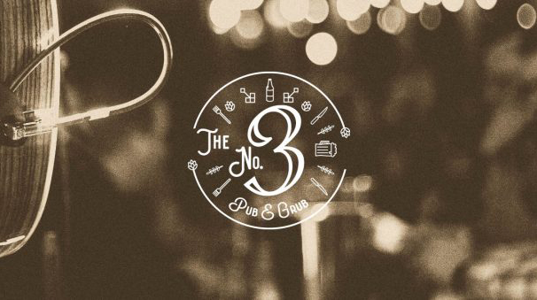
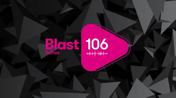
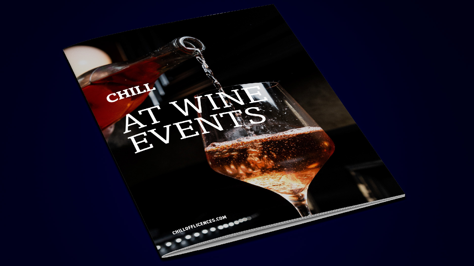
At Kaizen Brand Evolution, we have widespread and detailed experience in the event industry. Through working with businesses across Northern Ireland and Republic of Ireland, we have developed an esteemed portfolio in event design. As well as working with businesses, we have also collaborated with event organisers directly, providing professional design advice and execution to ensure the correct display of products and design for their events.

From content design, including logos, posters, roller banners, and even packaging design for table favours to website design and animation for presentations and video features, we have you covered. Kaizen Brand Evolution can guarantee that your event design requirements are planned, implemented and executed to the highest standard, boosting your position as a premium focused organisation.

Hosting an event in 2022 or attending a trade show and want to stand out from the crowd? Kaizen Brand Evolution can help you out.

If you are interested in involving a Graphic Designer in your event design, please contact our studio by calling us on +44 (0)28 95 072 007, emailing us at studio@kaizenbrandevolution.com or filling out the form on our contact page.

Annual Report Design – Telling a Compelling Story

Irish Football Association Annual Report Design - Kaizen Brand Evolution
Irish Football Association 2020 annual report design created by Kaizen Brand Evolution

The Annual Report is a critical part of a good business marketing strategy, both internally and externally.  Above all, it is the story of your business, whether it be for your investors, your customers or even your employees.  Annual Reports typically include:

  • The company’s financial data summary
  • Financial statements
  • General corporate information
  • Auditor’s report
  • Accounting policies
  • Financial transactional highlights
  • Letter from the CEO
  • Company Partners/Members’ Portfolios

Reasons Why Annual Reports are Important

An annual report is primarily for giving company financial performance to investors, but has evolved and therefore it is key your company should go with an impactful report. Go with a professional to make the most of your annual report design.

Annual Reports Communicate With Investors

Annual Reports are an integral part of a strategy to attract and retain investors, and ultimately illustrates proper management.  Above all, regular communication is good to keep everyone informed and the annual report is your most critical communication.

Builds Customer Trust

Annual Reports inform on a company’s statistics and vision, building trust in the brand.  They are also key to conveying the company’s stability and profitability.

Attracts & Retains Employees

No longer solely for investors, the annual report reassures employees with company success and awareness of any pitfalls/issues.  In addition, annual reports illustrate that the employer understands the marketplace and above all, has a vision.

Informs & Influences the Media

Reporters monitor and give details of a company’s fiscal year performance, health and future plans for coming fiscal years. In addition, any impacts to the community are illustrated.  Therefore, a clear and concise report is paramount in ensuring the correct message is conveyed.

Highlights Achievements

The annual report recaps the company’s mission statement, history and goals.  Following, it conveys the successes over the fiscal year, including but not limited to financial success, market share achievements, research progress, or any employee awards.

Therefore, engaging your audience is key and how to engage has evolved.  Annual report design is focused on visual content which compliments the text and holds the attention of your audience.

Compelling Annual Report Design Strategies

Statistics Featured With Infographics

Infographics should be kept focused.  A high level understanding of the presented statistic must be instant and should retain the attention of your audience.  There are various infographics you can select from to present your statistics effectively:

  • Statistical
  • Timeline
  • Process
  • Geographic
  • Informational
  • Hierarchical

A professional annual report design consultation with an expert can advise on what infographics can be utilised for a most effective presentation.

Effective Data Illustration

Your annual report is the story of your company’s fiscal year.  Think of it as a story and present it as such.  Use a unique cover page to grab the audience’s attention and interest.  The cover should include infographic elements and photography to best leave a favourable impression on your audience.

Share some of the main company highlights in the beginning of your report.  Allow your audiences to understand what you want them to readily comprehend.

Effective Photography Use

Photography adds the human element to your annual report.  When utilised effectively, photography an attract and inspire investors and shareholders, having a measureable effect on their decision making.

Following determining which pages would benefit from photography use, consult with an annual report designer to position in the most compelling way to grip your audience.  High-resolution photography is best practice to use in your report design.

Make It Interactive & Engaging

Keep the audience engaged with any relevant video presentations, image presentations, GIFs, and other elements in the digital form of your report.  Various interactive elements including graphs, subtle animations and characters will assist in making your annual report more compelling.  You want your audience inspired and engaged to review your most critical communication and adding some life will guarantee that.

Comparison Infographic

Giving context to your company’s performance allows you to tell the fulsome story about your fiscal year, without any ambiguity.  Comparison infographics clearly illustrate year on year performance effectively and efficiently.  Future growth expectations can also be made impactful with the use of comparison infographics.  A professional annual report designer can assist in advising on most impactful utilisation of comparison infographics.

Create a Short Motion Graphic

Make your report enticing and exciting.  Thank, welcome and impress audiences by creating a short motion graphic to introduce your report. 

There are many elements to consider when drafting your annual report, notwithstanding the content itself.  The story is one critical element to convey, but how you iterate that story is just as crucial for a successful annual report.  Consider your audience and how you want to convey the story of your company’s fiscal year in the most engaging and enticing manner.  It is your grandest statement, therefore, your design should be grand and well laid out.

Start a Project With Us

To begin an annual report project with Kaizen, or to discuss how we might work together further, please get in touch. Our client services team are available to contact on 028 9507 2007. Alternatively you can send us a direct message via the contact form. We look forward to working with you soon!

The Benefits of Blogging for your Business

In the modern era of online social sharing, blogging holds a massive opportunity for your company. Commonly associated with casual topics of discussion, such as beauty, travel and entertainment, the purpose of a blog often fails to gain recognition as a beneficial promotion tool for organisations.

With an overwhelming 4.5 billion people using social media in 2021, it is undoubtedly difficult to gain exposure and become a recognised and established name. Incidentally, the power of blogging will give your company a competitive edge, boosting your products and services into the online community in an enlightening and engaging way.

Blogging brings a massive boost to an organisations place in the market, increasing custom and growing sales through educating consumers about what you do.

Boost your Website Traffic through Blogging

Consistency is key when it comes to online content for your company. Sharing blog posts on a regular basis will undoubtedly increase your website traffic, driving more customers to visit your page and increasing your position in the online rankings.

To achieve optimum website traffic, it is recommended that you research the data of your target market and current customers. Doing this will outline a pattern, showcasing the age, location and areas of interest of your site visitors. Once this information is attained, you have the power to engage with your audience in a way that meets their interests and blogging is the perfect way to start.

The goal for any organisation is to be recognised for their hard work, hence blog writing is a key feature in achieving this.

Content is King

In our instantaneous world, remaining relevant is a tremendous task. According to WordPress, over 70 million blog posts are shared every month. With these figures in mind, it is important to keep up to date with trends, changes and competition. Many organisations are familiar with updating their website and social media platforms to remain relevant. Whilst this is necessary, it does not allow the flexibility to share a detailed insight into the functioning of the company. Blogging provides your organisation with a platform to boost your reputation in the industry, promoting your adaptability with to the world. Sharing content through a blog allows your organisation to hold a direct line of communication with customers and ensure they are heavily involved in the progression.

Brand Awareness through Blogging

The power of blogging can promote your organisation in many platforms. It is a prime location for explaining to your audience what it is you do and how you stand out against the competition. Blogs allow you to go into comprehensive detail on the products and services you offer, which incidentally could encourage new customers.

Catch Questions and Queries

A tip for blogging would be to incorporate solutions to possible queries that readers may have. For example, if writing a blog about Billboard and Adshels, it is advisable to incorporate figures, measurements and lead times, which could potentially target those searching the web for answers. If your blog holds a solution to a query of a potential customer, it will likely appear on their search results and lead them directly to you. Providing engaging and informative blogs is imperative for your organisation as it will be a key deciding factor for potential customers.

Consistency is Key when Blogging

Like everything in life, we thrive on consistency and routine. This should be no different when blogging for your company. According to HubSpot, organisations that publish 16 or more blog posts per month generate 4.5% more leads than those that publish 4 or less. An advisable strategy for any organisation would be to create a plan for blog posting, ensuring a recognisable timeline for weekly sharing – for example: Monday 10am and Friday 3pm. This will not only develop an organised structure internally but will also create a posting timeframe that readers will begin to recognise.

Educate and Engage

Blogging provides an opportunity to educate your audience on matters that are important for your business. Whether you want to encourage the importance of sustainability or promote the benefits of incorporating employee wellbeing into your organisation, blogging allows you to share your opinion freely. There is a great opportunity to boost corporate social responsibility by sharing your internal values. Doing this may engage with a reader and create a potential customer for your company.

Additionally, using your platform to blog about your products and services will ensure there is a more well-rounded understanding of your organisation. When readers have a clear vision of what your company has to offer, they are more likely to follow through and become a valued customer.

Blogs Create Social Media Content

A massive benefit to creating consistent blog posts is that you will never run out of social media content. Spending lengthy periods of time carefully creating blog content must be followed up by an impressive promotion plan in order to reach your target customers and potential new audience members. Kaizen Brand Evolution recommend that you share your blog post on social media to boost brand visibility and expand reach. Remaining active on social media is paramount for organisations and ensuring content is continuously fresh and innovative will give you that competitive edge.

Blog about what you do!

There is no better way to showcase all of the brilliant things your organisation does than through blogging. A blog provides an unfiltered, unlimited and underrated platform to shout about what you do, sharing your achievements, your improvements and your advancements. If your organisation has gone that extra mile on a project, why not write a detailed case study to share this with the world?

Providing a detailed analysis about what your company does on a blog will invite readers, clients and potential customers to experience an insight into the ideas and functioning of your organisation. This transparent awareness projected onto the reader will build a level of trust that is invaluable for any organisation.

People are curious, feed that curiosity with engaging and exciting blog content and you are winning!

Boost your Brand Awareness with Billboards

Modern day marketing and advertising promote a driving force on digital exposure and online engagement. Often, the benefits of traditional advertising fail to receive deserved recognition, due to the old-fashioned associations it holds. It is paramount for organisations to remain open to a variety of advertising platforms, to ensure they reach a widespread target market. This can be done through opting into Out-of-Home advertising, incorporating Billboards and Adshels.

Key Areas of Advertising

The goal of an organisation is to constantly reach and engage with potential and existing customers.

Three key areas of marketing and advertising to target audience:

  • Digital Advertising

The benefits of promoting your organisation through digital platforms needs no introduction. Digital is undoubtedly the most prominent and relied on platform in the modern day. Social media, animation and web design, to name a few, are prominent features in an advertising plan, targeting an audience 24/7.

  • In-Print and Media Advertising

Secondly, advertising promoted through newspapers, television and radio remain key for engagement and outreach. Although it does not hold the same instantaneous speed, it continues to be a reliable promotion tool. Unlike social media or online promotion, where an advertisement quickly disappears once the page is refreshed, in-print advertisements are permanent, often residing in homes for numerous days. Additionally, advertisements via television and radio, if done correctly, have the power to resonate with the reader.

  • Out-of-Home Advertising

Finally, out-of-home advertising, including billboards and adshels embody a prominent and engaging investment, beneficial for both large-scale organisations and smaller companies. Reaching a vast audience, billboards and adshels ensure that your organisation is being advertised at all times, catching the customer at moments they are unable to scroll online or engage in media.

Catch the Commute

In most cases, traffic is not a welcomed experience. Yet, when your organisation is advertising via billboards and adshels, traffic is hailed a favourable occurrence. According to The Independent, travelling to work is currently taking longer than ever before, with the daily commute now taking up to an hour every day. Hence, the rise of travel time presents a rise of opportunities for investing in billboards and adshels.

Prime Location

Careful consideration is required when deciding the location of a billboard or adshel, choosing a position that will reach high volumes of traffic and footfall to catch the attention of as many individuals as possible.

Additionally, recognising your target audience is also key. Many fail to place billboards and adshels under the bracket of easily targetable advertising, yet it is possible and very important. Through internal monitoring of engagement, your organisation should hold a clear idea of their target audience, target location and target market. Incidentally, there may be key areas of importance: such as a particular city, town or highly populated area.

Less is More

When spending on advertising, many believe it is important to squeeze in as much information as possible, getting value for money. Yet, it is important to remember that when dealing with adshels and billboards, you have a short period of time to catch the attention of an individual. Be it driving on the motorway or walking in the city centre, an instantaneous message is key. You have approximately 6 seconds to make an impact with your billboard design. Kaizen believe a brief and explanatory design that showcases exactly what your organisation is trying to promote will be enough to encourage a call for action.  

No Company Too Small for Billboards

Billboard and adshel advertising hold numerous incorrect connotations, including the idea they are for large-scale, corporate companies only. Kaizen wish to promote that they prove beneficial for all organisations, no matter the size or reach. Additionally, it is widely believed that billboards and adshels are massively expensive, exceeding company budgets. Yet, they are arguably a very affordable piece of advertising material, with an audience reach wider than the majority.

Boost Brand Identity and Awareness

Kaizen believe that all company marketing and advertising should encompass a recognisable and uniform design, boosting brand awareness at all times. The goal of any company should be to engage with an audience that immediately recognises their branding and what they offer.

Kaizen promote that in order to boost brand identity and awareness, a billboard or adshel should incorporate:

  • Company logo
  • Recognisable company colour scheme
  • Call to action contact details – e.g. website
  • Company text font
  • Company slogan if applicable

Kaizen can create your Billboard and Adshels

At Kaizen Brand Evolution, graphic design is our speciality. Our team have worked on an impressive number of outdoor campaigns, encompassing adshels and billboards for organisations throughout Northern Ireland. Kaizen have first hand experience in recognising the benefits of investing in adshels and billboards for your company, providing top quality design to ensure success.

Did you Know?

Kaizen work alongside Northern Ireland’s most established outdoor advertiser, Clear Channel NI, allowing us to offer an extensive variety of services in both specific and widespread areas.

Get Started

Kaizen understand the importance of effective marketing and advertising for your organisation. We believe you should show off your company. Go big or go home with a 48-Sheet or 96-Sheet billboard. Kaizen have a graphic design team that recognise the importance of developing an eye-catching out-of-home advertising campaign.

Contact Kaizen to discuss the development of a Billboard or an Adshel today.

Evolve your Annual Report with Kaizen

An annual report is a vital puzzle piece for any company, showcasing pertinent information to clients, stakeholders, shareholders, employees, the public and media. A brilliant annual report will not only provide relevant company information for those who are currently involved with the organisation but it will also play a dynamic role in the company marketing plan, targeting new customers and clients.

An annual report is a detailed file that delivers a wide-ranging report on company activities and progress throughout the past year. Fundamentally, an annual report gives an external insight into the internal workings of an organisation, sharing the following information:

Profit

Loss

Expenses

Company Growth

Company Degrowth

Investments

Charity Involvement

Selling of Products

Buying of Products

Financial Status


Avoiding overwhelming your target audience

The fast-paced environment we now live in, leaves diminutive time and patience for the traditional, text heavy annual report design we were once accustomed to. Overdetailed and under visualised annual reports present not only a tedious task to read, but an overwhelming experience for stakeholders and potential investors. It is paramount for organisations to promote an engaging and user-friendly annual report, in order to remain competitive and efficient.

Opportunities to EVOLVE your Annual Report Design

The possibilities are endless. It is important to leverage the opportunities provided, engaging with both existing clients and potential new clients.

All companies are experienced in the process of setting goals and working towards achieving them. At Kaizen, we believe that this should be no different with your annual report design. Initially, you must ask yourself what it is you are trying to achieve in sharing your annual report as it is an important component in appealing to and engaging with potential clients.

It is paramount that your organisation holds a competitive edge and this can be achieved through breaking the traditional mould and involving a more modernised annual report. Kaizen Brand Evolution believe an effectively designed annual report can leverage trust, engagement and interest for your organisation, all of which are required when entering a new business year.

Use Infographics

Annual reports were once viewed primarily as a detailed and heavy document, dreaded to create and dreaded to read. However, through design evolution, annual reports are moving away from these heavy layouts to a cleaner and image friendly design. Kaizen Brand Evolution believe that visualising your data through infographics is key to achieve an engaging and balanced read, replacing text with interactive images and graphs that explain and promote the company on a more understanding and exciting level. 

Maintain a Recognisable Brand Identity

Like everything in an organisation, brand identity is paramount. The goal for any company is to withhold a recognisable and engaging image, that can be spotted continuously and immediately. This is no different for an annual report design, using the company colours and fonts to layout a familiar design for the reader. Kaizen promote a simplified colour usage for annual reports as we believe an influx of unnecessary colour can crowd the design, which once again would appear heavy and overwhelming. Additionally, it is important to maintain a consistent and identifiable typography. Often overlooked, text holds power in brand identity and using the correct text and font will steer the attention of the reader to key information.

Kaizen Brand Evolution follow a text hierarchy when creating an Annual Report Design incorporating:

Header Text

Sub-Header Text

Paragraph Text

Avoid Information Overload

The purpose of an annual report is to showcase information and it can be understandably difficult to put a limit on the detail included. Kaizen promote the utilisation of space, carefully curating an organised design, breaking up text with engaging and informative infographics. In addition, it is recommended that written information is separated into reduced, manageable sections, promoting a clear format and interesting read.

Add a Personal Touch to your Annual Report

Within any organisation, personal connection is key. Kaizen believe that annual reports pose an excellent opportunity to showcase your company as an employee focused organisation. Doing this not only provides your employees with deserved recognition but also introduces them to clients, shareholders, the public and the media. Kaizen recommend that annual reports incorporate a brief synopsis of employee portfolios, explaining what they do, their expertise and company accomplishments.

Enthuse your Audience

Although a primarily informative project, annual reports provide an opportunity to engage with and motivate the reader. Take this opportunity to show off to your current clients and potential investors. Share information that you are enthusiastic about that will in turn encourage the reader to be excited. Additionally, Kaizen believe that company vision should appear front and centre in an annual report, showcasing the purpose of the organisation, promoting that format follows function.

How Kaizen Brand Evolution can transform your Annual Report Design

Kaizen work with a wide variety of companies, encompassing public, private and third sector organisations. We pride ourselves in our prompt understanding of your organisation, recognising the opportunities to showcase your information in an engaging and informative design.

Kaizen Brand Evolution strive to change your annual report design for the better.

BeyondHR – Brand identity

BeyondHR focus on a relationships based approach to Human Resources, their headquarters are based in Ballymena, Northern Ireland, with another office based in Glasgow, Scotland. Previously named Personnel and Training Services (PTS), our rebranding project was undertaken to reposition the business within the market.

Their name PTS, was out-dated for the marketplace, we took this opportunity to rename, to allow the company to engage with its audiences in today’s world. Starting wide, we went through over 50 names each with reasoning on why the name was relevant. We then refined, short-listing down to seven.

The chosen name ‘BeyondHR’ was a fantastic metaphor for the business with lots of branding potential.

Understanding the Brand

We looked at the industry landscape and noticed the majority were very corporate, and didn’t seem very approachable for a business which dealt with people. A lot of the logos didn’t give you much of a hint of what they do. We seen this as one of the challenges we had for BeyondHR, as we needed the business to look approachable, friendly and tell you what they do.

Our goal within the BeyondHR rebranding was to create a trustworthy brand, which kept inline with their core values of focusing on relationship.

Brand Audit – Brief

To create a brand identity for BeyondHR incorporating the new name with a clever, friendly visual direction. The new identity would become the face for the brand and reflect the core values of BeyondHR. The brand will position the business as the go to HR company when you need them the most. The brand allows flexibility to evolve over time. BeyondHR wanted to reach out to smaller businesses, as they want to make Human Resources more approachable.

Like many brands we create at Kaizen Brand Evolution we have created a branding system which makes it simple for anyone in the business to be able to use. We show the client how the brand works and how it can be utilised. BeyondHR’s brand was developed from research we gathered from multiple sources to make sure we understood the industry we are designing for. We took elements from our research and we created three independent brand concepts that fully reflected the marketplace BeyondHR operate in. Each had a unique value proposition so BeyondHR could visualise their brand potential, after refinement of the chosen brand concept, we are rolling this out across a range of deliverables both offline and across digital media.

The Logo Build

The logo type was created using elements ‘BeyondHR’ + ‘Support’ + ‘Eye’ + ‘People’. From this we built a clever device, which houses a person in the negative space of the ‘O’. This represents that BeyondHR are people centric in everything that it does. We wanted people to smile when they discover the person in the logo, and hopefully smile when they engage with BeyondHR. The device will be used throughout the branding system from housing different icons depending on the sub-brands/services they offer.

Each element of the brand has been thoroughly looked at, from brand campaigns to lanyards to how the coffee mugs would look like.

We introduced a vibrant colour palette to use against a contrasting navy, the colours used per sub-brand each have their purpose in the brand, the red is used as it shows leadership and suggests stability; the teal is used as it’s more softer for training purposes and represents knowledge; the yellow is used as its friendly and approachable, perfect for recruiting; and finally the green is associated with healing and protection.

Brand Language

We created the approachable brand, we needed a tagline which helps define what BeyondHR does as the brand language is just as important as the visual identity. “We’re People People”.

Whiterock Finance – Brand identity

Whiterock Finance are an independent alternative funding company based in Belfast, Northern Ireland. Previously named Whiterock Capital Partners, our brand audit project was undertaken to reposition the business within current and new markets.

Traditionally such businesses are branded in a manner akin to an accountancy practice and of course this adds strength to the diligence requirement of such a process. However for many entrepreneurs or business owners, this traditional look may be misunderstood for a variety of reasons.

Our goal within the Whiterock Finance audit was to create an engaging, dynamic brand, that retained the heritage of an established, trusted and extremely well respected business.

Understanding the Brand

In the process of understanding the Whiterock Finance brand and its products/services, we were led to the many clients they have supported with the Growth Loan Fund and Growth Loan Fund II. Entrepreneurial, growth driven and ambitious companies who are making a huge impact in each of their sectors was the common theme and from this it was very clear to identify the personas of key markets.

We created three independent brand concepts that fully reflected the marketplace Whiterock operate in. Each had a unique value proposition and while design is objective, the selection process is of course subjective. After refinement of the chosen brand, we are now rolling this out across a suit of deliverables both online and across digital media.

What is Alternative Finance?

Alternative Finance is an umbrella term that covers any type of finance that does not come from a mainstream provider, such as a bank. It is not a mortgage, but a considered loan for use as investment within your company.

Whiterock Finance support local businesses with ambition that can demonstrate sales and profitability growth.

Brand Audit – Brief

To create a new and engaging brand identity for Whiterock Finance, incorporating the new name with a smart, modern and visual direction. The new identity will become the voice of the brand and reflect the core values that Whiterock Finance represents. The new brand will also position Whiterock Finance as the premier alternative finance option for entrepreneurs seeking growth in their businesses across Northern Ireland. The new brand will be flexible for growth, perhaps in Scotland and the mainland. The brand will be attractive not only to entrepreneurs but to major investors across the water and fit in with their brand library.

The Logo Build

The logo was created using elements ‘W’ + ‘ Whiterock’ + ‘Money clip’. From this we built a clever Rock device crafted from the negative space of the logo. This represents a strong foundation to help support your business. The device will be used to throughout the branding system from housing photography, to use as an arrow to point to the language or to be placed as a white rock when the logo can’t be used.

Each element of the brand has been well thought out from the colours, layout and the typography. We used a typeface, which can be legible from size, with subtle curves in the letters to tie back to the curved logo.

We introduced a clean colour palette inspired by the coast, using a sunset yellow and rock grey with contrasting bright colours used to add more depth to the brand. These colours were used when we updated the Growth Fund logos too so they updated in the style of the new brand.

Brand Language

The brand language was critical, as it had to be corporate and approachable. Some of the language created was, “We invest in the brave”,” We invest in the ambitious”, “Alternative, Intelligent Finance” and “Grow your business”.

As well as the branding system, we produced a range of visuals to show them how the brand could be used across different mediums; including adshels, brochures, signage, business cards, lanyards, mugs and online presence. When you see how all the brand elements are brought together it’s clear to see the cohesion. With this brand structure, Whiterock Finance will stand out from the rest of competition. 

With Whiterock Finance we built a strong brand that works for the business and for their clients. We throughly enjoyed working with the Directors on this exciting project and look forward to working with them to evolve the brand even further.

The Number 3 – Brand Identity

The Number Three is a traditional Bar & Restaurant based in Limerick with a contemporary audience. Previously trading as Tom & Jerry’s it has since changed owners, the new proprietors wanted a brand to reflect the new services that they would have to offer of food and drink as well as live music. The name Number Three comes from the location on Glenworth Street.  The logo’s mark is tasked to show that the business serves food as well as alcohol through iconography, we have interpreted the request across the logo with the symbolisation of beer, drinks and food brought into the logo. The most important message was food/drink and bringing that together for the new bar and therefore we came up with the tagline ‘Pub & Grub’ this shows the traditional Irish side with the slang term ‘grub’ meaning food, as well as the pub element. As the new owners are starting out fresh they wanted the logo to look contemporary but with the old Irish feel to fit in with the local community of Limerick and the industry landscape. Kaizen Brand Evolution had to create a logo that was adaptable for the future that didn’t fit in with trends so that it could be timeless and stand alone for the business and stay classic for the duration of the bar’s lifespan.

The No 3. logo design uses a timeless cursive styled font with vector illustrations of wheat, barley the types used in beer making, there is also wine bottles to symbolise the pub and drinking aspect. We have also used the iconography of a knife and fork to show the grub side, the style is a contemporary vector design around the framing to show food and drink together. The logo is a established with the colour scheme gold and dark green to give an old traditional feel of Irish food and drink in Limerick. The logo shape is in a circle with the iconography crafted around it, the circle breaks for the wheat and barley at each end to come to show. It gives that traditional friendly vibe with a modern take on it with the vector illustrations. The photography and art direction style is comfort and homely atmosphere with a sepia filter, showing good live music with also traditional connotations.

The No. 3 logo comes in two versions, the circular version with iconography and main 3 typography as well as the longer version with ‘The Number Three’ in landscape for signage for the front of the bar. For the rollout of The No. 3 logo, it will be used on glass etching for the glass windows which will work well for the etching typography for the number three, signage for the front of the bar and interiors, mirrors, doors, food and drink menus, social media. The interior designer will be working alongside the brand for the No.3 to give that homely traditional but feel inside with booths, picture frames, high stools, a long bar and wooden interiors everything you would expect to see in your typical traditional Irish bar. We look forward to working with The No.3 across all of the deliverables and seeing the brand live in Limerick, we wish the owners the best of luck in their new venture.

United Wines – Brand Identity

United Wine Merchants approached the brand team at Kaizen Brand Evolution with the objective of repositioning their brand identity and communications to be more in line with their unique service, product and reputation. With over 36 years in business, United Wines have moved with the times in terms of their product portfolio and brand associations, however, their own brand has remained unchanged. Today the company is modern, forward-thinking, and upholds a formidable reputation. With this said it deserved an identity to truly represent them.

In their own words:

United Wine Merchants incorporating HEINEKEN NI is a dedicated Agency led wholesale business within the Licensed Trade servicing the entire On and Off Trade.  As a subsidiary of HEINEKEN IRELAND, we are the licensed wholesale company responsible for developing the HEINEKEN portfolio including Orchard Thieves across Northern Ireland. Now in our 34th year of operation, we pride ourselves on our market leading and award-winning portfolio of Beers, Wines, Spirits, and Soft Drinks. Beyond timely supply and reliable delivery, we have got a range of marketing support and an experienced sales team to help you select the right range for your customers. We can design your wine lists, supply POS and provide your staff with product training as our Sales and Marketing team are all WSET qualified.

The team at Kaizen Brand Evolution created 3 unique brand designs for United Wine Merchants, each one exploring separate USP’s and reflections of their current standing in the marketplace. From colour variation, negative space, wine hints and some contemporary type styles we aimed to flex our creative skills in this brand audit, after all, it has been 30 years since the current branding, time for us to show potential. The new, chosen brand mark incorporates modernity, negative space and a clear, focused typestyle. The colour palette is reflective of their current ‘wine palette’ with a great balance of a highlight and base ‘berry purple.’ Each element of the logo represents truthfully the ambition United Wines set us from the outset. You will also notice that the word “merchants’ has been removed from the primary, simply for simplicity. When referring to the company people tend to drop the Merchants, so we dropped it.

Language plays an important role in the new brand direction for United Wines.  We put together a language style for the brand to take forward, one which highlights their USP’s but one that has an almost tongue in cheek wordplay. Statements such as ‘from harvest for beer fest’ for ‘forward thinking drink’ set the brand apart from local and national competitors. Setting this tone of voice at the beginning of the new brands journey will pave the way for how the brand communicates on and offline, short and sweet…but engaging. The company and staff at United Wines are extremely personable and friendly so the language guide was set to reflect not only their products and service but their people – something that United Wines pride themselves on.

We directed the artistic and photographic style for the new branding using process, ingredients and the art of creating the products they sell at United Wines – rather that typical product imagery or cheesy stock imagery. The new visual narrative for the company has depth and explores the story of their products.

We are extremely proud of the United Wines rebrand and continue to roll the branding and design out across digital and printed materials. The new United Wines website is under development in the Kaizen Brand Evolution studio as well as the new internal office and vehicle livery which we are excited to see live and kicking. If you feel your business is in need of a rebrand or repositioning to represent your service or product accurately simply get in touch with our award winning brand experts at studio@kaizenbrandevolution.com

McQuillan Companies – Brand Identity

McQuillan companies approached the branding team at Kaizen Brand Evolution to re-position and revitalise their brand identity. The family-owned business is well established across Northern Ireland and is specialists in civil engineering, quarrying, waste management and outdoor cleaning services to name a few.

McQuillan Companies have a large presence on the road, their vehicles being instantly recognisable, a lot of which is down to their unique colour palette, something that the branding team had to keep in mind throughout the brand audit. Auditing a brand is our way of truthfully expressing the business offering today, whilst retaining loyal clients brand understanding and improving brand touchpoints (such as vehicle livery and presentation design) we aim to create a brand purpose that keeps the business relevant and exciting for new and potential future clients.

About McQuillan Companies

McQuillan Companies are a Northern Ireland based family run business which incorporates a diverse range of activities including civil engineering, demolition, quarrying, hazardous and non-hazardous waste management, outdoor cleaning services and analytical chemistry. A fourth generation business operating for over 100 years through the parent company John McQuillan Contracts, the McQuillan Companies name is synonymous with quality and excellence throughout our various divisions.

Getting started we focused our research and investigation to forward-thinking, modern brands in the engineering, construction and land service industry – looking to London, New York and further afield. With brand learning’s from across the globe we built a solid understanding of what branding was working and not working in this industrial landscape. Following initial research and mood boarding, we filtered the findings down into 3 solid directions and began brand planning.

We initially developed the narrative before jumping into the design for McQuillan Companies. The brand language on this occasion launched with ‘Here for tomorrow’ – a modern, forward-thinking strapline for a modern, forward thinking business who are, in effect working on making tomorrow a better, safer place to live. We purposely avoided building or construction clichés so that the narrative was widespread across the entire company intern breeding a positive brand culture – essentially this narrative has legs to be flexible across different business facets.

Brand Design – McQuillan Companies Lisburn

We now needed a logo mark that reflected what we were talking about in the narrative. The McQuillan monogram stems from the idea of engineering and overall solid work that the company undertake. The new logo is a strong, trustworthy mark that brings together the initials of the family name and visualises the industry – simply. Our goal for any brand undertaking is to simplify, make brands that people get, without the use of selfish design techniques or trends.

The logo proves successful when used across brand materials and especially in the brand livery and uniforms. Alongside the new mark, we introduced a structured contemporary typeface that suits the tone of voice and industry of McQuillan Companies. The flexibility of the new identity becomes apparent across the different business sectors where the company sector is simply introduced to the stacked lettering in each instance.

Throughout the new branding, we have directed the new photography style, using modern dramatic images of the work in progress as well as team members in situ.

The crescendo of the brand audit was the re-design and use of the new branding across the vehicles. The vehicles that define a McQuillan job have been reinvented for future use and business growth, utilising the flexibility of the new logo mark and brand narrative they suitably stand out on the roads and truthfully represent the businesses heritage and future.

It was a pleasure working on the brand audit for McQuillan Companies and we look forward to rolling out the brand collateral in the not too distant future.

Blast 106 FM Brand Development

Belfast’s most music station Blast FM approached Kaizen Brand Evolution to design and develop a new brand identity system for their group of radio stations across the UK and Ireland. Blast FM has been live on air for a number of years and reached a point of significant growth, and they needed a brand identity that was going to help propel them to even greater heights, appealing to more listeners. The market of radio is highly competitive and the team at Blast FM needed a unique identity to truly reflect what they offer and stand out in their industry landscape.  Blast Fm’s brief was to create a modern, recognisable identity that spoke to their core audience correctly as well as being bright and bold. They wanted something that was going to stand out within the market, showing them as one of the leading players within the industry. A unique request was to include a WAV file of an important figurehead from Blast FM talking who had recently passed, a touching piece of communication now represented forever in their brand mark. Blast FM as a group own 7 further stations and a part of the challenge was to create their identity so that it could become a flexible mark, easily recognisable across all markets, as well as being easily adapted in colour and name for other stations whilst retaining the group look and feel.

We designed a flexible identity system around the concept of the play button. The play button represents radio, music, playfulness and fun so we thought it was the perfect symbolism for the group identity. We also introduced a secondary keyline surrounding the play button to represent movement, volume and radio signal. Utilising the play button’s shape we were able to house the frequencies of each station and the WAV file from the brief. The play button acts as the boilerplate brand mark for the set of group marks, on each of the different stations identities the colours change as well as the frequencies of the related station. The name of each station and it’s geographical location sits to the left of the button and is easily interchangeable as the brand rolls out across the remaining stations – Blast Fm Belfast, Iur Fm Newry & Mourne, ABC across the ABC region, Blast Digital Glasgow, Your Fm Stockport, Blast Blackburn and Blast Northwest. Each station adopts its own unique colour system, each palette as bright and eye-catching as the last. This approach keeps the group brand profile true across all business areas and reinforces the brand personality across the UK and Ireland.

Along with the play mark, we introduced black and white art direction for the brand imagery. The choice for black and white imagery was primarily to place further emphasis on the identity and its bold colour palette. The two, when designed together, marry very well and create an over well rounded, bright and modern identity with a considerable and noticeable change from their previous brand identity. The photography is primarily portraiture of key musicians featured on playlists from the respective radio station. Each set of images is put together in a concertina format for use across social media, advertising and in print. We also introduced a set of geometric 3-dimensional backgrounds for the Blast FM brand rollout which can be seen on their social media channels. The geometric shapes and 3D effect simply adds depth to the brand mark and creates a more modern corporate brand world for the new mark to thrive in.

As the brand rollout continues across the entire group we look forward to creating further digital and printed collateral. As brand guardians for each of the business facets, we have a clear understanding of how the branding should be treated across all mediums. We thoroughly enjoyed the design and developments of the brand system for Blast FM and look forward to seeing the branding out in the real world as it begins to evolve.

Harlow Brand Identity

The client’s ambition was to supply top of the line Italian and Scandinavian fashions online with an eventual ‘bricks and mortar’ store in Northern Ireland.  The brand had no name, identity, narrative or visual strategy. It was our job to sculpt and direct the branding from naming to delivery.

We chose a name that reflected the company’s ambitions, high-end, one with an abstract meaning and a subtle hint to a landscape in which the clothes are made. The name Harlow was a great driver for the identity creation and overall styling of the brand collateral, as it reflects elegance, subtly and confidence.  The naming process was approached with the same rigour as any brand identity project. Firstly with research and investigation, looking at hundreds of colloquial, European meanings and names, names that echoed style, femininity, and confidence, all brand pillars of what is now known as Harlow Clothing Company.

With the company name to hand, we could now focus on creating the brand identity. Our research revealed some really outstanding fashion outlets and quirky retailers across the globe. We explored texture, palette, photography – fashion, landscape and otherwise. We tested and worked with an array of type, symbolism and mark making. We used the stem ‘passion led us here’ as a backbone narrative for the project – this language opened up the door for passionate photography, and an overall ‘chill’ – ‘hippy’ lifestyle vibe for the brand – something that the client was immediately connected with.  The narrative paved way for an ‘airy,’ modern use of type with wide spacing between letters. The font used for the primary type mark is a Grecian typeface, one that screams ‘foreign contemporary’ to keep in line with the business ambition and to suit the product. The type in the mark now decided upon we wanted to introduce a simple device to enhance the overall identity. Traditionally when thinking to European or foreign language we expect to see accents or glyphs that derive from foreign alphabets, so how do we introduce this – cleverly. Taking inspiration from the missing holes inside a button we introduced an “umlaut”-style device above the H in Harlow. This addition creates a unique brand identity and creates a new brand atmosphere to begin to use dots and the separated H as part of the brand material and roll out.

The colour palette is subtle, confident and modern reflective of the 3 pillars of Harlow Clothing Company. The greys and blues echo the denim and highbrow fashion on sale. Pairing the colour palette with fashion photography enhances the brand personality, solidifying the clients’ expectations and price ticket of some of the brands on sale at harowclothing.co. Harlow’s initial brands are Italian denim magnates Freddy and Scandinavia’s SVEA – two unique, stylish brands that radiate quality and fashion. Harlow sits confidently in this brand landscape and showcases the products on sale fantastically. The photography brings another element of landscape to the identity, transporting its customers to the origins of the garments on sale. The photography is a welcome addition to the brand pack, it’s storytelling ability enhances the experience and establishes the new business as an already market leader in this field. I must highlight that Harlow is the first business in Northern Ireland to stock and sell the Freddy and SVEA brands.

We designed all brand material from online e-commerce site to tags, labels, packaging and signage. All brand elements adapt the same brand tone, minimal yet impactful. The brand is now live and boasts an already impressive online following on Instagram. As Harlow’s reputation builds we continue to work with them, acting as brand guardians, as they evolve so do we.

GB Poultry Brand Development

The family business of GB Poultry contacted Kaizen Brand Evolution wanting to their refresh the identity of their well known brand. GB stands for Gregory Bell which is the family name of the business established since 1982 that has been passed down the generations. In their own words “GB Poultry Ltd is a family owned business based in Crossgar in the rolling countryside of County Down”. There are 7 Directors in the company, all from the Bell family who are personally involved and committed to the general day to day running and operating of the business. An EC Approved Cutting plant and are guided by DAERA (Department of Agriculture, Environment and Rural Affairs). Supplying a wide range of Whole Chicken, Flash Fried Chicken, Sauces, Cooked Chicken, Turkeys and other meat products. GB Poultry wanted to modernise their brand and bring it into the future as they are leading in their field of poultry in Ireland. Supplying to outlets such as Boojum, Pallas Foods and Henderson a refresh of brand is what they wanted to align with their customers aspirations.

One of the main USPs that GB Poultry wanted to bring across is that they are from Crossgar, a small village in County Down, we travelled down to their offices and were met by fields upon fields! They are very proud of where they come from therefore we have come up with the tagline ‘A Taste of Crossgar’ as an important part of narrative of their brand. This brings in the origin of the product and also links to the taste of which is also developed in Crossgar.

The previous logo consisted of a cooked chicken and a wreath, similar to your traditional styled butchers, our creative studio updated this with a modern rounded typeface which gives connotations of friendly and approachability. We created a custom vector illustration of a chicken to match the rounded typeface. We have selected the colour scheme of a dark grey and light blue palette which gives a refreshing difference from their usual red and green branding. We have used the colour separation of the blue and white two toned logo for the GB and the Poultry text.

When we travelled to Crossgar we noticed the beautiful landscape around it, we captured this by creating a custom illustration of fields with trees, tractors and chickens in it that can be rolled across their branding. We used textures and muted colour palette for this to utilise the brand and the modern logo, they bring across the farm aspect of the brand. GB Poultry have several products requiring packaging design, this includes sauces, flash fried chicken and cooked chicken which flavours they create themselves. The flash fried chicken products are readily available from most local shops, make sure you try them out. We have visualised up three different types of products, sauces, salt & chilli chicken goujons and breaded chicken burgers using three different colour schemes to define the different products. The packaging is a sticker on the products which sit on shelf with all of their competitors therefore the bright colours of blues will stand out. The brand roll out includes tone of voice, business stationery, packaging, vehicle graphics and signage.

We greatly enjoyed working with Bell family on their brand refresh for GB Poultry and we are looking forward to seeing the packaging roll out and the well known vans on the road.

Belfast Mens Health Logo Design

Belfast Men’s Health Group (BMHG) is made up a group of people across the community of Belfast and volunteer organisations across Northern Ireland, all with a strong interest in the health and well being of men, by raising awareness of all the main health issues relevant to men and sharing events of interest across Greater Belfast.

BMHG provide a range of information shared by experts who really are experts in their fields. Organising meet up events, provide videos, podcasts and even hosting competitions, they want men to really feel good about themselves and to look after others. BMHG want to make sure there is access to all the relevant information where ever you are.

In their words:

“Belfast Men’s Health Group is a made up of representatives across statutory, community and volunteer organisations across Belfast with a strong interest in the health and well-being of men. Each year we celebrate Men’s Health Week and International Men’s Health Day by organise events to raise awareness of health issues that are relevant to men. We also work with other agencies at other health events to raise further awareness. We are developing the work of the group and a website to further evidence of our ambitions.”

Initially approaching Kaizen Brand Evolution on a website, designed to help them share a range of media and information to a wider audience, our working relationship grew. After our first studio meeting, BMHG noticed our wall of clients and our portfolio of work, it was at this point they decided to rebrand their logo as they felt it was outdated, and it wasn’t communicating the tone of their current direction.

BMHG wanted a logo that worked along side the Northern Health and Social Care Trust branding, they wanted it look like a sub brand to the Northern Health and Social Care Trust and to feel like a brand you can really trust with some sensitive topics within the health and general well being of men.

Hoping to show people that they were a Belfast based organisation, whilst also hinting at what they stand for. They also didn’t want a logo that was too clinical, so this became our challenge to produce a mark, which would become instantly recognisable, corporate and memorable to men across Belfast.

We created a device using the B for Belfast, removing the counters and replacing with the cross for health. The colours are more of a muted blue, which when in use is quite corporate and masculine. The B+ device could be used as a window what information BMHG has to offer, the logo will work well online, email signatures, on t-shirts, beanies and also work on pop up banners, and flyers for events. The use of blue helps the logo have confidence, and feels trust worthy.

We are also creating a website for Belfast Men’s Health Group which will be their audience’s digital handbook for anything and everything they need to know about Men’s Health and well-being. The website will include a range of videos, podcasts, blogs and links to other websites in a visual and clear manner, to help men understand the importance of good health and uniting together. The site will be launching during Men’s Health Week in September 2018.

It will be great to see how their new logo will be used around Belfast, knowing they are helping Men across Greater Belfast.

Day & Age – Brand Development

Day and Age, creators of short films, use video to make sure the little moments are never forgotten. Kathryn approached Kaizen Brand Evolution when she wanted to steer Day and Age in a new direction, when she wanted to hand her brand identity over to safe hands for an all over evaluation, and when she wanted to evolve her business.

Starting from a young age Kathryn was capturing videos for weddings, corporate insights and family events. Day and Age is now pushing forward to new areas of film, looking to create memorable films that become powerful memory aids. Focusing on making memories and treasuring each moment, whether it be for promotion or an event, a memory for someone that may forget, or even just to give as a gift – Kathryn creates the most beautiful and effective videos.

To display this evolution of the business, we took the Day and Age brand and re-focused it. A brand that will appeal to the current, the new, and the expanding target audience. Kathryn and ourselves agreed that that bold and fitting name of the business should remain, everything else we could assess, address and push in the right direction.  

Throughout the process, it was clear what Day and Age represented and what it would bring to each of its clients-memories. A Day and Age film would provide a beautiful memory aid and so much more. With memories, nostalgia and capturing the moment in mind, we came up with the suitable brand language that would surround the brand. The strapline ‘Memory Studio’ helped give definition to the name, explaining exactly what Day and Age is. They create memories and help you ‘Remember each day’.  

The brand identity itself was provided as a wordmark and an abbreviated device ‘D and A’ to apply throughout any brand extensions. We found the connection between the initials of the brand and term ‘DNA’ riveting. Day and Age’s main aim is to celebrate families and individuals, all about the ‘DNA’. Displaying this connection subtly through the abbreviated device meant the ‘Day and Age’ name still held prevalence.  The versatile device can be applied in many different ways to connect you directly back to the Day and Age name while highlighting the ‘DNA’ or ‘D and A’. We used the combination of a rounded and modern font to reflect personality, approachability and style, a brand that you would want to work with and trust.

The colour palette and imagery came naturally from the Day and Age films.  Using all stills from taken footage, we could see how well the brand would work. We applied a soft and neutral colour palette to compliment the brand identity, language and each film. Not to distract, but to honour the nature of the brand and each film. 

We are now seeing the brand come together to display a clear focus and direction, the direction that Day and Age were and are aiming for. The new Identity is tailored to evolving clients, through narrative, identity and finally the implementation, whilst still appealing to a greater audience. Day and Age creates memories, but it can also still cater to and appeal to any possible film seeking client.

We continue to work with Day and Age, rolling out their new brand across various different forms of stationery and promotional materials. The new brand is coming to life and complimenting all the great work that we are seeing from Day and Age. It is a pleasure to work with such elegant content and now a new brand that compliments that content. We look forward to seeing where the business and new brand goes from here.

Graze, Belfast – Brand Audit & Logo Refresh

Graze is a restaurant based in Ballyhackamore, East Belfast. They love serving tasty little dishes (also know as tapas). These dishes are full of flavours using quality local produce, paired with your favourite wines. Graze is a great place to enjoy your tapas as they have created an atmosphere that is comfortable, friendly and the ideal place for people who just love great quality food and drink. Graze has made a name for themselves because of their special fish dishes, which change daily, based on the catch that morning.

In their own words:
“The Graze experience is about more than just food. A sincere effort to educate our staff on all aspects of food and wine culture is the basis for our service philosophy. We take great pride in our relaxed style of service and our welcoming staff at Graze go to great lengths to make diners feel at ease, comfortable and well taken care of.”

As well as the restaurant serving tapas & wine, Graze has the Lounge; soft lighting, with dark interiors and comfortable seating makes the Lounge feel relaxing. It’s known for their range of local Gins, craft beers and ciders.

Graze really know how to make your experience extra special; with their resident mixologist, who will make you some amazing drinks and cocktails.

Graze love their Gins so much they have their own Gin Club. Get involved in their monthly club where you can try 5 new gins, and shown how you can serve them up yourself.

Graze approached Kaizen Brand Evolution to create a brand audit for their restaurant because they wanted a brand which was consistent, and reached a new audience of late 20’s early 30 year olds. Graze’s approach has always been simple, so we felt we needed to create a branding system, which would be easy to use. They will be able to use across all of their marketing for both online and offline. It had to be simple for them to use. It had to stand out from their competitors and it most of all had to be consistent.

To create a brand that really represents Graze and develop a brand identity really needed. The previous brand and the food didn’t pair well so we took inspiration from everything within Graze, from the dishes they serve to the colours used in the interiors of the restaurant.

The Graze brand combines a word mark with a personality, a popping friendly colour palette and referencing the tiles they have in their interior. We developed a tone of voice which is friendly, and sounds familiar, it reminds you to “Enjoy the little things” in life and to cherish those moments with friends, family and to be surrounded by great food and drink.

As well as the branding system we produced a range of visuals to show them how the brand could be used across different mediums; including work uniform (aprons and chef jackets), interior signage, exterior signage and menus.

I enjoyed working with Graze on this branding project; I can’t wait to see the branding all over social media and Ballyhackamore. I’d like to see Graze develop into a restaurant, where people come from all over to try their tapas and gin.

I hope Graze sets the mark for what tapas should really be all about.

Meet our evolutionaries – Dawn

1.What has working in Kaizen Brand Evolution taught you about the design industry?

The main thing it’s taught me is adaptability. The world of design is fast moving and it’s so important to evolve with it and to be able to work on a wide range of projects. It’s also taught me that you can’t just think like a designer making pretty pictures, you have to think like a marketeer, an advertiser, a strategist, an accountant, a business owner and a consumer to ensure you get the best and most effective results for your client. Oh and it has to look good too.

2.Desert Island Design Studio, which typeface would you bring with you?

Burford. It’s not one I use all the time, but it’s a really creative typeface that you use by building layers. It consists of base layers, top layers and bottom layers that you can have a lot of fun with. It would definitely keep me entertained and give me something to do if I was stuck on a desert island!

3.What do you use for motivation inside the studio?

When I’m in need of some serious motivation, there’s nothing for it but headphones and heavy tunes. Anything from ASIWYFA, Daft Punk, Royal Blood, Muse or Biffy Clyro depending on how I’m feeling.

4. Any designers you have been stalking online recently?

I’ve been following/stalking Morag Myerscough on Instagram since I was at her talk in Offset last year. I love her use of bright colours and typography. I really want to decorate my house in this style, but I might need to invest in some super strength sunglasses first.

5. What are you listening to in work today?

Today I’ve had a bit of 6 music with Father John Misty, and The Vaccines, Temples, and um Justin Bieber on Spotify. I have a very eclectic taste in music. Don’t judge.

6.Any exhibitions in Belfast recently that are worth checking out?

The Late Night Art Bus Tour is absolutely brilliant and definitely worth checking out. The bus takes you round various galleries and street art in Belfast, often to places you’d never think of going to. Some of the stops even include a glass of wine, so it’s a super night out, very inspiring and great craic.

7. What’s your pet called? Tell us about them.

Sadly, I’m currently petless. I did have 3 goldfish but it didn’t end well. Nuff said.

Code Fixer – Branding

Codefixer are a small web design and development company based on the Malone Road, Belfast. They design websites for a range of clients  across many different industries all over Ireland. Codefixer are one of the few companies that specialise in Google Ad words, SEO friendly websites and Analytics. Having this all under one roof helps give you the ultimate package for your business. They make the whole experience very easy for your business and needs.

In their own words:

“Codefixer offers a comprehensive range of first class web design and development solutions including e-commerce and WordPress, that coupled with our extensive skillset in SEO and Pay Per Click helps all types of websites punch above their weight.

Whether you are a small to medium sized business, a start-up to a multi million pound online business we’re confident that we can help you improve and get more of out your online business. Our success is due to our hunger to succeed and provide web solutions that exceed client expectations.”

Codefixer came to Kaizen Brand Evolution wanting a new look to their brand. The old brand was out-dated and didn’t match the professionalism and years of experience Codefixer had. It just looked cheap and amateurish and this was so far from the truth. In fact they have been in this industry for just over 15 years. Codefixer wanted a refreshing logo that would set them apart from the industry landscape. They needed to look like a professional web design studio who you want to look after your online presence. As being a company who works with the internet they are potentially competing in global market not just local. The current brand doesn’t do Codefixer and justice.

Our approach was to create a memorable logo, which is future-proof; we wanted it to say exactly what sector they were in without looking like your typical web design company. We created a logo that would easily develop into a brand with sub logos.

In the meantime it had to be a logo that covered all basis of what Codefixer do into an eye-catching design, which prominently worked across all screens from mobile devices to desktop.

The mark is a inspired by the language of code. A main object is written in square brackets ‘code’ followed by an instruction ‘fixer’ in this case. This language is written in lowercase (computers don’t understand uppercase). The [code]fixer mark can easily be written when the logo isn’t present on any device and will become instantly recognisable. The use of azure blue helps reach out to more corporate clients. This blue makes the business feel trust worthing and reliable.

The new logo will be used on social media, Linked In, their own website and possible print materials.

I believe the new mark will help them get the business and clients they want for their business.  The logo will be able to work well for training course and possible coding events in the future in Belfast and across Ireland.


Active Health – Brand Development

Holywood based Active Health Solutions approached the team at Kaizen Brand Evolution to reposition their brand identity to tie in with their plans to build a new website and a re-fit to their facility on Hibernia Street. Investment into their online service and internal facilities sparked the requirement to refresh their entire brand identity from their logo mark to their brand purpose and narrative. Active Health Solutions required a fresh, contemporary brand audit that reflected their ambitions for the business and a brand that spoke to new and existing clientele.

In their own words:

We are a company of passionate health care professionals providing a holistic, multidisciplinary approach to healthcare from our bespoke clinic in Holywood, County Down. Our mix of services include Physiotherapy, Podiatry, Chiropody, Massage Therapy, Pilates, Personal Training, as well as the provision of Occupational Physiotherapy to a number of large companies and organisations across Northern Ireland and Ireland.

Active Health Solutions was started in 2006 by husband and wife team David & Rachel Saligari who are both are highly trained Musculoskeletal Physiotherapy Specialists who met while completing their Masters of Manual Therapy in Perth, Western Australia. They and their clinical staff pride themselves on providing the most up to date and evidence based treatments available. Whatever your requirements, you will be directed to the health care professional within the company with the expertise to solve your problems and achieve your goals.

Utilising their own description of Active Health Solutions we crafted a brand narrative and identity that would help re-position the business as market leaders, experts and forward thinkers. The first port of call was the logo mark itself. In a brand audit we retain and refresh rather that re-invent. This ‘refresh’ was a modern take on their existing mark, a contemporary word mark with considered typographic detailing using the ‘sportier’ glyphs found in ITC Avant Garde along with a simplistic ‘Plus’ brand device that the business can introduce as a nod to the health industry as well as reflecting that they are a physiotherapy business at the core “PLUS’ so much more. A key piece of the audit was also to remove the word ‘solutions’ from the primary brand mark – this decision came into play rather early in the design process, we felt that ‘solutions’ was too generic a word to describe the full set of services on offer at Active Health. This was an easy removal for the business owners as most clients refer to the business as ‘Active Health’.

We introduced the narrative ‘Activate your Health’ to use across all branded touch points both online an in print. Activate your health is a direct call to action for the brand and acts on its own as almost a sub brand for the business to use around the building, on advertising and in any promotional material they produce. With the logo mark and brand language set in place the colour palette and photography direction was next in completion of the brand audit. The colour palette reflects the previous branding, rather than using a primary lime green, we have introduced a pastel scheme to accompany a beautiful blue grey. The colour symbolises renewal and growth, addressing the key selling points of Active Health Solutions. The photography direction is focussed, dramatic and telling of the services carried out at Active Health – we wanted to move away from the traditional stock photography direction of clients smiling in a clinical environment, something that this market is saturated in. The imagery is much more though provoking and speciality focussed.

Active Health are currently working on refreshing their website with us, creating an informative, user friendly experience online, all reflective of their service in store.

Naturally Rosie

Rosie came to Kaizen Brand Evolution seeking a brand for her Naturally Rosie naturally hand-made animal products, a balm for animals paws, an oil for fur and a toothpaste for their gums. Rosie has been selling her products at local craft fairs around Northern Ireland and wanted an established identity to make her stand out in the market and progress to sell on Etsy, Folksy and Amazon. We have produced a brand that is ready for the high end shelves and incorporates the values that her product is all about.

We created the logo for Rosie bringing in her name into the imagery, incorporating a rose and lavender to bring across the natural handmade iconography, as all of her products are made out of naturally grown ingredients and lavender is one of the main ingredients in most of her products. The logo is modern, using a minimalistic typeface with her ingredients represented in icon format that will be recognisable in the craft market. The brand language for Naturally Rosie ‘Nourish Your Furry Friends’ is a friendly message to show her target audience that she caters for all types of animals with her products and they are like a spa treatment for them. Throughout the brand roll out we have highlighted her iconography to represent her products, these are tested on humans, natural ingredients and hand-made with love, each of these three pillars were matched with a sketched icon to represent them. To show the softness and friendly nature of Rosie’s products we have used watercolour sketches of ingredients and a muted pastel colour scheme of light pink, blue and navy. We have also incorporated textures of rose gold and paper texture to uplift these colours and give an organic feel. The photography plays a large part as it shows warm colour tones with happy pets with their owners. The image library is made up of cats, horses and dogs used to show that the product is for all types of animals.

‘A Tail Waggin’ Treat’ and ‘A Perfect Present’ language has also been added to emphasis the ‘Nourish Your Furry Friends’ encouraging that this is a special treat for your favourite pet but it also has health benefits. For each product we have also created a symbol so that each product can be easily identified for Rosie’s clients. The Wham Balm we have used an icon of paw print to represent the animals paws, the Tell Tail Oil we have used an droplet to represent the oil and for the Gums+Tums we have used a tooth icon. Each product design comes in three different scents, therefore three different colour schemes have been added to distinguish. Stress is a scent with lavender ingredients to soothe and calm the pet down, to reflect this we have used the colour violet, sleepy which is to help your pet slumber is denoted by the colour green as it is associated with sleep. Fussy is non scented therefore we have used a natural tone for this one. The watercolours also represent the ingredients used in each product. The white minimal packaging design deliberately shows the products clean and pure derivatives. 

Naturally Rosie presentation collateral has included stationery, bags, tags, advertising, stall graphics, social media concepts and web development. We have visualised these in a loving engaging way with kind colour scheme to engage her target market. It has been a pleasure to work with Rosie on her new branding for Naturally Rosie and we look forward to seeing her in our next local craft fair and beyond!