Annual Report Design – Irish Football Association

An annual report provides a robust and comprehensive understanding of the operations and financial standing of your organisation in any given financial year. By their very nature, the content contained within an annual report is detailed and data heavy. It is imperative that we as graphic designers ensure your annual report design is created to engage and inform the reader.

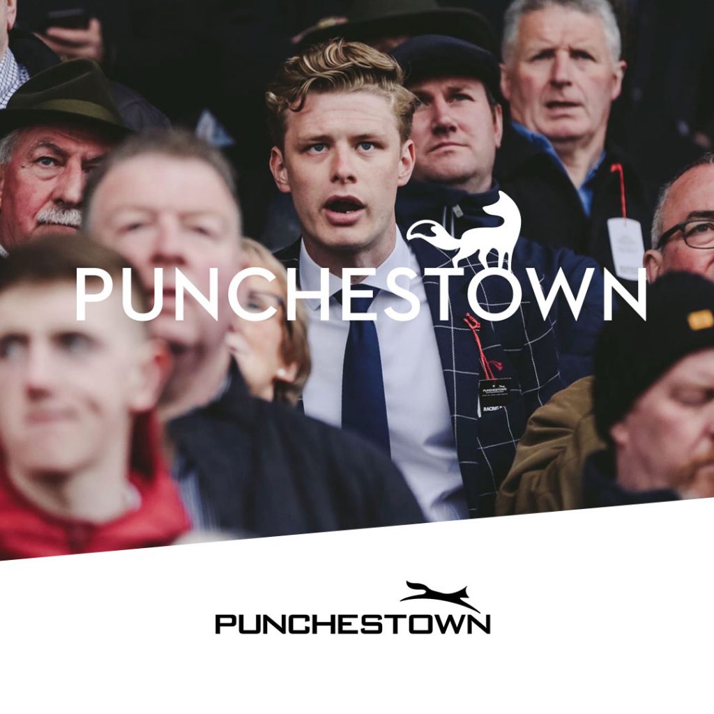
Today we are presenting a recent project: the creation of annual report concepts and design layout for the Irish Football Association. A project such as an annual report, is collaborative in its approach. Within this project our graphic designers liaise daily with both Marketing and Communications teams as well as the Finance department. Each party has a huge role and influence in the final decision. Working in a collaborative manner, we support such projects through to successful completion.

Creative & Engaging Annual Report Design

As graphic designers, annual reports are a key focus for many of our clients. These incredibly comprehensive documents historically would have been a large body of text supplemented with financial tables. While fine for those engaged in their creation, the information was sometime hard to follow and even harder to digest. We will work closely with you to truly understand your content and its intent.

With a strong brief and our ability and willingness to understand your business acutely, we will not only create beautiful designs. But an annual report that is engaging to all stakeholders.

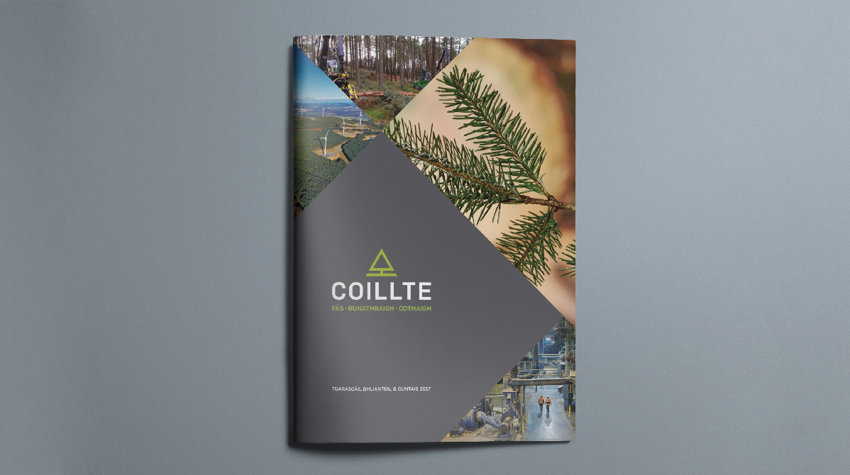
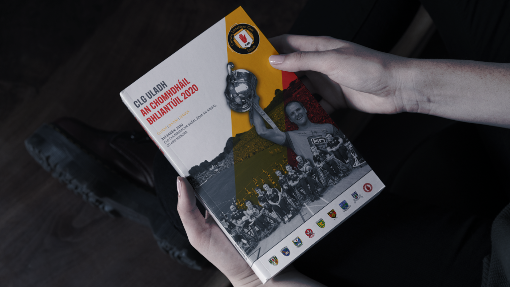
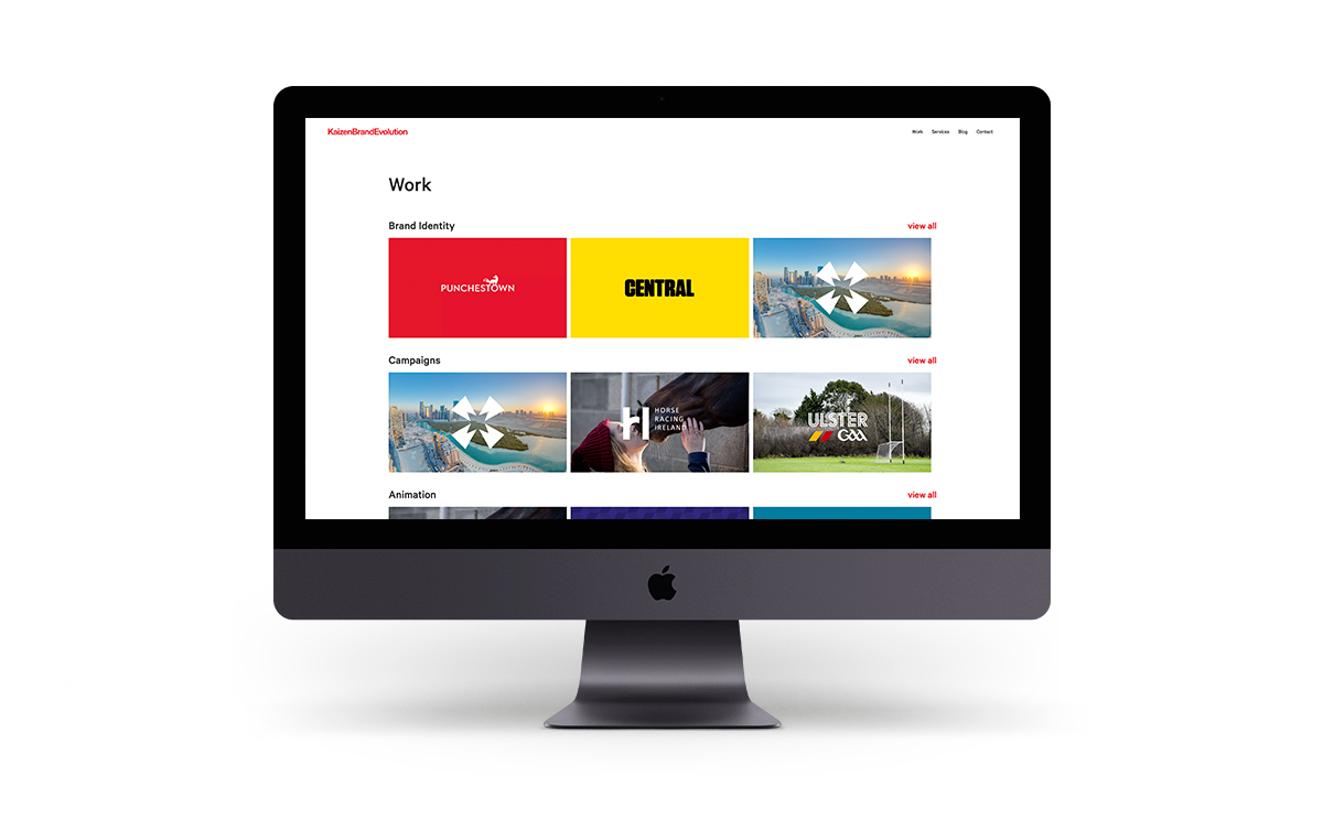
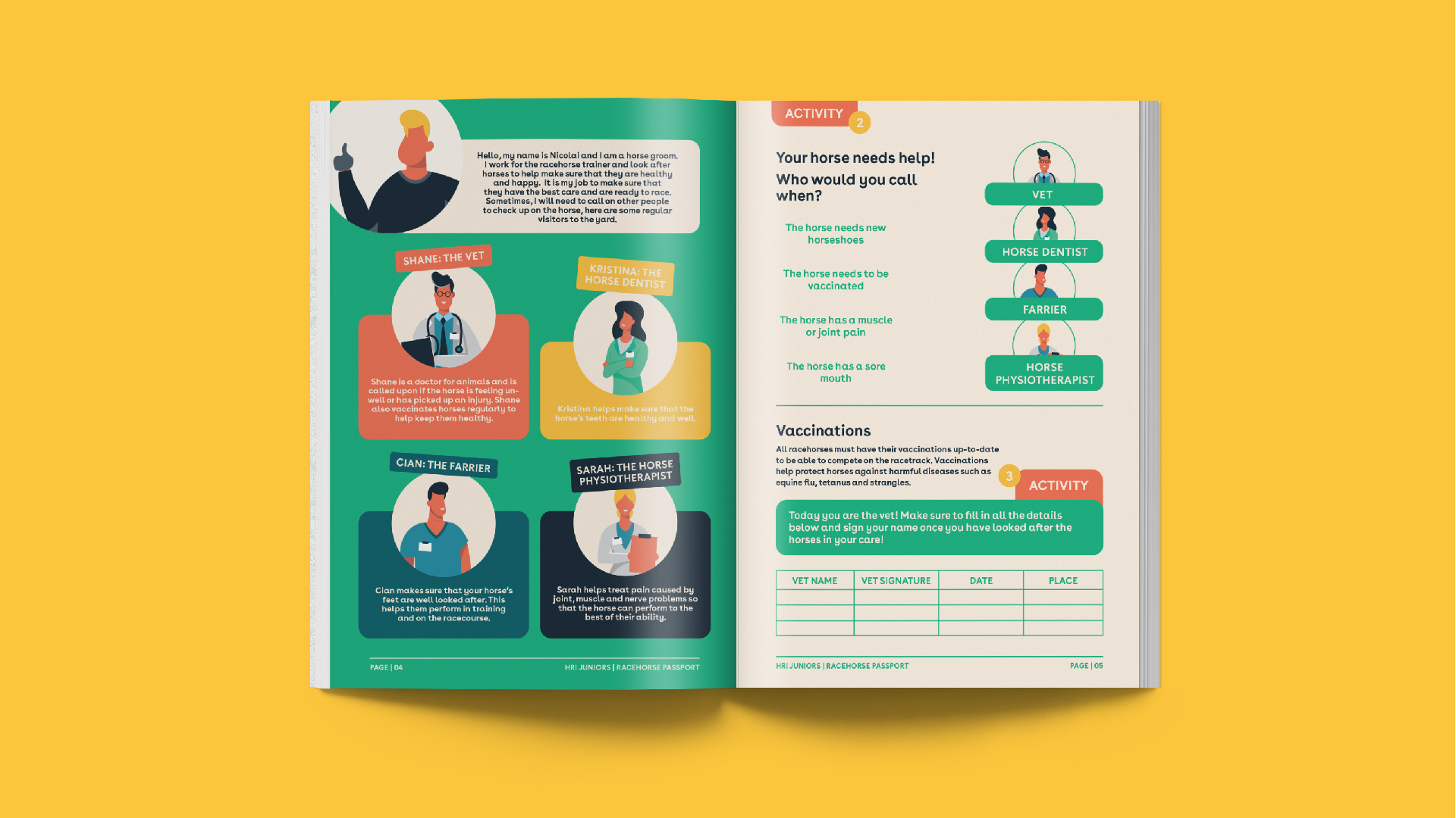
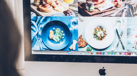
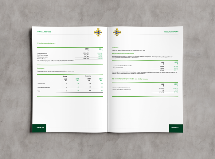
2020 Annual Report for the Irish Football Association

View the full Irish Football Association 2020 annual report design created by Kaizen Brand Evolution by visiting – http://www.irishfa.com/media/33993/irish-fa-2020-annual-report-and-financial-statements.pdf.

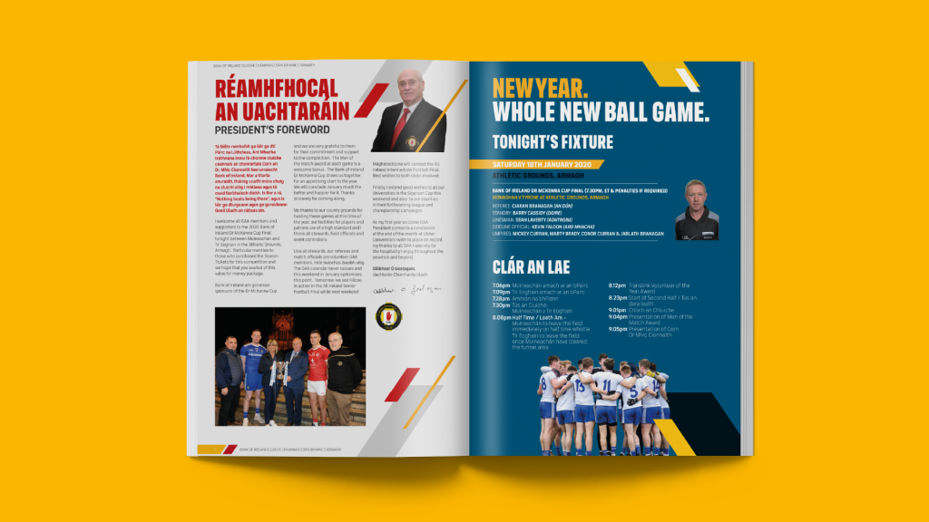
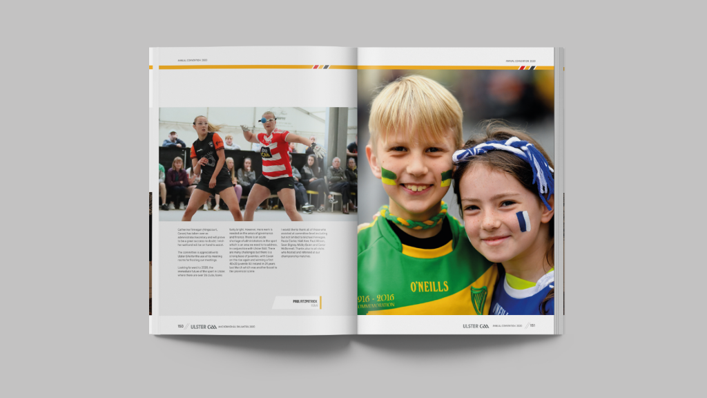
Alternatively you can view a selection of page spreads below. Within the designs presented below, we have shown a selection of pages from the 2020 annual report. This includes cover design, text and image led pages. We have also shown examples of financial data presented in tabular format.

Irish Football Association Annual Report Design - Kaizen Brand Evolution

Adherence to Brand Guidelines

Annual reports are not the time nor the place to go off-piste with regard your brand guidelines. As guardians of your brand, we will ensure we maintain strict standards around the design of your annual report. Where brand guidelines are not available, we will be delighted to create these for you. Or we can help create interim design structure to support the annual report design. This is often useful for our clients who are creating their first annual report with a design agency.

Organisations That Require Annual Reports

While annual reports may not cross your desk daily, they are required by law in publicly traded companies. Within private companies Directors prepare the annual report to ensure the keeping of proper books of account. These accurately disclose the financial position of the company. Organisations that may create an annual report include:

  • Public sector organisations
  • Publicly traded companies
  • Private companies
  • Charities
  • Local Councils

How to Design an Annual Report – Design Process

Creative Briefing

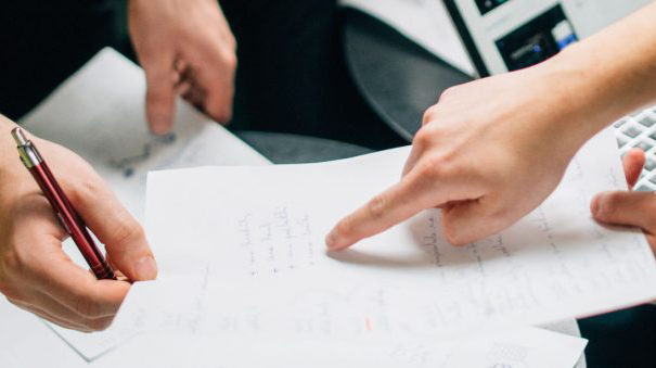
A great project starts with a great briefing process. Our client services design team members will walk you through the briefing process. We’ll provide a suite of briefing documents for you to complete (don’t worry they are very self-explanatory). Once we receive these, we’ll schedule a call to chat through the project further.

Supply of Content

Content is King!! Best practice would always be that we don’t start designing until we receive final content. However, we’re realists, and we understand that in the tens of thousands of design projects we’ve created, that this just won’t happen. What we do ask for is as close to the finalised copy as possible.

We’ll need all photography provided as high quality JPG’s at 300dpi and all logo assets supplied as vectors. If you have brand guidelines and fonts, please supply these also.

From the supplied assets we’ll build a project folder and ensure this is backed up in 2 separate locations.

Design of Cover & Spread

Armed with the brief and assets, we’ll begin designing. Depending on the level of design we are providing, we may present 1-3 concepts for your review. These concepts normally include the cover design, a spread to include text and imagery. On occasion, they may include some of the financial table design. We will work with you to provide the most relevant design concepts to ensure understanding from your Directors.

Approval of Concepts

We will present and explain each of our concepts, providing you with the PDF to share amongst your team. These will be refined if necessary and reviewed alongside our designers. On approval, the chosen concept will become the basis of the overall design.

It is at this point we need as close to final content as possible. A foreword or paragraph missing is no problem at all. However, all spelling and text amends throughout the document should be completed by this time.

Completion of 1st Draft

Within the studio our team will take the approved design direction, content and imagery and will begin to output the full annual report. This process timeline is highly determined on the length of the document, however it is usual for this to take a number of weeks. We will provide check ins as part of our overall timeline and will share work in progress during that time. We are happy to take any design changes in batches as artwork is presented to ensure the project continues at pace.

Author Revisions

We understand that these are living and breathing documents within your organisation. Some people will be brought in to review content throughout the process and this will create unforeseen changes. Within any annual report design project, we make provision in our timeline for author revisions and corrections. We will explain the process and costs within our initial consultation meetings.

Presentation for Print and Digital Distribution

On final approval of the report design, we will package the files up in the agreed manner. Most commonly for print or for digital distribution via email or placement on your server for download. We are incredibly well versed in all manner of traditional and digital media and will always use best practice in file delivery. Our sister company Kaizen Print may be able to assist in the print function.

Project Debrief

On completion of any large design project your client manager will arrange a post-project meeting where we can discuss the project in detail. We are always happy to discuss opportunities to better our service and learnings we can implement in future projects. Working with our clients over many years we have honed specific best practices for each client.

Start A Project With Us

To begin an annual report project with Kaizen, or to discuss how we might work together further, please get in touch. Our client services team are available to contact on 028 9507 2007. Alternatively you can send us a direct message via the contact form. We look forward to working with you soon!

Hiring a Logo Design Company – A Detailed Guide

A brand logo is possibly the most powerful marketing tool for businesses and companies. In fact, it is a crucial part of brand identity alongside the brand name, slogan, and theme. It has the ability to help businesses achieve their business goals and fulfill their vision within a targeted timespan. 

The primary purposes of creating a brand logo are to build brand recognition, increase brand awareness, and establish a trust factor among the people. However, a brand logo serves a company beyond these things. It plays the most crucial role in the growth of a company. This is why every company or business must have a powerful brand logo that can clearly convey its messages to potential audiences. 

Creating a logo design may seem a simple task, but it is very challenging. It is not just a process of designing specific shapes and combining them with attractive colors and texts, but it is much more than this. It is a strategic process comprising:

  • Understanding the business, its goals, and purposes
  • A comprehensive logo design research
  • Competitive analysis
  • Knowing what audiences love the most 
  • Understanding the market trends 
  • Planning a comprehensive marketing strategy 
  • Designing a brand logo 

When you think of designing or redesigning your brand logo, you have mainly got two options: do it yourself or hire a logo design specialist. We recommend you hire a logo design specialist as they can provide you with what you actually desire. 

Many logo design companies are out there, making it challenging for you to choose the right one. Well! We are here to help you. 

This comprehensive guide has listed seven important things that you need to consider before hiring a logo designer. Check them out below!

7 Important Things to Consider Before Hiring a logo design Company

A logo design company should serve the real purpose. They must meet your requirements and preferences. Check out the following considerations!

Reputation

Where does your chosen logo design company stand in the market? What do their past clients say about their services? Do they have their unique identity?

Finding the answers to these questions will help you know the status of your chosen logo design company. You can expect to get the best quality products and services from a well-reputed logo design company. 

Excellence in Graphic Designing 

Logo designing is a challenging task. Although you can create a logo using graphic design software, it is not possible to design a result-oriented brand logo without excellence in graphic design. 

A lot of factors matter for designing a perfect logo, such as:

  • Uniqueness 
  • Simplicity 
  • Timeliness 
  • Scalable 
  • Color Palette 
  • Memorable 
  • Targeted 
  • Clear Message 

So, make sure your chosen logo design company has excellence and expertise in all essential aspects of graphic designing. If they have certificates of excellence in their field, rewards, and noticeable accomplishments, nothing can be better. 

Experience 

Experience matters a lot. A company with years of experience designing brand logos and other visual designs for marketing purposes can provide you the best logo design services. They know a lot about the market, audience preferences, and creative techniques to design an attractive and result-oriented brand logo. 

They usually have a team of highly skilled and experienced graphic designers who ensure you get what you want eventually. So, we would recommend you to hire a well-experienced logo design or graphic designing company. 

Reviews and Client Testimonials

Checking out reviews and client testimonials gives you honest feedback about a company’s service quality. You should not skip this step as it is the most important part to know the originality of a company. 

It will help you know if the past clients enjoyed working with them and if they were satisfied with the final product. Moreover, evaluating clients’ testimonials and reviews will help you find if the claims and promises of a logo design company are honest. 

Make sure you go through this step, or else you will not know the originality of your chosen logo design company. 

Requirements and Goals 

You would have certain goals and requirements. Does your chosen graphic design company meet them? Can they provide you with what you exactly require? Do they meet your budget requirements? 

How would you find the answers to these questions? Well! Checking out their official website and talking to their business representative are the best ways to find the answers. If your chosen logo design company meets your goals and requirements, you probably have the right one. It would help if you continued with them. 

Time Required For Project Delivery 

You would have targeted a period to achieve your business goals. But, does your chosen company have the ability to deliver your project within your targeted period? Ask their business representative and check out honest client reviews; it will help you know the average time taken by your chosen company to deliver a complex project. 

Conclusion

All the considerations included in this guide are equally important. It would help if you kept all these points in mind before hiring a particular logo design company. 

In the end, we hope this comprehensive guide is informative and valuable for you. For more detailed information about logo design and print marketing collateral, stay in touch with us. 

What to consider before you rebrand

Sooner or later, every business feels the need to re-invent and rebrand themselves. Different businesses feel the need to do this for different reasons – a changing of the guard, a change of focus and direction, a change in business philosophy, or simply a need to refresh and revitalise a tired brand. So what are the key Rebranding considerations you need to think about?

Ten Important Rebranding Considerations Your Business

Who are we, and what is our core message?

Before you can sell your company to a consumer – you have to sell yourself to yourself. What does this mean? You need to decide what you stand for as a company, what your core values are, and how you wish to present yourself to consumers. Consumers can tell the difference between a company that has and believes in a core value system, and those that do not.

Look to the past before you rush into the future:

A business is like a family, and, much like families, are built on tradition. Resist the urge to throw out everything in your company’s past in a mad rush to modernise. Logos and overall tone of your re-brand needs to gently bridge the gap between the old and the new. You need to remind the customers of where you came from as a company, as well as were you want to go in the future.

Decide what is working and what is not:

A rebrand does not – and should not – be a wholesale re-do of everything that represents your company. Resist the urge to completely replace everything that you currently use to represent your company. For instance, if you have a tagline that currently works well and is truly representative of your company, there is no reason to get rid of it simply for the sake of having something new.

Be careful:

Carefully consider every element, such as logo, tagline, and core message that defines your business before making any decision to change or replace it. To the public at large, your brand is your business, and you need to resist the urge to recklessly change everything just for the sake of change. Reckless disregard for what works and what does not work is the one common thread that runs through every failed re-branding. The other common thread is the drive to simply throw out the out and embrace the new simply because it is new – and not because it is actually better or more representative of the business.

Be comprehensive in your rebranding:

Many businesses have no idea of just how many places in which their logo, taglines, and related brand messaging appears. All of this will need to be changed as part of any re-branding in order to be consistent across the business. For instance, if you are a retailer, you will need to change packaging, letterhead, billing materials, shipping orders, business cards – basically any piece of paper that contains your current logo or related branded message. This will also extend into any online presence, included websites, blogs, and social media accounts such as Facebook or Twitter. Best practice is to perform a comprehensive audit of anywhere your logo or related branding messages currently appear, and diligently check these items off as they are upgraded to the new branding.

Have a timeline, and stick to it:

A re-branding is a large, complicated project with a lot of moving parts. A properly organised re-branding can take months to carry out, much longer if there is no clear direction or sense of urgency. It is critical that before taking the first step that you lay out a comprehensive, all-inclusive timeline for your re-branding, and that you include definitive due-dates for every step of the project. Proper planning – and a commitment to stick to the plan – is critical to the success of any re-brand.

Research the competition:

Are your competitors doing a better job marketing themselves to your targeted market? Learn from their success. Decide what they are doing right, and see how you can apply that to your re-brand. Conversely, if you have a competitor who is not doing as well as they could due to branding or messaging missteps, learn from their mistakes, and exploit them in designing a better brand and better marketing message for your business.

Publicise your re-brand:

Tease your upcoming re-brand in the weeks leading up to your brand re-launch. Customers, and employees, need to be excited about the re-brand, and neither group is particularly fond of sudden, major surprises. This is particularly crucial if your re-brand is so extensive to make it difficult for customers to link the ‘old’ company and the ‘new’ company. For instance, if a customer logs into your billing system today to pay a bill, and the logo and interface are completely changed with no prior warning, you will quite likely end up with a very confused and angry soon-to-be-ex-customer. Building excitement and anticipation prior to the launch will make your customers feel like that are part of the re-branding.

Consider the consequences:

It is very important that you realise that not everyone will be as in love with your re-brand as you are. There will inevitably be backlash from customers who preferred your old branding, just as there will also inevitably be those who cheer the changes. You need to be prepared to ride out the consequences and give the re-brand time to gain traction among existing customers, potential new customers, and the public at large. At the same time, be realistic in your expectations – a simple rebrand is not going to suddenly double or triple your sales overnight, nor will it cause your company to immediately crash and burn. Give the re-brand time before hitting the panic button and making wholesale changes or roll-backs to the old brand element.

Characteristics and Fundamental Principles of Logo Designing

A logo is a quick visual representation of a company, business, or organization. It briefly explains the people about your company, products & services, and the benefits you provide to them. Simply and straightforwardly, it is a visual identification of your business.

It consists of various visual design elements, such as alphabets, symbols, shapes, colors, etc. The perfect combination of these elements creates an outstanding logo design that makes a long-lasting impression on customers.

Designing a brand logo seems like a cakewalk, but it is much more challenging than you think. It is a strategic process that includes:

  • Understanding the business and audiences
  • Researching to collect market data
  • Analyzing the market trends
  • Conducting competition analysis
  • Designing different elements of the logo
  • Combining all elements to create an outstanding visual representation

Typically, professional logo design services or a brand designing agency is responsible for designing brand logos. However, you can also create one on your own. But if you don’t have enough knowledge and experience of logo designing, your logo may lack clarity, effectiveness, and engaging elements that are a must to drive results. Therefore, it is the best option to hire a professional logo designer.

There are some fundamental principles of logo designing that a designer must follow while designing a brand logo. We will comprehensively discuss those principles in this writing piece. But before we move on to that section, let’s explore the different characteristics of a logo design.

What Are Some Different Characteristics of A Logo?

A brand logo has many different characteristics that play a crucial role in how people experience your brand. When you choose or design them correctly, people fall in love with them at the very first sight.

Here are some most common logo characteristics that you need to select and design correctly. Check them out below!

Shape- Each element of your brand logo is crucial for effective visual communication. When you choose or design them, make sure they complement your business type, objectives, and vision.

While choosing a specific shape, you need to keep in mind that every shape has a different characteristic, and all of them do not perfectly meet your logo requirements. You need to choose a specific shape that you want your brand to look like.

Size- Your brand logo represents your business in different channels, such as print marketing materials (letterheads, business cards, brochures, etc.), online platforms, and advertising banners. You cannot feature the same size of the logo in all these channels as their requirements are different. Therefore, it is always a good idea to have at least four different versions of your logo of different sizes. You can determine the different sizes of your logo based on the requirements of different channels.

Color- Color is the most dominating element of a logo. It helps you make a powerful impression on your potential audiences and influence them to associate with your interest. Just like shapes, colors also have different characteristics and emotional connotations. For example, Red is the color of blood, and it indicates urgency and alertness.

So, while choosing a color or a color palette for your logo, make sure you choose a color that conveys your emotions and messages to your audiences.

Typography- Typography refers to designs, styles, and layouts of text. It is equally important as the shape, size, and color of your logo.

First, create a line that has an in-depth meaning and conveys a powerful message to your audience. Then, you need to make your line impressive and pleasant to the eyes by making the best use of fonts, styles, and layouts.

Fundamental Principles

The fundamental principles of logo designing comprehensively describe how your brand logo should look and how it should be to your audience. Here we have mentioned the five most important fundamental principles. Check them out below!

Simplicity- Some people think that creating a graphic-loaded brand logo makes a significant impact on audiences. However, things are different. The more you add to your logo, the more complex you make it for your audiences.

Remember, a logo that gives your brand a clear message to your audience is considered the most impactful logo. So, keep your logo simple yet effective.

Memorability- People remember those brand logos that are visually awesome and give a clear message to them. Use complementary colors, designs, and other relevant elements and strategically place them to create a stand-out logo. It will leave a lasting impression on the audience’s mind, and they will recall your brand so often.

Modern and Timeless- Designing a logo based on the current trends is a great idea, but remember, the trends change from time to time. A movement is hot today, but it will run out of steam with the passing time.

So, before choosing a particular trend for your logo design, make sure it is timeless and perfect for the long run.

Complementary- All the graphic elements, including shapes, colors, texts, and designs, should complement each other. It is the most fundamental principle of logo and graphic designing.

Suppose you want to choose two different colors for the color palette of your logo. The color combinations like blue with red, green with yellow, and orange with yellow are the best options to choose from as they complement each other. Similarly, the shapes, fonts, and designs should be complementary to each other.

Balance- A balanced logo is catchy and pleasant to the eyes. It grabs people’s attention quickly and leaves a lasting impression on them.

Use the method of proportion and symmetry to create a balanced brand logo.

Versatility- A brand logo is used in many different ways on different channels, for example:

  • On advertisement banners
  • On print materials, such as newspapers, magazines, letterheads, etc.
  • On websites, blogs, and social media platforms
  • On caps, bands, and other wears
  • On clothes

A brand logo should maintain its integrity and serve its original purposes in all situations. It should clearly convey your message to your audiences.

The Importance of Good Website Design

When it comes to highlighting your online presence, there are several things that you need to put into great consideration. What does this actually imply to online marketers? Basically, the act of establishing your online presence does not simply end by just creating a basic website for your business and/or company.

Most, if not all, websites have gained success through their online marketing efforts by incorporating the right SEO tactics and constantly feeding it with the right elements. It may not provide you with instantaneous positive outcomes, but in due time, it will surely make progress.

The Importance of Website Design

There are numerous factors that lead to a successful online presence. There are various ways to look at the whole standing of your website as well. But before going on any further, let’s focus first on one of the most basic elements that make up your online identity — your website design. How exactly important is it?

The design of your website can either make or break the business you are trying to deliver. It actually makes a difference on how your target audience views your business or company and potentially turns them into your customers. As such, developing a website design that has an impressive user interface will result in a much better conversion rate, which leads to better business and revenue.

Key Elements to Consider when Designing a Website:

1. Navigation

This is essential especially when your website has so many pages. It basically includes a well-labeled navigation bar or a menu that shows a list of the different web pages. When the website navigation is developed well, users can easily explore and understand your website. It doesn’t need to have state of the art typefaces. Settle for a simple yet intuitive navigation that can make visitors come back for more.

2. Content and Visual Elements

These also include the choice of font and other typographic details. Such aspects of web design should go along together to deliver an accurate message to the audience. In most cases, readers tend to remember the message when it is concise and something that the readers can identify with.

However, overdoing these elements won’t bring any good to your website, Web pages with too much content will look messy and can affect conversion rates. How? Visually clutter pages may be difficult to read, resulting in disinterest in visitors and making them not wanting to come back.

To avoid that from happening, it is best to streamline the content wherein website designers can easily incorporate the text in their design. Moreover, designers are able to add negative or empty spaces that let the readers’ eyes rest in the middle of their reading.

3. Brand Uniformity

Your brand is what sets you apart from your competitors, and it is usually identified through a logo. If your business/company has a unique logo that is placed on all print materials, then all the logo’s elements must be integrated into the website design for the sake of consistency.

It is very important for your target market to recognise your business brand in all types of medium. If for instance, there are slight changes in your brand and visual communication, then it can result in confusion among your customers and make them feel that there is something wrong with your business.

4. Engagement

Web pages should have an exceptional layout so that they can appear more appealing to the users and make them want to engage with your page. It needs to feed people’s eyes because the truth is; this is where every engagement will begin. For this, the need of website design and development is an indispensable factor that should be measured carefully by every website owner.

5. Organisation and Search Engine Optimisation

Just like how we read a book, it is comfortable to read a web page from left to right, top to bottom. Virtuosi in web designing use the same reading pattern when they’re designing a website. Because most people read starting from the upper left area, designers put the most important information there. It increases the chances of relaying your message to the visitors who can become your customers.

Aside from the organisation, utilising the visible areas for the important website details can also improve the search engine optimisation or SEO. This happens when you incorporate business-related keywords in the HTML text. When search engines like Google, Yahoo, and Bing can crawl into your website, it results in higher search engine placement, which means your website becomes more visible and searchable.

In this digital age, most businesses have already developed their respective websites to become more accessible for their customers. With the help of website design, business owners are able to create a user-friendly and welcoming online environment where users can get useful information any time of the day.

Have a look at our web design portfolio here.

Why Motion Graphics Should Be An Essential Part of Your Marketing

For years, motion design and animated videos have been a fun way to inform and entertain customers and employees alike. Producing a custom animation that delivers your message can sometimes cost more than you want to spend. If you are on the fence about whether or not you should use motion graphics to tell your story, keep reading.  Here are the four main benefits of creating motion graphics videos.

1. SIMPLIFY COMPLEX INFORMATION

If you work in a highly technical industry or simply seek to explain complicated information, communicating with your audience can have its challenges.

Motion graphic videos are an effective way for content marketers to communicate this complex information and data-rich content in an easy-to-digest format.

Once your audience has a clear understanding of your information and process, they can make the connection between what your brand does and how it can fulfill their needs. This is essential to moving your audience through the sales funnel.

Motion graphics can make learning new information exciting. The dynamic nature of the content draws your audience in and keeps them focused—which helps with retention of the information.

2. INCREASE BRAND AWARENESS

We all know that brand awareness is key to driving conversions. In a market that is highly saturated with content – standing out from the crowd can be challenging. After all, if someone has never heard of your brand, how can they be expected to convert?

Put simply: motion graphics are memorable—and that drives brand awareness.

While live action video is a great way to engage your audience, there can be limitations to how much you can incorporate your brand messaging without it feeling like overkill, or too salesy.

Motion graphics, on the other hand, can be easily altered to fit the needs of your different audiences—all while keeping your branding and core messaging consistent.

3. COMMUNICATE WITHOUT AUDIO

These days we find ourselves putting subtitles on just about every video designed to hit the social media airwaves. Often when viewers are scrolling through timelines they do not want to be bothered with audio.

Creating motion graphics using text is a way to communicate via video without having to subtitle your images after the fact.

By designing the video to use text from the start you will be able to elevate the design and ultimately create a more compelling video.

4. UNLIMITED CREATIVITY

Paramount to all of the above, motion graphic videos allow you to truly tap into your creativity. You can create any scenario you wish with unlimited parameters. And, in a world where budget plays a role in the creation of any video, motion graphic videos tend to be more forgiving for a lower budget.

In essence: With motion graphics you get what you pay for. But you don’t have to spend a fortune to create a video that communicates your message.

Whether you’re telling a story, sharing interesting data, or explaining complex subject matter, motion graphics provide endless possibilities in representing your brand.

At Kaizen Brand Evolution,  we’ll help you create the right video for your brand.  Click here or give us a call to start your motion design project.

VIEW OUR PORTFOLIO OF MOTION GRAPHICS HERE.

Why having a good logo design is so important

What is a logo? A logo design is a combination of text and visual imagery that serves two purposes. It tells people the name of the company and it creates a visual symbol that represents your business. Some logos have powerful symbolic associations connected to people’s memory. For example, the McDonalds golden arches are so familiar that they no longer need the text “McDonalds” for you to recognise that that symbol represents McDonalds.

Having a professional looking, well designed logo builds trust. Potential customers are more likely to do business with you if you have a well designed logo. If your logo looks like it was designed in Microsoft Word, people will question how well you are able to deliver your core business products/services.

Key Elements of a Good Logo

Make the text part of your logo super clear and readable

When you’re starting out with your logo, one of the most important characteristics is that the text of your company name is clear and easy to read at a distance, as it may appear on vehicle signage, building signage, posters or some other place where the logo is seen at a distance.

Use it consistently

When brands get a logo designed they often prepare large brand standards documents, dozens of pages deep, covering things like:

  • Guidance on the different variations of the logo and where they should and shouldn’t be used.
  • Guidance on modifying the logo and what shouldn’t be done to the logo.
  • What should and shouldn’t appear nearby the logo.
  • How the logo should appear in all sorts of different scenarios.

Although this level of documentation may seem like alot, it means that your company understands that if brands are inconsistent in the way their logo appears in different situations, this can be damaging to trust.  So be really consistent with how your logo is used.

When we create a logo for you, either for a logo design project or as part of a larger branding project, our team at Kaizen Brand Evolution will provide you with brand guidelines that outline and demonstrate how your logo should be used. 

Simple colours – think about the different situations it will be used in

Your logo might appear on screens, business cards, letterheads, pull up banners, vehicles, shop signage, product packaging, newspaper adverts just to name a few.  Logos that have gradient colours, lots of fine detail, a lot of different colours or photographic content are much more likely to look quite different in these different situations as many of them use completely different printing technology and it makes it difficult to match the colours exactly.  This is why the most powerful brands in the world usually stick to a simple palette of less than 3 main colours.  They also use solid colours rather than gradients.

Have something visual/memorable

While it might take you a few decades to become the next Coca Cola or McDonalds, having something memorable about your logo is a good idea.  Some businesses do this by using interesting text or modifying part of the text in the logo to not just be a standard font.  Other businesses do this by adding some sort of illustrated icon alongside the text part of the logo.  One useful aspect of having an icon is that you can use the icon on it’s own in some situations as well.  For example, the Nike tick can appear with the Nike text or without.  While originally the Nike tick would have meant nothing if it didn’t appear alongside the Nike text, over time that visual memory association has developed.  If you’re wanting a very sleek, minimalist logo, just using a modern looking font with a pop of accent colour is a good option.

How do I get a logo?

The best way to get a logo is to have it professionally designed.  Although there are online logo design services, from our experience the best value and service is from graphic design studios, like ourselves. At KBE, we are lucky because we have a print team downstairs, so we can roll out your new logo design on printed materials. This also helps you nail that brand consistency.

Tips for choosing a designer and getting the best result

Make sure you view examples of their previous work — and you like what they’ve done previously.  If they have a large portfolio of great looking logo design examples, you can be more confident in their ability to design you a great logo. 

Importance of PowerPoint Pitch Deck For Startups

Establishing a startup business is just like turning dreams into reality. Many entrepreneurs have a business idea in their minds. Some of them are pretty sure about its success, but they cannot dare to turn them into reality due to lack of funds. Apart from having money, you have to be determined for your dreams. And once it works out in your favor, your startup will flourish, creating an excellent brand image.

If you can’t support your startup financially, raising funds from investors is another way to keep your new business up and running. Though it is a time-consuming and challenging task, but it is crucial for every startup that is actively looking to establish value through a pitch deck. It is the best way to articulate an interesting and compelling story. Before discussing the significance of the PowerPoint pitch deck for startups, let’s know more about it.

What Is A Pitch Deck?

It is a 10-20 slide presentation designed to give a brief about your startup, its plan, and its vision. A pitch deck doesn’t serve a single purpose. It serves different purposes varying from trying to impress a new investor to telling an audience about your startup on a stage and others. Though creating a pitch deck and its structure could vary, the intention will be the same: introducing or making the people aware of the company, no matter whether they are the investors or normal audience.

You have to make sure that your pitch deck should be more visual and contain a little text. Considering graphics and images is important as they are easily remembered. Your viewers can easily see it from far and can relate the things with the image while telling and informing them about what you have presented in the slide. Even if you have to email your pitch presentation to your clients, make sure it is self-explanatory. If you really wish to see a positive response to your startup pitch presentation, you can also take professional help. Many printing and designing companies offer pitch deck design and development services. They help develop a great pitch while ensuring it has all the ingredients to help you get to follow-up emails from investors and clients.

What Are Important Ingredients Of A Perfect PowerPoint Pitch Deck Presentation?

We have shared some important elements that should be there in a successful pitch presentation. The elements we have mentioned are suggested by authors, venture capitalists, startup founders, and evangelists. These include:

  • Problem
  • Solution
  • Product
  • Market Size
  • Business Model
  • Underlying Magic
  • Competition
  • Better/Different
  • Marketing Plan
  • Team
  • Traction / Milestone  

Experts believe that producing a compelling pitch deck requires special skills other than slideshow skills. You must know how to create great designs, aesthetically pleasing slides, accurate market estimations, and overall market dynamics. All these are good enough to start creating a pitch deck if you are doing it by yourself.

Given below are some critical elements of a great pitch deck. If you choose a professional to create your startup presentation pitch, they will ensure that all these elements are there in a pitch deck to make it worthwhile.

  • High-Intensity summary slide: You can create one or two slides for this. These will be opening preliminary slides that highlight your startup business. These slides seize the quintessence of your business story. You must include those points that you would want to communicate to the audience.
  • Mention The Problem You Will Be Solving: You need one or two obligatory slides conveying the nature of the market along with the opportunity you address with your business, its products, or services. All you need to do is highlight what is missing or not working. If possible, make sure these slides include information that clarifies that buyers are spending real dollars on imperfect products. Most of these products do not adequately address their needs.
  • How Your Product/Service Can Help: After duly demarcating the problems faced by your target audience, the following slides should be about you and your business. First and foremost, describe how your products or services can provide a solution for the unmet market demands. You have already described in the preceding slides. This slide should highlight how your products or services are different. Make sure these slides leave no holes in your story. In short, there should be no questions that remain unanswered.
  • Marketing/strategies: By this time, your audience will be impressed with your product and business model, proactively enunciating a go-to-market strategy. The reach of these slides will more or less depend on your development stage. However, it should clearly exhibit your thoughts about how to roll out your startup business and how to capture market share.
  • Financials/projections: When you are a startup, the number in your projections typically doesn’t matter in the early stages. However, assembling a set of thoughtful predictions on both the revenue and cost sides significantly augments your authority with potential investors. While your audience may feel projections are impulsive in assessing the business. Your audience will appreciate that you understand financial metrics and how to maneuver a successful business.

Always keep in mind, when pulling together your pitch deck presentation, you must consider the tone you want to express. Be inventive. It will help if you avoid dry and boring presentations. You must show some personality as it will help you have a winning combination. If you think creating a pitch deck is not your cup of tea, you must hire a professional agency.

How to Make High Impact Design for Billboard Advertising

Billboards have always been very important in the world of advertising primarily because of their extensive reach. Even with the growth of technology and online marketing, the billboard continues to play an important component as a marketing tool. As a physical marker that thousands of people can see daily, it can hold great potential in exposing your company and product to potential buyers–if designed properly. 

This is already reason enough to ensure that the amount you would be spending would eventually translate into meaningful sales conversions. Here are some of the key considerations when creating a high impact design for billboard advertising.

Use a Sensible Story to Deliver a Message

Your billboard design needs to have a story in order for it to be memorable for everyone. To determine which story to use, try thinking about something that you would want viewers to do whenever they see the ad. Do you want them to stop at your next branch and eat some steaks? Do you want them to remember your brand whenever they go shopping for clothes? You can come up with a good and sensible story based on the message you want to deliver.

Stories are important for billboards because people are actually good at recalling them but are bad at recalling facts. As a visual medium, the next thing to do is to find out what text and images to use in order to deliver the story. Being strategic is key when creating a good design. To make an impact, you need to use a fun but short word play. Short rhymes are helpful in making people remember the message. If you need help to find the right story for your next billboard, contact any leading media and marketing professionals in your area for some very reasonable billboard prices.

The Message Should Be Safe and Short

Keep in mind that the billboard will be seen mostly by drivers, passengers and passersby. On the average, they only have around five to 10 seconds to look at the text and design and understand the message. This is the main reason why the message should be kept short. Try to limit the words you will use to only 7 words max.

Ensure Text Readability

With such an enormous layout, it is very important that the design text of your OOH advertising is highly readable. Use a large, bold and clean font for an enhanced readability. By doing so, the viewers can have more time to read and comprehend the message better from afar.

The More Colourful, the Better

In order to draw more viewers in an effortless manner, it can help to include a bold image and bright colours in the design of your billboard advertising. The use of colour contrast can produce an even greater effect and is very helpful in message retention. For the background, it needs to be simple so as not to compete with the foreground for attention. Additionally, the use of a single large photo or image is better in creating a greater impact than the use of several images.

Make it consistent.

It is easy to look at a billboard and think of it as a clean slate for another marketing plan, but think of how your billboard design fits your larger marketing puzzle: is it consistent with your overall marketing strategy and company branding? Does it match similar advertisements in newspapers, magazines, online, or on TV? Sometimes the best billboard designs allow audiences to remember it in relation to your logo or brand in another context. Having the continuity between your different advertising outlets is just as important as the advertisements themselves.

The Importance of Branding For Small Businesses

When we speak about brands or branding, the temptation is always to think very big. To think that brand focus is a practice reserved for globally recognised entities. The Coca-Cola Brand, The McDonalds brand, Apple branded products. The very term can conjure up visions of unattainable recognition and grandeur. This may be the reason why many small business owners do not see the importance of branding, and do not invest their time and efforts into getting it right.

However, this should not be the case. Effective branding is absolutely crucial for businesses at every level of the pyramid. From the global powerhouses to the smallest of sole traders.

A brand is what identifies your business to consumers and distinguishes you from your competition. This includes visual elements such as the colours and logo. However, brand is so much more. Your brand can guide all of your business’s activities.

Once translated into one dynamic package, branding speaks to your audience and communicates exactly what you represent as an organisation. But why is branding so important, even for those smaller businesses without a large audience?

Being Memorable

Customers enjoying a positive experience with your product or service is great, but this has to be married with recognisable branding. If your branding does not effectively differentiate your business from the competition, highlights what makes your business amazing and capture the minds of the audience, then your hard work delivering an experience can be undone. You need to be memorable. And for all the right reasons!

Culture and Building Teams

Strong branding is key for small businesses when building and growing a culture. A clear and consistent brand allows a workforce to understand just what it means to represent that organisation. It creates a focal point for emotional investment and something staff can really get behind and believe in.

When constructing a brand strategy, we will set out a list of brand values which best represent their business and what they aspire to be like. These are guiding principles which direct all of an organisation’s activities. From effecting external communications to who you employ.

Consistency Across the Board and Effective Marketing 

Brand influences every action taken by an organisation. No matter the size or scale of the business. Consistent brands are far more trustworthy to consumers. If a brand is inconsistent with its messaging then this will confuse the audience, leaving them uncertain of your offering.

So, when putting together a marketing campaign you must ask yourself, “Does this convey what we want to represent as a brand?”.

Why Creating A Powerful Brand Identity Is Important For Any Business?

Like an individual whose personal identity makes him unique, similarly, a brand identity is vital for any business that sets it apart from competitors. And brand identity design is something that reflects the identity of any business at its best. Therefore, if you are running a company, no matter big or small, brand identity is something that you cannot overlook. 

Before we discuss how to shape a strong brand identity to take your business to the next level, let’s first determine what brand identity is and what it has to do with the design. Also, we will discuss the role of a brand design agency and the different ways they use to help any business develop its unique yet positive identity! 

What Is A Brand Identity?

 It is an outward expression of a brand that comprises different elements such as name, trademark, communications, and visual appearance. These elements together represent the right image to its customers. Brand identity is different from “branding” and “brand image.” Branding refers to the marketing practice that lets you actively shape a brand, and brand is the company’s insight in the eyes of the world. It is a way to communicate with the world and differentiate your company/business from your competition. You have to create a brand experience that inspires your audience to engage with you. They will associate your brand identity, your products, or services. This will help you build customer loyalty.

What All Is Included In A Brand Identity?

Many business owners think that a nicely designed logo and a website can help them make a brand identity. But this isn’t true! When designing an identity, you need to develop a comprehensive visual language that applies to everything from your business website to your product packaging. Your branding needs may be expansive and vary based on your brand, but a basic brand identity consists of:

  • Logo
  • Colors
  • Data visualization
  • Design System
  • Iconography
  • Illustration
  • Interactive elements
  • Photography
  • Typography
  • Video and motion
  • Web design

Remember one thing that your brand identity should translate across channels, so make sure you include everything you think it must have.

How to Build a Brand Identity?

 If your brand is new or you are planning to rebrand, but you are unsure where to start, below are some steps to follow. These steps can help you build a strong brand identity seamlessly.

Step 1: Complete Your Brand Strategy

Step 2: Dig Into Your Existing Brand Identity

Step 3: Know Your Identity

Step 4: Recognise Your Competition

Step 5: Pen Down Your Creative Brief

Step 6: Brainstorm Your Visuals

Step 7: Design Your Elements

Step 8: Build Your Brand Style Guide

Why Is Brand Identity Important?

There are several reasons why one should focus on creating a good brand identity. Some of these reasons are:

  • Personality: A brand identity is the visual illustration of your brand’s principles and “personality.” You can set the tone of your brand with identity design which can be used to induce certain emotions into your audience. You should design your brand identity in such a way that it communicates your overall business message and promotes your business goals.
  • Uniformity: When you build a brand identity, you will create a consistent message across all marketing resources. Each piece should have a similar basic style and design features, creating a unified branding suite.
  • Differentiation: A brand identity lets you differentiate your business from the competition and properly position your brand. Developing a professional, creative identity design can help you outshine your potential customers in your marketplace.
  • Cognizance: Creating a brand identity package guarantees that your brand is at the front position of all your marketing materials. This will help you increase your brand awareness. The more places your brand is featured, the higher the chances it will make contact with consumers. This will make it more memorable.
  • Reliability: A compelling brand identity can help you build customer allegiance and faith in a brand since it lets customers connect to a product and the company.

What Should You Do To Build A Strong Brand Identity?

 Know who you are! Yes, it is most important that you must know who you are as a brand which is made up of a few important things such as:

  • Your mission – what’s your and “why.”
  • Your values – what opinions drive your company?
  • Your brand identity – if you consider your brand as a person, then what kind of personality would they have?
  • Your unique positioning – how are you different from your competition?
  • Your brand voice- if your brand is a person, how would it communicate?

 These are a few elements that define your brand. Before you start building your brand identity, you must clearly understand each of the above-mentioned elements.

If you find it challenging to figure out who exactly you are, don’t sweat it. Brainstorm to help you get clarity on who you are as a brand. You need to ask a few questions to yourself:

  • Why did you start this business?
  • What beliefs and values are important to you as a company?
  • What should you do to be better than anyone else?
  • What makes you different?
  • If you could describe your brand in three words, what would they be?
  • What are the three words you would want your customers to use to describe your business?

Once you understand the significance of brand identity and get the answers to the above questions, you are ready to develop your business identity. You can also take professional help by hiring a brand design agency like Kaizen Brand.

A Complete Guide To Design Your Brochure

When we think of traditional printed marketing collateral, Brochures are the first thing that comes to mind. Brochures are an integral part of marketing for a company despite the growing popularity of various online marketing tools. With brochures, we can capture the attention of potential users. A brochure with captivated visual effects proves to be the most effective as it contains product-specific information. Your brochure or booklet focuses on the business and services. With the help of best brochure design, you can bag the undivided attention of your customers, unlike producing a product advertisement in magazines and newspapers. Moreover, a brochure is a cost-effective way for a small and emerging company having a tight budget. 

The objective of printing a brochure;

  • The ultimate aim of effective marketing campaigns is to emphasize customer interactions. Likewise, brochures are another way of interacting with customers. Ensure that your printed brochure should have an interesting pitch, precise information, appropriate graphics, and a call to action.
  • In addition, if we compare reading content from emails or websites to a printed brochure, it is far easier to read from a brochure. Brochures are versatile pieces of information utilized for promoting more or less all sorts of products and services and different venues like reception desks, academic events, and any other promotional event in that matter. 

By now, we have become familiar with the power of a brochure. But choosing the best brochure design and fold to get the perfect result is a real deal! Because there are different types of brochures available in 6 folds.

Let’s take a look at some compelling brochure folds-

  • Gatefold Brochures – This type of brochure is durable as made up of premium quality paper. Gatefolds are for high-end marketing. However, its unique feature of inward folding makes it compact, and thus, it becomes easy for a person to carry around. It has an 8-panel structure with adequate space for describing your product and services. It also contains complementary images. 

The other specification of a Gatefold is –

  1. It has graphics-heavy designs and menus with comprehensive visuals like landscape images and architectural layouts.
  1. Its standard size is 8.5’’ * 11’’.
  1. A Gatefold is also known as the Window fold. It usually works great for a single product presentation. The width of its central panels’ measures doubles from the side panels.
  • Bi-Fold Brochures- The extended version of the Bi-Fold brochure is a booklet. A booklet contains multiple pages, and it looks more like a magazine. However, as the name suggests, the Bi-Fold brochure has 2 folds that form 4 panels. It consists of- two internal panels, a front panel and a back panel. You can describe your product and brand in the space given on the inner panel. It is the most conventional type of brochure as it contains more space for product description.

Its other specifications are – 

  1. It is inclusive of a single sheet of paper. The single sheet of paper gets to fold twice and is also known as the Half Fold.
  1. The standard brochure size is similar to the GateFold, that is, 8.5’’ * 11’’.
  1. It suits best for manufacturing product sheets as they have rich content, specs, and photos. Also, it is convenient for simple product presentations, pricing, programs, city maps, and real estate offerings.
  • Tri-Fold Brochures– These brochures are the next version of bi-fold brochures as it contains 6 panels. The Brochures with more panels contain more information. Because of this feature, Tri-fold brochures seem to be the muse of most large organizations. 

Some other specifications are-

  1. Since it has 6 panels, a single sheet is divided into 3 folds, as the name is suggesting. The three sections of the brochure will be outside, inside, and both zipped.
  1. Its popular sizes are 8.5’’ * 14’’, 11’’ * 17’’, and 11’’ * 25.5’’. 
  1. It does not contain many visuals hence is used for a simple product presentation. 
  • Flyers and leaflets- These brochures are different from other brochure formats. They are generally used to target a large audience. Flyers and leaflets are single-page brochures used for small-scale marketing. However, they are predominant as they reach many people. If you consider them a part of your promotional campaign, make a distinctive design to create the difference.

Other specifications are- 

  1. Its standard size is A4. 
  1. Either you hand it out to your target audience or insert it with print media( newspaper, magazine)
  1. They are one of the most effective ways to promote your product. These leaflets contain product information and announcements only.
  • Folders and Inserts- If you want your event, conference, or exhibition to gain attention, then folders and inserts are the best way to advertise your enterprise uniquely. These brochures have an appealing feature of folders within them. Further, the printed sheets that contain information about the topic go inside the folders and are called inserts. 

Other specification-

  1. You can insert feedback and free coupons in the folder as well. They are considered ideal and credible for presenting business material. 
  • Z Fold Brochure- This brochure, as the name suggests, folds like the letter ‘Z.’ It has a 3-panel zig-zag fold, exemplary to show lists, user manuals, and technical specifications. 

Other specifications-

  1. Since it is a 3-panel fold, it folds using the document folding method that includes two parallel folds to create six panels(three panels on each side). These six panels have equal sizes. 
  1. The way this brochure fold gives an aesthetic appeal, like the Accordion! Its 3 panels have ample space to write about your product.

Well! By now, you are aware of the types of brochure fold you will use for your next campaign. But what about the design? It is crucial to give attention to your brochure design as the perfect design will enhance the appearance of your brochure.

Here are some of the best brochure design tips- 

  1. Do not try to infuse many colors. Although your brochure should look appealing, a simple color correction can make you achieve the target. Always use brand colors to design the brochure.
  2. Try not to use an artistic font. Too artistic an approach for a font would spoil the readability. And eventually, that can lead to a blunder. Choose a classic style of font to give an appealing look. 
  3. Put graphics, images, and illustrations in an equal proportion. Too much of any one thing will spoil the visuals. 
  4. Always add the Call-to-Action! Do not ever forget that.

Although, if you need a little professional help, take help from Kaizen Brand Evolution! We have expertise and knowledge of the brochure designs and folds. 

Brochure Websites – What are they and their benefits.

Moving your business online is an obvious step for most people, but choosing the right type of website for your business is another question. 

Brochure Websites and EComm Websites couldn’t be more different. And so choosing the right one for your business is essential. 

In this blog post we will endeavour to outline what a brochure website is, what companies they work well for and finally, the advantages of using a brochure website.

What is a Brochure Website?

A brochure website is what you would call a static website in terms of content. This means that site content does not change much, if at all. This kind of website usually has a small number of pages and these pages are structured on one level, only rarely utilising a hierarchy of subpages.

A brochure website is useful when there is something you want to share with the world outside. This could be a small business, a start-up, yourself (think of a CV or portfolio), a future event, something you sell (e.g. a house or some second hand items from your attic), etc. Your first objective is to make something known as soon as possible, first to a circle of people you know, then to a broader target audience. With a brochure website you can’t go wrong; Populate it with clear information, compelling text and photographs and you have a quick, successful receipt of how to promote your business or event.

The Benefits of a Brochure Website 

For some businesses, an eCommerce website just isn’t appropriate to your business model, as a professional web design company, we understand this. If you’re interested in a website that will promote your products/services but you don’t want to integrate an eCommerce platform into your website, here are a few reasons why you should opt for a brochure website.

  • Almost Everyone Is Online – A simple reason, but still nevertheless true. We live in a generation where almost every business has a website. If your business doesn’t have a website or if your website is poorly optimised or is sparse in content, you’re missing out on a range of opportunities.. 

  • Advertising Opportunities – It’s similar to a billboard advertisement, only it’s sitting in the most high traffic area in the world, search engine results pages. By claiming your online space, you’re gaining a lot of publicity.

  • Open 24 Hours A Day, 7 Days A Week – Unlike other forms of getting information. The internet is always open. This is fantastic if you’re looking to expand your audience. The internet is always open and can be everywhere at once, enabling you to reach a much larger audience. 
  • Ideal For Service Focused Businesses – Often many businesses provide services, some of these can’t be easily sold through a simple online transaction. Often the service you provide is different for every customer and one size fits all approach just isn’t appropriate for the type of services you provide.  This is where brochure website design really shines.
  • Easier To Update – A brochure website is very easy to maintain, unlike a static website. The content is easily updated. Which means you can very easily (with the assistance of a skilled copywriter) optimise your website for search engine results. 

    We live in an age of information. Brochure websites, being very simple to update are a great way to share information with your customers. Search engines like Google, Yahoo and Bing love it when websites frequently share relevant information. They want to provide a good user experience for both businesses and consumers. The nature of a brochure website makes it a great candidate for various digital marketing techniques. 
  • Far More Effective Than Social Media Alone – Whilst social media is a fantastic way to boost your online presence, you might not see that directly translate into sales. Social media is all about interacting with your audience and brochure websites are about informing your potential customers and converting them into customers/clients. 

    This means that a brochure website and social media can combine into the ultimate engage and inform combo. Social captures their attention, whilst the brochure website gives them all the information they need. Ideally, the potential customer then thinks “wow! What a great business” and calls you for a quote or purchases your product from a retailer. 

Step-by-Step Guide to Evolve Your Business as a Brand

Creating a brand identity adds value to your business. It contributes to building powerful recognition, credibility and boosting sales and revenue generation as well. 

However, creating a powerful brand identity is not a cakewalk, and it doesn’t happen overnight. It takes several months and sometimes years. 

Some people think that branding is all about creating a powerful logo and other branding elements combining text, colors, and some attractive graphic elements together. It is not true! Branding is much more than just about creating some attractive visual elements. It is a long strategic process that consists of:

  • Comprehensive market research
  • Competition analysis
  • Strategy-making
  • Business analysis
  • Setting up business goals and objectives
  • Designing branding elements using graphic designs 
  • Combining branding elements together to create a presentable brand identity
  • Launching and promoting brand 
  • Maintaining brand value 

It requires a lot of effort and a relevant set of skills to proceed through the brand-making process and successfully complete it. Typically, this strategic process is done by professional brand designers or brand designing agencies. For better results, it is a great option to hire their services instead of trying to design your brand by yourself without having a relevant set of skills and experience. 

Here we have comprehensively defined the step-by-step process for creating your brand identity or evolving your business as a brand. Check out the guide below!

Comprehensive Market Research and Competition Analysis

Conducting comprehensive market research and competition analysis gives a broad idea about the market trends, demands, and scope. This further helps in making powerful result-driven strategies for designing a brand. 

Before making any decision on brand designing, dive deep into the market data by conducting comprehensive market research. The market data will help you find out the answers to many relevant questions, like:

  • Who are your top competitors?
  • Who are your target audiences?
  • What customers love the most about the product or service you offer to them?
  • Which type of product has broad potential in the market? 
  • Which is the best-selling product?
  • Which time period is ideal for boosting sales?

There are many ways you can find the answers to these questions. Some of the most effective ways are:

  • Taking professional assistance from a reliable brand designing agency
  • Browsing on the web 
  • Conducting offline and online surveys 
  • Interacting one-on-one with potential customers or interviewing them
  • Collecting data from social media platforms
  • Buying customers’ data from data selling websites or companies

A couple of things that you must take out from your research are: 

Lowest-Hanging Fruits- The lowest-hanging fruits refer to those potential customers to whom you can sell your products and services easily. 

Your Real Competitors- There will be many companies that deal with the same products and services you deal with. It is not necessary that all of them are your competitors. Your real competitors are those brands and businesses that are well-established and well-known in the market. 

Interest- The interest of your potential audience: which type of product and quality they like to invest in the most. 

Developing Brand Building Strategies 

Before designing branding elements, such as a logo, business theme, and punchline, it is essential to develop effective branding strategies. With branding strategies, you can smoothly and hassle-freely proceed through the entire brand-making process and develop a really powerful brand identity for your business. 

The data, stats, and information collected from the market research will help you develop powerful branding strategies. 

For making effective branding strategies, you need a team of highly skilled and experienced strategists, market analysts, and graphic designers. 

While making branding strategies, you need to keep a couple of things in mind, such as:

  • Your branding strategy will guide your entire brand-making process. You should develop it considering all the factors in mind. If anything goes wrong with your strategy-making, it will affect the entire brand-making process. And maybe you do not get the desired results eventually. 
  • You should design your branding strategy sequentially so that it helps in smooth proceeding through every step of the entire brand-designing process. 

Designing Branding Elements 

A brand or brand identity is made up of various tangible and intangible elements, including:

Visual Design Elements- A business logo, name, corporate design & color, background pattern, text, tagline, labels, packaging, etc.

Features- Sensibility of design, relevancy, balance, personality, quality, and the message. 

These branding elements play the most important role in evolving a business as a reputed brand. They must be designed carefully. 

While designing visual design elements, you have to ensure that those elements should clearly convey your message to your potential audiences. They must be compelling and engaging enough to leave a huge impact on your potential audiences and influence their decision-making. 

Your business logo, corporate design, and tagline should complement each other and be relevant to your business. They should have relevancy, design sensibility, and define your business personality. 

For designing compelling and engaging branding elements, it would be a good idea to hire a branding UK agency as they are specialized in this. And the best part is that you get an assurance of getting the desired results. 

Reviewing and Launching the Brand

Once you have done with designing all the branding elements, it is essential to review them before launching. Reviewing your branding elements helps to find the areas that need significant improvements. It also helps ensure that all the elements are designed as per the branding strategy. 

After reviewing and finalizing your brand identity, schedule a brand launch. You can launch your brand using mediums like advertisements, press releases, press briefing, etc. 

Promoting the Brand 

Designing branding elements is not enough to make your brand popular among people; you have to promote it. Running advertising campaigns, using print marketing tools and digital media are some of the best ways to promote your brand identity. You should make full use of them. 

The promotion of your brand increases the recognition and credibility of your business among people. It also helps in maintaining your brand value.


The Pro’s of Billboard Advertising

Are you looking to increase awareness about a new or existing product or service? Well, billboard advertising is the best way to do it right. Just like other marketing methods, there are some costs associated with billboard advertising. Here’s what you need to know about the pros of billboard advertising before venturing into it.

Pros Of Billboard Advertising

Accessible Location 

If the billboard is placed in a location where people can see it effortlessly, you can rest assured that bikers, drivers and anyone walking in the area will see it. You should also include your contact information to make sure that potential customers can reach you whenever they want to do it.

Creating Visual References 

Most people have a strong memory for images compared to large texts. Therefore, billboards are the best way to communicate to potential customers because they will increase brand awareness for your product with a particular image. If the images are attractive and enticing, you can rest assured that the potential customers will pay attention to what your company has to say.

Increase In Sales 

Billboards are unique advertising tools because they can create impulse purchase. A potential customer might be driving and notice your billboard then decide to make the purchase immediately. If they can get the product immediately, you can improve the value proposition of your business as well as the products thus leaving the customer completely satisfied.

Enticing New Customers

Numerous billboards have provided the directions to the store in question. Upon reading the billboard the customer can decide immediately whether or not to proceed to the store to make a purchase. They might decide to proceed to your store immediately or visit it later but whichever the case, providing information about your store on the billboard is a good way to entice more customers.

Targeting Those With A Buying Power 

Anyone viewing your billboard and finding a little interest in it wants to purchase your products. Therefore, you are targeting people with a buying power, especially people who can visit your store and actually purchase products. With a billboard, you can make a blanket advertisement that covers anyone in the target audience and actual customers will proceed to make the purchase.

While all of these benefits may seem pretty easily achieved, without the correct Billboard Design, you run the risk of wasting your opportunity. At Kaizen Brand Evolution, we have a team of designers who are experienced in designing billboards that grab attention and get your message out infront of your customers. 

To speak to our team about your billboard design, you can email us here or visit our website and fill our the contact form.

Rebranding – The Benefits

Rebranding offers the opportunity to clarify your image and new business goals, which in turn could lead to a more productive discussion of your key benefits and solutions.

A company rebrand is something which must be considered very seriously before the decision is made. If the change is well thought out, well-researched, and carried out properly it can yield positive results that can make a substantial impact on your company now and with future growth.

There are several reasons why a business might choose to start rebranding itself. It may need to connect with its customers on a more significant level. Some companies may need to change different components of their brand message because of current events or preferences. It is a process which can be proactive or reactive depending on what the goals of the organisation happen to be for this effort.

If you are thinking about a rebranding for your business, then here are the pros consider today.

1. Staying current

Keeping your business relevant and current is one of the most common reasons for a company to decide on a rebrand. The perceptions and opinions of brands and industries are constantly evolving, meaning that what was once considered successful and effective, may start to feel dated and out of touch with modern advances.

A successful rebrand can be just the thing a company needs to bring their products and services into the modern world and to the attention of the modern consumer.

2. Differentiating yourself from competitors

Successful businesses will find that after a while other competitors may start to become so much like you and your USP that customers forget what makes your company unique. Similarly, conditions in your industry could mean that it has become so saturated with competition that it’s difficult to distinguish yourself from the next company. 

Consumer perception is paramount and a rebrand can benefit your company by bringing its strengths and successes to light ahead of your competitors.

3. Connect with audiences old and new 

It’s imperative that your company stays ahead of the curve to ensure that your brand values, attitudes and preferences are fully in line with your existing demographic. Much like technology, culture and society also evolve, so it’s likely also that your position within the market may no longer hold appeal to your original audience. A rebrand in this instance could position your business more in line with your demographic and their new expectations whilst also opening your business to appeal to a completely different set of demographics.

4. Shift the company focus 

The best companies are innovative enough to be able to adapt to changing times. As well as staying current, you will need to be able to see a new opportunity for growth and to forecast where this will take you. 

5. It can help you to achieve new goals.

Rebranding gives you an opportunity to shift the focus of your organisational efforts if there is a new goal that you wish to achieve. When your company has the privilege of serving customers for a long time, there is a need sometimes to improve your existing product lines or develop new ones. 

6. It can increase engagement levels with your customers.

If you add a product or service to your existing line of options, or make a change to your brand, then there is an opportunity to create a significant splash of interest in what you offer. The process of rebranding offers a chance to engage with people on multiple platforms about your new value proposition. It is a way to encourage social media communities to share and discuss this important moon for your company. You will also have new ways to show people how your changes will benefit them in the future. You get to explain why the alterations to your brand were necessary, and why you as a business decided to implement them.

Client Testimonial

When our business first started, we created our own logo and brand, however as a company we had huge plans for growth and development and realised that we wanted to take our business to the next level, and to do so, we needed a new brand that was professional looking.After a few initial discussions with Kaizen about our business and how we wanted to be seen, Ryan and the wider design team at Kaizen presented our new brand to us. We went into this meeting knowing we would be pleased with the outcome, but we were blown away by what we actually got. Our new brand now represents our company well and is more desirable to our clients and customers. Having our brand on point will be very beneficial to us in the longer run as we aim to grow and build on what we have already achieved as a company.

– Chris at Energise Sales

Why you should hire a graphic designer for your next project

In today’s business world more and more marketers have taken it upon themselves to draw up and design their own assets and campaigns. This trend has increased in recent times for a number of reasons. Some of the motivations behind this include; 

  • Business owners demanding more for less
  • Marketers taking initiative and learning new skills
  • Free design platforms increasing accessibility
  • Free design platforms improving in capability
  • Business filling resource gaps (either temporarily or otherwise)

There are a number of reasons why many marketers choose to opt for designing their own assets. Many of them out of necessity and many simply because, why not? After all, designing your own assets is an admirable initiative to take. This being said there are a number of reasons why you might want to invest in seeking professional help. A graphic designer can help in a number of ways;

The finer details

Ability in regards to design varies among amateurs. Many amateur designers can complete work that ranges from passable to actually rather good. Without years of training and experience of completing design work day in and day out however, there will almost always be a discrepancy in quality. And it is in the attention to the finer detail that this can make a big difference. A good graphic designer understands their trade and can manipulate design tools to create designs that go that extra mile towards achieving superior end results. 

Consistency

Being consistent in your design is one of the primary sticking points for amateurs. Professional design pays attention to your brand guidelines and always abides by them. Without the technical training, many amateur designers can attempt to follow brand guidelines but will invariably fall short. Brand guidelines can be very particular and exacting in the expectations they set. If your design is just a few pixels out you can fall short in producing something that drives engagement or increases enquiries and sales. 

Professional insight

Many of us consider ourselves to have a creative eye. The difference when it comes to hiring professionals is in the experience of creating high-impact design day in and day out. Professional graphic designers have cut their teeth by working with brands every day to solve design problems. Professional graphic designers understand what works and what doesn’t. Design is about more than just creating something that looks nice, it’s about getting results. Work is granted to designers on their capability to bring a return on investment. Designers understand this and they know how to create designs that really deliver. 

Scope

Another major difference between amateurs and professionals is in their ability to cope with all manner of design tasks. Amateurs may be able to create high-quality designs for web pages, social media posts or email campaigns, but this may not stretch to whole websites. While an amateur may be able to fill in the gaps for design here and there when it comes to the bigger stuff, it can soon become overwhelming. For projects where you may need to invest more time and money, having a professional on-hand can provide reassurance. By opting for a professional graphic designer you can minimise risk and maximise reward. 

At Kaizen Brand Evolution we have worked with numerous brands to help them create stunning designs that work. Our professional design team work with you to understand your challenges and find design solutions for your problems. Whether for big or small brands, we know how to maximise ROI and help you get more bang for your buck. To find out more about how you can benefit from help from our team of graphic designers get in touch via our contact form or by calling 028 9507 2007. 

Blogging For Your Business Website

A blog is a common feature of many modern websites. Whether writing about industry news, sharing best practices or updating customers on what’s been happening in the company, blogs can be used for publishing a wide range of content.

Blogs need to be updated regularly with value-adding content. This can be quite a task, especially if you don’t have an abundance of time on your hands to get it done. Therefore, many small businesses are often left wondering whether it is worth having a blog at all.

What is a Business Blog?

A business blog is a part of a brand’s website where content is published that helps educate the company’s target audience about their products or services. A blog is a marketing channel and is an essential part of a brand’s content marketing strategy in that it helps attract potential customers via search engine listings.

How to Get the Best Results From Your Blog

Consistency is Key

Consistently producing blog content helps build your thought leadership, subscriber list, and your inventory of content to promote on social media. Your readers come to trust the information you share when they see that you are continually adding value to your community of followers.

Blogging consistently is also crucial in building your domain authority. Following a good link building strategy, you will link your blog pages to your company solutions pages of your website. Other blogs will begin to link to your content, as well, if it’s authoritative and helpful. Over time, this web of links will build and Google will determine that your site is relevant and useful to searchers.

Use Keyword Research to Determine Topics

Keyword research will help you determine the topics that are relevant to your target audience, the questions they are searching in Google and other search engines, and the topics your competitors are writing about. Use keyword research to select topics that your customers want to read about, as well as topics that your competitors are not covering. Those content gaps are an opportunity for you to provide valuable content that answers common questions.

Use Images

Add professional, engaging images and infographics to your blog posts. And, blog articles with infographics get 12% more views. Images will also help your blog posts stand out when you and your followers share them on social.

It is not necessary to have a graphic designer or photo researcher in order to create an attractive and fitting visual. You can also use free stock images for this purpose. What’s important when selecting an image for the blog post is to make sure that it fits the content of the article and is not cut out on smaller screens.   

Remember to add alt text to your images when you upload them, Google image search is on the rise and alt text will help your images surface in searches.

Amplify Your Content

Content creation is not a one and done event. You want to use your blog content to expand your reach and build your brand visibility. Get extra mileage out of your blog content using these tactics:

  • Share your articles on your social channels
  • Repurpose your blog articles into videos
  • Reach out to the sources you included in your articles and ask them to share on social
  • Create pdfs with highlights of data from your article and post them as pdf carousels on LinkedIn
  • Combine several blog articles on a similar topic into an eBook, available for download
  • Add structured data to your blog articles to help search engines understand your content

The Advantages of Writing a Blog

Blogging is a great way to create regular fresh content. Perfect for boosting your SEO. But a blog has more benefits than just increasing your Google ranking.

1. Increase organic traffic to your website

As we’ve just mentioned, by posting regular content you will be easier to find on Google. Therefore, creating opportunities to attract new customers. 

The more fresh content you upload to your website, the more brownie points you will score with Google’s little Internet-crawling spiders. Happy spiders mean more visibility for your site.

Equally, the fact that there is physically more content to find means you are more likely to be found. Especially when it comes to long-tail search queries – those where the query is more specific.

2. Strengthens your authority in your industry

Writing thoughtful articles on appropriate topics helps to highlight yourself as an expert in your field. It will encourage people to see your company as trustworthy. In time, you could become the go-to resource for whatever it is you specialise in.

3. Humanises your brand

The personality of your brand is really important. It is what makes you different from your competitors. Having a brand personality that matches yours will make sure that you attract your ideal customers.

Having a blog is perfect for getting your brand personality across. It allows you to talk about topics and issues important to your business in a way that your customers will understand. Whether that is in full technical detail, or simplifying a subject down for a wider audience.

4. Perfect content for sharing

It goes without saying that social media forms an important part of the marketing strategy for most modern businesses. It can be hard to regularly come up with engaging content. This is where your blog comes in. Share it on your social media channels and reach an even wider audience.

In doing so, you will increase your brand awareness too. Which can only be a good thing!

By writing engaging articles you may spark conversations with your followers. This helps to build solid relationships and loyal customers.

So, is it worth having a blog on your company website?

The simple answer? Yes, absolutely. The benefits you can reap from writing, and maintaining, a company blog are huge.

Just remember, it is not worth having a blog if you’re not going to maintain it.

What Makes an Annual Report Presentation Impactful for Investors?

An annual report is a detailed report of a company’s activities performed throughout the preceding year. It typically involves:

  • The summary of the company’s financial data
  • Financial statements
  • General corporate information
  • Auditors’ report 
  • Accounting policies
  • Some highlights of the financial transactions
  • A letter from the company’s CEO to shareholders and other interested persons
  • Portfolios of the company’s partners and members, etc. 

An annual report is mainly designed for giving information related to the company’s financial performance to the investors so that they show interest by investing in your company. Therefore, an annual report design must be impactful. 

In this blog, we have been discussing some of the best tips to make your annual report presentation impactful. Let’s check them out!

Best Tips to Make Your Annual Report Presentation Impactful 

Use High-Resolution Compelling Photographs

Photos are visuals, and visuals are one of the most effective mediums of communication. With high-resolution photographs, you can clearly and effectively convey what you want to convey to investors through your annual report. Visual representation is a great way to make your annual report attractive and engaging enough to grab the investors’ attention. So, it would be highly recommended to use compelling high-resolution photographs in your annual report. They will make your annual report presentation impactful. 

Graphics

Graphics are also visuals. You can use graphics to make your annual report look attractive, exciting, and engaging for the investors. Typically, a well-designed annual report includes charts, graphs, infographics, and illustrations. You should also utilize all these graphic design elements effectively in your annual report to make it impactful. 

Add a Short Note by CEO 

Typically, an annual report includes a short note to the investors from the CEO of the company. This note motivates and influences the Investors to invest in the company. So, don’t forget to add an influential short note of your company’s CEO in your annual report. Additionally, it would be best to frame your CEO’s short note using some graphic designs and dedicate an entire page to it.  

Highlights the Benefits For Investing in Your Company 

Investors invest in a company to gain huge profits. Apart from this, nothing matters to them. So, when you pitch your annual report to them, they look for the benefits you provide to them. They analyze the entire data and stats, then decide whether to invest in your company or not. 

So, it would be suggested that you should highlight all the benefits you are providing to the investors in a single slide. It will help you grab the investors’ attention and influence their decision-making. 

Add Less Text and More Visuals 

Investors are not interested in reading lengthy paragraphs and sentences because they are typically too boring. They just make an annual report presentation lengthy and less interesting. 

So, make sure to avoid adding too much textual content in your annual report. If you have too much content to share with the investors, it would be good to create a separate annual report presentation and send it to the investors via email. 

Your primary annual report should contain less textual content and more visual content; it is ideal for designing a primary annual report. 

Pitch Your Annual Report Presentation Effectively 

The decision-making of your investors highly depends on the way you pitch your annual report presentation to them. If you have designed an impressive annual report but fail to pitch it effectively in a room full of investors, all your efforts will go in vain. So, after preparing your annual report, practice pitching your presentation several times till the time you find yourself confident and ready. Some best ways to effectively pitch your annual report presentation are: 

Greet Warmly- Before starting to pitch your annual report presentation, greet warmly, welcome all the investors, and thank them for coming and joining you. Additionally, it would be exciting to have some laughter to make the ambiance energetic and active.

Run a Motion Graphic Video to Introduce Your Company- Typically, an annual report contains a slide introducing the company. But if you want to pitch your annual report effectively to the investors and promote your brand design, it would be a great idea to create a compelling motion graphic video and run it before getting started to pitch your annual report presentation. It will surely make your annual report presentation impactful. 

Make It Interactive- While pitching your annual report presentation, don’t frequently look at your presentation; it may make your entire presentation boring and ineffective. Maintain your eye contact with the investors and keep it interactive; it would help make pitching impactful. 

Give Satisfying Answers to the Investors’ Queries- During the annual report presentation, the investors may ask you hundreds of questions. You need to give satisfying answers to their queries on the spot. It will definitely make your annual report presentation impressive enough to influence the investors’ decision-making.  

How to write a perfect logo design brief

A well-written logo design brief is what puts designers on the right track towards designing the perfect logo for your business. Before you start your brief, it’s important to understand the key components of a creative brief, as well as some useful design language to help you describe what you want. By the end of this guide you will be capable of writing logo briefs that empower designers to create the perfect mark for your company.

What is a logo design brief?

A logo design brief is a document that provides a designer all of the information needed to create a logo for you. It commonly outlines fundamental information about the business, the desired design style, the project timing and the budget. Any miscommunication on these points could lead to a disconnect between you and the designer (and a logo that’s off-mark), so let’s make sure you are prepared to write each step!

1. Provide information about your business

While it’s easy (and fun) to jump into the visual aspects of a logo design brief, it’s always better to start with the why. In this case, background information on you and your business. After all, graphic designers are more than just computer operators: they understand people, products, industries and how to choose compatible aesthetics for these aspects.

Describe your product, target audience and industry

Good designers know which design techniques work well for different types of products, audiences and industries, so this is a good place to go into detail. Think about sharing your product materials, manufacturing process, customer lifestyles or other industry competitors you have.

Describe your brand values

Different brand values also translate to different design styles. When explaining your brand values it might help to think of different value spectrums, such as modern vs vintage, fun vs sophisticated or young vs mature. Designers can render these values visually with design elements. Notice the stark difference between a fun logo and a sophisticated logo:

Provide your company name

While this one seems obvious, it’s often overlooked. Make sure you specify exactly how it should be presented: what case do you want the letters in? Are there spaces between words? Does it matter if everything appears on one line or multiple lines?

Provide your company slogan (if needed)

In some cases, slogans are embedded into a design and can’t be removed from a logo. Think long and hard about whether you want one in your logo. Or, if you want something more flexible, you can make sure to let your designer know you need it to be removable.

2. Communicate your desired logo style

Express what logo type you need

Wordmark? Emblem? Abstract mark? Specifying your desired logo format will save you and your designer(s) a lot of time during the design process. If you’re not totally sure on the format, feel free to suggest a couple formats that you think might work. Your designer(s) might be able to show you a couple different options.

Design style

In addition to logo type, you can mention style as well. Some examples of logo design styles are vintage, flat or minimal.

Colors

Good designers will know exactly which colors are right for your company. With that said, color suggestions are welcome in a brief. Your suggestions can be as general as “blue and black”, or for a more specific suggestion you can include images containing examples of specific color values your are seeking.

Inspiration (e.g. mood board)

A mood board can be a place for many things. Here you can include photos featuring nuanced color palettes, photos of logo applications you have in mind (beer coasters, wooden signs), photos featuring elements of other logos you like, or even a pre-existing logo your business might have that you want to evolve.

3. Clarify timing and budget

Timing

The design process is just that: a process. While creating a great logo design can happen unexpectedly in a few hours, it often requires a period of experimentation and exploration on the part of the designer. For this reason, allowing more time to designers will increase your chances of receiving amazing designs.

While our designers are more than willing to work rush jobs, do your best to plan ahead and start the design process well before your business launch. Give your designer(s) a time frame that allows for revisions. It’s best to budget 2-4 weeks (or be willing to pay more for a rush!)

Budget

It can be awkward to talk about money, but it’s necessary if you have a budget and need to stick to it! If they work hourly, like we do at Kaizen Brand Evolution, ask them approximately how long they think your project will take.

Is it Time To Consider Rebranding Your Business?

What is a business rebrand?

When a business rebrands itself, it changes the way it presents itself to the public through every channel (not just the website). A rebrand can impact the design of the brand (logo, color palette, typography, photography, icons, etc.), as well as the messaging of the brand (company name, value proposition, slogan, content, voice and tone, etc.) to more competitively position itself in the marketplace.

Like website redesigns, company rebrands are initiated and shaped by business goals and market realities.

Does your business need a rebrand?

Deciding when to rebrand isn’t as difficult as you might think. It’s relatively easy because rebranding is about change. When your business has changed to a certain extent, it’s time to make that change. But how do you decide whether your business has changed enough to warrant a rebrand?

If you suspect that it’s actually a rebranding that your business needs, then ask yourself these questions:

  • Have the products or services we offer significantly changed since our last rebranding or inception?
  • Has our target audience evolved (demographics, perceptions, goals, budget, etc.)?
  • Is our brand out of step with current design trends and market expectations?
  • Is our messaging and/or design aesthetic inconsistent across channels (e.g., website, sales materials, business cards and email signature)?
  • Does our business lack a strong point of view?
  • Are our key audiences unable to understand what we do?
  • Are our key audiences unable to understand what we stand for?
  • Are our employees unable to consistently and succinctly say what it is that we do and the value we offer?
  • Are our internal marketing and sales teams asking for brand assets and guidelines to communicate with external audiences?
  • Is it difficult to distinguish our business from our competitors?
  • Is our brand more of a liability than an asset?

More than three yes’s indicate that you should probably consider a rebranding for your business.

What to do next?

If you have identified that your business needs to rebrand, your next step will be to find a branding agency who can help you to do this. But it can be hard to find one that suits your business and what you want from your rebrand.

Ask them questions about their processes, experience in your industry, and how they measure success. This will get you started on the path to finding the right partner that can help you execute the right project.

The investment of resources will be worth it, as it will allow you to best position your business for success in the years to come.

Looking for some inspiration?

Check out some of our favorite website redesigns and rebranding projects in our gallery of client work. If you’re interested in how Kaizen Brand Evolution can help you reach your business goals with a rebrand then you can get in touch with us here.

Everything You Should Know About Creating a Compelling Pitch Deck

A pitch deck is a presentation or proposal that startups and entrepreneurs prepare for raising funds from investors. In general, they prepare a pitch deck using either Microsoft PowerPoint or Keynote. 

On average, a standard business pitch deck consists of a minimum of 10 slides and not more than 19 slides. However, the number of slides can vary depending on the startups’ requirements. 

As described in an article published in Forbes, startups need at least two different versions of a business pitch deck, including a text-heavy pitch deck and a visual-based pitch deck. 

Text-Heavy Pitch Deck

As the name suggests, a text-heavy pitch deck focuses on providing textual information rather than visuals. It contains detailed information, and so it cannot be presented in a room full of investors. If entrepreneurs try to pitch this version of the pitch deck to the investors, it could be boring and ineffective. Therefore, they send a text-heavy pitch deck via email to the investors. 

Through a textual pitch deck, investors can get detailed information about a business, its objectives, future plans, etc. 

Visual-Based Pitch Deck

Visual-Based pitch deck is absolutely opposite to a text-heavy pitch deck. It contains a visual representation of important information and data. It is prepared by the entrepreneurs using infographics, pictures, bullet points, and other graphic design elements.  

The entrepreneurs prepare this version of the pitch deck to pitch to investors their business proposal face-to-face. This pitch deck’s version is much more important than a text-heavy pitch deck. 

Three Key Points to Design a Compelling Business Pitch Deck 

A pitch deck must grab the investors’ attention, and for that, it must be: 

Clear and Simple

While creating your business presentation deck design, keep the delivery of the message clear and simple so that investors can easily understand it. If you add hard-to-understand words and sentences in your pitch deck, it won’t work for you. Use the most commonly used simple yet powerful words; it will definitely work for you. 

Compelling

A business pitch deck must be compelling enough to grab investors’ attention and engage them with the proposal you want to offer. To make your business pitch deck compelling, you must add attractive visuals, present the data in an organized and attractive way, and highlight the major points. Apart from this, using infographics, pictures of your business environment, and other graphic elements can be a great addition to your business pitch deck. 

East to Act-On

Your business pitch deck must be impressive enough to influence the decision-making of the investors. It would be useful to highlight what benefits you are going to provide the investors and how your business will successfully dominate the market in the upcoming years. 

The Slides Your Pitch Deck Must Have 

Problem

A slide covering the problem must be at the beginning of your business pitch deck after the introductory slides. This slide usually contains an actual problem (a painful problem) that you will be going to focus on. The problem must relate to real-life issues and easy to understand.  

In this slide, you need to comprehensively describe the problem, its consequences, major effects, and negative possibilities. You also need to describe that no one is taking this issue seriously except yours. It would be impressive for grabbing investors’ attention as a commoner. 

The Solution

The solution slide must be right next to the problem slide to create a sequence. It must be concise and clear. In this slide, you need to effectively describe what you aim to solve. This is the problem that you mentioned in the problem slide. You can also describe your plans and strategies to cope with the problem in this slide. It would be impressive for investors. 

The Market Scope

In this slide, you need to describe your startup’s market scope comprehensively. It is one of the most crucial slides of your pitch deck as it influences the decision-making of investors. Therefore, You can describe it well with an attractive visual representation of market stats and data. 

Competition

In the competition slide, you need to comprehensively explain your planning and strategies to face the competition and come out as a winner. This slide also plays a crucial role in influencing the decision-making of investors. 

Product or/and Service

The product slide contains your product pictures, information, and services. It must involve the benefits and usage of products. 

Growth Rate

If you represent your startup through your pitch deck, you need to explain your business’s expected growth rate using other related companies and the market’s stats. On the other hand, if you represent your established business, you need to show your company’s month-over-month growth rate. 

The Team

In the team slide, you need to introduce your whole team, including board members, the CEO, and other prominent members of your company. Add a complete portfolio of each team member and explain their roles in your company. It would be helpful for investors to know the faces behind your company. 

Finance

Finance must be a conclusion slide in your pitch deck. In this slide, you need to explain to investors how much fund you want to raise and how the fundraising process will go on. Make sure you keep all the information in this slide clear and concise so that investors can easily understand what you actually want from them. 

These eight slides are a must for your business proposal. However, you can add more slides in your presentation, depending on your business requirements and preferences. 

The Do’s & Dont’s of Billboard Design

Whilst some marketers may be consumed by digital platforms and channels in the modern age, there remains a significant demand for Out-of-home (OOH) advertising amongst UK business-owners. 

Billboards arguably represent the most versatile and cost-effective OOH marketing channel in the current climate, whilst these types of ad can help entrepreneurs to achieve a significant ROI. The key lies in your execution, however, and in this post, we’ll look at the dos and don’ts when designing one or a number of billboards! 

Do Develop Concise Text 

It’s fair to say that not all billboards have been created equal, from 16-sheet posters to 48 and 96-sheet adverts (which provide a larger-than-life marketing presence at the side of major roads).  So, although this allows marketers an opportunity to target customers at a time when they’re most likely to engage with brands (such as during the daily commute or a day’s shopping), there’s a relatively limited window in which to promote products or present clear messaging. 

In fact, six seconds is noted as the industry average for reading a billboard, so it’s important to design adverts that are both compelling and easy to comprehend.  

Concise written messaging is central to this, and as a general rule, your billboard should contain no more than seven or eight words.  

There’s some flexibility here depending on the precise presentation of the billboard and the size of the font that you use, but keeping the total number of words to a minimum will help you to achieve the optimal impact. 

Do Create Consistent Branding 

Whilst billboards represent an effective advertising channel, they tend to work best when used as part of an overarching and integrated marketing campaign.  

In fact, there’s ample evidence to suggest that billboards are effective drivers of assisted conversions, which refer to the various interactions that an individual has with a brand before they’re converted into a paying customer. 

In this respect, billboards work by building brand awareness and recognition amongst your target audience, compelling customers to engage further with your messaging through mobile and online channels. 

In order for billboards to realise their full potential, however, you need to ensure that they’re branded in a consistent and familiar manner.  

This means deploying the same logo, colour palette and overall brand identity that define your existing online channels, whilst leveraging similar fonts and campaign messaging. 

Your billboard’s design and messaging should also clearly reflect the brand’s core values where applicable, as this can help to drive recognition over time and potentially create a foundation of loyal customers. 

Just remember, consistent branding and messaging tend to rely heavily on your attention to detail, as even the smallest discrepancies can undermine your campaign and negate the effectiveness of individual billboard ads. 

Do Use More than One Billboard 

On a similar note, it usually makes sense to design more than one billboard and target several different areas when investing in OOH advertising. 

So long as each location has been researched and identified as having strategic importance, this can help to optimise your exposure and generate a far higher number of leads. 

Of course, there are challenges to designing multiple billboards as part of a single campaign, including cost and the need to vary your messaging when targeting alternative audiences. 

In terms of the former, you should prioritise traditional billboards over digital alternatives. Whilst there’s nothing wrong with digital billboards, these entities are far more expensive, whilst they also require advertisers to share space with up to five competitors during each 60-second period. 

Conversely, traditionally billboards feature a single exclusive ad during the course of your booking, whilst they also cost considerably less on average. 

Don’t Become a Huge Distraction to your Customers 

If you follow our first few tips, you should be able to design a series of engaging and cost-effective billboards that work as part of an integrated campaign. 

However, there are still several pitfalls to avoid when creating your billboards, especially if you don’t run the risk of upsetting potential customers or causing a major disruption with roadside ads! 

The latter point is particularly important, with billboards commonly used to target cyclists, drivers, bikers and pedestrians as they go about their daily business. Now, whilst you may want to create an eye-catching and engaging advert that captures the attention of your target audience, you must avoid using content or imagery that’s overly shocking or disruptive. 

This can be a challenging balance to strike, especially as the notion of being disruptive and distracting is central to any successful advertising campaign. Not only this, but there’s often a need to use vivid colours that help your billboard stand out, as this type of advert is non-intrusive and tends to blend seamlessly into its natural environment.  

Once again, one of the best ways to achieve this balance is to use a traditional billboard, as this prevents you from featuring sudden animation or distracting lighting as part of your advert. 

Instead, you can rely on intelligent messaging and relevant imagery to target customers, whilst using brand colours and contrasts to help the advert pop.

Don’t Be Too Clever! 

This may sound counterintuitive, but it’s possible to be a little too clever when trying to engage an audience within a relatively restricted window of opportunity. 

In the same way that a boring or unimaginative billboard may be ignored, an advert that tries to be too clever or overly ambitious in terms of its messaging is likely to be lost on the audience. 

The last thing that you want to do is leave people uncertain about the core message behind your billboard ad, particularly as the main purpose of advertising is to promote a commercial solution to a specific problem.  

If your customers aren’t even sure about the issue that your product or service is trying to solve, how can you expect your marketing spend to generate a viable return? 

To avoid this issue, you’ll need to ensure that your concise messaging is also clear, both in terms of how it relates to your brand and the core product or service that has been advertised. When combined with relevant imagery, this can also present a clear value proposition to customers, and one that encourages them to continue their journey with the brand. 

Above all else, you’ll need to keep in mind that complex visual metaphors simply don’t work when designing billboards. This means that you’ll need to retain a semblance of control over the design process, whether you’re working with an in-house team or an external marketing specialist. 

Don’t Make your Logo Too Big or Too Small 

We touched earlier about the ability of billboards to build brand awareness and drive recognition, so long as they maintain a consistent visual identity. 

The use of your brand’s logo is central to this, as established companies such as Nike, Coco-Cola and Apple have proven over time. All of these brands can be instantly recognised through their simple and iconic logos, so featuring this prominently as part of your billboard can deliver outstanding results over time. 

However, you need to ensure that your logo is ideally sized on any billboard canvas, whether you’re using a 16-sheet poster or a 96-sheet roadside ad. After all, it needs to be large enough for customers to recognise and associate with the billboard messaging, without compromising on the integrity of the ad or distracting from precisely what you’re trying to sell. 

Clearly, you need to scale the size of your logo to suit the dimensions of the billboard used, as those used on large-format ads will need to be seen clearly from a considerable distance. 

Take some time to consider the exact layout of your billboard too, as placing your ideally-sized logo in corner of the advert will provide you with ample space to feature the text and imagery that will shape your campaign! 

The Last Word 

As you can see, there are several dos and don’ts when designing a billboard, and in truth, these represent the tip of a large and omnipresent iceberg that can sink your marketing campaign! 

By following the tips featured here, however, you can hopefully avoid the most common pitfalls when creating a billboard ad, as you look to engage your target audience and achieve a viable return on your marketing spend! 

Top Six Strategies You Should Follow to Design Your Annual Report

An annual report is a crucial part of a business marketing strategy. It plays a vital role in attracting and engaging investors and influencing their decision-making. 

It also helps a business stand apart from its competitors and expand its market to local and global markets. Therefore, it is crucial to design a stand-out annual report to help your business achieve its goals within a targeted time. 

When it comes to annual report design, we predominantly focus on designing a text-heavy annual report. It is a traditional approach to design an annual report. But these days, this method is no longer followed by most businesses and companies. They follow a new way of designing an annual report that involves elements of infographic-inspired designs, such as data visualizations, illustrations, and icons. This new method is predominantly focused on visual content as the visual content is a much better medium of effective and engaging communication than text-heavy content. 

In this blog, we have compiled the top six strategies to design an infographic-inspired annual report. You should follow all those. 

Let’s go deeper to explore. 

Feature the Stats Using Infographics

Stats are never featured in text form. They are featured either in bullet form or infographic form. So, make sure you do not present your company’s stats in text form in your company’s annual report because text-based stats can be difficult to understand for the audiences.   

First, to feature the stats in infographic form, collect all the stats, and organize them appropriately. After that, choose particular infographics that can present your company’s stats effectively and engagingly. You can select any of the following infographics. 

  • Statistical infographics
  • Timeline infographics
  • Process infographics
  • Geographic infographics
  • Informational infographics
  • Hierarchical infographics
  • Infographic template etc. 

If you don’t know these infographics, you should consult with an expert and experienced annual report designer. He/she can help you with this. 

Illustrate the Data Like a Story 

The illustration of the data is as important as the presentation of the data. So, make sure you illustrate all your annual report’s data effectively. It would be best if you illustrate it like a story. 

First of all, design a unique cover page (like a movie poster) that awakes your audiences’ interest. Your annual report’s cover page must be full of infographic elements and photographs, including icons, characters, graphs, shapes, 3D shapes, etc. It will be best to leave a long-lasting impression on your audiences’ minds. 

Secondly, share some of the main highlights of your company’s annual report in the beginning. You can present these highlights in bullet points, arrows, or a template. It will also be helpful to attract your audiences.  

Apart from this, you should illustrate all your company’s annual report data sequentially. And every data, stat, and the transaction must connect to others. It will allow your audiences to understand what you want to make them understand readily. 

Use Photographs Effectively

Photographs are the true visual element. They are effective and attractive more than any other visual design element. They bring your goals to life as they add a human element to your annual report. 

It would be best to use high-resolution photographs in your annual reports. First of all, find out all the pages of your annual reports in which you can use various pictures. After that, consult with an annual report designer and select high-quality pictures you want to feature in your annual reports. Then place them perfectly to grab the attention of your audiences and engage them.

Using photographs effectively in your annual report, you can readily attract investors and stockholders and influence their decision-making. 

Make It Interactive 

If you want your audiences to read or see your annual report, you need to make it interactive using various interactive elements. Use subtle animations, characters, and graphs to make your annual report interactive. Apart from this, you can add relevant video presentations, image presentations, GIFs, etc., in your annual report’s digital form. It will help you keep your audience engaged during the whole presentation. 

Comparison Infographic

If you want to show your company’s performance is getting better than the last year, you should use comparison infographics. With these infographics, you can efficiently and effectively demonstrate how your company did better than the previous year. Apart from this, you can also show the growth expectation of your company through comparison infographics. This method of visual content can also influence the decision-making of investors and stockholders. 

Create a Short Motion Graphic

As part of the introduction, it would be impressive to create a short motion graphic to thank and welcome your audiences. You can also give a brief introduction of the company and annual report in a short motion graphic. It will be exciting. 

These are some of the best strategies you should follow while designing your company’s annual report. These methods will help you create a powerful and result-oriented annual report. 

Ashton Recruitment – Brand Identity, Web Development & Billboard Campaign

Recently, we were engaged to review the Ashton Recruitment Brand Identity, Web Presence (https://www.ashtonrecruitment.com) and create a Billboard Campaign for them. Our aim was to create a new Brand Identity for Ashton Recruitment, one that would reflect where they were as a business today. 

With any project of this size, our first task was to understand Ashton Recruitment and what differentiates them from their competition and why. 

Through both interviews with their leadership team and research by our own studio team we were able to develop an understanding of their business and the market they operated in. We also identified what opportunities were available and what threats the business may need to navigate in the coming years.

Ashton Recruitment Brand Identity 

Through a brand audit, we developed a narrative for the new brand position of Ashton Recruitment. With careful consideration to the brand a new typography and colour palette was chosen to accurately reflect their business.

Use of the Brandmark

The brand mark uses lines and shape to draw into the wordmark to give it character and embody the brand message “talk to us”. With the use of the typeface and graphic accent, the two marry each other to make up a speech bubble.

Use of Photography

Engaged, happy, and authentic are the main components of the art direction for Ashton. The models should always look as if they are

fulfilled and happy in their job. The goal is to not look like models at all, instead, look like a snapshot of everyday life in a working environment. 

Use of the Website

The Ashton website should feature large imagery of working people that are seemingly very happy with their job. This joy brought through with the principal photography will set the tone and subliminally tell you how Ashton will get you a job that is fulfilling and one you will be happy with. The text should be used sparingly and be straight to the point, not cause confusion. The website

should flow through with ease, and the layout should be kept dynamic and engaging yet user friendly for the purpose of finding and posting a job.

Use of colour

Deep and Highlight purples are used throughout the brand as complementary brand colours. These colours reinforce the inviting, fresh, yet modern, and architectural feel of the logo and art direction.

Use of Typography

The typeface used for the wordmark and throughout the brand direction is modern yet architectural, which adds character and incredibly legible to read. The slabs in the typeface complement the speech bubble accent in the logo itself. The secondary font is from the same font family but without slabs and at a lighter weight for legibility and hierarchy. The typeface highlights Ashton as a modern, inviting, yet trustworthy recruitment company.

Top Tips on Perfecting Label Design

Label Design is a key marketing tool for any product at the point of sale. No matter whether you’ve been crafting a recognisable brand for years, or you’re a new company just setting up, the design of your packaging and any associated labels is a key way to generate new interest amongst consumers.

You’re bound to have experienced the power of product labels at some point – maybe you picked up a new bottle of wine because of its fancy label, or you finally tried a new food after it had a packaging refresh. Simple scenarios such as these demonstrate the importance of packaging and labelling for product perception, and show how important it is to ensure your label design and quality is the best it can be.

Why do some product labels seem to jump out at you while others are hardly noticeable? Some characteristics, combined with various psychological factors, can easily determine whether your label catches someone’s attention or gets lost in a sea of similar products. Studies have shown that the most successful of all product labels tend to share some very simple, common attributes. Stick with us as we explain what they are and how you can use them to your advantage.

In this blog post, we’re highlighting essential tips for your product label design, showing how you can promote your product with thoughtful and clever label designs.

1. The Use of Fonts in Label Design

Fonts are a crucial piece of the puzzle when creating a product label. They are the voice of your label, acting as the first line of communication during a customer’s perception process. It’s on them to relay your product’s most important information. Here are some things to keep in mind as you design your packaging:

  • Limit the number of fonts you use. Don’t use any more than two fonts on a product label. Too many fonts dilute the message and make it difficult for a potential customer to read.
  • Make sure the font size is readable. Too large of a font may overwhelm the label and consequently your product. Too small of a font size almost guarantees the information will be overlooked. This requires a search for the perfect balance of size.
  • Use a font that relates to both the product and your brand. If your product is a sophisticated, you want to use a more refined font. If it’s a children’s snack, consider one that’s more playful or fun.

2. Using the Right Images

An image or logo gives your customer a quick and familiar way to differentiate your product. A properly positioned image can both identify what your product is and make your customers’ decision process even easier.

  • Incorporate your brand in your images. All great companies do this and you should too. Branding your product labels is very important for building relationships between your product and a customer. Make sure you keep the style consistent. If your brand uses illustrations, don’t go putting photographs on your product packaging.
  • Use images to convey characteristics of your product. Think about a lollipop with a picture of a cherry on it, almost instantly you know what flavor it is. Make associations between your product and its distinctive traits, so customers can easily seek out things they need, want, or can relate to.

3. Material Preferences

A label material is an easy upgrade to make and one that can add a polished look to your label. Something unique or eye-catching cam add another dimension to your product.

  • Stop doing what everyone else is. Take a look around next time you’re surrounded by products — many of them are dull and ordinary, right? What does it say about your product if standard white paper is the best foot you can put forwards? Using different materials, such as brown kraft or foil, can play an important role in the interaction with your product and a potential customer.
  • Add textures and distinction. Engage with consumers on more than a visual level. Appeal to their sense of touch or intrigue them with something new and innovative.

4. Colour Considerations

The colours you use when creating a product label are very important to the way your product is received in the marketplace.

  • Utilise your brand colours. Make sure to incorporate your brand’s colours into your product label. The more easily identifiable your products are with your brand, the more likely you are to increase brand recognition and repeat customers.
  • Use vibrant colours. The use of vivid colours in your label, such as bright reds and yellows, will help differentiate your product label.

5. Use Customised Die-Cut Label Shapes

Circles, rectangles, and squares make up the vast majority of label shapes on products, but have you considered using customised die-cut label shapes? By going for a special custom shaped label, you’re making a statement that you care deeply about your label design, and therefore your product. 

6. Luxury Metallic Embellishments

Foil Blocking is a popular way to help enhance a label. Not only does it make a product look more premium and luxurious, but the foil reflects light in a different way to the rest of the label to help the whole product become much more eye-catching. If you combine the print with the optimal colour palette, you’re on to a winner!

Using Infographics in Your Annual Report

Despite claims that infographics are just a passing fad, they’ve managed to stick around.

And why wouldn’t they? Infographics are great for engaging and educating audiences, especially in Annual Reports. If you’re trying to explain something complex, infographics are a non-intimidating way to walk your audiences through an explanation, step by step. If you want to highlight facts and figures in a report, a sidebar of infographics is a great way to give those stats their day in the sun.

How infographics can help with your Annual Report;

Emphasise a key fact or message

It should be immediately clear what the key message is, if it isn’t then you will have seriously handicapped your design. Most infographics will need a viewer to read more to fully understand the graphic, but the high level – instant take away must be there. All too often an infographic is challenged with delivering too many messages, if this happens it is guaranteed to say nothing to everyone. Keep it Focused.

Easy to understand

The purpose of an annual report infographic is to communicate simply and clearly what the copy alone can’t. If you ask one infographic to convey multiple meanings to a variety of audiences it is most likely going to become confused and disordered. Keep it simple – using a clever visual device or icons help people relate to the key facts, don’t over complicate things with unnecessary graphics that might confuse.

Quick to extract key information

Your average annual report reader will at some point skim through looking for key information or sections they are particularly interested in. This type of reader is looking to get the most information for a limited amount of time spent or effort. Make it easy for them.

Format follows function

Creativity is essential when creating infographics but it must never override the need to convey the key message or information. If you have an infographic in your annual report and it looks wonderful but doesn’t convey the information it should, it is just a pretty picture and should be replaced. Infographics should always have a purpose and should never be used as a visual distraction, doing so compromises all the other infographics and potentially the annual report itself by creating distrust or confusion for the reader.

Annual Report Design Ideas For The Businesses: Tips To Consider

An annual report is a necessity for companies as it acts as a medium to share information to inform stakeholders on how your company is different from the others. It displays information on the investments and returns obtained on those investments along with profits gained by the company. But nowadays, the way of presenting a company’s annual report has changed completely. There has been a significant change in the annual report design as many unique elements have been incorporated. Infographic-inspired designs are gaining popularity which includes illustrations, data visualisations, and icons. Brands are depending more on visual content to communicate their message.

We have seen a trend of people moving away from  more traditional and heavy-text reports as no one has time to go through them. If you are planning to create a report this year, transform it into an engaging piece of content with the below techniques.  

·         VISUALISE YOUR DATA

There are so many ways in which annual reports communicate. Infographic inspired elements in the report will offer a different perspective to the readers. They will witness the change. Using bold charts and graphs to break up the content is a good way to display the data. Moreover, such a representation makes it easier for readers to make quick decisions and distinguish trends in the data. If you display the same information in the paragraphs, then it would be hard to understand.

·         DEMONSTRATE A STORY

If you think there is not much data to show, you can still add other visual elements. You can compel readers to continue reading your company report with a unique cover page. You can also use diagrams and pictures to break your report into clear sections. Use icons as they will draw the eye to key concepts. All these elements can work in tandem to communicate a bigger story and help your readers draw conclusions. If you have some business data to share, it would be great as it can form a critical piece of the visual story.

·         HIGHLIGHT PHOTOGRAPHS

Photographs are a highly functional visual element in any annual report. It can bring your products or services to life by adding a human touch to it. The use of machinery, groups of people, and others may add a dynamic feel to it. With bold photography, you can easily balance longer blocks of text. It is important to choose only high-resolution photos to make sure that your annual report looks its best. You must know that the annual report design somewhat contributes to brand design. It can go outside the box. You can choose subtle cropping or screening that can elevate the whole design. No need to go overboard.

·         CREATE A COLLABORATIVE EXPERIENCE

 If you really wish that more and more people should read your report, consider a communicating microsite. Check out examples online as you will learn how to display the most relevant data. Find out how the delicate and smart graphics encourage scrolling. Even simple movement can increase the reading experience.

·         DISPLAY MULTIMEDIA ELEMENT

 Your annual report is no less than an opportunity to showcase the best of your work from the previous year. It would be great to make the most of what you have already made. Making an interactive piece will also allow you to insert new content or existing assets such as videos or social media posts. Then linking to blogs, videos, and other highlights is a great way. It is premeditated and appealing at the same time.

·         IMPLEMENT MULTIPLE FORMATS

The more data you have, makes it even more important for you to carefully watch how you present it. So if you bury your graphical data in a long report, readers would never be able to find it. Maybe your idea behind making complete data available is to appeal to casual readers who are interested in getting deep knowledge of the company. Using multiple formats will make it easy for the readers to choose the one that appeals to them the most.

·         CHOOSE AN ANNUAL REPORT INFOGRAPHIC

An annual report infographic uses a variety of visual procedures. This tactic trims down text; relies on pictures, icons, and data. This less-is-more approach always works better compared to text. The result is reader-friendly and driven by data.

·         CREATE A MOTION GRAPHIC

Annual Reports on paper don’t live more. If you really wish to make your reports engaging and boost their friendliness, consider a motion graphic. Your audience might not have enough time to read a long report, but you can say a lot in just 30 seconds using motion graphics. In fact, the majority of video marketers believe that video has improved user understanding of their product or service.

Design The Best Annual Report

Use the above techniques and create a business annual report that can say more than what your readers expect. You can take professional help in designing and developing annual reports for your stakeholders. Professionals know how to develop an engaging yet desirable report that can give a piece of good information about your company. Your company’s impression also depends on how good or bad your annual report is. Don’t hesitate to get professional annual report designing assistance.

The Importance of Packaging Design to Your Brand

When it comes to the visual identity of your brand, consistency matters, from your website design and your social media pages to your storefront sign and your business cards. Consistency is what helps to strengthen your brand identity. As such, it’s important that consumers can recognise your brand from the packaging design of your products. If the packaging is consistent with your brand, people who are already familiar with your brand will identify it right away. This makes it easier to stand out from the crowd.

Keep in mind that it works the other way as well – those who purchase your product will become familiar with your brand as a result and be able to identify your brand when they see it elsewhere — as long as there is consistency with your branding efforts.

Think about it: when you are picking out a bottle of wine, aren’t you drawn to the bottles with interesting labels? Your product’s packaging can be a consumer’s first point of contact with your product, and a well designed package may make someone try a new brand or product line they’ve never heard of. 

Your package design is one of the most important elements in a successful product launch (or re-launch). But there are so many things to think about when designing a package – it is design that has to function. It has to protect what’s inside. It has to allow for easy storage and distribution. It needs to display information about what it is and draw attention to itself on a shelf full of competing products. 

No matter how good a product is, poor packaging can keep it from selling. Here are some important questions that need to be asked when creating a successful packaging design:

3 Questions to Ask When Designing Packaging for your Product  

1. How will the packaging represent your brand?

What is your brand’s personality? This can be conveyed through colour, fonts, and textures. Good design uses these elements to convey a brand’s story. Great design goes even further…consider the shape of the package – whether it’s a bottle or a box, make it stand out with a unique silhouette. Consider metallic foil stamps, embossing or varnishes.

2. What is the desired price point for this product?

We make assumptions on a product’s price point before we see a price tag. Once we’ve made those assumptions, we look at the price and decide either “this is a really good value” or “I can’t believe they are charging that much for this.” Your product’s increase in desirability and perceived value can help you charge more for it.

3. What types of materials are you going to use?

How durable does this packaging have to be? How long does this package have to stay intact before consumer use? Plastic, aluminum, glass, and paperboard are traditionally used, but we also need to think about your target audience. Are they environmentally conscious? If so, it’s probably best to look at alternative materials such as bioplastics. Sustainability also means using the least amount of material possible. An eco-friendly package will be ingeniously designed to function well with minimal materials.

E-Commerce Grant for NI Retail Businesses

A new £3 million fund to help retail micro-businesses in Northern Ireland looking to grow their business online. Many of the Kaizen Brand Evolution Clients who are looking to develop their online selling ability and capacity may be eligible for this support.

Get in touch with our Client Services Team. They’ll only be too happy to help with your application and provide guidance on the most suitable opportunities for your business.

The COVID-19 Micro-business E-commerce Grant (MBEG) is open to any micro-sized retailer that wants to prepare for growth, develop their customer base and find new markets by enhancing their digital offering, building e-commerce capability and increasing online sales. The scheme was developed and is operated by Invest Northern Ireland.

What is available?

Businesses can access up to a maximum grant of £5,000 to support 80% of eligible costs (projects must have a minimum of £1,250 of eligible expenditure).

Eligible activities include the services of a supplier(s) providing expertise to:

  • – Review current digital marketing capabilities and online sales channels.
  • – Develop a digital marketing/e-commerce strategy to drive sustainable growth in online sales.
  • – Implement an enhanced online e-commerce system or improvements to your existing e-commerce solution for the business.
  • – In-house training and knowledge transfer to develop the digital marketing and e-commerce capability of the employees for the business.
  • – Improve integration and automation with existing e-commerce systems.

How Can Kaizen Brand Evolution Help?

Research to Identify Relevant Benchmarks

Our analytics teams will conduct a thorough in-depth review of the markets the organisation operates in. We will identify relevant benchmarks through which to compare effectiveness of the proposed activity and to set a baseline for this project. A report will be provided to present a user-friendly interpretation of the data.

Review of Current Digital Marketing Capabilities and Online Sales Channels

Taking an objective view of current presence and activity, we will respectfully review the sales and digital marketing channel. We will analyse the data collected where available and where not available make suggestions to support data collection for future projects.

Where available we will review the sales channel analytics data to understand how and where customers visit the site as well as what they do on their sales journey.

Develop a Digital Marketing Strategy to Maximise Online Presence

Using our extensive experience in this area we will focus on the relevant digital marketing activities suitable to your organisation. We will deliver a strategy that will have the greatest impact and value addition to the organisation. We will build off-site and on-site processes and plans that can be adopted by your in-house team for output. Where current systems in use are to be retained, we will be respectful of obligations and integrations they may support.

Develop an e-Commerce Strategy to Drive Sustainable Growth in Online Sales

Our team will provide the strategy and plan across a suite of areas all focused on delivering increased sales. This will include increasing traffic, reducing store abandonment, reducing cart abandonment, increasing customer retention and engagement.

Implement an Enhanced Online e-Commerce System or Improvements to Your Existing e-Commerce Solution for the Business

Reviewing current e-commerce functionality in line with the organisations objectives we will review if it is the most suitable option for the organisation. In the case where the system requires optimisation or development to become more effective we will provide suggestions and costs. Our team will provide a report to support and justify our suggestions in this area.

Training and Knowledge Transfer to Develop the Digital Marketing and e-Commerce Capability of the Employees for the Business

Our digital marketing and web development teams will provide a training series to support the knowledge transfer of all systems used to deliver and develop the online capabilities of the organisation. We will ensure adequate reporting guidance is provided to support the organisation as a whole

Improve Integration and Automation with existing e-Commerce Systems

Where existing e-commerce functionality can be improved upon, Kaizen will make suggestions and act where appropriate to deliver enhanced integration within systems and automations to support increased efficiency.


As a micro-sized retailer, you are eligible if:

  • Your business operation is based in Northern Ireland.
  • You are a micro-sized(link is external) business, trading at least two years and employing less than 10 full-time equivalent staff in Northern Ireland.
  • Your business has physical, retail premises in Northern Ireland (e.g. high street shop, sales/trade counter, etc).
  • If your business is not exclusively retail then more than 50% of your turnover must come from the retail part of your business (i.e. you are not primarily a manufacturer or producer, etc).
  • Your business has an existing online presence such as a basic business website, online marketplace or social media channels.
  • Your business has a physical product, or a range of physical products, that can be sold online and shipped to customers.
  • Your project is not receiving any other public funding such as government or European Union funding.
  • You are able to complete your project, pay your supplier and make a claim within the next 6 months.

If you are a business, which is part of a group structure with the same ultimate ownership, you can only submit one application across the group.

Who cannot apply?

The following are examples of businesses that are not eligible to apply:

  • Businesses that cannot demonstrate they have a viable and profitable operation.
  • Businesses involved in the primary production of agricultural products, fisheries and aquaculture.
  • Businesses providing hospitality and leisure services such as hotels, pubs, cafes and restaurants.
  • Businesses primarily involved in the provision of a service such as travel agents, mechanics and tyre fitting services, grooming and beauty services, hair salons, tattoo artists, funeral directors, medical, dental and veterinary practices, accountancy, legal and financial services and insurance broker services.
  • Franchisees of retailers for whom the franchisor provides material online support such as online marketing or e-commerce expertise.
  • Businesses involved in activities that Invest NI considers as ineligible or as involving an unacceptable reputational risk, such as gambling, adult entertainment, tobacco products and cannabis-based products, which are not, authorised as medicines.

How to apply

The COVID-19 Micro-business E-commerce Grant is open for applications.

Making an application

The online application process takes approximately one hour to complete.

If you meet the eligibility criteria, you will need the following information to complete the online application form.

  • Your business name.
  • Your contact name, email and phone number.
  • Your business address and postcode.
  • The date you established your business in Northern Ireland.
  • The number of people you employ in Northern Ireland.
  • The financial year-end of your business.
  • The annual turnover of your business.
  • The balance sheet total of your business.
  • Annual accounts and financial position including offline and online sales.
  • Details of the project with costs, tasks/work to be completed and timelines of when the work is to be started and completed.
  • Your company registration number (if applicable) issued by Companies House, beginning with NI followed by six numbers, for example, NI123456.
  • Details of any De Minimis funding your business (if applicable) has received in the current or previous two fiscal (accounting) years.

You will also need to provide three types of documents electronically:

  • A valid form of Photographic ID as proof of your identity, such as a scanned or photograph copy of a valid passport or a current (full or provisional) driving licence. All driving licences with an expiry date between 1 February and 31 August 2020 will be treated as valid for a further seven months;
  • A scanned or photograph copy of proof of the business address such as a bank statement dated within the last three months for an account used by your business that clearly shows the address;
  • A supplier quotation(s) for all the project costs included in the application form. The costs should be itemised and sufficiently descriptive to allow us to determine which costs are eligible. To get the best value for money you are expected to shop around and get quotes from other potential suppliers with a track record of delivering similar services but please only attach the preferred supplier quotation(s).

*If there are any queries over value for money Invest NI may ask for your alternative supplier quote(s).

Further information

For more information on the scheme and applying, read the Micro-business E-commerce Grant – guidance notes (PDF, 450K).

If you have any enquiries about the COVID-19 Micro-business E-commerce Grant complete the online enquiry form(link is external).

The Key to Designing Engaging Annual Reports

Company annual reports provide information on the health of your company to shareholders, stakeholders, the media and your community. Annual report design can come in many formats, ranging from basic typewritten pages to full-color, glossy publications. Understanding the purpose of the annual report can help you ensure that your report contains pertinent information for your company.

Simple design tricks can help you create a more engaging report which is easier and more interesting to read. Let us check a few in detail.

7 Key Elements to Create Pleasant Annual Report Design

A Clear Format

Usually, when we talk about annual report, we expect a booklet of information which would require a lot of reading. At times, this can be boring. Therefore, it is very important for you to select a format that is interesting as well as provides all the required details. Traditionally, the annual report design has to be a booklet-style. However, a lot of contemporary formats are also used today that aren’t boring. These might include, a website page, an app, other digital mediums, or print formats with more visual designs.

The basic idea behind selecting a particular format or medium is to give the viewers/readers a sense of appeal. If the booklet-style is also tried and made attractive, they wouldn’t mind reading it.

Purposeful Story-Line

Once the format is finalised, the second and challenging step is to think of a story-line that you would use for the report design. Along with the finance and figures, the story must highlight the company’s success and learning experiences. Moreover, envisioning the coming year is also a major component here. 

A story-line also depicts the seriousness and hard-working attitude of a company. Hence, choose the best way to tell your story.

Add More Visuals & Infographics

This makes information easy to digest!

Text when combined with infographics, charts, graphs, and other visuals give clarity and lucidity to the report. Therefore, find new ways and designs to highlight the data and information with the most impactful visual effects.

Be Careful With Colors & Highlights

It is advisable to use a single highlight color in the report. Too many colors can often take away the charm of the design. Also, bold typography is an important way to highlight important information. This draws attention to key information. 

Using the colors carefully is also essential when you highlight different information. Although connected with each other, giving every idea a unique theme creates a visual impact that is easy to understand.

Typographic Hierarchy

Along with color highlights, text also plays an essential role in guiding the readers to key information in the report. Therefore, using text with correct size and style makes the report easy to navigate.

The entire document should consist of text hierarchy: Header Text, Sub-header Text, and Paragraph Text. The first is normally big and bold as it helps to grab attention of the readers. Sub-headers are comparatively smaller and not as stylish as headers. Paragraph text is very important as this is the main section that contains all the information. Therefore, keep it simple, clear, and readable. 

Space Utilisation

It is very essential that you use the space wisely. An annual report consists of information that needs a lot of room in the design. Everything should not look too clumsy or disorganised. Leave space where required, as this would give a decent and clear visual impact. 

Divide The Information

Annual reports usually contain a lot of information. Everything should be connected well with a natural flow as you form the story to make some sense. Therefore, it is recommended to divide the information into small sections. Also, use common themes to connect pages. 

Choosing A Great Branding And Designing Company For Your Business

Branding is an important marketing practice in which a company decides its name, logo, and design. These all are elements that are associated with the identity of any business or company. They help to identify a business product and differentiate it from others. Branding is necessary for a memorable impression on consumers. It decides the expectations of clients and consumers. It is a great way to tell others what makes you a better choice. Your brand is built to show a true representation of who you are and what you are and how you wish to be perceived.

There are so many areas that are used to develop a brand such as:

  • Advertising
  • Customer Service
  • Reputation
  • Logo
  • Promotional Merchandise

All these elements work together to create a unique and fetching business profile, creating a great reputation online. In this blog, we will discuss the different design and branding elements that help businesses grow their identity online. These are not a complete list of elements but a few of them just to give you an idea of how these elements play an important role.

BRAND DESIGN

From startups to multinationals, a great brand identity design can help in shaping an organisation, its products, and services right across the world. A brand identity is the collection of resources that support your company image all through the business functions. Generally, the logo is considered as your brand; however, people don’t know that it is just one part of your brand. We keep focusing on the following elements combined to make up your brand. These include:

  • Brand Guidelines
  • Brand Narrative
  • Branding Design Process
  • Colour Palette
  • Illustrative Direction
  • Language Set
  • Logo Design
  • Photography Styling
  • Tone of Voice
  • Typography

If you choose branding experts like us, the very first thing they do is research your market and recognise the key stakeholder requirements. In addition to our own research, we discuss the requirements and creative briefing from the company itself. Nothing is left to chance. We evaluate every bit of competition and find out what is working and more what is not. A well-crafted brand character emphasizes engaging and efficiently communicating to your customer base.

After completing the brand identity design, we then move further to discussing and planning the roll-out of your new branding.

LOGO DESIGN

The logo is important to any business or brand. It is the main identifier of any business organisation. Most of the clients associate the logo with the experience they had with your business. Whenever you think of your favorite company or brand, the very first thing that you will be able to imagine is the logo of the company. Logo design is the first step towards brand development.

WEBSITE DESIGN

Website is the next big thing. It would not be wrong to say that it is the first thing a business should consider as it is no less than the identity of any business. People who could be your potential customers are looking for you online and they expect to see you through your business website. No matter how big or small your business is, you can start with a small brochure style website in the beginning and extend it as much as you can with the response and sales.

A strong website is vital for any business and organisation. Considering this, we focus on designing websites that direct your customers efficiently towards the desired goal. We believe in matching imagination and passion with the technical ability to build a website into the one that customers would love.

Online business has never been so competitive and that’s the reason why a customer chooses an experienced company through their complete online journey. An experienced web design and development company uses its in-depth knowledge to understand what customers want to create the most effective business website. So, make sure you get someone experienced and reputable for the website-related task for your business.

ANNUAL REPORT DESIGN

When you do your best to take care of your customers, then it’s your responsibility to keep your stakeholders updated about the company’s performance and profits through annual reports. It is an integral part of any business which comprises a text-heavy document with complete financial data of the company. It can be overwhelming to the stakeholders therefore it needs to be prepared well or in a professional manner.

We have a separate team of annual report design that is experienced in creating, engaging, and exceptional report design to deliver a clear financial report of your company. We will include attractive infographics wherever required and make the best practice of typography. We include a great type of layout to make sure a consistent and easy to follow content structure.

The Building Blocks of a Great Annual Report

As part of our annual report design process, several different design concepts are considered including:

·         Brand Guidelines: A good company always acts as guardians of your brand and delivers a design that matches well to your brand guidelines.

·         Digital & Print: Within any organisation, consistency of the brand is key to consolidation. This includes annual reports and other stakeholder materials that are time and again ignored. We have great experience in both traditional printed outputs and digital interactive annual reports. We provide the most suitable output formats for stakeholders keeping their needs in mind.

·         Typography: To maintain the perfect balance of design and functionality, we offer best in class typography.

·         Infographic Design: Taking an idea from the data-heavy information and bringing it to life through infographics is a great way to understand the intent and your target audience.

For any kind of branding and designing help, feel free to contact Kaizen Brand Evolution.

Why you should hire a Graphic Designer

Graphic designer skills are important for all businesses. A skilled graphic designer will translate your company’s message, services and product information using eye-catching visuals. Graphic designers strategically use a combination of technology, art, text, and images to convey messages that attract consumer attention.

HOW CAN A GRAPHIC DESIGNER BE OF VALUE TO YOUR BUSINESS?

Take a moment and look around you. Look at the cover of a magazine or book. A magazine or book cover may give you a hint about what you might read or find inside. It is designed in a way to capture your attention. 

Now think about the packaging of your favorite bag of chips versus the care instructions on your shirt. The perfectly designed bag of chips is enticing you to eat a delicious snack. The care label on clothing is to simply inform you. Notice the billboards you see on the way to work. Take note of the advertisements you view on Facebook and Instagram. Every graphic design has the intent to lure you in for more. 

Graphic designers are used for all sorts of marketing communication. Consider graphic design as a necessary part of your business. Graphic design isn’t just about being creative; it’s also about achieving a set of objectives using text, images, and symbols.

HOW DESIGN CAN TRANSFORM YOUR COMPANY

Businesses use graphic designs for almost everything they do. Graphic designers create a brand image or logo to convey a consistent and unified look so that your customers can identify with you.

Business identity items keep your company name and brand image in the forefront of your customers’ minds. Items like business cards, stationary, envelopes, and logos are apart of your business identity.

Business cards are still relevant. Invest in a good business card and quality card stock. You’ll want to make the best impression possible when giving out your business card. Graphic designers also create local advertisements. In addition, a graphic design company creates artwork for billboards and van wraps. Direct mail is still a common form of marketing. You could send your customers unique catalogs and brochures. Consider sending promotional items such as t-shirts, hats and tote bags. A graphic designer can provide you with low and high-resolution files so you can reproduce anything you need to promote your company.

Digital graphic design services can be used on a daily basis. Websites need to have up-to-date visuals. When you launch new products or services your online store should reflect the changes. Consider the images that are used on social media, and within email blasts. Each visual is carefully constructed and pieced together to drive your defined agenda. A graphic designer can edit images using Adobe Photoshop or Illustrator. Maybe the photo you took is not professional enough to be uploaded on social media or your website page. A talented graphic designer can edit colors, remove or sharpen objects to make your image come to life.

WHY HIRING A GRAPHIC DESIGNER IS SO IMPORTANT

Have you heard of the phrase “a picture is worth a thousand words?” Graphic designers use advanced design software that will translate your message and make your company stand out. A professional graphic designer will use a combination of typography, photography, illustrations, colours and design expertise while keeping your message and target audience in mind.

An advantage of hiring a marketing and graphic design company is that your business message will be clear and concise. The company branding will be coordinated across the board. When a company does not work with a professional graphic designer, they may use a printer. As a result, the company branding may not be consistent.

Four Questions That Need To Be Answered In Your Business Pitch Deck

As a business enthusiast or entrepreneur, you better know that you need financing to start or keep running your business. It is often not possible to raise that fund or capital from your own capital and your partners’ capital. It is so because generally, a business needs a large amount of money or capital to get started and keep running. Therefore, you need to raise capital from external sources to start or keep running your business. 

Now, you might be wondering what external sources are from the perspective of raising capital for your business. If you have enough knowledge and understanding of starting a business, then it (external source) might not be a new term for you as it is very common in business. But if you are new to the business field, it might be an unknown term for you. If it is so, we are here to guide you. 

What Are External Sources to Raise Funds For Businesses? 

A business mainly depends on two major sources to raise its capital. Those include internal sources and external sources. 

Internal sources include the capital of business owners and partners. While the external sources majorly include shareholders or stakeholders and investors. 

Generally, a company or business sells its shares to stockholders and investors and alongside gives them certain rights of the company. That’s how a company raises its capital from external sources. 

However, to attract investors and stakeholders to invest in your company, you must have a well-prepared business plan. And that you can display using a powerful business pitch deck. 

What is a Business Pitch Deck?  

A business pitch deck is a brief yet detailed presentation of your business plan, the thought behind starting your business, products, services, potential growth in the market, benefits, possible challenges, solutions, etc. These days, it plays a very crucial role in growing a business as it attracts stakeholders and investors and influences their decision-making. 

So, it is very important to have an effective business pitch deck if you want your business to flourish in the market. 

To create your presentation deck design, you can take professional assistance from brand designing agencies or printing companies. They will certainly professionally help you with this. 

But before you hire a brand design agency, you must prepare effective and engaging content for your business pitch deck. 

Here we have compiled four different questions of investors and stakeholders that you need to satisfyingly answer in your business pitch deck. Let’s have a look at those four questions. 

Four Common Questions of Investors That Need To Be Answered 

Generally, investors want to know a lot about your company, products, services, future plans, benefits, etc. before making their investment. And so, they often have a big list of questions. As a business owner, it is your responsibility to answer all their questions and that too in a satisfying manner. If you fail to do so, you can lose many potential investors and stakeholders. So, you must keep this in mind. 

Here are four common questions of investors that you need to clearly answer in your business pitch deck. 

1. What are the potential benefits of investing in your business?

This is the most common question that investors ask business owners. So, you must be well-prepared for answering this question. 

Of course, as a business owner, you will be having some potential benefits on offer for investors. You just need to pitch those benefits impactfully to investors. Try to focus on those benefits which you are exceptionally providing to your investors. This will certainly help you influence the decision-making of investors. 

Apart from this, make sure the list of benefits must be both in your mind and on slides. 

2. What makes you stand out in the market? 

Investors have a number of options in the market to invest their money. And so, they can invest in any company as per their preferences. They will ask you why they should invest in your company and what are the things that make your business stand out in the market. So, you must have logical answers to these questions so that you can satisfy them and convince them to invest in your business. 

3. What are your strategies to outperform the competition?  

Investors want to know how you will beat the competition in your market and what are strategies you are focusing on to outperform your competitors. You have to answer this sensibly because a single mistake or irrationality in your answer can result in losing a number of investors. So, use the data, reports, and surveys logically to explain your strategies to outperform your competitors. 

4. How can your business survive for the long-term?  

This is another very crucial question. Generally, this question is asked by those investors who plan for doing investment for a long time. So, if you want them to invest in your business, you need to clearly explain to them how you are going to survive for the long-term in the highly competitive market. And for that, you have to do good preparation.  

Apart from these four questions, there are more you should include in your pitch deck presentation. You can explore those questions on the internet. 

An Ultimate Guide to Design a Pitch Deck that Impacts the Decision-Making of Investors

A pitch deck matters a lot for startup companies and businesses as it is an important marketing tool to attract investors and impact on their decision-making. It helps them raise capital from investors, establish their business, and start operating their daily business operations smoothly. So, it is crucial to design a killer business pitch deck that has some interesting and effective content to attract investors and impact their decision-making.

Generally, most business owners prefer to hire a trusted brand design agency for designing their business pitch deck. It is a good option if you don’t have in-depth knowledge and understanding of pitch deck designing or if you want to have the highest quality pitch deck. You can hire them, but alongside, you should also have enough knowledge and understanding of business pitch deck designing because ultimately, you will be the one who will be pitching in a room full of investors. If you don’t have enough knowledge and understanding of business pitch deck designing, this ultimate guide is for you. 

In this ultimate guide, we have comprehensively explained every step of designing a killer business pitch deck. Let’s have a look at those pitch deck designing steps. 

Pitch Deck Designing

Pitch deck designing is a strategic process that requires a lot of internal and external research to be done. Referring to internal research, we are talking about deeply exploring your business, the thought behind starting your business, the short-term and long-term goals, and the benefits you are offering to your customers and investors. When referring to external research, we are talking about deeply exploring the market, market trends, scope, and potential customers. And this is the first step of designing a business pitch deck. Let’s discuss it in more detail.

Step 1 – Do Proper Research  

Doing proper research is a must as it helps to prepare the base of a business pitch deck. It helps you know some important points and factors that provide extra value to your business and potential scope for investors. You should focus on them while designing your business pitch deck because those points can be key to grab the attention of investors and stakeholders. 

So, before you start designing your presentation pitch deck, make sure you do in-depth research both internally and externally. 

Step 2- Create Compelling Content 

Content is the main part of a pitch deck as you pitch it to investors and audiences. So, it is very important to create compelling content for your pitch deck. It will help you impress the investors and stakeholders and make them invest in your business. 

To create interesting and engaging content, you must first consider the outcomes of the research. Based on those outcomes, you should prepare your content making strategies. You should focus on those points which show the strongest side of your business. For example, if your business is doing something differently from other businesses and that is beneficial for both the customers and investors, you should highly focus on that. Apart from this, you should involve the following things in the content. 

  • Who you are- (a brief introduction)
  • The basic idea behind starting your business
  • A message for investors and other audiences from the CEO of your company
  • The faces behind your business
  • Products & Services
  • Potential market scope of your business 
  • Potential benefits for investors 
  • Some historical data and metrics about your business category
  • Short-term and long-term future goals

Step 3 – Design a Professional Presentation 

Once you prepare content for your business pitch deck, the next thing you need to do is to design a professional pitch deck presentation. Here is how you should design your pitch deck presentation. 

Select a Professional Layout or Theme – Firstly, you need to choose a particular theme and layout for your pitch deck presentation or you can design a new one. Here you need to consider a few things that are:

The aspect ratio of your selected slide or layout must be 16.9. It is an ideal size for a professional pitch deck presentation as it covers the whole screen without leaving space in the sides, top, and bottom of the slides. 

The layout and color palette of your pitch deck must be attractive enough to grab the attention of investors and other audiences. 

The theme of your presentation must be professional. 

Add Content to Pitch Deck – Once you select a professional slide design for your presentation pitch deck, the second thing you need to do is to add content. The content you prepared earlier, you need to add that in your pitch deck. 

While adding content to your pitch deck, you can use different features of the pitch deck to make it more attractive and interesting for your audience and investors. You can use bullet points, graphical presentation of data and metrics, infographics, pictures, videos, etc. 

Apart from this, while adding content to your pitch deck, you should avoid using lengthy paragraphs as they can trigger boredom. Instead of length paragraphs, you should use two-four lines paragraphs and bullet points. You also need to nicely align and organize all your content so that it looks pleasant to the eyes. 

Step 4 – Review Your Presentation Pitch Deck 

Once you have completed designing your business pitch deck, the last thing you need to do is to review your pitch deck. You need to ensure that every single detail you mentioned in your pitch deck is correct and doesn’t have any false information. If you find any irrelevant and unnecessary content in your pitch deck, you should remove that. Now, your business pitch deck is ready to share with investors and stakeholders. 

Rebranding Your Business in 2021 – The Benefits.

In business, nothing ever stays the same. Fresh competition could be hot on your heels, your business may have grown, or you’re identifying new trends in the market. The world’s most successful businesses learn to reposition and evolve their brands to stay relevant to audiences, time and time again. It’s a proven model for continued success.

All that being said, there are times when a rebrand is in order. With a comprehensive rebranding strategy and the help of experienced brand strategists, the rebranding process can be smooth and efficient. However, it’s important to understand the pros of rebranding. It’s also critical to recognise the importance of having a carefully developed rebranding strategy, in addition to having a well-organised timeline for implementing the rebranding process. You can also evaluate your reasons for rebranding, and whether it truly makes sense to go through the process.

The Benefits of Rebranding

The positive effects of rebranding a company are pretty clear. After all, the purpose of a rebrand is to improve your image in one or more ways, with the goal of becoming more relevant, more competitive and more profitable in your target market. If there aren’t many positive outcomes of rebranding, then why would anyone spend the time or effort to go through it?

Reinvigorate your business image 

Rebranding is not just a vanity exercise but a calculated business decision. It’s a conscious decision to improve your business reputation and image. Dated branding not only damages the perception of your business but does nothing to motivate your team. A fresh new brand identity can add energy to a business, both inside and out

Attract New Customers

After you’ve been in the market for some time, your image and company message may have become stagnant, and maybe even irrelevant to your audience. While your goals and mission as a company may have adapted over time to your customers’ unique needs and challenges, your brand may not clearly reflect that anymore. By rebranding your image, your company personality or your target audience you can attract new customers and rekindle an interest from your existing audience.

Achieve New Goals

Another benefit to rebranding is that you can significantly shift the focus of your efforts, allowing you to achieve new goals. Some of your new goals may be to develop new products or to improve existing ones. Or, you may decide to have your employees become more involved in advocating on behalf of your company, in which case a rebrand is a great excuse to get everyone in the company involved.

Increase Engagement

Whenever you add something new and exciting to your product line, or make a change to your brand, you have the opportunity to make a big splash. You can use a rebrand as a chance to get people talking about your company on social media. Instead of fearing the change, you can show existing and potential customers what is great about the changes you are making, and why you are making them.

Streamline Messaging

Somewhere along the line, your message and brand may have become diluted or inconsistent. A rebrand offers the opportunity to bring everything back to the main focus again. If getting your online reputation under control has been on the back burner this could be the perfect time to get to it, and kill two birds with one stone.

In conclusion..

The importance of branding to a company cannot be overstated. The world’s top companies are successful because they use their brand to communicate their products.

If your branding isn’t right, then it’s important to consider rebranding your company. It might seem like a long and difficult task now, but by following the pointers in this post, you should find it a lot easier!

Your brand is the core of your business, and it’s important you get it right. Getting your branding right will play a key role in the success of your business.

Now that you know the benefits of rebranding, and how to run your rebranding project, what do you think?

To speak to our team about your rebrand in 2021, you can call on 02895072007 or email us at studio@kaizenbrandevoltuion.com.

Is it time for a rebrand in 2021?

Rebranding your business can be a tough decision.

It’s a little bit like when your favourite item of clothing becomes too tight or worn out. You know it’s time for an upgrade, but nostalgia makes it difficult to make the change. Furthermore, if you spend every waking hour managing the day to day aspects of running your business, it’s easy to miss that its time to shake things up.

Rebranding your business at the right time can breathe new life into your marketing, help you to reconnect with lapsed customers and widen your base to reach whole new market segments. Launching a rebrand when it is not necessary, however, can be very expensive and may actually have a negative impact on your marketing and sales.

It is, therefore, important to consider your move carefully and make sure that you launch a rebranding campaign at the right time. Here are some key signs it may be time to rebrand your business;

1. You Aren’t Attracting the Correct Market

If you started your business in the correct way, chances are you were targeting a very specific target market at the start. However, you may have found that this market wasn’t as interested in your products as you thought. Maybe they are, but your price point is wrong for them. Maybe your idea of this target market was too broad, and you actually need to target one of several sub-markets that you are now much more aware of.

Rebranding can be a great way to either increase your brand’s appeal with your original target market, or to change your brand’s identity and target an entirely new one

2. Your Company Feels Stuck and You’re No Longer Excited By It

This is more of a personal point than a business one, but if you don’t feel proud of your business when talking about it to others, or you don’t feel motivated to keep growing it, it may not quite be the right kind of business for you.

This is more important than you might think – you need to be motivated and passionate to do your best work.

If it is possible to rebrand your company to something that will make you excited again, this is one of the most important things you can do – and who knows, it might have the same result for your customers!

3. To Represent a Change of Ownership or Merger

If you have purchased a business from somebody else, then rebranding it to suit your own goals can be a great way to take ownership and align the business with your own goals for it. Equally, in the case of a merger, the goals and objectives of the newly created entity can be quite different from your original targets.A rebranding can represent this change in direction and help get across the message of what your business can offer.

4. The Business is Becoming Unfocused

Maybe scope creep has you offering more for your clients and customers than you originally intended. Maybe you’ve invested in too many different areas and the company’s focus is no longer as narrow as it should be.

You could even be losing sight of the original aims you had when creating the business. This is all too common in business, especially as companies begin to scale and grow. In the busy day-to-day grind of running a business, combined with the pressures of a competitive marketplace, it is easy for your focus to shift so that you suddenly find yourself focusing on services and goals that are completely different from your original intentions.

As you start the rebranding process, begin by returning to your business’ original mission, vision and core goals. Build your new brand strategy so that it is completely instep with these elements and will position your perfectly to meet your goals.

5. The Marketplace has Evolved

Some industries stay the same forever, whereas others are in a constant state of change. Competition can also drive changes in the marketplace and force you to react.

If you feel like customers are looking for something slightly different to what they were when you first began operating, it may be time for a change.

Similarly, if competitors have begun to offer unique propositions that are getting the attention of your target market, it might be time to respond with your own new offerings.

Regular rebranding is a crucial part of staying competitive and appealing in a competitive and changing industry.

6. You Don’t Stand Out Enough

This can be a big problem – if your branding is too similar to your competition, it needs to be adapted to allow you to stand out from the competition and grab your customers’ attention. It may be that competition has grown and developed significantly since your business started, or it could just be that you didn’t give branding as much thought as it deserved.

Either way, blending in with your competition is a strong sign that it is time to rebrand your business. Look for a way to appeal to your ideal customers while being authentic to your brand’s identity and values.

It is important to find a way to differentiate your business from your competitors while not losing sight of who you are. Don’t try to make your business stand out by pretending to be something you are not. Instead, think about your unique selling points (USPs). What are the products or services you offer that your competitors do not? What makes you different from them?

The answers to these questions should form the basis of your rebranding.

If you are still on the fence about a rebrand in 2021, why not arrange a call with our studio team on 02895072007, use our contact form, or email us at studio@kaizenbrandevolution.com.

Using Motion Graphics for your Brand

Motion graphics are one of the most powerful tools for branding and marketing.

Video marketing and animation grows year on year. It’s effortless to consume, it’s effective at conveying information, and when done well, it’s a joy to watch.

But with so many video marketing options available, why would you choose to use motion graphics over another method?

Let’s start by looking at exactly what motion graphics is. We’ll then go on to discuss the benefits of motion graphics for branding and marketing.

What are motion graphics?

Motion graphics is a type of animation that uses text, graphics, colour, and movement to create visually striking video content.

In general, motion graphics is used for videos that do not feature characters and do not have a strong narrative. For that reason, it’s often used for logo animations, product animation videos and explainer videos.

For decades, motion graphics have been used by leading brands across industries. They are a proven, effective method of conveying key messages clearly, concisely, and beautifully.

Why use motion graphics

Almost any business can benefit from video marketing, but it’s important that you choose the right type. In order to do that, it’s good to have a basic understanding of the different types of animation available. With that in mind, here are six of the key benefits of motion graphics.

1. Motion graphics are perfect for logo animations

Motion graphics are ideal for logo animations. If you need your logo to jump out, a simple logo animation is a tried and true method to achieve it. From Coca-Cola, to MasterCard, to Hewlett Packard, logo animations are used by every major brand.

The advantage of an animated logo is quite simply that it catches the eye. If you want people to remember your brand name and logo and with some particular video content, then an animated logo is the proven way to do it.

2. Great if your product isn’t visually strong

If your product or service does have a strong visual side – for example, an app, a software product, or a technology component – then motion graphics can come to your aid. By using graphics, you can brand a product or service so that even the least visually appealing product becomes attractive.

In the world of digital products, motion graphics are increasingly important for branding and marketing. Consider brands such as Uber, Spotify, or Headspace, whose visual identity is consolidated with careful and consistent use of graphics and animation – the user remains immersed in the visual world of the brand as they use the product. It’s powerful stuff, and it’s helped to build some of the biggest tech brands in the world today.

3. Enables sophisticated and elegant visual branding

For some brands, 2D and 3D animation can seem too casual. One of the advantages of motion graphics is that it can enable you to create a sophisticated feel for your visual branding. This is more suitable for many corporate brands, as well as a lot of technology companies.

By choosing the right typeface, font, colours, voiceover, and even types of movement, it’s possible to craft motion graphics that perfectly represent the personality of your brand. It’s simple and powerful and it means that engaging and visually appealing video can be a reality for literally any sort of brand.

4. Ideal for clear communication of facts, stats, and benefits

Motion graphics are great for conveying information in a simple and pure way. They enable you to remove clutter, forcing you to focus on your core message. For marketing, this is extremely valuable. By restricting you to basic yet powerful visual elements, motion graphics get straight to the point.

This means that motion graphics are often ideal for explainer videos. If you need to convey complex information to customers, then the purity and directness of motion graphics are often just what’s needed.

Brochure Design

Our design studio have created thousands of brochure designs for businesses, charities and other organisations spanning every conceivable market sector. Our experience and knowledge of type, layout and photography ensures we position your brand perfectly, while  providing opportunity to meet the strategic goals of the project, whatever they may be. We understand that the delivery of your brochure may take many forms and so our team of graphic designers can expertly output your brochure design for both print and digital delivery.

Do you still need a marketing brochure?

The marketing brochure is one of the oldest tricks in the marketing playbook.

While digital strategies are dominating the modern marketing trends, traditional techniques like the trusty sales brochure aren’t going anywhere.

In fact, physical marketing media may be more powerful than ever. One marketing research firm suggests that physical media is more memorable, more persuasive, and more likely to drive behavior than digital media. 

The best marketing strategies of today integrate the digital with the physical, focusing on flyers, brochures, and posters just as much as websites and social media graphics.

How do you make a brochure that is worth keeping? 

Designing a brochure is easy. But designing a brochure that your recipient will keep for future reference is no easy feat. Effective brochure design is crucial in creating one with accessible product and service information. The more useful your brochure is, the longer its life with your recipient and the higher the chance it could be passed on to other would-be customers.

Brochure design is not entirely limited to the images or layout that you want to use. Rather, it is a mixture of elements working together in harmony that makes your brochure effective. Elements such as the font you used, the content, and even the type of paper on which you print your brochure should be given careful consideration during the planning stage.

Here are 7 things that you need to consider for effective brochure design.

1. Determine your purpose.

As with all planning, the very first step is to identify your brochure’s objectives. This will determine how the entirety of your brochure marketing will go, and by extension, the design of your brochures. 

Which segment of your target market are you going to distribute your brochure to? Will it be distributed by hand or sent through direct mail? What benefit do you hope to get? Answering these questions makes for an effective brochure design.

2. Know your brochure folds.

One of the distinguishing features of a brochure is its numerous folds. In fact, these folds control how your product and service information is presented to your recipient.

Picking the right brochure fold is challenging. You want the fold to complement the type of content that you include in the brochure and the way your intended recipients read it. Things like product features, or a sequence of steps, would benefit more with a brochure that folds open to reveal each step sequentially.

PrintRunner currently offers seven types of brochure folds, each with their unique features and best applications. To learn more about them, check out our blog post on brochure folds.

3. Review your copy.

A lot of people think that only the content of a brochure is important when it comes to the creation process. While I agree that the content is important, how it is presented to your reader is more crucial, in my opinion. This is where understandability comes into the picture.

Review your copy with respect to your reader. Is it giving too much information that could overwhelm your reader? Is it too short? As a general rule, concise writing isa must for brochure marketing. You have to give valuable information in a short amount of time. 

Aside from this, you should also review how your copy relates to the overall visual design. Too much text and your brochure would not be enticing to read. Also, always check for spelling and grammar mistakes.

4. Choose your fonts.

The copy for the brochure is usually outlined with a heading, a subheading, and the body of the text itself. You should keep this in mind when choosing the fonts that you are going to use for your brochure. I highly suggest that you limit your font choices into just three, one for each. 

Fonts determine the readability of your text, sets the tone of your brochure, and influences its visual appeal. If you are new to typography, I highly suggest looking for font combinations that work together. To start, check out Canva’s Design School compilation on the basics of typography and suggested font combinations in their Ultimate Guide to Font Pairing.

5. Know your paper stock and coating.

Consider the paper stock your brochure is printed on, as well as the coating that you can apply. For most customers, your choice of paper stock and coating can influence their perception of your company. A brochure with a thicker paper stock and a glossy or matte coating will be perceived as more upscale than one with a thinner stock.

Your choice of paper stock and coating will also affect durability. Heavier stock usually lasts longer than lighter ones. Coating can protect your brochure from smudging and abrasions. It will also make your colors more vibrant. These options can make your brochures shine, literally. 

6. Use high resolution photos.

It is a crime at this point to use blurry, jagged, low resolution photos when there are a lot of high quality images on the internet. For effective brochure design, image quality is very important. If you are going to use stock photos, try to select ones that do not look like stock photos. Using those corporate images with one person on the foreground staring directly at the camera is laughable nowadays and might negatively affect your brand image if used.

If you are going to use product images, make sure that they are arranged in a visually appealing way. I suggest hiring a photographer to ensure the quality of your product presentation. If you plan to go DIY, there are plenty of tutorials on the internet on how to create an ideal product photography setup.

7. Include a call-to-action

Arguably, the call-to-action is the most important section of your brochure. This is the part where you lead your recipient to an intended action. Whether it is to buy your products, check out your website, or avail of your discounts, it is important that you always include a statement that will lead your customers back to you. 

Make your call-to-action immediately visible to your recipient. I suggest using visual cues, such as a bigger font or larger white space around it to make it stand out. Be specific with what you want from your recipients. 

For better response to your call-to-action statements, include an incentive to readers. Things like coupons or exclusive promotions will encourage your customers to take this action after reading your brochure.  

Packaging Design at KBE

How many times did you stop to check out a product simply because the packaging design caught your attention?

When you had to choose between two similar products, did the way those products look influence your decision?

While we should try our best to not judge things by appearance, the truth is, we care a lot about first impressions. And in a world like this, the way a product’s packaging looks matters just as much as the product itself. Because no matter how good your product is, poor packaging design is going to drag sales down.

There are a lot of things to take into consideration when choosing the packaging of a product. It needs to protect what’s inside, allow for easy storage, display information about the product and catch the attention of customers when displayed on a shelf. 

Why does packaging design matter?

Product packaging is, above all, a practical tool, but it also means much more than that for the product and brand it represents. It is the packaging that, through its design, convinces a consumer to purchase a product or not.

Packaging design matters for many reasons, but here are those we believe to be the most important:

Gives a strong first impression

As we’ve already established, first impressions matter a lot, especially when your product needs to stand out in a sea of similar products. Eye-catching packaging design will differentiate your product from others on the market, be it on the shelves of stores or on the pages of an eCommerce website. This is your first chance to win consumers over and get them to know your brand, so take as much advantage of it as you can.

Creates and supports brand identity

Your brand has a story – an identity you have been working to create. What better way to emphasize on brand identity than packaging design? After all, it’s what consumers see first. To ensure packaging design tells an accurate story of your brand, make sure it clearly displays your company logo and makes use of fonts, colors and trademarks associated with your company. This way, consumers will be able to recognise your products anywhere.

Communicates with customers

No matter how much you play with packaging design, don’t forget that it must also be informative. It must communicate with customers and tell them everything they need to know to convince them of the product inside. Good packaging design needs to be able to answer the following questions:

  • Who is this product created for?
  • What is this product used for?
  • Where can I learn more about the manufacturer?
  • Does it expire? When?
  • How will this product improve my life?

Packaging Design Agency

Considered packaging will ensure your brand is developed at every touch point of the purchase process. With great experience in B2C moment of choice decision influencing, our creatives will ensure your brand has the best opportunity for purchase and engagement.

We have an excellent team of dedicated and world class designers, who have helped many a products evolve their packaging, ensuring that their products are the best looking on the shelves.

Packaging Design Outputs

When it comes to packaging design, consideration to the printed output and knowledge on how to achieve this is critical to the project success. We work in tandem with packaging printers all across the UK & Ireland to ensure our packaging and labelling designs can be expertly output in the most effective manner. From gift boxes, to gift bags, food packaging sleeves and outer for all types of products, we have a wealth of experience in packaging design.

Within our studio, packaging refers to any labelling, boxes, sleeves that are used to identify or protect a product. We generally leave bottling and food grade packs to the experts in their respective fields.

Pitch Deck Design

You’re almost nearing the end of presenting a pitch deck design to a room full of suited and booted individuals. In your mind, everything was covered in your presentation, you spoke and deliver with confidence and the end result is in sight – which, in this case, is the required funding.   

Your presentation ends.

But you’re met with silence. No applause. No nods of approval. You don’t get the ending you had imagined.

Where did you go wrong?

Perhaps your content and core ideas were great.  But you didn’t pay attention to your pitch deck design.

You see, while the content of course is king in a pitch deck, how effectively and efficiently the message is communicated can have an impact on the recipients. We are experts in presentation and pitch deck design, working with some of the countries leading brands and most innovative startups, creating engaging presentations.

So the next time you want to see sparks of interest among investors, pay attention to your pitch deck design. To help in your endeavor, we’d like to share some incredible pitch deck design tips with you.

Lets start from the very beginning…

What is Pitch Deck Design?

A pitch deck is a presentation, often created using Indesign, PowerPoint or Keynote, used to engage your audience with a snapshot of your business plan. A pitch deck is usually a digital file presented on screen but also commonly provided in print format. Many of the most recognised brands today sourced funding through the use of pitch decks.

Our Pitch Deck Design Process

Our design process is tried and rigorously tested. Whether you are starting from scratch or have a draft ready for review, our designers are specialists in the enhancement of presentation documents. Once we receive your initial document, a member of our team will get in touch to talk through a design brief. 

Armed with an understanding of the project and its intent, we begin our process of design. We’ll design the deck cover and an agreed number of pages / slides to ensure we’ve grasped the concept fully. On approval of our first drafts, we roll the agreed styling out across all pages quickly and efficiently.

Here are our Do’s & Dont’s for Pitch Deck Design

Dos For Pitch Deck

Narrate the Story

People love to listen to well-constructed interesting and engaging stories rather than long-lasting boring speeches. Even investors love stories. So, whenever you start creating aPowerPoint pitch deck, make sure the narration of the content flows like storytelling. Try to organise all the content in a sequence so that the audience can understand your point of view and engage with your vision. This is one of the most important aspects of making investors think about your proposal. 

One Slide – One Idea

We know content is the king, but the well-constructed presentation of content is equally important. So, never forget this point. No doubt, the best way to make a pitch deck presentation powerful is to use new customised feature-rich templates. If you don’t want to spend on buying customised feature-rich templates, still you can create a powerful presentation of a pitch deck. For that, you need to follow a few simple steps which are mentioned below.

Use one slide for one idea only. Whether the idea you want to put on a particular slide has only a few words or only an image, don’t put other ideas on that page. 

Avoid repetition of content or specific words. It will decrease the excitement level of the audience. 

Use different colors, highlighting features, underline, outline, and other features to make the slide look attractive. 

Focus on Making Great First Impression

There is a saying “the first impression is the last impression.” This is very true. You must dedicate all your skills, creativity, focus, discretion, and experience in making a great first impression. A great first impression will aid you to engage the investors and other audiences to your business proposal. They will take interest in your proposal and respond better than as per your expectations. So, make sure you leave a long-lasting impression on investors through a few first slides of yourPowerPoint pitch deck. 

Prepare Yourself Before Presenting Your Business Proposal 

Once you complete creating your presentation, prepare yourself accordingly. You must know all the calculations or metrics mentioned in the slides so that you can confidently present them. The best advantage of the preparation of the presentation is that you can confidently present all the data with just having an overview of slides. You don’t need to read all the slides word by word if you are prepared. 

Don’ts For Pitch Deck

Avoid Using Too Many Bullet Points

Presenting the content in bullet points is a great idea. It is an effective way of presentation. However, if you use too many bullet points in your PowerPoint pitch deckpresentation, it will be a poor presentation. So, avoid it by limiting the uses of bullet points in the pitch deck’s slides. In replacements of too many bullet points, you can create short 2-3 line paragraphs. This will increase the value of your presentation. 

Don’t Make Your Pitch Deck Too Long 

This is a really very important point. Make sure you create a short and average slides pitch deck. If you don’t have enough knowledge about creating a PowerPoint pitch deck, you can take assistance from professionals. 

Remember always, the words and statistics you say by your mouth is more important than what slides show. People are not interested in slides, they are interested in what you say about your business proposal by referring to your pitch deck. So, make your pitch deck not longer than 30 slides. 

Don’t Create a Picture-Poor, Text-Reach Presentation

The investors sitting in the conference hall to listen to you cannot read and listen at the same time. So, create a balanced presentation that has more pictures and graphical statistical content than text content. This will allow investors to listen to you more than paying attention to slides. So, make sure you follow this step wherever you create a pitch deck for a business proposal. 

Don’t Use Small and Too Many Fancy Fonts 

Sometimes, people use small and fancy fonts in presentations to make it more attractive. However, they don’t know that small and fancy fonts will only create disturbance in pitch deck presentation. You should not use these types of fonts but you should use simple and commonly used fonts such as Ariel and Times New Roman.

These pitch decks do’s and don’ts are very effective to help you to create a powerful pitch deck presentation. At the same time, these points will help you to present your pitch deck confidently and make investors accept your proposals. So, whenever you have any business proposal and you want to create a pitch deck for that, make sure you follow these effective dos and don’ts tips. 

The KBE Studio 

We appreciate that pitch decks may be required in a hurry. With a team of 12 dedicated pitch deck designers, all in-house, we can work to almost any deadline.

For speed, we design all presentations in Indesign primarily and then transfer the presentation to your chosen software. This ensures deliverability and the ability for you to edit your presentation deck after receipt.

Our most common pitch deck and presentation outputs include: Powerpoint, Visme, Prezi, Keynote and slides. Other outputs of course are available on request. Please just let us know at the time of briefing.

To speak to our team about your Pitch Deck Design, you can call us on +44 (0)28 95 072 007 or email our team on studio@kaizenbrandevolution.com.

Getting into Graphic Design

Belfast is a wonderful, vibrant city, that is producing some of the world’s greatest graphic design talent. We have design agencies leading world-wide world-class companies through strategic design support and the emerging talent from our local Universities is a testament to the consideration and uptake of the graphic design and media courses that are taught by local and international lecturers.

The level and quality of Graphic Designers in Belfast is incredible and the future of reach of our services internationally is promising prospect. However, for those looking to find out more about this career choice, there’s little by way of information in the who, what and why of graphic design. Today, with a little input from our senior team, we’re bringing you a resource on how to get into graphic design and how you can plan your career in graphic design or other specialisms such as: Branding, Motion Graphics, Illustration

What is Graphic Design?

Graphic design is the process of creating visual outputs. There are a number of elements to graphic design that are used together to create communication pieces. These include typography, photography, iconography and illustration. As a graphic designer you will use text and imagery to create media files that can be used digitally or in printed outputs such as brochures, leaflets and more.

Within graphic design there are a number of different specialisms that all fall within visual communications. These include: branding, motion graphics, illustration, typography. Each of these methods of design are used by graphic designers to create corporate design (logos and branding), editorial design (magazines, newspapers and books), wayfinding or environmental design, advertising, web design, communication design, product packaging, and signage.

Studying Design in Belfast

Within the University of Ulster, Belfast, there is a specific degree Graphic Design and Illustration
BDes (Hons)
that is a highly accredited and well taught course – https://www.ulster.ac.uk/courses/202021/graphic-design-and-illustration-19234/. It is currently the main path of learning that main of our Belfast based graphic designers use to start or further their career in the industry. Other respected courses include Interactive Multimedia Design or Illustration undergraduate degrees, both taught at the University of Ulster also.

Graphic Design Jobs

Graphic Design is a promising career choice for many and Belfast as a City has a huge reputation for producing some of the worlds greatest graphic design talent. With the nature of this career, your skills are transferrable world-wide. As a digital media mainly, this allows you to work remotely both from your company and for your clients.

At Kaizen for example some of our clients are located as far away as New York or Hong Kong. The quality of our work has allowed us to deliver great graphic design projects internationally.

All of the good graphic design agencies in Belfast will always be happy to receive a CV from a designer, so never fear dropping a portfolio and cv in an email to them. They may not have current opportunities open, but will be happy to keep your details on file if a role does come us.

You can send us your CV via the contact form.

Aside from working for a graphic design agency like Kaizen Brand Evolution, there are many roles available for graphic designers in-house within a company. We would often make the argument that a designer should experience both the pace and output required at agency level and the specific brand focus a designer must have working in-house. This will give anyone a more rounded career path and ultimately more opportunities in their career.

Events & Exhibitions

As a new or studying graphic designer, it’s wise to get involved at events within your industry. Many of the design agencies in the city will host multiple events year-round. These are not only great from a learning perspective but also a great opportunity for you to network and meet your peers within the industry. Like any business, design is tough, and putting yourself out there is required. Make real world connections and these will last you a life time.

Since 2015, Belfast Design Week happens in early November. This wonderful collection of events, seminars and activities all across the city is the perfect opportunity for you to immerse yourself in the industry and educate yourself in facets of graphic design you may be unfamiliar with.

Tomorrows Design Leaders

At Kaizen Brand Evolution we are committed to helping develop the next generation of graphic designers in Belfast. Each year we are happy to invite students into our studio to work alongside our creative teams and get a meaningful experience working in a fast-paced graphic design and branding studio. Recruitment for these roles usually starts in May of each year.

You can read about Oskar’s experience working within our Web Development Team over the past 12 months here.

We wish you the very best of luck in your graphic design career and hope you found this article somewhat useful in helping to decide on or further your career in graphic design.

Graphic Design Belfast – What a studio like ours does on any given day

So what does a Graphic Designer in Belfast do….

We have worked on hundreds of graphic design projects in Belfast. From working with clients in the Hospitality industry, to the Medical Industry and from Professional Services to Sporting Governing Bodies, and pretty much everything in between.

The term graphic in graphic design literally means a visual that is proper and accurate. The designing part in graphic design is for creating a specific message in a professional and artistic way. The aim here is to produce a piece of visual information for a target audience. The term graphic design also stands for visual communication or communication design.

The creative process involves the client and graphic designer. To create memorable design pieces, the designer uses different visual arts, typography skills, images and layout techniques. The arrangement of various design elements in a graphic design depends on the media such as posters, logos, package, website, etc.

By applying visual hierarchy and page layout techniques, designers use typography and pictures to meet users’ specific needs and focus on the logic of displaying elements in interactive designs, to optimise the user experience.

Why do you need a Graphic Designer in Belfast?

No one can do every work individually without any help. Everyone requires some professional help and ideas to make things better and alluring. Graphic Designers are trained in their ability to attract customers through design. Also, to portray a message effectively through design. To be done correctly, it requires a creative expert. Someone who can combine design, creativity and technology in order to communicate a message. 

But if you’re not convinced just yet, here are our top 5 reasons why you need a Graphic designer in Belfast:

First Impression is the Last Impression

Graphic designing is important for a positive and lasting impression of any business. Good graphic design will ensure you make the right one. A business card, an online ad or a page on your website may be the first business graphic that a prospect may encounter, so any business may need an expert graphic designer.

Creativity to stay ahead of competitors

Graphics Designing is necessary for any business looking to stay ahead in the competition. Create content in an innovative way that may solve a problem or promote an idea. Moreover, great business comes with great showcasing.

For Building Credibility

Graphic designing is important for any business who wants to build credibility in their respective fields. A good content that solves the problem of the audience will make them trust your advice and start to regard you as an expert in your field. Thus, create content consistently to build a dedicated following of people who believe in your messages.

Efficiency and Productivity

If the graphics are badly designed, it can have a negative impact on the worker’s productivity and the workplace’s efficiency. A business’ website is an area that should be perfectly designed and doesn’t create any headache or customers to surf your website. A practical design must have easy navigation, legible fonts, and attractive colors.

Your message signifies

Every business has a story and it needs to be communicated to the audience rightly. Every single element in your design matters and signifies any emotion or feeling that supports your message.

Types of Graphic Design 

At Kaizen, we have worked on a huge range of graphic design projects in Belfast. You name it, we have done it. Anything from business card design right up to billboard design. And everything in between. 

All our graphic Design Services can be found here on our website. But we have listed our most popular ones below. 

Logo Design 

Logo design is vitally important to any business or brand. It is the primary identifier of your organisation and commonly clients will associate it with the experience they have with your business. Think of your favourite brand, and you will be able to picture the logo clearer than you will the typeface or name. Logo design is often the first step in any brand development and should be considered at the earliest stages of business planning.

Campaign Design 

A great campaign is something that a brand can really shout about. It’s often the cornerstone of the rebranding process, where it brings everything that has been done together, and lets you launch your company to the next level. It’s because of this reason that the campaign needs to be perfect. If just one element is unclear, it can negate the impact of your campaign and the opportunity it presents.

Advertising Design 

Advertising can and does cover a whole host of opportunities; everything from print advertising to digital material such as websites, social channels and PPC advertising. When it comes to advertising design, whether it is a complete campaign review, or just a small one-off advert, it’s vitally important that everything is done to absolute perfection. Your advertising is what your customers see and feel when you are promoting your product, service or business. Ensure the right message is portrayed at every step of the process through considered advertising designs.

Billboard & Adshel Design 

Bigger is better right? Well, you don’t get a much bigger advertising opportunity than 48-Sheet or 96-Sheet billboards. When you are marketing at a local or national level, a graphic design team that understands how to create impactful out of home advertising is critical to your project’s success.

Designing at scale for outdoor advertising purposes requires consideration for many elements not required in other design functions. Visibility while in transit is critical and our team always suggests a less is more approach to your roadside advertising designs.

Poster Design 

Posters have been at the forefront of advertising and marketing since its inception, and are used by almost every company and organisation across the UK & Ireland, not just Belfast. It’s because of this, that it is imperative when designing a poster that you use a design studio with expertise and experience in this field. People that are looking at these posters everyday, need to be able to read them. They need to be able to understand what exactly is going on and act upon your sales message. Whether you need an A3 short run digital poster or an A0 nightclub poster, we’ve created thousands of poster designs for organisations like yours.

Annual Report Design 

Annual reports are an integral part of communicating with key stakeholders in your organisation. They are however often text heavy documents with financial data that can often be overwhelming to stakeholders. To achieve exceptional and engaging annual report design our design team will create a clear system of delivering financial reports. We will create engaging infographics where appropriate and will always use best practice typography and type layout to ensure a consistent and easy to follow content structure.

Pitch Deck Design

Some of the greatest brands in the world were first communicated to potential investors, stakeholders and partners through the use of pitch deck design. While the content of course is king in a pitch deck, how effectively and efficiently the message is communicated can have impact the recipients. We are experts in presentation and pitch deck design, working with some of the countries leading brands and most innovative startups, creating engaging presentations.

Menu Design 

Menus are one of the most important pieces of marketing and sales materials available to restaurateurs. A well crafted menu will not only drive increased sales, but assist in directing customers to the purchases you wish to sell more of.

As a design studio our team understands the psychology of purchasing and how design can influence this. Our team of dedicated graphic designers have undertaken thousands of menu design projects throughout our business and they use this knowledge and skill set to great use in creating your menu design.

So now that you know what we do as Graphic Designers, we have a blog post dedicated to ‘Why You Should Hire A Graphic Designer’.

If you are in need of a Graphic Designer in Belfast, please don’t hesitate to contact our studio by calling us on +44 (0)28 95 072 007, emailing us at studio@kaizenbrandevolution.com or filling out the form on our contact page.

When is it Time to Update Your Website?

After having some time to reflect on our own site over the past 6 months, we decide it was time to redesign and rebuild our website. Evolve it, if you will.

Our internal team got to work on what would become the new online home for Kaizen Brand Evolution. Now here we are, a few months later with a brand new site that truly reflects our recent work and where we are as a company today.

If we didn’t have the spare time over lockdown to explore the idea of developing a new website, would we have done it? Would we have spent the time designing and building it? Who knows. What we do know, is that while the past 6 months COVID-19 has caused a huge upset for most businesses, us alike. It forced us to press pause, re-evaluate and learn to do things differently. So while there have been huge downsides to the past 6 months, this is one positive we can take from it. Having the time to work on our new website.

So now we ask you – Is it time for a new website design and build?

Gone are the days of finding companies in your local print Yellow Pages. Now, people do nearly all of their product and service research online. However, this doesn’t mean you can have a website quickly slapped together and forget about it afterward. It takes time and knowledge to create a good website, and it’s well worth it if done correctly and maintained over its lifetime. Is your website losing you business? According to a new survey, 81% of internet users think less of a business if the website is not updated, and 39% would think twice about using a product or service if the website is not fresh, user friendly and current.

So, if you’re wondering how your site compares, here are some warning signs that it may be time to for an upgrade.

You’re getting traffic but no sales

You may well be in the position where your website has previously worked for you and your business, but you have noticed that sales seems to have dried up. If you find yourself in this situation then it’s time to take action. A large amount of traffic without sales suggests that you have an established website in the search engines, but there is something blocking your visitors from buying with you.

Before you go spending on a new website, it’s important that you make sure that there isn’t anything simple that you may be missing. There are many reasons why your customers may not be buying through your website that could well be because of a specific issue on your site. Rather than a more general usability issue, it could be that you are experiencing one of the following problems;

  • Part or all of your payment gateway is broken
  • Vital information isn’t displaying or is broken
  • Your site works on some devices and browsers but not others
  • You experience regular server errors or problems
  • You haven’t updated the website in a long time
  • Competitors are offering something you are not

If however, after looking closely at possible problems, you can’t find any blocks like the above, then it may well be time to think about investing in a new website. If you’re getting traffic but no sales then you are leaving money on the table. Here’s when it’s time to spend some cash;

No Clear Call To Action

One of the most common design mistakes is a lack of a clear call to action. Things like “contact us”, “shop now”, “watch video”, “sign up”, etc. are important for driving potential customers further down the buying funnel. These elements will encourage them to take an action that will benefit your business. Getting traffic to your site is nice, but it doesn’t mean much if people leave without taking any meaningful action.

Not Optimized For Google

A big sign that you need to update your website is if it wasn’t designed with search engines in mind. If Google can’t easily index your site, you likely won’t be showing up on the first page of search results. If your customers can’t find you, then they’ll likely go with whatever business is showing up at or near the top, as these companies are seen as more legitimate by many people.

Your website is unresponsive

Over half of web traffic is now made via mobile. And depending on your industry, it can be much higher than this. If you work B2C then your customers will invariably access your site via mobile phone. If your website isn’t responsive then you may as well be cutting off over half of your audience. 

Your site is difficult to navigate

Besides responsiveness, navigation issues are the next biggest killer when it comes to your sales. Your customers are not patient when it comes to their experience with you. If you can’t fulfil their requirements in a few shorts seconds or within a few clicks then they will disappear into the ether never to be seen again. Making your website as easy as possible to navigate is vital to ensuring you convert the traffic that is coming to your site. 

You are getting left behind

With ever-advancing technology comes ever-increasing expectations. While your website may be more or less functional, is it capable of providing the solutions that your customers expect? If you’re not looking forward then you will soon be left behind. Make sure you keep ahead of the curve and seek out the advantages made possible by new technologies. 

If you think that it may be time to invest in a new website but you aren’t quite sure, then don’t hesitate to get in touch with our friendly team. At Kaizen Brand Evolution we can help you diagnose any issues that may be affecting your site. So, if you’re looking for honest and open advice on whether or not to take the plunge then get in touch today via our contact form or by calling 028 9507 2007

How to Pitch a Presentation Deck To Investors?

Pitching a business presentation deck to investors is a very challenging task as well as an extremely nerve-wracking process. It is so because it is something that forms the base of the future of a business or company. The fear of failure and the fear of making mistakes are the two biggest factors that make a pitching presentation deck extremely challenging.

However, it should not be terrifying for you. Yes, it is nerve-wracking, but you have to be confident and strong enough to present it effectively to the audiences.

It is not just about everyone, but with deep knowledge and understanding of the business’ idea, command in the language, and very good presentation skills, you can pitch the deck to investors perfectly.

However, there are certain ways and tips & tricks that you must follow before, during, and after pitching the presentation deck. These will help you professionally and effectively present your business idea, benefits, and long-term vision to investors. And eventually, as a business entity, you will be able to attract investors and stakeholders that will directly benefit your business.

Some Effective Tips to Pitch Your Business Presentation Deck

Before we start disclosing some effective tips on how to pitch your business presentation deck effectively, we must have a quick discussion over designing a pitch deck. It is equally crucial.

The presentation deck design must be attractive, effective, and engaging so that you can build and maintain the interest of your audiences throughout the presentation. Now, the big question is “how to design an effective and attractive pitch deck?” Well, the simple and straightforward answer is to hire a graphic designing and printing company. They will design your business pitch deck in some investment. However, you will have to prepare the content that you want to add in your business pitch deck and suggest what designs, templates, and graphics you want to put in your pitch deck. That’s all for designing a pitch deck. Let’s come to the point.

Do Preparation

Preparation is the most crucial part. Before the day of the presentation, you must deeply read and understand each slide of your pitch deck. If you are unable to understand any point in the presentation, ask marketing experts and content managers. They will certainly solve your queries.

On the other hand, you must comprehensively know the profiles of business partners and other managerial personnel so that you can effectively introduce them without having an eye on slides.

Once you read and understand the whole content in the pitch deck, practice to confidently and impactfully present it. You should practice it at least twice before the day of the presentation. It will prepare you for giving an outstanding performance.

Smile and Spread Positive Vibes

Your body language, posture, and vibes also matter a lot. It spreads positivity and reliability among the audiences. Whether or not you are a specialist presenter, you must keep this in mind and keep your energy high throughout the whole presentation. It will keep the interest of the audiences high as well as motivates them to invest in your business.

So, as soon as the presenter hands over the stage to you, go, greet, smile, and spread the energy and positive vibes around the ambiance and keep it high until the presentation program ends. It would certainly bring so many positives to your business.

Start With Laughter

It might seem a bit weird, but it is actually a very good way to start a presentation program. Yes, we know it is not an entertainment program and party, but it is not necessary that laughter should only be in entertainment-based programs. A little flavor of laughter is good for everything.

So, start the pitch deck presentation program with some laughter. However, you should not keep it continuing throughout the presentation program as it is a professional business pitch deck presentation program.

Don’t Look Every Time On Slides

This point has a direct connection with the first point that is “Do Preparation.” If you are not prepared, you will have to look every time on slides to pitch the audience. And this can lower the impact of the presentation. And you will never want that.

So, this is why preparation is a must. It will help you effectively pitch the presentation deck. You will not need to look every time on slides to pitch the point and that would be an advantage for you.

Try to avoid reading the whole content. Just take a quick look at the slide and decode the point to the audience.

Keep the Interactivity High

This is another good point you must follow during presenting your business pitch deck. It is very crucial with the perspective of engaging the investors and stakeholders in your business’ interest, You should ask questions and answer the questions throughout the presentation program. Apart from this, share some amazing visuals, personal experiences, and some relevant and interesting stories. It is a great way to keep the audience engaged.

End on the High

Generally, the energy level and excitement get low in the last few minutes of the presentation program. This thing is not acceptable when you are presenting a business pitch deck as it can badly affect. So, try to end the presentation ceremony on a high and let the audiences take another level of energy and excitement back to their home.

These are some of the best tips you must follow while presenting the business pitch deck to investors and stakeholders. This will surely kick back with outstanding results.

To start your presentation deck design project, please get in touch with our Client Services Team on 028 9507 2007 or get in touch with us via the contact form.

Brochure Design Tips

As graphic designers, brochure design is one of the most common projects we undertake for clients daily. However for many of our clients, this is a relatively uncommon project. It could be the first project of this nature they are managing. Fear not, for we have created this post to ensure you not only understand the process entirely, but can also pre-plan your brochure and collate the required elements to ensure it is a great success.

Consider your final output – Print, digital or both

When designing a brochure it’s prudent to start with the end in mind. During our initial project briefing, we will always ask if your brochure is for digital distribution, or if a printed brochure is required. The output will have a very big bearing on how we design the project and also what files are needed to ensure the highest quality output. For example if your brochure is for digital distribution only, then we will not require high resolution imagery and may design in an RGB colour format. Whereas if the brochure is to be printed, then we must work with images at least 300 dpi and output your print pdf in CMYK, which is the format printers use to ensure a greater accuracy and vibrancy of colour in print.

Collate necessary elements/content for your brochure

The most important task in brochure design from the client side is supplying the assets, elements and contents we the designers will need. From the logos, photography, the written content, brand guidelines, every element we need to design the brochure must be supplied in a usable format.

  • Logos should be supplied as vector files, in ai, pdf or eps formats. Where not available, the best quality version should be supplied.
  • High resolution photography should be supplied. To ensure images are not pixelated when printed, the image should be minimum of 300dpi at the actual size of the image.
  • Content is king in brochure design. Please ensure you have final content written and approved before engaging your design team. This helps streamline the process as the design team will set the content based on the original headings and length. Changes to this after design may cause the page to be redesigned and so additional costs may incur.
  • Consider the brochure intent and ensure you include calls to action where appropriate throughout your brochure.

Create a brochure design page plan

Armed with content and imagery, we need to create a page plan. A page plan can be as detailed or as loose as you want. Certainly when designing the brochure we may need to change layout, but by following an indicative plan, we can ensure a general flow is maintained and no content is missed in the design. When designing a brochure for digital printing, the pagination must always be in multiples of 4. This ensures the brochure can be printed without the addition of blank pages.

Proofread again

Before we complete your brochure, we will send a final draft for proofing. We cannot stress enough how important it is to proof read your brochure one last time before you commit to sending it. It’s often now that many spelling or grammar errors are noted. Many of our clients send the proof to a colleague who is not familiar with the project. These “fresh eyes” are often not close to the project and seeing the content for the first time, they are able to better review the content.

Brochure Design Belfast

We are one of the leading graphic design agencies in Belfast and have helped create thousands of brochure designs for all manner of businesses and 3rd sector organisations. To speak to our team get in touch with us via the contact form or call us on 028 9507 2007. We’d be delighted to chat to you about your brochure design project.

COVID-19 Digital Selling Capability Grant

The Minister for the Economy has launched a new £1 million COVID-19 Digital Selling Capability Grant (DSCG) from Invest Northern Ireland

Aimed at helping retail and wholesale businesses grow online sales, DSCG is part of a wider COVID-19 support package to help eligible businesses progress recovery plans, strengthen supply chains, develop new products and access finance.

At Kaizen Brand Evolution we can deliver each of the eligible activities for your organisation to create a capable and robust selling platform, supported by industry leading digital marketing strategy.

Our approach to such projects will be led by the data we can use to make informed decisions about the current digital marketing efforts, how this creates traffic and then how this traffic converts effectively into transactions. Below we outline our activity in each of the eligible sections available within the grant.

Some of digital clients already include: Boojum, Kaizen Print (obviously), RHK Cocktails & Slims Healthy Kitchen.

To discuss a digital selling capability project please get in touch with our client services team on 028 9507 2007.

For more information on the grant itself, please visit the NI Business Info website.

Research to Identify Relevant Benchmarks

Our analytics teams will conduct a thorough in-depth review of the markets the organisation operates in. We will identify relevant benchmarks through which to compare effectiveness of the proposed activity and to set a baseline for this project. A report will be provided to present a user-friendly interpretation of the data.

Review of Current Digital Marketing Capabilities and Online Sales Channels

Taking an objective view of current presence and activity, we will respectfully review the sales and digital marketing channel. We will analyse the data collected where available and where not available make suggestions to support data collection for future projects.

Where available we will review the sales channel analytics data to understand how and where customers visit the site as well as what they do on their sales journey.

Develop a Digital Marketing Strategy to Maximise Online Presence

Using our extensive experience in this area we will focus on the relevant digital marketing activities suitable to your organisation. We will deliver a strategy that will have the greatest impact and value addition to the organisation. We will build off-site and on-site processes and plans that can be adopted by your in-house team for output. Where current systems in use are to be retained, we will be respectful of obligations and integrations they may support.

Develop an e-Commerce Strategy to Drive Sustainable Growth in Online Sales

Our team will provide the strategy and plan across a suite of areas all focused on delivering increased sales. This will include increasing traffic, reducing store abandonment, reducing cart abandonment, increasing customer retention and engagement.

Implement an Enhanced Online e-Commerce System or Improvements to Your Existing e-Commerce Solution for the Business

Reviewing current e-commerce functionality in line with the organisations objectives we will review if it is the most suitable option for the organisation. In the case where the system requires optimisation or development to become more effective we will provide suggestions and costs. Our team will provide a report to support and justify our suggestions in this area.

Training and Knowledge Transfer to Develop the Digital Marketing and e-Commerce Capability of the Employees for the Business

Our digital marketing and web development teams will provide a training series to support the knowledge transfer of all systems used to deliver and develop the online capabilities of the organisation. We will ensure adequate reporting guidance is provided to support the organisation as a whole

Improve Integration and Automation with existing e-Commerce Systems

Where existing e-commerce functionality can be improved upon, Kaizen will make suggestions and act where appropriate to deliver enhanced integration within systems and automations to support increased efficiency.

To discuss a digital project with our team or to find out more how our web development and digital marketing teams can assist your business, please get in touch with us on 028 9507 2007.

How to Design a Custom Logo For Your Business- Step-by-Step Guide

Designing a logo seems like a cakewalk, but in the real sense, it is a quite tough and challenging task. It is not just a process of selecting and combining particular shapes, colors, and text together into one element. It is much more than that. It requires a lot of research, strategies, and planning to be done. 

Putting it in simple terms, it is an organised and strategic process of understanding the audience and business’s nature, conducting market research, analysing competitions, and designing a powerful brand’s logo based on that. 

Most businesses and brands prefer to hire a business logo design expert or company for designing their brand’s logo. They do so because they want to get the highest quality brand logo. They know and understand the values and importance of a brand logo in the development of their business. And therefore, they prefer to pick an expert logo designer instead of creating it by themselves. However, if you want to create a logo design by yourself for your business or website, you can do so. But for that, you should be aware of marketing concepts behind designing a logo. 

In this blog, we have compiled a comprehensive guide on the step-by-step process of designing a custom logo for a business or website. This will help you a lot to design an effective and productive brand’s logo. Before moving to the guide, let’s have a quick look at what exactly the logo is and why it is important for the development of a business. 

What is a Logo and Why It Is Important For the Development of a Business? 

The way humans are identified by their names and faces, the same way businesses, brands, organisations are identified by their names and faces. And for them, their name is their business name and their face is a business’ logo. So, basically, a logo is an identification or face of a business, brand, or organisation. It is a flawless combination of different shapes, colors, designs, and texts that conveys a powerful message to the audience. 

It is crucial because it helps a business or brand to publicise its identity on a large scale. It attracts people and engages them with the business motive which boosts sales and revenues. This is why a logo is very important for the development of a business. 

Step-by-Step Guide to Designing a Custom Logo

You can easily design a logo within a few minutes, but that’s no use of. It would be a randomly created logo that won’t fulfill your purposes. Therefore, it is better to design a well-planned and research-based custom logo. 

Within five steps, you can easily design a powerful custom logo. However, it can take a few hours, a few days, and sometimes a few weeks depending on the complexity of the project. Here is how the professional logo designing process go:

Step 1 – Understanding Your Business and Audience

This is arguably the most important stage of the whole logo designing process. This sets the base for logo designing. In this stage, you need to understand the nature of your business and audience. No matter whether your business is about fashion, lifestyle, toys, or banking and finance, your brand logo must resonate with your audience and business’ nature. This is crucial for connecting your audience with your business motive. 

Step 2 – Market Analysis

Coming to the next step you need to analyse the market mood and trends. The very first thing you need to do is competitor analysis. Find out all the leading businesses that come under the same category in which your business is in. Once you get the list, analyse their marketing strategies and logo designing. Then prepare better planning and strategies to counter them. 

Step 3 – Choose a Perfect Colour Combination 

After completing all the research and analytical work, you have to choose a perfect color palette that compliments your business or products & services. You need to be very specific while choosing a particular color combination for your brand’s logo because it will convey certain emotions to your audience. 

Step 4 – Select the Text That Speaks About Your Business 

The next step is selecting the text. Basically, you can choose two different types of texts for your logo that are the main text (business name or starting alphabets of business name) and supporting text (slogan). While putting your business name in your brand’s logo, make sure it must be highlighted so that people can easily recognise your business. The slogan must be loud, appealing, and influential. You can use different fonts for different texts as per your choices or strategies. 

Step 5 – Balancing 

Once you select both colors and text, come to the next step that is balancing. To make your logo look attractive, effective, and appealing, it is very important to place the different elements of the logo in an organised way. It will balance the logo that will be attractive to the eyes. 

Step 6 – Reviewing and Making Corrections

The final step is all about reviewing your logo and making corrections if needed. You need to check the sizes of elements, graphic resolution, color contrast, placements of elements, etc. If you find any flaw, you need to make corrections. 

Importance of designing a great brochure & using it as a business marketing tool

If you are an entrepreneur, then you must be aware of what the brochure is and what its significance is. A brochure is considered as a common marketing tool used to publicise any business, its product, or services. It is also a great way to introduce your new business products and services to existing customers or increase their reach to new prospects. You can hand them out in person, through the mail, or leave at specific businesses that are ready to help you reach their customers. A brochure typically has one, two, or three folds and is different from a direct mail letter, flyer or catalog.

HOW TO MAKE A BROCHURE?

Making a nice-looking and business-friendly brochure is tricky. You need to hire brochure design services or professional brochure designing company as it will save your time so that you can focus on other areas of marketing of your business. They may provide you different templates of a brochure from which you can choose the most suitable and good to go brochure template. They will replace dummy text, graphics, and logo of the template with your company/business logo and information and contact details. They will upload photos related to your products/services and arrange them on the brochure so that everything looks uniform and great. Many companies also put forward logo design and graphic design services as well so that clients don’t have to roam around and get different business elements designed from different places. They serve as a one-stop-shop for clients that are looking for help in designing graphics, logo, and marketing materials at affordable rates.

PURPOSES OF BROCHURES

The idea behind the development of a brochure is to extend your customers’ knowledge about your business and make them familiar with your product and services. Brochures can help you:

· Catch the attention of your target audience with its amazingly beautiful visual design.

·         Promote your products, agency, or service in a natural way.

·         Build trust between you and your potential customers.

·         Promote your business in a cost-effective manner as compared to advertising on TV or in newspapers.

·         A tangible, physical, and subtle brochure become more precious to the customers.

DIFFERENT TYPES OF BROCHURES

If you are planning to get a brochure for your business, you may have to choose the right type of brochure that you can create to make your customers familiar with your business.  There are different types of brochures, and each type has got a different role to play. It can be categorized into the following five types according to format and layout.

·         Gate Fold Brochure: This is not a very common type of brochure as it is a bit expensive. But this brochure has a great influence when it is used properly. It has an inward folding design that makes it easy to carry. The quality of paper used for this type of brochure is of excellent quality; thus, readers can keep it for a long time.

·         Bi-Fold Brochure: Bi-Fold Brochure is a commonly found brochure type. It is also one of the most popular and widely used brochure types among businesses. It has a more formal layout than tri-fold brochures. It is primarily used for product catalogs, trade shows, presentations, and corporate meetings, etc.

·         Tri-Fold Brochure: It can be easily imagined by its name, i.e. three folds brochure. This is also the most common type of brochure that we can see everywhere. This brochure has sufficient space for designers to display information about the company and graphics, thus attract more attention to the reader.

·         Z-Fold Brochure: A Z-Fold brochure, mainly an accordion fold, is a wonderful brochure folding option because of the adaptability it offers. Designers can separate each element of this brochure while designing, making each panel separate, or design the brochure so that it finally opens out to a full spread with a single large, vivid image.

BENEFITS OF A BUSINESS BROCHURE

They contain huge information in a small area: Brochures are compact in shape and sharing data, but you can share a lot of information about your business, its services/products in that given size. You can use brochures to introduce your company, provide a snapshot of products and/or services, as well as share exclusive features, benefits, and contact information. 

They are extremely versatile: As compared to other print materials, brochures are highly versatile. It can be mailed, used on location, or distributed at events.

They can be easily distributed to a targeted audience: Whether you are handing out brochures in a large event or distributing them door-to-door, the biggest advantages of a brochure is that they are a simple yet effective way to target a group of people. This method is particularly beneficial for local businesses or small franchises.

Brochures are cost-effective marketing material: There are so many companies that offer brochure design and printing at highly affordable rates. Get your brochures printed in bulk as it will cost you less and you can use them in many different ways over time. Larger orders often mean lower prices.

They offer an easy referral system: It may appear to be simple, but brochures can be passed from person-to-person. This referral method still works today, and shouldn’t be ignored.

To speak to our team about your brochure design, don’t hesitate to contact us through our contact form, by emailing us on studio@kaizenbrandevolution.com or by calling our offices on
028 9507 2007

365 Days at KBE

After the first week at Kaizen I was given my first project, which was to design and build a website from scratch. Although I found the task challenging, I believe that this was the best way to enhance my skills in Web Development. Ever since my first project I have built over 10 websites fully, from scratch, and worked on over 40 other websites. In the past year Web Development wasn’t the only area I was able to improve on. I also got to work on my Animation & Design skills, learning from my team leaders. I feel like Kaizen has helped me prepare for final year of University and I’m confident that the skills I learned in Kaizen will help me get the best grades possible. 

One thing I loved about working with Kaizen is that Connor (Company Director) was always willing to listen and try any ideas I had. He would also be willing to give them a try, which is great as it encouraged me to speak up about any improvements I thought would help me to make better work. One of the best things about working in Kaizen are the good vibes you get from working in the office. The music is always blasting, and you can have a good laugh with your work colleagues and the pay day lunches are the cherry on top. A workday in Kaizen doesn’t feel like work at all!I would really like to thank Connor and the rest of the KBE team for the past year. It really was my favourite year from my time at University and I would highly recommend that any student considers taking on a company placement year as it will develop their skills to a whole new level. 

Oskar.

Annual report design: why it should look good?

The company’s annual report is an important document that tells about the health of any company to its stakeholders, shareholders, media publications, and your community. You can find different annual report designs, formats, and shapes. It ranges from basic typewritten pages to full-color, glossy print of your company’s yearly progress. You must understand the purpose of the annual report as it will help you make sure that your report contains relevant information for your company.

Prospectus, interim report, financial press release, and personal contact with company officials are some of the ways through which you can communicate about the company’s affair. Despite the existence of several sources of information, the annual report is considered as the most significant source of sharing and communicating information about a company’s affairs. It is really focused on the community at large; to whomsoever, it may have been formally addressed. Let’s discuss more reasons why annual reports are preferred over other sources:

  • Annual report is comparatively more and easily accessible as compared to any other source of information.
  • Annual report encompasses audited information which develops confidence among the public.
  • Annual report includes additional detailed information besides financial statements, such as historical summary, important business results, statistical data, company’s plans, and policies that cannot be accessed in other sources of information.
  • Annual report represents the most commonly available source of information based on past performance. Therefore, the statements within are used by both professional and amateur investors to forecast the future performance of the company, thereby giving a fair idea about the future share prices and the related cash flows to the investors.

Therefore, every company must publish corporate annual reports so that investors and other users don’t need to go through other sources for the company information needed by them.

Now, when we have fully understood the significance of the annual report for the company, it’s time to recognize the importance of annual report design. The design of your annual report is an important element as it will help you inform the progress of your company in a positive way. A well-thought-out annual report design can guarantee the engagement of all investors, even those who don’t evaluate such documents on a regular basis. That’s why you need a great team that can understand the engagement of this manner openly and will convert your dull and boring word document report to an exciting and engaging annual report.

Because an annual report consists of valuable corporate and financial information about the company, it doesn’t mean that it should be just a book of numbers. Your annual report is a vital communication tool for your business, so it has to be interesting, highlighting the achievements, investments, and successes to your potential stakeholders.

TURN YOUR ANNUAL REPORT INTO AN OPPORTUNITY

It’s time to make your annual report stand out and engaging with some great designs and formats. It’s high time to create a report that reflects your company’s vision. It will definitely help you deliver an impact on your investors and let you connect with them through great design. An annual report with plain data, stats, and financial figures will fail to engage your audience. In fact, it might actually put them to sleep. There is an important fact about the annual report, i.e. those who will read your annual report have a valid interest in your company. This can turn out to be an excellent opportunity for you. Don’t let this opportunity pass due to dull and uninteresting annual report. Find out the ways through which you can make your report attractive yet informative. You can take the help of designing experts who can convert your plain text into a graphical format.

COMMUNICATE BEYOND WORDS THROUGH MEANINGFUL DESIGN

We are living in an era, where things that look good are sold well. Because customers truly acknowledge the fact that pictures speak a thousand words and human attention is the rarest commodity. When it is about impressing investors, stakeholders, and shareholders, you cannot simply represent your company’s success on a plain paper. It should be in a nice format and represented excellently so that it can grab their interest. A nice and presentable report might force them to invest in your company. Great designs help you communicate complex concepts or grab an emotional response quickly from the investors.

You will need the help of a designing company that can make the best use of creativity and experience to represent your brand that outsmarts the competition. Companies, global giant, or start-ups, visit the designers with some objective in mind and look for a passionate team that can offer them comprehensive annual report design and strategic thinking. They look for professionals who can help them achieve engaging communication through reports. Apart from designing reports, a creative design company can help you increase your company’s reach ad reputation by trying hands on the latest marketing products like:

  • Advertising Design
  • Billboard & Adshel Design
  • Brochure Design
  • Retail Design
  • Campaign Design
  • Event Design
  • Label Design
  • Wayfinding Design
  • Logo Design
  • Package Design
  • Pitch Deck Design
  • Poster Design

If you have any plans for moving your company digitally, then you could also choose several digital solutions like websites, social media platforms, and other channels that can help you reach more and more investors.

To speak to our team about your annual report design, or any other design project, you can contact us through our contact form, by calling us on +44 (0)28 9507 2007 or by emailing us on studio@kaizenbrandevolution.com.

How design plays a part in your marketing efforts

When crunching the numbers, good graphic designers in your camp can often be considered a nice-to-have rather than a business necessity. Well, truth be told, design is as important as any other part of your business, if not more so. Great design is about providing visual solutions to user problems, whether it be reducing the time it takes for a customer to read your advert, ensuring your sales messages are remembered or changing the way your customers think or feel about your brand, product or service, design is an integral part of the whole process and should never be underestimated. 

So in what ways does design help your marketing efforts? Here’s our run-down; 

Design makes people feel good

First and foremost, design provokes an emotional response. You’ll know this from your own experience. Whether you have a positive or an adverse reaction to a piece of design is usually decided within a split second of viewing. So as good as your product or service may be, and as valuable as it might be to your customers – if the design flops then they are unlikely to give any more thought to it. On the other hand, if your design appeals to your intended audience, then you will be on the front foot from the very start. Your audience will immediately feel more positively about what you have to say, and you can begin to show the value behind what you have to offer. 

Design is functional

Far from being a “fluffy” part of business, as it is sometimes wrongly thought of, good design serves a very practical and functional purpose. Whether it is helping customers to find their way around a website, or acting as a source of information to teach or inform your audience about a particular topic or subject, design is there to make your customer’s lives that little bit easier. It is also there to help bring your business sales. Because if you can make your customer’s lives easier and help guide them to the right answers, then you can also guide them to your business and to buying into your brand. 

Design is everywhere

Design is so commonplace that we often forget that it’s even there. Design isn’t just about the glossy two-page magazine spread, the billboard display, or a stunning looking website; design is also about how easy the payment gateway on your e-commerce site is to use, or whether or not a button on one of your marketing emails is big or clear enough. And while these seemingly minor details may not seem all that critical, they are as important to your marketing efforts as any visually beautiful piece of advertising, and will no doubt take up as much thought and work in ensuring that your marketing efforts are on the right track. 

Colours and fonts really do make a difference

Depending on what it is you are trying to achieve, seemingly minor elements of your design, like the colours and fonts that you choose to use, can make all the difference. Whether you want to make people feel happy, sad, inspired, creative, or motivated to buy, the colours and fonts you choose to use will subconsciously be doing the leg-work for you before your customers have even read the first word of copy in your advertising or the first sentence on your website. 

At Kaizen Brand Evolution, we’ve worked with numerous businesses and organisations to improve their design and branding. We understand the difference that great design can make to your marketing efforts and how to use it effectively to help increase brand presence and sales. To find out more you can visit our contact page or get in touch by calling 02895072007.

The difference in e-commerce and Brochure websites

Strong website design is vital for any business and organisation, not just those selling online. At Kaizen Brand Evolution we match creativity and passion with the technical capability to develop your website into one your customers will love.

Online business has never been more competitive and so customers use our experience of working on many website projects across multiple industries to guide them through the online journey. We design basic brochure websites through to e-commerce mega-stores with thousands of SKU’s.

However, while each business may require a website, not every business will require the same type of site. Brochure websites and ecommerce websites are two totally different types of websites, both with different aims and advantages; it will really depend on the type of business you own and the aims you have for it. 

Today, we will go through both types of sites and why our clients choose either or.

E-Commerce Websites

What is an ecommerce website?

Simply put, e-commerce means to complete a transaction online, so an e-commerce website is a means of buying and selling goods and services online. Just as in a traditional shop you’d find on the high street, online retailers, or companies with an online presence, need a platform on which to build their online store and carry out transactions.

There are two aspects to an e-commerce website: a storefront and a checkout. The virtual storefront allows you to display your products and/or services so customers can find out about them, and the checkout allows them to securely pay for those goods and/or services

Why do our clients choose them?

For many businesses, their website is the first point of contact between buyer and seller. Many people do their shopping online now, for all sorts of goods and services. This means that having a website that’s both a visually pleasing and easy to use brochure of your website may not be enough. Depending on your business and industry, having the option for users to purchase your products or services directly from your website can be vital to ensure you don’t lose out on custom, or even fall behind competitors already offering this as an option.

Brochure Website‘s

What are they?

A brochure website is essentially a digital version of a printed brochure. They show the products or services your company provides, however, unlike an e-commerce website, they do not sell the product or service online. With a brochure website, the goods and services are only displayed, so customers will have to contact the company to place an order.

Brochure websites tend to be visually engaging, and the best brochure sites make the most of search engine optimisation to really get the noticed in search results. These websites can be accessed on desktops, smartphones, and tablets through any browser, so you can be sure your company is reaching the maximum number of people.

A well-made brochure website is great for promoting your business. Using effective words and captivating images, they can draw people in and really sell your products.

Why clients love them

Brochure websites are also great if you don’t want to have to spend too much time updating and managing a website. By simply designing a brochure website, you can leave it up on the internet and only update it as and when your services or prices change. 

Whatever your web design project, we’d love to hear from you. To discuss a website design project with our team, please fill in the contact form below or call us on 028 95072007.

Important stages of brand development that a designer has to go through

If you have established a new business and are thinking of making it popular through print media, then you must understand that this is not going to work. It is important for businesses to be present online these days. Because most of the people have started opting for online channels to buy, shop, and hire goods/services. Print media is a good way to inform people about your existence but it could prove successful locally. For the worldwide or nationwide reach of your business, you should be present online and must have a business website at least.

Merely having a website is not just going to help. You will have several competitors who are sharp and at a much higher position. You have to meet their standards and work in a unique way so that you can stand out among them. Your customers should recognize you which can only be possible if you have a strong brand personality. An attractive website, engaging content, and outstanding graphic design Belfast can make your website complete with all essential elements. Apart from this, it would later need a smart marketing strategy so that it could reach its potential audiences.

How Graphic designing is a silent ambassador of your brand?

Graphics designing plays a significant role in branding. People think that branding is done by marketing specialists, but the fact is somewhat different. It is a graphics and logo that are silent ambassadors of your brand.

If we talk in terms of business, a brand is a unique sign, symbol, words, design, or a combination of any of these that are used in creating an image that recognizes a product and distinguishes it from its competitors. In other words, a brand is a graphical illustration that audiences compare with a company or a product. An effective brand identity is the one in which customers associate with a high level of integrity and excellence.

Let’s check out our division of a branding process into some important stages which designers have to experience while creating any brand.

BUSINESS GOALS AND BRAND NATURE

Though it’s not the designer who decides business goals or defines its personality, still a designer plays a significant role in laying a foundation for the branding process. Of course, they would need to identify the character of the company or brand first before they start working on a visual part. If being a client you don’t give a designer a brief description characterizing your company, then how would he create graphics for your company.

One more thing that a business owner should know is that there is a big role of psychology in design. It can help designers understand user behavior and their possible reactions to the design. So, think from the designer’s perspective when you create your business goals.

MARKET AND USER RESEARCH

When the goals are set and the personality of the business appears to be clear, it’s time to start research work. The research helps to plunge into the situation of the upcoming brand and understand the fads which may impact its success.

Designers discover potential competitors and all about the current market trends. This could help them create a unique and effective logo and shape brand identity.  Designers cannot completely depend on the sense of beauty for designing website elements. They would need data on user preferences and their psychological peculiarities to come up with something unique as well useful.

LOGO DESIGN

A logo is the mark of brand identity and the most prominent symbol of a brand image. One cannot underestimate the role of logo design. It is considered as a foundation of an effective marketing approach empowering its connection with the target audience.

Here are some essential stages of the creative logo design process. These include:

  • Setting the Task
  • User Research
  • Marketing Research
  • Creative Search
  • Choice of Style Direction
  • Choice of Colour Palette
  • Testing in Different Sizes & Environments

After thorough research and collecting core information, designers move further to the artistic stage, i.e. logo creation. They choose the most suitable style direction and colour palette after going through various studies so that it will work best for a brand.

VISUAL ELEMENTS OF BRAND

Logo designing is not where the story of the designer ends. It is not the only visual representation of a brand. There are some more elements that deserve attention like mascots and typography. Every company wishes to personalize their brand and designers have a solution for them. Mascots are the custom design characters formed to signify the brand in an emblematic manner. They can be made as a part of a logo or present as a discrete element. A mascot can serve as a communication and interaction tool that can interact with users and help in transferring the message in a unique way. Typography is another visual element that is responsible for brand identity. Many logos look unique with the best use of typography.

CORPORATE BRAND STYLE

When the logo is ready, the color palette is selected, and other visual elements are all set, it’s time to bond them together into harmonic corporate style. It is necessary when a designer is working on branding tasks.

CONCLUSION

It can be concluded that branding is a complex process. Each step should be carefully performed based on the business goals as well as the needs of the target audience. 

Connect and engage your stakeholders with a nicely represented annual report

An annual report is a lengthy document that represents a comprehensive report on a company’s transactions or activities (selling & buying of products, investments, charities, etc.) throughout the preceding year. It transparently explains the expenses, profits, growth & degrowth, and the financial status of a company on the day of the annual meeting. It is a must for every listed company. Basically, the purpose of preparing this report is to present the report of all the activities of a company including profits and losses to the stakeholders, partners, investors, employees, and other people who are interested in it.  

These days, a company’s annual report is no longer only a representation of financial figures and statutory reports of the company for the preceding year, but it is much more than this. It has become a strategically designed marketing tool for a company through which a company tries to maintain the interest of existing stakeholders and attract more stakeholders and investors for the growth of the company. Therefore, it is very important that the design, structure, and representation of the annual report of your company reflects your brand, vision, and business values. If you try to prepare an effective design and structure for your company’s annual report without having expertise in this field, you will definitely create a mess. So, it is better to hire professional annual report design firms. This approach will help you to design an attractive, interesting, and engaging annual report of your company for the preceding year. 

Why Design and Structure of An Annual Report are Important?

During the recently passed decade, the trend of designing a company’s annual report emerged. Before that, for most companies, it was just a representation of financial figures with some statutory reports. In simple words, it was only the responsibility for a company toward the stakeholders. At that time, giving information about the company’s activities and financial status for a preceding year was the only purpose of preparing an annual report. But, today, several smart marketers use their company’s annual report strategically to attract more stakeholders and investors and make strong relationships with them. And that’s why an annual report of a company must be attractive and interesting so that the stakeholder and investors can connect and engage with your brand’s vision.  

For making your company’s annual report attractive, interesting, and engaging, you need to hire professionalannual report design firms. They are available every corner of the world and you can reach them over the internet and through their contact numbers. 

Three Things to Make Your Annual Report Interesting and Engaging

Generally, a representation of an annual report of a company is quite boring for even stakeholders and investors due to its simple and lengthy data. Sometimes, the audience starts yawning and even sleeping during the representation of the annual report of a company. It often happens because nobody takes interest in a lengthy and boring presentation of data. That’s why the need for designing and structuring annual reports emerged. 

Here in this section, we have mentioned three things which are very important to make your company’s annual report interesting, attractive, and engaging. Make sure you always include these data in your company’s annual report.

Use Infographics

Using infographics for statistical analysis and achievements of a company in the annual report is a great idea. It is far better than representing the statistical data only in text form as infographics are attractive and easy to understand. Basically, infographics are graphical or visual representations of data. It tells a story in a proper way. The best things about infographic representation of data are:

The statistical data look really very attractive and interesting. The audience pays their full attention during the whole presentation of the annual report with excitement. 

The data is easily readable and understandable for the audience that includes stakeholders, investors, partners, the board of directors, employees, and other interested parties.

The data tells a story of the whole preceding year in a series and that looks quite interesting.

The infographic representation of statistical data is also easier to represent correctly in front of the audience for representatives of the company. 

Bold Fonts and Colors

Leave the old-fashioned way of preparing an annual report with a white page, black text, and no colors. This is really unattractive. If you want to maintain the interest of your stakeholders, investors, and other people who are interested, then your approach must be trendy for designing your company’s annual report. Make sure you use bold fonts and colors smartly in all pages of the annual report. Your brand name and logo must be bold and highlighted throughout the whole document. This approach will make your company’s annual report interesting and vibrant and inspire stakeholders to be with your vision and promote your vision. For the best results, you should hire professional annual report design firms. Their experts will do the job for you. 

Show the Portfolios of Your People

It is a great idea to include portfolios of your company’s people in your annual report. This will motivate the audience and leave a positive impression on those. Use their pictures in which they are looking professional and briefly explain their role in your company. Explain about their expertise, experience, and achievements, these things will inspire both your company’s people and the audience. 

It is better to put the portfolios of your company’s people after the introduction part in the annual report. Make sure you do not make this part too lengthy. Put those people in your annual report which are pillars of your company and play a vital role in the development of the company. So that the interest of the audience remains high throughout the representation of your company’s annual report. 

Motion graphics – explainer videos for Horse Racing Ireland

This year has been a funny old one. We’re mid-July but it still feels like the longest March ever. At this stage we’re pretty tired of the words unprecedented and lockdown. That said, this period has been one of the most innovative for Kaizen and our clients right across the country. Where some businesses pivoted into entirely new markets, others tasked us with rapidly deploying their online presence and providing e-commerce functionality through Shopify Development and Woo-Commerce stores.

Sport in general however was completely decimated overnight. Games, races, festivals and entire seasons concluded overnight. Many of these sports are now thankfully on the path to restarting and we have just assisted the Irish Football Association with their Return to the Everyday Game, guidance strategy document design.

Horse Racing, of which we are deeply intertwined with both the governing body in Ireland and multiple racecourses, lends itself well to social distancing. Plenty of space, a non-contact sport and with a sole jockey being able to manage most tasks pre, post and during a race, few people are needed to keep the sport going. The Irish Government have been quite supportive of the return to Horse Racing in Ireland and as such this has been one of the first sports to come back to life….though the notable absence of crowds and even owners makes this a surreal time for all.

As part of the return to racing Horse Racing Ireland and RTE have teamed up to show racing every Saturday evening, showing racing from right across the country. This is huge for the sport as with many other sports remaining absent, we have been able to gain new viewers and followers who may have previously discounted the sport. Helping to engage newcomers to the sport, Kaizen were tasked with creating a series of explainer videos. The aim of the video series is to introduce the sport, its rules and to address some of the most common questions that arise from racing.

We cover topics such as: The Ground, How Long is a Race? Stewards Enquiries and many more common topics. All videos are output at broadcast quality and with the addition of a great voice over, these explainer videos have been incredibly well received both in broadcast and online platforms.

PowerPoint pitch deck dos and don’ts

A pitch deck is through which businesses, companies, and professionals try to effectively interact, influence, and engage their clients, business partners, investors, and employees with their business. We can say, it is one of the most important and valuable tools companies have. It is something that briefly describes the company, and its owners, investors, products & services, business plans & strategies, business models, etc. 

While compiling a PowerPoint pitch deck, even the professionals often make very silly mistakes which actually decrease the value and effectiveness of a pitch deck. And this directly affects business meetings with investors, business partners, and employees. So, as a business owner, you must be very careful while creating a pitch deck for your business. 

For creating a pitch deck for your business, you generally get two different options that are “create yourself” and “hire a brand evolution company.” If you want a professional to create a pitch deck for you, this is actually the best option as the professionals serve the best product. On the other hand, if you want to create it by yourself, you need to be specific. In this post, we have compiled all the dos and don’ts you must follow while creating a pitch deck for your business and presenting it in the meetings and conferences. Let’s start with the do’s points. 

Dos For Pitch Deck

Narrate the Story

People love to listen to well-constructed interesting and engaging stories rather than long-lasting boring speeches. Even investors love stories. So, whenever you start creating aPowerPoint pitch deck, make sure the narration of the content flows like storytelling. Try to organise all the content in a sequence so that the audience can understand your point of view and engage with your vision. This is one of the most important aspects of making investors think about your proposal. 

One Slide – One Idea

We know content is the king, but the well-constructed presentation of content is equally important. So, never forget this point. No doubt, the best way to make a pitch deck presentation powerful is to use new customised feature-rich templates. If you don’t want to spend on buying customised feature-rich templates, still you can create a powerful presentation of a pitch deck. For that, you need to follow a few simple steps which are mentioned below.

  • Use one slide for one idea only. Whether the idea you want to put on a particular slide has only a few words or only an image, don’t put other ideas on that page. 
  • Avoid repetition of content or specific words. It will decrease the excitement level of the audience. 
  • Use different colors, highlighting features, underline, outline, and other features to make the slide look attractive. 

Focus on Making Great First Impression

There is a saying “the first impression is the last impression.” This is very true. You must dedicate all your skills, creativity, focus, discretion, and experience in making a great first impression. A great first impression will aid you to engage the investors and other audiences to your business proposal. They will take interest in your proposal and respond better than as per your expectations. So, make sure you leave a long-lasting impression on investors through a few first slides of yourPowerPoint pitch deck. 

Prepare Yourself Before Presenting Your Business Proposal 

Once you complete creating your presentation, prepare yourself accordingly. You must know all the calculations or metrics mentioned in the slides so that you can confidently present them. The best advantage of the preparation of the presentation is that you can confidently present all the data with just having an overview of slides. You don’t need to read all the slides word by word if you are prepared. 

Don’ts For Pitch Deck

Avoid Using Too Many Bullet Points

Presenting the content in bullet points is a great idea. It is an effective way of presentation. However, if you use too many bullet points in your PowerPoint pitch deckpresentation, it will be a poor presentation. So, avoid it by limiting the uses of bullet points in the pitch deck’s slides. In replacements of too many bullet points, you can create short 2-3 line paragraphs. This will increase the value of your presentation. 

Don’t Make Your Pitch Deck Too Long 

This is a really very important point. Make sure you create a short and average slides pitch deck. If you don’t have enough knowledge about creating a PowerPoint pitch deck, you can take assistance from professionals. 

Remember always, the words and statistics you say by your mouth is more important than what slides show. People are not interested in slides, they are interested in what you say about your business proposal by referring to your pitch deck. So, make your pitch deck not longer than 30 slides. 

Don’t Create a Picture-Poor, Text-Reach Presentation

The investors sitting in the conference hall to listen to you cannot read and listen at the same time. So, create a balanced presentation that has more pictures and graphical statistical content than text content. This will allow investors to listen to you more than paying attention to slides. So, make sure you follow this step wherever you create a pitch deck for a business proposal. 

Don’t Use Small and Too Many Fancy Fonts 

Sometimes, people use small and fancy fonts in presentations to make it more attractive. However, they don’t know that small and fancy fonts will only create disturbance in pitch deck presentation. You should not use these types of fonts but you should use simple and commonly used fonts such as Ariel and Times New Roman.

These pitch decks do’s and don’ts are very effective to help you to create a powerful pitch deck presentation. At the same time, these points will help you to present your pitch deck confidently and make investors accept your proposals. So, whenever you have any business proposal and you want to create a pitch deck for that, make sure you follow these effective dos and don’ts tips. 

9 important things your business powerpoint pitch deck must contain

A pitch deck plays a vital role in businesses and industries. It helps them to easily and effectively explain to their clients and staff about their products, services, visions, achievements, status in the market, etc. Today, every business, small and large companies prefer to have an effective PowerPoint pitch deck of their company, and approximately more than 80% of companies already have their pitch deck. This helps them to effectively attract, interact, and engage their customers, business partners, investors, and employees. Likewise, companies and businesses become able to expand their market and boost their sales and revenues.  

What is a Pitch Deck?

A pitch deck is a brief introduction, presentation, or an overview of a business or company that is used to describe all about the business including its vision, proposals or offers, achievement, employees, products or services, etc. Mainly, it is used in face-to-face meetings, online meetings, B2B, and B2C dealings. It is generally made using PowerPoint, Keynote, or Prezi. Out of these three pitch deck creation platforms, PowerPoint pitch deck is the most commonly preferred platform by the companies. As an owner of a company or business or a business entity, if you still don’t have your business pitch deck, you can hire a brand evolution company near your locality. They will do the job for you. 

9 Important Slides Your Pitch Deck Must Contain

The content your business pitch deck contains plays a vital role to educate, attract, and engage the clients, customers, business partners, and investors. Therefore, a pitch deck must contain all the important information that can leave a lasting impression on clients, customers, business partners, and investors. Here is some important information that your pitch deck must contain. 

1. A Brief Introduction of Your Company

The first and foremost thing that your pitch deck must contain is a brief introduction to your company. Describe who you are, and why you are here? Try to keep this short, concise, and effective. If you make the intro part in thePowerPoint pitch deck too long, it would be boring and irrelevant. So, keep this point in mind when making your business pitch deck. 

2. Introduce the People Behind the Vision

The second most important thing to remember when creating your pitch deck is to introduce your team, business partners, or people who are behind the idea and who are associated with your vision. Keep it short and effective. Try to add their professionalism and big achievements to their profile. It will help you to leave an impact on the audience. One thing you should take care of that this content must be on the second slide or second topic of your pitch deck.

3. The Idea Behind or Problem

After effectively representing briefly about your business and business partners, come to the problem part. Describe what is the problem that led you to establish your business or vision or what are you trying to solve? But before this, explain where the idea of creation of this vision comes from or what is the story behind this. Keep in mind that you have to keep all the content short and concise so that it could be more effective.

4. The Benefits

Once you explain the problem, come to the benefits and solution part. Explain what are the benefits of their solutions and how your solutions are different? How will you be contributing to benefitting your clients, customers, business partners, and investors? Also, if it is possible, explain how you will be contributing to society, government, economy, and environment. 

5. Products & Services

After describing problems, solutions, and benefits, come to the part of introducing your products and services. This part must carefully be designed as it is the main part of your business. It is something that you will be offering to your clients. So, keep all your products and services organized in your PowerPoint pitch deck. Cover all the important products and services in slides and remove all the unnecessary stuff. One thing that you must present in the products and services parts of your pitch deck is their specification. So, keep this in mind. 

6. Scope or Market

This is another most important thing you must nicely cover in your pitch deck. Describe what is the potential market or scope of your products and services and why people will buy your products & services? Make sure you present some statistical data, reports, and surveys about the current market situation. Also, present what are the aspects that will force the customers to buy their products and services.

7. Competition and Competitors

For this, you need to do comprehensive market research and analysis. You will get the data about the competition in your field and your competitors. Explain what are the strategies you are following to beat the competition and what are you doing differently to attract more and more customers. This part is as important as Products & Services and Scope or Market.

8. Business Model & Investment Plans

Now, you need to disclose your business model, investment planning, and market strategies to expand and increasingly grow your business. This is one of the most important parts of a PowerPoint pitch deck. Your business model, investment plans, and market strategies must be impressive to grab the attention of investors, clients, and business partners. This part, you need to comprehensively elaborate in your pitch deck. 

9. Contact Details

Lastly, you need to provide all the important contact details of your business and business partners for business inquiry. Add mobile numbers, landline numbers, email addresses, fax numbers, website links, and others that you have in your pitch deck. This is also very important. 

So, that’s all your business pitch deck must contain. If you have more information that you want to add, you can. But make sure it should be relevant and impressive.  

Kaizen Brand Evolution

At Kaizen Brand Evolution we have helped many many businesses from innovative start-ups to clients like Coca-Cola, Hellenic and Mirror Media Ireland with considered graphic design and engaging presentations. As part of our design process we seek to understand the real message you are attempting to communicate with your pitch deck, and then we go about creating beautiful looking pitch decks for you to wow your audience. If you’d like a printed version to hand out after your presentation, we can also provide an exceptionally high quality print service to support your digital presentation. To find out more you can visit our pitch deck design page, or get in touch via our contact form, or by calling 02890022474.

Pitch Deck Design

Why blogging for your business is so important

Getting your name out there can be tough.

But, as a business, it’s vital to your long-term stability and profitability that you make your products or services known in the marketplace.

While that once required a sizeable advertising budget, the options for promoting and marketing a business have changed dramatically over the past few years with the advent of marketing.

It still takes time and effort, but many of the best methods for marketing have changed and become more accessible–especially to smaller businesses.

One of the most effective ways to market a business these days is through online content and blogging.

Whether you’ve never considered blogging for your business or have already made the leap, keep reading for an in-depth look at the benefits of blogging and some of the top reasons why your business needs one.

The Benefits of Blogging – And Why You Need One

If you still think of blogging as a personal endeavor where the writer pours out their heart and soul or rants about the latest political outrage, think again.

Blogging has matured into a serious tool that’s used by business all over the globe to sell more products and make more deals.

With so much content out there, you have to stand out somehow. If you want to stand out in the sea of information that is the world wide web, you need to make your way to the top somehow. And blogging is a great way to do just that.

Content Matters

If you want your business to be found, well-written, useful content should make up the base of your strategy. If you don’t start with great content, it will be really hard for new customers or clients to find you, no matter how great your products or services are.

The content filling the pages of your website gives the other elements of your site context and structure, letting visitors know what you’re all about and why they should stay on your site.

One of the best ways to fill your website with lots of useful, customer-attracting content is with a blog that relates closely to your customer’s needs and desires.

If you’re on the fence about starting a blog, remember how important content is to building an effective online presence.

Improved SEO 

Blogging is a recognised way of improving your website’s SEO. By producing fresh content on a regular basis you are giving search engines fresh content to index and providing yourself with more opportunities to include keywords.

A study by Hubspot found that the average company that blogs receives 55% more website traffic than the average company that doesn’t blog. In regards to marketing, where numbers/statistics are sometimes hard to pin down an improved SEO that generates web traffic is a valuable metric to use when calculating the ROI of your marketing effort.

Increased Website Traffic

Blogging gives your business the opportunity to create relevant content for your website’s audience. Your social media platforms should constantly be pulling content from your blog in order to drive traffic back to your site. Social media posts should include the correct website links to the blog article(s), along with attractive and creative visuals, so your followers will click through to your site.

Become an Industry Leader

Having thought-out and well-written content can demonstrate your business as an industry leader in a certain matter. By posting blogs that are designed for your market, you will show your target audience how knowledgeable and informative you are in that industry.

The goal is to become an industry leader in what your company’s niche is. The more you can show your potential audience that you are well-versed in your field, the more likely they will trust you to supply them with the information they seek.

What is branding?

“Branding” is one of those terms that is often misunderstood – but it’s crucial that you get it right in order to make it work for your business.

People often mistake branding for simply having a logo or mark that identifies your business. But, while a logo is part of your brand, it isn’t your brand itself. Your brand is actually emotional rather than physical. 

As one of the most important factors to your business’s success, branding is the promise you make to your customers. More specifically, your brand is the set of emotions and perceptions that you intentionally cultivate around your business, which you constantly communicate to your customers through a series of visual and verbal cues. 

That’s all fine, but why do you really need to spend time to developing your brand? 

Because, branding helps to identify your products or services, distinguish you from competitors, and create a persona that your customers can connect with. In other words, it’s not just the physical products or services your business provides; it’s also the emotions your audience feels when thinking about your business – emotions that you can help to create. 

Ask yourself: What do people say, think, and feel about your business? That is your brand, and you have the ability to form that impression.

“Good branding (or brand identity) effectively communicates a business, service or product’s truth. When I see a fantastic business represented with a poor brand identity it’s really quite upsetting, it’s an imbalance, confusing and most importantly untruthful” 

Ryan Stanfield, Design Director at Kaizen Brand Evolution

Why branding is important for business success 

Branding is one of the most important things in a business. It is basically a marketing strategy under which the business creates a name along with a symbol or a design that is easily identifiable as belonging to the company. It is very important for all the businesses to understand the value of the branding as it helps in identifying a particular product or service and comparing it against competitor products and services. Through the branding, the customers get attracted to a particular business and it makes the client know what actually they are expecting from your company. 

Brand identity is actually one of the smartest ways through which you can distinguish yourselves from your competitors and under this, your business can clarify about the different things that they are offering. Your business can explain to various people about how they can make a better choice by choosing your business over others. 

The brand you are making for your business will be the true picture of who you are as a business, and how you want your business to be seen

It is true, that branding is one of the most important parts of your business as it makes an overall impact on your business. There is no doubt that branding can definitely change how people will see your brand. Through this, you can actually make people aware of your business. In order to have a professional branding make sure that you take the help of the professional brand design agency who are experts in their field.

How to grow your business through branding 

Your brand is more than selecting a few colours and deciding upon a font that you like, your branding is the gateway to your business. It tells your audience and your customers who you are and what you stand for. Whether or not your customers decide that they want to spend their time and money on you, will always in some way be determined by the relationship that they have with your brand. In essence, your brand is all-important. Here’s our top tips on how to use your branding to help successfully grow your business;

Branding to be proud of

Before you can go about growing your business from your brand, you’ll want to make sure that you are not only 100% sold on the branding that you have decided on, but that it has been designed to function effectively across multiple different devices, platforms and print runs. Once you know for certain that your brand can be taken into the market without any issues then you can rest assured that you won’t have any hiccups, embarrassing mistakes, or unprofessional branding letting you down.  

Stick to the brand guidelines

Calling them “guidelines” can sometimes misconstrue the purpose your brand guidelines are intended to fulfill. They’re not really guidelines in that sense of the word at all, they are clear and unbreakable rules that can damage your brand perception if they are not kept to. As much as your brand is all important, it is also easily damaged if you are not strict about the ways in which it is used. 

Set out your objectives

Once you are both clear on your brand and how to use it, then you’ll want to have a clear idea of what you want to achieve with your branding. Are you running a lot of events? Do you want to get your name out in the local area? Would you like to improve your relationship with existing clients and customers? Do you want to keep front of mind with your existing clients or customers? Do you want to help your sales staff to seal the deal? How you choose to use your branding can help you in all of these areas. 

Get your name out there

With your objectives in mind and your key target audience to impress, it’s time to get your name out there (quite literally). Here’s a few examples of uses for your fantastic new branding;

Sales Collateral

Smart and professional looking branding is great for creating a good impression with your clients and customers. If you want to help your sales staff look the part when it comes to their sales pitch then branded Business Cards, branded Booklets & Brochures, and branded Presentation Folders, is a fantastic way to do this. First impressions are everything, and by ensuring that you have high quality sales collateral to offer to clients and customers you can rest assured that they are armed with everything they need to seal the deal. 

Advertising Materials

So you’ve just completed your rebrand and you want to show every man and his dog. And why wouldn’t you? Well, what better way to get that great looking brand out there than with branded posters, flyers, and plotted stickers? Investing in branded advertising materials is the perfect way to raise awareness of your new brand and to get people talking. 

Events

If you do a lot of events but never quite manage to do as well as you’d like, it might be that your branding is letting you down. Beautifully designed and professional looking events collateral can be the difference between success and failure at your next event. Branded events materials such as roll up banners and selfie frames are a great place to start. 

Branded Merchandise

Want to keep front of mind with your clients & customers? Why not try branded notepads & desk pads, or branded wall calendars. Providing your customers with high quality branded materials that they will use every day is a fantastic way to ensure they never forget about you. 

Our Kaizen Brand Evolution team have developed have worked with businesses right across the UK and Ireland. If you would like to speak to our team about your brand identity, simply contact us through our contact form, call our team on +44 (0)28 9507 2007 or email us on studio@kaizenbrandevolution.com

The importance of hiring a brand design agency

Generally, people misunderstand and misuse the term “Branding or Brand Designing.” They often consider branding and marketing the same thing but it’s not so. Both are completely different aspects of business promotion. Branding is simply a creation of an identification of a brand while marketing is an act of promoting or selling products and services. Both are equally important for the growth of a business, yet branding matters more than anything as it builds a name, reputation, and identification. And you know better what a brand identity matters for business owners. 

What Does Branding Include?

Branding is a comprehensive term. It’s only not about logo designing and slogan writing but it’s more than these elements. It’s a comprehensive process of building a brand identity that a brand design agency does. It mainly creates or shapes the brand in a particular way in the minds of people by using specific logos, symbols, names, slogans, color combinations, packaging, and presentation. This is a strategic process that includes market research, market analysis, planning, execution, testing, and eventually launching the brand identity publicly. This actually influences the mind of people so that they never forget about the brand. Overall, the main objective of creating a brand is to make people know about the business, products, services, and influence them by explaining how good a brand is.  

Why is Branding Important?

In this 21st century, the world we see today is a new world. Everything is advanced, modern, and high-tech here. From our homes to streets, restaurants to marketplaces, shopping malls to tourist places, small businesses to large businesses, all have become advanced today. And the rapidly growing technology is the reason behind the origin of this new world. Every individual, business, and organization wants to keep at the top and earn money, fame, and reputation in the industry. All we mean to say, it’s a competitive world where nobody wants to lag behind. 

If you are an owner of a business, you would be very well-versed about the tough competition in the industry. And you would also know what are the things that can help you to beat the competition. Branding is one of those things and for this you have to hire a brand design agency. If you have a great brand identity then you would be able to generate manifold sales and annual revenue. And one of the best things about having a great brand identity is you don’t need to advertise your products and services too much. Your brand identity would be enough to meet your revenue goals. 

Let’s take an example of Coca Cola. Approximately, more than 75% of the world population know about the brand Coca Cola. The stats can be little up and down but the fact is the same. And have you ever noticed that they rarely advertise their products? Yes! Because they have a great brand identity. If they will not advertise their products, yet people will buy and consume their products. This is all because people have a strong brand identity of Coca Cola in their minds. So, this is how brand identity works and this is why branding is very important for a business. 

The Importance of Hiring a Professional Brand Design Agency

Several businesses and organizations hire a brand design agency for their companies’ branding or rebranding. Nowadays, this is very common as every business wants to keep ahead of others in this competitive industry. 

Basically, branding agencies convert businesses, companies, organizations, services into a brand by building a strong brand identity. They strategically (based on the market research) design brands’ logos, punch lines, product packaging by using graphic design and digital branding tools, and the effective combination of these all create a brand identity. 

Branding can make a huge difference in your business. Today, as a business entity with low brand identity, if you are generating two billion annual revenue in consecutive years, and if you want to manifold it, branding can make it happen for you. Yes! It’s not only we believe but the expert businessmen believe this. 

Branding is not a thing you can do on your own. It’s a strategic process that needs plans, market research, logo designing, brand name framing, punchline writing, packaging printing, and many more things. It’s a lengthy process that may take six months, one year, two years, and sometimes more than that. As a business owner, you need to have patience as branding takes time. However, once your brand identity will comprehensively strike the minds of people, you will soon see a difference in your monthly and annual revenues. 

For building your brand identity, you need to hire a specialist brand design agency. They will do the job for you. Whether you wanna make your brand popular within your home country or you wanna make it globally well-recognized, a branding agency can help you in the best way.  

Here are a few reasons why you should hire a professional brand design agency 

  • Branding agencies have expertise in this field. They generally carry more than 10 years of experience in this field. They know all the ways to effectively build a brand identity and make it popular nationally or globally. 
  • They do market research and design your brand identity based on the trend and customers’ behavior. 
  • They provide you assurance of their professional branding services. That means you can sit and relax without worrying about the branding process. 
  • They prioritize your requirements and preferences and based on that, they design your brand’s logo, packaging, and punchline.
  • Branding services are very affordable. If you invest a small amount by hiring a professionalbrand design agency then you can manifold your business revenue in the future. 
  • They provide guaranteed brand designing services to all the businesses. Whatever your requirements are, they will provide you the best branding solution to your business. Their impeccable services ensure your brand meets its goal. 

Concluding this, as a business entity or start-up, if you are planning about increasing your monthly or annual sales, focus on building or strengthening your brand identity. If you hire brand design specialists to rebrand or brand your business, you can make a huge difference in your business sales and revenue. Several businesses did so, now it’s your turn. 

If you’d like to find out more about what we can offer you can visit our website page. Alternatively, you can get in touch via our contact form or by calling 028 9507 2007

How to perfect pitch deck design

As a design studio working with businesses engaged in delivering new ideas, raising awareness or indeed looking for funding for their start up, Pitch Deck Design is one of the most popular design services we undertake. We work with brands you know and brands you’ve never heard of, helping craft their content into a manner that will communicate efficiently to the target audience and as a branding agency, we are perfectly suited to creating perfect pitch decks.

Like me, you have no doubt sat through hundreds of presentations. From those hundred or so pitches, how many truly stand out? How many captured your attention and presented the information you needed truthfully and in a manner you could easily digest. I guarantee you it was a handful at most.

Our role as pitch deck designers is simple: We must understand the intent of the content and interpret this through effective, engaging design.

If we achieve the above and nothing more, your pitch deck design will already be in the top 1% of presentations. However, we’re not here to be in the top 1%. We’re here to help create the best presentation.

This post assumes we’re going to be the designers on your upcoming projects. We make no apologies that this post is to show our wares and to entice you into the Kaizen family. However, if you choose to take our advice and go solo, these actionable tips will evolve your presentation beyond the standard powerpoint templates of yesteryear.

What makes a great pitch deck design?

Content, Content Content

Before we get into design elements, the most important factor in creating a top tier pitch deck is content. The old adage that less is more, could not be truer than in the design of a pitch deck (The irony of this lengthy post is not lost). Make your content short, simple and easy to understand. Use short phrases and truncate the information you intended to show on screen. Use your presentation skills to expand upon each point and leave the design alone. Make the intent of each page obvious, so that anyone can understand this with only a glance. Where your content is data or content heavy, consider breaking this up into multiple slides 

Presentation Design Transcends Borders and Timezones

Because of the digital nature of presentation design, we work with clients worldwide. This week alone we had a three-way call with Hong Kong and Dublin discussing the heritage of Irish Whiskey for a suite of new brands we are working on. We live in a truly global village and our studio is adept at delivering engaging presentation designs to meet any business need.

Why you need a perfect pitch desk design 

It’s your chance to showcase your expertise

You’re the experts in your industry and you know what you’re talking about. But, if all that information is thoughtlessly packed into a presentation deck it can quickly alienate your audience.

If you combine your expertise with a deck-full of well-considered, eye-grabbing visuals your audience will find the information easier to understand and digest.

The team at Kaizen have worked endlessly with companies to create the perfect pitch deck design, ensuring that they leave with a design that will capture their audience, engage them, and effectively display their information. 

There’s a science to it

When presenting to an audience, you need to get a lot of information across as quickly and as effectively as possible and, to do that, you need to design the information in a way that will flick that switch in people’s brains from off to on.

For example, did you know that bullet points are considered to be presentation killers? Or how about that the colours you use can evoke different emotional responses from your audience. A well-designed presentation will be able to tell a story, influence people and make information easier to digest and remember.

Essentially, there’s more to it than just words and pictures on a page, and getting it right can mean the difference between winning or losing new business.

It will reinforce your brand 

Presentation decks are essentially an extension of your company, your brand, and of you, so it needs to be consistent. If you give a presentation for a new project with a deck that looks and feels nothing like your existing business brand, then you’re going to have one confused audience.

At Kaizen, we work with a huge variety of businesses, from start up companies to fully established businesses. Each and every single pitch deck design that we create, will be bespoke and reflective of your business aims. 

Startup Pitch Deck Design

With a thriving entrepreneurial and technology industry here in Ireland, we have been fortunate to help many startups or those looking to raise capital with the design and development of their pitch decks. Our true strength is understanding the intent of your pitch deck and delivering an engaging design. This understanding, coupled with creative ability and experience puts us far beyond our competition in the marketplace.

Strategic Presentation Design

Aside from start ups, our strategic presentation design service has helped many of the brands you know and love, develop strategic communication documents for both internal and external audiences. We’re delighted to support international’s such as Coca-Cola Hellenic and Mirror Media Ireland with considered graphic design.

Powerpoint Presentation Design

As a graphic design studio with 11 graphic designers, all working in-house, we are experts in meeting deadlines, no matter how tight. While many of our pitch decks remain flat PDF files, each of our designers is proficient in Powerpoint and Keynote, ensuring that regardless of your chosen output format, the presentation / pitch deck is fully compatible with your needs.

Kaizen Brand Evolution

At Kaizen Brand Evolution we have helped many many businesses from innovative start-ups to clients like Coca-Cola, Hellenic and Mirror Media Ireland with considered graphic design and engaging presentations. As part of our design process we seek to understand the real message you are attempting to communicate with your pitch deck, and then we go about creating beautiful looking pitch decks for you to wow your audience. If you’d like a printed version to hand out after your presentation, we can also provide an exceptionally high quality print service to support your digital presentation. To find out more you can visit our pitch deck design page, or get in touch via our contact form, or by calling 02890022474.

Focal Media brand & web development

Focal Media is Ireland’s leading digital solutions provider. From their headquarters in Dublin, they serve a wide range of markets including: Retail, Automotive, Hospitality and Military the experience Focal Media brings to running and managing digital signage networks is second to none. Over the past 20 years in business, they have developed and delivered digital content for organisations all across Ireland, North and South in innovative and engaging ways.

Recently, we were engaged to review the Focal Media Branding and Web presence (focalmedia.com). Our aim was to show a true reflection of the business and how it has pioneered technology to deliver data driven digital campaigns within organisations and businesses nationwide. 

With any project of this scale and output, our first task is to understand the business, its stakeholders, what differentiates Focal Media from the competition and why. Through both interviews with the leadership team and research by the studio we were able to develop a great understanding of the market. What opportunities are available and what threats the business might need to navigate in coming years.

Focal Media Brand Development 

Through a brand audit, we developed a narrative for the new brand position of Focal Media. We also delivered a language set that would be understood by the business stakeholders. With careful consideration to the brand a new typography and colour palette was chosen to accurately reflect the digital and forward thinking business. Each of the above elements was displayed in 3 concepts alongside 3 unique logo options for the brand.

Showing our research and understanding of the business alongside its position in the marketplace, we were able to deliver 3 wonderful brands, we would be happy going to market. From this the business leaders were able to make an informed decision on their new creative. The chosen brand as you can see, is a mix of contemporary fonts, intelligent language and a bold colour palette that works equally well in print as it does in the digital arena.

Almost overnight the entire brand suite was rolled out across the company and utilised across all communication channels and market verticals. We are delighted to support the in-house team with brand assets and best practice guidance. As part of the brand roll out we created a suite of business stationery design, a pitch deck presentation design template and case study designs that will be utilised throughout all business functions.

Website Development

In addition to the brand development, we were engaged to create the new website for the business. Being such a visual brand and having a wealth of experience in the digital marketplace, we were able to draw on some fantastic imagery to help portray the business. 

Using user experience best practice, we delivered an outline of this extensive site and on approval, developed the wordpress CMS in line with the brand guidance. With an incredibly extensive portfolio of products and services we utilised a robust mega menu to deliver categories and services in a neat and easy to navigate manner. All content and design was reviewed in line with current best practice techniques ensuring that when live, the website has the best opportunity to perform well in the search engines.

Covid-19

During the project, Covid-19 became an integral part of the future planning for the business and as such provided an opportunity for the business to serve new and existing customers with a new range of products including thermal imaging cameras. With the website being built in wordpress, we were able to develop a new category and product content in a matter of hours, ensuring the business can have first mover competitive advantage. 

Conclusion

In conjunction with the new range of products, a new brand and website, Focal Media are in a prime position to deliver their business in goals now and in the future. The brand is reflective of the high level of experience and quality of work / service the business brings to organisations right across the country.

If you want to chat about your brand development, a brand refresh or developing your web presence, we would be delighted to chat to you about this. Simply fill in the contact form or call our brand team on 028 9507 2007.

Lean Bean – brand identity

Lean Bean approached us to create a unique brand identity as the business was faced with significant growth across Dublin and Ireland. Lean Bean is a well-established Fresh Food Outlet in the centre of Dublin, serving up some of the tastiest breakfast and lunch time meals on the island. Reputation soon spread of the fast, fresh offering across the city and demand for the product dictated an increase in stores. With this in the pipe-line the owner of Lean Bean realised opportunity to re-define and re-state the brand purpose, look and feel and communications. With the naming already in the mix it was our job to deliver an identity to reflect the reputation and truthfully communicate this forward-thinking delicious offering.

In their own words:

Founded in 2017, Lean Bean is a destination for healthy food served fast. To us healthy means real food made from scratch. Lean Bean was built on the idea that today people are time poor and the food on offer is of low nutritional value. We want to change that by providing real food, real fast at an affordable price. We believe education around food is very important to our success and that people are actively making more health-conscious decisions.

First off was the logo. We created a unique word mark based on a Stencil font which provides a sense of tradition, sophistication and modernity. The way the letters fall in the stacked version of the logo allowed the typography to play over the line ever so slightly to create an interesting, stand out identity. Paired with the traditional stencil style mark we introduced a modern san-serif to bring harmony in the brand across headlines, menus and body copy that was to be used. Clarity between the two typefaces is important as you will see throughout the menu and website, a natural yin and yang balance really elevates the brand and gives it strength to roll out across any medium required. 

Following the craft of the word mark we created a colour scheme to suit the offering and attract the right audience. Numerous concepts were put forward but the pairing of the fresh ‘lemon’ and the strong ‘teal’ working together provided something completely new for the industry landscape. Teal’s of course reflective of the green ingredients with the hint of Lemon to freshen things up across the brand. The completed palette is extremely ‘fresh’ and packs a real punch when placed in front of the fantastic plates, ingredients, drinks and interiors at Lean Bean.

One of Lean Beans mantra’s is sustainability, as seen here:

Sustainability

We are always trying to reduce our carbon footprint. Over 90% of all our packaging is now compostable with some of the remaining being used from either plant based or recycled plant-based material which is 90% less carbon.

This Lean Bean ethos of sustainability sparked an idea for a new style to accompany the word mark and colour palette. With this in mind we created a unique set of bespoke illustrations which are intertwined across brand textures, backgrounds, interiors and the website. The illustrations are hand-sketched and really bring an air of sustainability to the whole brand personality. This in toe we wanted to introduce a strapline to sum this up. Eat Smart was born. Eat smart encompasses once again the brand ethos of Scratch Cooking, Transparency, Healthy Living and great food. We felt it was a much easier was of letting the customer know that ‘we do healthy food’ and encouraging them to join the food revolution. 

Lean Bean very much is a revolution in fast food and we continue to work with them in the brand roll out and evolution of the business.

Westville Hotel – brand identity

The Westville Hotel is a longstanding boutique hotel situated in the heart of Enniskillen. For many years the Westville has grown in popularity for its diverse range of high spec rooms, service and entertainment, not to mention food outlets across the town. With success comes change and the owners at the Westville realised that now was the time to re-state exactly who the Westville are and what it means to stay there. So they approached Kaizen about doing a new Brand Identity for them.

In their own words:

A Superbly Stylish Boutique Hotel in Fermanagh

Perfectly located in the heart of Enniskillen’s waterside historic quarter, The Westville Hotel is a sophisticated, yet understated, boutique destination – offering everything to the contemporary, discerning guest, including a Terrace restaurant, beautifully spacious and comfortable rooms, a stylish WV Bar matched with the warmest, welcoming service.

A great focus for the Hotel was to attract the Instagram generation, making the boutique experience much more in tune with key experiences across Enniskillen all the while having a hotel where you want to stay in, eat drink and Instagram! This brief for the designers was a dream for some of our keen city breakers and self -proclaimed hipsters within the studio. This was an opportunity to create a really ‘cool’ and unique brand identity for the type of people that, well… we are. Adventure seekers, young professionals with a genuine passion for where they stay and what they do at the weekend, interested in their surroundings, food, drink and experiences.

Language

First-off we re-stated exactly what it was the Westville offered. Through language we we’re able to set the scene on how the brand identity would develop throughout the hotel’s communications. We introduced the line ‘Stay and Explore’ as the overall purpose of the Westville. This strapline opened up a world of visuals both for the hotel and Enniskillen with a lovely link to the tourism opportunity for the area surrounding the Westville, from the caves to the lakes we’ve got this covered.

Typography

The brand identity takes its form from a classic but very modern type family ‘Condor’. With a series of customisations, cuts, raises, kerning and craft in the type we created the unique word mark for the Westville. The type is a natural evolution from their previous logo but completely simplifies the identity for 2020 and beyond, making it a lot more flexible and removing a lot of the previous symbols, stars and even the word ‘hotel’ was removed with the aim of producing a modernised version of the mark. As well as the language we really wanted to introduce a symbol that reflected the strapline and purpose – hence the ‘Westville wave’ was introduced. A simple glyph, taken and customised which sits beautifully above the W. The wave is reflective of the lakes, the water and the fact that Enniskillen is in fact an island locked in by water. This opportunity to tell this story was a no-brainer for the design and roll out of the brand. The wave is utilised as a pattern system throughout the interior, brand assets and marketing as you will see. This symbol also made way for 3 beautifully drawn badges that feature across the brand, all three highlighting the Stay and Explore message. 

Art Direction

Art direction for the Westville was as important as the new brand mark. We introduced a stylised, hipster photography direction and colour palette which pair beautifully with the mark and bring an air of freshness to the brand which is reflected in the interior and brand accents across the hotel. We provided concept across the entire hotel offering, from website to door hangers, bottled water and towels, this project has been a real passion project for the studio and we love to continue to work on the brand as it develops, rolls out and evolves. We love seeing brands we work on out in the wild and cannot recommend enough paying the newly branded Westville.

At Kaizen Brand Evolution we understand the difficulties that brands face in evolving their brand and in keeping it fresh. If you’d like to find out more about what we can offer you can visit our brand identity page. Alternatively, you can get in touch via our contact form or by calling 028 9507 2007

Boundary CrossFit – brand identity

Understanding the Brand

The newest player in the CrossFit arena, ‘Boundary CrossFit’ came to us to create create a unique brand identity and system to showcase their brand new high-end facility, to help them prepare it for launch and growth within the industry. Their ambition was to achieve a modern, bold narrative that would pay homage to the raw industrial nature of the sport but also the physical interiors within the gym itself.

The Logo Build

The vast majority of us have heard of or have some kind of idea about what CrossFit is. For those who don’t CrossFit in recent years has become much more than just a choice of exercise. The growing CrossFit brand has become a culture amongst likeminded passionate individuals. We felt that this was a primary message we needed to get across through the Boundary Brand Identity Narrative. We needed to pay homage to the people who commit and support these gyms. We wanted to capture the spirit of these individuals and their culture and lifestyle.

The brandmark was created with the brand name at the soul of its direction. The term ‘ Boundary’ illustrates a conflicting ideology it can reflect a division, a defense mechanism, but also a sense of place, a sense of strength.

The word itself has such a powerful narrative that it was an organic development that the brand mark would be a strong typographic word mark.

The logo is set in a modern Flat-Sided san serif typeface, a style also known as ‘gaspipe’. The modular letters evoke modernity and industrialism. The type led brandmark visualises the feeling of the word ‘Boundary’ and encapsulates the narrative of the brand. To further project the narrative of the brand an organic underline was incorporated to bring a softer contrast to the modular typemark. To amalgamate the strength of the word with the raw passion and commitment to the people who belong within it. 

This notion of a warrior, war paint, the raw grit and dedication associated with the physically experience of the brand. The underline creates a device that can be used throughout the brand roll out as a visual sense of the word ‘bound’ to create metaphors and links through visual assets. The line device also enables ‘Crossfit’ to be neatly combined within the logo but also easily removed when needed and to ensure brand longevity. This strong typographic approach creates a unique typographic identity, which will become a natural association to the ‘Boundary’ brand.

The strength evoked within the logo helps to resonate with the desired audience of the brand. There is an immediate connection to the name ‘Boundary’ and the visual depiction of the meaning of the word throughout the type. This typographic language that will be used throughout the brand roll out creates a direct and powerful connection to audience the brand is trying to attract. A loyal client base who share like-minded goals, who are passionate about being a part of the ‘Boundary’ culture. 

Photography

A creative direction for the photography was developed to further enhance the narrative of the brand. It is people focused to give the audience a true reflection of the ‘Boundary’ culture and to ensure the right people invest in that culture. The imagery depicts loyalty to the brand a common visual trend associated with the sports industry and the nature of the CrossFit community. Promoting through imagery of branded sportswear and to evoke this sense of belonging and passion. To showcase the hard work, dedication and passion valued by the ‘Boundary’ brand. 

An image treatment has also been developed for the brand to create gritty, high contrast visuals that portray movement and energy. Contrast plays a primary role within the narrative of the ‘Boundary’ brand, with the confident stand alone brandmark the physical experience of the brand needed to be further introduced throughout the brand imagery as a storytelling device to stand out within a crowed industry.

Brand Colour

The brand colours will primarily be black and white to reflect a modern and minimal tone of voice. However, to achieve the contrast and successfully reflect the brand values associated with this industry and its audience a warm red palette was introduced as a secondary colour device for the brand to utilise. 

Red is a strong colour that has a direct cultural connotation to passion and love, but also has conflicting meanings of jeopardy or boundaries, and in this case over coming these physical boundaries the blood, the sweat and the tears reflective of the industry and resonates with the target audience.

Brand Language

To further enhance the brand narrative of unity and strength we developed a tagline to define Boundary as its own culture, the unity of the people who experience it ‘Bound by Passion’.

Typography is one of the main devices used within this brand. The modular san serif typeface that not only gives life to the brandmark, will also encapsulate the entire brand story. The large type family allows us to utilize the typeface throughout. 

Kaizen Brand Evolution

At Kaizen Brand Evolution we understand the difficulties that brands face in evolving their brand and in keeping it fresh. If you’d like to find out more about what we can offer you can visit our brand identity page. Alternatively, you can get in touch via our contact form or by calling 028 9507 2007.

Making sure you have the relevant information on your website

Writing content and providing a structure for a website can be a daunting task. There is so much information to include, how do you make sure that you say everything that you need to say? And beyond this, how do you say everything you need to say in the most succinct and user-friendly way possible? The answer is to do your research and follow a clear plan.

Here’s our guide to ensuring you have all the relevant information you need for your site;

Bring your whole team into the conversation

Perhaps your first point of contact when it comes to ensuring your site has all the relevant information is those around you. It is sometimes easy to forget that one of your most valuable resources to completing a task is your fellow team members. It is also easy to omit important information when completing a task on your own. Naturally when completing tasks, we are swayed in one way or another towards our own particular preoccupations, or our own expertise. By opening the conversation out to your team you can help to iron out these omissions by taking advantage of the expertise that you have available to you. 

Ask your sales team

In particular you may want to speak with the members of your team that have the most direct contact with customers. Your sales team for instance are likely to be answering questions from customers on a daily basis. If there are any questions which occur repeatedly, then make a note of them. These questions should provide a framework for your website. By resolving as many of these questions as possible you can help to take the strain off of your sales staff and subsequently free up their time to spend on the things you really want them to be doing – i.e. selling!

Take inspiration from other sites

While you don’t want to simply copy your competitors it can be helpful to review their sites and what they are doing. As a task, why not do a review of the site of a competitor and make a note of all the elements you like and all the elements you don’t like. What information have they included that you think is good and what have they left out that you think is needed? Beyond this, how well have they communicated this information? Is it easy to read and to navigate? How might this be improved?

Monitor what your audience are searching

Asking your colleagues and reviewing competitors are two good ways to gain the insight you are after. But you can also go further than this. When deciding what to include on your website it’s important not to forget your customers. While your fellow team members have an insight into customer behaviour it is still not a completely objective one. The frequently asked questions they are asked may for example be a product of a number of different factors that are specific to you and your brand. Monitoring your audience using analytical tools such as Google Analytics and Google Trends, or social listening tools such as Hootsuite, can help add some objectivity. Having visibility of what your customers are searching for can help to provide a framework for the kind of site that will be useful to them.  

Survey your customers

Surveying your customers is another possibility for ensuring that you are providing all the information that they require. Your customers are likely to have opinions about how you can improve their experience, so why not ask them directly? The advantage of surveys is that you can control the questions that you are asking. If you have specific questions that you would like answered, then surveys are one of the most effective ways to achieve this. 

If you’d like to find out more about how to create the perfect website then visit our website design page or get in touch via our contact form or by calling 02895072007.

Marketing tips for hotels during lockdown

As marketers and business owners we are all currently faced with a unique challenge. One that has and will change our industries forever. It will change the way we do business, change how we sell our services and also change how we conduct marketing in times when our businesses face the greatest threat of our generation.

However as responsible marketers, sales managers and business owners, we are also focused on the future. Although hard to fathom right now, this time will pass. Those who use this time wisely, planning and implementing their marketing strategies, will come out stronger on the other side.

Today we’re going to run through some of the projects we recommend you start moving forward with now. The results from each of these will long outlast the current period and will set your business up for the seasons ahead of us.

1. Get Ahead With Your Marketing Plan

The one thing we have right now is the luxury of time. We’ve had countless chats with marketing teams this past week and their big focus is getting their marketing plan started/finished and putting effort into the challenge that will come after this lockdown. Namely everyone will be marketing! Use this time to create an overarching marketing plan and then a monthly/weekly schedule of activities you can start now and then introduce more normal marketing activities in a later period.

We are in new times and as marketers we need to think beyond this lockdown. What is likely to happen immediately. With less travel restrictions within the country likely happening first, we fully expect staycations to become a much bigger focus for people right across the island of Ireland. Those hoteliers who hope to capture more of the niche markets such Ramblers, Adventure Seekers, Solo Travellers as examples will find it easier to cut through the noise of the mass marketing activities we will see. Think about your ideal customer, who they are, what they are interested in and what drives them to stay away for a night, two or more.

  • Locale Focussed Blogging

One of the most important and long lasting actions you can take right now is to start, deliver and grow your blogging capability. Right now, this is the one channel we can communicate effectively through without additional noise. 

If you don’t have a blog on your website, we can of course help you with that very quickly and easily, but if you do, start writing content now. 

  • Why focus on your own locale?

Many of the hotels we work with rely on 3rd party booking providers to deliver bookings for their businesses. We can help flip this reliance on its head getting our brand and website out in front of users before they start researching accommodation. For example if you are a hotel on the North Coast, you might create a well written piece about the Giants Causeway, Portrush or the filming locations of Game of Throne on Portstewart Strand or Ballintoy Harbour. Not only are you writing good content for your site, but you are localising this to the area your hotel serves. This adds authority in search engines such as Google and will help you rank higher.

2. Refine Your Menus

Although you are not physically at your hotel, there are a number of ways in which you can prepare for when you will be.

Refining your menu being one. Changing a restaurant menu can be a difficult task while you remain open, so now is the perfect time to look at how changes can be made to better your offering. 

In doing so, your menu can bring many benefits, to both your customers, your staff and your bottom line. Do you want to review a menu item, reduce the offering or focus more heavily on the most profitable items. Knowing the expected outcome, we can focus on delivering a more robust menu design.

With regard our customers – Updating your menu will help with keeping your customers interested and excited. The hospitality industry is a busy and competitive industry, with trends changing at every turn. By taking the time to reimagine your menu, you give customers a new reason to come back to your hotel restaurant when you reopen. 

Allowing your kitchen staff to co-create your new hotel restaurant menu will increase your staff’s engagement through what will be a difficult and challenging time. Through enabling staff to co-create the new menu, it will allow them to invest time, thought and creativity into something which they will then nurture when rolled out.

If you are unsure about creating a new restaurant menu, another way in which you can refine your menu, is to fully evaluate what currently works and what doesn’t. You can replace outdated dishes with newer ones and keep popular dishes that serve your restaurant well.

In making the above changes successfully, your hotel restaurant will be able to move towards increasing your bottom line. Through hopefully creating a new interest around your menu, and keeping your customers interested and happy

3. Review Your Customer Journey

While it can be easy to overlook things like your customer journey, in favour of other elements of your restaurant. It is an essential task for all marketers and business owners. 

You can start to maximise your performance if you manage to break down a customer’s journey into smaller sections and then build a plan to address each section of that journey.

One of the best ways to gain invaluable insight into your customer journey, is by getting someone outside of your business, a person you trust to act like a customer, and to critically analyse each and every move they make from the moment they make the booking, until they pay the bill. 

The three main stages you can break this into are the first point of engagement, dining in your restaurant and leaving your restaurant.

With each of these stages, make a note of every emotion your customer would feel at this point of their customer journey, this can be a number of emotions. You should also look at potential thoughts your customer may have at this point of their journey. By looking at both their emotions and thoughts, you can begin to build up an idea of what exactly the customer is going through at that point of their journey. You are able to look at ways in which it can be improved and developed on, to improve their journey

4. Audit Your Website

We are living in a digital age, whereby every single thing we do is now being adapted to suit and work seamlessly with technology. If you already have a website dedicated to your hotel restaurant, you are in a position to update and make changes to this as you see fit. 

Using this time to re evaluate your website could be a great way of moving your business to the next level for when you reopen. 

Here are some of the top way in which you can update your restaurant website;

  • Update all your online information

This may seem like an obvious suggestion, but there are a high number of business websites that are not updated from the minute they are put live, and naturally, things can change over time. It may be small changes to your opening hours, or bigger changes to your location, booking system or contact information. 

Making sure that your details are correct and up to date is the first step to updating your hotel restaurant website.

  • Updating all imagery 

Images are the one thing that lets customers get an insight to your hotel restaurant before even setting foot inside. So make sure you are making a good first impression. Remove old and dated photos, and replace them with clear and eye catching imagery that would make you want to visit a restaurant. Spend time with your chefs, and plate each dish so that it can be photographed and uploaded to your website.

  • Adding a downloadable menu 

Having your menu available online can be a real deal breaker when it comes to customers choosing your hotel restaurant. 

By uploading your menu online, and allowing customers to download it before visiting can prove beneficial in so many ways. 

Not only does it let customers see what you are offering, it lets them get an idea of the type of restaurant you are and how it would suit them. For instance, if you have a customer with a dietary requirement, they will be able to check online if you cater to this, ahead of visiting you. 

  • Optimising your website for SEO

Spending time on the SEO of your website will prove invaluable to your business. It looks after your marketing when you are not. 

One of the best ways to optimise the SEO on your website, is through the use of Blogs. They are a great way of promoting your business activities, changes and offerings whilst also helping with your marketing.

A big thing that sites like Google and Bing look for are keywords in the content of the blog. These keywords need to be related to whatever the end user is searching for!

For example, if you own a hotel restaurant in Belfast and your user is searching for ‘best restaurants in Belfast’. You can create blogs to cater for this search, with keywords including ‘Belfast’, ‘Restaurants’ & ‘Dining near me’. These keywords can help show are Google or other search engines that your website is a good source for getting information about restaurants in Belfast. 

5. Look at your Customer Data

Looking at your customer data is an essential part of your marketing plan for your hotel restaurant. 

The information that you can get from customer data can hold the most valuable insight to your hotel restaurant. 

Many restaurant owners do not realise that they are sitting on a goldmine of restaurant customer data, and therefore, don’t use it to their advantage. This data is not just numbers, but really useful information which if identified and tracked, can help improve performance, give you a competitive edge and increase your profits. 

For instance, by collecting customer data including names, addresses, phone numbers, and email addresses you can start to built your customer CRM database. Using this information will be invaluable to your business.

With this information, you can then start to contact customers through targeted emails and texts. Whether you are promoting a new restaurant night, changing your opening hours, or even hosting an event – You will have direct access to your valuable customers and will be able to notify them straight away. This allows you to quickly and easily kick off your next marketing campaign, as you already have a database of past and current customers.

Another way in which you can utilise your customer data is through identifying customers who come to your hotel restaurant frequently, and then reward them for their custom. Be that through a loyalty scheme, or through a discount code. Your customers will appreciate your reward, and feel like a valued customer of your business. The aim here is to show your customers that you appreciate and remember their custom time and time again. 

6. Engage Directly with You Customer

Now is not the time to be selling, in fact those businesses who are pushing sales are likely to be thought of in a less than suitable light. However those businesses that engage with clients, not to sell, but to build relationships and develop an understanding of their needs and plans, will be better positioned  after the current state of play. If suitable, a call will greatly received. Explain you are looking forward to welcoming the customer back also and when they are there, we’ll try to make the experience as delightful as possible. You can follow this up with a customer service email from the reception with an offer or discount on extras during their stay. Whatever is appropriate in your hotel.

How can we help?

We’re very much in this together and we at Kaizen Brand Evolution are happy to share our experience of what is working and what isn’t working in any industry we work with. We are fortunate to work with businesses all across the UK & Ireland that intend to come out of this situation much stronger.

Both Ryan Stanfield and Connor McAuley are available for video chats on all projects, to arrange this with the Studio, please email studio@kaizenbrandevolution.com

Advertising design at Kaizen Brand Evolution

At Kaizen Brand Evolution we’re all about helping brands achieve fantastic results with smart design. Our many years of experience and expertise help us to get the very best for our amazing clients. We work closely with our clients to get behind their brand and really understand what they are all about. Whether helping with formulating a brand from scratch or in evolving and developing existing brands, we know how to take brands to the next level. 

What you can expect when you work with us

Passion and dedication

At Kaizen Brand Evolution we know that expert design is about more than simply qualifications. Great design comes from a combination of hard work, creative spark and a street wise understanding of design in practice. At Kaizen Brand Evolution, our design team helps to create powerful advertising through a combination of these attributes. 

Knowledge and Expertise

Our expert design team has a huge amount of knowledge and expertise. As well as being loaded with qualifications, they also take a hands-on approach to all of our clients design projects. At Kaizen Brand Evolution we understand that true knowledge and expertise stretches beyond creating great design. It’s also about finding an advertising channel and focus that is right for you and your business. 

Working as a team

Advertising design is not a one size fits all process and we treat each client on their individual needs and requirements. Our highly qualified design team works with our clients to understand their campaigns and projects. We also work closely with our clients to understand other important factors including their;

  • Customer base
  • Broader business objectives
  • Brand identity and core values
  • Previous campaigns and projects

At Kaizen Brand Evolution our best advertising projects have been the ones where our clients have fully cooperated and participated with us. Think of us as an extension of your team. We’re here to help you get the very best.

How we can help with your advertising design

At Kaizen Brand Evolution we pride ourselves on trying new and innovative ways to help you stand out from the crowd. Our advertising design services can be broadly split into four key areas: branding, digital, design, and video. And we work tirelessly to push the boundaries in all of these areas. 

Branding

Brand evolution is the heart of our business and is fundamental to all of your advertising design. When planning your advertising campaigns it is imperative that they are not only attractive and distinctive, but also that they remain true to your brand. When working with clients on advertising design campaigns we will either work with your existing brand guidelines, or help to create these for you. Either way we can help you to maximise the effect of your brand in the mind’s of your customers. 

Digital

We work with clients to increase engagement, drive action and increase sales through effective digital design. Whether you require web design, social media, email design or any other channel, our design team can help you get more from your digital advertising. Focusing on your audience and their preferences and typical behaviour we will help you to optimise your online presence. 

Design

High quality design is integral to any successful advertising campaign. At Kaizen Brand Evolution our team of world class designers will help you create powerful advertising campaigns. 

Video

Working around your brief we’ll also look to integrate innovative video  campaigns that help you stand out from the crowd. We can help you to craft evocative brand stories that engage and entertain your audience. We’ll also look to introduce the latest technologies wherever possible. 

Kaizen Brand Evolution

To find out more about how we can help you with your next advertising design project get in touch via our contact form or by calling 028 9507 2007. 

The importance of good packaging design

No matter how good your product is, first off you need to convince consumers to buy into what you are offering – Thats where packaging design comes in.

While quality is of course vital to a product’s success (or failure) it is a mistake to consider this the be all and end all. Typically consumers will choose products on the basis of a combination of the following factors;

  • They have purchased the product before
  • They have purchased similar products before
  • They have purchased a product by the same brand before
  • It has been recommended by a friend
  • They have seen it in an advertisement
  • It is on offer (as part of a broader sale or otherwise)

A key factor will be packaging design. Good packaging design can mean the difference between your product flying off the shelves and being ignored. So why is good packaging design so important?

Packaging Design tells your customers what your product does

One of the primary functions of your packaging is to tell the world what your product actually does. This might be self-evident in many cases, but this is not always the case. Beyond this you’ll want to ensure that your packaging covers off all of the necessary detail. You may wish to know the ingredients or calories that go into a cake for example, or the finish on a tin of paint. Whatever it is that customers may want to know in more detail you’ll want to consider including in your packaging design. This is an extremely important consideration when designing your packaging. If you fail to answer the questions that customers may have before committing to purchase then you risk losing them.

It does your pitching for you

Great packaging can do a lot of the heavy lifting for you when it comes to increasing brand awareness and sales. Think of your packaging as your silent marketing partner. Your packaging can sell what you have to offer when you are not in the room. 

It makes your product stand out from the crowd

Perhaps the most important function of packaging is to help your product stand out from the crowd. With so many products out there and so much choice, it can be difficult for consumers to make a choice one way or another. Your packaging can help to sway them in your product’s direction. When designing your packaging you’ll want to consider the following questions;

  • How does your packaging compare to similar products?
  • What makes your packaging different to these products?
  • What is the incentive to buy your product beyond the price?

By answering these questions you can go some way towards fulfilling a brief for your packaging design. 

It contributes to brand awareness

Your packaging design fits into a broader branding project. To ensure that you maximise the impact of your branding it is important that every element adds up. Consistency is key. If shoppers have come into contact with your brand before, you’ll want to ensure that they remember it at the point of purchase. The more your customers come into contact with your brand the more likely they are to remember it. This familiarity is a powerful advocate that you won’t want to miss out on. 

It acts as advertising in the homes of consumers

Packaging does not just exist on shelves in the shops or as images on your smartphone. Your packaging continues to play a role in the homes of your customers. Once your product has made it into your customer’s homes it acts as a daily reminder of why your product is so great. While we do not keep the packaging for every item we buy it is still important to consider how your packaging might be used beyond the initial purchase. 

Kaizen Brand Evolution

At Kaizen Brand Evolution we have a dedicated team of world class designers to help you create the perfect packaging design. To find out more about how you can benefit from our help you can visit our packaging design page or get in touch via our contact form or by calling 02895072007.

When is it time to update your menu design?

As a restauranteur your menu is a critical piece of brand collateral. Your menu is both a necessary requirement and a piece of marketing material. Unlike the majority of your marketing efforts, your menu will be seen by all of your customers and visitors. This is a unique advantage that few other businesses have. For other businesses it is rare that there would ever be an occasion where this kind of marketing opportunity is available. And while all businesses have branding and advertising opportunities at the point of sale, few are quite so pivotal to the customer experience. It is very important therefore that you make a good first impression by presenting your customers with a good menu. So when is it time for an update?

When you have made changes to your menu

To keep things fresh and your customers interested it is always a good idea to revisit your menu and consider updates. By updating the choices that you give you can show that you are a restaurant that is regularly looking to improve and move things forward. 

If you are selling more of one thing than another

As a restauranteur you will know the importance of giving your customers what they want. Any menu update therefore should be careful not to remove any firm favourites. At the same time however, it is also important to take some calculated risks every now and then. While it is impossible to please everyone all of the time, by giving your customers new choices you can help to keep things new and exciting. If you notice any trends in customer choices this can inform the kind of new additions you choose to add to your menu.

If you are prioritising the wrong menu choices 

If you notice that your customers are choosing one menu choice over another regularly, then it may be time to update your menu design. Your menu should reflect what the majority of your customers are interested in. If you notice a firm favourite emerging, then you may want to consider making this option one of the focal points of the menu. This can be achieved by adding a photograph of the meal or by naming it as a favourite of regulars. 

If you aren’t offering variety

While your menu design should fulfil the needs of the majority, it should also offer variety. You don’t want to ostracise customers with allergies or with alternative dietary requirements. These options may not always be your top sellers, but they are essential for providing overall customer satisfaction. 

If your menu design is confusing

Sometimes when designing a menu (especially for the first time) it can be easy to forget one or two important elements. While, as a restauranteur, you know your menu like the palm of your hand, sometimes this can actually be a disadvantage. As with many design projects, the closer you are, the more likely you are to miss out certain elements. If you are designing a menu for the first time we’d recommend asking an unbiased party with no connection to your restaurant to have a look over it. If you already have a menu, then ask your waiting staff to make a note of any element of your menu that regularly causes confusion. By making a note of these points of confusion you can make sure that they are addressed in any new menu design you have planned. 

If your menus look tired and old

The experience of your customers does not begin and end with the food. There are a number of  important factors that will determine whether or not your customers leave satisfied with their experience. If your menus are looking old and frayed, or the design looks outdated, then your customers will pick up on this. They will immediately be framing their experience and expectations by this initial contact with your restaurant. 

There are a number of ways you can spruce up your menus. A great looking menu design will immediately put your customers at ease. They will know straight away that they are in for a good meal. At Kaizen Brand Evolution our amazing team of designers have worked on thousands of menu design projects. To find out how our dedicated team can help you, visit our menu design page, or get in touch via our contact form or by calling 02895072007.

1 Month at Kaizen Brand Evolution

Scarlett Aubrey

I was hired at Kaizen Brand Evolution in January, starting the year off on the right foot. New country, new year, and a new job.

At the end of last September, I decided to move away from my home in Vancouver, Canada and change my life entirely. I have dual citizenship and a bunch of family in Northern Ireland, so I thought the transition would be a little more possible. I concluded that I had to challenge my career and creative environment. To do that, I had to live somewhere other than Vancouver.

Fast forward through the trials and tribulations of moving to the other side of the world and bam, I landed a job with Kaizen Brand Evolution!  I was so happy to get my foot in the door of Belfast’s design industry.


In the last month, I have been thrown right into the thick of it. I had started at one of KBE’s busiest times. It seems ‘New year, new me’ definitely had an effect on the creative industry, and to its benefit!  I hit the ground running tackling a variety of jobs; from print/digital marketing material, branding concepts, brand asset development, some motion graphics and anything in-between. 


One of the highlights is that I had the opportunity to work on motion graphic jobs right away. Motion graphic is my newest skillset, so as you can imagine, I would naturally have the urge to develop it. At Kaizen Brand Evolution everyone’s unique skills are recognised and put to use. You are also given the opportunity to grow your skills or learn new ones through training sessions online once a week; for me, that was a great thing to see a company do. 


What I have enjoyed so far is the detailed process of developing brands from scratch. I have especially enjoyed the first research stages and development. However, these stages can be creatively ‘painful’ because as a creative, you end up taking each project like these personally. It makes the final result ever so sweet when you see it coming alive before your eyes in the concept presentation. 


I haven’t been here long, so the challenges I have faced have been subtle and not what I would have expected. I would say most of them have to do with cultural barriers. The other day I had the receptionist of one company on the phone thinking I had the wrong number and that I was calling from America, I had to confirm that I was calling from Northern Ireland.

On a more serious note, the differences I have been the production processes between Canada and here;  it has been a little bit of a learning curve, but that is what I wanted right?  ‘A’ paper sizes are more strictly referenced here while in Canada I was just given the dimensions in inches for each job (though we do know about ‘A’ paper sizes). I really like the universal use of these ‘A’ paper sizes and that the clients usually understand them too. I wish that would be something that was better adopted in North America; it would make life so much easier.


I hope to grow further with Kaizen Brand Evolution and work more on jobs that challenge my creative thinking. I would love to develop my copy-writing as I am not a copy-writer and could benefit from building that ability. I feel that through challenging branding projects, I will get that opportunity to do so. I am eager to see how my future unfolds here at KBE and to see what kind of designer I will become as a result.

Informe – brand identity

Rightpath Recruitment, based in Armagh approached Kaizen Brand Evolution to create a new name and identity for their brand to develop into an innovative force that makes an impact on the recruitment industry across the construction, IT and finance sectors.

Rightpath Recruitment are made up of a team of passionate, highly skilled and knowledgeable recruiters with over 20 years combined industry specific recruitment experience in the 3 main sectors. To commence the corporate naming project, our team of 12 designers set to brainstorming name generation concepts that could represent the business.

After a filtering process by Design Director, Ryan Stanfield, and close liaison with the client the name was selected.  The outcome of the naming process was ‘Informe’ which highlights the experience and building trust provided as part of the service. The word Informe has been designed to include the number three as this represents the three industries within recruitment; construction, IT and finance. This has been cleverly incorporated as part of the E within the brand mark. 

The informe brand mark is a modern and contemporary, simple type logo. Forming is the key representation of this logo which is taken from the small sections taken out of the F & 3 which represents the forms taken shape in the construction, IT and finance sectors. It has mileage that doesn’t fit any trends and will be timeless for years to come.

The brand mark is shaped from a san serif typeface called Termina. Amongst the landscape of geometrics, Termina breaks the norm with its generously wide letterforms. It is bold and stands out with industrial and technology connotations. We have customised the typeface taking a small section from the F and the 3 which represents three and allows the letterform to represent three. The 3 number format has been custom sculpted for inform brand. 

The tagline ‘We form careers’ has a nod towards the industrial landscape which the candidates are from with forming being a key part of construction. The word form is also taken out from the brand name Inform which is a clever note towards it. Forming a relationship between the ideal job and the candidate. This is developed in the three brand pillars, where the language changes to ‘Forming Construction’, ‘Forming IT’, and ‘Forming Finance’ the candidates and inform are forming the careers, relationships and future for the UK and Ireland. 

We have created a set of three icons for Construction, IT and Finance, the 3 core sectors of the business, these can be used across the brand as the brand pillars. For art direction of photography for Inform we want the viewer to be aware of the type of candidate that Inform would be recruiting, the type of candidate that is clean cut, wears a suit. High end shots including lifestyle imagery of buildings, computers or technology related fields. The balance between lifestyle photography and candidate shots is important to show a variety. 

When researching into the competitors we came to the realisation that red is heavily used in the recruitment industry. We have used a bright yellow to stand out from the crowd, yellow is friendly and approachable, it also gives meaning of energy and loyalty. This is particularly important in recruitment industry so that the client is trusting to them. Yellow is paired with black to give a corporate approach. The colour black which represents strength, seriousness, power, and authority.

The brand is rolled out considering the device, strapline, brand language, art style, and how primary colour palettes will look. This will be in line with market research conducted in your landscape. The new branding will be tested on a range of relevant applications such as website, business stationery, presentation folders, signage and internal collateral.

Creating branding for a recruitment company has been a challenging and rewarding project for the design studio. The roll out is when it really comes to life and starts to increase interest and return revenue for the client. 

Brogans – brand identity

PJ Brogan Opticians are a pillar in their respective communities across Lisburn and Ballynahinch, known for their expertise and reputation in optometry. This family-run business has kept ahead of the curve in terms of their offering and adapted with the ever-changing demands of modern customers. 2020 brings a new opportunity for PJ Brogans in that they have chosen the team at Kaizen Brand Evolution to re-fresh their brand identity across all stores.

In the initial phases of the re-brand it was clear that PJ Brogan’s where a modern, forward looking company with a clear objective at hand – attract new, younger customers whilst retaining their core audience and expanding the brand reach, becoming relevant in 2020.

We approached the re-brand project with a look to modernising and re-stating the business through strong, simple communications that would easily fit into the buying persona of a modern retail audience. Firstly the logo needed re-thinking and with this we wanted to introduce a smart yet subtle link between the letters in PJ Brogan and the immediate visual representation of the business – in this case a pair of glasses. A large part of the re-brand was actually in the name – we asked the question, do people still say the full moniker “PJ Brogans’ or is it simply known as Brogan’s? The answer was Brogan’s – and in the best interest of telling the truth about the business we shortened the name to Brogan’s.

In their own words: “We aim to delight our patients with our personal service, innovative eyewear and clinical expertise.” Pairing off with a unique statement which under-pins the logo we introduced ‘eyes and ears’. This was a result of careful attention to what Brogan’s work for and where their passion lies. Language in situ we had the ingredients for a real ‘eye-catching’ brand system.

One of the ways I rate success in a logo design is when someone perhaps doesn’t see something and is surprised (in a little way) when something hidden within the logo is revealed later. We achieved this with an intertwined glasses icon which hides in the ear, links and loops of the G in Brogan’s.

Paired with a modern, luxurious and almost trendy colour palette, we have created a retail/specialist brand identity in line with the company’s trajectory and the buying patterns of its ideal customers. The symbolism and logo versatility sit strongly across signage, internally and externally as well as online, importantly on their new website (designed and built by us at Kaizen Brand Evolution) and social presence. The brand now sits firmly in the 2020 landscape and is ready for the next phase in Brogan’s business journey.

It was a pleasure to craft and create the language, identity and brand projections for Brogan’s and we all thoroughly look forward to how the brand rolls out and more importantly how the customers engage with the new brand system in place. We continue to work with Brogan’s as they embark on this re-brand for 2020 and beyond, creating all marketing assets across print and digital. Keep an ‘eye’ as Brogan’s hits the high street with their shiny new identity.

When is it time for a new website?

Your website is the heart of your business. And yet whenever it gets mentioned you feel the need to apologise for it. If this is you then that is probably a tell-tale sign that you need a new website. There are many instances, however, where you may not be so sure about whether or not it is the right time for a change. So how do you know when is the right time to take the plunge and invest your time and money?

You’re getting traffic but no sales

You may well be in the position where your website has previously worked for you and your business, but you have noticed that sales seems to have dried up. If you find yourself in this situation then it’s time to take action. A large amount of traffic without sales suggests that you have an established website in the search engines, but there is something blocking your visitors from buying with you.

Before you go spending out on a new website, it’s important that you make sure that there isn’t anything simple that you may be missing. There are many reasons why your customers may not be buying through your website that could well be because of a specific issue on your site. Rather than a more general usability issue, it could be that you are experiencing one of the following problems;

  • Part or all of your payment gateway is broken
  • Vital information isn’t displaying or is broken
  • Your site works on some devices and browsers but not others
  • You experience regular server errors or problems
  • You haven’t updated the website in a long time
  • Competitors are offering something you are not

If however, after looking closely at possible problems, you can’t find any blocks like the above, then it may well be time to think about investing in a new website. If you’re getting traffic but no sales then you are leaving money on the table. Here’s when it’s time to spend some cash;

Your website is unresponsive

Over half of web traffic is now made via mobile. And depending on your industry, it can be much higher than this. If you work B2C then your customers will invariably access your site via mobile phone. If your website isn’t responsive then you may as well be cutting off over half of your audience. 

Your site is difficult to navigate

Besides responsiveness, navigation issues are the next biggest killer when it comes to your sales. Your customers are not patient when it comes to their experience with you. If you can’t fulfil their requirements in a few shorts seconds or within a few clicks then they will disappear into the ether never to be seen again. Making your website as easy as possible to navigate is vital to ensuring you convert the traffic that is coming to your site. 

You are getting left behind

With ever-advancing technology comes ever-increasing expectations. While your website may be more or less functional, is it capable of providing the solutions that your customers expect? If you’re not looking forward then you will soon be left behind. Make sure you keep ahead of the curve and seek out the advantages made possible by new technologies. 

Kaizen Brand Evolution

If you think that it may be time to invest in a new website but you aren’t quite sure, then don’t hesitate to get in touch with our friendly team. At Kaizen Brand Evolution we can help you diagnose any issues that may be affecting your site. So, if you’re looking for honest and open advice on whether or not to take the plunge then get in touch today via our contact form or by calling 028 9507 2007

How to make your brand stand out from the crowd

In a world of ever-increasing noise, making your brand stand out from the crowd has never been so hard. There has never been so much choice and there have never been so many different ways to buy or research. So how do you stand out in a world full of people aiming to achieve the exact same thing – and often while selling the same products and services? 

Be you with your brand

You can be the biggest, best or loudest brand in the world, but if it doesn’t feel authentic then you are unlikely to get the results that you want. You don’t have to try to pretend to be something that you are not in order to get attention. Providing a service that people want, need or value means that your brand has an important purpose. The secret to how to present your brand should start from this point. If you can find a way to encapsulate the value that you provide your customers then you are halfway there to creating a brand that stands out from the crowd. 

Be different with your brand

Once you’ve come to understand your brands KSP’s, the next step is to think of a way to communicate this. Being different, however, is easier said than done. There are very few brands that can say that they are genuinely unique. Most brands occupy a crowded space where choice is plenty for the consumer. 

So how do you build a brand that can differentiate itself from the crowd? The answer to this question also lies in what it is that makes you valuable to your customers. While there are numerous brands that either do what you do or do something similar, there is only one brand that is yours and yours alone. Find out what makes you different and amplify it. 

Being different might come from any one of the following values;

Innovation

Does your brand push the boundaries in your industry? Is there anything that you do, or any process that you follow, that no-one else does?

Customer Service

Do you take pride in giving exceptional customer service? There are fewer more valuable selling points than a brand that can demonstrate genuinely great customer service. 

Care

Does your brand make a positive difference to the world? Whether directly or indirectly your brand will provide a service that helps others. 
Whatever it is that makes your brand tick. Find it, and tell the world about it. 

Be high quality

Once you’ve got your message right, you’ll want to make sure that you do it justice. You don’t want to stand out from the crowd for the wrong reasons. Knowing what your brand should say and how it should be presented is one thing – executing it is another. Great brands stand out from the crowd, partly from a great underlying message, and partly from great design. Understanding how to encapsulate what you do in a few short words or images, or in a logo, is not an easy task.

Kaizen Brand Evolution

And that’s where we come in. At Kaizen Brand Evolution we have spent years honing our craft. Our expert design team have worked with countless brands to increase their brand presence. We know what works and what doesn’t. Our many years of experience of finding design solutions to brand problems make us perfectly equipped to take your brand and give it the x-factor to make it truly stand out from every other brand out there competing for the same space.

If you’d like to find out more about how we can help then get in touch via our contact form or by calling 028 9507 2007.

2020 – is it your time to rebrand?

Where did the last 10 years go? This is the question that has been on everyone’s lips since the turn of the decade. Ten years on and (if you’re anything like us) added a few distinguished-looking grey hairs and wrinkles. But what about your brand? Has your brand aged quite so gracefully, or is it time for a rebrand? Is your new year’s resolution to give your brand a revamp? And if not, should it be?

Here’s how to know when it’s your time to rebrand. 

You’ve lost momentum

A brand is only as fresh as the people behind them. If you are passionate about your brand and what it stands for then this is half the battle. If, on the other hand, you feel like your brand has hit a bit of a rut, then this is likely to show over time in your brand too. Typical examples of this include brands that have;

  • Brands that have never considered branding to be all that important
  • Brands that have stopped trying to evolve what they already have
  • Brands that have forgotten what they initially stood for

You’ve taken a wrong turn

A brand should be in a constant state of evolution, but this does not mean that you should abandon or forget about where your brand started. Brands that have lost their way typically;

  • Try to appeal to everyone all at the same time
  • Send out contradictory messages
  • Seem confused in their approach 
  • Contradict themselves in their presentation and sales messages
  • Break brand guidelines or do not have any

If you feel like you tick any of these boxes then it’s probably time for a rebrand. 

How a rebrand can help

Without a rebrand, it can often feel like you are throwing money at problems that you can’t ever seem to solve. A rebrand can diagnose where you may be encountering problems and put a plan in place to get your brand back on track. A rebrand gives you a solid direction to take that you know you can use as a guideline for all of your marketing and sales messages moving forward. If you are confident in your brand and your message, then you can feel confident in all further investments in it. 

What’s involved in a rebrand?

A rebrand will look at your business in detail and attempt to understand what it is that makes it tick. It will also look at your customers and potential customers and how you fit into their daily lives. Once you know who you are and who your customers are a rebrand will bridge the gap with brand and design assets. Finally, it’s time to get your brand out there with targeted and tailored marketing and branding campaigns. 

Where should you put your new brand?

You’ll want your new brand to be seen by as many of the right people as possible. Depending on your customers and what you are trying to achieve this can include any number of the following assets;

  • Your website
  • Digital marketing campaigns
  • Branded stationary
  • Branded promotional material
  • Clothing (work or otherwise)
  • Printed marketing materials
  • Letterheads & business cards

And the list goes on. If it doesn’t already then your brand should live in as many places as is feasibly possible. No stone should go unturned when it comes to using what you have to get your name out there. 

Successful brands consider their brand in everything that they do and every decision that they make. Over time, this is likely to mean making some difficult decisions and making some sacrifices. But this is all part of what it takes to drive a brand forward.

Kaizen Brand Evolution

At Kaizen Brand Evolution we understand the difficulties that brands face in evolving their brand and in keeping it fresh. If you’d like to find out more about what we can offer you can visit our rebranding page. Alternatively, you can get in touch via our contact form or by calling 028 9507 2007.

Designing a billboard to attract attention

Billboard advertising can be a little daunting for a lot of marketers. Many brands may be put off because they think billboard advertising belongs to bigger brands. They may view it as a higher risk project than other more measurable forms of advertising, or they may think it may be outside their budget.

In fact, billboard advertising can be a lot more affordable than people think. And there remain few quite so powerful means of getting your message across.

So how do you go about designing a billboard to get the attention that you are after? Here’s our top tips;

Keep it simple

As with all marketing campaigns, the trick with billboard design is to make the complex and difficult, look simple and easy. It can be even more tempting with billboards however to fill all of that space available with as many sales messages as possible. The trick with billboard design, however, is to make your sales message both stand out and be understood instantly. Whether your audience is pedestrians walking the streets, commuters on the train or drivers, you only have a few seconds to make the impact that you are after. 

Your message, therefore, needs to be concise and to the point. It needs to encapsulate exactly what you have to offer in as few words as possible. The images you choose to use should also tell the story of what you’re selling. You need to ensure that every available piece of space is working to trigger a response amongst your audience. 

Have fun

While your billboard design needs to be functional that doesn’t mean it shouldn’t be fun. Adding humour or something a little different to your design will make your advertisement stand out.  As well as having an instantly recognisable message, add a little intrigue or creativity to your message. You will engage your audience and encourage them to spend more time viewing what you have to say. 

Be bold, be different

Your audience will appreciate you taking a risk. Simply telling them that you have a sale on is a good way to attract attention.  But, by being bold with your design or message and trying something a little different you can reap the reward of the element of surprise. We’re all subjected to hundreds of different sales messages each day, many of which are almost identical in approach. By doing something different you can stand out from the crowd and dictate your own terms. 

Be targeted

When we think of billboards we might not always think of targeted advertising, but we should. When planning your media buying you can also decide the geographical areas that you’d like your billboards to occupy. Understanding the typical traffic of these areas and the kinds of people that are going to see your billboard can really help you tailor your design and your messaging. If you have a store nearby to the billboard you might even want to tell passers-by how far away they are so they can stop by. 

At Kaizen Brand Evolution we are experts at getting your brand attention. Looking for adshels, billboards or backlit lightboxes?  We know how to help you make the most of out of home advertising to drive brand engagement and sales. To find out how we can help you can visit our billboard and adshel design page or get in touch via our contact form or by calling 028 9507 2007.

Five key elements for an engaging creative annual report design

In the businesses, an annual report plays an important role in highlighting the company’s growth and other important activities throughout the year. It informs and educates the clients, partners, employees, and shareholders to see how the company has performed during a period of the year. As it is having a huge impact on the representation of your business data, its visual appearance must not be taken lightly.

The information inside an annual report must be clear enough so that the viewers can understand it properly. The content flow must be logical and backed by powerful words. Your annual report is representing your growth and even the losses, so everything inside is important for your company. 

It is always an important thing to give it a proper design and structure. The easiest way to do this is to hire annual report cover design firms. As per the industries and your business activities, the content inside an annual report may vary. But, when it comes to designing, some important rules apply to each type of report. 

So, here in this article, we are going to know five key elements to design your annual report in a much professional and interactive manner.

1. Choose the format carefully

The information inside your annual report may carry anything as per your desires. But, when it goes to anyone’s hand, it must look professional. To do this, you will have to pick a format wisely. Do not just pick a traditional and simple booklet carrying a number of pages inside it. Instead, go for a stylish and professional design that can give an impact on its readers. Its outlook is going to be like a first impression. And, you will never want the first impression to be bad. So, choose a format that can suit your industry and type of people who are going to read this report.

2. Visual data is the key

Using appropriate visuals to show the information will be a good step for interactive annual report design. Make sure to use charts, infographics, tables, and other types of things to share the data properly. 

Instead of adding thousands of words that are going to take hours to read, the visuals are going to explain the things in a much better way. Sharing any type of details and company’s statistics is easier with the infographics. In order to show your growth rate, revenues, and areas of improvement, you can easily pick any type of visual graphics to make things easier to explain and understand.

3. Use appropriate fonts

The fonts play another important role in enhancing the attractiveness of your report. Whether you are using any type of format and design for your annual report, using proper fonts is also an important part of its effectiveness. 

If you are capable to handle the typography work properly, it will give an amazing outlook to your report. Also, using proper bold fonts to highlight import points is good. Use font color combinations to make important points easy to be seen by the people. While inserting any type of paragraphs, headings, and other fonts in your annual report, do not forget the take care of the available space too. You will have to manage the available space properly depending upon the total length of your report. 

4. Take care of the space

Using infographics and proper space is an important thing. But, without a proper space management strategy, you will never be able to make your report effective for the readers. Pick images, tables, and informative charts properly at the space they are required. But, do not forget to utilize the space properly. 

Add the texts wherever they are required. It will not be good if you are adding numerous images and other visuals continuously on multiple pages and then you add texts on the next multiple pages. This is going to be frustrating for the readers too. So, make sure to add the things where they will suit them best. But, do not forget to mix up everything and give a great outlook to your report.

5. Keep the covers in your consideration

You might end up making a highly attractive and easy to understand business report after reading and understanding the steps above. But, the cover is the first thing that everyone will see. So, making it attractive is also important. Pick a good cover format and customize it as per your desires. You can add related business images and your major achievements on this page. Use attractive headlines to let the people open it as soon as they see it. Do not forget the back cover page too. It is another important aspect of a creative annual report design. The cover itself must be able to tell a story about how you did in this business year. 

Why an attractive annual report is important?

The annual report is a big business asset that can easily be used to show you what are the things you are focused on. It reflects your hard work and empowers you to give your consistent efforts towards perfection. To create an attractive and knowledgeable annual report, you must know its benefits for the business too. So, let’s reveal some of those below.

It promotes your company

We know annual reports are good to show your achievements to others. But, do you know a business annual report can also work as a great marketing tool. By promoting it to your potential customers, you can build a good reputation and relations with them. It indirectly helps your business to get more sales and hence increased business revenues.

Building confidence

When you show your achievements to others, positive confidence starts to build up among your customers, clients, partners, and shareholders. It helps you to attract new and productive customers for your products and services. Also, it will help a lot in employee retention. In a nutshell, a good annual business report will work as a great tool to enhance the sales for your next year too.

Informing Media

You can easily use your annual business report to influence and attract the media. If you are capable of highlighting your achievements, the media can give it a big boost and increase its reach among lots of people around the world. 

Show your competency

The annual business report gives your competitors an idea of how you are growing in your industry. It will let you become dominating over others. But, to do this effectively, you will have to focus mostly on the areas where you have grown. So, a good business annual report creation and development strategy become crucial for this.

Financial Information

The annual business report also helps us to confirm and highlight our annual financial transactions. Along with the profits and losses, you are going to have a brief overview of everything. This will help you to prepare better for the future. Also, you will become proficient to grab the upcoming growth opportunities too.

Final Verdict

As compared to any other business documentation asset, the annual report must be created with proper care. It shows others how you are serving in your industry and how committed you are. It will motivate your employees and give your investor a sense of relief by working with you. To get the most out of these reports, you can also connect with a good company that can help you with this.

Kaizen Brand Evolution wins creative contract for Ulster GAA

Ulster GAA, have recently appointed Kaizen Brand Evolution as their creative agency, after a competitive tendering process. Ulster GAA is the provincial council and governing body of the Gaelic Athletic Association sports of Hurling, Gaelic football, Camogie & Handball in Ulster.

The two year contract will run from November 2019 through to November 2021 and will involve the management of Ulster GAA’s brand identity, the design and planning of creative campaigns across all Ulster GAA games and initiatives, management of design and of all Ulster GAA Match Programmes and the collation and design of annual reports and presentation materials.

To achieve this contract, Kaizen Brand Evolution competed successfully against a number of other design and branding agencies including a written submission, case studies and a panel interview.

Ulster GAA Public Relations Officer, Declan Woods, commented:

‘‘ We want to continually enhance the marketing and communications activities of Ulster GAA and in Kaizen Brand Evolution we have an excellent partner to help us achieve that objective. We look forward to exciting times ahead working together.’’

The managing director of Kaizen Brand Evolution, Connor Mc Auley said;

‘We are delighted to have been chosen as the Creative & Branding agency for Ulster GAA. Their contribution to Irish life is immeasurable, and their success story is undisputed – We are excited to be a part of the future of the GAA in Ulster”.

The account win for Kaizen Brand Evolution continues an incredible year for one of the countries leading design agencies. Working with some of the most recognised and influential brands on the island of Ireland, they have become one of its most noted design studios.

Headquartered in Belfast, Kaizen Brand Evolution have grown to a team of 37 and recently moved to a new 5,000 sq ft base in Jennymount Business Park in York Road following a £250,000 investment.

Kaizen Brand Evolution focuses on brand creation, brand development and graphic design. They work with clients to develop clear company vision and strategic direction which they then support with Visually developing their brand to reflect both their vision and company culture.  Their unique approach delivers deep and meaningful change across clients’ businesses.

Belfast Live Press Release here

Belfast Telegraph Press Release here

Why your business needs a creative presentation deck design

It is very important for you to understand that, how you present is very important as what you present. So, you would never want your design to let you go down anyway. If you are not a designer, there is no need to worry as there are various online platforms who are professionals in creating the best presentation deck designs for your business.

All you have to do is investigate the printing services you are planning to hire in order to get the best results. Never choose printing services for your business without investigating them, as nowadays there are many online platforms who are actually bluffing the people. Try to get the best advice from the people who have already taken these kinds of services before. 

There are actually a few secret weapons that every business owner should use in their business. And one of them is creating a professional and creative deck design. There is no doubt, that your presentation deck design can work as your key in order to get the dollar bills in order to give life to your business. Presentation deck designs should be of high quality if you want your business to grow. 

There are various tips that you must follow if you are planning to make a professional-looking presentation deck for your business. 

Here are the certain tips that you should follow in order to make a creative presentation deck designfor your business: 

Consider your audience

If you are planning to go to the meeting with the various investors, you have to make sure that you are basically pitching the right people. For example, the people who are always ready to invest in your business plans. It is very important for you to ask yourself, whether they are into you or they will go to pick up whatever you will throw down. 

If you are having plans on focussing on changing the world for better, you will definitely be going to point out the VC firms, as their motive is to invest in the businesses that are basically looking for making a social impact. 

There is no doubt, that you will have much better luck in locking in a particular investment with a like-minded VC firm than with the one who is all about launching the latest and the most beneficial and profitable technologies. 

Keep it simple

There is no doubt, that you must never try to include the various words, graphics, colors, data as due to this you will definitely end up visually overwhelming your audience and your message will definitely going to lose in the shuffles. 

Make sure that you are not exceeding the 20 words per slide. The professional way of doing this is by adding one headline phrase, one sentence caption, and that’s it. The slides that you have prepared are not basically the scripts as they are the visual guide for your audience. 

You should have the main motive of grasping a slide the moment they glance at it. 

If you will add more information on your slide, the less information your audience will be going to process. If they are reading that means you are in trouble, because that means that they are not listening to what you are explaining to them. Which can be a huge drawback for you. So never try to add extra information on your slide at the time of your presentation.

Keep it honest

This is one of the most important points when you are putting together and presenting your pitch deck always try to make it a rule to practice full transparency. 

Because if you will try to hide anything, thinking that it will reflect very badly on your business, then trust us: that your VC’s will definitely be going to find out about it. And later on, it will actually come back to you in you know what sort of conversations. 

In order to get the professional presentation deck for your business, you have to hire the best printing services. As they will be very beneficial for you and your business needs. 

Here are some of the benefits of hiring the best printing services for your business: 

Online printing services will definitely save your time

By hiring professional online printing services for your business you can manage to save your precious time and efforts of your employees as well as the services of your desktop printer which most likely would not be able to handle the print job in bulk.

There are many things you don’t have to worry about such as: 

The details of learning the process of organising your printing job as well as the aggregate binding process. You can save your time like this and focus on other important things in your business.

You can get experts advice and suggestions

The online printing company has all the professional printing experts along with smart printing machines. All you have to do is, ask them about their ideas so that you can also use them for your business requirements. 

The commercial printing companies have the design experts to help out the clients by making sure that the designs are correct and good enough for their business projects. 

Meet our web development team

Introducing our Web Development Team

If your company is considering a website refresh, Our team brings experience and knowledge to help overcome those issues. If you are keen to improve your user experience, achieve a higher conversion rate or improve your website’s appearance, the Kaizen Web Development team are ready to tackle every issue.

Say hello to Lizi, Ryan Mc, Ryan S & Oscar…

Lizi – Our Leading Lady

We also welcome back Lizi from maternity leave, who will be on hand to ensure that all websites and designs are forward thinking and progressive.

Lizi has been with us at Kaizen Brand Evolution for 5 years, working as a web and graphic designer.

Lizi is also the team leader for our team, ensuring everything runs smoothly and that her team are working on jobs that they love and thrive on!

Ryan Mc  – Our Designer Dynamo!

Ryan Mc has a background in brand design so his eye for colours and fonts matched with his web development knowledge makes for an interesting pair and helps him to create eye catching web pages that have great functionality.

Oskar  – Our Animation Artist!

He brings his passion for animation to the web development team, helping him to create a truly dynamic and engaging website experience for all users. 

Ryan S  – Our Coding Connoisseur!

Ryan is the go to guy for all your coding issues, with a calm and collected attitude, he is ready to tackle the most perplexing coded issues! 

So if you are in need of some Website Development – We have the team for you!

Contact us today on 028 9507 2007 or visit out website.

5 essential qualities of a great logo design

It may seem unfair, but a great logo design can make or break a brand. While it might seem like such a small part in the grand scheme of what you have to offer, it is vital that it sticks in the minds of your customers. Your logo is at the heart of your branding and is attached to everything that you do. If your customers can’t remember your logo, they are unlikely to remember your brand, and they are therefore unlikely to think of you when it comes to forking out their hard-earned cash. But what makes for a great logo? Here’s our list of the 5 essential qualities of a great logo;

A great logo is simple

The best logos forego the bells and whistles. When you think of the most famous brand logos in the world, you probably think of Nike, McDonalds, or Apple, all of which are of course incredibly simple logos – a tick, the letter m and an apple. 

A great logo means something

A logo is intended not only as a means of advertising your brand but also as a means of symbolising something that it stands for. A logo should not only tell your audience who you are, it should have some kind of meaning. Whether this meaning is immediately obvious or not, is not necessarily the point, but what is more important is that the logo feels like it has a story behind it. 

A great logo is authentic

Which brings us to authenticity. A great logo feels authentic. It feels like it is inextricable from the business, as though one cannot exist without the other. While much of this is to do with audience recognition and perception, and how well the logo is used in practice, it is also to do with how authentic it feels to your audience. If your logo feels like a mismatch of corporate ideas, it’s probably because it is one. If your logo, on the other hand, feels natural and like it belongs, then you know you are doing something right. 

A great logo is relevant

A great logo is relevant. Not only relevant to what you think the brand stands for, but also for how your customers and colleagues feel about the brand. A great logo should feel at once universal and personal. It should say something, however small, about what it is that the business does (even if it is simply in the choice of colours), while at the same time saying something broader about what it is that the business stands for. 

A great logo is timeless

If a logo has been designed with current trends or fashions in mind over and above the qualities aforementioned then it is likely that it will soon look dated and forgettable. While it is always a good idea to take inspiration from what is going on around you in the market, by copying or imitating something that looks cool, purely for the sake of it, it’s likely that this lack of authenticity will come across in the final design. 

If you look at any of the most successful brands in the world, they all have these five qualities in common. And while they may have made modifications to their logo over the years, ultimately the basics behind them remain the same. And while they may look simple in their finished state these logos would have taken a huge amount of time, effort and hard work to get right. Great logos don’t happen by accident, and thinking that they can be produced in a couple of hours is a mistake. 

Kaizen Brand Evolution

At Kaizen Brand Evolution, we have worked with numerous brands on creating and developing their brand logos. As branding experts, we know what makes for a truly outstanding logo and with our guidance and help, we can help you achieve the results you are looking for. To find out more about how we can help with your logo design you can visit our logo design page, or get in touch via our contact page or by calling 028 9507 2007.

Tips to design an annual report for your business

An annual report is one of the crucial elements for every public company. It is basically a marketing opportunity for businesses as one can show their organization’s identity and vision through the annual report. Moreover, an annual report also helps in attracting new investors while keeping the interest of the existing ones.

Since an annual report has such a huge significance, it is extremely crucial to choose the best annual report design so that it can convey your message loud and clear. Believe it or not, but focusing on the report design is as important as the content you want to publish inside.

A poorly designed annual report can cause havoc for your organizations, whereas an appealing annual report can captivate shareholders and encourage them to trust your brand. It means that one should never compromise with the annual report design whatsoever.

In order to help you design the best annual report, we have compiled a list of tips you should remember while designing the annual report for your brand.

Add Graphs and Graphics

With the annual report, the goal is to attract prospects and shareholders. And, that’s only possible when your report contains graphs and chart illustrations to connect with the readers more effectively.

You can use these types of visual elements to draw the reader’s attention towards your achievements such as milestones covered and other important things your company has accomplished in the past.

No doubt, you can also illustrate these figures with the help of numbers, but graphs and charts make the entire report visually appealing and they are easier to understand at the same time. So, make sure that your annual report design has all the essential graphs and charts.

Convey Your Message With Appealing Headlines

Here’s the thing; readers don’t have plenty of time to read the entire report. So, there’s no point in writing fluffy text that takes forever to read. Instead, try to convey your messages by writing compact yet powerful headlines.

You can also incorporate the text with appealing images so that the reader doesn’t get bored and reads the majority of the report. You should focus on limiting the text while adding more visual elements (images) to convey your message loud and clear.

Talk About Company Vision

If you have designed an annual report in the past, you already know the significance of talking about the company vision. However, one thing that you must keep in mind is that the entire annual report should talk about the vision.

One of the biggest mistakes that companies make while designing the annual report is to conclude the company in two-three lines. Try to design the annual report in such a way that company vision is the center of the topic.

Use High-Quality Images

We have discussed several times the importance of adding images and we can’t stress this point enough. However, make sure to add high-quality images that looks extremely appealing. The images will captivate the readers and help you connect with them more effectively.

Conclusion

An annual report is one of the most crucial elements of an organisation. Moreover, designing the annual report is also important as it will have a huge impact on the future of your organisation. That’s why we recommend hiring annual report design firms that have professional designers who have expertise in designing a captivating annual report for different businesses.

Brochure designing 101-tips to design captivating brochures

Know Your Objective

Before looking for brochure design services and moving ahead with the designing process, take your time and have a clear vision about the objective of the brochure. Are you going to promote a concert, a newly launched product, or a contest?

When you completely know what is the objective of your brochure, it becomes way easier to move in the right direction. So, gather as much information as possible and list out all the important details that must be added to the brochure.

Since everything that you add on the brochure will communicate with the customers, it is important to pick out the most suitable pieces of information that are likely to attract potential customers.

Know Your Customers

As we mentioned earlier, a brochure will act as a communication tool for your brand. That’s why it is extremely important to know your customers so that you can easily capture their interests.

Having clarity about who your customers are will make it much easier to design your brochure accordingly. For instance, if your target customers are tech geeks, you’ll have to choose a design that relates to the latest technologies.

Similarly, if your target customers are fashion enthusiasts, you can pick a design that talks about fashion. In any scenario, make sure to research thoroughly so that you can design bespoke brochures that attract your potential market and bring in more customers.

Showcase Your Creativity

Showcasing your creativity is extremely important, especially if you want to stand out from the competitors. Keep in mind that if you use the same old designs, like everyone else, you are less likely to be noticed by the customers.

In an era where competition has become extremely fierce, it is imperative to utilize your creativity in the best possible way so that you can captivate as many customers as possible. While picking a design, try to be unique so that you can add the uniqueness factor to your brochures.

In addition to this, it is also imperative to focus on every small detail of the brochure. For instance, make sure to be picky while choosing the right font colour and size for the text. Your main objective should be to design a brochure that sets you apart from the crowd.

Avoid Big Fancy Words

With brochures, you are not supposed to impress the audience with your vocabulary. Try to use simple words so that you can easily convey the message around. The more complex words you’ll use, the more likely will the customers drift way.

Since you want to convey a specific piece of information through brochures, try to stick to the point. This will engage the readers and they’ll easily comprehend the message you wanted to convey across in the first place.

Make the Brochure Customer-Centric

While designing the brochure, it is important to keep customers’ interests at the back of your mind. There’s no point in showcasing your creativity if it doesn’t reach and engage the target audience. So, make sure to keep customers’ interests your top priority so that you can design customer-centric brochures.

For instance, if the target audience prefers pink colour, make sure to keep the colour texture pink, even if you hate it. This will help you captivate the customer, that’ll eventually lead to a new sale for your business.

Brochure Design 101-Final Words

Using brochures for branding can do wonders for your business. Not only it draws attention of the target audience, but a brochure will also help you build the brand authority of your business. The above-mentioned tips will help you design the most suitable and captivating brochures for your business so that you can promote your brand without any hassle. If you are looking for the best brochure design services, we can help. At Kaizen Brand Evolution, we utilise the best-in-class tools and the latest techniques to design captivating brochures for our customers.

Why branding is important for business success

Branding is one of the most important things in a business. It is basically a marketing strategy under which the business creates a name along with a symbol or a design that is easily identifiable as belonging to the company. It is very important for all the businesses to understand the value of the branding as it helps in identifying a particular product or service and comparing it against competitor products and services. Through the branding, the customers get attracted to a particular business and it makes the client know what actually they are expecting from your company.

Branding is actually one of the smartest ways through which you can distinguish yourselves from your competitors and under this, your business can clarify about the different things that they are offering. Your business can explain various people about how they can make a better choice by choosing your business over others.

The brand you are making for your business will be the true picture of who you are as a business, and how you want your business to be seen.

What is the importance of branding?

It is true, that branding is one of the most important parts of your business as it makes an overall impact on your business. There is no doubt, that branding can definitely change how people will see your brand. Through this, you can actually aware the people about your business. In order to have a professional branding make sure that you take the help of the professional brand design agency who are experts in their field.

Through branding your business will get recognition: 

If you are planning to grow your business, it is very important for you to have branding for your business as your business will definitely get the recognition and people will get to know about your business. As most of the people all around the world usually get attracted by the branding of a particular business. In order to impress and attract the people towards your business make sure that you are creating an attractive brand design for your business.

The logo design of a company is an important element of branding as it is essentially the face of the company. This is why hiring the professional logo design company for your business can be powerful for your business requirements. As through this, it is very easy for your business brand to make an impression on a person at a first glance.

The business value increases through the branding:

There is no doubt, that branding for your business can be very important if you are trying to generate your future business. And if you are creating a strong brand for your business, it can definitely increase your business value bu actually giving your company more importance in the market.

Branding is the most important investment opportunity because of its firmly established place in the marketplace. Through branding, it will become very easy for people to search for you on the internet.

How can you generate new customers through branding?

If you are having a strong brand for your company it actually means that you have a strong and a positive impression of your company amongst the various customers. Through strong branding, the customers will like to work with you because of the familiarity between your business and them. Once you built a strong branding for your business, oral communication will be the companies best and the most effective advertising technique.

Business becomes trustworthy within the marketplace:

Through a professional and a well trusted, well strategised it will be easy for the business organisation to build trust with the potential customers, and clients. It is true, that many of the people always prefer to work with the business that actually has a polished or a portrayal professional. Through the professional and a well-established brand, the public will actually believe in you and companies products and services they offer and the way they handle their business.

Helpful in the advertising process:

Advertising is another component of branding, and there is no doubt that the advertising strategies will actually reflect the brand along with its desired portrayal.

A well-designed brand is one of the easiest ways to convey potential customers about their business and how they can professionally provide the best quality of goods and services and how trustworthy they can be.

In order to look for the best business branding services UK, you can go and search them on the internet. As there are many online platforms that are providing the best logo design services.

Make sure that you investigate each and everything about them as there are many online platforms that are bluffing the people and are charging them with high prices.

 It is very important for you to look at the prices that the different online platforms are charging for their services, and choose the best service provider as per your business needs.

How to build a more premium brand

Building a more premium brand is more easily said than done and moving from one type of brand to another brings with it a series of potential hurdles such as the challenge of;

  • Adapting internal processes
  • Adapting long-standing employees
  • Overcoming audience preconceptions of your brand
  • The time and expense of creating something new

So how do you go about doing this successfully? How do you move from one type of brand to another seamlessly and without any teething issues? 

Be Patient

Building a premium brand won’t happen overnight. To create a premium brand, you’ll want to put in place a long-term strategy as to how you are going to achieve it and the steps that you are going to take to get there. 

Position your brand

To build a premium brand, you’ll need to position it as a premium product. Increase the price of your product and put the extra revenue back into ensuring a premium service for your customers. You can position yourself as a premium brand by incorporating a few design and content tricks like emphasising precisely what your customers will get in return for the extra expense or reducing the urgency of your advertising. Your brand won’t be considered to be premium if you don’t position it as such. 

Be high quality

This perhaps goes without saying, but to be considered a premium brand, you must provide a premium service. For your branding and design to shine and be considered authentic, it needs to be followed through with exceptional service. There’s no point in promising a premium product or service through your brand positioning and not being able to follow up on that initial promise. You’ll soon be found out, and once you are, your credibility will be tainted. 

Offer a seamless brand experience

When building a premium product, you need to ensure that every part of that product is of high quality. It is imperative that your brand guidelines are abided by, that any piece of design and branding is completed by professionals who know exactly what they are doing. Any hint of amateurish design can threaten the brand you are trying to build.

Be exclusive, be different

Customers turn to premium brands because they want something extra. Whatever that little bit extra is, as a brand, you need to own it and make sure that you absolutely appeal to your target audience. Offer your customers something that they can’t get anywhere else and back it up with a premium brand that they can trust, and you’re on to a winner. 

Be Persistent

Don’t be deterred if you don’t see results overnight. It can be easy to backtrack back to old ways if you don’t see an immediate return on investment. It is important to be patient and to stick by your guns and your new price points. To attract a higher paying audience, you’ll need to ensure that your brand remains true and resolute to its foundations and that you do not weaken your brand by compromising in any areas. 

Kaizen Brand Evolution

As our name suggests, at Kaizen Brand Evolution, we are experts at helping our customers evolve their brand. No matter what the direction that you want to go with your brand or business, we can help advise you on how to get there. To find out more about how we can help you build a more premium brand you can visit our brand identity design page, or get in touch via our contact page or by calling 02895072007.

What is the process of designing a logo

Have you ever seen a big brand without a logo? No, because there is no brand that does not have a personal logo design. It is true, that through the logo design your customers will perceive your brand. In order to maintain the reputation of your brand, it is very important for you to create an outstanding logo. 

There are many people all around the world, who are a little bit confused when it comes to design a particular logo design. So, today we are going to tell you the exact way through which you can create an amazing logo design for your brand. 

Now, let us discuss a little about the designing process.

Here is a process that you are in need to follow while creating an outstanding logo design for your brand: 

Research about the field:

It is very important for you to make proper research about a particular field as it will definitely help the designers to get a sense of the environment under which the logo would be living in. This process is actually very helpful for the designers who have not done any prior work in that particular field or the industry. It is a must for you to know all the trends and what’s appropriate for that field. 

There is no doubt, that if you are creating a logo design for the real estate business, it will be completely different from the logos of the restaurant. You have to see which type of logo will be appropriate for the field you are working on. Through all this, it will become easy for you to start thinking about how you can differentiate the new logo designs with the pre-existing ones. 

There are some cases under which a logo should not be radically different because this can actually put the people off. If you are planning to create a logo design for the health care industry, you will make a logo design that will make people comfortable and have some familiarity with it. But if you are creating a logo design for a concert, you should make a logo that is more creative and innovative because people love these types of logos in the concerts. All the logo designs vary from the field to field. 

Sketch on the initial ideas:

It will be a very good idea if you will present three to four possibilities and if you are making more than this, it will definitely help yourself for doing the revisions on all of your ideas. That will actually set you up with a lot of work along with a much higher bill.

Know the Client

Once you have decided to understand the particular field or industry, it is very important for you to understand the clients perspective about what they do and who are their targeted audience. 

There are actually two parts of this step. The first one is when you are trying to collect the information under which you will get to know, what does your client do, what exactly do they think of their industry, and who are they selling to. The second step is the interpretation process. 

Just imagine that you are working with a client who has a construction based company, but on the other hand, your client is telling about how much they are family-based. You will have to face the challenge under the condition like this, as it will become very important for you to capture the essence of your client’s company. 

Get the feedback

The next step is to collect the best designs from the rough sketches in order to target a particular audience and get their feedback. The logo design company will ask the various people who fit the description of the targeted audience and ask them to give their personal opinions on the various logo designs that you have shown to them. Once you get the opinions of the people, you will try to make the improvements on your logo designs, and the process can be taken forward. 

This is one of the most crucial steps in the process of designing the logo as you can make various changes in your designs at this time. The logo design agency should take the proper time in conducting research and take the opinions of the people since it is very important to consider everyone’s viewpoint and come up with design that actually fits all the requirements.

Make sure that you are taking the opinions of your clients as well along with the opinion and the feedback of the test audience.

Deliver the Logo

At the time of delivering the logo design make sure that you are presenting it in a professional style. The designer will show 2-3 logos to the client in a formal manner and along with it, they will present various iterations of the logo design in order to show how it will look on the website, on the companies board, in the newspapers and on the building etc. If the client is satisfied with the logo design, the designer will deliver the logo to them. 

To find out how we can help you, visit our website design page or get in touch via our contact form, or by calling 028 9507 2007.

Horse Racing Ireland

Horse Racing Ireland have appointed Kaizen Brand Evolution to deliver Graphic Design Services to promote Irish thoroughbred horse racing internationally, following a competitive tendering process.

Horse Racing Ireland (HRI) are the national authority for thoroughbred horse racing in Ireland. They lead, develop and promote the industry which is one of Ireland’s best performing agricultural sectors and at the forefront of international sporting success. Its primary functions include the development and promotion of the Irish horseracing industry, the development of authorised racecourses, the administration of prize-money at race fixtures and the control of the operation of authorised bookmakers. The HRI Racecourse Division is responsible for four racecourses, Leopardstown Racecourse & Golf Centre, Fairyhouse Racecourse, Navan Racecourse & Tipperary Racecourse

The contract has a maximum potential duration of four years and will require Kaizen Brand Evolution to provide ongoing Graphic Design Services to HRI, including Event Logo Development, Concept Creation and Design & Development of promotional material namely; Digital/Online Design, Signage, Newsletters, Outdoor Advertising and Booklets amongst others. The contract was awarded to Kaizen Brand Evolution, following a tendering process in which a number of Graphic Design Agencies submitted tenders. 

Managing Director of Kaizen Brand Evolution, Connor McAuley said ‘ We are delighted to have been awarded such a prestigious tender,  for an organisation that has such a great heritage in Ireland. 

It is a hugely exciting time for our studio and it’s a testament to the creative and management team who delivered this result. We are looking forward to working alongside and supporting Horse Racing Ireland for the next few years.’

The account win for Kaizen Brand Evolution continues an incredible year for one of the countries leading design agencies. Working with some of the most recognised and influential brands on the island of Ireland, they have become one of the most noted studios.

Kaizen Brand Evolution have a wealth of experience in the Horse Racing industry, working alongside Punchestown and Down Royal racecourses on their respective rebrands and ongoing creative materials. With this experience they will be able to bring a depth of experience to their new contract with Horse Racing Ireland. 

Headquartered in Belfast, Kaizen Brand Evolution have grown to a team of 37 and recently moved to a new 5,000 sq ft base in Jennymount Business Park in York Road following a £250,000 investment.

Kaizen Brand Evolution focuses on brand creation, brand development and graphic design. They work with clients to develop clear company vision and strategic direction which they then support with Visually developing their brand to reflect both their vision and company culture.  Their unique approach delivers deep and meaningful change across clients’ businesses.

The necessary elements of a great website

When we think of great website design, we tend to think of the websites that have done something a little (or a lot) different. We tend to think of websites that incorporate a background video, sliding graphics, animations, big and bold images or designs or websites that integrate interactive content like VR or AR. And while making a beautiful and exciting website can work wonders for the brands that do it successfully, it is important to remember that at their foundation, these websites are successful because they follow a few simple rules. So what makes for a great site? Here’s our run-down of the key elements you’ll need to consider to create a great website;


▪️ Always put your customers first

▪️ Don’t put design before functionality

▪️ Reduce clicks

▪️ Do your research

▪️ Plan ahead

▪️ Investigate every single avenue

Always put your customers first

At every step of your website design, you should ask yourself the question. What would our customers want? Whether it’s the navigation in the header of your website, the content of the pages, the tone of voice of the content, or the choice of images, whatever it is, every single decision should be guided by the end-user. 

Don’t put website design before functionality

While there are some great websites out there that can do all kinds of weird and wonderful things, taking advantage of some of the most exciting technology out there, ultimately the good ones remain exceptionally easy to use. Don’t get sucked into trying to out-do your competitors with the latest technology, instead work from the premise of giving the very best user experience possible, and on selling in exactly how your product or service provides value to your customers. 

Reduce clicks on your website

The best possible user experience is one where you can reduce the number of clicks as much as possible for your users to get to the answers that they want. Now, of course, this doesn’t mean just putting all your content on one page in an endless scroll, but what it does mean is reducing the amount of time it takes to fulfil the needs of your customers. Make your content easy to navigate, and intuitive to use, and you’ll be winning in the eyes of your customers. 

Do your research

Putting your customers first doesn’t mean doing what you think they want. Putting your customers first takes in-depth analysis into user behaviour. If you have a website already this means looking at user behaviour on your website in relation to which pages they spend the most time viewing, or which pages they can’t get enough of. If you don’t have a website, this means researching what other successful websites are doing and understanding the key components of web design that help to improve user satisfaction. 

Plan ahead

Once you have done your research, it’s time to start putting the building blocks together in the construction of your website. Any great website starts with great planning. Understanding precisely what you want to achieve from your website, and drawing out an exact framework of how you want your website to work, will save you a great deal of time, money and frustration in the long run. 

Investigate every single avenue

Once you think you’ve got your website all sorted. Go over it again. Get friends, co-workers, focus groups to look over your website plan. Don’t let any stone go unturned. Depending on what it is that you sell, or the service you provide, a website can be an extremely complex beast, so make sure you give it the respect that it deserves. 

If you follow these fundamental rules, then you are halfway there to creating an outstanding website. At Kaizen Brand Evolution, we have a wealth of experience of working with brands to improve their websites. To find out how we can help you, visit our website design page or get in touch via our contact form, or by calling 028 9507 2007.

Choosing colours and fonts that fit your brand

How to choose colours and fonts that fit your brand

Choosing the right colours and fonts for your brand is about more than just going for something that looks kind of nice and appeals to you personally. And while this might seem like a fairly obvious statement to make, this is often a powerful driver behind why organisations and businesses opt for a particular font or colour. When it comes to what we like and what we don’t like, it can often be hard to get past our preferences and bias when considering the best direction to go in. It is important, however, to take ourselves out of the equation and to try to be as objective as possible when it comes to our brand design

Ask the right questions

Before you start any brand project, you should begin by asking some probing questions about what your brand represents and what direction you want to take it in. When considering fonts and colours that fit your brand, you should try to answer the following questions;


Who do you want to appeal to?

What kind of impression do you want to make?

Where does your brand fit in the market?

What makes your brand different or unique?

What makes your brand important?

Once you’ve answered these questions, you can start to piece together a narrative or story behind your brand that can help you to drive branding decisions. 

Come up with some initial ideas

There have been numerous studies on the science and psychology behind how we perceive colours and fonts, and while no one person will perceive a colour or font in the same way as another, there are some definite trends worth considering colours and fonts for your brand. Is your brand exciting and innovative, warm and friendly and all about fun, or authoritative and secure? When choosing your brand colours and fonts, you should be aware of the basics behind audience perceptions and expectations. 

Blues can denote peace and serenity, but they can also represent security and authority. Banks often choose blue to reflect this. Yellow’s and Orange’s tend to be more warm and friendly, while purple is usually associated with a more luxurious product. Similarly, when considering your fonts, a bold straight typeface can reflect sturdiness and confidence, while a font that reflects more of a written word kind of style will come across as more personal, stylised and friendly. Choose a selection of options that you think best reflect the answers to your initial questions and start to draw up some initial ideas. 

Do your research

In order to put your objectivity into practice, you should conduct a thorough analysis of your brand and businesses and organisations that offer similar brands and services. When conducting this research, you should try and think of the merits and faults of your competitors and also how your brand fits into this bigger picture. How does the branding of your competitors and other brands reflect what they have to offer? Once you’ve drawn up some conclusions as to what you like and what you don’t like, you can start to piece together the best way to reflect your brand through the colours and fonts that you opt for. 

Try out a few different options

Being too narrow in your approach can result in narrowing the potential of what you have to offer. While your brand needs to be cohesive and consistent, it isn’t a static or singular entity. Your brand is always moving and changing, and you should be doing the same. Draw up a few different options and provide a rationale behind each option. Once you have a few options available, you can mix and match and getter a better understanding of what works and what doesn’t.  

At Kaizen Brand Evolution we’ve helped numerous brands to come up with colours and fonts that not only look great, and make them stand out from the crowd, but that have also been ideally suited to the brand’s core values and identity. To find out more about how we can help you with your branding you can visit our brand design page, or get in touch by via our contact page or by calling 028 9507 2007.

When to revamp your design portfolio

You’re proud of the work you have produced over the years, and your design portfolio provides a little glimpse into a history of your professional working life. Almost like moving house, or having a clear-out of some of your belongings, it can be hard to let go of some the designs that have helped you clinch work and progress in your design career. However, whether you have been creating design work for two years or twenty, it is always worth regularly looking over your design portfolio and considering whether or not it needs a revamp. 

So how can you tell if your design portfolio needs a revamp? Here’s a quick rundown of questions to consider when deciding whether or not your portfolio could do with a refresh;

▪️How old are the designs in your portfolio?

▪️Is there a single solid narrative or theme to tie your designs together?

▪️Do the designs reflect the kind of work you want to get?

▪️Have your designs moved with the times?

▪️Is the work still relevant?

If the answer to any of these questions, is no, a long time, or I’m not sure, then it may be time to consider revisiting your trusty design portfolio. Here’s our top tips when considering whether or not your design portfolio could do with a revamp.

Have someone else take a look

With so many designs to choose from and with so much personal connection to your own work, it can sometimes be challenging to take a step back and be objective about what to include or leave out of your portfolio. Whether it’s a fellow designer or a friend, it is always worth getting a second opinion as to which work should make it into your design portfolio and what maybe shouldn’t make the cut. 

Take time to think about what you want

Habits can be hard to break. But to keep yourself and your design fresh, you should always try to think about what it is that you want from your work moving forward and how the work you have completed can help you to get where you want to go. If you’ve produced a great piece of design work, but it doesn’t quite fit with your current direction, then don’t be afraid to leave it out. 

Have a look at other design portfolios

While it is never a great idea to simply copy other designers, gathering inspiration is the cornerstone to any design project, and your design portfolio is no different. How does your portfolio match up to others out there? What are the techniques that other design portfolios use? What kinds of designs are they showing off, and what do they focus on? These are the kinds of questions you should be asking yourself when considering whether or not now is for a refresh. 

Could the design of your design portfolio be updated?

As well as the content itself, understanding when the design of your design portfolio needs updating is also critical to ensuring that you are presenting your work to its full potential. The design of your portfolio is in many ways as important as the design work itself. If you have a tired or old looking design portfolio, or if its format is bland or formulaic, then you are missing an opportunity to show off what you can do. 

At Kaizen Brand Evolution, we have worked with numerous brands in helping them revamp their design portfolios. To find out more about how we can help you update your design portfolio, get in touch via our contact page, or by calling 02895072007.

What makes a good design portfolio?

Having a great design portfolio can be the difference between winning and losing at your next pitch. A sharp well thought out, and tailored portfolio will make you stand out from the crowd and can help you put your best foot forward when it comes to clinching that deal. A stale looking portfolio that doesn’t reflect the best of what you do, on the other hand, can be a real turn off for potential clients and investors. So, how do you stand out from the crowd?

Keep up to date

In the world of design and branding, if you aren’t constantly updating your design portfolio and what you have to offer, then you will quickly fall behind. What worked last year, last month, or last week, may not work today, so make sure you are always up to date with the latest design trends. Take inspiration from the great design examples around you and put your spin on your presentation, and you’ll be halfway to producing a fantastic design portfolio. 

Tailor what you have to offer

No one meeting or client pitch is the same. Your portfolio shouldn’t be a catch-all tool. While you’ll want your design portfolio to show the breadth of what you are capable of, you’ll also want to speak the language of your audience. Make sure you include projects that will be of specific interest, and for the projects that may not seem immediately relevant, think of the cross-overs between the projects you have completed and what you can offer that potential investor. 

Push the boundaries

Playing it safe is a sure-fire way to be forgotten in a hurry. Your portfolio is a reflection of the best of you and your craft, so don’t be afraid to put yourself out there and show what you can do. As a designer, you are already aware of what makes for great design, so make sure you don’t miss the opportunity of doing something exciting with your design portfolio. Consider how you might use different images, fonts, layouts or materials to bring that design work to life. 

Do exciting work

Having a nicely designed and professional looking design portfolio is great, but if the work you are presenting doesn’t live up to the smart and creative design of the portfolio itself, then you are unlikely to win your audience over. While finding exciting work to produce a great portfolio may seem like a chicken and egg situation (i.e. you need the portfolio before you can bag the work), there are some creative ways you can build up your portfolio, without actually having one to work with. Consider offering your services at a reduced cost, or free of charge to local charities, or sponsoring the design of your local youth football teams kit. Whatever it is, keep in mind that you also want something great to show off what you can do in return. Document your project, keep all of your design work drafts, and keep a log of everything you do. 

Kaizen Brand Evolution

At Kaizen Brand Evolution, we have worked with numerous organisations and business with their design and brand positioning. We also have an extensive design portfolio of our own, that we use to win over potential clients and use as a point of reference in support of those we work with to help them create their own distinctive design portfolios. If you’d like to find out more about how we can help you create a winning design portfolio, then get in touch via our contact page, or by calling 02895072007

The power of branding

Branding can mean the difference between winning over your customers or losing them. It can be the difference between being known and unknown, trusted or put off. But why is branding such a powerful tool for your business?

Here’s our guide to the power of branding;

It reminds customers who you are

It represents your authority in a particular area

It breeds trust in you and your business

It makes a statement about what your business is about

It reminds customers who you are

As consumers, we are bombarded with choice on a daily basis. We can’t possibly remember every single brand that crosses our path, and neither can we recall every single brand when it comes to making purchasing decisions. We are all guilty of making snap purchases, or of buying without considering every angle or side to a story – and we do this for a number of reasons. As consumers;

We are time-poor

We simply don’t have time to research every option of every purchasing decision. We all lead busy lives and so we naturally gravitate towards the brands that will give us the quickest answers – even if that answer is simply whether or not you have heard of the brand in the first place. 

We are lazy

As technology gets more and more advanced, we no longer expect to have to put in any leg work whatsoever, so when it comes to our buying or purchasing decisions we expect only the very best customer experience and nothing less. Your branding is an integral part of that experience. 

We are impatient

If we don’t get what we want when we want it, we quickly become impatient. Your branding is there to remind your customers that you can solve their problems, wants and needs, with your product or services. 

Build a solid and memorable brand and you are halfway there to building a successful business. Whether your audience has never bought from you but are aware of your brand, or they have had contact in some shape or form with you (maybe to buy from you or to spend time in one of your stores), if they remember you, then you will be front of mind when it comes to that next purchasing decision. 

It represents your authority in a particular area

Great branding tells your audience that you are the go-to brand in your industry. It says that when it comes to that thing that you do so well, that you are the bees knees. While being amazing at what you do and having great customers service will of course in itself go a long way, there is nothing quite like a piece of great branding to back that service up and to really make you shine. Similarly, if your audience has never head of you, then they will never have the opportunity to find out how great you are.

It breeds trust in you and your business 

With authority comes trust. As in life, if something is familiar to us, then we are more likely to trust it. Rightly or wrongly, as consumers, we are programmed to take our trust signals from very brief encounters with brands. If you can ensure that you are remembered for all the right reasons then you’ll not only be able to persuade customers to buy from you, but also to trust you and become loyal to your brand. 

It makes a statement about what your business is about

Branding tells the world who you are and why what you do is important. The most powerful branding is uncompromising in its message and bold in its communication. Your branding is your chance to get behind what you do and feel proud about it.

At Kaizen Brand Evolution our team of experts specialise in helping business grow their brand through exceptional design and branding. To find out how we can help you develop your brand you can get in touch via our contact form or by calling 028 9507 2007.

Branding design process

The top brands all have a few key things in common.

They provide an exceptional customer experience at every possible customer touchpoint. They keep their employees happy and they have a memorable brand.

Whether it’s Starbucks, Nike, Apple or Google, the best brands refuse to be forgotten. But how do they achieve such a successful brand presence? What is it about the branding behind these that work, and why does it work? What do all of these successful brands have in common? The answer (at least in part) is their branding design process.

Great branding doesn’t happen by accident.

The most successful brands ensure that they make their branding integral to everything that they do. Creating great brand isn’t just a catchy slogan or a nice looking logo, it is the embodiment of everything that your business or organisation represents.

In this sense, your values must be reflected in your brand and vice versa. In other words, while it’s great to have a set of core values and beliefs that your brand stands for, you need to ensure that you live up to these values through your actions, whether this be externally with your customers, internally with your colleagues, or in any other aspect of day to day business life. 

So where does your branding design process come into this? Here’s our rundown of what makes for a successful brand design.

Understand who you were, are, and where you are going

The key to branding design process is in the term “process”. Your branding design is never something that stays still. Like your business, your branding should continuously evolve to meet new challenges and new opportunities. Your branding design process will need to have one foot in the present, and one a step or two ahead to ensure that you are never standing still. If you plan to expand in years to come, then you’ll want your brand to be able to move easily into this new identity without being held back.

Take a step back

With any branding design process, it’s important to take a step back and try and view your brand from another person’s point of view. Hold a workshop with some of your employees, or hold a focus group and ask them to tell you what they think of your brand. You may be surprised by the results when you ask others what they think. It can be very easy to be unknowingly biased when you are so close to your brand, so getting an objective perspective can help to develop and breathe new life into your brand.

Create a few different initial designs

Once you’ve come up with some conclusions about what your brand represents, where it fits in the market, and what the future holds, it’s time to start coming up with some designs to bring this brand vision to life. The colours, fonts, style and content of your design, will be determined by the conclusions you have come to about these questions. Again, as your branding design is a “process”, it helps to come up with multiple options and designs and to whittle it down from there to the designs that best fit your brand. 

Commit to your brand

This tends to be the hurdle that most businesses and organisations struggle at. Committing to your brand and your brand guidelines is easier said than done. Committing to your brand guidelines means abiding by the rules that you have decided upon no matter what business pressures or deadlines you need to meet. It means living and breathing your brand values and using your brand to compliment this by integrating it at every touchpoint possible, be it for customers or employees.

At Kaizen Brand Evolution, we have helped numerous brands with their design and branding, and in helping them to integrate this into their own internal processes. If you’d like to find out more about how we can help you with your branding design requirements, then get in touch via our contact page, or by calling 02895072007.

Using branding to grow your business

Your brand is more than selecting a few colours and deciding upon a font that you like, your branding is the gateway to your business. It tells your audience and your customers who you are and what you stand for. Whether or not your customers decide that they want to spend their time and money on you, will always in some way be determined by the relationship that they have with your brand. In essence, your brand is all-important. 

So how do you go about growing your brand? Here’s our top tips on how to use branding to grow your business. 

Branding to be proud of

Before you can go about growing your business from your brand, you’ll want to make sure that you are not only 100% sold on the branding that you have decided on, but that it has been designed to function effectively across multiple different devices, platforms and print runs. Once you know for certain that your brand can be taken into the market without any issues then you can rest assured that you won’t have any hiccups, embarrassing mistakes, or unprofessional branding letting you down.  

Stick to the brand guidelines

Calling them “guidelines” can sometimes misconstrue the purpose your brand guidelines are intended to fulfill. They’re not really guidelines in that sense of the word at all, they are clear and unbreakable rules that can damage your brand perception if they are not kept to. As much as your brand is all important, it is also easily damaged if you are not strict about the ways in which it is used. 

Set out your objectives

Once you are both clear on your brand and how to use it, then you’ll want to have a clear idea of what you want to achieve with your branding. Are you running a lot of events? Do you want to get your name out in the local area? Would you like to improve your relationship with existing clients and customers? Do you want to keep front of mind with your existing clients or customers? Do you want to help your sales staff to seal the deal? How you choose to use your branding can help you in all of these areas. 

Get your name out there

With your objectives in mind and your key target audience to impress, it’s time to get your name out there (quite literally). Here’s a few examples of uses for your fantastic new branding;

Sales Collateral

Smart and professional looking branding is great for creating a good impression with your clients and customers. If you want to help your sales staff look the part when it comes to their sales pitch then branded Business Cards, branded Booklets & Brochures, and branded Presentation Folders, is a fantastic way to do this. First impressions are everything, and by ensuring that you have high quality sales collateral to offer to clients and customers you can rest assured that they are armed with everything they need to seal the deal. 

Advertising Materials

So you’ve just completed your rebrand and you want to show every man and his dog. And why wouldn’t you? Well, what better way to get that great looking brand out there than with branded posters, flyers, and plotted stickers? Investing in branded advertising materials is the perfect way to raise awareness of your new brand and to get people talking. 

Events

If you do a lot of events but never quite manage to do as well as you’d like, it might be that your branding is letting you down. Beautifully designed and professional looking events collateral can be the difference between success and failure at your next event. Branded events materials such as roll up banners and selfie frames are a great place to start. 

Branded Merchandise

Want to keep front of mind with your clients & customers? Why not try branded notepads & desk pads, or branded wall calendars. Providing your customers with high quality branded materials that they will use every day is a fantastic way to ensure they never forget about you. 

At Kaizen Print we specialise at making brands look brilliant. If you’d like to find out more about how we can help you to grow your business with high quality branding and high quality branded materials you can get in touch via our contact form, or by calling us on 028 9002 2474.

How does branding help marketing?

How branding and marketing work together.

Branding is all important to marketing. Without a strong brand then any number of marketing activities can fail before they’ve even got off the ground. Great branding on the other hand, tells your audience that you know what you are doing and that your business is one that they can trust. Here’s our thoughts on how branding helps with your marketing efforts;

Raise Awareness

Without branded touchpoints, how is your audience supposed to know who you are? While your employees can put in all of the effort into providing the very best service possible (and making it a memorable experience for your customers in the process) ultimately you are still missing a trick if you don’t back this up with reminders at every turn of the business they are dealing with. Your audience is naturally visual and also naturally forgetful. With so many competing interests and distractions, you want to make sure that you give your business every chance of leaving an impression, in whatever form that takes. 

Remind your audience that you exist

Making your audience aware of your existence isn’t enough. It will take at least three viewings of your brand or advert for the average person to even register your existence. After that they will just as easily forget your existence if you don’t continually remind them why they shouldn’t and the value that your brand and business can bring to them. 

Tell your story through branding

You’ll want to remind your existing customers and prospective customers alike not only of your brand, but also what it stands for. Once you have gotten through to your audience, and once many of them have become customers, then is the time to use your branding to really win them over and make them lifetime customers and ambassadors of your brand. Truly great branding does a great deal of the leg-work for your support teams, to support them with your core values and remind customers why they shop with you. 

How do you remind your customers that you exist and why they should buy into you and your brand?

Make a list

In order for your brand to help in your marketing efforts, you’ll want to make a list of all the possible touchpoints your customers currently have with you and your business, and think about how you might be able to use branding within these particular touchpoints. If you regularly send mail to your customers for instance you’ll want to make sure that you brand any documentation with letterheads. For any advertising that you produce, you’ll want to make sure that it is supported with your logo and other distinguishing brand elements so that it is absolutely clear that it is your brand being advertised. Do you work with clients who invest a lot of time, money and energy with you and your brand? It may be worth spending a little extra and gifting them branded merchandise to say thank you, and to always be front of mind. 

Be high quality

When considering how branding can help with your marketing efforts, it’s also worth thinking about how poor branding can damage your marketing efforts. Your branding is your audience’s first impression of you and your brand. Your audience is time-poor and will make snap judgements based on how well you present yourself with your brand. If you do not make the grade then they won’t hang around to find out more and you will have lost your chance before you have even started. So as much as it is great to consider every touchpoint you have with your audience, and to get your brand out there in front of all of the right people, if you are doing all of this and you still feel like you are not reaping the rewards, then it may be that your branding itself needs to be looked at. 

Branding is all important to marketing. If you have a poor brand then your marketing is likely to suffer, and if you have a strong brand, then it can help in multiple ways that go beyond just bringing in leads to your business. Develop a strong brand and then get it out there for everyone to enjoy!

At Kaizen Print we are experts when it comes to your brand. We can help you with your design needs, and also with high quality cost-effective branded materials to help you really let your branding shine. To find out more you can get in touch via our contact form, or by calling us on 028 9002 2474.

How to create the perfect pitch deck

Firstly, what is a pitch deck?

A pitch deck is a set of designed presentation slides used for the purposes of presenting information to an audience. Typically pitch decks are presented on platforms like Microsoft Powerpoint or Keynote by Apple. 

Who uses pitch decks?

Pitch decks can be used by all kinds of people for all kinds of purposes. If you have an important message that you need to get across to an audience then a pitch deck is where you need to start. This might be to propose a business plan or to pitch your services to a possible client.

Why is an effective Pitch Deck important?

While presenting an idea or service, it is not just the content of what you are saying that you will be judged on. Your audience will consider every part of your presentation, from how enthusiastic you are about what you are saying, to how confident you are in your pitching abilities, right through to how you are dressed and whether or not you make eye contact. Presenting the perfect pitch can be a minefield when it comes to ensuring you make the right impression, but by having a nicely designed and highly functional pitch deck to turn to, you can rest assured that you will be helped along the way. 

Pitch deck best practices

Don’t overload your slides

To win people over in a pitch you want your personality and enthusiasm to shine through. This isn’t going to happen if your audience is reading your slides rather than watching your Oscar winning performance. Your slides are there as a step-off point into the content or message that you are attempting to sell or convey. They are not there as a means of telling your audience the in’s and out’s of what you have to offer.

Don’t get bogged down in detail

Just as your pitch deck shouldn’t be overloaded with text, you should also avoid where possible too much detail. While you want to be specific and smart with what you are saying, you don’t want to be boring. Cutting out the unnecessary elements of your pitch deck will not only make it leaner and more efficient, it will save your audience from falling asleep in their notepads. Your pitch is there to be accurate, but also to inspire, the real detail can come in later. 

Be different

If there is a sure fire way to be forgotten as soon as you leave the room, it’s in not providing your audience with something different from what they have seen before. Now, you don’t have to put on a fire juggling act (although this might wake your audience up a bit), but what you should do is say something that excites your audience. Use your pitch deck to really get this difference or differential across to your audience. Use big bold visuals, take advantage of animated or video content, do something a little different with your design, surprise your audience!

Make it nice to look at 

You might have the best product or service in the world, you may be an exceptional presenter and thrive in the limelight of a presentation, but if your pitch deck looks like a dogs dinner then you’re unlikely to win over your audience. Now while, under exceptional circumstances you may be able to win over your audience in spite of your pitch deck, ultimately it is integral to your success, so ensuring that it is presented smartly is an absolute necessity. 

Now, following the first two points in this list can help a lot here. By ensuring you don’t overcrowd your pitch deck you’re already going some way to making your pitch deck design a little more pleasing on the eye. The next step is to think about how you visually present your ideas. Using well thought out images rather than words, for example, is one way you can both limit unnecessary text and make your pitch deck look great at the same time. 

Find out more

At Kaizen Print we have helped many many businesses from innovative start-ups to clients like Coca-Cola, Hellenic and Mirror Media Ireland with considered graphic design and engaging presentations. As part of our design process we seek to understand the real message you are attempting to communicate with your pitch deck, and then we go about creating beautiful looking pitch decks for you to wow your audience. If you’d like a printed version to hand out after your presentation, we can also provide an exceptionally high quality print service to support your digital presentation. To find out more you can visit our pitch deck design page, or get in touch via our contact form, or by calling 02890022474.

Whiterock Finance – Website design & development

Working with businesses across almost every conceivable market sector, we get to understand and learn from many of the most innovative business people across the country. We also get to work within Industries that support this development and innovation within each of these market sectors. Today we’re delighted to publicly launch the Whiterock finance website design and development that has been undertaken following our recent branding project for the organisation.

Who are Whiterock Finance?

Whiterock finance are Northern Ireland premier alternative funding provider for entrepreneurs and businesses focused on growth and require funding between £500k and £2 million. 

Located in Belfast, Whiterock Finance are a locally owned fund manager who have been operating in Northern Ireland since 2012. They understand NI business and what factors are needed for successful implementation of their deployed loans. Initially managing the £55m Growth Loan Fund, Whiterock Finance now has £115m of funds under management through three funds; the Growth Loan Fund, the Growth Loan Fund II (successor to the Growth Loan Fund) and the Growth Finance Fund.

With the launch of the Whiterock Finance Brand, the managers identified the difficulties in accessing suitable finance, and so they set up a Property and Commercial Finance Division to act as a relationship broker and help identify funding opportunities if ineligible for either of their Funds.

We’re in a great position to support the web design and development project for Whiterock Finance. Not only do we know the Whiterock Finance team through multiple past projects, but many of our customers are theirs also. Understanding the needs of entrepreneurs across Northern Ireland, we are able to tailor the website development to them.

Website Design Technical Elements

The Whiterock Finance website was built in WordPress. The ease of usability of the CMS is something that cannot be ignored. With many stakeholders contributing to the site, we need to supply and provide an easy access and management of the back-end. WordPress does this effortlessly. 

With a little focus on search engine optimisation, coupled with best practice user experience and development techniques, the Whiterock Finance website is designed and coded for the web today and in the future.

We’re absolutely delighted with the brand and website as a suite of assets for the Whiterock Finance team to grow their organisation and helping more of Northern Ireland’s entrepreneurs to reach their own business ambitions.

To start a branding or web development project with our team, please get in touch with us via the contact form or call us on 028 9507 2007.

BeyondHR – Brand identity

BeyondHR focus on a relationships based approach to Human Resources, their headquarters are based in Ballymena, Northern Ireland, with another office based in Glasgow, Scotland. Previously named Personnel and Training Services (PTS), our rebranding project was undertaken to reposition the business within the market.

Their name PTS, was out-dated for the marketplace, we took this opportunity to rename, to allow the company to engage with its audiences in today’s world. Starting wide, we went through over 50 names each with reasoning on why the name was relevant. We then refined, short-listing down to seven.

The chosen name ‘BeyondHR’ was a fantastic metaphor for the business with lots of branding potential.

Understanding the Brand

We looked at the industry landscape and noticed the majority were very corporate, and didn’t seem very approachable for a business which dealt with people. A lot of the logos didn’t give you much of a hint of what they do. We seen this as one of the challenges we had for BeyondHR, as we needed the business to look approachable, friendly and tell you what they do.

Our goal within the BeyondHR rebranding was to create a trustworthy brand, which kept inline with their core values of focusing on relationship.

Brand Audit – Brief

To create a brand identity for BeyondHR incorporating the new name with a clever, friendly visual direction. The new identity would become the face for the brand and reflect the core values of BeyondHR. The brand will position the business as the go to HR company when you need them the most. The brand allows flexibility to evolve over time. BeyondHR wanted to reach out to smaller businesses, as they want to make Human Resources more approachable.

Like many brands we create at Kaizen Brand Evolution we have created a branding system which makes it simple for anyone in the business to be able to use. We show the client how the brand works and how it can be utilised. BeyondHR’s brand was developed from research we gathered from multiple sources to make sure we understood the industry we are designing for. We took elements from our research and we created three independent brand concepts that fully reflected the marketplace BeyondHR operate in. Each had a unique value proposition so BeyondHR could visualise their brand potential, after refinement of the chosen brand concept, we are rolling this out across a range of deliverables both offline and across digital media.

The Logo Build

The logo type was created using elements ‘BeyondHR’ + ‘Support’ + ‘Eye’ + ‘People’. From this we built a clever device, which houses a person in the negative space of the ‘O’. This represents that BeyondHR are people centric in everything that it does. We wanted people to smile when they discover the person in the logo, and hopefully smile when they engage with BeyondHR. The device will be used throughout the branding system from housing different icons depending on the sub-brands/services they offer.

Each element of the brand has been thoroughly looked at, from brand campaigns to lanyards to how the coffee mugs would look like.

We introduced a vibrant colour palette to use against a contrasting navy, the colours used per sub-brand each have their purpose in the brand, the red is used as it shows leadership and suggests stability; the teal is used as it’s more softer for training purposes and represents knowledge; the yellow is used as its friendly and approachable, perfect for recruiting; and finally the green is associated with healing and protection.

Brand Language

We created the approachable brand, we needed a tagline which helps define what BeyondHR does as the brand language is just as important as the visual identity. “We’re People People”.

365 days at KBE

This year has been the most challenging, yet rewarding and enjoyable year of my time at university. The industry experience I’ve gained while being on placement at KBE has been invaluable and just as importantly the work has been thoroughly enjoyable. Twelve months just fly in when you’re immersed in engaging projects. At the start, getting used to the 9-5 life was tough.  However, as the months went on I grew in confidence and got into the flow of working and started to really enjoy it. I might even stretch to love it. There were many firsts during my time at KBE, most notably being introduced to my first Boojum burrito bowl. Let’s just say, I am one stamp away from getting that T-Shirt. 

No two days where ever the same. As a Junior Designer, I worked closely with the Senior Designers to deliver high-quality creative work, brands and marketing campaigns, seeing briefs through from conception to completion. I was involved in a whole range of projects through which I experienced different roles within the company. Ranging from small art working jobs to the complete design of signage, posters, brochures, flyers and full brand audits. Every project big and small brought with it a variety of challenges and things to learn from.

A few weeks into my placement I was given my first branding project to work on, for Jigsaw Day Nursery. Along with two other designers, we were given the task to come up with an engaging, child-friendly brand that would work as a sub-brand as well. After all three brands were pitched to the client, I was soon to find out my design was chosen as the brand they wanted to roll out. This was a big achievement, having my idea chosen during my first branding project, I will never forget the feeling. Throughout the year I continued to work on many Jigsaw projects including rolling out their new brand. 

While working on this project and others I have learnt there is so much more to a brand than just a logo, it is also language, imagery and typography. These different elements put together in a specific layout are what make a visual identity. The logo is just there to enforce all these elements. 

I started my placement in one building, and finished in another. Starting out on the Lisburn Road in a three-story terrace town house, converted into a design studio was interesting. Even though it was small I really enjoyed my first 6 months there. The buzz and setting of the Lisburn road was an ideal location, however for an evolving studio, we were out growing our premises.

It was very exciting to be part of the move to Jenny Mount, during my time at KBE. This was a huge milestone for the company. The studio vibe changed dramatically, as we went from a room where everyone was facing a wall while working to an open plan layout with designated break out zones, gaming areas, coffee stations and swings, to de-stress when the going gets tough.

There is a definite culture of knowledge sharing within KBE, with monthly shared learning talks and tutorials, which helps the place evolve as a whole, something I certainly benefited from during my time there. During my year with KBE I was given a fantastic opportunity to speak at the event they were hosting, as part of Belfast Design Week. Talking about how my outside hobby of pottery and ceramics influenced me as a junior designer. This was a great personal achievement of mine.

Needless to say, I have truly loved the time I’ve spent at Kaizen Brand Evolution. This year has stretched me in more ways than I ever thought possible, and pushed me out of my creative comfort zone, both personally and professionally. The people are what really make this company special. 

I just want to say a big thanks to Lynsay and Ryan at KBE for giving me this amazing opportunity to be part of the team, where there is never a dull day! Huge thanks should go to all the design team, thanks for all the laughs, chats and Friday lunches. They all have put up with my endless questions (and all of my mistakes along the way!) I admire all of them and have learnt so much from their wealth of knowledge and perpetual patience showed to me. 

I would definitely recommend industry placement for all students studying Graphic Design. It will stand by me during the final year of my degree and has validated a clear sense of direction for my professional future.

Placement – It’s Been Brill

EB 

Over & Out

Fusion Antibodies – Brand identity

A refresh of one of the world’s most recognised Antibody Humization brands with updates to the iconic antibody mark and a design language that allows the brand to live outside of the lab.

Fusion Antibodies is one of the world’s most trusted and leading Humization brands. Kaizen Brand Evolution has refreshed the Fusion Antibodies visual identity, reasserting and amplifying the brand’s visual expression. The project sought to re-assert the antibody logo, introduced many years before becoming a PLC, and to derive a typographic language that could communicate effectively. The refresh was initiated as part of a larger branding project that covered a full re-design of the Fusion Antibodies website, internal and external facing brand.

One of the primary goals was to reinvigorate the brand identity and optimise the brand for online customers across the world. Fusion Antibodies has a global reach that is viewed on multiple digital platforms and the identity refresh allows for this expansion and scale. The new visual identity brings strength and simplicity to the brand enabling Fusion Antibodies to voice their experience and services.

Kaizen Brand Evolution worked closely with on the project with senior management and stakeholders at Fusion Antibodies. The challenge for the designers was to translate results from a series of workshop answers created from multiple team members on what the business means to them. The designers had to strengthen a recognised brand for a global audience, crossing language barriers in a digital world.

The logo and secondary brands have been redrawn to thrive across brand areas on and offline, at different sizes and scales. The brand typography has been carefully resolved to be more legible and effective across contexts such as the Fusion Antibodies website on desktop and mobile, signage and conference stands. The graphic system along with the colour palette is flexible, engaging and highlights the personality of the brand. The pentagons extend through the applications, including brand stationery, signage, marketing material and the website. The supporting typography is set in the modern sans serif Gotham Pro.

Throughout the branding the use of gradients and pentagons allows information to breathe and be digested, this is especially useful on the website where content is plenty. Kaizen Brand Evolution developed the brand messaging, which was created to engage key clients and create a cohesive voice for services and future activity as the business grows. 

The team created the Fusion Antibodies website from the ground up, utilising creative elements for the refreshed brand identity and typographic system. The colour palette and pentagon shapes enhance the brand expression in digital platforms. Each page on the site has been meticulously designed to suit the content and talk to the customer on their level without any confusion. We sought out to create a useable, informative customer journey from enquiry to sale. The team worked closely with senior marketing at Fusion Antibodies in the customer journey, sitemap and pipeline. 

As Fusion Antibodies continues to evolve so does our creative relationship with them. Antibody Humization is an extremely important field for human kind and we are grateful to have created this important identity.

Best accessories for designers

When it comes to graphic design, obviously the main tools you are going to be using are your software, for example, the Adobe Creative Cloud software package and your choice of machine, whether it is a laptop or desktop computer.

But, believe it or not, that isn’t the be all and end all as there are numerous accessories out there that can make your experience as a designer and the creations that you produce that much more impressive. Within this article, we are going to take a look at a few of what we think are the most important ones.

Graphics Tablet:

What exactly is a graphics tablet you ask? One of the best tools a designer or even just a digital artist for that matter can own. It’s basically a drawing pad that will connect to your machine, allowing you to draw like you would on paper. This makes it so much easier to produce your creations, especially those with curvature than with a standard desktop mouse, or worse still, a trackpad…

There are plenty of options out there for these, however personally we would recommend anything from Wacom. There cheapest will set you back a modest £50 while the most expensive is upwards of £2000, but is a machine in and of itself, coming with a 24” screen built in.

With these, you often get great software that will let you create entire pieces of art digitally such as Art Rage, Sketchbook and of course using the Adobe Illustrator software.

Sketch Books:

Where would any designer be without their sketchbook? That goes for even digital designers, as more often than not it is good to get a good sketch down on paper before bringing your ideas to life digitally. Obviously, there are loads of different types of sketchbooks out there, so it all depends on what it is you are working on for which one you choose. And the size is also something that you should consider. Do you plan on sitting down for a couple of hours to draw something out? Then something like A4 or A3 is the way to go. But if you are more akin to being out and about and sketching for 5-10 minutes at something you’ve seen, then maybe an A5 or A6 one is good for you. Again, it is entirely a personal preference, but a sketchbook is something we feel no designer should be without  

Colour/Pantone Books:

Knowing your colours is absolutely vital when you are a designer, as you need to be able to spot the slightest difference between one colour and the other. This is why it is handy to have a Colour Book or perhaps a set of Pantone colours to hand when you are creating. These will be a great help especially if you are working with a brand that can’t quite decide what their colour scheme should be or even if you are rebranding someone. With these to hand, you can beat determine what goes well with other colours and also what colours beat suit their mission statement as a brand. It will also help with the explanation of why those colours are chosen, as it is sure to be a question that is asked.

Note Pads:

Coinciding very well with the sketchbooks that we mentioned previously in this article, are Notepads. It’s the worst thing for a designer, when perhaps you are out and about or even if you’re in the office and come up with a great idea, but don’t have some paper to write it down. You say “It’s okay, I’ll remember it later” but you never do and half the time that idea is lost. This is where always having a good notepad handy is a great idea. It allows you to capture all of your great ideas and then implement them into your designs. If a writer is never without one, why should you be?

We hope that this article has not only provided some insight into the life of a designer away aside from their computer, but also helped those of you out there that might be looking to kick things off in their design career, and want to know where the best place is to start.  

Whiterock Finance – Brand identity

Whiterock Finance are an independent alternative funding company based in Belfast, Northern Ireland. Previously named Whiterock Capital Partners, our brand audit project was undertaken to reposition the business within current and new markets.

Traditionally such businesses are branded in a manner akin to an accountancy practice and of course this adds strength to the diligence requirement of such a process. However for many entrepreneurs or business owners, this traditional look may be misunderstood for a variety of reasons.

Our goal within the Whiterock Finance audit was to create an engaging, dynamic brand, that retained the heritage of an established, trusted and extremely well respected business.

Understanding the Brand

In the process of understanding the Whiterock Finance brand and its products/services, we were led to the many clients they have supported with the Growth Loan Fund and Growth Loan Fund II. Entrepreneurial, growth driven and ambitious companies who are making a huge impact in each of their sectors was the common theme and from this it was very clear to identify the personas of key markets.

We created three independent brand concepts that fully reflected the marketplace Whiterock operate in. Each had a unique value proposition and while design is objective, the selection process is of course subjective. After refinement of the chosen brand, we are now rolling this out across a suit of deliverables both online and across digital media.

What is Alternative Finance?

Alternative Finance is an umbrella term that covers any type of finance that does not come from a mainstream provider, such as a bank. It is not a mortgage, but a considered loan for use as investment within your company.

Whiterock Finance support local businesses with ambition that can demonstrate sales and profitability growth.

Brand Audit – Brief

To create a new and engaging brand identity for Whiterock Finance, incorporating the new name with a smart, modern and visual direction. The new identity will become the voice of the brand and reflect the core values that Whiterock Finance represents. The new brand will also position Whiterock Finance as the premier alternative finance option for entrepreneurs seeking growth in their businesses across Northern Ireland. The new brand will be flexible for growth, perhaps in Scotland and the mainland. The brand will be attractive not only to entrepreneurs but to major investors across the water and fit in with their brand library.

The Logo Build

The logo was created using elements ‘W’ + ‘ Whiterock’ + ‘Money clip’. From this we built a clever Rock device crafted from the negative space of the logo. This represents a strong foundation to help support your business. The device will be used to throughout the branding system from housing photography, to use as an arrow to point to the language or to be placed as a white rock when the logo can’t be used.

Each element of the brand has been well thought out from the colours, layout and the typography. We used a typeface, which can be legible from size, with subtle curves in the letters to tie back to the curved logo.

We introduced a clean colour palette inspired by the coast, using a sunset yellow and rock grey with contrasting bright colours used to add more depth to the brand. These colours were used when we updated the Growth Fund logos too so they updated in the style of the new brand.

Brand Language

The brand language was critical, as it had to be corporate and approachable. Some of the language created was, “We invest in the brave”,” We invest in the ambitious”, “Alternative, Intelligent Finance” and “Grow your business”.

As well as the branding system, we produced a range of visuals to show them how the brand could be used across different mediums; including adshels, brochures, signage, business cards, lanyards, mugs and online presence. When you see how all the brand elements are brought together it’s clear to see the cohesion. With this brand structure, Whiterock Finance will stand out from the rest of competition. 

With Whiterock Finance we built a strong brand that works for the business and for their clients. We throughly enjoyed working with the Directors on this exciting project and look forward to working with them to evolve the brand even further.

Digital marketing: starter guide

I think it is safe to make the assumption that we now live in a digital world. When things like AR and VR are becoming more and more common in the real world, it’s hard not to notice. The way people shop has changed substantially over the past few years, with many purchases being made online. For business owners however, this springs the question; “If everyone is living online, how do I reach my customers?” The simple answer? Digital Marketing. You’re guaranteed to have heard of it, maybe even dabbled in it for a bit? But then maybe you thought, “I don’t understand this”. It’s true that within Digital Marketing there is a lot going on, but it doesn’t have to be confusing, in any way shape or form. In fact when utilised correctly digital marketing can and will be your best friend, allowing you to target customers you never thought you could, in ways you never thought you could. Within this article, we are going to look at some of the most important elements of digital marketing and what you need to be looking at to get started

Digital Marketing

  • SEO
  • Content Marketing
  • Social Media Marketing
  • PPC (Pay-Per-Click) 
  • Email Marketing 
  • Benefits of Digital Marketing

SEO

SEO is one of the biggest aspects of Digital Marketing, but first off what exactly is it? SEO stands for Search Engine Optimisation and is exactly what it sounds like; you are optimising your website for a search engine (this can be as many as you like). With it, you want your website to rank higher on that search engines web pages of results, so for example, if you start at the bottom of page 5 on Google, your aim should be to get to the first page and ideally become the number one search result. What this will do for your website and ultimately your business, is increase the amount of organic traffic that you receive, as usually, people don’t tend to go past the 1st or second web search page when they are looking for something. There are a few different platforms that will benefit from this such as your own website, blogs and the use of infographics. 

One element of SEO that is vital for it to work is that of keywords. Again, keywords are exactly what they sound like; the keywords that you want your web page or blog website to rank for. Keywords act as the link to what people are searching for, to the content that you are providing. The great thing about them, however, is that you can use short term keywords or long tail keywords, which are more small phrases than just words. These help your business to rank for more specific terms, which could be related specifically to the area or location that you are in. You must be careful with keywords however, as being too vague might lead to unwanted traffic and give you data – such as how many people have visited your website – which isn’t a true reflection. 

Content Marketing

Content marketing is the creation of your content to help with brand awareness, growing your website traffic or generating new leads and new customers. In most cases, content marketing usually falls under having a blog section on your website, like this one. Writing content that people want to read is only going to have benefits for your website, as they will come for that but find something else that they like the look of. Before you know it, you have gained a handful of new customers, who aren’t just visiting your site to view what’s on there, but buying products and using services if you happen to have them. Some of the best content, especially when you have products to sell, is that which will give the customers tips on how to use what you are selling. Therefore, they have two in one, both the product and handy content on how best they can put it to use. 

However, content doesn’t have to just be written, as podcasts are also a great source. Podcasts often allow you to tackle bigger subjects and talk about them for longer, as people are more likely to listen to something for longer than they will read something. What’s great about these, however, is that you can start by publishing on media sites, where consumers will find your content and then this will help drive them to your website. The only downside with podcasts is that they sometimes don’t allow for keywords to be included, which blogs do, so in turn, blogs might be better for driving the traffic of your website up. 

Social Media Marketing

We now live in a world that isn’t only digital, but a world where social media rules. What is one of the first things that we do when we find ourselves alone, perhaps waiting for a friend, or even just bored at night? We whip out our phones or tablets and get straight onto Facebook, Twitter or Instagram. So as businesses, why not utilise this for your own success? Target the platforms where the customers are, not where they were. 

Social Media marketing is great for increasing brand awareness and driving traffic, especially if you are a smaller company who has just started out. The ease of access that people have to it means talking to your customers is a breeze, instead of emailing back and forth. As well as this, however, all of the major social platforms (Facebook, Twitter, Instagram and LinkedIn) allow you to boost or sponsor the content that you put on there, meaning you can pay to increase the reach that it has. Within this, you can also target specific groups of people, industries, careers, even hobbies, meaning your keyword research for your SEO will come in handy here too. 

PPC (Pay-Per-Click)

PPC or Pay-Per-Click is a way of generating traffic to your website by paying for it, instead of organically the way the previous forms of digital marketing have shown. Basically what you are doing is paying a publisher each time someone clicks on your ad, for example from the top of a Google search page. This is called search engine advertising and is one of the most popular forms of PPC, as when it is done correctly the amount of traffic that you get from this will greatly outweigh the amount of money you are spending to pay the publisher. 

With PPC, keyword research also comes in very handy as they can be put to use when creating the campaigns and advertisements that you wish to put out. However, again they need to be specific in some cases, especially if your business isn’t selling to a niche market.

Benefits of Digital Marketing

Digital Marketing is one of, if not the most popular form of marketing in the current landscape and there are many benefits that come from it. For one, it allows you to see real-time results and data. For example, if you put an ad in a newspaper you don’t have any way of telling how many people have actually viewed your website. However, when you put out an ad digitally the analytical software that is available allows you to track everything about who is coming to visit your website, such as their gender, their age, where they are from and what page they have clicked on. This date, therefore, allows you to manage and change campaigns as you go, targeting more or different groups based on the data that you have collected. 

Digital Marketing is a fantastic way to market for any business, especially as I have mentioned due to the digital world that we are living in. It is something that we are very focused on here at Kaizen Brand Evolution and we hope that from this article you have a better sense of what is involved and how it can help you. 

Belfast business awards – finalist

As many of you know, we’re not normally the ones to shout about our own greatness. Rather the king maker than the king! However with this year being one of big change within the studio, we decided as a company to engage in some additional public relations in partnership with Serious PR. We identified that as a business who is proud of our services and studio output, that we should promote ourselves through award entries and submissions. New territory for us, that’s for sure.

With that said our first entry was to the Belfast Business Awards and we’re delighted to announce that we have been shortlisted as a finalist in the Best Creative Business category. It’s extremely humbling to be shortlisted with some unbelievable businesses. Some of which are partners and customers who we’ve helped shaped their brand and digital presences.

The awards are being held on the 10th May and one way or another, we look forward to supporting the best of Belfast businesses being recognised for their own individual achievements.

We’re in Great Company – Award Finalists

The other finalists in the Creative Business Award sponsored by Destination CQ are:

· Blick Studios
· Cinemagic International Film and Television Festival for Young People
· Collaborate
· Kaizen Brand Evolution
· NI Silver
· Sugar Rush Creative

Graphic design – the what and how

Many of our clients have historically know our business for its brand development projects. However there are a large proportion of our clients who task Kaizen Brand Evolution with the day to day graphic design Belfast services that keep their marketing and sales departments functioning effectively.

What services do graphic designers in Belfast offer?

On any given day we could be creating brand presentations, leaflet design, menu design or any other number of projects for almost every conceivable industry. Depending on how you originally came across Kaizen, you may not know all the services we provide, so today we’re introducing some of the most popular graphic design projects we have recently undertaken:

Leaflet Design – Many proclaim that print is dead, but this couldn’t be farther from the truth. The volume of print is of course in decline, but this has seen a rise in more targeted leaflet designs and campaigns. We work with your team to identify the best leaflet design for your campaign objectives.
Booklet Design – From magazines to annual reports, sales presenters and training manuals, we design booklets and brochures for all manner of business sectors.
Logo Design – Some of logo projects are not suited to a full brand experience. This could be a sub-brand within an already established company or a start-up identifying new markets and want to do this in a professional manner. Whatever your project, our logo design team can help position your logo in the correct manner for your business opportunity.
Poster Design – Indoor posters or outdoor posters such as Billboards and Adshels. Whatever your requirement our designers are extremely well versed in creating impactful poster design to engage your audience.
Social Media Design – Crafting a considered Social Media presence is critical to many brands who want to grow their business online. With a firm understanding of your business and target market, we are experts in social media design.

Working with your graphic designer

We understand that as a business you may not have a regular requirement for graphic design and so today we’ve put together our top tips for briefing your graphic designer. We’re always here to help and if you have any questions at all, please just ask.

Briefing

The single greatest input you can provide in the graphic design process is a strong brief. Consider the “Who, What, When, Where and Why” of the design and write down clearly the focus of the project.

Quality Assets

“You only get out what you put in” – these words couldn’t be truer and so providing high quality imagery, logos and proofread text is critical to creating a perfect design. Our job as designers is to carefully craft the design and tease out the information that will directly impact the projects’ success.

Working with us

As expert graphic designers in Belfast, whatever your project, we would be delighted to chat to you about the opportunities we at Kaizen Brand Evolution can help with. Based in Belfast, Northern Ireland we help local and national businesses meet their ambitions through considered graphic design.

To get in touch with our studio, please call us on 028 9507 2007 or use the contact form.

Typography: The important bits and what it means to design

When making your way into the world of graphic design or when working with a graphic designer on a project, one of the most important elements that you will come across is that of Typography. Typography is stated like this: 

the style and appearance of printed matter.the art or procedure of arranging type or processing data and printing from it.

Wikipedia

It is vital within graphic design, as it can often be the centre piece of the design, helping to draw in the attention of the reader before they begin to notice what else is going on. But there are also so many different things you can do with Typography, from the way it looks to how it is used in conjunction with the actual graphics that have made it into the design. 

However, while typography is great and does so much for a design, it is also important to understand what is being said, so that as a designer you understand what client wants and vice versa, as a client you understand what a designer is saying to you. So within this article, we are going to take a look at the in’s and out’s of typography, looking at some of the popular terms that are used so that when the time comes, you are ready. 

Typography

  • Font/Typeface
  • Serif
  • Sans Serif
  • Why Typography is vital in Design

Font/Typeface

When designers started to consciously put letters and numbers together to help accentuate the design that they were creating, a font and a typeface were two separate elements. Previously the Typeface was the specific design of the letters, numbers and symbols that were being used and Font was used to refer to the size of that typeface. However, they are now used interchangeably by designers the world over, which makes things a lot easier for those that don’t know!

Serif

When a designer is talking about a serif, they are talking about the short line or the stroke that is seen extending from the open ends of the letters. These typefaces or fonts would normally be seen in corporate branding, as it gives off an older, more sophisticated kind of vibe.

Why Typography is vital in design

When you see a new poster, flyer or billboard out and about, what is one of the first things that catches your eye? The type. It’s often right where it needs to be and saying exactly what is appealing to you. But this isn’t just pot luck or an accident. A designer has meticulously thought about what typeface to use, where to place it, how big it needs to be and the colour it is going to be, all before actually writing what is going to be said. And trust us, writing the content is the easy part! When working on a design, whether it is a one-off flyer design for a club or bar, or something larger like a re-brand for a business, the typography that goes with their branding is incredibly important. It needs to be something which catches the attention of the reader but also matches what the company is trying to say themselves. For example, if a design is being completed for a law company the typeface that is chosen isn’t going to be something that you might find in relation to a tech company, as it wouldn’t fit. It will be something simple, but serious and professional, more than likely a Serif Typeface, helping to get across the message that they won’t mess about and will get the job done. It needs to match what or who it is being used for so that it makes sense to the readers. 

Typography is a vital design element that a lot of people might overlook and not realise just how much it does for the overall design. Hopefully however, this article has given you a little more insight into the importance of it and made you a little more aware of what a designer might be talking about. 

International brand coverage at the National Stadium

Wednesday past saw the UEFA Euro 2020 qualifiers start with Northern Ireland winning 2-0 over Estonia. Yeooow! Now that that’s out of the way, some of our studio was in attendance for the match and were treated to the visual delights of some of our recent creative adorning pitchside branding and corporate boxes.

Grafton Recruitment

First up was our recent brand audit for Grafton Recruitment. New sponsors of the Irish Football Associations Family stand, our brand audit was in full display across multiple sites across the stadium. It was great to see the brand activated in such a prominent manner and the new trinity mark displayed perfectly beyond the brand itself.

Working with an established brand such as Grafton Recruitment we must always be mindful of the heritage of the brand while positioning it perfectly to meet the company ambitions. This island of Ireland recruitment company has huge plans and we’re delighted to be apart of their brand journey. As part of this brand audit, we presented campaign messaging, photography and typography styling alongside brand guidelines and a suite of B2B and B2C marketing materials. In addition, we created the “Trinity” mark you see prominently behind the logo in the photos here. This mark frames the logo and provides an opportunity for perfect placement in a variety of uses.

toalsbet.com

With a brand going live to the world via the Euro 2020 qualifiers is a hugely exciting moment for us as well as the entire team at toalsbet.com. This established bookmakers here in Northern Ireland has over 50 stores across the province and is one of the leading independent family own bookies around. We were tasked with establishing the new toalsbet.com brand focusing on the opportunities surrounding bookmakers online. Developing the brand narrative, campaign messaging and of course the logo itself, we have positioned the toalsbet.com brand in the perfect position to communicate effectively to its target audience.

The brand is currently rolling out across new stores within Northern Ireland and soon to be live on their toalsbet.com betting platform.

Northern Ireland’s Euro 2020 Campaign Design

As a branding and graphic design studio, we’re delighted to support our national businesses and National team. We were invited to pitch creative for Northern Ireland’s 2020 campaign and while we were unsuccessful in this project, being in the mix with international branding and design agencies is a great place to be. We’ve just seen the new creative all across Belfast on billboards and it is a great campaign.

Here’s to the next 12 months and Good Luck to the Northern Ireland team.

What are the aspects of a rebrand?

Taking on a rebrand is a serious commitment. You need to be sure that this is what’s needed for your business to move forward but also that you know what you need before going into it. It may seem daunting, but it doesn’t have to be. It can be made so much simpler by knowing what is required. Within this article, we are going to look at what you as a company and brand need to look at when you are considering a rebrand

Have you determined your brands target audience?

Every brand needs a target audience, no matter what it is you are selling. These are the people that you hope are going to be buying the majority of your products or services. However, after 5, maybe 10 years as a brand evolves, does your target audience change? This is the first question that you need to ask yourself before going through with a rebrand. The current brand that you have will have been created to appeal to certain people, but as you evolve more and more people are going to be buying your products or using your services and as such when your rebrand you can’t focus solely on those you did before. You need to conduct research into who your current customers are and base your need branding on them.

Have you established a brand mission statement?

As every company or brand begins, it is important that you have a mission statement. This is for telling customers why you are doing what you are doing. What do you want to gain from selling your products or services? It is important that this is often customer focused, as not very many people are going to buy from a company who’s mission statement is ‘we want to make money’, just keep that bit to yourself. But over the years that you are in business, might your mission statement change? As you start to offer new products or services, or gain a new customer base, you might begin to see that what you are selling your products for changes. You need to make sure that when you are going through with a rebrand, you take this into consideration and base it around the new mission statement.

More importantly, does your brand truly reflect your current offerings and product?

As we have previously stated, over the course of 5 or 10 years that your company is in business, the products or services that you sell may very well change. You might change as a brand completely but it is more likely that you will just branch out and offer more products or services than you did at the beginning. With this, you need to reflect on what your brand says against what it is you are selling. If they don’t match, then you know that it is time to think about a rebrand, to ensure your customers don’t get confused, or that the new product you are offering doesn’t fail because no-one knows you are selling it.

Is your brand ready for your future projects and clients?

You may be thinking about a rebrand, but not sure if you should or not. However, one question that we suggest you ask yourself is are you ready for the future? The current direction that you are heading, do you think that this will be enough for 5 or 10 year down the line, when the market that you are in has shifted and new competitors have entered the fray? This is where you need to do further research on the market and your competitors, to see what exactly they are doing and try to build your new rebrand off this.

How has your business changed its values or consumers since the last time you looked at your branding?

There is a fair possibility that you haven’t looked into your businesses values or your consumers in any great depth since you first started your company. However, before going into a rebrand it is very important to do this. Look at how your customers may have changed from when you began to now. Has the age range increased or decreased? What demographic are they coming from? Looking at all of this will help immensely in bringing about your rebrand and making sure that it is what works for you

Here at Kaizen Brand Evolution we want to make sure that when you are undertaking a rebrand it is the best you can get and also one that works for you and where your company is at in the moment. If you feel like you are heading towards a rebrand, please do not hesitate to give us a call on 028 9005 2007 or send us en email to studio@kaizenbrandevolution.com, we’d love to chat.

The importance of design in leaflets and flyers

Leaflets and flyers are used by many businesses across the world, whether they are advertising a new product or talking about the services that they offer. However, when it comes to a flyer it is important to make sure that it looks good. This is due to the limited amount of space that you sometimes have to get across the message that you want, but also because more often than not people are being handed them as they are making their way to a certain destination, so have other things on their mind. This means that you need to capture their attention as soon as they are handed it and this is where the design comes in. Within this article, we are going to look at the importance of design when creating flyers and some tips for getting the best design on them.

Eye-Catching Design

Let’s start with the most obvious; the design. Whatever it is you are trying to sell or inform people of, the design on your flyer HAS to be eye-catching. Without an eye-catching design, people are either going to walk straight past your flyer, or take one and throw it out immediately as they think they won’t be interested in it. Obviously, this is exactly what you want to avoid. When designing your flyers, make sure that whatever you are putting on the front can be seen immediately and as such is the right size, instead of either being too small or too big and people can’t figure out what it is. In this instance, it’s probably alright to assume that you are going to include some form of text on your flyers. Make sure that you don’t cover your design in loads of text. Whatever you have to say, keep it short and snappy, as if the first thing that someone sees on a flyer they have been handed is loads and loads of text, they are sure not to want to read it, no matter if they are in a rush or not.

Use Colour to your advantage

Nobody wants to see a drab flyer. Instead of helping to bring out the design of the flyer, it will only dampen it and as a result, those who see it won’t want to read it at all. So make sure that the colour you use, compliments the design that you have chosen, but also makes people look at the flyer. By all means still use dark colours in your flyers, as they can really help to get across the message that you want, depending on what you are talking about. If you are using a theme in your flyer, do some research beforehand and pick colours from that era or topic. For example, if you are designing a flyer advertising an 90s disco party, research what colours would have been popular during this time, such as bright colours, possibly some neon and big lettering to accompany this. Doing some research beforehand will really help bring your flyer to life.

Organise

Before you start putting your flyer together, it is important that you have all of the information gathered that you want to be there. There is nothing worse than having something designed and then printed only to realise that some key piece of information is missing. So it is good to be organised while the research is being done, but just as important to keep everything organised on the flyer itself. Use an information hierarchy, where the most important pieces of information or text will be the easiest to see, as this is what you will want them to lock their eyes onto almost immediately. As well as this, while it may seem like a good idea to try and be abstract when designing a flyer, sometimes keeping it simple is the best course of action, because if the information is all scattered about it can make it hard to understand and read, leading to people not wanting to.

Hopefully, this gave you a little bit more insight into just why Graphic Design is so important when creating a flyer or leaflet and that one done up in Word, really isn’t going to cut it. However, we do understand that not everyone is a graphic designer. So if you are in need of some design for your next project give us a call on 028 9507 2007 or email us at studio@kaizenbrandevolution.com, we’d love to chat.

Where to start Branding for a small business?

Every business has to start somewhere, as they aim to become the market leader in their industry. One thing that will help them do this, almost more than anything else is their brand. It is vital for anyone, whether you are just starting out or have been around for 20 years, you need a good brand. But for those small businesses that have just entered their chosen market, their brand will define them, maybe not forever as they can re-brand, but for the first 5 – 10 years it will be how people view them. However, for small businesses, where do you start? Branding is a daunting task but when done correctly it will come off better than you can imagine. Within this article, we are going to look where you should start

Define your brand

As previously mentioned, branding will define your business and how you are viewed. But before you can get there, you need to define yourself, know what you are about. You need to know what your core beliefs are and what the values of your business are before you can think about starting the branding process. A good way to do this is to look at the product or service that you are selling. From here you can begin to look at the market that you are going to be entering and also the customer base that you are going to be targetting. What is the market like? What do your customers want? Do some research into this, looking at who your competitors are going to be and how they deal with and interact with their customers.

Another good thing to do is to think of your business as a person, why is your business doing what it is doing? What is driving it to do these things? Try and understand that while the customers and clients that are involved in your market are after the same product or service, they are all different people and will respond differently to a brand. It is key that you understand this when defining your brand so that you can try your best to appeal to everyone in the market, eventually leading to you having the majority share.

With that in mind, it becomes easier to figure out what the values of your business will be, and what you want to come from your business aside from selling. Once you have all of this, you can start to think more about your physical branding, using what you have found to shape how it is going to look and feel to you. Your brand should do 3 things: Promote your business, connect with your customer base and make you different from those in your chosen market. With the research that you have done, you’re on your way to getting all of these.

Building your brand:

Once you have got the definition of your brand done and dusted, it is time to start thinking about building your brand. This will often be where the design studio comes in, helping to create the graphics and the visual identity for you. However, before this, it is imperative to make sure that what you bring to them, the research about your customers, competitors, the market and everything about what your brand will stand for, is 100% consistent. There isn’t much worse than a business with a brand that says one thing in one instance and then says another somewhere else. This will result in customers feeling that they can’t trust you, as they aren’t sure what they are going to get.

Another thing is to make sure that you stay true to yourself. When you enter a market, there are going to be brands there that have the majority share and have been top dogs for a while. It may be tempting to copy what their business model and take some things from their brand. This is not a good move. When brands begin to copy other brands, especially ones that are very successful, customers and clients alike are very unlikely to do business with them as they will feel that immediately get the impression of what they are selling is almost like a knockoff of the first brand. You want to be original and something brand new, not only so that customers trust you but also so that you stand out in whatever market you have chosen, which depending on the product can be very saturated.

Finally, be innovative. If you have something in mind that you want to say or a value that you want your business to uphold, then do it. Instead of shying away from something and following the pack, stand out from the crowd and shout about why you are different and why customers and clients should choose you over your competitors.

If you are a small business owner, we do hope that this article has provided you with a little insight into how you should begin to brand your business and the process that is involved beforehand. Here at Kaizen Brand Evolution, we have helped many businesses with their first-time brand as well as rebrands, so it is fair to say we know what we are talking about. If you are thinking of your brand and would like some help with the process, please don’t hesitate to give us a call on 028 9507 2007 or email us at studio@kaizenbrandevolution.com, we’d love to chat.

How important is a Brand?

We’ll start with the obvious: Branding is very, very important for any business. There isn’t any ‘might’ or ‘could be’, it just IS. But why is it important? What does a brand do for you and your business exactly? Within this article we are going to take a look at exactly that, helping to give you a better understanding of why Brands are important and why you need one if you haven’t already.

Firstly, what exactly is a Brand? What is Branding? In the conventional sense, branding is where a company creates everything that will identify them, from their name to their logo and colours that will be encompassed within this. A brand is something that makes a business easily identifiable from others that work within the same industry as them. But a brand is also so much more than this, as it becomes everything you do as a business. All of your actions will be viewed not as individuals, but as a whole under one BRAND.

A Brand is important because, as previously stated, it helps set you apart from your competitors and tells customers why they should do business with you, over someone else who is offering more or less the same product or service. You build your brand from the ground up, not only the way you see it but also in the way that you want to be perceived by others, because due to how much your brand encompasses of your business, it is how you will become recognised and viewed by everybody, not only those within your industry.

One of the most important aspects of your brand is that of your logo, so it is vital that you get it right, but also that it makes sense in the message you are trying to get across. Your logo will essentially become the face of your company before you ever employees. The logo that you choose therefore needs to be professional, as people will immediately begin to view you in a professional manner, someone that they can trust and want to do business with. It is important at this stage that you put the investment in and get a professional graphic designer to do this for you, instead of someone who might be able to give you what you want. A professional will be able to take everything that you already have and everything that you want to achieve and bring this into a logo that is going to match your business, help to bring you success and ultimately help to bring you a positive ROI.

What you will ultimately want to achieve from your business, is for it to bring in customers and for them to buy your products or use your services. A strong brand will undoubtedly help with this. It will help to generate new customers because it instantly creates a positive impression of you. Again, similar to having a professional logo, having an excellent overall brand means people are more likely to do business with you. From this, begins the word of mouth process as the popularity of your brand spreads from person to person, helping to increase the number of customers that you have and ultimately the amount of profit you are pulling in.

A great brand isn’t just for the benefit of customers, however, as you will immediately notice that it benefits your employees, or that they show improvement, especially if you have recently rebranded and are showing a renew sense commitment to your brand, your goals and your cause. Employees will have greater satisfaction and sense of pride in saying that they work for you, making them happier to come to work and making the workplace a better place overall.

Finally, another advantage of having an excellent brand is the fact you will be given respect in the market you are involved in. You are more likely to get business again from those you have worked with, but also more likely to be taken seriously by competitors, as they can see that you are serious about what you are doing. Strong branding will help to give the impression that you are an industry expert, even if you are only starting out.

We hope that by reading this you have seen the importance of a brand and just how much it can help nearly every aspect of your business, both day to day and long term. To follow up on this, we are holding an an event on the 22nd of February titled, “When is the right time to rebrand” this will aim to show you when is the perfect time and help you through the process. Tickets can be purchased right here for only £5: https://www.eventbrite.co.uk/e/when-is-a-good-time-to-rebrand-tickets-54847035961

If you feel that you are in need of some branding work, feel free to give us a call on 028 9507 2007 or send us an email at studio@kaizenbrandevolution.com, we’d love to have a chat.

Investor Pitch Deck Design – Fyre

If you were recently enthralled by the Fyre Festival documentary on Netflix, you’ll certainly have some questions about the investors and how they came to the decision to invest in the “Greatest Festival That Never Happened”.

Below as you can see, the Fyre presentation deck is well designed and has substance in areas. In others it’s purely aspirational, with 3 of the 8 potential brand partners are showing as “pending”. This content is glossed over and hidden in plain site. Overall the content is well put together and the use of the aspirational imagery, which was so prominently featured in the documentary, strikes a key with the tone of the brand and its ambitions.

It’s easy to visualise the goals of the brand and the opportunities it presents through the presentation deck. While we all have our own opinions about the documentary and its participants, the pitch deck could have contributed to gaining investment, even with some questionable content.

Fyre Investor Pitch Deck

Pitch Deck Design

As a design and branding agency working with start ups, pitch decks are commonplace in our studio. From tech firms to media agencies, we take provided presentations and create enhanced versions for a variety of uses, including investment rounds.

As a studio it’s not just our remit create a beautifully designed pitch deck in line with brand aspirations. But also to critically review and understand presentations’ intent. In doing so we extract key information, highlighting and focusing the readers attention on the key points made.

Designing a Pitch Deck

When designing a pitch deck the first step in the process is reviewing the content. We’re happy to receive emails, word docs or even half finished powerpoint files. Once we have reviewed the content, we meet for a discussion on intent.

What do you want to achieve with this pitch deck?

Understanding intent allows us to communicate in a manner your recipients expect. An investment round deck looks and feels different to a quarterly review deck because the intent differs. At this meeting it’s great to get brand assets also. Armed with content and assets, we’re ready to start designing.

We design he cover and 2-3 inner pages of the deck first. In doing this we can gain approval of our style, highlighted elements and content layout. Upon acceptance of this we roll our the style across all other pages. We send the document to you for review and upon final sign off, export this to your chosen format.

Want to start a pitch deck project with us? Get in touch using the contact form below. Alternatively do get in touch with us on 028 9507 2007

[contact-form-7 id=”2910″ title=”Blog Post – Pitch Deck”]

And in case you haven’t seen some of the reactionary marketing from our local brands, here’s a Lidl Google search ad on the topic of Fyre 🙂

Apples & Mermaids Round-Up

At the end of January, we here at Kaizen Brand Evolution held our first event/workshop of the year, titled Apples & Mermaids. This was a workshop detailing the importance the logos play in our lives and just how important they are to businesses everywhere, no matter what industry they are in. The event took place in The Mac, Belfast which we can only say had a fantastic set-up for us.

Ryan Stanfield, our very own Design Director, was the speaker during the event, taking us through what logos mean to us and also how we are influenced by them. For example, is there a brand that you are faithful to and won’t deviate from even if someone else is offering a similar product at a cheaper price? Think perhaps shoe or trainer manufacturers. If you are always buying Adidas trainers, you are less likely going to buy anything that Nike might have to offer. The same can be said for Vans and Converse. It is usually one or the other. However, if you remove the logo from these products and do a test, you might find that your loyalties change. This is because it is all to do with the brand and logo that we see, the logo that we feel a connection with.

Those that attended the event were also given the opportunity to put their own design skills to the test, being given an exercise where they had to try and figure out what symbol, font and colours best suited a certain company. The point of this was to show those in attendance the process that goes into creating a logo for a company and how much else there is involved, rather than just sketching something and saying it is okay. It is vital to look at what industry you are in and see what would go well. But it is also important to look at what other people in the same industry are doing.

At the end of the morning, guests had the chance to ask Ryan some questions, getting further insight into his knowledge and also help with understanding some of their own projects that they are undertaking. As well as this, they had the opportunity to chat with some other team members who were in attendance.

It was a great morning had by all and we can’t thank everyone who came enough, helping to make it so. We are now in full preparation mode for our next upcoming event, “When is a good time to rebrand” taking place on 22nd of February in The Academy Restaurant. If you would like to buy tickets, you can do so right here: http://bit.ly/rebrandtime

If you feel that you are in need of some inspiration and help with your current branding project or perhaps you are a company just starting out, then please do not hesitate to contact us either by email at studio@kaizenbrandevolution.com or else by phone on 028 9057 2007 to get your next project underway.

Tips on working with a Graphic Designer

As expert graphic designers in Belfast, we have helped thousands of businesses with their creative projects. From full brand development to basic flyer design no project is too large or too small. Engaging with a graphic designer for the first time can seem daunting, but it shouldn’t be.

With our top tips below, we’ll guide you through the process from briefing to print and everything in between. And if you are looking for a graphic design studio to work with, we’re of course happy to recommend Kaizen Brand Evolution.

Our top tips on working with a graphic designer are:

Briefing a graphic designer

A clearly defined brief is the starting point for any successful graphic design project. It should include: Project Goals, brand guidelines, final copy and any assets for consideration of use in the project. We of course can get started on a project without some of these items, but using best practice will always achieve better results. When speaking to a graphic designer, tell us of projects you like and also those you dislike. They may be local design projects or international. This gives us an indication of what style you like and a starting project for the project.

Project Goals

As marketers and business owners we must always consider the end goal of a project. What is our aim and how do we hope to achieve it. Considering the end first, will help us design a project much more efficiently.

While not necessarily a consideration for the design team, it’s always prudent to consider the effect a successful campaign will have on your own internal resource. To give an example, our recent headquarter move was originally timed over the period we intended to run a national print offer on our roller banners. It was determined that the offer may put too much pressure on our production schedule with the move considered. While it will still happen at a later date, running a successful campaign could have put undue pressure on our team.

Assets Matter

When it comes to creating high quality graphic design, starting with high quality assets is key. These assets comes from a variety of sources, your own branding, previous photoshoots or from supplier image banks. We also have access to millions of high quality stock images on Adobe Stock & Shutterstock.

Content is King

When we start any design project the first thing we suggest is that our clients begin or complete the copywriting process. Even we as regular content writers underestimate the time taken in creating and finalising great content for projects. With larger projects such as websites, annual reports or magazines, this is of greater importance.

We hope you found our tips on working with a graphic designer useful and informative. If you have a project you’d like to discuss with us, we’d be glad to hear from you. Simply message us via the contact form below with some further information.

Start a Project Contact Form

[contact-form-7 id=”1665″ title=”Contact form”]

Town – brand development, website design & social media

When branding a new venue, whether restaurant, hotel, nightclub or bar, thee are considerations we must make as your branding partner. Our initial discussion will focus on customer demographics, market opportunities and the heritage of the business in the case of a bran audit or brand refresh. After meeting with the owners of Town, Leixlip we were blown away by their passion and drive within the hospitality trade in Co.Kildare. They had a vision for the bar / restaurant and we were engaged to bring that vision to life through: Brand Strategy, Brand Identity Design, Logo Design, Menu Design, Website Design and a social media launch campaign.

About Town, Leixlip

Town is a bar based in Leixlip, Co. Kildare, Ireland. They loved the idea of being the ‘Talk of the Town’ bar as this would be great for a ‘Town’ campaign they can work with and evolve over time. We explored diffident uses for brand language, which could easily evolve over time. Their target audience would be locals who would head into Dublin for a night out. They were inspired by well known neighbourhood bars in the likes of Dublin and Manchester and aimed to bring it back to Leixlip so punters could get the same experience and not having to travel as far, back in their home town. A place you can go for your coffee meetings, family dinners to having a night out partying on the dance floor with your friends. 

Town is “More than just a bar”.

Town approached Kaizen Brand Evolution to create a brand for their bar because they wanted to create a bar for everyone in the local community. Town’s approach was creating a friendly bar for all generations of the Leixlip community. They needed a branding system, which worked for everyone. It had to feel homely after it all it was a Town in their hometown. Town is a bar that would rely heavily on their social media to advertise their events each night and mid week offers. The Brand would have to work particularly well on social media platforms as most of their audience would be on these, to create a social media friendly brand we looked at how other bars across the globe used social media to promote their business. 

We created the branding system in way, so it’s simple for Town to use. It had to also stand out from their competitors but mainly be consistent. To get the brand identity for Town, we gathered our research of places the owners of Town liked. We took elements from our research then we crafted 3 concepts, which were all unique created to tell the story of Town. 

We Partner Your Interiors Team

We worked closely with the interior designer to make sure the brand worked with the interiors and to complement the building. We introduced a contemporary colour palette for the brand, using a rich blue, teal and gold with contrasting pinks from the floral elements used to add more depth to the brand.

Crafting the TOWN mark had to represent a place for everyone with some character. The Mark had to feel established, friendly and Town had to you make you feel like you belong, a place where you can go for a morning coffee, or grab a bite to eat or have a really good time with your mates, it had to feel like a place you never have to leave as it’s all under one roof. This is where it ties back to he underpin for Town, “More than just a bar”. 

Brand Language is Critical

The brand language had to be simple, but unique to Town. “Fancy a G&T”, “It’s T-time” and “Down to a-T” using the T mark, which can easily evolve for future adverting promotions. The language is playful, and it’s simple. 

Brand Development Is Just The Start

As well as the branding system we produced a range of visuals to show them how the brand could be used across different mediums; including work uniform, menus, hand stamps, glassware, and online presence. When you see how all the brand elements are brought together it’s clear to see how well the brand works as a whole. With this brand structure, Town will stand out from the rest of competition.

Website Development

With any branding project we must further consider its reach beyond the conceptualisations presented. We look at all manner of print and digital mediums the brand is to shown on and develop these further in line with the brand strategy. For most in the hospitality sector, the main focus of attention moves from brand to website development. As you can see from the graphic above, we have captured the essence of the brand and brought to life a new website for the thriving business.

We enjoyed working with Town on this branding project and we look forward to seeing the branding used across social media, the branding paired with the interiors of the bar and we are excited to be part of the Town evolution.

Start a Branding Project

Want to start a bar, restaurant or nightclub branding project of your own? We’d be delighted to have a chat. You can get in touch with us on +44 289507 2007 or you can get in touch with us via the contact form below

[contact-form-7 id=”2934″ title=”Blog Post – Branding Blog Post”]

November round-up: Belfast Design Week

November was a busy month for all of us here at Kaizen Brand Evolution as we had not 1 but 2 events on. These were during Belfast Design week at the beginning of the month, with one of them even kicking it all off! How lucky are we?

To start we will begin by talking about our Jr. Sr event, which we held in our very own studio on Tuesday 6th November. This was a breakfast event as part of Womenfolk, which holds events specifically for women within the design and business community. A few of our staff members have been to a couple of these over the past few months, so we were more than happy when they asked us to host one and select a few of our own creatives to be the speakers at it, as part of the beginning of Belfast Design Week 2018. As the theme was Jr.Sr, we chose our very own Lizi Daley and Ciara Topping to be the speakers. Lizi has been with us at Kaizen Brand Evolution for 4 years and Ciara just recently celebrated her 1 year, so they were the perfect candidates.

The aim of their talk was just to let people know firstly about Kaizen Brand Evolution, who we are and what we do. After the introduction to the company, it was time for them to start talking a bit more about themselves and their roles within Kaizen. Lizi was up first and is our resident Web Designer. She is the one that looks after all of the website jobs that come through, designing and coding them to how the client wants. Throughout her part of the talk, Lizi also talked about how her time at Kaizen has progressed, from being a Jr. part of the team herself to more recently becoming a Team Leader. This position obviously comes with more responsibilities and it is now part of her job to look after the team and make sure everyone is motoring along how they should be.

Next up was the Jr. member of our Womenfolk team, Ciara. Ciara is a Graphic Designer here at Kaizen Brand Evolution and has worked on many different projects and with many different brands already in her short time. Throughout her talk, Ciara discussed her day to day and how she is constantly focused on creating the best possible designs that she can for clients, making sure that their products are constantly one up on the competition. As well as this, however, Ciara talked a bit about how she helps design wedding stationery for our sister company, Kaizen Weddings. Similar to her normal clients, Ciara has worked with many brides from across the country, helping them to get the stationery that they have always dreamed of.

Our second event of November and our second event of Belfast Design Week was certainly an exciting one. It was called “Bit on the Side” and was an opportunity for some of our creatives in the studio to talk about their hobbies and why they make them better designers in the studio. Our speakers for the event were made up of our design Director Ryan Stanfield and two of our Designers, Dean Machala and Esther Blair. What made this event even more special, was the fact it was being backed by IDI (Institute of Designers Ireland) as part of their Bread and Butter series of events. This was great for us, as IDI is an exceptional organization, so to have them back our event during Design Week was a fantastic opportunity to show what we can do and that we are a force to be reckoned with in the Branding/Design industry. As for the night itself, it was great as each designer was able to talk about something they are passionate about – Ryan spoke about his Blacksmithing, Dean about his Beer Making and Esther about her Pottery – and share it with everyone that turned up. With the success of this event, we hope to make it more of a regular occurrence, where designers from all across Belfast and Northern Ireland, whether freelance or working within an agency can come and share what their Bit on the Side is and how it makes them the designer they are.

November really was a busy, but great month for us as we got to promote ourselves as a design and branding agency, but also some of our designers got to promote themselves, take a load off and feel proud of the work they do, in front of other people rather than just their day to day work colleagues.

We hope that you have enjoyed reading about the most recent events we have hosted here at Kaizen Brand Evolution, but make sure to keep an eye out on our Facebook page and other social media channels over the coming month or two, as we are planning another few events which we think will be just as good as the last.

Why is typography important

Here in the Kaizen Brand Evolution studio, we use typography every single day in our work. In every brand that we generate, on every website that we design and in every logo that we create, it’s always there and always important to us.

Typography is described as being “the study of the design of typefaces and the way in which type is laid out on a page to best achieve the desired visual effect and to best convey the meaning of the reading matter”. It may seem like something very simple, and like it may not make much of a difference when it comes to design, however, this couldn’t be further from the truth. In fact, Typography can often be the element that either makes or breaks the main design, whether it is a logo or just a piece of packaging.

But why is it that important you might be asking? Surely the way in which an image looks is going to be more important than what is written there? Well within this article we are going to look at just why Typography is so important, and hopefully, after reading this you will understand it a little better.

Catches The Attention Of The Reader

The type that you put on your marketing material is your message. This is going to be the part that tells the customers exactly what it is that you are offering. As such it is important that it catches the eye of the reader. It needs to draw them in so that they begin looking at your marketing material, and then they can begin noticing everything else, such as the design. It is important in this sense then to have what is called a ‘type hierarchy’ on your marketing material. This means that when there is more than one piece of type, one takes dominance over the others, becoming the main body. This is the piece that will catch the eye of the reader and draw them in. Once they are in, they will begin to notice the smaller bits of type, where the rest of the details about your message are being conveyed.

Conveys The Feeling and Mood Of Your Message

Typography is just as great for helping to set the feeling and tone of your message as your design is, and it all depends on which font you choose and also the typeface that you choose. There are thousands, if not hundreds of thousands of fonts and typefaces out there for you to choose from. However, it is important that you make sure and choose one which suits the message your brand is trying to convey. It is often evident a mile off when the type on a brands marketing material doesn’t fit, and even if it is only small, it puts the whole thing off.

Shows Professionalism

Good typography not only helps your immediate design and marketing material look good, but it is also helping to look your and your business look good, by showing the professionalism you carry. It shows that you take care when designing your marketing material and that you want people to notice what you are trying to say.

Build up recognition

Consistency is key to recognition, and recognition is exactly what you want from your branding and marketing. If you start using one type of font and make it distinct to you, customers will begin to immediately associate this with you and your brand. All the biggest brands in the world are consistent throughout all of their marketing when it comes to type because their typography and font have become a staple of their overall brand.

Hopefully, by reading this article you can start to see just how and why Typography is important to your brand, often becoming just as big a part of the brand as the logo.

Glo – Brand Creation

Recently we branded Glo Beauty, a new Beauty Salon in Belfast. This undertaking included: full brand development, logo design website design and social media campaigns.

The client’s ambition was to create a modern beauty salon offering a customer service in Belfast. Bringing a similar feel to other Cities across the globe like Dublin, London, New York and Milan. Glo is based in Kings Square, off Kings Road, Belfast. Offering a variety of services from Manicure & Pedicures, Tanning, Wax & Hair Removal, Eye Enhancements, to Make Up. Building upon the foundation, Glo will deliver a quirky experience, which makes you feel really good about yourself.

Glo Beauty is one of the first Beauty Salons in Belfast, to be funky, modern and appointment only to give you a premium service and only using the Top Market brands. Ireland’s Leading Make up artist Aimee Connolly (Sculpted) has trained Glo’s very own Maria Chesser. Maria is a prodigy in the industry, bringing elements she has learned from across the country into Belfast. As well as running the business Maria wants to get heavily involved with the services, as that’s what she’s being training for. She will be available for appointments as well.

Glo approached Kaizen Brand Evolution to brand their Salon opening in their Flagship Store in Belfast. They asked us to design and develop a new branding system for their salon; it needed to feel welcoming, bright, and luxurious. It should look modern so it could really stand out in Belfast. We wanted to Glo to brighten up the beauty industry in Northern Ireland.

Our research revealed some amazing hair salons and beauty brands across the globe. We explored texture, palette, photography – fashion, landscape and otherwise. We tested and worked with a range of type, and mark making to create something unique. We used “Your skin is Glowing” as the initial concept behind the brand identity. We combined an array of light and eyelashes for beauty with the word GLO. This creates a beautiful mark, which becomes the GLO Ray device that can be used to highlight the subject and used throughout the branding collateral. The colours used in Glo Beauty are natural colours, which will work in contrasting colours across the brand.

We incorporated ‘Glo’ into the language. This helped with the photography direction used within the brand. We created Glo’s brand language and tone of voice to offer her services. Statements like “You Glo Girl and “Glo on your Day” were created during the creative writing process for the brand. Glo Beauty Is the place where you’ll feel better every time, your skin will Glo and to really make the brand shine we had to show the brand could be used to motivate women and feel positive about the way they look. Using this brand language will help Glo in the future for marketing campaigns and advertising and will across the services Glo offers.  We married together the brand language and the logo mark to successfully to show Glo’s brand.

Following the identity and language creation, we implemented the branding across a number of deliverables. We visualised how the brand can be used across everything Glo will need from coffee cups to uniforms to help with the overall experience at Glo. These visuals will help show the direction on how the brand can be used for the signage to branded collateral for when Maria goes to beauty events. Having a strong visual brand with a clear message will help her stand out amongst the big competitors within the industry.

It was great to work on the branding for Glo and we look to seeing the brand will be rolled out across their social media, uniforms and in the salon itself as Glo continues to evolve.

Watch out for these pitfalls when designing brochures

When it comes to Brochures, they can often be one of the best pieces of marketing material that you can own. For something being quite small, it can be so important, as they can carry a lot of important information, that perhaps you couldn’t quite get across in a meeting, for example, due to a lack of time or a need for further information, brochures expand on what you have already said in greater detail, or give you the choice to let it do the talking for you.

However, it isn’t just a matter of including all of this information and expecting it work from there, as well as getting across vital information your brochures also need to look good. If they don’t no one is going to want to pick one up and read it, as more than likely they won’t even notice it. Here’s what exactly to avoid when it comes to designing your brochures, and how you can get the most out of them.

Visually Pleasing

Brochures need to be visually pleasuring, there isn’t any denying that. It’s the first thing that is going to attract someone into lifting up your brochure, whether you happen to have left them behind after a meeting, or else you’ve sent some along to a trade show, as mentioned before if it doesn’t look good, no one is going to be enticed to pick it up. In that sense, it’s a good idea to make your brochure look exciting. While it may be a temptation to produce them quickly, and you might think it will look professional, this will not be the case. It will end up just being walked by and not noticed, as there is nothing there to make it stand out from the rest of the brochures that happen to be sitting on a table, for example in a waiting room, or at a show. There is a fine line between being too boring and also being too over the top when it comes to designing of brochures, and it is the middle ground that you want to be on. “don’t judge a book by its cover” is a phrase thrown about but the reality is people usually do.

Easy to Read

With all of the information that you are going to be putting in your brochures, it wouldn’t do them or you any good if your target audience can’t read them. There are a few factors that you have to be on the lookout for here, to make sure that they are legible and do what they are supposed to do. Firstly, make sure that you choose a font you can read, for example staying away from scripted fonts unless absolutely necessary or used large enough to be easily read. As well as this, make sure that the font you have chosen isn’t too small on the finished article. A good way to ensure that this doesn’t happen is to print a few tests runs with different fonts and sizes, so that you can see exactly what they look like, instead of printing a large batch, only for them all to be unreadable. Another thing to keep in mind is the colours which you choose, both for the overall design and also the font itself. Using a font colour that contrasts with your background colour is the best way to go, for example using a darker font colour with a lighter background and vice versa.

Good Quality

The job of a brochure is for it to be lifted, held and read in someone’s hands. This means that it is going to be moved around a good bit. Therefore, they need to be good quality. Don’t think that by going for a cheaper paper stock you will get the same brochure but you are saving money. It won’t turn out like this, as the cheaper quality will eventually show through. The more the brochure is read and handled, the more it will start to fall apart and therefore be discarded, meaning you don’t get anywhere near the same marketing coverage that you were hoping for. They need to be durable and feel good in the hand, meaning even if the better quality paper stock is slightly more expensive, it’s a good idea to choose it, as you will reap the benefits in the long run.

Hopefully, by reading this article today, you have a better idea of what to watch out for when you are designing your brochures or getting them designed for you.

In that regard, if you are need of some help designing your brochures, we can help you here at Kaizen Brand Evolution. Our team of professional designers have been designing them for years, so know exactly what they are talking about. Give us a call on 028 9507 2007 or get us by email via our contact form.

The Number 3 – Brand Identity

The Number Three is a traditional Bar & Restaurant based in Limerick with a contemporary audience. Previously trading as Tom & Jerry’s it has since changed owners, the new proprietors wanted a brand to reflect the new services that they would have to offer of food and drink as well as live music. The name Number Three comes from the location on Glenworth Street.  The logo’s mark is tasked to show that the business serves food as well as alcohol through iconography, we have interpreted the request across the logo with the symbolisation of beer, drinks and food brought into the logo. The most important message was food/drink and bringing that together for the new bar and therefore we came up with the tagline ‘Pub & Grub’ this shows the traditional Irish side with the slang term ‘grub’ meaning food, as well as the pub element. As the new owners are starting out fresh they wanted the logo to look contemporary but with the old Irish feel to fit in with the local community of Limerick and the industry landscape. Kaizen Brand Evolution had to create a logo that was adaptable for the future that didn’t fit in with trends so that it could be timeless and stand alone for the business and stay classic for the duration of the bar’s lifespan.

The No 3. logo design uses a timeless cursive styled font with vector illustrations of wheat, barley the types used in beer making, there is also wine bottles to symbolise the pub and drinking aspect. We have also used the iconography of a knife and fork to show the grub side, the style is a contemporary vector design around the framing to show food and drink together. The logo is a established with the colour scheme gold and dark green to give an old traditional feel of Irish food and drink in Limerick. The logo shape is in a circle with the iconography crafted around it, the circle breaks for the wheat and barley at each end to come to show. It gives that traditional friendly vibe with a modern take on it with the vector illustrations. The photography and art direction style is comfort and homely atmosphere with a sepia filter, showing good live music with also traditional connotations.

The No. 3 logo comes in two versions, the circular version with iconography and main 3 typography as well as the longer version with ‘The Number Three’ in landscape for signage for the front of the bar. For the rollout of The No. 3 logo, it will be used on glass etching for the glass windows which will work well for the etching typography for the number three, signage for the front of the bar and interiors, mirrors, doors, food and drink menus, social media. The interior designer will be working alongside the brand for the No.3 to give that homely traditional but feel inside with booths, picture frames, high stools, a long bar and wooden interiors everything you would expect to see in your typical traditional Irish bar. We look forward to working with The No.3 across all of the deliverables and seeing the brand live in Limerick, we wish the owners the best of luck in their new venture.

Planning your website project

When you own a business, it is safe to assume that you have at least thought about the idea of having a website. It is a good idea, as in this day and age nearly everything is online, and having a web presence can sometimes be more vital than having a physical shop, for example helping you to reach places and customers that your shop cannot.

However, when it comes to a website, it can sometimes be a delicate process, as it isn’t just as simple as setting one up and leaving it at that. It needs maintenance, for example when you get new products or publish new content. But you don’t have to worry about doing all of this yourself, as here at Kaizen Brand Evolution, web design is something that we specialise in, and as such would be more than happy to help. But before jumping in the deep end take a look at some of the things you need to think about before beginning your website project.

Written content:

Before you can even start to think about putting your website together, you need to think about what you want to go up on it. There isn’t much point in saying you’re ready to bring the website together if you don’t have content, as then you will just set yourself back. To begin with, think about the different pages you want to have and what they are going to be. This all depends on what business area it is you are involved in. For example, if you are like ourselves here at kaizenprint.co.uk, you are going to want a lot of different pages detailing all of the different products that you have. However, if for example if you own a photography studio you might want to have fewer pages, and instead include a gallery page which then has subcategories of all of the different types of photography that you are involved in. But aside from this, everything on each page is vitally important, from the homepage telling people who your brand is to the contact page. So before starting your project, we highly advise sitting down and thinking about all of this, making sure that you have everything, before going over it again just to make sure you haven’t missed anything. Of course, it isn’t compulsory to have this planned before visiting us but will save a lot of time.

Photography and video content:

When beginning your website project, it is important to think about what visuals you are going to have on there, and this all depends on what it is your service or product is. However, one thing that is a common factor among all of the great websites is their photography. Images sell on a website, so before you have started your project it is a good idea to plan ahead and get them sorted now. Again, think about what your website is going to be used for, and plan your photography around that for example If you’re selling products, it is a good idea to use a professional photographer. They can catch your products in the best light, making them easy to view and also enticing for customer viewing them. Using a professional photographer is a good idea for whatever photography that you need, as it will really show in the quality of your images. Here at Kaizen Brand Evolution, we understand the best brands are ones that work together and we can put you in touch with a few of our favourite photographers. If you don’t need a professional photographer we have a team of graphic designers that can use stock photography that will look right at home.

Purchasing a domain:

Before beginning your website project, it’s a good idea to purchase your domain name. When you do this, you are ensuring that the website address is yours and yours alone. We highly recommend that you purchase yours off 123reg.co.uk and get it now. When this is done, you can let us know and we can upload a holding page to go up until your website is being completed.

Hosting your website:

Before you can begin hosting with a company, they usually request that you own your domain name, so it is definitely a good idea to get that part sorted first. But what exactly is web hosting? It is a service provided by companies that allow both individuals and other companies to bring their website online, and put it on the internet and provide them with the tools they need to do this. Here at Kaizen Brand Evolution, we use a company called Big Wet Fish who we highly recommend and will gladly put you in touch with them if you don’t already have something sorted yourself.

Research other websites:

One of the final steps that will be involved with your website project is the designing of it and once all of the content has been gathered this can go ahead. However, before meeting with your web designer, it would be a good idea to come with some preparations. Take a look at some other websites, whether they are in the same business as you or not, take a look at ones you like the look of and compile a list. Look at how they are designed, their functionality, colours and imagery, as this will all help when it comes to designing yours. For example, if you have a few, you could tell your designer that you like the look of X but the way Y functions, and as such can begin to create exactly what it was you had envisioned for your website.

We hope by now you have some idea of the steps that are required when you begin your own website project. But we also hope that this article has helped you understand a little better, and help you your way of gathering everything you need, before taking the step to creating your online presence.

If that is what you are currently thinking about, then why not let us help you even further? Here at Kaizen Brand Evolution, we have a specialised Web Designer in-house who is always happy to help get you up and running. Give us a call on +44 (0)28 9507 2007  or get us by email via our contact form.

Why hire a design agency?

Kaizen Brand Evolution was born nearly 4 years ago as its own stand-alone studio under the Kaizen moniker. It is the job of Kaizen Brand Evolution to help our clients even further. If a client wants a completely new brand, we are there to help. If a client wants a new logo, we are there. Even if all a client wants is the design for their new marketing campaign, Kaizen Brand Evolution is there to help.

Since the studio came to life, we have worked with many important brands in many different industries, such as Punchestown, Down Royal, Boojum, to name but a few. But aside from the big players, we are also there when the smaller, more independent clients need us, but they are by no means any less important. If there is a smaller local business who sees that they need that extra something to bring their brand to the top level, they know they can come to us to help them bring their ambition back to life. We want to see businesses succeed because when they do it means that we have done our jobs correctly, and there is nothing we love more than seeing happy clients, both old and new.

In that regard though, why should you think about hiring a design agency? What can they do for you that perhaps you couldn’t do yourself? The answer more often than not is quite a lot, and today we are going to look at a few of those reasons, to help make your decision a little bit easier.

Portfolio:

Firstly, let’s assume that you are in two minds about hiring a design agency and maybe have a few in mind. You’ve got them side by side, with advantages for both. But I would ask you to stop with the general outlook and focus in on one thing about them all; their Portfolio. The size of an agencies portfolio doesn’t necessarily mean that they are the best out there, as it may be a case that they are taking all of the jobs that they can find, even if they aren’t the best to work on and don’t benefit them. The agency that you want to hire, will be the one with the big names attached to their portfolio. They will be the ones that haven’t done the reaching out but have been approached to take on these jobs. And if their portfolio is big, that’s even better as it means they have been approached by many of the top, top companies. Looking at the portfolios will give you a sense of what exactly it is you are getting and should make your decision easier on who to go with.

A Team of Creatives:

Freelance or agency? Part of the allure of going with a freelancer comes from them usually being cheaper. However, think of the reason that they are cheaper; there is only one person working on your project. This isn’t going to be great if you are in need of a full rebrand, as a lot of work goes into this and as such, they may not be able to cope with the workload. However, if you decide to hire a full agency, you are guaranteed to get a team of at least 3 if not 4 designers working on your project at the beginning. This is exactly what happens here at Kaizen Brand Evolution. When we receive a new job from a client a brief is passed to 3 or 4 designers to each give their own take on it. From there, each of these designers creates presentations that are presented to you the client, meaning you could have 3 or 4 different looking brands to choose from, instead of one brand from one person, which you may not like, setting the project back a few weeks. What is also advantageous about this, is that you may have the option to combine different aspects of each designers concept, meaning you not only get the brand you wanted but the brand you need.

Help from Beginning to End:

When you are starting out with your next project, you may only be thinking about a few things, a few immediate things to get you started, for example, logo design, website design and marketing material. However, as the project progresses and comes to its final stages, there may be more than you now realise you would like done as well, such as packaging design, poster design or even design for your first campaign. With an agency such as Kaizen Brand Evolution, we are more than happy to help you out there too. Bringing together everything that we have done over the course of the project and continuing on the work. We’re not happy until you are happy, and as such won’t leave you when you need our help.

If you are ever in need of design and branding work for whatever the reason consider looking at design agencies, despite them being slightly more expensive than for example a freelance designer, you know that it will be worth it in the long run.

If you are in need of a design agency to help you with your next project, whether that is branding, web design, rebranding or a brand audit please do not hesitate to give us a call on 028 9507 2007 or by email via our contact form, and we can set up a meeting to discuss what Kaizen Brand Evolution can do for your brand.

United Wines – Brand Identity

United Wine Merchants approached the brand team at Kaizen Brand Evolution with the objective of repositioning their brand identity and communications to be more in line with their unique service, product and reputation. With over 36 years in business, United Wines have moved with the times in terms of their product portfolio and brand associations, however, their own brand has remained unchanged. Today the company is modern, forward-thinking, and upholds a formidable reputation. With this said it deserved an identity to truly represent them.

In their own words:

United Wine Merchants incorporating HEINEKEN NI is a dedicated Agency led wholesale business within the Licensed Trade servicing the entire On and Off Trade.  As a subsidiary of HEINEKEN IRELAND, we are the licensed wholesale company responsible for developing the HEINEKEN portfolio including Orchard Thieves across Northern Ireland. Now in our 34th year of operation, we pride ourselves on our market leading and award-winning portfolio of Beers, Wines, Spirits, and Soft Drinks. Beyond timely supply and reliable delivery, we have got a range of marketing support and an experienced sales team to help you select the right range for your customers. We can design your wine lists, supply POS and provide your staff with product training as our Sales and Marketing team are all WSET qualified.

The team at Kaizen Brand Evolution created 3 unique brand designs for United Wine Merchants, each one exploring separate USP’s and reflections of their current standing in the marketplace. From colour variation, negative space, wine hints and some contemporary type styles we aimed to flex our creative skills in this brand audit, after all, it has been 30 years since the current branding, time for us to show potential. The new, chosen brand mark incorporates modernity, negative space and a clear, focused typestyle. The colour palette is reflective of their current ‘wine palette’ with a great balance of a highlight and base ‘berry purple.’ Each element of the logo represents truthfully the ambition United Wines set us from the outset. You will also notice that the word “merchants’ has been removed from the primary, simply for simplicity. When referring to the company people tend to drop the Merchants, so we dropped it.

Language plays an important role in the new brand direction for United Wines.  We put together a language style for the brand to take forward, one which highlights their USP’s but one that has an almost tongue in cheek wordplay. Statements such as ‘from harvest for beer fest’ for ‘forward thinking drink’ set the brand apart from local and national competitors. Setting this tone of voice at the beginning of the new brands journey will pave the way for how the brand communicates on and offline, short and sweet…but engaging. The company and staff at United Wines are extremely personable and friendly so the language guide was set to reflect not only their products and service but their people – something that United Wines pride themselves on.

We directed the artistic and photographic style for the new branding using process, ingredients and the art of creating the products they sell at United Wines – rather that typical product imagery or cheesy stock imagery. The new visual narrative for the company has depth and explores the story of their products.

We are extremely proud of the United Wines rebrand and continue to roll the branding and design out across digital and printed materials. The new United Wines website is under development in the Kaizen Brand Evolution studio as well as the new internal office and vehicle livery which we are excited to see live and kicking. If you feel your business is in need of a rebrand or repositioning to represent your service or product accurately simply get in touch with our award winning brand experts at studio@kaizenbrandevolution.com

Sports Medicine NI – Branding

Sports Medicine NI approached Kaizen Brand Evolution wishing to create a new brand to go with their new premises in Windsor Park. In their own words “Sports Medicine NI offers a comprehensive management service for athlete injury and health. Using our in-house sports science and medicine experts, we are able to provide a holistic team approach to guide the athlete on their journey to health and performance. Whether you are an international athlete, a coach, sports club/association or simply someone who enjoys being active, we are able to provide tailored support to recover from injury, regain health and remain healthy to achieve your sporting goals. Our specialists have experience in working with athletes and teams at the highest level and can bring that expertise to address your specific problem in one venue, simplifying the process, increasing the communication and reducing the cost.”

Sports Medicine NI target market is anyone who has been injured through physical activity or someone who takes part in physical activity or competitive sport. Their ideal customer would be a regular gym player or an amateur sports player, coach or schools player. Sports Medicine NI provides expert advice on all athlete injury, illness and performance. The aim of Sports Medicine NI is to get the player back into the game and for them to stay in the game. They specialise in physiotherapy, exercise physiology, sports psychology, sports nutrition, strength and conditioning and sports medicine, with touch points also in radiology, surgery and other specialities.

From this excellent brief from the client we were able to use this terminology for the language and strapline, this came as the key brand pillars of “Injury, Health, Performance”. For the key narrative, “Getting you back in the game” ‘helping you stay in the game’ and ‘succeed in the game’ was thought of as it covers all of the key touch points for the clients ideal market. The positive messaging shows what Sports Medicine NI can do for you throughout your sporting career. This is paired up with an inline font to highlight the words, back and stay and also in keeping with the logo design.

The Sports Medicine NI logo is made up of lines symbolising the many lines on a track or pitch, and an arrow is crafted in the M to show positivity and moving forward. The logo used a friendly soft san serif font – Effra – which is approachable and corporate at the same time. A key element in the rebrand was to have a smaller version of the logo using the SM only which can be used with and without Sports Medicine NI to the right-hand side. The colour scheme used is a cobalt blue, bright yellow and turquoise as the brand colours. The colours are bright, they stand out and are also current, as well as being representative of a sports brand such as Nike and Adidas. Additional colours of navy, pink and red are used to highlight six key sections within the brand. Throughout the brand rollout, the arrow is used in the M in the SM NI logo to denote the forward thinking and moving forward, which is very important in a athletes life, especially if they have suffered from injury.

The photography used within the brand is bright and full of colour, showcasing athletes taking part in their chosen sports, as Sports Medicine NI has clients from all manner of different sports. We have used a diverse range from swimming to karate, as well as the most popular sports such as football, boxing and rugby.

The brand rollout has been visualised on a number of different deliverables including billboards, website and social media, business stationery, flyers, signage and uniform. We enjoyed greatly working on this project and we look forward to continuing working with Sports Medicine NI as their brand rolls out.

How much does a rebrand cost?

How much does a rebrand cost?

This cost of a rebrand is reflective of how much value it can bring to your business. In order for us as brand designers to evaluate this, it is very important to understand what you hope the rebrand can achieve for you. Your ambition and goals will determine the outcome and the cost value. For instance, you may need your rebrand to simply sell more to one specific audience, case in point – a restaurant wishing to attract more vegans – we would perform a rebrand with a clear and direct focus allowing the customer to see immediate results appealing to their new vegan audience. In the same vein, you may wish to increase your turnover by 15%, a clear goal for us as designers to evaluate and analyse your business in great depth to ensure we are targeting and communicating to the right people at the right buying level. This process is far more in-depth and can take place over a number of weeks before we actually begin the design process. Market analysis, client and business profiling exercises as well as gaining a deeper understanding of a company are all part of this. With this higher sense of your company purpose, we can accurately craft a rebrand to suit your goals and ensure success in all communications, paving a clear way for all future marketing and brand activity.

If you have clear goals then we as brand designers can determine a true value that a re-brand can have for your business and intern develop a tailored cost package to suit your needs. Believe it or not, there are no clear ways of pricing a re-brand as every one’s needs and goals are different, from the goal of attracting a new customer to increasing company turnover by 15%, raising the entire bottom line of a business your re-brand will do what you need it to do. Of course we have a fair idea following a brief of how much it could possibly cost to perform a rebrand and to what level to pitch a quote, however we always break down the price against what we have discussed in order to reach your business ambition, so you receive no nasty surprises.

Investment is a business necessity that we are a familiar with. Investing in store/building fit-outs, staff training, product development or vehicle fleets we are comfortable with these investments as of course, they show immediate results right in front of your eyes, instantly. When you hand over money for a car, the car is there in front of you to drive away, you can drive it, smell it and use it as it is supposed to be used. Investing in your brand correctly, by engaging a brand design agency such as Kaizen Brand Evolution who will take time realising the potential and delivering results through creativity will set your business apart from competitors, aid the decision-making process with consumers, increase reputation and be a true reflection of what you have to offer. Branding is an investment that you will always see results from, from year to year, an investment that will continue to evolve and give your business the platform it needs to succeed when faced with tough competition.

If you are interested in finding out how much a rebrand of your company would be, setting your ambitions for the business and reaching your goals talk to one of our team at Kaizen Brand Evolution and we will be able to take you through, step by step how much of an investment you will need to make in order to reach your objectives. Give us a call on +44 (0)28 9507 2007 or get us by email via our contact form

The benefits of the rebrand

One of the most powerful and effective times to re-brand is when a business sees a great change in circumstance, a takeover, a merger a new product line or direction. The benefits of rebranding now are so you have the opportunity to communicate truthfully exactly what the change means to the business and express exactly what it is and how you are going to do it differently. A re-brand can reposition a company’s reputation, re-establish a failing business, make relevant what was a tired product or service and increase or develop a new interest in a business and its purpose. There are many factors but there are three main benefits that a re-brand can have for a company or service.

Refresh

A rebrand completely refreshes a business from the ground up. A new identity and re-brand project with pull the truth out from under the surface and find out what really sets you apart from the competitors and rival companies. With this understanding the re-brand with truthfully express (through logo, language and art direction) what it means to work with you as a business. USP’s are brought to the forefront, how you work differently and what makes you unique as a company can all be expressed in your re-brand. A successful re-brand will not follow design trends but assess who you are, what you do, why you are here and who you are here for. Ambition setting allows a design team to realise your potential through branding and communications. A re-brand is not simply there to impress your customers but also your team, your loyal staff who have been sitting under the same masthead for a number of years now have a voice during the research stage with the brand agency. Involvement and belief from your team will benefit brand culture internally and appeal greatly to those ideal candidates – we all want the best people to work for us and your brand and culture is an important factor in that decision-making process – would you want to drop in a CV to a tired, lacklustre looking brand? Or would it make more sense to engage with a brand that speaks your language?

Relevance

A rebrand can make a tired product or service relevant in today’s marketplace, tap into the mindset of modern consumers and engage relevantly. Your product or service might be the best, the strongest the most efficient, but if the branding, packaging or shop front isn’t relevant to todays consumer or shall we say ‘attractive’ then you can easily lose interest to young, bright and bold competition. Perhaps their product or services isn’t nearly as good as yours but they, of course, are relevant. This is a key attribute of a re-brand – to re-establish your brand/logo/packaging/website – whatever communication or brand exposure you have to become relevant to the right consumer.

Restate

To restate what you ‘now’ do is a fantastic benefit of a rebrand as it gives you a new opportunity to restate all of the lovely new things you have to off that perhaps customers might not know about – your new lines of products, your new technological advance, your new building or premises these are all seismic shifts in your business and through the power or identity, language and artdirectionn – the milestones of a rebrand you can restate your offering to your audience and restate it correctly with intrigue and excitement.

There are many reasons a re-brand can is beneficial, and the proof is in the pudding. Get in touch with the Kaizen Brand Evolution team to talk further if you feel like you might be ready to re-brand.

McQuillan Companies – Brand Identity

McQuillan companies approached the branding team at Kaizen Brand Evolution to re-position and revitalise their brand identity. The family-owned business is well established across Northern Ireland and is specialists in civil engineering, quarrying, waste management and outdoor cleaning services to name a few.

McQuillan Companies have a large presence on the road, their vehicles being instantly recognisable, a lot of which is down to their unique colour palette, something that the branding team had to keep in mind throughout the brand audit. Auditing a brand is our way of truthfully expressing the business offering today, whilst retaining loyal clients brand understanding and improving brand touchpoints (such as vehicle livery and presentation design) we aim to create a brand purpose that keeps the business relevant and exciting for new and potential future clients.

About McQuillan Companies

McQuillan Companies are a Northern Ireland based family run business which incorporates a diverse range of activities including civil engineering, demolition, quarrying, hazardous and non-hazardous waste management, outdoor cleaning services and analytical chemistry. A fourth generation business operating for over 100 years through the parent company John McQuillan Contracts, the McQuillan Companies name is synonymous with quality and excellence throughout our various divisions.

Getting started we focused our research and investigation to forward-thinking, modern brands in the engineering, construction and land service industry – looking to London, New York and further afield. With brand learning’s from across the globe we built a solid understanding of what branding was working and not working in this industrial landscape. Following initial research and mood boarding, we filtered the findings down into 3 solid directions and began brand planning.

We initially developed the narrative before jumping into the design for McQuillan Companies. The brand language on this occasion launched with ‘Here for tomorrow’ – a modern, forward-thinking strapline for a modern, forward thinking business who are, in effect working on making tomorrow a better, safer place to live. We purposely avoided building or construction clichés so that the narrative was widespread across the entire company intern breeding a positive brand culture – essentially this narrative has legs to be flexible across different business facets.

Brand Design – McQuillan Companies Lisburn

We now needed a logo mark that reflected what we were talking about in the narrative. The McQuillan monogram stems from the idea of engineering and overall solid work that the company undertake. The new logo is a strong, trustworthy mark that brings together the initials of the family name and visualises the industry – simply. Our goal for any brand undertaking is to simplify, make brands that people get, without the use of selfish design techniques or trends.

The logo proves successful when used across brand materials and especially in the brand livery and uniforms. Alongside the new mark, we introduced a structured contemporary typeface that suits the tone of voice and industry of McQuillan Companies. The flexibility of the new identity becomes apparent across the different business sectors where the company sector is simply introduced to the stacked lettering in each instance.

Throughout the new branding, we have directed the new photography style, using modern dramatic images of the work in progress as well as team members in situ.

The crescendo of the brand audit was the re-design and use of the new branding across the vehicles. The vehicles that define a McQuillan job have been reinvented for future use and business growth, utilising the flexibility of the new logo mark and brand narrative they suitably stand out on the roads and truthfully represent the businesses heritage and future.

It was a pleasure working on the brand audit for McQuillan Companies and we look forward to rolling out the brand collateral in the not too distant future.

Tonic Pharmacy – Branding

Tonic is a friendly, caring Pharmacy based in the heart of Derry/Londonderry. The Pharmacy began in February 1987 with John MacCafferty (originally with the name MacCafferty’s Chemist) with a belief that focusing on the delivery of a personal customer experience. They offer a variety of pharmaceutical services to meet the health needs of the local community.

They are the first in the area to provide a 24-hour prescription ordering app and messaging service. You can also order popular health and beauty products from their online shop.

In their own words:

“We are dedicated to providing a friendly, caring pharmacy experience with an emphasis put on delivering a quality, efficient healthcare service to our community. In November 2007, we purchased the Pharmacy and by following the same ethos the business has continued to grow.

Tonic pharmacy is a trusted e-commerce platform for anyone to purchase quality skin care and health care products, which help people feel better about themselves. Tonic in a sense means rejuvenating/ up-lifting/ invigorating/ replenishing. We sell only products that we feel have these properties and help ailments and treat concerns. We try to focus on natural products, which are not tested on animals and contain only natural ingredients. We offer an e-commerce service to collect in store with 48 hours: ‘pick-me-up’ service or an e-commerce delivery experience option for any of our products. What sets us apart from other retailers is that we have a dedicated pharmacist available to guide and advise on suitability and choice of products via an online chat/email conversation.”

Tonic approached Kaizen Brand Evolution to rebrand their pharmacy of 31 years. They asked us to design and develop a new branding system for a pharmacy, skincare, well-being store and e-commerce business that needed to be contemporary, bright, striking and clean. It should look modern so it could really stand out in Derry/Londonderry, or in any city if they decided to branch out. We wanted Tonic to set a new standard for how modern pharmacies should look.

They wanted to reach a new target audience of Men and Women aged 35+ and Parents. People who really wanted to feel good and really look after themselves would be the type of people Tonic wanted to be their customers.

The new Tonic Pharmacy wordmark consists of the word Tonic and a mortar & pestle (as it’s a tool used to crush, grind and mix solid substances into a powder). Tonic wanted to promote more of their natural medicines. We felt people know Tonic is a medicine, which has a general effect of making you feel good and the mortar and pestle best sums up their natural products.

We developed a tone of voice, which feels really positive, friendly and trustworthy. We wanted people to feel reassured, “Heal & Soothe” knowing Tonic is always there for you, 24-hours a day in-store or online. You can always rely on Tonic, they want you to feel good.

As well as the branding system we had created illustrations of what they stand for; a flower (for natural remedies), a clock (for 24-hour service) and Derry’s Guild Hall (for Trusting Local) using the elements of the mortar & pestle. It would be fun to work on other illustrations. We also created some visuals on how the brand could work across different mediums including their delivery van, packaging, business cards/stationery, signage and their website.

Over time when Tonic has become more established, the T and the Mortar & Pestle could be used stand-alone, and it will still be recognized as Tonic Pharmacy.

We enjoyed working with Tonic Pharmacy on this branding project; we can’t wait to see the brand being rolled out across their vans, social media and perhaps a visit to their store. I would like to see Tonic expand and set the bar for modern pharmacies.

Blast 106 FM Brand Development

Belfast’s most music station Blast FM approached Kaizen Brand Evolution to design and develop a new brand identity system for their group of radio stations across the UK and Ireland. Blast FM has been live on air for a number of years and reached a point of significant growth, and they needed a brand identity that was going to help propel them to even greater heights, appealing to more listeners. The market of radio is highly competitive and the team at Blast FM needed a unique identity to truly reflect what they offer and stand out in their industry landscape.  Blast Fm’s brief was to create a modern, recognisable identity that spoke to their core audience correctly as well as being bright and bold. They wanted something that was going to stand out within the market, showing them as one of the leading players within the industry. A unique request was to include a WAV file of an important figurehead from Blast FM talking who had recently passed, a touching piece of communication now represented forever in their brand mark. Blast FM as a group own 7 further stations and a part of the challenge was to create their identity so that it could become a flexible mark, easily recognisable across all markets, as well as being easily adapted in colour and name for other stations whilst retaining the group look and feel.

We designed a flexible identity system around the concept of the play button. The play button represents radio, music, playfulness and fun so we thought it was the perfect symbolism for the group identity. We also introduced a secondary keyline surrounding the play button to represent movement, volume and radio signal. Utilising the play button’s shape we were able to house the frequencies of each station and the WAV file from the brief. The play button acts as the boilerplate brand mark for the set of group marks, on each of the different stations identities the colours change as well as the frequencies of the related station. The name of each station and it’s geographical location sits to the left of the button and is easily interchangeable as the brand rolls out across the remaining stations – Blast Fm Belfast, Iur Fm Newry & Mourne, ABC across the ABC region, Blast Digital Glasgow, Your Fm Stockport, Blast Blackburn and Blast Northwest. Each station adopts its own unique colour system, each palette as bright and eye-catching as the last. This approach keeps the group brand profile true across all business areas and reinforces the brand personality across the UK and Ireland.

Along with the play mark, we introduced black and white art direction for the brand imagery. The choice for black and white imagery was primarily to place further emphasis on the identity and its bold colour palette. The two, when designed together, marry very well and create an over well rounded, bright and modern identity with a considerable and noticeable change from their previous brand identity. The photography is primarily portraiture of key musicians featured on playlists from the respective radio station. Each set of images is put together in a concertina format for use across social media, advertising and in print. We also introduced a set of geometric 3-dimensional backgrounds for the Blast FM brand rollout which can be seen on their social media channels. The geometric shapes and 3D effect simply adds depth to the brand mark and creates a more modern corporate brand world for the new mark to thrive in.

As the brand rollout continues across the entire group we look forward to creating further digital and printed collateral. As brand guardians for each of the business facets, we have a clear understanding of how the branding should be treated across all mediums. We thoroughly enjoyed the design and developments of the brand system for Blast FM and look forward to seeing the branding out in the real world as it begins to evolve.

Harlow Brand Identity

The client’s ambition was to supply top of the line Italian and Scandinavian fashions online with an eventual ‘bricks and mortar’ store in Northern Ireland.  The brand had no name, identity, narrative or visual strategy. It was our job to sculpt and direct the branding from naming to delivery.

We chose a name that reflected the company’s ambitions, high-end, one with an abstract meaning and a subtle hint to a landscape in which the clothes are made. The name Harlow was a great driver for the identity creation and overall styling of the brand collateral, as it reflects elegance, subtly and confidence.  The naming process was approached with the same rigour as any brand identity project. Firstly with research and investigation, looking at hundreds of colloquial, European meanings and names, names that echoed style, femininity, and confidence, all brand pillars of what is now known as Harlow Clothing Company.

With the company name to hand, we could now focus on creating the brand identity. Our research revealed some really outstanding fashion outlets and quirky retailers across the globe. We explored texture, palette, photography – fashion, landscape and otherwise. We tested and worked with an array of type, symbolism and mark making. We used the stem ‘passion led us here’ as a backbone narrative for the project – this language opened up the door for passionate photography, and an overall ‘chill’ – ‘hippy’ lifestyle vibe for the brand – something that the client was immediately connected with.  The narrative paved way for an ‘airy,’ modern use of type with wide spacing between letters. The font used for the primary type mark is a Grecian typeface, one that screams ‘foreign contemporary’ to keep in line with the business ambition and to suit the product. The type in the mark now decided upon we wanted to introduce a simple device to enhance the overall identity. Traditionally when thinking to European or foreign language we expect to see accents or glyphs that derive from foreign alphabets, so how do we introduce this – cleverly. Taking inspiration from the missing holes inside a button we introduced an “umlaut”-style device above the H in Harlow. This addition creates a unique brand identity and creates a new brand atmosphere to begin to use dots and the separated H as part of the brand material and roll out.

The colour palette is subtle, confident and modern reflective of the 3 pillars of Harlow Clothing Company. The greys and blues echo the denim and highbrow fashion on sale. Pairing the colour palette with fashion photography enhances the brand personality, solidifying the clients’ expectations and price ticket of some of the brands on sale at harowclothing.co. Harlow’s initial brands are Italian denim magnates Freddy and Scandinavia’s SVEA – two unique, stylish brands that radiate quality and fashion. Harlow sits confidently in this brand landscape and showcases the products on sale fantastically. The photography brings another element of landscape to the identity, transporting its customers to the origins of the garments on sale. The photography is a welcome addition to the brand pack, it’s storytelling ability enhances the experience and establishes the new business as an already market leader in this field. I must highlight that Harlow is the first business in Northern Ireland to stock and sell the Freddy and SVEA brands.

We designed all brand material from online e-commerce site to tags, labels, packaging and signage. All brand elements adapt the same brand tone, minimal yet impactful. The brand is now live and boasts an already impressive online following on Instagram. As Harlow’s reputation builds we continue to work with them, acting as brand guardians, as they evolve so do we.

GB Poultry Brand Development

The family business of GB Poultry contacted Kaizen Brand Evolution wanting to their refresh the identity of their well known brand. GB stands for Gregory Bell which is the family name of the business established since 1982 that has been passed down the generations. In their own words “GB Poultry Ltd is a family owned business based in Crossgar in the rolling countryside of County Down”. There are 7 Directors in the company, all from the Bell family who are personally involved and committed to the general day to day running and operating of the business. An EC Approved Cutting plant and are guided by DAERA (Department of Agriculture, Environment and Rural Affairs). Supplying a wide range of Whole Chicken, Flash Fried Chicken, Sauces, Cooked Chicken, Turkeys and other meat products. GB Poultry wanted to modernise their brand and bring it into the future as they are leading in their field of poultry in Ireland. Supplying to outlets such as Boojum, Pallas Foods and Henderson a refresh of brand is what they wanted to align with their customers aspirations.

One of the main USPs that GB Poultry wanted to bring across is that they are from Crossgar, a small village in County Down, we travelled down to their offices and were met by fields upon fields! They are very proud of where they come from therefore we have come up with the tagline ‘A Taste of Crossgar’ as an important part of narrative of their brand. This brings in the origin of the product and also links to the taste of which is also developed in Crossgar.

The previous logo consisted of a cooked chicken and a wreath, similar to your traditional styled butchers, our creative studio updated this with a modern rounded typeface which gives connotations of friendly and approachability. We created a custom vector illustration of a chicken to match the rounded typeface. We have selected the colour scheme of a dark grey and light blue palette which gives a refreshing difference from their usual red and green branding. We have used the colour separation of the blue and white two toned logo for the GB and the Poultry text.

When we travelled to Crossgar we noticed the beautiful landscape around it, we captured this by creating a custom illustration of fields with trees, tractors and chickens in it that can be rolled across their branding. We used textures and muted colour palette for this to utilise the brand and the modern logo, they bring across the farm aspect of the brand. GB Poultry have several products requiring packaging design, this includes sauces, flash fried chicken and cooked chicken which flavours they create themselves. The flash fried chicken products are readily available from most local shops, make sure you try them out. We have visualised up three different types of products, sauces, salt & chilli chicken goujons and breaded chicken burgers using three different colour schemes to define the different products. The packaging is a sticker on the products which sit on shelf with all of their competitors therefore the bright colours of blues will stand out. The brand roll out includes tone of voice, business stationery, packaging, vehicle graphics and signage.

We greatly enjoyed working with Bell family on their brand refresh for GB Poultry and we are looking forward to seeing the packaging roll out and the well known vans on the road.

Belfast Mens Health Logo Design

Belfast Men’s Health Group (BMHG) is made up a group of people across the community of Belfast and volunteer organisations across Northern Ireland, all with a strong interest in the health and well being of men, by raising awareness of all the main health issues relevant to men and sharing events of interest across Greater Belfast.

BMHG provide a range of information shared by experts who really are experts in their fields. Organising meet up events, provide videos, podcasts and even hosting competitions, they want men to really feel good about themselves and to look after others. BMHG want to make sure there is access to all the relevant information where ever you are.

In their words:

“Belfast Men’s Health Group is a made up of representatives across statutory, community and volunteer organisations across Belfast with a strong interest in the health and well-being of men. Each year we celebrate Men’s Health Week and International Men’s Health Day by organise events to raise awareness of health issues that are relevant to men. We also work with other agencies at other health events to raise further awareness. We are developing the work of the group and a website to further evidence of our ambitions.”

Initially approaching Kaizen Brand Evolution on a website, designed to help them share a range of media and information to a wider audience, our working relationship grew. After our first studio meeting, BMHG noticed our wall of clients and our portfolio of work, it was at this point they decided to rebrand their logo as they felt it was outdated, and it wasn’t communicating the tone of their current direction.

BMHG wanted a logo that worked along side the Northern Health and Social Care Trust branding, they wanted it look like a sub brand to the Northern Health and Social Care Trust and to feel like a brand you can really trust with some sensitive topics within the health and general well being of men.

Hoping to show people that they were a Belfast based organisation, whilst also hinting at what they stand for. They also didn’t want a logo that was too clinical, so this became our challenge to produce a mark, which would become instantly recognisable, corporate and memorable to men across Belfast.

We created a device using the B for Belfast, removing the counters and replacing with the cross for health. The colours are more of a muted blue, which when in use is quite corporate and masculine. The B+ device could be used as a window what information BMHG has to offer, the logo will work well online, email signatures, on t-shirts, beanies and also work on pop up banners, and flyers for events. The use of blue helps the logo have confidence, and feels trust worthy.

We are also creating a website for Belfast Men’s Health Group which will be their audience’s digital handbook for anything and everything they need to know about Men’s Health and well-being. The website will include a range of videos, podcasts, blogs and links to other websites in a visual and clear manner, to help men understand the importance of good health and uniting together. The site will be launching during Men’s Health Week in September 2018.

It will be great to see how their new logo will be used around Belfast, knowing they are helping Men across Greater Belfast.

Day & Age – Brand Development

Day and Age, creators of short films, use video to make sure the little moments are never forgotten. Kathryn approached Kaizen Brand Evolution when she wanted to steer Day and Age in a new direction, when she wanted to hand her brand identity over to safe hands for an all over evaluation, and when she wanted to evolve her business.

Starting from a young age Kathryn was capturing videos for weddings, corporate insights and family events. Day and Age is now pushing forward to new areas of film, looking to create memorable films that become powerful memory aids. Focusing on making memories and treasuring each moment, whether it be for promotion or an event, a memory for someone that may forget, or even just to give as a gift – Kathryn creates the most beautiful and effective videos.

To display this evolution of the business, we took the Day and Age brand and re-focused it. A brand that will appeal to the current, the new, and the expanding target audience. Kathryn and ourselves agreed that that bold and fitting name of the business should remain, everything else we could assess, address and push in the right direction.  

Throughout the process, it was clear what Day and Age represented and what it would bring to each of its clients-memories. A Day and Age film would provide a beautiful memory aid and so much more. With memories, nostalgia and capturing the moment in mind, we came up with the suitable brand language that would surround the brand. The strapline ‘Memory Studio’ helped give definition to the name, explaining exactly what Day and Age is. They create memories and help you ‘Remember each day’.  

The brand identity itself was provided as a wordmark and an abbreviated device ‘D and A’ to apply throughout any brand extensions. We found the connection between the initials of the brand and term ‘DNA’ riveting. Day and Age’s main aim is to celebrate families and individuals, all about the ‘DNA’. Displaying this connection subtly through the abbreviated device meant the ‘Day and Age’ name still held prevalence.  The versatile device can be applied in many different ways to connect you directly back to the Day and Age name while highlighting the ‘DNA’ or ‘D and A’. We used the combination of a rounded and modern font to reflect personality, approachability and style, a brand that you would want to work with and trust.

The colour palette and imagery came naturally from the Day and Age films.  Using all stills from taken footage, we could see how well the brand would work. We applied a soft and neutral colour palette to compliment the brand identity, language and each film. Not to distract, but to honour the nature of the brand and each film. 

We are now seeing the brand come together to display a clear focus and direction, the direction that Day and Age were and are aiming for. The new Identity is tailored to evolving clients, through narrative, identity and finally the implementation, whilst still appealing to a greater audience. Day and Age creates memories, but it can also still cater to and appeal to any possible film seeking client.

We continue to work with Day and Age, rolling out their new brand across various different forms of stationery and promotional materials. The new brand is coming to life and complimenting all the great work that we are seeing from Day and Age. It is a pleasure to work with such elegant content and now a new brand that compliments that content. We look forward to seeing where the business and new brand goes from here.

Graze, Belfast – Brand Audit & Logo Refresh

Graze is a restaurant based in Ballyhackamore, East Belfast. They love serving tasty little dishes (also know as tapas). These dishes are full of flavours using quality local produce, paired with your favourite wines. Graze is a great place to enjoy your tapas as they have created an atmosphere that is comfortable, friendly and the ideal place for people who just love great quality food and drink. Graze has made a name for themselves because of their special fish dishes, which change daily, based on the catch that morning.

In their own words:
“The Graze experience is about more than just food. A sincere effort to educate our staff on all aspects of food and wine culture is the basis for our service philosophy. We take great pride in our relaxed style of service and our welcoming staff at Graze go to great lengths to make diners feel at ease, comfortable and well taken care of.”

As well as the restaurant serving tapas & wine, Graze has the Lounge; soft lighting, with dark interiors and comfortable seating makes the Lounge feel relaxing. It’s known for their range of local Gins, craft beers and ciders.

Graze really know how to make your experience extra special; with their resident mixologist, who will make you some amazing drinks and cocktails.

Graze love their Gins so much they have their own Gin Club. Get involved in their monthly club where you can try 5 new gins, and shown how you can serve them up yourself.

Graze approached Kaizen Brand Evolution to create a brand audit for their restaurant because they wanted a brand which was consistent, and reached a new audience of late 20’s early 30 year olds. Graze’s approach has always been simple, so we felt we needed to create a branding system, which would be easy to use. They will be able to use across all of their marketing for both online and offline. It had to be simple for them to use. It had to stand out from their competitors and it most of all had to be consistent.

To create a brand that really represents Graze and develop a brand identity really needed. The previous brand and the food didn’t pair well so we took inspiration from everything within Graze, from the dishes they serve to the colours used in the interiors of the restaurant.

The Graze brand combines a word mark with a personality, a popping friendly colour palette and referencing the tiles they have in their interior. We developed a tone of voice which is friendly, and sounds familiar, it reminds you to “Enjoy the little things” in life and to cherish those moments with friends, family and to be surrounded by great food and drink.

As well as the branding system we produced a range of visuals to show them how the brand could be used across different mediums; including work uniform (aprons and chef jackets), interior signage, exterior signage and menus.

I enjoyed working with Graze on this branding project; I can’t wait to see the branding all over social media and Ballyhackamore. I’d like to see Graze develop into a restaurant, where people come from all over to try their tapas and gin.

I hope Graze sets the mark for what tapas should really be all about.

Meet our evolutionaries – Dawn

1.What has working in Kaizen Brand Evolution taught you about the design industry?

The main thing it’s taught me is adaptability. The world of design is fast moving and it’s so important to evolve with it and to be able to work on a wide range of projects. It’s also taught me that you can’t just think like a designer making pretty pictures, you have to think like a marketeer, an advertiser, a strategist, an accountant, a business owner and a consumer to ensure you get the best and most effective results for your client. Oh and it has to look good too.

2.Desert Island Design Studio, which typeface would you bring with you?

Burford. It’s not one I use all the time, but it’s a really creative typeface that you use by building layers. It consists of base layers, top layers and bottom layers that you can have a lot of fun with. It would definitely keep me entertained and give me something to do if I was stuck on a desert island!

3.What do you use for motivation inside the studio?

When I’m in need of some serious motivation, there’s nothing for it but headphones and heavy tunes. Anything from ASIWYFA, Daft Punk, Royal Blood, Muse or Biffy Clyro depending on how I’m feeling.

4. Any designers you have been stalking online recently?

I’ve been following/stalking Morag Myerscough on Instagram since I was at her talk in Offset last year. I love her use of bright colours and typography. I really want to decorate my house in this style, but I might need to invest in some super strength sunglasses first.

5. What are you listening to in work today?

Today I’ve had a bit of 6 music with Father John Misty, and The Vaccines, Temples, and um Justin Bieber on Spotify. I have a very eclectic taste in music. Don’t judge.

6.Any exhibitions in Belfast recently that are worth checking out?

The Late Night Art Bus Tour is absolutely brilliant and definitely worth checking out. The bus takes you round various galleries and street art in Belfast, often to places you’d never think of going to. Some of the stops even include a glass of wine, so it’s a super night out, very inspiring and great craic.

7. What’s your pet called? Tell us about them.

Sadly, I’m currently petless. I did have 3 goldfish but it didn’t end well. Nuff said.

Code Fixer – Branding

Codefixer are a small web design and development company based on the Malone Road, Belfast. They design websites for a range of clients  across many different industries all over Ireland. Codefixer are one of the few companies that specialise in Google Ad words, SEO friendly websites and Analytics. Having this all under one roof helps give you the ultimate package for your business. They make the whole experience very easy for your business and needs.

In their own words:

“Codefixer offers a comprehensive range of first class web design and development solutions including e-commerce and WordPress, that coupled with our extensive skillset in SEO and Pay Per Click helps all types of websites punch above their weight.

Whether you are a small to medium sized business, a start-up to a multi million pound online business we’re confident that we can help you improve and get more of out your online business. Our success is due to our hunger to succeed and provide web solutions that exceed client expectations.”

Codefixer came to Kaizen Brand Evolution wanting a new look to their brand. The old brand was out-dated and didn’t match the professionalism and years of experience Codefixer had. It just looked cheap and amateurish and this was so far from the truth. In fact they have been in this industry for just over 15 years. Codefixer wanted a refreshing logo that would set them apart from the industry landscape. They needed to look like a professional web design studio who you want to look after your online presence. As being a company who works with the internet they are potentially competing in global market not just local. The current brand doesn’t do Codefixer and justice.

Our approach was to create a memorable logo, which is future-proof; we wanted it to say exactly what sector they were in without looking like your typical web design company. We created a logo that would easily develop into a brand with sub logos.

In the meantime it had to be a logo that covered all basis of what Codefixer do into an eye-catching design, which prominently worked across all screens from mobile devices to desktop.

The mark is a inspired by the language of code. A main object is written in square brackets ‘code’ followed by an instruction ‘fixer’ in this case. This language is written in lowercase (computers don’t understand uppercase). The [code]fixer mark can easily be written when the logo isn’t present on any device and will become instantly recognisable. The use of azure blue helps reach out to more corporate clients. This blue makes the business feel trust worthing and reliable.

The new logo will be used on social media, Linked In, their own website and possible print materials.

I believe the new mark will help them get the business and clients they want for their business.  The logo will be able to work well for training course and possible coding events in the future in Belfast and across Ireland.


Active Health – Brand Development

Holywood based Active Health Solutions approached the team at Kaizen Brand Evolution to reposition their brand identity to tie in with their plans to build a new website and a re-fit to their facility on Hibernia Street. Investment into their online service and internal facilities sparked the requirement to refresh their entire brand identity from their logo mark to their brand purpose and narrative. Active Health Solutions required a fresh, contemporary brand audit that reflected their ambitions for the business and a brand that spoke to new and existing clientele.

In their own words:

We are a company of passionate health care professionals providing a holistic, multidisciplinary approach to healthcare from our bespoke clinic in Holywood, County Down. Our mix of services include Physiotherapy, Podiatry, Chiropody, Massage Therapy, Pilates, Personal Training, as well as the provision of Occupational Physiotherapy to a number of large companies and organisations across Northern Ireland and Ireland.

Active Health Solutions was started in 2006 by husband and wife team David & Rachel Saligari who are both are highly trained Musculoskeletal Physiotherapy Specialists who met while completing their Masters of Manual Therapy in Perth, Western Australia. They and their clinical staff pride themselves on providing the most up to date and evidence based treatments available. Whatever your requirements, you will be directed to the health care professional within the company with the expertise to solve your problems and achieve your goals.

Utilising their own description of Active Health Solutions we crafted a brand narrative and identity that would help re-position the business as market leaders, experts and forward thinkers. The first port of call was the logo mark itself. In a brand audit we retain and refresh rather that re-invent. This ‘refresh’ was a modern take on their existing mark, a contemporary word mark with considered typographic detailing using the ‘sportier’ glyphs found in ITC Avant Garde along with a simplistic ‘Plus’ brand device that the business can introduce as a nod to the health industry as well as reflecting that they are a physiotherapy business at the core “PLUS’ so much more. A key piece of the audit was also to remove the word ‘solutions’ from the primary brand mark – this decision came into play rather early in the design process, we felt that ‘solutions’ was too generic a word to describe the full set of services on offer at Active Health. This was an easy removal for the business owners as most clients refer to the business as ‘Active Health’.

We introduced the narrative ‘Activate your Health’ to use across all branded touch points both online an in print. Activate your health is a direct call to action for the brand and acts on its own as almost a sub brand for the business to use around the building, on advertising and in any promotional material they produce. With the logo mark and brand language set in place the colour palette and photography direction was next in completion of the brand audit. The colour palette reflects the previous branding, rather than using a primary lime green, we have introduced a pastel scheme to accompany a beautiful blue grey. The colour symbolises renewal and growth, addressing the key selling points of Active Health Solutions. The photography direction is focussed, dramatic and telling of the services carried out at Active Health – we wanted to move away from the traditional stock photography direction of clients smiling in a clinical environment, something that this market is saturated in. The imagery is much more though provoking and speciality focussed.

Active Health are currently working on refreshing their website with us, creating an informative, user friendly experience online, all reflective of their service in store.

Mongey Communications – Branding

Mongey Communications tasked the Kaizen Brand Evolution studio with a full company rebrand of their hugely successful communications business based in Co. Kildare. The work that Mongey carry out is instantly recognisable across the island of Ireland with reach across audio and visual in some of the most prestigious sporting and high profile events across Ireland, not to mention their security communications and audio work. Mongey communications reputation is exceptional, however their brand identity was falling behind. We created a new brand purpose for the business including strong brand narrative, ident and brand vision for future growth and success.

In their own words:

Mongey Communications , founded by brothers David and Cyril Mongey is built on over 30 years worth of experience in the sound and communications market. Operating throughout Ireland, the company has the commitment, resources and experience needed to provide a comprehensive audio-visual and communications solution for any event, project or venue.

We have developed an enviable reputation in providing AV and communications solutions for the event industry in Ireland in the sporting, cultural and entertainment arenas.

We are experts at providing first rate audio-video solutions. This is our job. We have been doing this for the past 20 years at some of the biggest events Ireland has ever witnessed, from the hugely successful Ryder Cup in 2006 to all the rugby and soccer internationals in Landsdowne Road and Croke Park.”

Our first challenge was the name, we believed that the name Mongey stood alone in its own right as a recognisable name, so we decided to drop the ‘communications’ from the brand paving the way for a simple, clever mark. As we investigated further with narrative and storytelling for Mongey we introduced the ‘MORE” concept. More audio, More visual, More CCTV for example. This alliteration makes the Mongey name synonymous with More than communications. This new strapline also aids Mongey for growth and introduction of new technologies, which the company pride themselves on. Any new technique of communicating to audiences Mongey is an early adapter, from Walkie Talkies to drone work they are a progressive, contemporary business with focus on the future. All of these business attributes have been considered in the new branding for Mongey.

The new Mongey mark is very much an audit of the original abbreviation “MC” that they used as their brand identity for many years, we felt this was the best approach for the business, to recognise success by treating the logo mark as a contemporary 21st century brand system with modern values. The M becomes the device for the brand and evokes the sense of the Mongey personal touch. This personal ‘signature’ style was crucial in reflecting how the Mongey business is very much a family business, a subtle but relatable hint. The remaining word mark takes a very modern, structured approach. Increased kerning and valued space between letters in the mark improve its visibility on screen and in print. We have retained the original Mongey red palette and introduced a beautiful Teal palette to work alongside it, as well as a brand image library full of high impact, abstract photos. The photo direction is an important factor in the new Mongey brand as it propels Mongey as a stand out communications company. Competitors traditionally use images of their actual equipment, screens and speakers we have focused on the experience that Mongey brings to a project with bright, dramatic shots of fibre optics, close ups of audio systems and even high impact visuals of the types of events that Mongey has experience of working in.

The brand itself has extensive reach across Ireland which we as a studio are excited about, from Croke Park to Kingspan Stadium the Mongey brand is now prepared to soar across Ireland successfully. It was a pleasure to work on and we look forward to continuing the brand roll out across print and digital.

Meet our evolutionaries – Dean

1. What has working in Kaizen Brand Evolution taught you about the design industry?

From only being here a week, I’ve noticed how fast-paced the studio can be, you always need to be on the ball.

2. Desert Island Design Studio, which typeface would you bring with you?

Odd place to use a typeface; I love geometric typefaces, I’d take LL Circular, it’s fun, and has character…

3. What do you use for motivation inside the studio?

Flicking through some design books, drinking coffee (black, no sugar) and being surrounded by creative people.

4. Any designers you have been stalking online recently?

I’ve been stalking Tony Futura over a year now. He’s a fantastic conceptual artist, creating tongue in cheek visuals. It’s different.

5. What are you listening to in work today?

Today I’ve listening to Eric Prydz (he’s coming to Belfast in June) always puts me in a happy mood, love his visual work to (GMUNK). I usually try to sneak in some hard house and hardcore.

6. Any exhibitions in Belfast recently that are worth checking out? 

I’m looking forward to an exhibition called ‘The Museum of the Moon’ (W5). It on 10th Feb to 4th March. It involves a massive installation of the Moon. I’m get excited by new uses of technology.

7. What’s your pet called? Tell us about them.

Heidi and Kitkat, Heidi’s a cross between a Dachshund and a Bichon, then there’s Kitkat (Chunky). She’s a massive cat.

Offset 2018 – 5 reasons to attend a design conference

In 2009 Dublin opened it’s doors to a new and exciting conference for design creatives. Starting out in the Liberty Hall, with 411 seats to fill, the Offset festival has significantly grown. The conference now takes over the Bord Gáis Energy Theatre for one weekend every year. Filling around 2,500 seats, two stages, workshops and activities, making Offset one of the world’s most inspirational, educational and vocational conferences for the design and creative industries. A weekend we would suggest – not to be missed. 

Each year the studio makes the best efforts to get down to the festival. This year was no exception. Here is why we find Offset to be such a beneficial part of a designers calendar.

1. To Learn

In the design industry, we believe that we are learning every day. This is true. However, to hear from the leading creatives in the industry, you are likely to learn a little more than the average day at the studio. From the first talk of the weekend, we are gathering information and not always from the particular field that we work in. We can learn from the thought processes of any creative, illustrators, fashion designers or even photographers. Offset provides a range of workshops, this year they were run by Facebook’s Creative Shop. Workshops are run at a much smaller scale and provide a more personal learning experience. We attended a workshop ‘Create Fast’. Showing how the industry leaders advertise and how anyone can apply their techniques to a scale that suits best. 

2. To get the Inspirational Hit

The weekend at Offset flies in every year, but what is evident is the boost and lift you feel after the conference. It could be down to a range of things. The dance moves thrown at the delegate party, the work shown on anything other than a Pinterest board or maybe the array of talent displayed by creatives. Designers that started off just like us. The conference is a constant reminder with every talk that ordinary talented people are creating the work we look up to and aspire to. A lot of the talks, give us a personal insight into the speaker’s journey taken, to where they are now. Then the background to some of their projects, reviewing what they have learned along the way. Adam Brimm from Adam & Eve/ DDB highlighted that the smallest and most random of ideas can turn into some of the most effective advertisements. Then, on the other hand, Frith Kerr discussed how all of her projects stem from one Truth, every project develops from one simple truth. Both small tips that can go a long way and can be forgotten or overlooked in our usual routine. 

3. To be Surrounded by Your People

Offset has grown a lot over the years, it still fascinates us just how many creatives we are surrounded by at the conference, speakers and audience members. The conference is a friendly reminder and celebration of the size of the creative industry. There is something to be said about a 2,500 person group of people that can empathise exactly with you. After a stressful or successful week in the studio, there will be at least one speaker that you can identify with from your own experiences. This year Irish design studio Red Dog discussed their 25 years in business, their ups and downs, many of which we could feel exactly, and provided us all with a good laugh along the way. 

4. To Treat Yourself

Maybe not the most important reason to attend a conference, but let’s not forget the goodies. The drinks, the food, the prints. What’s even better at offset all the treats and freebies look great.

5. To Appreciate the Industry

65% of Offset attendees are professionals working in the industry. Like many others, our studio is a happy, creative and very busy one. As creatives, we can often forget to appreciate what we do, forget to enjoy our work and appreciate that we are getting paid to do what we love. Taking a break from the computer screen, the meeting room, the studio and getting out of town to celebrate the industry and the people we work with is exactly what we would recommend. Hearing everyone’s stories and remembering your own, catching up with friends at one of the after parties and meeting people with jobs you would never have imagined helps remind us to appreciate this exciting industry we are in.

Whether it be Offset, or any other design festival or conference, we would suggest making the effort to attend. We are back to the studio with a spring in our step, a drive to do more and lots of prints that will need framing. 

Poppogoblin

Poppogoblin are a healthy focussed café/juice bar situated on Alfred St, Belfast. They have garnered a reputation for fantastic, delicious healthy alternatives for lunch and for having warm friendly staff that make the entire experience with Poppogoblin one to remember. The owners approached Kaizen Brand Evolution to re-position the branding for plans to refresh the business alongside an interior fit out and a unique Poppogoblin juice range. The businesses reputation an integral part of their offering, which became apparent in our own research into customer, reviews on trip advisor and the broad social media landscape. One thing that was reoccurring was the focus on how the customers where blown away by how friendly and lovely the staff were in Poppogoblin, which immediately set them apart from competitors and highlights their brand purpose. With the brand purpose in mind we made sure to include hints to the unique offering in their brand identity, narrative and tone of voice.

The brand mark itself reveals a smile in the typography, which is paired alongside a re-draw of their infamous lotus flower. The ‘smile’ in the typography immediately triggers a sense of positivity and the experience that Poppogoblin offers as a destination – you’re going to leave smiling. To balance the re-enforce the logo mark we introduced the strapline ‘eat smart, smile more’ – a strapline that sets the tone for the entire re-brand. You can now see as the brand launches in their signage, on their menus and even on their newly launched food truck – ‘eat smart, smile more’ is as dominant in the design as the logo itself, highlighting the power language can play on your brand.

Colour choice was a delight for Poppogoblin, healthy modern pastels we’ll call them help extend the brand reach to the modern diner without isolated a particular gender or mind-set. You can dine in Poppogoblin if you are vegan, veggie, and carnivore – any palette really so we kept the colour scheme open and friendly as to represent the brand purpose fully. Photography plays a role in telling the brand story of Poppogoblin to which we called upon one of our favourite Architectural, interior and food photographers Donal McCann. Donal’s shots extend the brand direction fantastically, capturing the warmth and friendly atmosphere as well as the beautiful food and drinks on offer.

Brand launch began some months ago in the background of the shop façade. Behind the scenes our team were building the full responsive website for Poppogoblin as well as preparing the social media channels for launch. The website utilises Donal McCann’s photo-shoot alongside beautiful typography, layout and brand placement. The full screen imagery on the site play a hug roll in telling the brand story and giving you a taste of the Poppogoblin experience on your desktop, on your mobile, anywhere really. We ensured that the brand roll out kept on track with the vision from the branding exercise. This extended into quality control with signage companies, interior fit out teams, vehicle wrap companies and juice bottle label manufacturers. We always like to keep a close eye on things as roll out happens, acting as full brand guardians as a brand starts to launch. This process and relationship with a brand extends our reach and expertise in the branding process and ensures that your investment in the brand is realised and achieved correctly as agreed.

Poppogoblin is a fantastic case study for us a brand designers, the brand itself highlights how every aspect of your brand can be considered for maximum purpose. The Poppogoblin brand identity, language and brand guidelines are all set in place for a bright future.

Meet our evolutionaries – Ciara

1. What has working in Kaizen Brand Evolution taught you about the design industry?

Other than all the practical do’s and don’ts, form and function.  Working in Kaizen Brand Evolution has taught me a lot about the customer focus, everyone has a different eye, therefor, see’s things differently, something you have to always keep in mind.

2. Desert Island Design Studio, which typeface would you bring with you?

Brandon Grotesque is hot. It would totally be my sidekick. So versatile, friendly, strong…

3. What do you use for motivation inside the studio? 

I find working in a studio with a group of talented designers motivational. I can look around the room at any time and be impressed, interested and motivated by all the amazing work going on around me. That and some heavy tunes.

4. Any designers you have been stalking online recently?

I am always stalking every designer. Recently I have been obsessing over Young Jerks. I’d recommend anyone to check out their work.

5. What are you listening to in work today?

I hate to admit it, but DJ Ryan Stanfield has usually got the best mix on. If I need to focus, I will usually listen to some small angsty band or Little Mix.

6. Any exhibitions in Belfast recently that are worth checking out? 

I am so proud of Belfast and how well the creative scene has blossomed the last few years, there is a beautiful new mural every few months. The Black box puts on a walking tour and exhibition of Belfast street art, I’d love to go.

7. What’s your pet called? Tell us about them.

My favourite thing in the world is my cat Kitty. She is small, black, and very noisy. She always has her tongue out, unless she is drinking milk or giving kisses.

ISTD 2018

Founded in 1928 by Vincent Steer, ISTD has pioneering roots. From as early as 1911 Steer described himself as an ‘advertising typographer’ on his business card. His background in printing had given him the opportunity to observe the trade in America, and he astutely recognised the need for creative typographer’s skill in a world where most ‘design’ was carried out through compositors’ layouts. He determined to develop the profession of typography in the UK and, to that end, brought together six other like-minded colleagues, for the first meeting of the British Typographers Guild, held at an Italian restaurant in Holborn London.

A new host for the 2018 ISTD assessments, which took place in the glorious Dublin Institute of Design – the longest established specialised design private third level college in the Republic of Ireland. There were 68 Irish ISTD entrants this year, with an incredible standard of work. The level of dedication from the students on reaching the submission is incredible and inspiring. The work this year raised the bar for Irish typographic design, the ideas, concepts and typographic craft proves the future of design in Ireland is bright.

ISTD board member Jonathan Doney FISTD joined the 2018 Irish Assessment. Jonathan Doney is an award winning book designer and educator; Jonathan was ISTD Education officer from 1995-2002 when he initiated the international development of the Student Assessment Scheme. He was ISTD Chair from 1004-2009 before taking up the role again in 2016. Jonathan is hugely passionate about typography – something which he hopes rubs off on to other people.

I was paired with Peter Maybury for the day’s assessments. Peter works as an artist, graphic designer, musician and educator. With formal training in visual communications in Dublin and London, his practice-based research has expanded to encompass design for print and screen, wayfinding systems, film, sound, artworks for exhibition, and curation. With a track record from more than 20 years working to the highest degree of excellence in visual communication and design for print and screen, his broad experience has developed into extensive knowledge taking in all aspects of design, editorial, pre-press and printing. It was great to get to know and work with Peter during the assessments; we found common ground in design, type and notably music – which made the assessments even more enjoyable. Also worth noting Peter’s former St Martin’s educator Jonathan Barnbrook, who made just as many appearances in the students research as Peter’s work did – fantastic for his ego – only joking!

Peter and I assessed nine submissions from the whole of Ireland with a fantastic range of typographic design, sparking debate and intrigue. Membership to the society is a fantastic achievement for any student in their final year of University and we had the pleasure of awarding membership to some outstanding submissions. The effort and dedication of the students was incredible, from the research to the final piece we assessed some beautifully finished books, abstract printed pieces, exhibition pieces, immersive and ambient projects. It’s incredibly exciting opening a students submission for the first time and finding out how they go to their final piece, going on the journey with them is as rewarding as examining the finer details in the end product.

As usual the hospitality and craic was excellent, meeting old friends and new, catching up and reviewing some excellent work. The location of the Dublin Institute of Design was perfect for a lunchtime stroll to view the Book of Kells at Trinity College and see the hoards of Rugby fans and tourists around the streets of Dublin. My fourth year running as an ISTD Assessor and I look forward to many more, especially with the 100th birthday looming. Long may it continue.

Boyd Rice Solicitors

Directors Neil and Ben took the decision to rebrand an established firm Boyd Rice as they took control, naturally they spoke to us!  They wanted to stands out against competitors and announce that they have changed directorship. Boyd Rice aimed to protect their current client base by communicating that they were changing directors but would have the same values and assure them that the same service would prevail. Personal injury and family are their target clients, with this in mind we have explored a brand that is friendly, modern and trusted to secure this. Our mission for Boyd Rice Solicitors was to create a corporate brand identity and narrative which will show their clients and future clients that there has been a change in the firm, but the same principles remain.

The logo consists of highlighting the two surnames Boyd and Rice giving both equal importance but we have shown that they are two different names of the company by differentiating with colour tones. The logo is designed with a soft rounded typeface that symbolises trustworthy and approachability. The type solicitors is placed smaller underneath the BoydRice showing the hierarchy of the design. The ‘O’ in Boyd Rice has been designed with a small line underneath it. We have highlighted the ‘O’ in Boyd to symbolise the hammer in law. This clever ‘O’ will be brought out throughout the brand language and will be used as a brand device throughout. The ‘O’ device has been a key representation of the brand being brought through for all language and the four brand pillars.

We have used a two tone colour scheme of navy and turquoise as they are rich bright colours, but are approachable for the clients target audience which is personal injury claims. We have also brought into the logo design a wall texture to show hidden depth to the logo. Due to the corporate nature of the solicitors the photography is suitably paired, we have chosen photography that is peaceful and relatable to Boyd Rice’s customers, showing family enjoying time together, law buildings and signing paperwork.

We have used iconography and sourced imagery for each of the main brand pillars; personal injury, conveyancing & property, matrimonial & family and probate & wills which symbolise each department with a caring image that has been chosen to represent each pilar. The language ‘On your Side’ represents Boyd Rice’s messaging to be there for there clients, it is matched with photography of family to target their main audience. ‘On Your Side’  language as solicitors is a positive message that they are on their clients side and there for them, it is encouraging for client and solicitors as it adds a personal touch with the word ‘your’ which immediately engages the viewer and will attract new clients for Boyd Rice.

The brand has been visualised onto aspects that Boyd Rice Solicitors would use in everyday activity, these include business cards, stationery, window signage, pop up banners and folders. We have ensured that the colour palette and branding has been brought throughout all of the aspects as well as the ‘On your Side’ messaging to strength the brand with consistency.

We enjoyed working on Boyd Rice creating a modern, but approachable brand identity for them. We created the brand highlighting these key points of corporate identity for the Solicitors firm and also taking into account the firms key audience of family which we made the brand also friendly. We look forward to working with Boyd Rice on their brand roll out with their launch which we will be designing business cards, letterheads, email signatures and any of their other needs.

Evolve your business with design thinking #ImWithTheBrand

Design solves business problems; it’s that simple.

Struggling to reach your target audience? Join us for the 4th event in our #ImWithTheBrand series, where we’ll take you through our full design process and help you grow your business with design thinking.

This workshop will introduce you to the tools to build and evolve, showing you how to bring a brand to life, both online and offline, adding value to your business.

Design thinking enables you to identify unique selling points of a business, identify key messages, generate stand out marketing campaigns and develop the overall ethos and goals of your business to allow for growth. These tools can be used to build, revitalise and strengthen any brand, from start ups to large corporations.

This event is perfect for owners of local start up businesses and established SMEs, and marketing/business development professionals who would like to see their businesses grow and thrive.

The workshop takes place on Jan 19th from 8am until 10am, at The Academy Restaurant in Ulster University. Early bird tickets are £5 until Jan 3rd (£8 after this date). If you’d like to book a place, you can buy tickets using the form below.

Speakers

Ryan Stanfield – Design Director at Kaizen Brand Evolution

Ryan leads the branding team that create and manage some of Ireland and the UK’s most recognised brands. After numerous years in branding agencies, Ryan has learnt that designing for the client, building relationships and getting to the core of the business is key when undertaking any brief. His creative take on the branding process enables him to build brands that present the core values and mission of a business in visual form. His unique approach delivers deep meaningful change across our clients businesses, brands come to us when they want results.

Lizi Daley – Digital Designer at Kaizen Brand Evolution

Lizi pushes the envelope with functionality online while keeping the user in mind at all times. Her approach to design focuses on user experience and engaging content, which always results in a positive impact on the bottom line of our client’s businesses. As well as interpreting the brand message to digital format, Lizi also offers training on functionality and purpose so that clients are fully equipped to get the best from their online presence. Online conversion is core to any business, acting as an extension to your sales team.

1 to 1 Sessions

Connor McAuley will also be hosting 1 to 1 brand consultations after the speakers as part of the event. If you would like to book a consultation, please contact us here.

Connor McAuley – Managing Director at Kaizen Brand Evolution

Connor has been in the business of design and marketing for over 16 years and as the industry landscape changes and adapts so does Connor’s technique. Under Connor’s leadership Kaizen Brand Evolution has grown from a small Ireland focused studio to a much larger business working with major international, national and regional clients in London, Dublin, and Belfast. Connor’s ability to get under the skin of a businesses core beliefs enables him to advise of how best to reach markets and communicate effectively.

Backlash Burger

Backlash is a brand new culinary offering in Belfast, serving up the meatiest, freshest burgers paired with beautiful craft beer and ale, what more could you ask for? Backlash is exciting new venture from local food tycoon Gary McIldowney that aims to focus on great burgers with an exciting dining experience to-boot. The dining experience at Backlash will transport you to a contemporary, urban landscape where burgers are king and craft beer pairings with every unique flavour. The Backlash restaurant is a modern take on 80’s burger joints with urban interiors, music and overall ‘cool’ vibe.

Our mission for the Backlash brand was to bring the urban vibe and culture into the identity and narrative. We explored a myriad of contemporary and vintage urban style fonts and typographic techniques as well as the bold colour palettes of late 80’s and 90’s hip-hop. What we created is a blend of all our research and development into the urban/burger & beer culture. The identity comprises of layered, contemporary type with an eye-catching Neon Pink colour scheme. In order for the identity to be justified we developed a clever narrative for the brand – taking inspiration from a classic Tupac Shakur song “Backlash – home to 3 of Belfastz most wanted – burgers, beer and shakes.” With this in place we were ready to begin exploring plays on relevant words and phrases such as ‘HIP HOPS” for craft beer campaigns and “BUN DMC” for burger campaigns and posters. This introduction of clever, witty language sets the Backlash brand apart from the traditional burger joints in Northern Ireland, developing a sense of ‘coolness’ when engaging with the brand. This idea of ‘cool’ is developed and visualised throughout their interiors, menus and uniforms. We proposed that staff were snapback baseball caps with dark denim aprons. Backlash is a young brand at heart however nostalgia is introduced through language and audio in the restaurant which sets to attract the 30-40 year old market, harking back to their years of breakdancing and 90’s hip hop.

With the language and identity up and running we began work on the menus, loyalty cards and website to act as the initial brand collateral for Backlash, preparing them for launch. The menu is reflective of the proposed interiors for the restaurant, focussing on strong, striking patterns with a contemporary, stark layout. Colour palettes begin to flourish though out the printed materials with bold greens, pinks and blues (echoing the forefathers of urban culture). We also introduced a set of brand iconography for Backlash that reflects the urban, contemporary theme. This set of illustrations comprises of a burger, a lightning bolt and a beer bottle and acts as an extra brand mascot to be used on the reverse of menus and loyalty cards. The illustrated iconography is planned for way-finding systems across the restaurant interiors and on the website as well as use across a series of homemade sauces to accompany your burgers.

The Backlash brand identity is contemporary, trendy yet timeless, bright and eye-catching, all of the attributes of the business ambition at the beginning of the project. This identity highlights how important ambition setting is for a business. Knowing who you are, whom you are here for and how you are going to do it are essential questions for any business in order to reach their ambition. We look forward to working with Backlash more and more as they prepare for launch in store and online. On the run up to launch we will be developing their social media strategy and working to finalise menus, loyalty cards and the new website.


The Skinny Sauce Company

The Skinny Sauce Company approached Kaizen Brand Evolution to create an engaging brand identity and packaging strategy for the launch of their exciting new Skinny Sauce product range. The brand story begins with the owner and entrepreneur Maria Doran. Maria’s passion for sauce has been long standing; from ketchup to curry she has always loved adding flavour to her meals to enhance the eating experience. Maria also embraces the healthy lifestyle, going to the gym, eating right and taking care of herself. She soon realised that despite eating healthy she craved the added flavour that the sauces and dips brought to her meals and the sauces available on the market were full of sugars, additives and unhealthy ingredients in general. Maria’s mission is to revolutionise the sauce market and make healthy dips and sauces for the health conscious consumer.

With this in mind be researched the industry and developed a strategy for the business with the tagline ‘skinny dip more often.’ This strapline acted as the foundation for the creation of her brand identity and packaging. Keeping the target audience (health conscious shoppers who crave sauce) in mind we designed a bold, eye-catching brand that highlights the good ingredients that go into Skinny Sauces. In a world of Heinz and other well-known sauce brands we aimed to reach Maria’s ambition of becoming a household name and compete and stand out on the shelves in major retailers.

The first point of call was the brand mark. We crafted a ‘handmade’ type based logo with a bright, youthful colour palette, which immediately stands out from the competitors. The logo is a reaction to modern brand styles and trends utilising hand drawn type and illustration to reflect the fun skinny sauce experience. The brand mark leads nicely into how we visualise the brand narrative ‘skinny dip more often’ – using the hand drawn script and bold palette to emphasise the text. The language plays an important role in communication the values and vibrancy of the product. Aimed at an audience of 25-35 we have tailored the brand to fit in with that demographics lifestyle. As well as the language and the brand mark we proposed a photographic and typographic direction that would spark an emotional and aspirational connection with the target audience, using young, happy, healthy models to communicate this rings true in the Skinny Sauce marketing strategy and in their brand collateral.

Following the identity, strategy and narrative and artistic direction we began work on the packaging for the Skinny Sauces themselves. Each bottle and flavour introduces a fresh colour palette creating an engaging, eye-catching suite of products. One ambition for the packaging was to make it look suited alongside the likes of high-end sauces within M&S or Waitrose. This ambition was easily realised following the identity and artistic direction for the brand. We were able to utilise the type direction and layout to suit such retailers and realise the ambition for future growth and perhaps buyer in such retail environments. As well as the colour palette for each flavour of Skinny Sauce we introduced hand-drawn illustrations to reflect the core ingredients inside the bottle – beautiful hand-drawn chilli’s, peppers, tomatoes were included to create an all round flavour focussed packaging piece.

In preparation for the Skinny Sauce Company brand launch we worked alongside Maria to ensure that the values set out from the beginning would be strengthened and represented fully in the collateral and packaging. Working as brand guardians for Skinny Sauces we continue to develop and evolve this unique, beautiful brand to ensure the businesses ambitions are realised. We thoroughly enjoyed working on this project and look forward to working more with the Skinny Sauce Company in the future.

Naturally Rosie

Rosie came to Kaizen Brand Evolution seeking a brand for her Naturally Rosie naturally hand-made animal products, a balm for animals paws, an oil for fur and a toothpaste for their gums. Rosie has been selling her products at local craft fairs around Northern Ireland and wanted an established identity to make her stand out in the market and progress to sell on Etsy, Folksy and Amazon. We have produced a brand that is ready for the high end shelves and incorporates the values that her product is all about.

We created the logo for Rosie bringing in her name into the imagery, incorporating a rose and lavender to bring across the natural handmade iconography, as all of her products are made out of naturally grown ingredients and lavender is one of the main ingredients in most of her products. The logo is modern, using a minimalistic typeface with her ingredients represented in icon format that will be recognisable in the craft market. The brand language for Naturally Rosie ‘Nourish Your Furry Friends’ is a friendly message to show her target audience that she caters for all types of animals with her products and they are like a spa treatment for them. Throughout the brand roll out we have highlighted her iconography to represent her products, these are tested on humans, natural ingredients and hand-made with love, each of these three pillars were matched with a sketched icon to represent them. To show the softness and friendly nature of Rosie’s products we have used watercolour sketches of ingredients and a muted pastel colour scheme of light pink, blue and navy. We have also incorporated textures of rose gold and paper texture to uplift these colours and give an organic feel. The photography plays a large part as it shows warm colour tones with happy pets with their owners. The image library is made up of cats, horses and dogs used to show that the product is for all types of animals.

‘A Tail Waggin’ Treat’ and ‘A Perfect Present’ language has also been added to emphasis the ‘Nourish Your Furry Friends’ encouraging that this is a special treat for your favourite pet but it also has health benefits. For each product we have also created a symbol so that each product can be easily identified for Rosie’s clients. The Wham Balm we have used an icon of paw print to represent the animals paws, the Tell Tail Oil we have used an droplet to represent the oil and for the Gums+Tums we have used a tooth icon. Each product design comes in three different scents, therefore three different colour schemes have been added to distinguish. Stress is a scent with lavender ingredients to soothe and calm the pet down, to reflect this we have used the colour violet, sleepy which is to help your pet slumber is denoted by the colour green as it is associated with sleep. Fussy is non scented therefore we have used a natural tone for this one. The watercolours also represent the ingredients used in each product. The white minimal packaging design deliberately shows the products clean and pure derivatives. 

Naturally Rosie presentation collateral has included stationery, bags, tags, advertising, stall graphics, social media concepts and web development. We have visualised these in a loving engaging way with kind colour scheme to engage her target market. It has been a pleasure to work with Rosie on her new branding for Naturally Rosie and we look forward to seeing her in our next local craft fair and beyond!

Belfast Central Business District

We successfully won the Belfast City Centre Management pitch to create a brand identity for the new Belfast Central Business District. Following the success of Belfast City Centre Management establishing Belfast One as Belfast’s first Business Improvement District (BID) on 1st of April 2016, Belfast Central Business District (BID) is now in development for the BT2 area of Central Belfast. This area of the city centre functions as Belfast’s ‘square mile’ with many large offices in the finance, technology, professional services and government sectors.  The area is also home to many reputable restaurants, historic bars, quality hotels and a range of independent retailers.

After a year of preparation Belfast Central Business District (Belfast CBD) has now reached the ballot phase. The publication of the final Business Plan for the business improvement district on the 14th of September formally launches the six week long campaign to secure a ‘yes’ result on 27th of October. The ballot involves over 420 votes from 350 businesses across 10 sectors. Businesses have an opportunity to secure an investment of over £2.4 million in a wide range of money-saving and promotional projects over a five-year period in the BT2 postcode area south of City Hall.

The identity and brand system that we created for the project brings to life the area involved in the Belfast Central Business District, visualising the footprint that it will have in the city in a contemporary, almost architectural way. The brand encompasses the area as well as the nature of the businesses and residence in the zone allocated to the BID. As you can see in the brand visuals the device is flexible when addressing different streets in the area, becoming the talking point for the likes of Adelaide Street or Linen hall Street. The colour palette is reflective of a forward thinking, corporate area in Belfast.

We needed to address and connect with the businesses and tenants that currently occupy the Belfast Central Business District, as they would be the ones ultimately sealing the fate of the Bid. We provided a trustworthy, corporate identity that the businesses could get on board with. The ownership comes from the craft of the ‘MAP’ logo to which the businesses can almost point out where they are located. The identity and type family used solidifies the positioning of the BID with a forward thinking approach and timeless brand direction. We used Omnes as the brand typeface, a soft, corporate face that has a big personality when used throughout brand collateral and business materials. As you will see on social media we created a series of props and point of sale items for Belfast Central business District, which really stood out from the crowd at the BID events.

The versatility of the device really comes in to play when housing the likes of ‘VOTE YES’ messages or “I’M IN” statements in their marketing collateral. The strong primary blue palate also helps marry the brand language with the visuals and mark helping the BID take ownership of the area in a contemporary fashion.

We are delighted to say that following the branding project and campaign the BID for the Belfast Central Business District was voted for and passed successfully. We can’t take full credit of course but the brand identity and vision from the offset was always on point with the ambition of the BID providing a solid path to success. We thoroughly enjoyed working on the branding for the Belfast Central Business District and look forward to working with them in the future as the BID formulates and is realised. Another successful corporate identity made for purpose in the KBE studios.

Punchestown Racecourse

Punchestown approached Kaizen Brand Evolution to perform a re-brand for their established and celebrated racecourse and entertainment venue. We re-positioned the Punchestown brand by creating an engaging narrative and strategy for the business. With focus on the new ‘Town’ campaign we developed a suite of versatile straplines to use across the new brand roll out and marketing campaigns.

The Punchestown Festival is considered amongst the Racing community as the equivalent to the Wimbledon of Tennis and the Augusta of Golf. The best of the best from far and wide and the entire annual racing season compete at Punchestown. The sheer audience and exposure of the Punchestown brand provided the need to keep their identity and advertising fresh and representative of their unique offering.

There is a deep history at Punchestown Racecourse, which helped immensely in the craft of the brand narrative, from the famous horses, trainers and events that have taken place there is much more than meets the eye at Punchestown. The racecourse is not only synonymous with racing, there is so much more to the venue, from music festivals, corporate catering, family days, hospitality and new years celebrations to name a few.

We felt that the best way for us to communicate the wider offering was to generate a campaign that’s going to be immediately representative of the brand and evoke the emotions and sense that you feel when attending events at the racecourse. This is where the “TOWN” campaign was born. Developing the campaign narrative from the courses namesake, presented potential mileage for the brand and its campaigns immediately and it seemed like an organic development for the branding. With the TOWN campaign decided upon we generated a suite of potential Irish colloquialisms, sayings and relative straplines that would become the driving force behind the new brand identity. ‘Get out of town’ was a saying that marries a few points at once, which we explored on launch.

The idea of getting out of Dublin Town to visit Punchestown is the initial response to this phrase, however we’ve blended a traditional Irish colloquialism in the messaging “get out of town’ also gets used when you’re surprised to hear or see something. i.e. ‘I got a new Ferrari handed to me by my boss’ – the response would be “get out of town’. So the narrative bar was set, to communicate on two levels and engage vocally through the brand materials.

With the narrative and strategy in place we could work the craft of the logo and brand materials. The logo, which features the Punchestown Fox (identifiable through the years across each variation their brand history) has been brought into the 21st century with the use of a fresh new type family and custom fox mascot, who sits neatly above the TOWN letters, harking back to the narrative and campaign messaging.

We introduced a contemporary colour palette for the brand, keeping yet improving on the notorious Punchestown red we added a seasonal suite of colours to be used across the festival graphics, easily identifiable with the likes of Spring, Summer, Autumn Winter festival days. The colour flexibility has really strengthened the brand materials and creates an immediate association with a time of year at Punchestown. Primary colours explore pairings that compliment the Punchestown red, gold and a deep navy.

Once the brand elements are married together it is clear to see the visual results of the successful re-brand, which now addresses the ambition of Punchestown as a business. The new brand identity and campaigns stand out from their local and national competitors. Everything from the strategy, narrative, identity, implementation and management of the brand has been considered and carefully treated to ensure absolute success as the brand evolves. We absolutely loved working on this brand as a studio and we continue to work with Punchestown as brand guardians and as the racing seasons come around.

NIce Design #ImWithTheBrand

Northern Ireland is known for punching above its weight in many industries, and design is no exception.

Join us for #NIceDesign, the third installment of our #ImWithTheBrand event series. Four creatives from across Northern Ireland will come together to share their knowledge and insight on areas ranging from graphic design and typography to animation and lifestyle branding.

Our speakers include:

/ Ryan Stanfield

/ Design Director – Kaizen Brand Evolution

Ryan leads the branding team that create and manage some of the most well known brands in Ireland and the UK. After numerous years in branding agencies Ryan has learnt that designing for the client, building relationships and getting to the core of the business is key when undertaking any brief.


/ Colin McKeown

/ Creative Director – Whitespace

Colin helps clients to develop their brand and communications to improve business performance. Originally formed in 1989, Whitespace provides integrated design services in brand creation and strategic design thinking.


/ Barry Falls

/ Illustrator

Barry has always loved drawing, and since graduating from the University of Ulster in 2005 he has managed to make a living from it. His work is an exploration of hand-drawn marks, textures, and imperfect repetition, and is inspired by everything from popular culture – movies, music, television – to tiny details half remembered from everyday life.


/ Lee McQuade

/ Creative Director – Alt Animation

Lee and his team make animation & motion graphics for film, TV and digital with a focus on character building and storytelling. Lee has worked for clients such as Disney, CBBC, Nickelodeon, Channel 4, O2, Children In Need, Discovery Channel, MARS, Romain Jerome and RTE delivering award winning material with exceptionally high production values.


Our event will take place in The Academy in Ulster University on Thurs Nov 23rd from 3pm. Come along for refreshments, networking and inspiration from design leaders in Northern Ireland.

Tickets are £5 until Nov 10th (£8 after) and 25% of the proceeds will be donated to Alzheimer’s Society.

/ Book here!

KBE Upcoming Events

We’ve got a busy few weeks ahead of us, so here’s the full run down on what we’re up to in November.

/ Belfast Design Week / Helvetica Screening / 08.11.17

First up, we have a few events at Belfast Design Week Our first event is a screening of ‘Helvetica’ in our studio on 8th November. Tickets are free, and if you fancy coming along, heres the link to book: http://bit.ly/KBEHelvetica


/ Belfast Design Week / Design Startup / 09.11.17

Ryan is also hosting a workshop on Nov 9th as part of the Design Startup: Build Your Own series.

He’ll be talking about the commercial application of design, and the tools designers need to have in order to successfully apply their design knowledge to a commercial market. Should be a great workshop for any aspiring designers, so make sure to apply if you’re thinking of starting your own design agency!


/ Digital Tourism DNA / How to Build a Successful Hospitality Brand / 20.11.17

On Nov 20th, we’ll be heading to Digital Tourism to host a special Studio Session with a focus on branding for the Hospitality and Tourism industries. We cant wait for this, especially since it’s an industry that we’re extremely passionate about promoting.

We’re showcasing alongside some of the biggest brands in the digital industry, as well as some massive names in hospitality and tourism. It’s a big honour to be asked to showcase alongside these brands, and we hope to bring something valuable to the delegates. 

We’ll be showcasing some of our branding projects, and discussing the essential tools for hospitality brands to evolve their business and outsmart the competition. We’ll also be exploring the importance of a strong brand in a digital world, and the impact it can have on customer perceptions online. We’ve got a lot of ideas, and we can’t wait to share them with everyone.

If you’d like to come along and attend our session, we have a special discount for our customers and followers; use the code KAI30 at the checkout for 30% off full day tickets to the event, and come along to see us! http://bit.ly/Digitaldnatourism


/#ImWithTheBrand / NIce Design / 23.11.17

We’re hosting the third event in our #ImWithTheBrand series on Nov 23rd; this time around we’ve got something special for all the design lovers in Belfast. Our event is called ‘NIce Design’ and we’ll be hosting a panel of designers from around Northern Ireland to share their experience and knowledge about their specialist area of design.

We’ve got a great mix of design experts, from lifestyle branding to illustration, animation and graphic design. We’re really excited about this one, so if you’d like to come along you can get tickets here.

Tickets are £5 until Nov 10th (£8 after) and 25% of all the proceeds will be donated to Alzheimer’s Society.


/ Networking Brunch / With Panacea / 26.11.17

Lastly, Ryan will be joining our client Panacea Drinks for a networking brunch on Nov 26th at the Merchant Hotel. 

If you work in the health and wellness industry this is an event not to be missed. Appealing to health food producers, personal trainers, instructors, gym owners, coaches, competitors, athletes, influencers, bloggers, healthy cafe and restaurant owners and anyone else involved in this industry. 

Come along to learn about building your brand, working with influencers and bloggers, gaining and keeping customers, what works and what doesn’t work and how to stand out. For tickets see https://ti.to/northstar/brunch


And that’s it for November! Well, aside from the most important thing we have going on…creating memorable and purposeful brands for businesses who want to take their business to the next level. Does that sound like you? If so, get in touch. 

Giant serviced apartments

Giant Property approached Kaizen Brand Evolution to brand their Serviced Apartments business. Offering some of the best locations across Northern Ireland and Belfast Giant Serviced Apartments where established online running under the Giant Property brand identity. As the business evolved and reach increased they felt it needed its own brand presence and came into the studio to outline their ambitions for the company.

The first goal of Giant Serviced Apartments was to be instantly recognisable as a standalone serviced apartments brand, standing apart from their competitors and raising confidence in clients who book through the likes of Air bnb and Booking.com so that Giant Serviced Apartments website gives them the confidence that they will receive the same level of service booking directly rather than through a third party.

We created the narrative ‘stay happy’ for Giant Serviced Apartments positioning them as business that provides a positive, friendly, happy service when staying at any of their apartments across Northern Ireland. This narrative was the foundation that we utilised in creating the unique brand identity and logo device. The logo is a bold, contemporary yet soft typeface with the addition of a ‘Giant Smile’ on the loop of the G. The Smile justifies the positive reviews currently featured on trip advisor and Giant Serviced apartments social media channels. This seamless transition of type into simplistic iconography showcases the strength of the brand mark. As part of the marketing collateral and brand rollout we have adapted the smile icon to house messaging, frame imagery and business stationery. Simplistic and versatile branding is always a goal when creating an identity system for a business and we have achieved this through Giant Serviced Apartments new brand positioning. As well as the dynamic logo created for Giant Serviced Apartments we introduced a fresh, engaging colour palette removing the brand from the current industry landscape of Serviced Apartments in Northern Ireland – subdued in corporate tones.

Photography plays a large role in the branding for Giant Serviced Apartments. We collated an image bank of modern, seasonal and fun photographs, which set the scene for tourists and customers wishing to travel to Northern Ireland. The image bank is in keeping with the tourism in Northern Ireland as well as the buzz of our cities and town’s nightlife and hospitality offerings. To coincide with the dynamic imagery for Giant Serviced Apartments we brought together the brand pillars of the business and adapted the ‘Stay’ message to work with them. At Giant Serviced Apartments their goal is for each and every customer to stay happy, comfy and curious. These three pillars immediately connect with the target market and aim to sum up their reasoning for choosing a location like Northern Ireland to travel to and stay with Giant Serviced Apartments. Strategically we are able to introduce this language set into all brand marketing materials, ads, brochures and online collateral – without the hard sell. The language was introduced to connect and engage with travelling clients on their level without screaming from the rooftops about offers or seasonal pricing we have focussed on the offering with an emotional language connection.

From signage to water labelling the new brand purpose flexes its muscles across all collateral in a very visual and engaging way. The language provides the tone of voice that you would connect with when travelling on business or leisure – signing off with the line ‘leave with a Giant smile’ when you are checking out solidifies the brand strategy and showcases its strength and marriage of logo, language and longevity.

It was a pleasure to work on the Branding for Giant Serviced and as it is currently rolling out of the studio keep an eye out for the Giant smile across Northern Ireland.

Watch Tech

Watch Portfolio Management is a well-established business specialising in financial guidance with many clients reaching from the UK to Australia. Watch Portfolio Management is based in Lisburn, Northern Ireland, and is known for their financial advice that leads businesses that have gone into insolvency to find solutions. This, however, is no longer the case! Watch Portfolio Management decided they would approach Kaizen Brand Evolution to create an identity for their cutting edge software, that they primarily would use for daily tasks, as going forward they would like to be seen as a financial software business. This software is to be called Watch Tech. The interface is easy to use and finds information fast making it the best financial insolvency software on the market.

To creating the brands identity we needed to first fully understand the industry landscape that Watch Tech would be positioning itself alongside. We researched and developed clear directions to take our brand ideas based on Watch Tech’s potential competitors in the financial, security and tech sectors. Learning from our research we found what was working and what wasn’t necessarily relevant moving forward with the creation of Watch Tech’s identity. It became clear that a simple, modern identity would be best to represent this brand effectively.

Now that our styling has been determined from our research the identity soon followed. A potential branding direction that we explored was revitalising Watch Portfolio Managements shield to link Watch Tech to it’s heritage, as well as to show the software’s strength and durability when it comes to protecting your financial well being. However, the brand chosen to represent Watch Tech was our identity representing “financial growth”. This mark, illustrating a positive outlook, is a meaningful graphic that lends itself to the company’s primary objective for its clients. The brand mark uses three primary bars linked by two diagonal bars in the background giving a ribboning effect to shape into a “W” ultimately representing Watch Tech. Looking back on our research we decided to use a corporate typeface in a variety of weights to blend with our modern brand mark. This typeface joined with our brand mark comes together to create our Watch Tech Logo.

Following the design of the brands elements we were able to focus more on what our brands message would be. Watch Tech is really the first financial insolvency software to come onto the market and we decided “Pioneering financial insolvency software” would be a good direction for their brand language. Our taglines to follow this direction are “faster, stronger.” and “better, smarter.” to illustrate how superior this software is in comparison to other financial insolvency software’s and its main selling points the software can provide. Leading from this language our imagery shows the idea of exploration and moving forward to illustrate Watch Techs brand message.

With our logo and language already decided the next step in our process is to show our strategy in regards to how the logo would be implemented. The new Watch Tech logo is a strong shape with distinguishing features making it recognisable individually. It’s because of this that we decided to use the outlined shape of the brand mark as a device to house imagery. Imagery on print, signage and online would follow this strategy or be full bleed with the brand mark positioned accordingly alongside our brand messages. We didn’t just create a new brand identity for a piece of software we created a new platform and style for a new business to follow going forward.

Join us for our next Brand Masterclass

A few months ago we hosted our first ever brand masterclass in association with Women in Business NI.

It was so successful that we’ve decided to host a few more masterclass sessions, starting with our “3 Steps to a Successful Brand” workshop on 29th September. Our masterclass will take place at the Thinking Cup on Lisburn Road from 9am to 10.30am, and tickets are free! Tickets are available to book now, just visit our event page here to book your place.

Whether you’re an aspiring entrepreneur or a long established business, having a strong brand presence and strategy will set you apart from the competition and help you grow your business. Our workshop will take you though the key elements of a successful brand, from logo and language through to longevity across all channels.

This session will cover:

  • What a brand is and why it’s so important
  • The key difference between a logo and a brand
  • The importance of a brand strategy for business growth
  • How language can impact and shape your brand perception
  • Key tools for building your brand online

This masterclass is perfect for those with a new business who need guidance to build their brand from the ground up. It is also helpful for businesses who have been established for a few years but who would like to evolve their brand and take their business to the next level.

We’ll be providing tea, coffee and refreshments from 8.30am if you’d like to come along early for a bit of breakfast and networking. We hope to see you there!

The Cookie Jar

The Cookie Jar is a well-established bakery situated in the beautiful surroundings of the Mourne Mountains. Since 1965 The Cookie Jar have been baking some of the country’s best known breads and sweet treats, from Wheaten bread to Soda bread, Fruit Bannock and beyond they have built on their Grandmothers fame across Northern Ireland and kept true to her original recipes. To this day owner James has kept every recipe his grandmother created the same, as they were in the 60’s – a testament to the quality of the products. From their premises in Newcastle, County Down The Cookie Jar noticed that there was high demand for their traditional Irish baking outside of the bakery shop and across the world. Ex-pats living in Australia, America and Europe seek the traditional baked taste of home and The Cookie Jar was happy to help. The power to re-create your favourite Wheaten, Soda, Scones and much more from your home, no matter where you are in the globe spawned the idea of ‘Bake your own’ – The Cookie Jar’s solution, in the form of ingredient packages. The ingredients simply need water and oil added in order to re-create the beautiful taste of home, still with James’ Grandmothers original recipe. With increased interest and success of selling and shipping the ‘Bake your own’ model required a brand identity as well as some packaging design.

In creating the brand identity we needed a narrative for the brand that immediately told the brand story before a logo or package is seen. How do we sum up a traditional bakery that is famous for their product in Newcastle, Co. Down – Mourne and Bread. Mourne and Bread is the lead narrative that sets the foundation for the brand identity and tone of voice. Mourne and Bread addresses the surroundings in which the bread is created and recognises the tradition and nod to being ‘born and bred’ in the Mournes.

Now that we have the narrative the identity would soon follow. We created a brand mark that remembers the old identity through a revised wheat icon as well as bringing the texture of the work surfaces in the bakery to the type design. The textured type instantly tells the tale of the bakery and once paired with the new, improved colour palette the entire mark communicates as a fresh, contemporary identity. We created both stacked and horizontal logotypes for versatility across the branding both in print, signage and online.

Marketing and promotion for The Cookie Jar allowed us to build upon the narrative, copy and art direction – from ‘Mourne and Bread’ to ‘up here it’s bread into us’ and gorgeous, epic shots of the Mournes and dramatic bread shots the branding, when pieced together is very powerful.

Following the design and marriage of all branding elements we were able to focus on how the ‘Bake your own’ packaging would appear. Taking into account the direction of marketing material and storytelling across the brand we wanted this to continue. Utilising the ‘Bake your own’ theme we designed the packaging to reflect the homemade feel and resonate with the ‘crafty’ audience who would be baking the breads and mixes. We introduced scenic Mourne illustrations and photography to the package design as well as a contemporary ‘way-finding’ icon set to be used as the product list develops.

We not only got to develop a fantastic brand identity and strategy but we also had the pleasure of creating some of the delicious breads and scones in the studio. The ingredient bags make it so easy and believe me the results are delicious – personally I had the Wheaten Bread and Scones and both are incredible, highly recommend you try out The Cookie Jar.


Jane McClenaghan

Jane McClenaghan owner of Vital Nutrition – Northern Irelands leading nutrition and healthy lifestyle brand approached Kaizen Brand Evolution to create an identity for herself in preparation for Jane’s evolution as a leading, national healthy lifestyle consultant. Jane has featured as part of Centra’s most recent influencer campaign and has appeared on BBC and numerous Food events across the province. Jane’s ambition is to be the figurehead for healthy living and nutrition, increasing her media coverage and crafting her ‘influencer’ brand presence.

The first step in the creative process was to fully understand the industry landscape that Jane aims to position herself as a stand-alone influencer. We researched and developed clear brand narratives based on Jane’s ambition and potential competitors in the healthy living/eating arena. Learning what is working and not necessarily working for some of the top brands was extremely important in the creation of Jane’s brand. As well as retaining the brand name ‘Jane McClenaghan’ we wanted to explore further options for her as a business, much like the way some influencers use nick names or brand names to trade under. Names such as Zoella, I Quit Sugar and Little Green Spoon have achieved major success from this approach. As one branding option we renamed Jane and presented her with “Nutrijane” as a potential brand direction – using this naming we seen potential for a clever brand strategy which would position her brand alongside the ‘quirky’ engaging names out there. In the end we stuck with Jane McClenaghan and plan to use Nutrijane throughout the brand emails and possible URL for her new website – so no idea un-used.

We designed a contemporary brand system for Jane McClenaghan to use across all of her marketing material both on and offline. We introduced a leaf to the word mark using negative space in the A to achieve instant brand recognition – summing up Jane’s offering and business objectives. Simplicity is the best policy here and when applied to type the negative space really speaks volumes for the entire brand identity. The logo itself positions the brand on the higher end of online influencers such as HEMSLEY + HEMSLEY, and Deliciously Ella which immediately resonates with Jane’s target audience. The unique blend of classic typography and clever brand language pulls the brand together in an engaging, visual fashion. We introduced a bold colour palette that reflects Jane’s colourful personality as well as the visually attractive meal plans she creates at events and on her online webinars. Taking influence from the bright palette of some of the key ingredients she like to use mirrors throughout the brand not just in her logo but in her very own, custom brand iconography set which will feature as a way finding system throughout her cookbook design and her website.

We created Jane’s brand language and tone of voice to reflect her offering in a clever concise way. Statements like “Health to thrive” and “I’m here for the good of your health” have spawned from the creative writing process for the brand. When married together the brand language and logo mark successfully tell her brand story.

Following the identity and language creation we implemented the branding on a number of deliverables that Jane has plans to release over the coming months as the brand is launched. From cookbook designs to event design and branded collateral for conferences we visualised how successful the identity can be across all of her needs with the colour palette and brand language constantly making an appearance, strengthening the identity as a whole.

It was a pleasure to work on the branding for Jane and we look forward to the roll out as she continues to evolve and increase her brand reach. Next phase is realising her new website and social media channels.

1 Month At KBE!

During my final year studying BDes Hons Graphic Design and Illustration at Belfast School of Art, I was given the opportunity to work part time at Kaizen Brand Evolution. I finished my degree and completed my end of year show at the start of June and I have been working full time at Kaizen Brand Evolution ever since! It is amazing to complete my studies and start a full time design job before I have even graduated. I have always been a jack of all trades when it comes to art and design (I still love fine art too!) but I realised I wanted to specialise in branding when I completed my placement year in a branding studio – so a year later to get a full time job in branding, is a dream come true. The great thing about KBE is the team, I fitted in and was welcomed straight away – they even gave me a photo of my cat Pumpkin in a frame to put on my desk! (you can follow Pumpkin on Instagram!)

In the past month I have got stuck in, working on a very wide range of projects. I have got to work with big clients and small local businesses. I have even had the opportunity to speak to and meet clients myself which is something I have never experienced before – it’s also something I could not have imagined myself being able to do this time one year ago!

One of the highlights so far for me has been my illustration skills being recognised and put to use. I got to work with Ryan, our Design Director, on the Down Royal logo update, seeing this rolled out in the Ulster Tatler and on Billboards around Belfast has been incredible!

At KBE each persons skills are recognised and you are given the opportunity to grow in any area you choose! For me, at the moment I am just developing my design skills in general – so I get to work on a bit of everything!

One thing I really enjoy is getting to be involved in research and brand concepts for clients, I think this is an amazing process – to design a brand’s logo, language, imagery and work it up to be presented. I think it is a great thing for me to be involved in as I learn a lot from the process every time I do it! The results that come from branding for businesses is eye opening – branding really does work wonders!

While working at KBE I have also got to work with our sister company Kaizen Weddings, so I have designed a lot of wedding stationery which has been great, I have even seen some of my designs get foil blocked! Recently I went to the Quirky Wedding Fair with Kaizen Weddings which was great because I got to help design our stand and help guide future brides on their stationery needs!

I think working here full time for a month has helped me develop as a junior designer already. I get to be involved in a lot of projects, it is such a great privilege for a junior to be trusted with work (I do get great guidance from the other designers!). It is great to work with people who inspire me to become a better designer and who are involved and up to date in the design world! At Kaizen Brand Evolution it is so important to attend design events and keep up to date with design trends, so that we are constantly evolving as designers (no matter how long we have been designers for!)

I look forward to the future and seeing where my journey with KBE will take me! By future I mean next week – I can’t wait to see what the next branding project is!

Telling your brand story

Every brand meet we have with a client or potential client focuses on one theme: Telling your story! Whether you are a nutritionist, a pet food manufacturer, a restaurant owner or a marketing manager, it’s our job to help you bring your brand, product or service’s story to life through amazing creative design, for print and the digital world.

Telling your brand story isn’t easy. It takes consideration and clarity of objective. It must help you address key business issues and overcome objections. It must focus all business stakeholders on a single message and support them in their daily activities, regardless of their position in your business.

So what is your brand story? Are you telling it right? How do you know if you’re wrong?

Our brand story

“We are a creative design agency in Belfast, Northern Ireland. We specialise in brand identity, graphic design and web design.”

But a brand goes far beyond a few words written down. It must embody a culture within a business and the purpose that the business has in it’s market.

“Our unique approach delivers deep meaningful change across our clients businesses.”

Creative design can be utilised in every facet of your business to promote growth or to focus on productivity enhancements, better user experience or clarity of business objectives.

This morning I was invited to the BBC to video some footage for their “Make It” mentor videos. The projects aim is to improve aspiration, expectation and confidence in young people, young males in particular, aged 16-24, whilst delivering employability, careers resources and pathways into training and employment.

In developing the content, I focused on my own brand story and the message I wanted to portray to those watching the video. What challenges I overcame as a business owner and where I am today?

My brand story

I’m a 34 year old husband and father, as well as a business owner here in Belfast. Kaizen started from our back bedroom with the aim of helping businesses with their marketing through design and printed materials. I’ve always been entrepreneurial and even in school I would have been the person selling sweets from their locker. I love business and love coming to work each day.

Women in Business Masterclass

On 6 June I had the pleasure of addressing an array of Women in Business members on the Importance of Branding at the Crowne Plaza Hotel, Belfast. The opportunity to present to such a prestigious gathering of female entrepreneurs and businesswomen was fantastic. With nearly 30 delegates in attendance at the Cottonwood Suite, Crowne Plaza we were ready to begin the master class. With the help of Lynsay and Alex from the Kaizen Brand Evolution studio we had prepared the room accordingly before I started the proceedings, providing a number of branded materials, interactive worksheets and ambient KBE graphics to set the scene.

As an introduction the first segment of the Importance of Branding Masterclass presentation asked the question ‘what is a brand.’ We may think we know what a brand is but I thought it was important to highlight the different stems of what a brand can be, from its origins in cattle branding to the modern day phenomena of celebrity branding and corporate brand experiences. As well as identifying what a brand can become I delved into some definitions of brand, from the late great Wally Olins to the CEO of Amazon – Jeff Bezos. All definitions of what a brand is are as important as each other when trying to understand the importance of branding. Wally Olins fantastically describes a brand as a tribe, a religion that we can feel a belonging, while Jeff Bezos’ famous quote ‘your brand is what other people say about you when you’re not in the room’ rang true with some of our female delegates and got them thinking. At this stage in the Masterclass I asked each attendee to pass their business card to the person on their left. One the person next to them had their business card I asked them to tell the business card owner how they felt their brand was communicating. This exercise opened up conversation on how the business card was selling their business, when they were not in the room to sell the brand.

With the idea of a how a brand can sell your business for you, without you being there to do so firmly instilled in the room I was ready to move onto the next segment of the presentation – the Kaizen brand Evolution process. I discussed a branding project we carried out for Ireland’s largest media company Mirror Media. I discussed the steps we took in order to achieve such a strong brand identity as well as strategy. From research and development to creating a narrative for the business that confidently explains their unique selling points. Following these stages I then moved into the actual design process, highlighting that design doesn’t actually take place for a while, showing how we build a foundation of research and narrative before putting pen to paper.

Next in the branding master class I wanted the attendees to start thinking like their target audience. This interactive exercise is an adaption of the process that we at Kaizen Brand Evolution perform with all of our branding projects. The process begins with setting customer profiles, giving them a name, age and illustration. For this character we then explore 4 assets of their profile that will help us correctly target them on their level. We explored in this exercise how a 19-year-old girl, 65-year-old man and a 45-year-old mother of two who are looking to purchase a used car would think, feel, talks and importantly where they go. With all of this information in hand we are able to identify the target audience on their level. Some interesting results indeed, but all relevant and useful information.

The branding master class was an absolute pleasure to be involved in and meeting the delegates after, it was very rewarding hearing the positive feedback.

We will be featuring the video of the entire master class on our website and social channels if you would like to see more.

A Year in the life of KBE

One year on from my graduation and finishing final year of BA Hons Graphic Design and Illustration in Ulster University Belfast, I find myself working in Kaizen Brand Evolution for one full year. The time has truly flew in! I have learnt so much I begin to wonder how I little I actually knew this time last year. When leaving university I knew that I wanted to work in branding straight away. I particularly like packaging design, as in Northern Ireland the food and hospitality industry is thriving and I knew this is where I wanted to progress my career in graphic design, therefore getting a job in Kaizen was the perfect fit.

Starting in Kaizen Brand Evolution I asked myself the question what is brand? Branding is everything associated with your service that you provide, it is what people say about you when you’re not there. I have been lucky to take part in producing creative branding concepts for start-up businesses and also evolution of top established brands and providing creative concepts. When I first started I took part in small projects to get started, but now I am able to manage my own clients and solve creative solutions for a brief and I have the confidence to do so. I find it very rewarding working one on one with clients and coming up with a outcome that their business can be proud of also when you see the work you have done out in the public domain.

I have been able to take part in brand presentations where we as a studio would get together and do research on the industry and then we would pick out three strong directions to pursue that meet the brand strategy. I have been able to design brands from scratch with a logo, language, art direction, social media consideration and website concepts. It was my brand submission that was chosen by the client is Couture Effects, a costume designer for clients such as ‘Game of Thrones’ who wanted a brand to reflect the work that they do as well as sit with the top global brands. For the brand presentation I designed a modern classic logo an adaption from their previous logo incorporating the C and E with an aspect of stitching and cutting. I also produced language and art direction in advertising concepts, stationery, uniform and garment tags. I particularly enjoyed working on this project and I believe it has helped me develop as a designer.

Working in Kaizen Brand Evolution has allowed me to learn about print and production as their sister company Kaizen Print is close by to help. I have learnt about printing techniques and setting up jobs for print, including cut contours and the importance of bleed, and when and when not to use CMYK printing. This has helped me grow as a designer and be able to assist a client on their project to ensure the best possible outcome is delivered.

I have had the opportunity take part in many events with Kaizen, including Culture Night Belfast last year and I look forward to participating in it again this year. In February I was able to travel to Dublin to go to OFFSET 2017 the design festival and found it very influential as a young designer.

One of the things I have enjoyed working in KBE is being a member of the team and working with others. Being able to learn from others and their experiences is fulfilling. I have also been able to pass my own knowledge on to others in the studio and we all can help each other to be the best! Last week I went to go see the final year show with the studio it brought back memories of what it felt like to be in their shoes. I found it interesting to visit some of my old classmates and view their work only this time I was coming from a design company a year on.

I look forward to continue to develop my knowledge and learning in Kaizen Brand Evolution for the next years to come and I hope to progress as a graphic designer to work on many other projects. Watch this space!


Little Hands Little Feet

Little Hands Little Feet are a leading day-care and afterschool facility that pride themselves on providing a fun, safe environment right in the heart of South Belfast. We’ve been working with Little Hands Little Feet for a number of years, from the development of their internal graphics and collateral to their external wall designs on their mobile classrooms. At the beginning of the year Little Hands Little Feet approached the team at Kaizen Brand Evolution to audit their brand. They felt that their brand presence needed revived both in print and online and wanted to lead the way in their marketplace. We were first tasked to solidify the LHLF brand at first by creating a set of brand guidelines for the business, setting the tone for the brand and providing a clear guide of how it should be handled in print and digitally.

We created the brand guidelines for LHLF revitalising the personality and brand culture of the workforce and experience that the children have when attending through design. We re-set the logo and brand colour palette to reflect a more fun brand outlook and overall contemporary brand identity. We provided the owners with a hard copy brand ‘bible’ outlining the new direction, palette, typographic direction and photography style. With this set in place we were then able to proceed with a new image library, branded collateral and web design.

Our in-house photographer visited Little Hands Little Feet for a photo shoot with the aim of capturing the creative, exciting environment at LHLF. The shoot spanned each room available on the premises as well as the interactivity the staff have with the children. The shoot was bright, colourful and messy at some points, which added to the new brand direction. Following a shortlisting process the new image library has began rolling out across a number of items from Interlocking Folder designs to event calendars supplied to exiting and potential parents.

With the new brand guidelines and photo shoot in place the next stage of the brand audit was the website design and build. The owners wanted the new Little Hands Little Feet website to reflect contemporary web trends utilising the new photography and colour palette in creating a highly visualy, engaging experience for existing and potential customer alike. We designed and built a clean, photo-led website with optimisation in tablet and mobile environments. Each page of the new site provides the user with an engaging, informative and playful experience, much similar to the offerings available at Little Hands Little Feet. New typographic styles and colour palettes have been introduced throughout the new site reflective of the new brand guidelines. (*The investment in brand guidelines at the early stages provides a solid foundation for the evolution of the brand and shows how the brand should be rolled out and controlled. They provide the designers and business owners with a clear understanding of progression and brand use which is agreed upon by both parties before any collateral is created or designed.) Navigating through the new site the use of white space provides clarity and support to the fantastic new photography. The new Little Hands Little Feet website stands out amongst the industry landscape highlighting how adapting and auditing your brand both on and offline can seriously affect your business for the better.

The brand audit of Little Hands Little Feet ensures consistency across the entire brand collateral. The audit highlights brand values clearly and concisely across all new and future brand exposure. With brand consistency comes trust and trust in a brand is one of the key elements for growth and brand sustainability.

Visit website: littlehandslittlefeet.org

University of Ulster Degree Shows 2017

On Thursday 2nd of June our Design Director, Ryan Stanfield, and Head of Brand, Lynsay Spence, got the opportunity to have a sneak preview of the annual University of Ulster Graphic Design and Illustration Degree show! Invited to a lunchtime industry private viewing, they screened the creativity and sketchbooks on show. On mass, the whole Kaizen Brand Evolution team popped down to the main event on Friday 3rd June. Never ones to miss a slice of inspiration, we took the liberty of stopping off at the ‘Dazed and Confused’ exhibition as part of Belfast Photo Festival in Writer’s Square en route.

On site at UUB, it was a pleasure to catch up with the course tutors Liam McComish and Jill Spratt, they helped facilitate our current recruitment drive – we are always on the look out for fresh talent emerging from final year! Like the previous years, the work was at a high standard and we got to see great work in all aspects of graphic design and illustration! The course is now different from when some of us did it, so it is refreshing to see up and coming illustrators along side graphic designers at the show. Straight away it was clear to see how much work the students had put into their show, it had an excellent vibe – with the added touch of a DJ playing this year! Ryan took an interest in the fantastic range of typography projects, he annually scores for the International Society of Typographic Designers. We where instantly drawn to Matthew Lavery’s Royal Ballet project – his attention to detail and skill level was outstanding. Another student that stood out to us was Craig Norwood, his typography and art direction was inspiring – we just loved the chocolate packaging! We also got to see the work by our very own Gaynor Gordon who has been working with us while studying in her final year – we could spot her black and white themed projects a mile off! We got the pleasure of looking at ‘Hand Made Font’, a book designed by Stephen Hanna, this was a really interesting project and unlike anything we have seen at the shows before. There was a lot of work that really stood out to us and we definitely could identify a few successful up-and-coming designers! We can’t wait to see what next year’s students will bring to the table. We wish the class of 2017 success in the future and thank you all having us down to be part of it!

We have asked each designer in our studio to choose their favourite piece of work at the show and explain why it stood out to them:

Lynsay: “A lot of projects stood out to me so it is hard to choose one! One of my favourites was an ISTD book designed by Shannon Tierney, this was awarded membership (well done!). I loved the use of screen printing and I thought it was a project that stood out because it was so fresh.”

Ryan: “A great show all round! It is hard to choose one project but I loved the Belfast Design Week Beer brand by Rachel McCullagh. Great use of illustration and I would definitely pick this up if I seen it on the shelf or in a bar!”

Alex: “It was great to see the show after graduating from the same course last year! There was a big variety of projects but the typeface designed by Elliott Lyness stood out to me. The animation to show the typeface was outstanding – like something you would see on fontsmith!”

Lizi: “I loved the Spice Girls typography project by Shannon Quinn, this was so original. It was very entertaining and a great typographic interpretation! Oh and one of my favourite things was the cat illustration on Gaynor’s business card of course – so cute!”

Shaleen: “There was a lot of inspiring work, I loved the illustrations by Gillian Warren, I would like one for my wall at home! Well done to everyone at the show and good luck for the future!”

Gaynor: “It is hard to say what my favourite piece was as I have worked with everyone all year and I have seen every project develop from start to finish! But what stood out to me was the amount of detail put in to Katri’s ISTD project – Her book was beautifully crafted and the content she curated was very rich. She wrote about the story of her family jewellery shop in Finland. I loved the typographic jewellery pieces she had made to go with the book and I thought the typography was very inspiring!


Web design for Belfast Music Production Academy

The team behind Belfast Music Production Academy contacted us recently with the request to design and build their online presence. After researching the marketplace both online and locally we decided to build a content led website focusing on the courses and software Belfast Music Production Academy offer guidance on.

Courses are held in physical location here in Belfast and while optimisation for search engines is paramount the focus on converting leads into course attendees is the primary focus of the website. Working with some of Ireland’s greatest I’m most successful producers Belfast music production Academy is in an amazing position to assist has many people as possible on their journey into learning electronic music production.

Built on a content management platform, our primary aim from an administration perspective is to reduce the time required to update the website and manage the payments from course attendees.

We are extremely happy with implementation of the website and will be following this up with considered marketing campaign utilising social media channels and E-newsletters.

About Belfast Music Production Academy

BMP Academy has a single aim, to help you learn the art of electronic music production, giving you the opportunity to grow your skills alongside the best in the business. BMP brings together some of the biggest names and rising stars in the electronic music industry, creating a professional network with the skills, capabilities, contacts and resources you need to build your career in music.

ISTD 2017

On 1 April this year I travelled to DIT Grangegorman to meet up with old friends and colleagues in the International Society of Typographic Designers for the Irish ISTD Assessments. It’s full day of assessing student submissions from the island of Ireland and the criteria for membership to ISTD is very high. As part of the student’s final year in University they have submitted their projects and answered one of the five briefs (below). An interesting twist this year was the addition of a purely digital brief entitled ‘Banned Books’ – This is the first time that the ISTD have included a digitally focussed brief. Each year there is a strong submission for typographic pieces in print, the likes of books, poster series, even printed flags and Project 1 presents a new medium for the students to explore which was very interesting to assess. As an assessor I was looking for work that I would be proud to associate myself with and the institution. We have to think of the student as a colleague and someone who could represent the ISTD to the highest possible standard. Excellent typographic practise and strong conceptual thinking and presentation are at the forefront when assessing each submission.


The ISTD Student Assessment has been described as ‘the most rigorous design assessment in the world’. Through the Student Assessment students have an opportunity to gain one of the most highly regarded graphic design ‘qualifications’ – ISTD membership. But it is through our continuous monitoring of assessment standards that the award of MISTD maintains its cachet.


Project 1: Banned Books

Choose a chapter from a banned book and visually interpret it as a digitally dynamic book. The chapter should resonate with you for some reason or encapsulates what you believe to be its insightful nature. Consider how audiences of the book would have reacted to it when it was initially released. What was or is the aspect of censorship at play?


Project 2: Makers

Celebrate the life’s work of a crafts person(s) from your local area. Tell us their story, through their words (and images). From basket weavers to sign painters, from glass blowers to flower arrangers; find, interview, disseminate, interpret and present a publication(s) based on a craft from the maker’s perspective. Avoid the obvious; letterpress printers, craft beer makers and Etsy sellers.


Project 3: Fickle Fads and Dedicated Followers of Fashion

You are asked to design a typographic work that explores the subject of ‘fads’. We expect you to investigate the widest interpretation of the theme from historical, cultural and global perspectives. We envisage lots of opportunities to draw upon references to different eras, societies, social groups, generations etc.


Project 4: Where is here?

So, here we are; now, right now as you read this word; with more history and perspectives than we know what to do with. You are tasked with writing your own Typographic Manifesto that captures what you believe are the building blocks of typographic practice today. Consider both what you say, and how you say it.


Project 5: The Dead Wood Archive

You are asked to celebrate a Dead Wood Archive that lives in a Learning Resource Centre close to you. You must utilise the Dewey Decimal System to locate a book. The Dewey Decimal Classification (DDC), or Dewey Decimal System, is a proprietary library classification system first published in the United States by Melvil Dewey in 1876.

Form all of the briefs that myself and co-assessor marked, I found Project 3 to be the most prominent. Some fantastic, engaging stories and typographic exploration came from ‘Fickle Fads and Dedicated Followers of Fashion’ that made the assessment that much more interesting.

Once again I thoroughly enjoyed this years ISTD assessments and look forward to seeing the students flourishing as their careers evolve. No doubt I’ll be seeing many of them in the future. Typographic excellence in Ireland is without question the core of Irish Design and with Institutions like the ISTD recognising such talent we pave the way for the future of the creative industry.


Ryan

Down Royal Racecourse – Brand Audit

We’ve been working closely with The Down Royal Racecourse over the past few years creating engaging advertising campaigns, race festival materials and digital ads. On the run up to the 2017 Summer Festival the Down Royal Racecourse approached Kaizen Brand Evolution to conduct a Brand Audit. Having had their identity for some time they felt that it was time for a refresh, to increase engagement with current clients and potential customers alike. We were well versed in the reach of the Down Royal’s marketing and the potential there to make a real difference to the bottom line of the business through clever brand strategy.

Auditing the Down Royal Racecourse brand and identifying how we could best position the business in the entertainment marketplace required focussed research and development from the studio. We explored how competitors sell entertainment as well as sport focussed strategies.

Our first point of call was the Down Royal mark itself. We decided to re-draw the horse icon giving it more depth and substance as well as a contoured texture representative of the racetrack. Using the previous colour palette we added a gradient to each fetlock on the horse then applied the texture. Once the icon was refreshed the type mark below required a contemporary type family to set the brand apart. With both elements in place the new logo mark had to now marry with a clever advertising campaign. This is when we introduced the abbreviated ‘DR’ (Down Royal) concept.

DR has always been a term I have identified with the Down Royal growing up near the racecourse and re-introducing it seemed the natural thing to do. With DR in place for a stream of AD’s we crafted some key copy that was synonymous with the Down Royal Racecourse, Drama, Dress up, Dream and Drink all versatile one-word descriptors of the offer at the Racecourse. The copy provided a solid foundation for the design with one key element always highlighted – the DR.

With the new logo & new campaign direction decided upon the next step was to create visuals that married with the type. For this we sourced high impact portraits, isolated on white. This single image would back up the campaign messaging and allow for a brand new secondary colour palette. We chose a striking portrait of a horse to portray Drama and a glamorous girl at the races to work with Dress up. The secondary colour palette is a fantastic, bold palette far removed from the primary gold’s in the previous identity. The new palette lifts the brand into 2017, stepping away from tradition and engaging with new audiences. The DR campaign will evolve across the Down Royal complex as well as their marketing material. Way finding systems in the complex are very important and utilising the DR campaign for the likes of the Bar areas is going to re-enforce the brand even further. Highlighting the DR across all touch points across the business will breed association with the brand even in instances where the logo mark itself does not appear. This clear, clever strategy set by the Kaizen Brand Evolution studio breathes confidence across the whole brand identity and is evidence of the power of a brand audit.

The first roll out of the ad campaign was for the Ulster Tatler and Business Eye Magazine (out now) as double page spreads. The identity will be rolled out as a soft launch across all of the Down Royal’s marketing material and brand touch points.

If you feel your brand requires an audit to really bring out the best in your business please feel free to get in touch and arrange an appointment with one of our senior brand experts.

The evolution of Brand

Evolution is defined online as ‘the process by which different kinds of living organism are believed to have developed from earlier forms during the history of the earth’ or ‘the gradual development of something.’ It is a term that we associate perhaps with ‘the evolution of man’ more often but it is such a true definition of how a business should act when faced with the likes of competition, a change in the market, or after years of established trading. Evolution is the only way to keep your product or service relevant to the ever-changing business landscape. A way of recognising how evolution is already a staple of your business is to look at the changes you’ve made since launch, whether it’s a new product, a new warehouse or a new member of staff, all evidence that your business has evolved. Brand evolution is paramount with such changes. For example maybe you’re entering a new market or trying to win a substantial tender with potential clients, how does your brand communicate what you offer right now?

Case in point – Guinness. In 2016 Guinness evolved their harp icon:
Guinness has used a harp in its branding since 1862. The icon is based on the Brian Boru harp, a famous instrument created in honour of the Irish king who fought against Norman invasion in the 11th century. The instrument was adopted as the emblem of the Irish Free State in 1922 and has featured in Irish heraldry for several centuries.
The redesign sees the brand move from a flat symbol to a handcrafted one with depth and shading. The phrase Estd. 1759 now appears on the harp’s sound board (its straight edge), in type inspired by metal-stamped lettering imprinted on ironwork at the Guinness Storehouse.
The instrument also features wavy lines representing the River Liffey which flows through Dublin (a similar device was used on early labels as an anti-counterfeit measure). A new word mark hand-drawn by Barney, meanwhile – who created the famous British Rail logo and drew an earlier version of the harp in 1968 – combines elements of letterpress type and lettering from John Gilroy’s famous posters for the brand.

The new Harp Icon gives the brand a new lease of life, reflecting how cleverly and beautifully a brand can be brought into this century. This brand evolution highlights the importance of continually moving forward and not becoming static. Brand evolution such as an identity refresh or brand audit can shift the growth potential of a business, communicate with new customers and re-set the connection of long-standing clients.

Investing in your brand is as important as investing in a new salesperson or fleet on the road. Once a salesperson has left the meeting or hung up the phone what are they left with? – Your brand. Your brand stays with the client and is selling your business when you’re gone; it’s what the client is talking about when you’re not in the room. Investing in keeping your brand identity, marketing material, stationery, photography or website up to date are invaluable to staying ahead of your competitors and continually communicating with the right customers. Small incremental changes, just like the re-draw of your icon (Guinness) can pave the way for your business reaching it’s goals. An essential point of evolving your brand is adapting to new technologies, does your website hold up in 2017? How does it look in mobile? With the ever-evolving mediums of brand communication you must ask yourself, does my brand communicate effectively across the outlets that my customers are using? This is where we step in.

At Kaizen Brand Evolution we create and evolve market-leading brands, businesses that continue to grow and develop their brands. If you feel like your brand is in need of a refresh just get in touch and we’ll be happy to prepare a strategy that is bespoke to your clients and market.

Offset 2017-02-22

Stand back! We’re ready to create something! The KBE team is rejuvenated and inspired after a weekend in Dublin for #OFFSET2017. iloveoffset.com. This was our third year as a creative team at one of the top design conferences, OFFSET. Last year we took back so much to the studio and rubbed shoulders with the likes of typographer Seb Lester and Stefan Sagmeister, this year we had new idols to stalk!

Our favourite speaker was Bruno Maag a typography designer. His theories on teaching and applying science to design really had an effect on us. Also as he pointed out that our work is always backed by science, and if we put in the time to learn, as we have, then we should always feel confident. “We are designers, not artists, we have a job to do” – Bruno Maag. He spoke about crafting typefaces in Dalton Maag and how he trained in typography with the guidance of Wolfgang Weingart.

An overall theme of OFFSET this year was creating the work you want to do, in the hopes that the money will come instead of settling in to doing work you may not like to pay the bills. Like previous years it’s always inspiring to see just how many people came to design through unique ways. Many of the designers at OFFSET preached that if you take the time to do the work that you love the most then you will get recognised for that work. A reassuring message to do what you love and find your niche!

We mostly recognise OFFSET as a graphic design festival however it was refreshing to see a number of illustrators such as Rod Hunt, Lorna Ross and Marion Deuchars just to name a few.
Rod Hunt’s  isometric illustrations for IKEA and Top Gear were particularly interesting where he shows us the original sketches that are sent to the client and the process of building the scene with adding colour and detail. He also taught, that as designers we should not do anything for free, that our designing and time is worth money, even if we are told that it will be great exposure. The Advertising Agency – Chemisty taught us how important copywriting and reaching the right language tone is. With work for Lidl, Tesco Mobile and The Irish Cancer Foundation where the catchy, bold language stands out against the simple background.

Not only was OFFSET 2017 inspiring, it brought new aspects of design to light for the kaizen team, such as the impact of sound design with Echo lab  who showed us how much emotion sound can add to an image you see the power of all design and the creative potential that exists in all media. Another interesting aspect to see was the paper interaction design of kellianderson.comKelli Anderson  who showed us with clever origami even a paper pop up camera is possible. We also got to hear about how to manage multiple creative departments in a large company from MPC Creative – mpccreative.io who worked on the very much loved Christmas Buster ad and blockbusters such as Ghost in the Shell, Mission Impossible and The Jungle Book. An interesting side for us, was to be shown behind the scenes of the Cushelle advert animation from how the scene is constructed down to taking facial expressions from their employees.

As always the talks inspired a newfound confidence for us, leaving us feeling lucky to do the type of rewarding work we love every day. We left OFFSET on Sunday evening tired, inspired and thinking about how we apply these creative meanderings to our own work. We are looking forward to getting back to the drawing board in the studio!

Loco Pizza

Loco approached Kaizen Brand Evolution to create a contemporary brand identity, menus, website and interior graphics for their fresh new pizza place situated in the East Point Entertainment Village, Dundonald. Loco’s mantra ‘mad about pizza’ highlights their passion for great tasting, hearty pizza. Not just your run of the mill pizza joint, Loco aims to cater for the masses. No matter how you like your pizza fix Loco caters for groups, parties, children’s parties, take away, table service and walk ins all which are welcome come lunch or dinner. Boasting a range of non-pizza items such as burgers, wings, salads & dessert pizza’s they’ve got you covered whatever your preference.

With all things considered and the target audience identified we created a brand identity that is fun, engaging and a bit mad. Textured, disjointed type flows through the Loco brand reinforcing the strapline ‘mad about pizza’ and with the addition of a brand language sporting slogans such as ‘in pizza we crust’ we created a platform for an engaging tone of voice. The branding balances hand-made design and modern graphics successfully, establishing the business as the stand out Pizza offering in Northern Ireland. Our research and development into Pizza restaurant branding provided some obvious results such pizza illustrations and Italian themes. We wanted to create a brand that was unique and one that would stand out amongst the crowd. When you visit Loco you will not see an Italian flag or any cliché pizza illustrations featured in the interiors or menus. The owners came to Kaizen Brand Evolution to create something different, an identity that would stand the test of time and one that customers could easily buy in to.

As well as the new logo mark and brand identity for Loco we created all aspects of the brand roll-out for launch such as the menus, website (coming soon), interior way finding system, window graphics, social media posts, napkin designs, table toppers, loyalty cards, over-bags, pizza boxes, receipts, t-shirts and custom wallpaper for the interiors. Loco have a great understanding of the importance of branding and utilising the team at Kaizen Brand Evolution as their brand guardians. We offer this service to all of our clients and when it comes to rolling out branding we, as the creators of the brand can oversee any aspects of print and digital materials that may be needed.

A key element of the Loco brand is the new website which we are completing as I write this blog post. We have focussed on the user experience for the design of the Loco site, creating a one-page site where most content can be viewed through a scroll of the mouse as soon as you land on the site loco.pizza. Utilising the stunning food photography of Fergus Jordan at White Cloud Photographic we created the site with the vision of prioritising the mobile experience following research into the users preference when visiting restaurant sites 80% of which where viewed on mobile. This knowledge then sets the precedent for the likes of portrait imagery, clean, concise typography and user interface design that is visually engaging. We look forward to the roll out of the site across mobile and desktop in the up and coming weeks.

It was a pleasure working on the branding and roll out of Loco and as another hospitality brand features in the Kaizen Brand Evolution portfolio we are excited for the future of Northern Irelands eateries. From our experience branding some of the countries leading hospitality brands, Northern Ireland has so much to offer whatever your taste and Loco is certainly top of the list when it comes to Pizza!

www.Loco.pizza

Offset 2017- Our top 5 speakers

Who are you most excited about for this year’s #offsetDUB?

Here is the run down of our top picks for this year’s Offset. The ultimate set of design talks hosted in Dublin, bringing together some of the best names in the creative industries, to celebrate and inspire.

JEAN-PAUL GOUDE
Jean-Paul Goude is a French graphic designer, illustrator, photographer and advertising film director. He worked as art director at  – Google SearchEsquire Magazine in New York City during the 1970s,and famously choreographed the 1989 Bicentennial Parade in Paris to mark the 200th anniversary of the French Revolution. In addition, over the last three decades, he has created well known campaigns and illustrations for brands including Perrier, Citroën, Kodak, Chanel, Kenzo and Shiseido.

BRUNO MAAG
Bruno Maag is a trained typesetter and type designer from Zurich, Switzerland. After graduating in Typography and Visual Communications from the Basel School of Design, he joined Monotype in London and Chicago, where he set up a Custom Font department.

MARION DECHARS
Author of the best selling Let’s Make Some Great Art series, Marion Deuchars is a Scottish born, award winning illustrator with a globally recognisable style. Her influential hand-lettering and illustration work has been used on advertising campaigns from Samsung and HP to posters for Formula 1 and stamps for The Royal Mail.

KELLI ANDERSON
Kelli Anderson is an interactive designer. She is currently exploring how design can tap into invisible forces at play in the world to make unexpected things happen. This Fall, she will publish This Book is a Planetarium—a collection of functional pop-up contraptions—which includes a tiny paper planetarium, and explains how humble structures can perform extraordinary feats.

DAN PERRI
Dan Perri was a student, colleague and friend of Saul Bass and has contributed the Title Design for some of the most successful films in history including Star Wars, The Exorcist, Taxi Driver & Raging Bull to literally name a few.


Branding Solv-ed

Solv got in touch with us with plans to undertake a brand audit. They required an update to the established identity to keep them ahead of the curve. Solv pride themselves on offering a personal service. Engineers turn up on time, wearing smart company uniform, driving one of their spotless vans and carrying company I.D. They will always carry out work to the highest standard and they are highly experienced and qualified in their respective trades. With this in mind, we were able to create an identity refresh.

We looked at a number of areas in Solv’s brand identity when performing the audit, from their logo to their tone of voice and art direction. We wanted to retain Solv’s core audience and increase brand confidence through the refresh. There are a few brand elements that we wanted to co-exist with the new direction, the Solv red and the brand personality. The red Solv vehicles are instantly recognisable across Northern Ireland, which we did not want to lose. We recognised that the red also associated with the fantastic reputation of the engineers, service and company, so it had to stay.

We began with a logo refresh, removing the word ‘group’ from the primary logo. We typeset the new logo in Vag Rounded, a similar but more sustainable typeface to use across the brand collateral. The introduction of Vag Rounded also provided a more circular and fluid logo mark. This small incremental change immediately secured an overall consistency with the brand language, brochures and vehicle graphics all now have a set typographic style. We also found a more suitable positioning for the registered trademark logo. One of the main objectives of the Solv audit was to simplify, we kept this mind-set when approaching all brand collateral.

As well as the logo design we developed a strapline to support the new brand direction. “Energy as always,” a simple & positive piece of copy that embodies the businesses brand pillars. Energy as always now features as a core part of the brand identity appearing on all printed material and vehicle graphics. The statement immediately shapes the audience perception of what Solv is all about, Energy. Whether it’s hot energy (oil and gas), cold energy (air conditioning) or green energy Solv’s team of specialists are here to help.

We created separate colour palettes and tag lines for each of the three brand pillars of Solv: Air Temperature, Heat and Environment. Feel the heat, Easy Breezy and Go Green. These digestible tag lines breakdown the services for the customers and make communications between the business and clients much more transparent. They also reinforce the already established brand personality.

The new brand elements were placed into a brand guidelines booklet for the business moving forward. It was imperative that the new brand direction was followed and some straightforward brand guidelines for staff and marketing were an essential addition to the audit.

The first piece of work in delivering the brand audit was the design of their fleet of vehicles, the red vans. We re-designed the vans in the new style, utilising the new brand guidelines, type styles and copywriting. We have also designed a number of advertising campaigns for Solv in the new brand style, which will be rolled out to the fullest in the coming months.

This was a fantastic project to be involved in and we continue to develop our working relationship with Solv. Recognising that your brand identity may need a refresh or audit is a fantastic way of keeping your brand fresh, relevant and adaptable to market trends. Get in touch with the team at Kaizen Brand Evolution if you feel your brand needs a facelift.

Branding The Future

We were approached by Adam / Founder and Director of the Future 17 Conference to develop a new brand identity and strategy for the up and coming tech conference for teens. Future was born out of frustration at the lack of tech events aimed at teenagers and was therefore created with the sole aim of inspiring the next generation of tech leaders.

After their first event, which hosted speakers from TIME’s list of most influential teens, they are now hosting Future17, a one-day tech conference and hackathon that aims to inspire Northern Ireland’s teenagers to get more involved in the tech industry. By using a unique model and organising a tech conference around a hackathon, they ensure that attendees get the most from this experience: not only will they be able to develop their skills first-hand by ‘hacking’ together a product, but they will also receive talks from some of the leading people in the technology industry today. The ultimate aim of the event is not only to inspire the next generation of tech leaders but also to make teens see code as more than lines and squiggles on a screen and appreciate it for the magic that it is. This founder has his sights set on a number of high-profile digital superstars to lead the conference to be held in the Titanic Building, Belfast.

We set the new Future 17 tone of voice around the primary mission of ‘developing greatness’ which symbolises the over arching theme of the event, inspiring the future of tech and digital/online developers. In keeping with the younger, teen target audience we aimed to create a brand identity that communicated effectively with this age group as well as potential sponsors. Adam, the founder has already secured solid investment from the likes of Twitter, Kainos and the MCS Group, all championing this growing industry in Northern Ireland. With this in mind, we created a clever brand mark utilising the ascender in the ‘F’ device with it’s own speech bubble mark. This subtle device speaks volumes across all marketing material on and offline. It immediately visualises the essence of the talks at the conference and is easily adapted across the brand.

As well as the primary ‘F’ mark we introduced an additional, more fluid ‘F’ device built from a data map concept. This secondary ‘F’ is used across the brand in more abstract, high impact fashion. The founder of Future 17 thought that this additional device spoke volumes across marketing material and liked how versatile it became when rolled out across the conference graphics on stage and delegate material. All in all, there are two key components to this brand, the contemporary primary brand mark using the speech bubble in the F Ascender and the ‘Data Map’ F which adapts the playful, secondary colour palette.

In keeping with the contemporary brand identity, we introduced Calibre as the brand typeface. The surge of circular typefaces in 2016 has been incredible and this one in particular fitted perfectly with the Future 17 ident, clean, concise, on trend. The supporting imagery with the Future 17 brand was chosen to inspire and intrigue, high impact scenic photography of skylines and the night sky symbolising the potential of the delegates and their future impact in tech.

We are extremely pleased with the final branding of the Future 17 conference and look forward to the roll out as the build up begins for 2017. Here’s to the future of tech in Northern Ireland. If you are interested in attending the Future 17 conference please follow the link below for tickets and any further information. http://www.future17.co/

WYOBTTWD…

Here at Kaizen Brand Evolution we are big music and fashion fans, so are eager to participate in this year’s ‘Wear Your Old Band T-Shirt To Work Day’ by Radio 6 on the 25th November.

We have our tees picked out, pressed and ready. It’s sparked a debate on our favourite albums that go with them, here’s an insight into our eclectic studio taste.

Ryan: Album – ‘Down in Albion’ by Babyshambles

For Band t-shirt day I’ll be wearing my Babyshambles – Pete Doherty, Heart Tattoo – T-shirt from their Irish Tour in April 2006 / Spring & Airbrake / Belfast

I kept this t-shirt as a memento to this epic gig! I had a pint with the band before their set, lit one of Pete Doherty’s cigarettes for him while he was on stage and appeared the next day on page 3 of the Irish News (which I still have) with Pete Doherty and Kate Moss on a feature about the band playing in Belfast.

‘Down in Albion’ is no doubt my favourite Babyshambles album. When I hear ‘Killamangiro’ it brings me back to my old student flat behind Auntie Annie’s where my mate and I started the band ‘The Couth.’ I’m still a massive fan of Babyshambles and the Libertines!

Lynsay: Album – ‘Stone Roses’ by Stone Roses
Painted by band member John Squire, the style harking to Jackson Pollock and the May 1968 riots in Paris, the chaos in the picture is balanced with the subtle placement of pattern that can be found in Squires current artworks. It’s my favourite, so much so, that my birthday present to me was the jacket. The chaos symbolises their handling of later events in their career, decorating those who had wronged them, homes and offices in paint, as “that’s the way people deal with things in Manchester”.

One of the first things a Roses fan will ask you when you meet them is, “first, or second album?”, I’m in the first camp, with ‘I Wanna be Adored’ still giving shivers.

I’m choosing the Phoenix Park T-Shirt over the classic ‘Lemon’ due to typesetting, I love green, and my friends and I got pit tickets and we were so close we could have licked him!

Shaleen: Album – ‘The Script’ by The Script
I listen to quite a lot of different music so deciding on a T-Shirt for Band T-Shirt day was quite difficult. My favourite bands would be Maroon 5 and The Script, who have the advantage as I’ve been to see them live in concert. One of my favourite songs would ‘The Man Who Can’t Be Moved’ but I generally love most of their songs. But I also love older music bands like The Beatles and Queen.

Jordan: Album – ‘Gutter Phenomenon’ by Every Time I Die
I wish I was wearing an Every Time I Die T-shirt for band T-shirt day, because that would mean the one that was ripped off my back at one of their gigs would still be intact. I loved that shirt! My favourite album of theirs is ‘Gutter Phenomenon’, because it’s just so heavy, riffs for days.

Vicki: Album – ‘Ill Communication’ by Beastie Boys
I don’t listen to that much music these days unless you count movie soundtracks. I don’t have that many band t-shirts (always too pricey for me, who loves a freebie!) In saying that, I still have and love my Calling tee. I was obsessed with them as a teen; finding out Alex Band was related to Charles Band, director of the ‘Puppet Master’ horror movie franchise, only made it worse! For the big day though, I have acquired and repurposed a Beastie Boys Tee, which you can see how here  here. I wasn’t as big a fan when I was younger, but finding myself really enjoying their music as an adult.

Lizi: Album – ‘Spice’ by Spice Girls
I haven’t really been a music lover or a groupie and loved one particular band and any band that has been cool and hip. I have always just liked any music just by the song, so picking my favourite band for band t-shirt day has been hard. I just go with the flow when it comes to music!

When I was little I always wanted to be part of the Spice Girls (I know, cool right!) Sporty Spice was my favourite and I knew every song and dance move there was!

Design of the Boojum Food Truck

This month in Kaizen Brand Evolution we had the pleasure of working on the concepts and design of Boojum’s brand new offering –The Boojum Food Truck. The Food truck is now available for bookings across the whole of Ireland for events, festivals, weddings and pretty much any party you can think of. The food truck craze has taken America by storm and the owners of Boojum felt that Ireland was the perfect place to launch their own!

We created the campaign, additional web pages and Food truck design itself for the launch and already it has had major bookings for festivals and events across the province. ‘You see me rollin’ is the lead campaign for the food truck encompassing the rolling of the burrito and the food truck rolling down the road. The vehicle design is big, bold and extremely eye catching. The branding was also ‘rolled’ out across video, print and digital campaigns. We are, as always very proud of the work done and wish the Boojum food truck all the success it deserves.

Collaborating & creating with Down Royal Racecourse

The Down Royal Racecourse has long been a stage for some of the most exciting spectacles in Northern Ireland, and this is exactly what we try to capture when we produce work for them.

One of the most exciting projects we have worked on with the team at Down Royal is their upcoming Festival of Racing, taking place on the 5th and 6th of November. This project was a culmination of joint efforts between the teams at Titanic Belfast and Victoria Square in getting us the source material to work with and us here at Kaizen Brand Evolution in bringing everything together into an informative and communicative piece of design.

We created the look and feel for the campaign with two goals in mind, and that was to excite and intrigue. The collage of images comes together to tell a story of equal parts, seamlessly joining The Down Royal Racecourse with the two main sponsors of the event, Titanic Belfast and Victoria Square. The horses jumping from one building to another are the visual link between the two giants of Northern Irish culture, and create a perfect basis to build our campaign upon. Once we had the visual style established, we started work on producing everything that was required for the event, from an in-depth festival brochure design, online and social media adverts right the way through to large format print campaigns that can be seen around Belfast and further afield.

The brochure consists of a full race schedule with an in-depth look at all the scheduled races and their individual history, as well as information and history about the racecourse itself. Information about the suites available for rent was also included, which rounded off the brochure brilliantly as a showcase of everything that The Down Royal Racecourse has to offer to its patrons.

We wanted the brochure to be indicative of the level of service and excellence that has come to be expected at the Racecourse, and as such we started from the ground up, crafting the look and feel for the typography and imagery by building a structured grid system with classic measurements, which all the content adheres to throughout the publication. Once we had established an appropriate grid we started looking at the typography itself, and decided upon a brilliantly characterful typeface called ‘Agenda’. This typeface takes its roots in the classic lines of the London underground typeface ‘Johnston’, so when looking at an institution like The Down Royal Racecourse, we thought this direction was definitely appropriate in terms of bringing an established feel to the publication.

This styling was then brought right across to all other materials required publicity of the event as well as for use during the event. The latter consisted of race-cards for individual events taking place during the festival, such as the Victoria Square Best Dressed Ladies Day competition as well as the first Grade one chase of the season in the British Isles. The messaging and offering was subtly changed in each printed material to attract the appropriate audience before being designed for double page spread adverts for print in The Ulster Tatler Magazine as well as the Northern Woman Magazine. These offerings were then crafted for use online on social media, but also on the extended network of advertising slots as supplied by the great team at Mirror Media, all coming together as a complete blanket campaign which covered all facets of the Northern Irish consumer market.

All in all, this project brought together the best aspects of the design industry – collaboration, creativity and coverage – and as such was an excellently rewarding project to work on.

Staying Healthy by Working Together

Slim’s Healthy Kitchen is one of the longest standing clients on the Kaizen Brand Evolution roster. Since their fruition, we have developed the brand, from the brand identity, tone of voice and brand personality to their website, social media design, menus and interiors. Our working relationship has strengthened as the business has continued to grow significantly, with the opening of 4 new restaurants in the Belfast area and now a new venture into all of the DW Fitness Clubs. Slim’s Healthy Kitchen continues to develop and evolve their brand with us and the understanding of the brand values is what makes our business, and theirs, truly successful. When we received news that Slim’s garnered a contract with DW Fitness Clubs to open the Express model across all stores in Ireland, United Kingdom and Scotland we were absolutely thrilled for their business.

The past two weeks has seen the launch of the Slim’s Healthy Kitchen brand in DW Fitness Clubs across Northern Ireland and with our help, we have delivered the Slim’s brand experience in this new venue. Brand consistency across the DW roll out was imperative and with the design of Digital menus for screens behind the counter, interior graphics for the restaurant, promotional material such as flyers, pop-up banners and social media posts we have set the standard for future Slim’s Health Kitchen Express roll-outs.

We worked closely with the marketing and management team at Slim’s Healthy Kitchen in the design of the new menu for DW Fitness Clubs. The brief was to attract and engage gym users, parents of children using gym facilities and appeal to personal trainers alike. We designed and developed a series of high impact graphic devices and colour schemes, bringing the screen menus to life. The brand personality is highlighted in the Slim’s Express model, use of contemporary graphic design utilising standout illustrations, high impact photography and personable brand language.

Along with the new menu design, we had to adapt the Slim’s Healthy Kitchen brand to suit the interiors of each DW Fitness Club. We created a series of branded vinyl signage, which can be seen throughout each location on counter fronts, window displays and feature walls. Vinyl signage is a great way of displaying brand identities, language and offers across the store especially on this project we were able to brand the already existing unit rather quickly. In addition to the vinyl signage we created and designed a series of internal posters for the restaurant. For the poster designs, we called upon local photographer Fergus Jordan (Whitecloud Photographic) who produced a beautiful series of stylised food photography showcasing the offering at DW Fitness Clubs. The imagery reflected the brand values for the Express Store fantastically using bright, eye-catching backdrops as well as some extremely creative food styling shots. The mix of high-end photography, graphic design, typographic design and illustration really sets Slim’s Healthy Kitchen apart from their competitors. The introduction of the branding into the DW Fitness Clubs has completely transformed the way healthy food and drink is now offered in this fast paced environment.

With the success of the first four Slim’s Express restaurants opening across DW Fitness Clubs Northern Ireland in Boucher Road Belfast, Bangor, Newtownabbey and Londonderry we are excited to evolve the brand even further as Gary McIldowney prepares to take over the DW Fitness Clubs restaurant offering across the United Kingdom and Scotland. Slim’s Healthy Kitchen is the perfect example of brand evolution, highlighting our own business model that together we are creative change makers, achieving big results from small changes over time well spent with clients. The Slim’s Healthy Kitchen brand has never been as strong as the business continues to grows, so do we.

The power of Snapchat

Snapchat is one of the most powerful ways of communicating today, short and sweet bursts of messages between you and a friend on your phone that disappear before you have a chance to react, it’s the fast-paced engagement and the exchange of information keeping us hooked. From Snapchat’s origin in quick fire picture exchange, its has significantly evolved offering text exchange between users, highly interactive and engaging video filters, story telling video diaries, worldwide event coverage and most prominent – Brand advertising. Just as the evolution of social media channels like Facebook, Twitter and Instagram, Snapchat has quickly overruled as the leader in brand awareness. The user interaction analytics secure Snapchat as the most used social media platform and with this information comes a responsibility as a business to jump on board and get your brand out there.

There are many tiers of Snapchat advertising that can be easily achieved at any business level and what makes it better is Snapchat advertising is surprisingly affordable. For instance, our first use of Snapchat advertising at Kaizen brand Evolution was a simple Geofilter (interactive branding watermark over the top of the live feed camera) at Culture Night Belfast 2016. For this, we simply created a mobile sized, branded template, which could be used on the night of the event. The brilliant thing about Snapchat is that you set your location; timings and radius reach to pinpoint exactly where you want the Snapchat Geofilter to appear. What an unbelievably personal, in the moment and engaging form of advertising. It was so exciting seeing people interact and use our own Kaizen Brand Evolution filter on the night, and it appeared on your selections just after the main Snapchat filters. Following the interactions and success of the evening at Belfast Culture Night 2016, we reviewed the analytics of our simple Geofilter design and the stats were staggering. Let me put this into perspective, we set the location radius to an area of Belfast about the size of a football stadium, we had it running on Snapchat for 6hours and we told maybe 100 people who came to our stall at Belfast Culture Night 2016 about its existence and how we were testing the new medium. Our analytics report on user engagement was staggering: We had 17.3k views of our filter and 346 uses.

This only sets to prove my point on how powerful Snapchat is as a brand awareness tool. Following our first use of Snapchat we have been providing the branding service for our clients. Most notably for Boojum and their Halloween campaign. The premise of the campaign was to draw customers to each of the 3 locations of Boojum restaurants in Belfast City Centre. We created and designed 3 separate Snapchat filter designs for Boojum to use across their Great Victoria Street, Chichester Street and Botanic Avenue sites. Each design is different and alongside a Facebook and Twitter post we encourage customers to attend each Boojum location to essentially ‘catch ‘em all’ (not to paraphrase the Pokemon Go craze, but you get my point). There are two key points to this campaign, brand awareness, and brand engagement. Alongside the fantastic Halloween themed design the plans to involve their customers and locations will certainly prove successful. This forward thinking brand medium provides a new platform for brands to showcase their business in a new way, and the results speak for themselves. If we can achieve 17.3k views with hardly any marketing or build up, imagine the possibilities for your brand.

We now specialise in the design, creation, and customisation of Snapchat Geofilters and advertising. If you believe in your business and would like some design intervention online, engaging and interacting with more potential customers that ever, get in touch and we’ll be happy to set up a meeting.

Top of the Pops this week

Design and Music go hand in hand and we are certainly inspired by the creativity of the music we listen to in and out of the studio. This week we’ve asked the graphic design studio to show us what music has inspired their designs and the brand we have created this week.

Two Door Cinema Club – Game Show EP released 14th October
The shiny and alluring but ultimately empty boxes shown on this cover do a great job at reflecting the themes for this album. The black plastic material hints to things being a little fake while being the perfect backdrop to create patterns with the lighting. The result is a fragmented pattern, that further reflects the themes of a fragmented society The band described the track as “rebelling against [consumerism]”. Guitarist Sam Halliday said: “The lyrics play on that and hating how the world is going in terms of commercialism and how people are addicted to social media and living on their phones.”

Bell X1 – Arms released 14th October
The simplistic doodle represents the simple life, overshadowed by the secondary images, giving the impression of a space age war, leading one to believe there is more dubious things going on behind the scenes. The colours still remain comforting and soothing, while the juxtaposition of the imagery sets it all on edge. “As the world feels like it’s becoming a harsher place (maybe there’s just more damn noise?), we seek out the comfort of the familiar and familial…arms” – Paul.

The chain smokers – Closer – Single released 14th October
This cover has a simplistic and modern look, using the intimate pose the models are in combined with an illustrated story in tattoos of two lovers exploring a relationship together. The reds and pinks representing lust and love, with the imagery also reflecting themes in this vain.

Meet our evolutionaries – Shaleen

1. What has working in Kaizen Brand Evolution taught you about the design industry?
In the few months that I’ve been at Kaizen Brand Evolution, I have learnt about presenting for design and how to present a client’s brief back to them and the best way to show outcomes. While working in Kaizen Brand Evolution I have learnt a lot about print and setting up different documents for print. I feel this is invaluable as it is something that will be used in all aspects of design.

2. Desert Island Design Studio, which typeface would you bring with you?
Helvetica, it’s my go to typeface as it is reliable, bold and can be used in all different weights for everything.

3. What do you use for motivation inside the studio? 
On a Friday here at Kaizen Brand Evolution we have a boojum, haha that keeps me motivated throughout the week. More motivation around the studio is the showcase of Kaizen Brand Evolutions work on our walls, seeing the brands that we have worked on and the creative solutions is very inspiring to see.

4. Any designers you have been stalking online recently?
My favourite designer is Jessica Walsh, I first heard her speak at OFFSET in my first year of University and I follow her on Facebook and Instagram.

5. What are you listening to in work today?
I listen to a mixture of everything, usually a bit of Beyoncé.

6. Any exhibitions in Belfast recently that are worth checking out? 
David Sherry at the Golden Thread Gallery, looks like an interesting exhibition I’m hoping to go to it this weekend.

7. What’s your pet called? Tell us about them.
I have a dog called Buddy, he’s old and quite stupid, I live on a farm and he likes to chase cows around the wrong direction.

Meet our evolutionaries – Ryan

1. What has working in Kaizen Brand Evolution taught you about the design industry? 
Reputation is everything, building a good reputation across industry in invaluable and keeping the creative momentum simply nurtures the reputation.

2. Desert Island Design Studio, which typeface would you bring with you? 
Helvetica Neue – the family. I know! But stranded on a desert Island, a neutral typeface with great clarity, no intrinsic meaning would be of great comfort to me.

3. What do you use for motivation inside the studio? 
An eclectic mix of playlists on Spotify, caffeine and surfing Behance.

4. Any designers you have been stalking online recently? 
I love the work coming out of Barcelona at the minute, particularly Mucho. Check ’em out.

5. What are you listening to in work today?
Nirvana – Nevermind as it’s the 25th anniversary.

6. Any exhibitions in Belfast recently that are worth checking out? 
Keith Wilson: Calendar, at the Mac. Looking at the cultural status of sculpture, considering how ideas develop from studio to public presentation.

7. What’s your pet called? Tell us about them.
I have a crazy cockapoo called Riley and a very chilled cat called Obi. They’re best friends, oddly.

Meet our evolutionaries – Lizi

1. What has working in Kaizen Brand Evolution taught you about the design industry?
KBE has taught me to always push myself to do the best – What I personally think is best for the design project I am undertaking.

It has also taught me that every day, every client will be different in the design industry.

2. Desert Island Design Studio, which typeface would you bring with you?
Why is there a design studio on a desert island? That’s what I am wondering first of all? …But if I was to bring a typeface with me it would be Futura. I would bring this because it works well with most design projects and is very reliable. It always has a slight retro feel to it, which I love.

3. What do you use for motivation inside the studio?

When I want to get motivated in the studio, I will plug in my headphones and zone out from the rest of the world, however the odd sweet or two also helps me, my favourites is Squashies incase anyone would like to know.

4. Any designers you have been stalking online recently?
I wouldn’t say stalk, but I love the web designer Sarah Parmenter, I love everything she creates, it is always so lovely!

5. What are you listening to in work today?
We usually have to listen to whatever Ryan puts on in the studio… Sometimes I will request the occasional Disney number but at the moment we are listening to the playlist Throwback Thursday #nostalgic.

6. Any exhibitions in Belfast recently that are worth checking out?
Oliver Jeffers was in the Ulster Hall recently doing a book signing who does lovely, cute illustrations (examples Lost and Found book). Also, Belfast Design Week is coming up in November which should be interesting and filled with lots of talent and creativity.

7. What’s your pet called? Tell us about them
As most people know I am a bit cat crazy – so of course I have a cat. She’s called Nala, she is the cutest thing ever, but also very crazy. Sometimes she will follow me to the bus on my way to work and try to get on with me (which is so embarrassing) or even just sit on top of my head just when she feels like it. I have plenty of stories about her which I talk about a lot in the office, but that’s for another time!

Meet our evolutionaries – Jordan

1. What has working in Kaizen Brand Evolution taught you about the design industry?
Probably how to manage time more effectively. There are so many things going on in the studio ranging right the way through from client graphic design work, photography and our own internal brand that I always try to take a step back from the work and ensure that what is being done is in the best interests of the client, whether that is ourselves or someone else.

2. Desert Island Design Studio, which typeface would you bring with you?
Garamond Premiere Pro! I don’t know whether this typeface would be particularly useful on a desert island but it is definitely my favourite out there. Its classic shape works equally well in lower case for body copy or in the small caps case for detail text and sub headers. I always find that it gives a real sense of class to whatever publication or project it’s used in. I suppose in that sense if I were stranded I could imagine it was part of a big adventure book all set in the classic typeface.

3. What keeps you motivated?
The sheer range of clients that we work with means that we can experiment a lot with different styles and ways of communicating as we try to find the unique voice of a brand. I suppose this means I never really get bored as every job presents a new problem or task, which needs to be overcome in a visually pleasing way.

4. Any designers you have been stalking online recently?
There is a company from Argentina called ‘Hola Bosque’ who are really inspiring for me because of how the use colour. Everything they do is bursting off the screen with ingenious combinations that always seem so obvious until you try to do it yourself. They are primarily an illustration studio, which means that their style is very handmade and organic, which, combined with the colours make for a brilliant result.

5. What are you listening to in work today?
I really love music, and having played in a kind of post-punk band for a few years I developed a taste for the heavier guitar riff bands like Queens of the Stone Age and Refused, but both my Dad and brother have great taste in music and send regular recommendations my way. Most recently I am going back to what my Dad played in the car when I was younger, a mix of Steely Dan and Sting. But I will listen to anything that catches my ear. One of my new favourites is ‘Dreams’ by Beck from the new FIFA 16 soundtrack.

6. Any exhibitions in Belfast recently that are worth checking out?
The most recent exhibition’s that I have seen were all on Culture Night 2016. There is always a plethora of events, shoes and performances to go and see so I don’t think I could choose my favourite from the night, but if I had to say it would probably have been the people from Flamenco Fino. Brilliant dancing and music.

7. What’s your pet called? Tell us about them.
I have a cat and a dog, Evee and Catty… Try to guess which one is which. They are both very old now but still in great shape, Evee especially. She is 15 years old and still going strong, but the best thing about her is that she is just so well behaved. Only barks when she needs let in from outside and loves a good hug. Catty is like any well respected cat would be, totally aloof until she needs something, then she’s all over you.

Meet our evolutionaries – Lynsay

1. What has working in Kaizen Brand Evolution taught you about the design industry?
That it is the team that you build around you and the studio culture that you craft that can be credited for the success of a studio. It’s that, that helps cultivate creativity. Clients then feel the passion and positivity toward their projects in pitches, gaining trust in the process. At Kaizen Brand Evolution, we have an amazing team!

2. Desert Island Design Studio, which typeface would you bring with you?
Helvetica. Sounds standard, but I love a bit of symmetry and it would bring a bit of order to the island, born fixer!

3. What do you use for motivation inside the studio?
Diet Coke! The real thing that motivates me most is being engaged in a client meeting when I know we can really help make a difference to their business, when I can see a solution using design intervention to create change.

4. Any designers you have been stalking online recently?
I’ve mainly been creeping on Wayne Hemmingway as I’ve been furniture shopping. Also been checking out D.A.D.D.Y. to stalk at OFFSET 2017.

5. What are you listening to in work today?
I only had a chance for a brief headphones moment today before the studio day started, it was to listen to and watch the trailer for the documentary ‘Oasis: Supersonic’. Nostalgic old footage and a very young Kate Moss. The studio today has mainly played Nirvana to mark the 25 years since Nevermind. New Warpaint album for the journey home.

6. Any exhibitions in Belfast recently that are worth checking out?
The Hockney exhibition at the Mac was a must for me after seeing the documentary at QFT a couple of years back. Turned out expensive for a free exhibit as I’d been looking for a sofa at the time and it led me to buy a Hockney inspired range. It’s very true in what he says, that there are ways of looking, it’s just a question of how hard.

7. What’s your pet called? Tell us about them
Currently two cats named Mickey and Mallory, after M&M Knox in ‘Natural Born Killers’. More often, they get called ‘the black one’ and ‘the other one’, as they are more natural born scaredy cats. Rescued from a centre after spending their first 7 months in a cage they hadn’t been used to human contact or touch, and so are taking alot of time and patience to become domesticated. ‘The other one’ is now brave enough to be stroked, but only in the dark.

Meet our evolutionaries – Vicki

1. What has working in Kaizen Brand Evolution taught you about the design industry?
You need to be fast, accurate and very, very good. I learn so much each day in the studio, and thankfully have a supportive and talented and patient team to teach me. 

2. Desert Island Design Studio, which typeface would you bring with you?
Century Gothic, nice, friendly and versatile font. I feel if ‘Wilson’ had been written in Century Gothic, he would have been more lively!

3. What do you use for motivation inside the studio?
Coffee, some more coffee, oh and some more coffee.

4. Any designers you have been stalking online recently?
‘I love dust’ I enjoy the biker persona they have and everything they do is loud and proud. I have a real soft spot for Chip Kidd, who doesn’t love the guy who created the Jurassic Park logo! His Ted Talks are really helpful and inspirational. I mostly stalk illustrators, mostly. Such as Steve Simpson (who I am a little obsessed with and literally stalked at OFFSET) Oliver Jeffers who just had a book signing at the Ulster Museum. Love local guys like Stephen Maurice Graham and Peter Strain. And a big fan of Chiara Bautista’s sketching. Her mix of music lyrics and emotionally charged imagery is delightful. I still check in to Deviant Art every now and again for a nosey too. 

5. What are you listening to in work today?
A mix of Eminem – ‘Rap God’ and Childish Gambino gets me motivated in the studio, and in the gym. For a calm down session I love Blood Orange – ‘Cupid Deluxe’ and anything by Devotchka. 

6. Any exhibitions in Belfast recently that are worth checking out?
David Hockney in the Mac, first time his work has been exhibited here, and marks a major turning point for art exhibits in NI. Late Night Art is always fun for free wine and a look at what’s happening each month. 

7. What’s your pet called? Tell us about them
Henry the cat. He had a bad tummy when he was young and a bad name ‘Henry’, named after some footballer. We just pronounce it differently now.
He is all better and eats constantly, has a little extra flab to carry around. 

GHBranded Culture Night 2016

Thank you to everyone who came down to GHBranded for Culture Night 2016. Super fun night branding your Social Media accounts! Everyone’s photos can be found here:

bit.ly/GHBrandedPhotos

Please tag, link and share your images, and of course use them as your profile pics!

We hope that those who came down enjoyed a taste of the expertise in design and branding offered by Kaizen Brand Evolution at our pop-up studio. The event opened up the experience of branding by offering advice on Social Media, staging a professional profile image with a choice of backgrounds to suit your personality, as well as taglines to suit your aim online. From Facebook, Twitter, Instagram, LinkedIn to Tinder we catered for all. Our own Snapchat Geo Filter on the night received over 17k views, not too shabby!

Our experienced designers in our Lisburn Road studio are here to help on a more permanent basis, to raise companies online profiles with strategic planning and reporting. We hope you keep us in mind for your next brand update, or when you decide to start up your own business.

To learn more about us, or view our portfolio of brands that we have created, pop over to: kaizenbrandevolution.com/portfolio

Get Twitter Branded

On Friday 16 September Culture Night Belfast 2016, we are offering to “Get Him/Her Branded”.

Kaizen Brand Evolution raises the profiles of clients we work with and so we are setting up a mini version of our process to enhance people’s online profiles on the night. Whether it’s to document the night with friends, for dating, or to have a killer LinkedIn image for that new job. On the night we’ll be offering personal taglines, and to have your picture taken in Cotton Court Galleries in the heart of the Cathedral Quarter. So come, down, get involved, Get Him/Her Branded!

Image and brand personality has never been so pivotal for businesses in the public domain on social media. Before the event we thought we would go through a few top tips for branding your companies social media accounts.

Twitter:

It’s a conversation, plain and simple. If your business holds a lot of events, or is conversation focused, Twitter will work well for you. Use Twitter to network in a more informal way. It isn’t about how many followers you have, but how many are engaging with you and your content. This is true for all social media, but more so of Twitter. Talk with people not at them, and you will see a big difference.

Use hash-tags to join other conversations and reach a wider audience. When you visit or host events, Twitter can help get the party started both before and during the event, you can create a buzz and reach more potential customers with your chatter.

On the night use our hash-tag chalkboard board to speak your mind in your profile photos, and start some conversations. Chatting to people in all areas whether it’s show off knowledge of your business or your passion for your work, it’s a sure fire way of getting noticed on Twitter.

Keep up to date on our event on our Facebook event page: bit.ly/GHBranded

Get Instagram Branded

On Friday 16 September Culture Night Belfast 2016, we are offering to “Get Him/Her Branded”.

Kaizen Brand Evolution raises the profiles of clients we work with and so we are setting up a mini version of our process to enhance people’s online profiles on the night. Whether it’s to document the night with friends, for dating, or to have a killer LinkedIn image for that new job. On the night we’ll be offering personal taglines, and to have your picture taken in Cotton Court Galleries in the heart of the Cathedral Quarter. So come, down, get involved, Get Him/Her Branded!

Image and brand personality has never been so pivotal for businesses in the public domain on social media. Before the event we thought we would go through a few top tips for branding your companies social media accounts.

Instagram:

Instagram is the vogue of social media, it’s all about beautiful well composed photos and videos. It’s all about aesthetics. Most prominent is food, fashion and fitness. If your company is any of these then Instagram is your main Social Media account.

Your imagery should be well composed, stick to the rule of thirds (Draw a 3×3 grid and place all object of interest onto the lines). Stick to them strictly and make sure your posts are beautiful and interesting! Filters can seem passé fast, so make sure you are up to date with new filters and try downloading apps with different filters to try out.

Like all social media accounts, being a little bit different can go a long way. Keep your hash-tags low, and put links and hash-tags in comments rather than the main body of text, as links won’t work on posts.

Keep up to date on our event on our Facebook event page: bit.ly/GHBranded

Get LinkedIn Branded

On Friday 16 September Culture Night Belfast 2016, we are offering to “Get Him/Her Branded”.

Kaizen Brand Evolution raises the profiles of clients we work with and so we are setting up a mini version of our process to enhance people’s online profiles on the night. Whether it’s to document the night with friends, for dating, or to have a killer LinkedIn image for that new job. On the night we’ll be offering personal taglines, and to have your picture taken in Cotton Court Galleries in the heart of the Cathedral Quarter. So come, down, get involved, Get Him/Her Branded!

Image and brand personality has never been so pivotal for businesses in the public domain on social media. Before the event we thought we would go through a few top tips for branding your companies social media accounts.

LinkedIn:

Professional photos are a must for LinkedIn. But try to look a little different. Everyone in the company should have a LinkedIn profile that links through to your company’s page. It’s your professional portfolio and shows off the individual and how you all combine to make the company a powerhouse.

All the rules of perfecting a CV apply here, and tailor it to your business you’re in or after. Follow and interact with people and groups, show off your authority and skill. Constantly learn and post the certificates regularly. Lynda, Google and Hootsuite to name a few, all have links that automatically share your recent learning’s or accolades.

Keep up to date on our event on our Facebook event page: bit.ly/GHBranded

Get Facebook Branded

On Friday 16 September Culture Night Belfast 2016, we are offering to “Get Him/Her Branded”.

Kaizen Brand Evolution raises the profiles of clients we work with and so we are setting up a mini version of our process to enhance people’s online profiles on the night. Whether it’s to document the night with friends, for dating, or to have a killer LinkedIn image for that new job. On the night we’ll be offering personal taglines, and to have your picture taken in Cotton Court Galleries in the heart of the Cathedral Quarter. So come, down, get involved, Get Him/Her Branded!

Image and brand personality has never been so pivotal for businesses in the public domain on social media. Before the event we thought we would go through a few top tips for branding your companies social media accounts. Let’s start with…

Facebook:

Is your personal story and public space to show the world what you’re about. Every business should have a Facebook page, as it is the number one social media platform. Think of it as the ‘Yellow Pages’, you need to be in it to be found and trusted. It’s best to make your Facebook profile picture the same as opposed to changing it regularly. However change your cover images to show what you’re up to.

Your posts shouldn’t sell directly, they should tell your business story. What’s interesting about your company? What can you add to people’s lives on a daily basis that will interest and engage them?

An engaged audience leads to brand advocacy and that leads to sales, without ever having to post an offer, gimmick, or sales pitch.

Keep up to date on our event on our Facebook event page: bit.ly/GHBranded

Mozilla – Open Source Logo Design

‘Open sourcing’ or perhaps ‘open publicity’, we couldn’t help but be curious to see the concepts being considered and there annotations on reasoning. Whilst we appreciate a much greater strategy may be propping up the concepts behind the scenes and the notes may be to provide justification to the masses, ‘there’s a touch of the optical illusion about the design’ might not be sound reasoning to divert a brand image. (PS if we had to pick one, that would be it, but not for those reasons).

At Kaizen Brand Evolution our team of seven creatives are brand strategists who utilise design thinking to resolve problems presented at brief. The refinement process is critical and rarely to never sees seven responses being appropriate resolves. We believe in the courage of our convictions when it comes to creative, confidently standing by presented concepts in response to brief with the weight of clear strategy.

However, we applaud the marketing aspect of this post, it does indeed succeed in tying into an open source community approach promoting inclusion in the change making process to bring current users along with the process and tease newbies to the brand. Will it help create the best outcome? Doubtful. But it will engage and create reach, and as we are talking about it, the marketing is working!

See them for yourself here: blog.mozilla.org/opendesign/now-for-the-fun-part/


Boojum, store No.7 opening night

Boojum Belfast celebrated the opening of their seventh store last night and they invited the KBE studio to explore the store, sample the Burritos and more. It was an fantastic atmosphere. The new Great Victoria Street premises are certainly very spacious and in great catchment area, just opposite GVS Train Station.

Since Boojum came on board the Kaizen Brand Evolution roster we have created some fantastic work together, including their brand new website, social media campaigns, in-store promotional material and some exciting, top-secret projects which are on the horizon. It is a pleasure to see Boojum evolving so quickly since the change of hands almost a year ago. They follow a brilliant business model and their success is only proof of this. As they grow, we grow and we look forward to the future of the biggest name in burritos.

Visit Boojums website here: www.boojummex.com

Panacea in Vogue and online

We love seeing a brand do so well from its fruition in the Kaizen Brand Evolution Studio. Working closely with Panacea Drinks in their brand evolution has proven a massive success for the company with features in Vogue magazine, tastings from The Body Coach, Joe Wicks and growth in London and Ireland.

This week we see the launch of the brand new Panacea website. We use a contemporary site design that reflects the needs of the customer through interactive blogs, visually engaging page layouts and insight to the product and lifestyle. The site boasts a straightforward user experience from start to finish, setting Panacea Drinks ahead of their competitors, paving the way for healthy, pro-biotic water-kefir in the United Kingdom and Ireland.

The website follows as a part of Panacea’s brand strategy moving forward. As brand guardians to Panacea we ensure the direction is on point and communicating with the target audience as it grows. We are proud to continue working with this innovative brand as it reaches the masses.

View the new site here: www.panaceadrinks.com

Reuben’s tasty new website

We love when businesses grow and reach new levels of success through hard work and considered business direction. It’s our goal to help them get there through great graphic design and web site design. Today we’d like to show how we’ve helped grow the presence of Reuben’s, a modern, rustic cafe that prides itself on delicious local food.

When the owners approached us to evolve their branding and look at their online presence we knew this was a tasty adventure we wanted to unfold. We felt their current website design did not portray the modern and friendly feel the Reuben’s team has worked tirelessly to achieve. The food which should be the hero of the hour was lost in a menu and not visually displayed online and so we extolled the virtues of great food photography, which has made a significant difference in it’s own right to the sites look and feel. Reuben’s new online presence was just not about making it pretty but also making sure we communicated the brand’s personality and history into it. Each page tells a story of Reuben’s cafe, from the opening in 1996 right through to the current day.

Evolving your brand is important to ensure you protect your business from the threat of competition. By continuously improving and ensuring dedication to your brand will ensure you are in a stronger position to grow and flourish. Don’t worry though, we are experts in this field, providing professional web design, here in Belfast.

It’s all black and white?

– A New Mobile Design Trend

Coined as Complexion Reduction by Michael Horton (UX/UI Designer at Swarm) this stark, monotone, type led mobile design trend of 2016 has seen companies such as Instagram, Airbnb and Apple climbing aboard. The design of these interfaces has become beyond minimal, describes Horton, beyond flat design and independent of progressive reduction.

Beyond minimal you say? Well… the brand colour palettes are being set to one side, in fact using Instagram, Airbnb, and Apple music’s platform’s the brands become almost faceless with the content itself shining through. This allows for a more visual and intriguing experience when browsing. Imagery is the real hero of the mobile design world, and rightly so. It’s far more interesting, album artwork, photography and design now has a more suitable frame for mobile in this age of ‘Complexion Reduction,’ not to mention the re-gen of mobile typography (*swoon.) Broken down, pictures and words are what we know and love, forget about the brand personality of Instagram, I want functionality, peace and quiet.

Put quite brilliantly Horton says:
“This means your iPhone home screen will soon become nothing more than a colourful mosaic of bright portals transporting you to Pleasantville.”

This monochromatic move by Mobile designers is a revolution of simplicity, as brand designers across multi-mediums we aim to achieve this on every project we work on. Users/Customers want the content, product or service outlined as easily as possible, engagement and capturing audiences through thoughtful, simple design are the twin pillars of Kaizen Brand Evolution.

Read more on this here: bit.ly/UXtrends

Comber Pharmacy Branding

The owners of Parker Pharmacy desired to re-brand their business to appeal to the communities in which they were situated. With the name change to Comber Pharmacy they required a modern brand identity with a nod to the classic branding of the past ‘Parker Pharmacy.’

We developed a considered brand strategy for Comber Pharmacy which positions them as a progressive brand that respects the legacy of the old business. We introduced a ‘plus’ device which can be seen throughout their brand materials and in-store way-finding system. This fusion of contemporary and classic in the identity is adaptable for business expansion and new locations for the pharmacy, keeping the brand messaging, colour palette and device consistent each time.

Shebelle’s Brand Identity

Shebelle required a brand identity to reflect high end, ethically sourced hair extensions and associated beauty products. During a temple ritual in India women donate their hair to the gods. The temples used to burn this high quality human hair but now they auction it on the open market and channel the profits back into community projects. The hair is locally made into wefts and Shebelle only chooses product from companies with proven ethical standards in manufacture, employee relations and charity work, especially the education of women and girls. The products that enrich the hair are derived from andiroba oil found wild in South and Central America and in Africa. This blend of quality ingredients and ethical sourcing was the foundation for a strong branding position.


We designed a luxurious, contemporary brand identity that sets Shebelle apart from their competitors. Patterns, photography and colour play their part in telling the story with each product having a separate, localised illustration. Traditional Indian, African and South American patterns weave through the packaging and marketing materials. The product launch is set for launch in late Summer 2016.

Robert Roberts

We had the pleasure of working closely with Robert Roberts on their brand and marketing materials recently. With the launch of their new range of flavours, based on famous landmarks across Northern Ireland we designed the advertising campaigns. Using the location specific designs with contemporary photography we created some intriguing ads that spanned the province.

Most prominently the ads are featured at Belfast City Airport. Branding the airport in a blanket fashion for Robert Roberts really profiles the brand, highlighting their forward thinking brand values and setting them ahead of their competitors. We continue to work closely with Robert Roberts and with our team of avid coffee enthusiasts we are excited for the working relationships future!

Hootsuite Conference

This week Hootsuite hosted a rather interesting conference. There were exhibit stands, a networking get together and talks held in a conference room, the difference being it was all done online.

In the talks we listened on how to effectively measure ROI. Speakers came from Microsoft, Twitter and beyond to explain the effectiveness of social media marketing and how to judge its rate of return.

One of the surprising take aways was how social media marketing is overtaking email marketing. Obviously email marketing still has it’s place, but more and more customers are turning to Facebook, not only to gain information from business, but to really get under the skin of who the business is, the kind that was once sent out weekly in a newsletter, can now be found on a social site.

It easy to keep track of customer habits and judge what content they are enjoying, and what content they are ignoring, thanks to programs such as Hootsuite, and analytical tools. Social media as a marketing and selling tool is growing fast, and it’s worth doing right. We have two Hootsuite Graduates in the studio who are experts at reading and reacting to this data.

This was definitely one of the more interesting conferences we have attended, and found the ability to chat to like minded people from all over the world enlightening!

Power of Video

The Power of Video Conference was held on Monday 6th June in the newly finished Waterfront Belfast and brought together some of the internet’s biggest stars, including Casey Neistat (Youtuber of the year) and our very own Cian Twomey (Facebook superstar).

The conference kicked off in typical David Meade style, with the audience being told to get up and shake out all those Monday blues. With the crowd suitably warmed up, the conference began in earnest with the first guest speakers, Casey Neistat and Matt Hackett, creators of the new content sharing app, Beme. They highlighted some interesting facts about how social media can be all consuming and that how it has become too much about gaining the adoration of people you might not even know. Promoting the sharing of genuine content for the simple reason that sharing your experience with others is more valuable than trying to gain as many “Likes as possible”. Whether this will take off for business use is another matter, as was made clear by Facebook expert Peter McNicholl.

Peter showed the value of using video on Facebook, especially when used together with the advert promotion tool. He showed a staggering difference to the interactions of people on Facebook regarding ads with, and without video, with video being the most effective.

Next we learned the true power of affiliate links on YouTube with jack-of-all-trades Zack Nelson (YouTube channel: jerryrigeverything). Affiliate links to Amazon and eBay etc are a great way of earning continuous income from your YouTube channel, especially if you use Amazon as a reseller of any of your products. They work by tracking if a customer has come from your channel and awarding you with up to 10% of the total basket price if they go on to buy! This also means that if a customer goes from YouTube to Amazon to buy one of you’re own products, you can earn 10% additional to the sale of the actual item.

We had a great time learning the ins and outs of how video can benefit our customers, and are looking forward to putting some of the techniques into practice.

Hot night for hot design!

On Friday eve our team popped down to the annual University of Ulster Degree Shows to see the latest talent emerging from Graphic Design in Belfast. It was a pleasure as always to catch up with course tutors, Richard McElveen, Liam McComish and Jill Spratt. Jill had been an excellent guide at Thursday’s preshows in walking us through the projects to help facilitate our current recruitment drive. So on the night it was great to put faces to projects and make introductions. The work was particularly well crafted this year and Ryan paid close attention to the International Society of Typographic Designers submissions that he annually scores nationally. The vibe was electric as celebrations began, we were glad to be part of the night that we remember so well when we completed the course. We definitely identified a few future design leaders and congratulate the year on such a high standard!

Sylvester’s is open

Belfasts’ newest restaurant, Sylvester’s approached Kaizen Brand Evolution to create a contemporary brand identity and logo design which celebrated the owner’s late grandfather ‘Sylvester.’ They required a brand identity that reflected the close knit family atmosphere that the owners pride themselves on. This was to be a completely new venture from the entrepreneurs, who already have an established track record, owning a successful chain of restaurants across Belfast – ‘Manny’s’.

Logo Design Belfast – Restaurants and Cafes

Sylvester’s opened its doors last bank holiday weekend and it was a joy to see it doing so well on opening day. The Antrim Road has been missing a hip little establishment and Sylvester’s really stands out as a leader in the area. The design of the brand identity firmly plans the legacy of ‘Sylvester’ and it’s evident across the restaurant. His image can be seen on signage and branded products throughout, with a custom portrait created in-house.

Aside from the original logo design project, we also undertook a suite of projects including signage, promotional material and menu design.

Sylvesters Cafe, Belfast

The Sylvesters Cafe Kitchen brand has been incredibly well received in the marketplace and this is backed up by an exceptional food, drink and customer service offering. Located on the Antrim Road, Belfast this cafe has become a regular destination for diners from all across Belfast.

Pride of Ireland

Mirror Media approached Kaizen Brand Evolution to give the prestigious Pride of Ireland Awards a brand refresh. They required brand identity, strategy and direction for print, online and event material. The Awards ceremony celebrates the achievements of Ireland’s unsung heroes. It is a national event and broadcast across Irish television channels with a list of celebrities endorsing the awards and recognising the nominees on stage.

We had the pleasure of rebranding this established ceremony with a contemporary device revival and additional modern typesetting. Using powerful imagery to enhance the engagement for the voting stages and a full new colour palette. We designed all advertising for print, outdoor and online. We totally re-designed the Pride of Ireland website, introducing the new branding with a fresh, user-friendly online environment. The brand launch has seen success in engagement and spreading the awareness of the event significantly.

Vandal opening night

Nothing gives us more pleasure than to see a brand created in the Kaizen Brand Evolution go live. Working with the management at White’s Tavern we designed the brand identity for Vandal.

On Friday night the Kaizen Brand Evolution team had the pleasure of being invited to Belfast hottest new bar/eatery. Vandal is located on the first floor of White’s Tavern and boasts a brand new type of crowd that you wouldn’t usually associate with the lovely, traditional surroundings of White’s Tavern. Vandal taps into the glory years with a cool twist – 90’s throwback design echoed through the branding, interior and whole experience really. Nostalgia is a powerful thing. You immediately associate with the Vandal brand, it transports back to a time when mortgage payments and car insurance meant nothing and all you cared about was your high score in Donkey Kong on the Super Nintendo and the Fresh Prince of Bel Air. Great alcoholic shakes and deep-dish pizza making the experience a full circle success. We can’t wait to go back.

SRC end of year shows

On Tuesday night we had the honour of congratulating Sinead McGreevy on completing an HND in Graphic Design at South Regional College. Sinead had been gaining experience in our studio for over 6 months and had been an asset to the team. The end of year shows were of particular interest due to our partnership working with the Design Centre ran by Michael Toman, allowing us to share live creative projects and offering feedback to help nurture creativity. Ryan Stanfield, senior designer at Kaizen Brand Evolution officially opened the shows, a previous student of the college his foundation in design studies and subsequent career launch has forged links with the College that continues to give back. Sinead’s final major project produced a series of educational resource books, containing basic information and theory behind graphics design. The project was named ‘Basepoint’ and we feel would be great tool for young designers starting out looking for industry hints and tips to get them studio ready. Following the end of year shows, the Design Centre students were awarded 1st Place in the ‘Creative Industries’ category of the Best Awards 2016. We were glad to play a small part in it all and am sure there was much celebrating at the weekend!

Ooh & Aah Website

Freshly baked GIANT cookies, as fond lovers of sweet things in our office, we knew this website was going to be right up out street.

With Ooh and Aah (sister company of Little Treats NI) required an e-commerce website that showcased their quirky style giant cookies for all occasions; from birthdays to new babies. Our design team made sure that the brand that we had created for Ooh and Aah was translated to digital inline with the brand guidelines. Keeping the contemporary pastille colours and typography that emulates French design.

The e-commerce site is easy to navigate to find what you may need. We also made sure that the website is also accessible on the move, so ordering a giant cookie for that special someone is always quick and easy to do.

The website really showcases the love that Ooh and Aah put into baking each and every cookie and we can’t wait to sink our teethes into one! Visit and order your giant cookies here.

French Village Catering Website

The French Village Bakery brand is one that we have evolved from conception, when the guys at French Village Catering came to us to discuss building a website, it was one we couldn’t wait to get started on!

The French Village team handcraft each of their catering menus to create a unique and unforgettable tasting experience. The website was to be a portfolio to showcase the creativity of their food along with the friendly and inviting team of staff that support the family business.

We intentionally used full screen images on this website to tempt the viewer with the amazing product range, inviting them to enjoy the experience. The design was in keeping with the parent brand, but allows French Village Catering to create it’s own division to sell to a different audience. In building the website attention was focused on responsive design, making mobile friendly along with the desktop version to allow their customers to access menus and download them at ease on the move.

French Village Catering promote nine key features of their business; office, corporate, weddings, funerals, private events, product launches, film catering, home and BBQs. It was important that the user could access each menu separately so that the selection and ordering process was simplistic. Working with French Village over the last few months on this project, we feel this site certainly highlights the temptation of all the menus, now we just need an excuse for a party!

Visit the website: www.frenchvillagecatering.co.uk

Slim’s Healthy Kitchen No.4

From the very inception of the Slim’s Healthy Kitchen idea, Kaizen Brand Evolution have been creative partners providing all manner of brand support from identity and brand language, to marketing and strategic positioning for all stakeholder communications. For many clients, our service goes far beyond graphic design and Slim’s Healthy Kitchen is certainly one this holds true for.

Last month, Slim’s opened their 4th store in Belfast and true to form, they wanted to make a huge statement to mark their arrival in Dundonald. A 25ft x 7ft mesh banner will do just that! The design takes the already strong Slim’s Healthy Kitchen branding and moves this towards our Spring/Summer campaign stylings which you will see visually rolled out across the brand over the coming months.

Babble Brand Identity

Babble required a forward thinking brand identity that showcased them as the one stop shop for a career in the call centre industry. As well as the launch of their Babble Jobs brand (online jobs board) they required an accompanying brand that would speak to the user across social media, for ‘Babble Social.’

We developed a contemporary, playful brand identity for Babble Jobs and Babble Social. Introducing ‘Barry’ – The Babbling Parrot, Babble’s Brand Mascot. Barry encompasses the user of the jobs board and social, he’s a well-travelled, chatty high flyer. Barry is seen across all collateral and acts as the voice of the company. A pleasure to work on and as the brand evolves Barry really starts to come to life.

Nuovo Ristorante

Jordanstown Village will soon boast a nuovo ristorante! Working closely with the team at Bureau by the Lough to expand their offering and launch an Italian experience, we conducted a naming process incorporating some design thinking picked up at the IBM workshop at Offset this year. The new Italian Restaurant specialising in pizza, pasta & seafood with an in-restaurant pizza oven, and spectacular view needed to tell a story. The translation of Little Blue to Poco Blu became the narrative for the branding process. Immersing ourselves in Mediterranean patterns and colours the brand story unfolds to share the Italian experience. Collaborating with Brill Design on interiors we eagerly anticipate tasting the delights at launch this summer!

Boojum, Cinco De Mayo

Boojum approached us to create a concept for the launch of their new ‘Win a trip to Mexico’ Campaign for Cinco De Mayo. We developed an online and printed campaign strategy that revolved around a ‘holiday tag.’ Using the tag as the device to drive the campaign it was clearly linked to the Holiday theme and strategically, ‘Tagging friends’ on social media became the staple of the competition. The tag also appears at the final stages of the competition where Boojum hold a special night where finalists have the chance to find a printed ‘Boojum Tag’ inside a Burrito on the night of the draw. Corona where the main partner in the holiday give away and we introduced some hashtag’s to coincide with the competition #boojum5demayo and #boojum&corona. The competition has proved very successful in driving new traffic to the main site www.boojummex.com (design by us) and raising brand awareness across Ireland.

Brand evolution of White’s Tavern

The owners of the White’s Tavern came to us with an idea to brand the floor above the traditional Irish pub into a one of a kind bar/eatery. Stepping away from the long-standing tradition of White’s the new addition was to be tailored to a young professional audience, which would become a place of nostalgia and happiness with an edge.

We delivered a striking brand identity for the new venture titled ‘Vandal.’ Vandal’s identity is a nod to nineties street art and culture. Through considered graphic design, the bright colours, patterns and hand drawn typeface are tributes to the 90’s theme with a contemporary treatment. The theme continues throughout signage, menus, wall graphics and online.

Offset 2016

Offset is a massive design conference hosted in Dublin, this year saw record numbers of attendees from across the globe. We were treated to hear from all sectors of the creative industries, makers at the top of their game, discussing their work and giving industry insights.

Last week we posted our top five list must sees, we weren’t disappointed. All speakers had a little something for us to take away from their talks. It was an incredible amount of talent in one spot.

4Creative spoke largely about how failing taught them not to fear failure, but to understand it’s a part of growing. Angus Hyland showed us his stunning array of book and magazine design, whereas Reed & Rader explained that we needed more cats!

Over the weekend we also participated in IBMs design workshop, experiencing how they develop and expand ideas. Their process helps identify a client’s weak point and find solutions to solve their problems at a fast pace.

We are back in the studio, invigorated and inspired for new briefs. And cat shopping!

Offset 2016, our top 5 speakers…

Who are you most excited about for this year’s #offsetDUB?

Here is the run down of our top picks for this year’s Offset. The ultimate set of design talks hosted in Dublin, bringing together some of the best names in the creative industries, to celebrate and inspire.

Rothco – Creative Agency
Their ‘Shred of Decency’ campaign last year was inspirational, a really simple yet bold idea, that was also moving and powerful. An agency focussing on teamwork, makes them a must see for us!

Stephen Averill & Shaughn McGrath – Graphic Design
As big music buffs we are dying to hear all about Stephen and Shaughn’s work with U2 from iconic album covers to bold poster designs. How creative do they get to be? What is most testing about the work? What’s Bono really like?

Angus Hyland – Pentagram
Named one of the UK’s top ten graphic designers by The Independent, we look forward to hearing a different perspective on Pentagram. Emily Oberman was a highlight from Offset 2015, and we recently heard from Harry Pearse, here in Belfast.

Morag Myerscough – Design & Art
A designer who follows her own ideas and expresses herself in an artistic manner. Mixing both the world of design and fine art to create unique projects. One thing’s for sure, visuals won’t be short on colour and we wonder if dog Lemy will be in tow!

Niall McInerney – Photography
He has photographed some of the great and iconic moments of the fashion industry since the 1980’s. We hope for some cheeky advice on blagging our way into VIP areas and might need a new outfit for this one…

Cache, discussing the creative community

Last week we attended Cache. An event designed to discuss bringing together the creative industries under one banner, hosted by Noribic at the Mac in Belfast.

We were greeted with smiles, wine, and music by local singer/songwriters Travis is a Tourist & Owen McGarry. After we got settled amongst some fellow graphic designers and SEO specialists, we got down to business. Kicking off with some key speakers talking from the perspective of their professional fields.

Mary McKenna was first up, a Northern Irish technology entrepreneur and angel investor, who spoke about the benefits of networking and collaboration. She shared with us some great bite sized bits of info, such as: “Every opportunity is attached to a person.” – Mary McKenna

She also has some great advice on her blog, here: http://bit.ly/1MW83Eh

After a quick break for some fish and chips, washed down with another cheeky glass of wine, we got back down to business.

Gemma Milne, keynote speaker and The Creative Lab Technologist at Ogilvy & Mather Group, talked about market research. She spoke about her passion for start up companies and helping them find their voice. “Corporates need to learn to speak startup & startups need to learn to speak corporate.” – Gemma Milne

Noribic then opened the conversation to all. In Northern Ireland we have no single strategy or representative body for the industry, as a whole. Willing to take up the challenge, Norbic had gathered everyone from across the creative industries to discuss the interest, if any, in such a venture. There was resounding support, with lots of positive feedback on the idea. And on that they left to ask the question again in Derry/Londonderry.

Talking Brand

Senior designer Ryan Stanfield popped into BBC Radio Ulster ‘Good Morning Ulster’ this morning to talk brand.

How it’s come about

It has been built on a solid foundation of 6 years of creativity, the studio was producing work across the island of Ireland and beyond, but was an unsung hero. We wanted to give the creative team and our clients a voice, a brand that could tell the story of who we are and what we do.

Why is what you do important

I believe it is important to effect change for the better. That is what design does. It intervenes to create a preferred state. It’s the ethos of Kaizen Brand Evolution and how we help our clients in business.

What will Kaizen Brand Evolution offer?

“In two words creative change. The ability to evolve in an ever changing and competitive marketplace. To continually engage with both internal and external audiences both visually and through brand language. We offer ideas and thinking on brand that can find output both in print and digital formats to reach the most fitting solution to the design problem. We offer a way forward.”

“We have recently converted our first floor into a studio space, allowing collaborative thinking from the designers, a break out meeting area, and reception to ask how you’d like your cuppa.”

“We are currently fortunate to work with a wide spectrum of clients, from charities to media moguls and everything in between. Our designers find themselves getting under the skin of many industries, believing that the value of design comes in knowing how businesses work in order to help find the right solutions to make creative change.”

“In terms of recruitment, we have just welcomed a new account manager, as well as someone to look after the numbers, and are in the process of sourcing a highly talented designer to join our gang.”

Why are brands important

Brand are incredibly important. Ultimately they are visual story tellers, they build consumer confidence and speak on behalf of your company. The visual language and tone of voice crafted for your brand will engage with your audience, build that audience and sell to that audience.

International Society of Typographic Designers 2016

I travelled to DIT (Dublin Institute of Technology) Grangegorman last weekend, 5 March 2016 for the Annual ISTD (International Society of Typographic Designers) Student Assessment. Every year design students from across Ireland take part in what Erik Spiekermenn described ‘The Most rigorous and honest assessment in the world. No personal likes/dislikes can affect the outcomes.’ The students answer one of 5 ISTD briefs to which they may use a number of mediums and outcomes. When assessing we look for strong concept with comprehensive typographic exploration.

On arrival we have a chance to grab some breakfast and catch up before beginning the assessments. This year I was paired with Jamie Murphy from Salvage Press, a typographer and letterpress printer and all round great guy. The briefs are outlined below.

Project 1: A life’s work

Celebrate the life’s work of Adrian Frutiger. Create a prestigious ‘publication’ (digital/physical or both) that celebrates the life and work of Adrian Frutiger.

Project 2: The Undiscovered Country…

‘Stare death in the face’ and find out everything there is to know about it. Consider international, societal, scientific, religious, historical, statistical, cultural, literary and poetic touch-points within your research, before determining your approach.

Project 3: Visualising Music

Using Philip Glass’ opera Einstein on the Beach as your source material, you are asked to investigate different ways of making visual typographic notations in order to create a music score for this work.

Project 4: Eye Witness

Your task is to translate a written, first person account of a significant event, into a typographic experience that is designed as a site-specific installation in the gallery of your choice.

Project 5: And the winner is…

Celebrate the Nobel Prize. You may wish to propose the design for a suite of publications that highlight the various categories of awards; perhaps a prestigious publication that investigates the life and work of a selection of Nobel Laureates; or a very focused approach looking at a specific category e.g. the prize for literature.

Yet again the standard of work for Ireland is exceptional with a number of students passing the bar and one merit awarded from myself and Jamie. I thoroughly enjoy the assessments and believe that this institution greatly benefits the design community, raising standards in typographic practice across the globe.

Sylvester’s – Brand

Sylvester’s needed a contemporary brand identity that held up the legacy of the owner’s Grandfather ’Sylvester.’ The new Belfast eatery is a full circle restaurant serving breakfast, lunch and evening meals in style. The owner’s family have a longstanding hospitality and restaurant background that puts Sylvester’s on a solid foundation for growth and success. We pitched 3 brand directions for the restaurant, showing interior, exterior and marketing materials for each scenario. The client chose the first concept to which they felt a personal connection with the illustrations of their Grandfather. The Logo itself includes the Grandfathers signature, which is carried throughout the branding. Illustrations were done in house at Kaizen Brand Evolution and rolled out across menus, wall graphics and online. The legacy of Sylvester lives on through the branding, and the contemporary direction will set Sylvester’s ahead of their competitors.

Girl Power

Kaizen Brand Evolution join Women in Business

We are excited to be part of Women in Business, one of the largest and ever growing business network’s for females in Northern Ireland. Lynsay from a design perspective, and Glenda from sales are new members joining many of our entrepreneurial clients. This gives us an amazing opportunity to network with local business as well as engage with new starts. An added benefit is the mentor programme, allowing our team to both mentor and be mentored to gain invaluable experience in the business world we contribute to. Looking forward to our first event and introduction to a great initiative. We’ll be sure to keep you posted!

BBC Digital

Connecting Homes Roadshow

Here’s one you don’t get everyday! Lizi Daley from our Digital team has been working with BBC Digital and Farset Labs to create an interactive roadshow showing the evolution of digital technology in the home. The walk in mini home has everything from doorbells that operate lights to DIY Raspberry Pi solutions. Our job was to make what would arrive as a mobile on home on wheels to a cosy home that could display the technology and make the unit a domestic environment for the three day roadshow. Lizi had the task of mixing kitsch, shabby chic 70s style interiors with the corporate BBC Digital branding. Liaising with Farset Labs Lizi made sure online styling matched the environment she was creating that would take to the road. After a lot of wallpaper swatches, lighting research and door hunting, the vision came to life. The roadshow will be outside Belfast City Hall as well as Northern Ireland Science Park, designed, print managed and fitted by our team.

Walking the Walk and Talking the Talk

Valuing brand with Robert Bau

Tuesday saw the alarm clocks set for 3.30am for Glenda and Lynsay as they embarked on a road trip to Dublin to attend a workshop hosted by the Institute of Designer’s Ireland with guest speaker Robert Bau, heavy-weight strategist and thought leader. Once fuelled with coffee and pastries courtesy of Brooks Hotel, they settled down to a compelling talk on the application of business strategy to selling and quantifying the value of design. Attended by mixed disciplines from interior design, packaging and ourselves from the point of view of brand and digital, the room was able to apply the theories to their own sectors within the design industry. It is easy to fall into a assumed pattern when pitching design and overlook the analysis of brief and predicted outcomes that as designers we all do, but don’t always communicate well or quantify as a valuable outcome of the process. The knowledge we gained in invaluable, both to our own company strategy as well as how we can help our clients. I feel a studio shared learning workshop coming on!

The value of Design

At Kaizen Brand Evolution it’s our job to communicate our skills and services eloquently to our clients. Selling a “non-tangible” product makes our jobs harder initially, but much easier upon completion when the work speaks for itself. Our Client Showcase page is our most visited web page, it shows live projects that have seen major success and growth from our approach of comprehensive brand design and strategic thinking. The Client Showcase page gives an understanding of the level of work we undertake daily for clients all over Belfast, Ireland and beyond. Graphic Design is not just about making something pretty, but rather creating elements that will enhance the business function they are working for. Great design should communicate a brand’s personality confidently and coherently. It’s much more than designing a logo. It’s about telling the brand’s story, communicating and engaging directly with your audience to raise the bottom line of their business.

Our team of experienced and award-winning designers here in Belfast can help you outsmart the competition from small changes in your brand, to complete brand & design packages. If you think your brand requires some design intervention, please get in touch on 028 9507 2007, or studio@kaizenbrandevolution.com to arrange an appointment. Click here to find out more about graphic design Belfast

Harry Pearce Pentagram

On Dec 10 2015 the design team at Kaizen Brand Evolution took a trip to the Connor Lecture theatre at Ulster University for a talk by Pentagram’s Harry Pearce. The University of Ulster Design department really pulled it out of the bag with this booking. Pearce gave an awe-inspiring talk through his life’s work with a look through the window to how it is to be a partner in Pentagram. Pearce’s work with the Royal Academy of Arts stood out for me, his dedication to Ai Weiwei’s up and coming show really highlighted the importance of getting involved with a client and learning from them on a personal level improves the end result. A fantastic night that left the KBE team hungry for more.

Hisssssssss!!! They’re Coming!

This week our creative team have been having some fun coming up with campaign ideas to make Sprite as synonymous to St Patrick’s day as Coke is to Christmas. After a brainstorming session that aired ideas across the team we channeled our thinking and agreed on a direction we felt carried weight. The narrative of our concept: It is written that St. Patrick banished all snakes from Ireland, chasing them into the sea after they attacked him during a 40-day fast he was undertaking on top of a hill. It has recently been proven that this legend has a twist (of lemon and Lime)… THEY’RE BACK!!! We built our campaign around the Hisssssssss!!! sound when you open a can or bottle of Sprite, that this sound could save the day by deterring the snakes back from whence they came. This is the perfect opportunity for our team to flex their creative muscles with ideas from ambient flash mob the ‘Worm’ dance offs to 3 sided ring pulls on cans to win cash prizes. Screens in the studio this week are a sea of Green!

Mourne Mountains Brewery

The Mourne Mountains Brewery approached the team at Kaizen Brand Evolution for some creative concepts for the up and coming launch of their festive spiced lager. Naturally we jumped at the chance to pitch for the client, working with such a brand that you yourself has passion for is extraordinarily rewarding. Mourne Mountains Brewery are a relatively new Brewery specialising in brewing techniques that produce some of the tastiest beers in the land. The brief was to create a new label design and marketing materials for the launch of The First Noel – their winter brew. The First Noel is a famous Christmas Hymn and the brew itself is a spiced lager the perfect mix for some great design concepts. We created a full red wrap label that stands out amongst the array of craft beers on the shelves, with a snowy Mourne scene of the labelling. This concept was then rolled out across draft labels, marketing materials, invitations and posters with the message ‘be merry’ as the call to action. A fantastic, delicious project for the Kaizen Brand Evolution team and a wonder to see our designs on the shelves across the province.

Slim’s Healthy Kitchen Cookbook

Kaizen Brand Evolution created the branding and designed every touch point you will see from Slims Healthy Kitchen, Slims being one of our longest standing clients, a client that is constantly growing, succeeding and as Slim grows in business as do we. When Slim came to us with the idea of designing a cookbook for the Christmas shelves in November, we were extremely excited and a little scared at the deadline! Our relationship with Slim and his team is incredibly tight and we knew, no matter what, we were going to produce the most exciting cookbook working together. Shout out to Chris Love (love PR) and Kate Magill who worked on the content and Khara Pringle for her outstanding photography. The Kaizen Brand Evolution team worked tirelessly with the Slims team in creating this wonderful healthy cookbook. The design approach was contemporary, straight forward and high impact. The imagery and text had to sit well together, be functional as people needed to follow the recipes and be visually stimulating. We succeeded in the delivery of Slims first Cookbook with plans for a follow up in 2016 which we cannot wait to get stuck into. The success of the book has increased the brand reach and interest in the healthy eating movement happening in Northern Ireland, with Slim being the captain of the ship. If you would like a copy of the book you can find it in Waterstones and most book retailers across the land but be quick they’re selling fast.

Visit slimskitchen.com for more info. Here’s to the next instalment. #choosebalance

Nurturing creativity

Southern Regional College

We have embarked on a partnership with Southern Regional College to work with students who are undertaking the graphic design course. To help develop industry skills and prepare students for live in a studio we are submitting live briefs for participation. The students get exposure to client briefs and an opportunity to respond in real time. We critique the responses offering advice and guidance and also show the final client pitch so that they can see the level of work involved and how their response compares. For some their work will get in front of the clients noses, for others they get to see how they can tweak and improve connecting to be client ready. In addition we have offered time to assist with portfolio surgeries to help prepare students for the recruitment process, advising on how to collate their work and mock interviews. We feel strongly about giving back to colleges that have supported us and prepare students so that they are industry ready on graduation. We have been impressed by the student’s thinking and commitment to deadlines, their motto to communicate, connect and create is paying off!

Links:

https://www.facebook.com/designcentresrc/

SRCgraphicdesign

http://www.src.ac.uk

Web Design for Boojum, Belfast, Dublin and Galway

Ireland’s premier burrito bar and Mexican fast food restaurant Boojum, are firm favourites in the KBE studio. Friday is most definitely a Boojum day, as is Monday and a regular late night. We’re fully fledged #boojumaddicts and proud. When the team behind Boojum engaged us to redevelop their online portal, this was one project we were happy to sink our teeth into.

Puns aside, Boojum operate across the Island of Ireland, north and south. The brand appeals to such a diverse demographic that we hand to be mindful of this while retaining the charm and character of the brand, that has been crafted over the last 10 years.

Attention was also paid to the usability of the website both behind desks and on the move. We ensured the site was fully responsive to enable flawless delivery on the move. Web traffic and user experience has increased greatly within the first few months of the launch.

Brand creation For Friends Daycare & Nursery

Watching our customers move into different markets and business ventures is amazing and we’re always happy to assist with their own business development. The owners of Friends Daycare & Nursery, Belfast approached us to develop the brand for their new daycare based on the Saintfield Road, Belfast. Understanding their approach to childcare it was clear we were to develop an identity of the highest level, that would appeal to the parents and of course the children of south/east Belfast.

Presenting a selection of concepts that embodied the business and retained the core ethos, we created this unique brand that will position Friends Daycare and Nursery among the highest regarded businesses in their sector. We are now in turn building the supplementary marketing and business materials required for the launch, alongside a bespoke website for the brand.

Slim’s Healthy Kitchen, Belmont Road – Design Belfast

Gary came to us for the launch of his new Belmont Road Store in Belfast, the third Slims Healthy Kitchen in Belfast. Gary was approaching on new territory and we prepared a number of brand progression scenarios for him. The brand is continuously growing, with the growth our involvement in the brand direction has stepped up a notch. The Belmont Road store was a complete refurbishment, including interiors, exteriors, menus, window graphics and a full wall mural. We created the new design direction for the Belmont Road Menus, a more minimal design which lets the food speak for itself, with this we dressed the windows with Festival style graphics. All of the design collateral in the build up to the launch we produced in Kaizen Brand Evolution. We also worked with local artists in the creation of wall mural you will see as you walk into Slims Belmont Road.

Northern Ireland Chamber of Commerce – Twitter with Nick Pickles

Today myself and Vicki were invited to the lovely setting of the Grand Opera House in Belfast where Nick Pickles of Twitter was discussing the ins and outs of twitter. As usual the Chamber put on a great spread for breakfast and fuelled the attendees for what was to be an intriguing insight to the world of twitter. Nick’s presentation helped explaining how twitter is not a tool used to generate profit, but to show your brand personality.

Who wants to read tweet after tweet with a hard sell, its much more personal. In fact the ratio for personality tweets against business news should be 80% personality and 20% business if even. Vicki and I soaked up the information like two digital marketing sponges and put together a plan for out digital marketing strategy for our current and potential clients. This invaluable information has went a long way and we continue to grow our social media packages with some of Northern Ireland’s leading brands. Thanks Chamber, we look forward to the next instalment of business talks …and bacon baps.

Changing markets!

‘St George’s Market Bar & Grill’ becomes ‘George’s of the Market’
Our creative team relish creating brands as much as turning around inherited brands. George’s of the Market logo was presented to us as a blank canvas to create the brand story to deliver a signage and way finding system as well as a range of menu offerings. Our initial presentation included heritage market images sympathetic to the character of the market and its traders, as well as simple graphic interpretations to build assets from the new logo. With input and feedback from the client we developed the visuals mixing the Victorian iron work illustrations with neutral contemporary colour palettes. Fonts that were reflective of the era and simple black and white styling was mixed with brown paper and craft cards synonymous of the packaging found on the market floor below. Stamps are created to brand the paper that would pack the fresh bread into on special nights such as the Twilight Market. Transforming the almost invisible upper level restaurant, to a modern airy eater that gives a nod to the historic market below.

Voice Box Awards NI

Voice Box is Northern Ireland’s national joke competition for school pupils, designed to raise awareness among children of the fun and importance of communication by the Royal College of Speech and Language Therapists.

Our challenge was to consider a new approach to the inaugural NI Voice Box Awards. An annual competition with national quedos, the client hoped

to develop a NI regional identity to follow the lead of Wales and Scotland.

The first part of the process was to establish the client’s budget and timeframe for output. Working within the restrictions of the budget we put together a menu of promotional items that we felt best marketed the awards scheme to the end user. Using both digital and litho printing to react to quantities required, we were able to get the best mileage of budget to reach as many people as possible. It was important to balance that budget between exposure pre and post event as well as essential items that managed the application and competition process.

The outcome was fantastic for the campaign getting jokes into Stormont and a laugh from Ministers is no mean feat!

Relax… you’re almost there

The next time you are travelling from Belfast international airport we hope you are well Fed & Watered! Our brief was to inject some soul into the outlet whilst protecting the balance of the customers perception of a high end offering at BIA. Expressing personality and character was key. The name, logo and colour palette was to remain, but our role was to evolve the brand to next level.

The project was progressed in line with the interior designers vision and also liaising with the signage supplier on materials to meet the clients timelines and budget for the project.

Firstly, we researched other restaurants to help benchmark the project visually. We created mood boards of materials and layout styles to make sure both designer and client were in agreement on the overall look and feel. Once we were exposed to the architects plans we adapted the mood boards to align the brand.

This resulted in chosen fonts, colour palettes and textures that informed the menus, signage and printed communication in the outlet. The brand now talks to the customer with humour at each touch point, maintaining a quality standard yet opening dialogue to build a longer lasting relationship with the customer. From a commercial point of view, it was important to visualise the food deals to reduce customer decision time and make the menu more simplistic to increase sales and upsell products.

The brand assets are solid, and can now be rolled out across other Fed & Watered outlets nationally, strengthening brand confidence and consistency across the portfolio.

Client Quote from press link

“Since its conception the brand has gone from strength to strength, with further outlets opening in Exeter Airport and the landmark Obel Building in Belfast. While the brand and the offering have evolved over the past four years, we took the decision earlier this year to execute a more significant brand refresh. The first part of the project was to work with our designers to reconsider the logo and associated corporate livery.” The updated brand assets have future-proofed this part of our business, and will now be rolled out across our other Fed & Watered outlets, thus strengthening brand confidence and consistency across the portfolio,” she added.

Press Links – http://www.nibusinessnow.co.uk/enhanced-offering-at-fed-watered-takes-off-at-belfast-international/

http://www.newsletter.co.uk/news/ni-business-news/mount-charles-wins-major-international-airport-contract-1-7080977

http://www.belfastairport.com/blog-news/2015/november/mount-charles-wins-major-contract-at-international-airport

Content is King!

Chartered Institute of Marketing’s Annual Ireland Board Chair’s Lunch

Exploring the phenomenon that context is replacing content as King of the Digital Marketplace, Lynsay Spence and Connor McAuley attended the event hosted at Malmaison Hotel Belfast. Guest speaker, Chris Fielding-Martin, Head of E-Commerce at Malmaison and Hotel du Vin gave us an insight to his own company’s marketing and content strategy. Touching on copy lines, sales and marketing the Q&A also offered advise on dealing with customer service online. In 2014 nearly 22 million questions were posted on Facebook and Twitter making this a platform that companies in the new age of marketing need to be equipped to manage effectively. It was inspiring to hear how a corporate company communicated at a customer level and how they reacted when they didn’t always get it right first time. We also heard from Gavin Walker, Managing Editor of Business First, who has eight years experience in editing for the online magazine. It was encouraging to know how much we are already doing right and how we can make adjustments to do things better. This reflection was made sweeter over afternoon tea at Malmaison following the discussion as part of a networking opportunity.

Simon Brien, Belfast – Website Launch Design

Simon Brien Estate Agents approached Kaizen Brand Evolution to design the advertising campaign for the Launch of their brand new website. Simon Brien are a forward thinking company with an extensive history in the Northern Ireland real estate industry and they required a fresh approach to their brand direction. Welcome Home’ was the campaign – which successfully communicates the web launch with the real estate industry, we featured the new video based ‘Home’ page on the ad with the copy top left in the design. The launch campaign featured in the Belfast telegraph as well as social media and proved very successful across all media. Each campaign we create for Simon Brien now has a play on words, the brand direction has really came to life over the past year.

International Society of Typographic Designers

The International Society of Typographic designer’s is the staple for excellence in worldwide typography. This year I was invited to assess the Irish submissions for the Awards. The assessments involved a full day at DIT Grangegorman with Ireland’s top design industry and education professionals. The standard of work from across the emerald isle was very impressive from the final year students with some outstanding projects that successfully made the grade for the ISTD Award. The atmosphere was inspiring and the detail in the assessment process highlights its importance in our industry. Once all of the assessing was finished we had a well-deserved meal just round the corner from DIT and wound down. It was a pleasure to be involved and I look forward to next year’s submissions.

University of Ulster Degree Shows 2015

The team at Kaizen Brand Evolution had the opportunity have a sneak preview of the 2015 student submissions for the graphic design and illustration courses final year exhibitions at the University of Ulster Belfast in the afternoon before the big event. Walking around the array of skill sets ranging from illustration, branding, typography and design it is clear to see that this years awards shows are destined for success. Illustration was a large part of the shows, which is a slight change from my days at Ulster University, it’s refreshing to see a discipline with more focus in the course. We were treated to some olives and bread as we perused the students final year projects which paired well with the level of maturity in some of the stalls, notably Emma Kenny and Tiernan Delargy. Being huge type fans we were drawn to these two students areas. Emma’s level of understanding a project from fruition to completion was a breath of fresh air while Tiernan’s attention to detail and obvious non-stop work ethic was inspiring. A great success for the 2015 degree shows. Roll on 2016.

Ciara from Snax ’n the City knows good food!

Long term city centre client  Snax ’n the City approached us to rethink how their food-to-go bags could look. Briefing there desire to move away brown bags, we set about exploring new ways for the brand packaging to evolve. We were conscious of how city centre workers would carry the bags against dark suits so we wanted stand out with an emphasis on the fresh produce on offer. We created a range of ideas developing the colour and graphic palettes. Our thoughts were as always, to go back to the roots. We revisited the Sex and the City comparison and used this to build a range of bags that were based on the graffiti element of the famous Carrie bag. The client loved it! Through a refinement process we brought the type style and heart graphic inline with the brand, maximising the impact of the contrasting colours. As a result we have now created both bag and cup ranges, instore graphics, and are about to commence an exterior wall graphic on the building. All carrying the motto Fast, Fresh, Fabulous Food!

Everyday’s A School Day at KBE!

Hootsuite University

Congratulations to Vicki, from our digital team, who graduated from the Hootesuite University. Hootsuite’s education and certification programmes are developed by industry-leading experts and feature up-to-date resources to drive meaningful results on social media. This management tool allows effective control of Twitter, Facebook, LinkedIn, Google+, Foursquare, MySpace, WordPress, TrendSpottr and Mixi from one dashboard. Kaizen Brand Evolution’s commitment to learning means that we can deliver premium campaigns and enhanced results analysis on your behalf. Vicki is now listed in Hootsuite’s public directory of social media professionals gaining recognition and a certificate to boot!

So if your passion is your business, your product, your big idea, spend your time doing what you love. Let us look after getting the word out there, using social media tools like Hootsuite pros! Planned campaigns, designed and scheduled posts and most importantly results analysis and adjustments will let you reap the rewards of structured content converting to wider audiences and in effect sales.

Boost North West 200 Design

Boost Energy drinks have been working with Kaizen Brand Evolution in the design and development of localised advertising campaigns for the past year. Boost needed an eye-catching campaign for the North West 200 that spoke to bikers and the general public to drive sales of the drink and link the racing week with the boost brand. We developed a series of messages that set boost ahead of the other brands, using a striking back drop with functional typography the ad campaigns seen fruition in print online and even commissioned art murals in Coleraine – home of the North West 200. The campaign was successful in increasing sales and awareness of Boost Energy Drinks in the North Coast and continues to strengthen the brand as it grows in popularity across Northern Ireland.

Fully Fledged at the Institute of Designer’s in Ireland!

IDI Registration

The Institute of Designer’s Ireland is Ireland’s largest and oldest association of design professionals. Our creative team are proud to be members of the Institute as a studio collective with Senior Designers Ryan Stanfield and Lynsay Spence qualifying as Certified Registered Designers. This is as a result of their academic merits, industry award accolades, and advocacy in their field. Adorning them both with the professional suffix of MIDI. To maintain their accreditation they commit to career development and involvement in the design landscape nationally to be able to successfully secure their scoring through rigorous testing in 1 years time. This will of course start with selecting our most coveted client projects for entry into the Institute of Designers Ireland Awards. The team will also benefit from national workshops and inspirational talks from design heroes. We hope to be filling the studio mantle piece with IDI Awards!!

OFFSET 2015, Dublin

When it comes to design religion the creative community pray south, towards Offset. It is a pilgrimage for the Kaizen Brand Evolution studio every year, trumping birthdays, Christmas and St Paddys’ day for the top spot in the calendar year. This year we used the wonderful Air BNB in securing an apartment just around the corner from the Bord Gais theatre and all of the nearest eateries and watering holes. The mood is what you would expect at the likes of Glastonbury, excitement, anticipation of seeing the worlds leading creatives and the opportunity to mix with your tribe.

Removing ourselves from the Belfast design studio and mingling with like minded designers is a way of refilling our creative juices for the creative year ahead. We secured excellent centre seats in the main Bord Gais theatre for the day ahead with some brief excursions to the top floor for Q&A’s.his ritual goes on for three days and with the amount of inspiring talks you really forget that you haven’t moved in maybe 6 hours from your seat. It’s brilliant!

Some of the most outstanding presentations came from Hey Studio, Annie Atkins and Andy Altmann of Why Not Associates, London Branding Studio. True inspiration that has us chomping at the bit to get back into the studio. As well as the conference we attended the Offset after party hosted by Absolut Vodka, let’s just say we enjoyed what they had to offer… a lot!

Walking about the party we were brushing shoulders with the likes of Annie Atkins telling tales of clients past and future projects. What a weekend in Dublin, 2016 tickets are in our sights and we cannot wait to get back down on holy ground.

Ministry of Sound Pitch – CD Cover Design

Kaizen Brand Evolution were asked to develop design concepts for the release of two of Ministry of Sounds new CD releases – Throwback and the Ibiza Sessions 2015. We designed the concepts from brief and were successfully awarded positioning of the design roster for Ministry of Sound, a global client with extensive reach. CD cover design has always been a sort of Holy Grail in the design industry and working with such a big player in the music industry is a pleasure. Featured are the design concepts supplied by the team at Kaizen Brand Evolution, contemporary, detailed scenes echoing the themes of each CD. The artwork had considerations for small size outlets such as iTunes and other mobile retail outlets, so big type was a must The designs were rolled out across TV advertisements and featured in all of the top music retailers including the big supermarkets. Ministry of Sound are an absolute pleasure to work with, keep an eye out for the Kaizen Brand Evolution stamp of excellence in any of their future releases.

Boost – St Patrick’s Day

Boost St Patricks Day Graphic Design

With Boost Energy Drinks being a market leader in independent retailers across Ireland they approached Kaizen Brand Evolution to develop an advertising campaign to link St Patrick’s Day with Boost. We set out to develop a campaign based around luck. From this idea ‘Boost your luck’ was born. This campaign message has the positive connotations that derive from essence of Boosts Brand, the idea of luck is already set in stone with the Irish Holiday and how do you make the day better? With a Boost of course. The typography and imagery was then designed in the bright green / a change of pace from the blues that are usually associated with Boost, and rolled out across in store printed materials and online campaigns. The success of the campaign has secured Boost Energy Drinks as one of Kaizen Brand Evolution’s top clients.

McCartney’s of Moira

McCartney’s Butchers of Moira approached Kaizen Brand Evolution to Design and develop their marketing materials in store. They required new menu design for the Deli and high impact posters and signage throughout. McCartney’s are a world famous brand with award winning produce and a renowned Deli, our mission was clear, to let the produce and surroundings speak for themselves. Using high-end imagery of the offerings at McCartney’s we produced a series of posters and ads that reflect the high standard of produce coming from the Butchers. We also designed contemporary menus for McCartney’s Deli that enhanced the branding and dining experience across the board. Taking an already established brand like McCartney’s and evolving it is something we pride ourselves on at Kaizen Brand Evolution. People are familiar with the business and trust in it, it was our job to keep this trust and build upon the visual nature of the business, bringing it to life for 2015.

Buns on the Run!

French Village Bakery Delivery Fleet

French Village Bakery are expanding their fleet of livery to deliver their tempting treats from the bakery to their Botanic Bistro and across Northern Ireland to their hospitality clients. Our brand team worked on concepts to translate the French Village Bakery style across the vehicles. After a site visit witnessing the bakers at their craft, delicately placing each embellishment by hand, we knew it was important that this art was not lost. The blue striped treatment with logo ribbon holder is a nod to traditional patisserie packaging to communicate the fresh handmade goods that French Village Bakery create daily. It’s subtle placement, not overpowering the vehicle, is the professional feel that the client required when arriving at corporate catering events and weddings. Our senior design Ryan Stanfield visualised and created artwork across a range of vehicle sizes, liaising with the vinyl print and applicator for quality control. We think they look très bon!

Ooh & Aah Bakery

Little Treats NI were an established baking company with plans to re-launch a cookie-based company known as ‘Ooh & Aah’. Their tastes for brand direction lay in contemporary French design and with this we pitched 3 brand concepts. The Ooh & Aah brand uses contemporary typography as their mark and is housed in a number of badges and devices across their product range. Clean, minimal and pastille colours were the flavour of the brand and high end baking utensils acted as the backdrop. The owners launched the brand at the Balmoral Show 2015 where we created ambient printed materials showcasing the brand direction and messages. They created custom cookies which were sold in a ‘pizza box’ style packaging all designed in Kaizen Brand Evolution. The success of their products and branding has now led them to commissioning an eCommerce website with Kaizen Brand Evolution where you can select any cookie topping for any cookie occasion. A tasty project that continues to grow with us.

Slim’s Healthy Mini Kitchen – Victoria Square

Slim took on the pod in Victoria Square Belfast as a brand new venture. His plan was to turn the old Victoria square kiosk and transform it into a one-stop juice bar for shoppers. The idea was great and we created the new ‘Slims Healthy Mini Kitchen branding for the POD. Mini Slims needed a new logo with a full vinyl wrap of the entire area below the Victoria Square dome. Our approach was to create a summer festival experience for shoppers in the heart of the city. The graphics featured a field, wooden directional signage, festival lights which sit with picnic tables, teardrop flags and parasols, the full works. The till area was transformed into a wooden hut with the bright, bold colours of Slims brand surrounding the POD. Slims Healthy Mini Kitchen reinforced the brand values in the centre of Belfast’s retail sector and in tern drove more customers to the larger store beside Top shop. A great project for the Kaizen Brand Evolution team.


Bakehouse Belfast – Branding

Bakehouse Belfast approached Kaizen Brand Evolution for a branding project to set them apart as the top B2B supplier of baked goods across Ireland. Already established in some of the countries top hotels they required a fresh brand that would be rolled out across packaging, marketing materials, menus and eventually plans to open a café/patisserie. We pitched 3 contemporary brand directions for the company to which they chose the wheat’ mark with accompanying distressed text logo, echoing the hand made aspect of the business. We designed the packaging for their initial stand alone protein bar using a mix of bold raspberry and mint green colour palette. The brand personality cam in the naming of some of their best selling products, for instance their apple pie was re-named ‘Granny’s hand made apple tart.’ We wanted to use ‘Belfast-ism’s’ for each product and reflect the companies Belfast heritage. All copy going forward would use this approach and set them apart from their competitors.

NI Design Alliance – Making Things Better

with NI Design Alliance

We are proud to be part of Northern Ireland Design Alliance, a group of practising professionals who believe that great design makes things better for people. That’s what we do at Kaizen Brand Evolution, we pride ourselves in being creative changemakers. Both with our clients as well as cultivating talent in our internship and links with design courses to make a real difference in our commercial and social landscape. A forum for change, as well as a voice through key partnership with the UK Design Alliance, facilitated by the Design Council they provide an opportunity to engage with all kinds of organisations and representatives from society. You’ll find us on their directory and as avid attenders of the Anatomy of Design’ series, you’ll see us amongst the great and the good at the next event.

SBD Events Website

A long time customer, SBD Events, came to us with a unique challenge. Working in such a visually focused industry, their website design needed to reflect the vast nature of their business, but also remain completely usable from a customers perspective. We created a fantastic image led website that presented each of the items they sell beautifully for all to see. Each of the website graphics are purposely set for sharing on Pinterest which is a huge element of the SBD Events sales and marketing focus.

We focus on amazing web design Belfast and provide an unmatched service meeting our customer needs and requirements for their online business or shopfronts.

Armstrong Learning NI

Access Through Music Identity and Magazine Design

Working with the team from Armstrong Learning, Belfast over the past few years, we were engaged to provide the brand identity for a new UK wide initiative entitled “Access Through Music”. Not only didn’t we craft an identity that directly relates to its target market through amazing logo design, but also we took the brand further into its journey with a series of magazine designs. The identity became the focal point for all future marketing materials and corporate literature. Through focusing on the energy within the brand, we were able to be playful and push the boundaries of the graphic design.

Action Renewables Website

We successfully won the contract to design and code the Action Renewables new web portal. Coming up against stiff competition, our ability to implement industry leading graphic design as well as integrating with their existing CMS, put us in an ideal position to increase the user experience and freshen up the look of the site.

Our approach to website design is to focus on how stakeholders interact with the content. Content and the functionality of use, is paramount to the success of such web design projects and with this in mind, we build websites that work for our customers all across Belfast and the rest of the UK & Ireland.

Aircore Brand Identity

The management behind Aircore were one of Kaizen Brand Evolutions very first customers. Understanding our approach to design, we were instructed to create a brand identity that could present an air of authority in an already busy marketplace. Through focus on contemporary elements, we created branding that is instantly recognisable and presents the company at the very highest level. Our logo design is now visible across all areas of the brands corporate realm including website, business stationery, marketing literature and of course on each of their wind turbines hundreds of feet above ground level.

Since its inception in 2010, Air Core Air Core has grown from strength to strength and has been involved with the development of over 50MW of wind energy sites in Northern Ireland.

Aircore now has over 13 installations all across the province and are headquartered in Belfast.

2nd Floor, The Linenhall
32-38 Linenhall St
Belfast, BT2 8BG

The National, Belfast – Concept Logo Design

Beannchor are one of Belfast’s’ most prominent hotel and licensed venue hospitality groups. Owning other amazing venues including The Merchant and Yardbird, Belfast, we were delighted to be invited to present our concepts for their latest venture “ The National” – https://www.thenationalbelfast.com/ . Blindly pitching work for new clients is a shot in the dark, but the response from management on our pitches was extremely encouraging, however on this occasion we were unsuccessful with our logo design pitch, in favour of one from their previously engaged graphic design agency.

As you can see from the concepts provided, there was an array of branding options presented include a nod to the buildings history in it’s previous incarnation as a bank. Ultimately, we were unsuccessful in our approach to this logo project, but having seen the final branding chosen for the project and having the understanding presented to us, we know they have made an appropriate choice on the design

Emerald Wood Identity

John J Doyle are one of Belfast’s leading chimney specialists. Looking at their market and the supply chain, they identified a market for Kiln dried wood to prolong the life of the chimneys they sold. Working closely with the marketing manager, we built a brand that was implemented across all online and offline marketing channels. The logo design website design and of course the packaging design were all developed in their entirety by Kaizen Brand Evolution and the finished product became a feature of the companies continued growth into new market territories.