Ashton Recruitment – Brand Identity, Web Development & Billboard Campaign
Posted on: February 25, 2021 10:26 am
Recently, we were engaged to review the Ashton Recruitment Brand Identity, Web Presence (https://www.ashtonrecruitment.com) and create a Billboard Campaign for them. Our aim was to create a new Brand Identity for Ashton Recruitment, one that would reflect where they were as a business today.
With any project of this size, our first task was to understand Ashton Recruitment and what differentiates them from their competition and why.
Through both interviews with their leadership team and research by our own studio team we were able to develop an understanding of their business and the market they operated in. We also identified what opportunities were available and what threats the business may need to navigate in the coming years.
Ashton Recruitment Brand Identity
Through a brand audit, we developed a narrative for the new brand position of Ashton Recruitment. With careful consideration to the brand a new typography and colour palette was chosen to accurately reflect their business.
Use of the Brandmark
The brand mark uses lines and shape to draw into the wordmark to give it character and embody the brand message “talk to us”. With the use of the typeface and graphic accent, the two marry each other to make up a speech bubble.

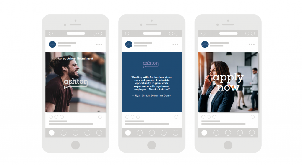
Use of Photography
Engaged, happy, and authentic are the main components of the art direction for Ashton. The models should always look as if they are
fulfilled and happy in their job. The goal is to not look like models at all, instead, look like a snapshot of everyday life in a working environment.

Use of the Website
The Ashton website should feature large imagery of working people that are seemingly very happy with their job. This joy brought through with the principal photography will set the tone and subliminally tell you how Ashton will get you a job that is fulfilling and one you will be happy with. The text should be used sparingly and be straight to the point, not cause confusion. The website
should flow through with ease, and the layout should be kept dynamic and engaging yet user friendly for the purpose of finding and posting a job.
Use of colour
Deep and Highlight purples are used throughout the brand as complementary brand colours. These colours reinforce the inviting, fresh, yet modern, and architectural feel of the logo and art direction.
Use of Typography
The typeface used for the wordmark and throughout the brand direction is modern yet architectural, which adds character and incredibly legible to read. The slabs in the typeface complement the speech bubble accent in the logo itself. The secondary font is from the same font family but without slabs and at a lighter weight for legibility and hierarchy. The typeface highlights Ashton as a modern, inviting, yet trustworthy recruitment company.