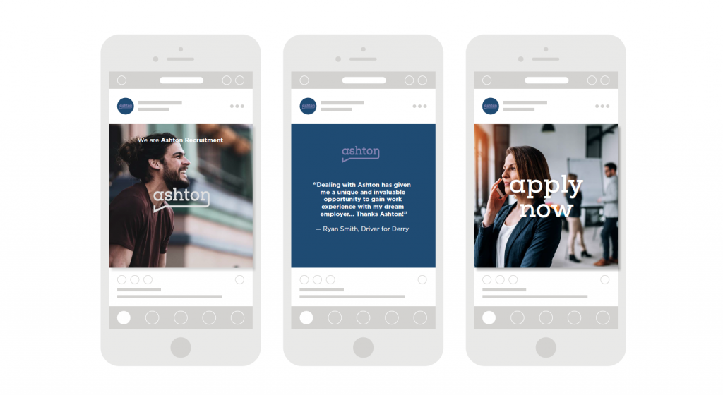
Ashton Recruitment – Brand Identity, Web Development & Billboard Campaign

Recently, we were engaged to review the Ashton Recruitment Brand Identity, Web Presence (https://www.ashtonrecruitment.com) and create a Billboard Campaign for them. Our aim was to create a new Brand Identity for Ashton Recruitment, one that would reflect where they were as a business today. 

With any project of this size, our first task was to understand Ashton Recruitment and what differentiates them from their competition and why. 

Through both interviews with their leadership team and research by our own studio team we were able to develop an understanding of their business and the market they operated in. We also identified what opportunities were available and what threats the business may need to navigate in the coming years.

Ashton Recruitment Brand Identity 

Through a brand audit, we developed a narrative for the new brand position of Ashton Recruitment. With careful consideration to the brand a new typography and colour palette was chosen to accurately reflect their business.

Use of the Brandmark

The brand mark uses lines and shape to draw into the wordmark to give it character and embody the brand message “talk to us”. With the use of the typeface and graphic accent, the two marry each other to make up a speech bubble.

Use of Photography

Engaged, happy, and authentic are the main components of the art direction for Ashton. The models should always look as if they are

fulfilled and happy in their job. The goal is to not look like models at all, instead, look like a snapshot of everyday life in a working environment. 

Use of the Website

The Ashton website should feature large imagery of working people that are seemingly very happy with their job. This joy brought through with the principal photography will set the tone and subliminally tell you how Ashton will get you a job that is fulfilling and one you will be happy with. The text should be used sparingly and be straight to the point, not cause confusion. The website

should flow through with ease, and the layout should be kept dynamic and engaging yet user friendly for the purpose of finding and posting a job.

Use of colour

Deep and Highlight purples are used throughout the brand as complementary brand colours. These colours reinforce the inviting, fresh, yet modern, and architectural feel of the logo and art direction.

Use of Typography

The typeface used for the wordmark and throughout the brand direction is modern yet architectural, which adds character and incredibly legible to read. The slabs in the typeface complement the speech bubble accent in the logo itself. The secondary font is from the same font family but without slabs and at a lighter weight for legibility and hierarchy. The typeface highlights Ashton as a modern, inviting, yet trustworthy recruitment company.

Top Tips on Perfecting Label Design

Label Design is a key marketing tool for any product at the point of sale. No matter whether you’ve been crafting a recognisable brand for years, or you’re a new company just setting up, the design of your packaging and any associated labels is a key way to generate new interest amongst consumers.

You’re bound to have experienced the power of product labels at some point – maybe you picked up a new bottle of wine because of its fancy label, or you finally tried a new food after it had a packaging refresh. Simple scenarios such as these demonstrate the importance of packaging and labelling for product perception, and show how important it is to ensure your label design and quality is the best it can be.

Why do some product labels seem to jump out at you while others are hardly noticeable? Some characteristics, combined with various psychological factors, can easily determine whether your label catches someone’s attention or gets lost in a sea of similar products. Studies have shown that the most successful of all product labels tend to share some very simple, common attributes. Stick with us as we explain what they are and how you can use them to your advantage.

In this blog post, we’re highlighting essential tips for your product label design, showing how you can promote your product with thoughtful and clever label designs.

1. The Use of Fonts in Label Design

Fonts are a crucial piece of the puzzle when creating a product label. They are the voice of your label, acting as the first line of communication during a customer’s perception process. It’s on them to relay your product’s most important information. Here are some things to keep in mind as you design your packaging:

  • Limit the number of fonts you use. Don’t use any more than two fonts on a product label. Too many fonts dilute the message and make it difficult for a potential customer to read.
  • Make sure the font size is readable. Too large of a font may overwhelm the label and consequently your product. Too small of a font size almost guarantees the information will be overlooked. This requires a search for the perfect balance of size.
  • Use a font that relates to both the product and your brand. If your product is a sophisticated, you want to use a more refined font. If it’s a children’s snack, consider one that’s more playful or fun.

2. Using the Right Images

An image or logo gives your customer a quick and familiar way to differentiate your product. A properly positioned image can both identify what your product is and make your customers’ decision process even easier.

  • Incorporate your brand in your images. All great companies do this and you should too. Branding your product labels is very important for building relationships between your product and a customer. Make sure you keep the style consistent. If your brand uses illustrations, don’t go putting photographs on your product packaging.
  • Use images to convey characteristics of your product. Think about a lollipop with a picture of a cherry on it, almost instantly you know what flavor it is. Make associations between your product and its distinctive traits, so customers can easily seek out things they need, want, or can relate to.

3. Material Preferences

A label material is an easy upgrade to make and one that can add a polished look to your label. Something unique or eye-catching cam add another dimension to your product.

  • Stop doing what everyone else is. Take a look around next time you’re surrounded by products — many of them are dull and ordinary, right? What does it say about your product if standard white paper is the best foot you can put forwards? Using different materials, such as brown kraft or foil, can play an important role in the interaction with your product and a potential customer.
  • Add textures and distinction. Engage with consumers on more than a visual level. Appeal to their sense of touch or intrigue them with something new and innovative.

4. Colour Considerations

The colours you use when creating a product label are very important to the way your product is received in the marketplace.

  • Utilise your brand colours. Make sure to incorporate your brand’s colours into your product label. The more easily identifiable your products are with your brand, the more likely you are to increase brand recognition and repeat customers.
  • Use vibrant colours. The use of vivid colours in your label, such as bright reds and yellows, will help differentiate your product label.

5. Use Customised Die-Cut Label Shapes

Circles, rectangles, and squares make up the vast majority of label shapes on products, but have you considered using customised die-cut label shapes? By going for a special custom shaped label, you’re making a statement that you care deeply about your label design, and therefore your product. 

6. Luxury Metallic Embellishments

Foil Blocking is a popular way to help enhance a label. Not only does it make a product look more premium and luxurious, but the foil reflects light in a different way to the rest of the label to help the whole product become much more eye-catching. If you combine the print with the optimal colour palette, you’re on to a winner!

Using Infographics in Your Annual Report

Despite claims that infographics are just a passing fad, they’ve managed to stick around.

And why wouldn’t they? Infographics are great for engaging and educating audiences, especially in Annual Reports. If you’re trying to explain something complex, infographics are a non-intimidating way to walk your audiences through an explanation, step by step. If you want to highlight facts and figures in a report, a sidebar of infographics is a great way to give those stats their day in the sun.

How infographics can help with your Annual Report;

Emphasise a key fact or message

It should be immediately clear what the key message is, if it isn’t then you will have seriously handicapped your design. Most infographics will need a viewer to read more to fully understand the graphic, but the high level – instant take away must be there. All too often an infographic is challenged with delivering too many messages, if this happens it is guaranteed to say nothing to everyone. Keep it Focused.

Easy to understand

The purpose of an annual report infographic is to communicate simply and clearly what the copy alone can’t. If you ask one infographic to convey multiple meanings to a variety of audiences it is most likely going to become confused and disordered. Keep it simple – using a clever visual device or icons help people relate to the key facts, don’t over complicate things with unnecessary graphics that might confuse.

Quick to extract key information

Your average annual report reader will at some point skim through looking for key information or sections they are particularly interested in. This type of reader is looking to get the most information for a limited amount of time spent or effort. Make it easy for them.

Format follows function

Creativity is essential when creating infographics but it must never override the need to convey the key message or information. If you have an infographic in your annual report and it looks wonderful but doesn’t convey the information it should, it is just a pretty picture and should be replaced. Infographics should always have a purpose and should never be used as a visual distraction, doing so compromises all the other infographics and potentially the annual report itself by creating distrust or confusion for the reader.

Annual Report Design Ideas For The Businesses: Tips To Consider

An annual report is a necessity for companies as it acts as a medium to share information to inform stakeholders on how your company is different from the others. It displays information on the investments and returns obtained on those investments along with profits gained by the company. But nowadays, the way of presenting a company’s annual report has changed completely. There has been a significant change in the annual report design as many unique elements have been incorporated. Infographic-inspired designs are gaining popularity which includes illustrations, data visualisations, and icons. Brands are depending more on visual content to communicate their message.

We have seen a trend of people moving away from  more traditional and heavy-text reports as no one has time to go through them. If you are planning to create a report this year, transform it into an engaging piece of content with the below techniques.  

·         VISUALISE YOUR DATA

There are so many ways in which annual reports communicate. Infographic inspired elements in the report will offer a different perspective to the readers. They will witness the change. Using bold charts and graphs to break up the content is a good way to display the data. Moreover, such a representation makes it easier for readers to make quick decisions and distinguish trends in the data. If you display the same information in the paragraphs, then it would be hard to understand.

·         DEMONSTRATE A STORY

If you think there is not much data to show, you can still add other visual elements. You can compel readers to continue reading your company report with a unique cover page. You can also use diagrams and pictures to break your report into clear sections. Use icons as they will draw the eye to key concepts. All these elements can work in tandem to communicate a bigger story and help your readers draw conclusions. If you have some business data to share, it would be great as it can form a critical piece of the visual story.

·         HIGHLIGHT PHOTOGRAPHS

Photographs are a highly functional visual element in any annual report. It can bring your products or services to life by adding a human touch to it. The use of machinery, groups of people, and others may add a dynamic feel to it. With bold photography, you can easily balance longer blocks of text. It is important to choose only high-resolution photos to make sure that your annual report looks its best. You must know that the annual report design somewhat contributes to brand design. It can go outside the box. You can choose subtle cropping or screening that can elevate the whole design. No need to go overboard.

·         CREATE A COLLABORATIVE EXPERIENCE

 If you really wish that more and more people should read your report, consider a communicating microsite. Check out examples online as you will learn how to display the most relevant data. Find out how the delicate and smart graphics encourage scrolling. Even simple movement can increase the reading experience.

·         DISPLAY MULTIMEDIA ELEMENT

 Your annual report is no less than an opportunity to showcase the best of your work from the previous year. It would be great to make the most of what you have already made. Making an interactive piece will also allow you to insert new content or existing assets such as videos or social media posts. Then linking to blogs, videos, and other highlights is a great way. It is premeditated and appealing at the same time.

·         IMPLEMENT MULTIPLE FORMATS

The more data you have, makes it even more important for you to carefully watch how you present it. So if you bury your graphical data in a long report, readers would never be able to find it. Maybe your idea behind making complete data available is to appeal to casual readers who are interested in getting deep knowledge of the company. Using multiple formats will make it easy for the readers to choose the one that appeals to them the most.

·         CHOOSE AN ANNUAL REPORT INFOGRAPHIC

An annual report infographic uses a variety of visual procedures. This tactic trims down text; relies on pictures, icons, and data. This less-is-more approach always works better compared to text. The result is reader-friendly and driven by data.

·         CREATE A MOTION GRAPHIC

Annual Reports on paper don’t live more. If you really wish to make your reports engaging and boost their friendliness, consider a motion graphic. Your audience might not have enough time to read a long report, but you can say a lot in just 30 seconds using motion graphics. In fact, the majority of video marketers believe that video has improved user understanding of their product or service.

Design The Best Annual Report

Use the above techniques and create a business annual report that can say more than what your readers expect. You can take professional help in designing and developing annual reports for your stakeholders. Professionals know how to develop an engaging yet desirable report that can give a piece of good information about your company. Your company’s impression also depends on how good or bad your annual report is. Don’t hesitate to get professional annual report designing assistance.

The Importance of Packaging Design to Your Brand

When it comes to the visual identity of your brand, consistency matters, from your website design and your social media pages to your storefront sign and your business cards. Consistency is what helps to strengthen your brand identity. As such, it’s important that consumers can recognise your brand from the packaging design of your products. If the packaging is consistent with your brand, people who are already familiar with your brand will identify it right away. This makes it easier to stand out from the crowd.

Keep in mind that it works the other way as well – those who purchase your product will become familiar with your brand as a result and be able to identify your brand when they see it elsewhere — as long as there is consistency with your branding efforts.

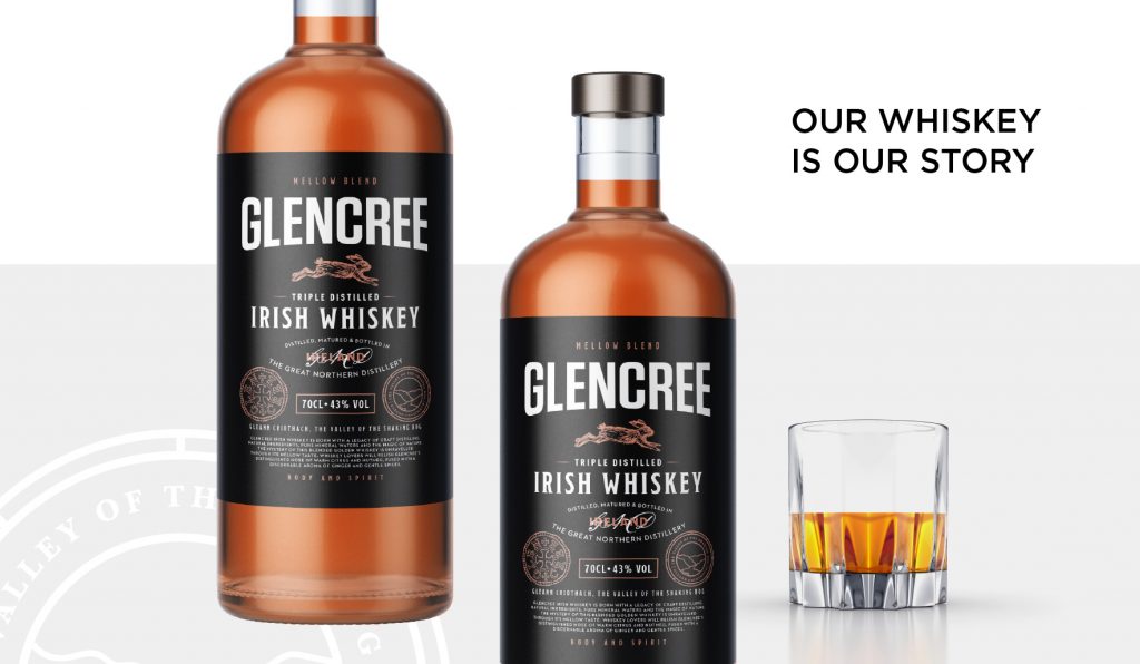
Think about it: when you are picking out a bottle of wine, aren’t you drawn to the bottles with interesting labels? Your product’s packaging can be a consumer’s first point of contact with your product, and a well designed package may make someone try a new brand or product line they’ve never heard of. 

Your package design is one of the most important elements in a successful product launch (or re-launch). But there are so many things to think about when designing a package – it is design that has to function. It has to protect what’s inside. It has to allow for easy storage and distribution. It needs to display information about what it is and draw attention to itself on a shelf full of competing products. 

No matter how good a product is, poor packaging can keep it from selling. Here are some important questions that need to be asked when creating a successful packaging design:

3 Questions to Ask When Designing Packaging for your Product  

1. How will the packaging represent your brand?

What is your brand’s personality? This can be conveyed through colour, fonts, and textures. Good design uses these elements to convey a brand’s story. Great design goes even further…consider the shape of the package – whether it’s a bottle or a box, make it stand out with a unique silhouette. Consider metallic foil stamps, embossing or varnishes.

2. What is the desired price point for this product?

We make assumptions on a product’s price point before we see a price tag. Once we’ve made those assumptions, we look at the price and decide either “this is a really good value” or “I can’t believe they are charging that much for this.” Your product’s increase in desirability and perceived value can help you charge more for it.

3. What types of materials are you going to use?

How durable does this packaging have to be? How long does this package have to stay intact before consumer use? Plastic, aluminum, glass, and paperboard are traditionally used, but we also need to think about your target audience. Are they environmentally conscious? If so, it’s probably best to look at alternative materials such as bioplastics. Sustainability also means using the least amount of material possible. An eco-friendly package will be ingeniously designed to function well with minimal materials.

E-Commerce Grant for NI Retail Businesses

A new £3 million fund to help retail micro-businesses in Northern Ireland looking to grow their business online. Many of the Kaizen Brand Evolution Clients who are looking to develop their online selling ability and capacity may be eligible for this support.

Get in touch with our Client Services Team. They’ll only be too happy to help with your application and provide guidance on the most suitable opportunities for your business.

The COVID-19 Micro-business E-commerce Grant (MBEG) is open to any micro-sized retailer that wants to prepare for growth, develop their customer base and find new markets by enhancing their digital offering, building e-commerce capability and increasing online sales. The scheme was developed and is operated by Invest Northern Ireland.

What is available?

Businesses can access up to a maximum grant of £5,000 to support 80% of eligible costs (projects must have a minimum of £1,250 of eligible expenditure).

Eligible activities include the services of a supplier(s) providing expertise to:

  • – Review current digital marketing capabilities and online sales channels.
  • – Develop a digital marketing/e-commerce strategy to drive sustainable growth in online sales.
  • – Implement an enhanced online e-commerce system or improvements to your existing e-commerce solution for the business.
  • – In-house training and knowledge transfer to develop the digital marketing and e-commerce capability of the employees for the business.
  • – Improve integration and automation with existing e-commerce systems.

How Can Kaizen Brand Evolution Help?

Research to Identify Relevant Benchmarks

Our analytics teams will conduct a thorough in-depth review of the markets the organisation operates in. We will identify relevant benchmarks through which to compare effectiveness of the proposed activity and to set a baseline for this project. A report will be provided to present a user-friendly interpretation of the data.

Review of Current Digital Marketing Capabilities and Online Sales Channels

Taking an objective view of current presence and activity, we will respectfully review the sales and digital marketing channel. We will analyse the data collected where available and where not available make suggestions to support data collection for future projects.

Where available we will review the sales channel analytics data to understand how and where customers visit the site as well as what they do on their sales journey.

Develop a Digital Marketing Strategy to Maximise Online Presence

Using our extensive experience in this area we will focus on the relevant digital marketing activities suitable to your organisation. We will deliver a strategy that will have the greatest impact and value addition to the organisation. We will build off-site and on-site processes and plans that can be adopted by your in-house team for output. Where current systems in use are to be retained, we will be respectful of obligations and integrations they may support.

Develop an e-Commerce Strategy to Drive Sustainable Growth in Online Sales

Our team will provide the strategy and plan across a suite of areas all focused on delivering increased sales. This will include increasing traffic, reducing store abandonment, reducing cart abandonment, increasing customer retention and engagement.

Implement an Enhanced Online e-Commerce System or Improvements to Your Existing e-Commerce Solution for the Business

Reviewing current e-commerce functionality in line with the organisations objectives we will review if it is the most suitable option for the organisation. In the case where the system requires optimisation or development to become more effective we will provide suggestions and costs. Our team will provide a report to support and justify our suggestions in this area.

Training and Knowledge Transfer to Develop the Digital Marketing and e-Commerce Capability of the Employees for the Business

Our digital marketing and web development teams will provide a training series to support the knowledge transfer of all systems used to deliver and develop the online capabilities of the organisation. We will ensure adequate reporting guidance is provided to support the organisation as a whole

Improve Integration and Automation with existing e-Commerce Systems

Where existing e-commerce functionality can be improved upon, Kaizen will make suggestions and act where appropriate to deliver enhanced integration within systems and automations to support increased efficiency.


As a micro-sized retailer, you are eligible if:

  • Your business operation is based in Northern Ireland.
  • You are a micro-sized(link is external) business, trading at least two years and employing less than 10 full-time equivalent staff in Northern Ireland.
  • Your business has physical, retail premises in Northern Ireland (e.g. high street shop, sales/trade counter, etc).
  • If your business is not exclusively retail then more than 50% of your turnover must come from the retail part of your business (i.e. you are not primarily a manufacturer or producer, etc).
  • Your business has an existing online presence such as a basic business website, online marketplace or social media channels.
  • Your business has a physical product, or a range of physical products, that can be sold online and shipped to customers.
  • Your project is not receiving any other public funding such as government or European Union funding.
  • You are able to complete your project, pay your supplier and make a claim within the next 6 months.

If you are a business, which is part of a group structure with the same ultimate ownership, you can only submit one application across the group.

Who cannot apply?

The following are examples of businesses that are not eligible to apply:

  • Businesses that cannot demonstrate they have a viable and profitable operation.
  • Businesses involved in the primary production of agricultural products, fisheries and aquaculture.
  • Businesses providing hospitality and leisure services such as hotels, pubs, cafes and restaurants.
  • Businesses primarily involved in the provision of a service such as travel agents, mechanics and tyre fitting services, grooming and beauty services, hair salons, tattoo artists, funeral directors, medical, dental and veterinary practices, accountancy, legal and financial services and insurance broker services.
  • Franchisees of retailers for whom the franchisor provides material online support such as online marketing or e-commerce expertise.
  • Businesses involved in activities that Invest NI considers as ineligible or as involving an unacceptable reputational risk, such as gambling, adult entertainment, tobacco products and cannabis-based products, which are not, authorised as medicines.

How to apply

The COVID-19 Micro-business E-commerce Grant is open for applications.

Making an application

The online application process takes approximately one hour to complete.

If you meet the eligibility criteria, you will need the following information to complete the online application form.

  • Your business name.
  • Your contact name, email and phone number.
  • Your business address and postcode.
  • The date you established your business in Northern Ireland.
  • The number of people you employ in Northern Ireland.
  • The financial year-end of your business.
  • The annual turnover of your business.
  • The balance sheet total of your business.
  • Annual accounts and financial position including offline and online sales.
  • Details of the project with costs, tasks/work to be completed and timelines of when the work is to be started and completed.
  • Your company registration number (if applicable) issued by Companies House, beginning with NI followed by six numbers, for example, NI123456.
  • Details of any De Minimis funding your business (if applicable) has received in the current or previous two fiscal (accounting) years.

You will also need to provide three types of documents electronically:

  • A valid form of Photographic ID as proof of your identity, such as a scanned or photograph copy of a valid passport or a current (full or provisional) driving licence. All driving licences with an expiry date between 1 February and 31 August 2020 will be treated as valid for a further seven months;
  • A scanned or photograph copy of proof of the business address such as a bank statement dated within the last three months for an account used by your business that clearly shows the address;
  • A supplier quotation(s) for all the project costs included in the application form. The costs should be itemised and sufficiently descriptive to allow us to determine which costs are eligible. To get the best value for money you are expected to shop around and get quotes from other potential suppliers with a track record of delivering similar services but please only attach the preferred supplier quotation(s).

*If there are any queries over value for money Invest NI may ask for your alternative supplier quote(s).

Further information

For more information on the scheme and applying, read the Micro-business E-commerce Grant – guidance notes (PDF, 450K).

If you have any enquiries about the COVID-19 Micro-business E-commerce Grant complete the online enquiry form(link is external).