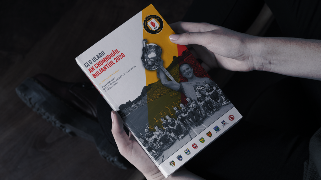
Company annual reports provide information on the health of your company to shareholders, stakeholders, the media and your community. Annual report design can come in many formats, ranging from basic typewritten pages to full-color, glossy publications. Understanding the purpose of the annual report can help you ensure that your report contains pertinent information for your company.
Simple design tricks can help you create a more engaging report which is easier and more interesting to read. Let us check a few in detail.
7 Key Elements to Create Pleasant Annual Report Design
A Clear Format
Usually, when we talk about annual report, we expect a booklet of information which would require a lot of reading. At times, this can be boring. Therefore, it is very important for you to select a format that is interesting as well as provides all the required details. Traditionally, the annual report design has to be a booklet-style. However, a lot of contemporary formats are also used today that aren’t boring. These might include, a website page, an app, other digital mediums, or print formats with more visual designs.
The basic idea behind selecting a particular format or medium is to give the viewers/readers a sense of appeal. If the booklet-style is also tried and made attractive, they wouldn’t mind reading it.
Purposeful Story-Line
Once the format is finalised, the second and challenging step is to think of a story-line that you would use for the report design. Along with the finance and figures, the story must highlight the company’s success and learning experiences. Moreover, envisioning the coming year is also a major component here.
A story-line also depicts the seriousness and hard-working attitude of a company. Hence, choose the best way to tell your story.
Add More Visuals & Infographics
This makes information easy to digest!
Text when combined with infographics, charts, graphs, and other visuals give clarity and lucidity to the report. Therefore, find new ways and designs to highlight the data and information with the most impactful visual effects.
Be Careful With Colors & Highlights
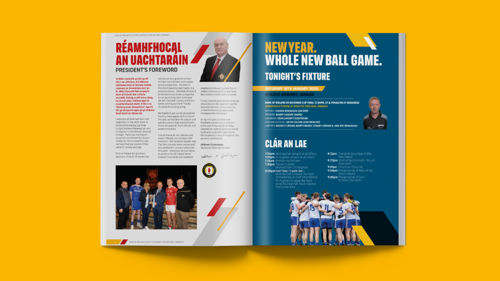
It is advisable to use a single highlight color in the report. Too many colors can often take away the charm of the design. Also, bold typography is an important way to highlight important information. This draws attention to key information.
Using the colors carefully is also essential when you highlight different information. Although connected with each other, giving every idea a unique theme creates a visual impact that is easy to understand.
Typographic Hierarchy
Along with color highlights, text also plays an essential role in guiding the readers to key information in the report. Therefore, using text with correct size and style makes the report easy to navigate.
The entire document should consist of text hierarchy: Header Text, Sub-header Text, and Paragraph Text. The first is normally big and bold as it helps to grab attention of the readers. Sub-headers are comparatively smaller and not as stylish as headers. Paragraph text is very important as this is the main section that contains all the information. Therefore, keep it simple, clear, and readable.
Space Utilisation
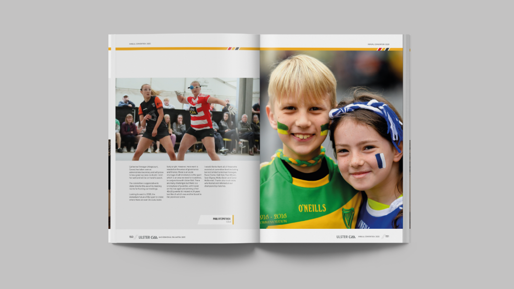
It is very essential that you use the space wisely. An annual report consists of information that needs a lot of room in the design. Everything should not look too clumsy or disorganised. Leave space where required, as this would give a decent and clear visual impact.
Divide The Information
Annual reports usually contain a lot of information. Everything should be connected well with a natural flow as you form the story to make some sense. Therefore, it is recommended to divide the information into small sections. Also, use common themes to connect pages.


