Brochure Design

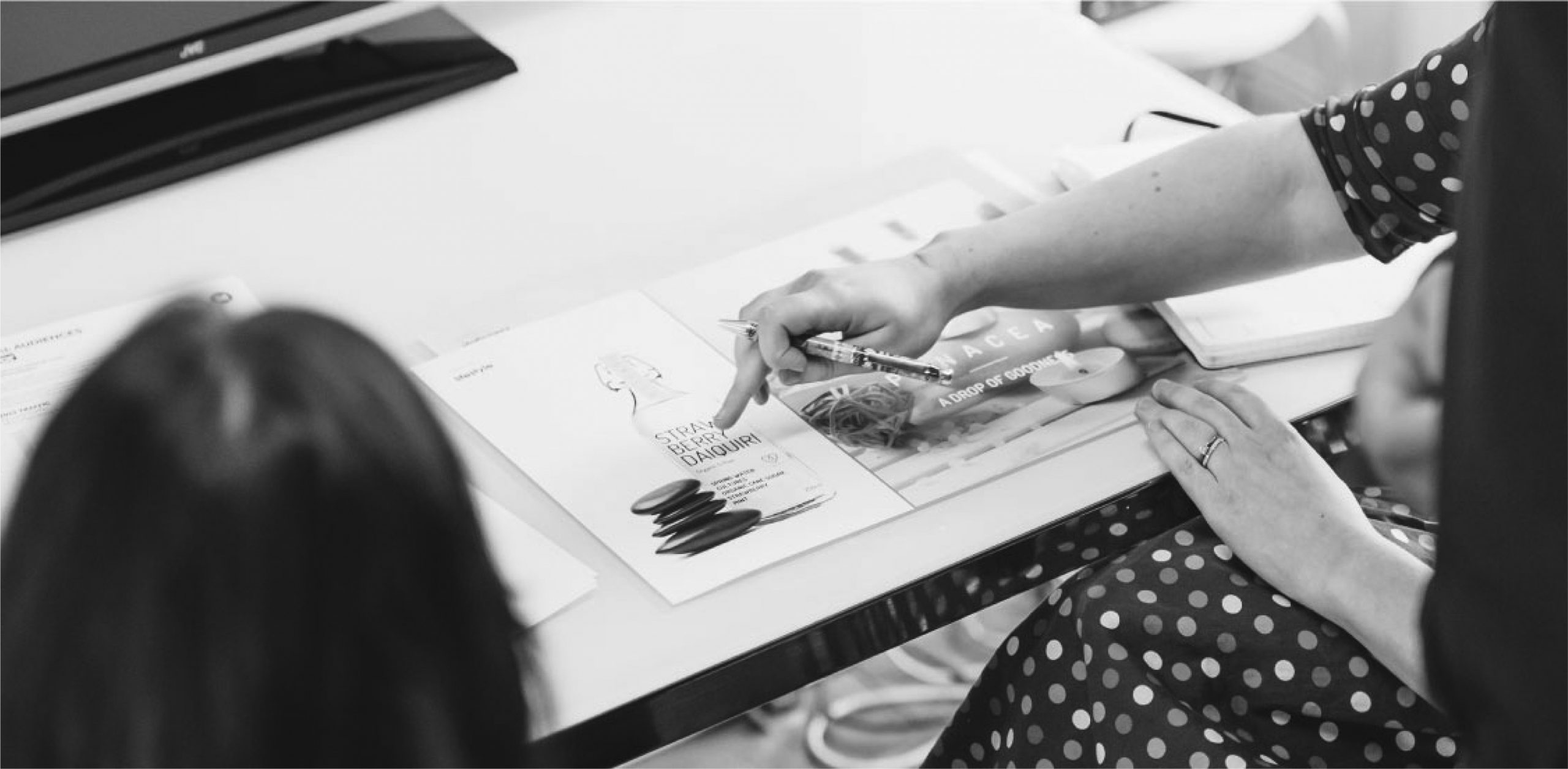
Our design studio have created thousands of brochure designs for businesses, charities and other organisations spanning every conceivable market sector. Our experience and knowledge of type, layout and photography ensures we position your brand perfectly, while  providing opportunity to meet the strategic goals of the project, whatever they may be. We understand that the delivery of your brochure may take many forms and so our team of graphic designers can expertly output your brochure design for both print and digital delivery.

Do you still need a marketing brochure?

The marketing brochure is one of the oldest tricks in the marketing playbook.

While digital strategies are dominating the modern marketing trends, traditional techniques like the trusty sales brochure aren’t going anywhere.

In fact, physical marketing media may be more powerful than ever. One marketing research firm suggests that physical media is more memorable, more persuasive, and more likely to drive behavior than digital media. 

The best marketing strategies of today integrate the digital with the physical, focusing on flyers, brochures, and posters just as much as websites and social media graphics.

How do you make a brochure that is worth keeping? 

Designing a brochure is easy. But designing a brochure that your recipient will keep for future reference is no easy feat. Effective brochure design is crucial in creating one with accessible product and service information. The more useful your brochure is, the longer its life with your recipient and the higher the chance it could be passed on to other would-be customers.

Brochure design is not entirely limited to the images or layout that you want to use. Rather, it is a mixture of elements working together in harmony that makes your brochure effective. Elements such as the font you used, the content, and even the type of paper on which you print your brochure should be given careful consideration during the planning stage.

Here are 7 things that you need to consider for effective brochure design.

1. Determine your purpose.

As with all planning, the very first step is to identify your brochure’s objectives. This will determine how the entirety of your brochure marketing will go, and by extension, the design of your brochures. 

Which segment of your target market are you going to distribute your brochure to? Will it be distributed by hand or sent through direct mail? What benefit do you hope to get? Answering these questions makes for an effective brochure design.

2. Know your brochure folds.

One of the distinguishing features of a brochure is its numerous folds. In fact, these folds control how your product and service information is presented to your recipient.

Picking the right brochure fold is challenging. You want the fold to complement the type of content that you include in the brochure and the way your intended recipients read it. Things like product features, or a sequence of steps, would benefit more with a brochure that folds open to reveal each step sequentially.

PrintRunner currently offers seven types of brochure folds, each with their unique features and best applications. To learn more about them, check out our blog post on brochure folds.

3. Review your copy.

A lot of people think that only the content of a brochure is important when it comes to the creation process. While I agree that the content is important, how it is presented to your reader is more crucial, in my opinion. This is where understandability comes into the picture.

Review your copy with respect to your reader. Is it giving too much information that could overwhelm your reader? Is it too short? As a general rule, concise writing isa must for brochure marketing. You have to give valuable information in a short amount of time. 

Aside from this, you should also review how your copy relates to the overall visual design. Too much text and your brochure would not be enticing to read. Also, always check for spelling and grammar mistakes.

4. Choose your fonts.

The copy for the brochure is usually outlined with a heading, a subheading, and the body of the text itself. You should keep this in mind when choosing the fonts that you are going to use for your brochure. I highly suggest that you limit your font choices into just three, one for each. 

Fonts determine the readability of your text, sets the tone of your brochure, and influences its visual appeal. If you are new to typography, I highly suggest looking for font combinations that work together. To start, check out Canva’s Design School compilation on the basics of typography and suggested font combinations in their Ultimate Guide to Font Pairing.

5. Know your paper stock and coating.

Consider the paper stock your brochure is printed on, as well as the coating that you can apply. For most customers, your choice of paper stock and coating can influence their perception of your company. A brochure with a thicker paper stock and a glossy or matte coating will be perceived as more upscale than one with a thinner stock.

Your choice of paper stock and coating will also affect durability. Heavier stock usually lasts longer than lighter ones. Coating can protect your brochure from smudging and abrasions. It will also make your colors more vibrant. These options can make your brochures shine, literally. 

6. Use high resolution photos.

It is a crime at this point to use blurry, jagged, low resolution photos when there are a lot of high quality images on the internet. For effective brochure design, image quality is very important. If you are going to use stock photos, try to select ones that do not look like stock photos. Using those corporate images with one person on the foreground staring directly at the camera is laughable nowadays and might negatively affect your brand image if used.

If you are going to use product images, make sure that they are arranged in a visually appealing way. I suggest hiring a photographer to ensure the quality of your product presentation. If you plan to go DIY, there are plenty of tutorials on the internet on how to create an ideal product photography setup.

7. Include a call-to-action

Arguably, the call-to-action is the most important section of your brochure. This is the part where you lead your recipient to an intended action. Whether it is to buy your products, check out your website, or avail of your discounts, it is important that you always include a statement that will lead your customers back to you. 

Make your call-to-action immediately visible to your recipient. I suggest using visual cues, such as a bigger font or larger white space around it to make it stand out. Be specific with what you want from your recipients. 

For better response to your call-to-action statements, include an incentive to readers. Things like coupons or exclusive promotions will encourage your customers to take this action after reading your brochure.  

Packaging Design at KBE

How many times did you stop to check out a product simply because the packaging design caught your attention?

When you had to choose between two similar products, did the way those products look influence your decision?

While we should try our best to not judge things by appearance, the truth is, we care a lot about first impressions. And in a world like this, the way a product’s packaging looks matters just as much as the product itself. Because no matter how good your product is, poor packaging design is going to drag sales down.

There are a lot of things to take into consideration when choosing the packaging of a product. It needs to protect what’s inside, allow for easy storage, display information about the product and catch the attention of customers when displayed on a shelf. 

Why does packaging design matter?

Product packaging is, above all, a practical tool, but it also means much more than that for the product and brand it represents. It is the packaging that, through its design, convinces a consumer to purchase a product or not.

Packaging design matters for many reasons, but here are those we believe to be the most important:

Gives a strong first impression

As we’ve already established, first impressions matter a lot, especially when your product needs to stand out in a sea of similar products. Eye-catching packaging design will differentiate your product from others on the market, be it on the shelves of stores or on the pages of an eCommerce website. This is your first chance to win consumers over and get them to know your brand, so take as much advantage of it as you can.

Creates and supports brand identity

Your brand has a story – an identity you have been working to create. What better way to emphasize on brand identity than packaging design? After all, it’s what consumers see first. To ensure packaging design tells an accurate story of your brand, make sure it clearly displays your company logo and makes use of fonts, colors and trademarks associated with your company. This way, consumers will be able to recognise your products anywhere.

Communicates with customers

No matter how much you play with packaging design, don’t forget that it must also be informative. It must communicate with customers and tell them everything they need to know to convince them of the product inside. Good packaging design needs to be able to answer the following questions:

  • Who is this product created for?
  • What is this product used for?
  • Where can I learn more about the manufacturer?
  • Does it expire? When?
  • How will this product improve my life?

Packaging Design Agency

Considered packaging will ensure your brand is developed at every touch point of the purchase process. With great experience in B2C moment of choice decision influencing, our creatives will ensure your brand has the best opportunity for purchase and engagement.

We have an excellent team of dedicated and world class designers, who have helped many a products evolve their packaging, ensuring that their products are the best looking on the shelves.

Packaging Design Outputs

When it comes to packaging design, consideration to the printed output and knowledge on how to achieve this is critical to the project success. We work in tandem with packaging printers all across the UK & Ireland to ensure our packaging and labelling designs can be expertly output in the most effective manner. From gift boxes, to gift bags, food packaging sleeves and outer for all types of products, we have a wealth of experience in packaging design.

Within our studio, packaging refers to any labelling, boxes, sleeves that are used to identify or protect a product. We generally leave bottling and food grade packs to the experts in their respective fields.

Pitch Deck Design

You’re almost nearing the end of presenting a pitch deck design to a room full of suited and booted individuals. In your mind, everything was covered in your presentation, you spoke and deliver with confidence and the end result is in sight – which, in this case, is the required funding.   

Your presentation ends.

But you’re met with silence. No applause. No nods of approval. You don’t get the ending you had imagined.

Where did you go wrong?

Perhaps your content and core ideas were great.  But you didn’t pay attention to your pitch deck design.

You see, while the content of course is king in a pitch deck, how effectively and efficiently the message is communicated can have an impact on the recipients. We are experts in presentation and pitch deck design, working with some of the countries leading brands and most innovative startups, creating engaging presentations.

So the next time you want to see sparks of interest among investors, pay attention to your pitch deck design. To help in your endeavor, we’d like to share some incredible pitch deck design tips with you.

Lets start from the very beginning…

What is Pitch Deck Design?

A pitch deck is a presentation, often created using Indesign, PowerPoint or Keynote, used to engage your audience with a snapshot of your business plan. A pitch deck is usually a digital file presented on screen but also commonly provided in print format. Many of the most recognised brands today sourced funding through the use of pitch decks.

Our Pitch Deck Design Process

Our design process is tried and rigorously tested. Whether you are starting from scratch or have a draft ready for review, our designers are specialists in the enhancement of presentation documents. Once we receive your initial document, a member of our team will get in touch to talk through a design brief. 

Armed with an understanding of the project and its intent, we begin our process of design. We’ll design the deck cover and an agreed number of pages / slides to ensure we’ve grasped the concept fully. On approval of our first drafts, we roll the agreed styling out across all pages quickly and efficiently.

Here are our Do’s & Dont’s for Pitch Deck Design

Dos For Pitch Deck

Narrate the Story

People love to listen to well-constructed interesting and engaging stories rather than long-lasting boring speeches. Even investors love stories. So, whenever you start creating aPowerPoint pitch deck, make sure the narration of the content flows like storytelling. Try to organise all the content in a sequence so that the audience can understand your point of view and engage with your vision. This is one of the most important aspects of making investors think about your proposal. 

One Slide – One Idea

We know content is the king, but the well-constructed presentation of content is equally important. So, never forget this point. No doubt, the best way to make a pitch deck presentation powerful is to use new customised feature-rich templates. If you don’t want to spend on buying customised feature-rich templates, still you can create a powerful presentation of a pitch deck. For that, you need to follow a few simple steps which are mentioned below.

Use one slide for one idea only. Whether the idea you want to put on a particular slide has only a few words or only an image, don’t put other ideas on that page. 

Avoid repetition of content or specific words. It will decrease the excitement level of the audience. 

Use different colors, highlighting features, underline, outline, and other features to make the slide look attractive. 

Focus on Making Great First Impression

There is a saying “the first impression is the last impression.” This is very true. You must dedicate all your skills, creativity, focus, discretion, and experience in making a great first impression. A great first impression will aid you to engage the investors and other audiences to your business proposal. They will take interest in your proposal and respond better than as per your expectations. So, make sure you leave a long-lasting impression on investors through a few first slides of yourPowerPoint pitch deck. 

Prepare Yourself Before Presenting Your Business Proposal 

Once you complete creating your presentation, prepare yourself accordingly. You must know all the calculations or metrics mentioned in the slides so that you can confidently present them. The best advantage of the preparation of the presentation is that you can confidently present all the data with just having an overview of slides. You don’t need to read all the slides word by word if you are prepared. 

Don’ts For Pitch Deck

Avoid Using Too Many Bullet Points

Presenting the content in bullet points is a great idea. It is an effective way of presentation. However, if you use too many bullet points in your PowerPoint pitch deckpresentation, it will be a poor presentation. So, avoid it by limiting the uses of bullet points in the pitch deck’s slides. In replacements of too many bullet points, you can create short 2-3 line paragraphs. This will increase the value of your presentation. 

Don’t Make Your Pitch Deck Too Long 

This is a really very important point. Make sure you create a short and average slides pitch deck. If you don’t have enough knowledge about creating a PowerPoint pitch deck, you can take assistance from professionals. 

Remember always, the words and statistics you say by your mouth is more important than what slides show. People are not interested in slides, they are interested in what you say about your business proposal by referring to your pitch deck. So, make your pitch deck not longer than 30 slides. 

Don’t Create a Picture-Poor, Text-Reach Presentation

The investors sitting in the conference hall to listen to you cannot read and listen at the same time. So, create a balanced presentation that has more pictures and graphical statistical content than text content. This will allow investors to listen to you more than paying attention to slides. So, make sure you follow this step wherever you create a pitch deck for a business proposal. 

Don’t Use Small and Too Many Fancy Fonts 

Sometimes, people use small and fancy fonts in presentations to make it more attractive. However, they don’t know that small and fancy fonts will only create disturbance in pitch deck presentation. You should not use these types of fonts but you should use simple and commonly used fonts such as Ariel and Times New Roman.

These pitch decks do’s and don’ts are very effective to help you to create a powerful pitch deck presentation. At the same time, these points will help you to present your pitch deck confidently and make investors accept your proposals. So, whenever you have any business proposal and you want to create a pitch deck for that, make sure you follow these effective dos and don’ts tips. 

The KBE Studio 

We appreciate that pitch decks may be required in a hurry. With a team of 12 dedicated pitch deck designers, all in-house, we can work to almost any deadline.

For speed, we design all presentations in Indesign primarily and then transfer the presentation to your chosen software. This ensures deliverability and the ability for you to edit your presentation deck after receipt.

Our most common pitch deck and presentation outputs include: Powerpoint, Visme, Prezi, Keynote and slides. Other outputs of course are available on request. Please just let us know at the time of briefing.

To speak to our team about your Pitch Deck Design, you can call us on +44 (0)28 95 072 007 or email our team on studio@kaizenbrandevolution.com.